DevExtreme jQuery - Adaptability
When adapting to a small container or screen, the DataGrid can hide columns. To enable this feature, set the columnHidingEnabled to true. Columns have hiding priorities - zero-based indexes that determine the order in which they are hidden. These indexes ascend from right to left by default, which means that the rightmost column is always at risk of being hidden. Use the hidingPriority option to specify a custom hiding priority and cancel the default priorities.
jQuery
$(function() {
    $("#dataGridContainer").dxDataGrid({
        columnHidingEnabled: true,
        columns: [{
            // ...
            hidingPriority: 2 // a valuable column
        }, {
            // ...
            hidingPriority: 1 // a not-so-valuable column
        }, {
            // ...
            hidingPriority: 0 // a first-to-hide column
        }]
    });
});
Angular
<dx-data-grid ...
    [columnHidingEnabled]="true">
    <dxi-column [hidingPriority]="2" ... ></dxi-column> <!-- a valuable column -->
    <dxi-column [hidingPriority]="1" ... ></dxi-column> <!-- a not-so-valuable column -->
    <dxi-column [hidingPriority]="0" ... ></dxi-column> <!-- a first-to-hide column -->
</dx-data-grid>
import { DxDataGridModule } from "devextreme-angular";
// ...
export class AppComponent {
    // ...
}
@NgModule({
    imports: [
        // ...
        DxDataGridModule
    ],
    // ...
})The table layout does not automatically adapt to changes made in the widget's container at runtime. Therefore, if you enable a user to resize the container, call the updateDimensions() method after each resizing to render the DataGrid in the new size.
jQuery
$("#dataGridContainer").dxDataGrid("updateDimensions");Angular
import { ..., ViewChild } from "@angular/core";
import { DxDataGridModule, DxDataGridComponent } from "devextreme-angular";
// ...
export class AppComponent {
    @ViewChild(DxDataGridComponent, { static: false }) grid: DxDataGridComponent;
    // Prior to Angular 8
    // @ViewChild(DxDataGridComponent) grid: DxDataGridComponent;
    renderDataGrid () {
        this.grid.instance.updateDimensions();
    };
}
@NgModule({
    imports: [
        // ...
        DxDataGridModule
    ],
    // ...
})
Data from hidden columns is still available in adaptive detail rows. A user can expand or collapse these rows by clicking the ellipsis buttons in the adaptive column.
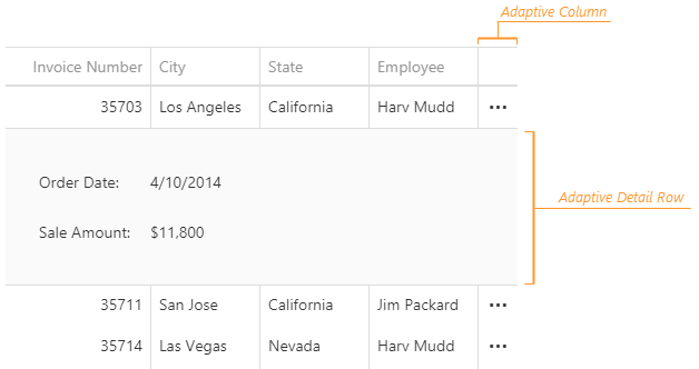
Adaptability Demo Hiding Priority Demo
You can expand or collapse adaptive detail rows programmatically by calling the expandAdaptiveDetailRow(key) or collapseAdaptiveDetailRow() method. Note that adaptive detail rows cannot be expanded simultaneously, therefore, calling the expandAdaptiveDetailRow(key) method collapses the previously expanded row. To check whether a specific row is expanded, call the isAdaptiveDetailRowExpanded(key) method.
jQuery
var expandAdaptiveDetailRow = function (key, dataGridInstance) {
    if (!dataGridInstance.isAdaptiveDetailRowExpanded(key)) {
        dataGridInstance.expandAdaptiveDetailRow(key);
    }
}
Angular
import { ..., ViewChild } from "@angular/core";
import { DxDataGridModule, DxDataGridComponent } from "devextreme-angular";
// ...
export class AppComponent {
    @ViewChild(DxDataGridComponent, { static: false }) dataGrid: DxDataGridComponent;
    // Prior to Angular 8
    // @ViewChild(DxDataGridComponent) dataGrid: DxDataGridComponent;
    expandAdaptiveDetailRow (key) {
        if (!this.dataGrid.instance.isAdaptiveDetailRowExpanded(key)) {
            this.dataGrid.instance.expandAdaptiveDetailRow(key);
        }
    }
}
@NgModule({
    imports: [
        // ...
        DxDataGridModule
    ],
    // ...
})
All adaptive detail rows contain the DevExtreme Form widget, so you can customize a row by changing the options of this widget. To access them, implement the onAdaptiveDetailRowPreparing event handler. For example, the following code marks the form item whose data field is "OrderID" as required:
jQuery
$(function() {
    $("#dataGridContainer").dxDataGrid({
        // ...
        onAdaptiveDetailRowPreparing: function (e) {
            for (let formItem of e.formOptions.items) {
                if (formItem.dataField == "OrderID") {
                    formItem.isRequired = true;
                }
            }
        }
    });
});
Angular
import { DxDataGridModule } from "devextreme-angular";
// ...
export class AppComponent {
    onAdaptiveDetailRowPreparing (e) {
        for (let formItem of e.formOptions.items) {
            if (formItem.dataField == "OrderID") {
                formItem.isRequired = true;
            }
        }
    }
}
@NgModule({
    imports: [
        // ...
        DxDataGridModule
    ],
    // ...
})
<dx-data-grid ...
    (onAdaptiveDetailRowPreparing)="onAdaptiveDetailRowPreparing($event)">
</dx-data-grid>