jQuery Chart - argumentAxis

The argumentAxis object, which is described here, configures the argument axis individually. To specify common settings for all axes in a chart, use the commonAxisSettings object. Axis-specific settings override common settings.
aggregateByCategory
Aggregation by categories can be applied only when the axis displays categories, and each category contains two or more series points.
When aggregateByCategory is true, data is aggregated using the specified aggregation method.
The following code shows an example of a data source that can be aggregated by categories and the Chart configuration for this use-case:
jQuery
$(function() {
    $("#chartContainer").dxChart({
        dataSource: [
            { arg: "A", val: 1 },
            { arg: "A", val: 1 },
            { arg: "A", val: 1 },

            { arg: "B", val: 1 },
            { arg: "B", val: 1 }
        ],
        series: {
            type: "bar",
            aggregation: {
                enabled: true,
                method: "sum"
            }
        },
        argumentAxis: {
            aggregateByCategory: true
        }
    });
});
Angular
<dx-chart dataSource="chartData">
    <dxi-series type="bar">
        <dxo-aggregation
            [enabled]="true"
            method="sum">
        </dxo-aggregation>
    </dxi-series>
    <dxo-argument-axis [aggregateByCategory]="true"></dxo-argument-axis>
</dx-chart>
import { Component } from '@angular/core';
import { DataPoint, Service } from './app.service';

@Component({
    selector: 'app-root',
    templateUrl: './app.component.html',
    styleUrls: ['./app.component.css']
})
export class AppComponent {
    chartData: DataPoint[];
    constructor(service: Service) {
        this.chartData = service.getDataPoints();
    }
}
import { Injectable } from '@angular/core';

export class DataPoint {
    arg: String,
    val: Number
}

let dataPoints: DataPoint[] = [
    { arg: "A", val: 1 },
    { arg: "A", val: 1 },
    { arg: "A", val: 1 },

    { arg: "B", val: 1 },
    { arg: "B", val: 1 },
    { arg: "B", val: 1 }
];

@Injectable()
export class Service {
    getDataPoints(): DataPoint[] {
        return dataPoints;
    }
}
import { BrowserModule } from '@angular/platform-browser';
import { NgModule } from '@angular/core';
import { AppComponent } from './app.component';

import { DxChartModule } from 'devextreme-angular';
import { Service } from './app.service';

@NgModule({
    declarations: [
        AppComponent
    ],
    imports: [
        BrowserModule,
        DxChartModule
    ],
    providers: [
        Service
    ],
    bootstrap: [AppComponent]
})
export class AppModule { }
Vue
<template>
    <DxChart :data-source="chartData">
        <DxSeries type="bar">
            <DxAggregation
                :enabled="true"
                method="sum"
            />
        </DxSeries>
        <DxArgumentAxis :aggregate-by-category="true" />
    </DxChart>
</template>

<script>
import DxChart, {
    DxSeries,
    DxAggregation,
    DxArgumentAxis
} from 'devextreme-vue/chart';

import service from './data.js';

export default {
    components: {
        DxChart,
        DxSeries,
        DxAggregation,
        DxArgumentAxis
    },
    data() {
        const chartData = service.getDataPoints;
        return {
            chartData
        }
    }
}
</script>
const dataPoints = [
    { arg: "A", val: 1 },
    { arg: "A", val: 1 },
    { arg: "A", val: 1 },

    { arg: "B", val: 1 },
    { arg: "B", val: 1 },
    { arg: "B", val: 1 }
];
export default {
    getDataPoints() {
        return dataPoints;
    }
};
React
import React from 'react';

import Chart, {
    Series,
    Aggregation,
    ArgumentAxis
} from 'devextreme-react/chart';

import service from './data.js';

class App extends React.Component {
    constructor(props) {
        super(props);
        this.chartData = service.getDataPoints;
    }

    render() {
        return (
            <Chart dataSource={this.chartData}>
                <Series type="bar">
                    <Aggregation
                        enabled={true}
                        method="sum"
                    />
                </Series>
                <ArgumentAxis aggregateByCategory={true} />
            </Chart>
        );
    }
}
export default App;
const dataPoints = [
    { arg: "A", val: 1 },
    { arg: "A", val: 1 },
    { arg: "A", val: 1 },

    { arg: "B", val: 1 },
    { arg: "B", val: 1 },
    { arg: "B", val: 1 }
];
export default {
    getDataPoints() {
        return dataPoints;
    }
};
This code produces the following result:

If aggregateByCategory is false, the aggregation methods are not applied. The first series point in each category is displayed instead.
aggregationGroupWidth
Specifies the length of aggregation intervals in pixels. Does not apply if aggregateByCategory is true. May be ignored in favor of the aggregationInterval option.
For data aggregation, the argument axis is divided into intervals. Series points that fall within the same interval get aggregated together. The aggregationGroupWidth option defines the length of each interval in pixels.
See Also
- Data Aggregation
- series.aggregation
aggregationInterval
Specifies the length of aggregation intervals in axis units. Applies only to axes of continuous and logarithmic types.
For data aggregation, the argument axis is divided into intervals. Series points that fall within the same interval get aggregated together. The aggregationInterval option defines the length of each interval.
If the axis displays numbers, assign a number to this option. For example, an aggregationInterval of 100 produces the following intervals: 0 to 100, 100 to 200, 200 to 300, etc. If the axis displays date-time values, set this option to one of the accepted string values. Alternatively, you can set it to an object that contains one of the fields described in this section.
jQuery
$(function() {
    $("#chartContainer").dxChart({
        // ...
        argumentAxis: {
            // Interval of one day
            aggregationInterval: "day",
            // Interval of five days
            aggregationInterval: { days: 5 }
        }
    });
});
Angular
<dx-chart ... >
    <dxo-argument-axis
        aggregationInterval="day"> <!-- Interval of one day -->
        <dxo-aggregation-interval
            [days]="5">            <!-- Interval of five days -->
        </dxo-aggregation-interval>
    </dxo-argument-axis>
</dx-chart>
import { DxChartModule } from "devextreme-angular";
// ...
export class AppComponent {
    // ...
}
@NgModule({
    imports: [
        // ...
        DxChartModule
    ],
    // ...
})
Vue
<template>
    <DxChart ... >
        <DxArgumentAxis
            aggregation-interval="day">     <!-- Interval of one day -->
            <DxAggregationInterval
                :days="5" />                <!-- Interval of five days -->
        </DxArgumentAxis>
    </DxChart>
</template>

<script>
import DxChart, {
    DxArgumentAxis,
    DxAggregationInterval
} from 'devextreme-vue/chart';

export default {
    components: {
        DxChart,
        DxArgumentAxis,
        DxAggregationInterval
    }
}
</script>
React
import React from 'react';

import Chart, {
    ArgumentAxis,
    AggregationInterval
} from 'devextreme-react/chart';

class App extends React.Component {
    render() {
        return (
            <Chart ... >
                <ArgumentAxis
                    aggregationInterval={"day"}>    {/* Interval of one day */}
                    <AggregationInterval
                        days={5} />                 {/* Interval of five days */}
                </ArgumentAxis>
            </Chart>
        );
    }
}

export default App;
On a logarithmic axis, intervals are calculated based on powers. For example, if the logarithmBase is 10 and the aggregationInterval is 1, the following intervals are produced: 100 to 101, 101 to 102, 102 to 103, etc. If the aggregationInterval becomes 2, intervals become longer: 100 to 102, 102 to 104, 104 to 106, etc.
When using the widget as an ASP.NET MVC 5 Control or a DevExtreme-Based ASP.NET Core Control, you can specify this option using the VizTimeInterval enum. This enum accepts the same values, but they start with an upper-case letter, for example, "day" becomes Day.
See Also
allowDecimals
Specifies whether to allow decimal values on the axis. When false, the axis contains integer values only.
argumentType
If your data source stores numbers or dates as strings, specify the proper data type using this option. Make sure the dates have a valid format.
Use the ChartDataType enum to specify this option when the widget is used as an ASP.NET MVC 5 Control or a DevExtreme-Based ASP.NET Core Control. This enum accepts the following values: Numeric, DateTime, and String.
See Also
- valueAxis.valueType - casts values to a specified data type.
- argumentAxis.type - specifies the axis type.
- dataPrepareSettings.checkTypeForAllData - validates the type of each value coming from the data source.
- dataPrepareSettings.convertToAxisDataType - allows you to disable the type cast in favour of the widget performance.
axisDivisionFactor
Specifies the minimum distance between two neighboring major ticks in pixels. Applies only to the axes of the "continuous" and "logarithmic" types.
For axes displaying numbers, the distance between major ticks depends on two interconnected options: axisDivisionFactor and tickInterval. Consider that you have specified both these options. If the specified tick interval leads the pixel distance between two ticks to being less than the axisDivisionFactor value, this tick interval will be ignored.
Use the axisDivisionFactor option only if you need to set the distance between ticks not knowing the axis values. Otherwise, use the tickInterval option.
breaks[]
Declares a scale break collection. Applies only if the axis' type is "continuous" or "logarithmic".
A scale break allows breaking off a part of the axis to improve the readability of a chart with high amplitude values.
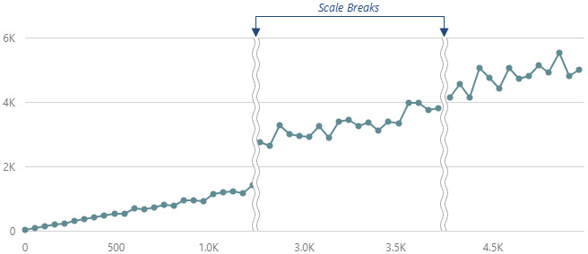
Each object in the breaks array configures a single scale break. Note that a scale break is visible only if its range exceeds the tick interval.
See Also
categories
Specifies the order of categories on an axis of the "discrete" type.
Arguments of the string type on discrete axes maintain the order of objects in the data source. Arguments of the number and date types are sorted in ascending order regardless of their order within the data source. Specify the categories array to set the required order of arguments. In the following example, arguments are sorted alphabetically:
jQuery
$(function() {
    $('#chartContainer').dxChart({
        // ...
        dataSource: dataSource,
        argumentAxis: {
            categories: continentNames,
            argumentField: 'continent'
        }
    });

    const dataSource = [
        { continent: 'Asia', area: 43820000 },
        { continent: 'Africa', area: 30370000 },
        { continent: 'North America', area: 24490000 },
        { continent: 'South America', area: 17840000 },
        { continent: 'Antarctica', area: 13720000 },
        { continent: 'Europe', area: 10180000 },
        { continent: 'Australia', area: 9008500 }
    ];

    const continentNames = [
        'Africa',
        'Antarctica',
        'Asia',
        'Australia',
        'Europe',
        'North America',
        'South America'
    ];
});
Angular
<dx-chart ...
    [dataSource]="dataSource">
    <dxo-argument-axis
        [categories]="continentNames"
        argumentField="continent">
    </dxo-argument-axis>
</dx-chart>
import { Component } from '@angular/core';
@Component({
    selector: 'app-root',
    templateUrl: './app.component.html',
    styleUrls: ['./app.component.css']
})
export class AppComponent {
    dataSource = [
        { continent: 'Asia', area: 43820000 },
        { continent: 'Africa', area: 30370000 },
        { continent: 'North America', area: 24490000 },
        { continent: 'South America', area: 17840000 },
        { continent: 'Antarctica', area: 13720000 },
        { continent: 'Europe', area: 10180000 },
        { continent: 'Australia', area: 9008500 }
    ];

    continentNames = [
        'Africa',
        'Antarctica',
        'Asia',
        'Australia',
        'Europe',
        'North America',
        'South America'
    ];
}
import { BrowserModule } from '@angular/platform-browser';
import { NgModule } from '@angular/core';
import { AppComponent } from './app.component';

import { DxChartModule } from 'devextreme-angular';

@NgModule({
    declarations: [
        AppComponent
    ],
    imports: [
        BrowserModule,
        DxChartModule
    ],
    providers: [ ],
    bootstrap: [AppComponent]
})
export class AppModule { }
Vue
<template>
    <DxChart ...
        :data-source="dataSource">
        <DxArgumentAxis
            :categories="continentNames"
            argument-field="continent"
        />
    </DxChart>
</template>

<script>
import DxChart, {
    DxArgumentAxis
} from 'devextreme-vue/chart';

export default {
    components: {
        DxChart,
        DxArgumentAxis
    },
    data() {
        return {
            dataSource: [
                { continent: 'Asia', area: 43820000 },
                { continent: 'Africa', area: 30370000 },
                { continent: 'North America', area: 24490000 },
                { continent: 'South America', area: 17840000 },
                { continent: 'Antarctica', area: 13720000 },
                { continent: 'Europe', area: 10180000 },
                { continent: 'Australia', area: 9008500 }
            ],

            continentNames: [
                'Africa',
                'Antarctica',
                'Asia',
                'Australia',
                'Europe',
                'North America',
                'South America'
            ]
        };
    }
}
</script>
React
import React from 'react';

import Chart, {
    ArgumentAxis
} from 'devextreme-react/chart';

const dataSource = [
    { continent: 'Asia', area: 43820000 },
    { continent: 'Africa', area: 30370000 },
    { continent: 'North America', area: 24490000 },
    { continent: 'South America', area: 17840000 },
    { continent: 'Antarctica', area: 13720000 },
    { continent: 'Europe', area: 10180000 },
    { continent: 'Australia', area: 9008500 }
];

const continentNames = [
    'Africa',
    'Antarctica',
    'Asia',
    'Australia',
    'Europe',
    'North America',
    'South America'
];

class App extends React.Component {
    render() {
        return (
            <Chart ...
                dataSource={dataSource}>
                <ArgumentAxis
                    categories={continentNames}
                    argumentField="continent"
                />
            </Chart>
        );
    }
}

export default App;
color
This option supports the following colors:
- Hexadecimal colors
- RGB colors
- RGBA colors
- Predefined/cross-browser color names
- Predefined SVG colors
- Paint server address
constantLines[]

Each object in the constantLines array configures a single constant line. Setting the value option is necessary for a constant line to be displayed.
See Also
- argumentAxis.constantLineStyle - specifies the appearance of those constant lines that belong to the argument axis.
- commonAxisSettings.constantLineStyle - specifies the appearance of all constant lines in the widget.
constantLineStyle
See Also
- argumentAxis.constantLines[] - configures individual constant lines. Overrides the options of the argumentAxis.constantLineStyle object, which is described here.
- commonAxisSettings.constantLineStyle - specifies the appearance of all constant lines in the widget.
discreteAxisDivisionMode
Specifies whether ticks and grid lines should cross axis labels or lie between them. Applies only to the axes of the "discrete" type.
Use the DiscreteAxisDivisionMode enum to specify this option when the widget is used as an ASP.NET MVC 5 Control or a DevExtreme-Based ASP.NET Core Control. This enum accepts the following values: BetweenLabels and CrossLabels.
See Also
grid
A grid is a set of mutually-crossing vertical and horizontal lines that stretch throughout the entire chart. Visually, grid lines can be considered extensions of major ticks. The grid improves the readability of chart data.
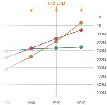
The commonAxisSettings.grid object specifies common settings for all grid lines in the chart. To configure only those grid lines that descend from a particular axis, use the following objects.
Axis-specific settings override common settings.
See Also
- commonAxisSettings.minorGrid - configures the minor grid built on minor ticks.
hoverMode
This option accepts one of the following values.
- none
Axis labels do not respond to pointing to them. - allArgumentPoints
When a user points to a label on the argument axis, series points of the corresponding argument become highlighted.
Use the ArgumentAxisHoverMode enum to specify this option when the widget is used as an ASP.NET MVC 5 Control or a DevExtreme-Based ASP.NET Core Control. This enum accepts the following values: AllArgumentPoints and None.
See Also
- commonSeriesSettings.point.hoverStyle - specifies the appearance of series points in the hover state. Applies to all series points.
- series.point.hoverStyle - the same, but applies to the points of a particular series.
inverted
When an axis is inverted (that is, when this option is set to true), its maximum and minimum values swap their places. As a result, axis values ascend in the opposite direction. Along with the axis, series also become inverted.
See Also
- rotated - rotates the chart.
label
Axis labels display the values of major axis ticks.

See Also
- commonAxisSettings.label - configures the labels of all axes in the widget.
linearThreshold
Specifies a value used to calculate the range on a logarithmic axis within which the axis should be linear. Applies only if the data source contains negative values or zeroes.
Setting this option prevents generating an infinite number of small axis values. Set it to an integer value that designates a power of logarithmBase. The following code sample shows how different linearThreshold values affect the linear range when the logarithmBase is 10:
linearThreshold: -1 // [-0.1; 0.1]
linearThreshold: -2 // [-0.01; 0.01]
linearThreshold: -3 // [-0.001; 0.001]
logarithmBase
Specifies the value to be raised to a power when generating ticks for an axis of the "logarithmic" type.
By default, ticks on a logarithmic axis are generated on a base of 10, i.e., 0.1, 1, 10, 100, 1000 etc. But you can specify the needed base using the logarithmBase option. For example, if you set this option to 5, the following ticks will be generated: 0.5, 5, 25, 125, 625, etc.
max

Use the visualRange property instead.
Coupled with the min option, focuses the widget on a specific chart segment. Applies only to the axes of the "continuous" and "logarithmic" type.
maxValueMargin
Controls the empty space between the maximum series points and the axis. Applies only to the axes of the "continuous" and "logarithmic" type.
By default, the axes extend slightly beyond their extrema generating an empty space between the axes and the minimum/maximum series points. It prevents cutting off parts of those points. To control this empty space, use the minValueMargin and maxValueMargin options. These options are used in the following formulas for the actual start and end axis values.
startAxisValue = minDataValue - (maxDataValue - minDataValue) * minValueMargin
endAxisValue = maxDataValue + (maxDataValue - minDataValue) * maxValueMargin
For example, consider that minDataValue is 1960 and maxDataValue is 2010. If you set the minValueMargin and maxValueMargin options to 0.1, the axis will start in 1955 and end in 2015.
startAxisValue = 1960 - (2010 - 1960) * 0.1 = 1960 - 50 * 0.1 = 1960 - 5 = 1955
endAxisValue = 2010 + (2010 - 1960) * 0.1 = 2010 + 50 * 0.1 = 2010 + 5 = 2015
See Also
- commonAxisSettings.valueMarginsEnabled
min
Use the visualRange property instead.
Coupled with the max option, focuses the widget on a specific chart segment. Applies only to the axes of the "continuous" and "logarithmic" type.
minorGrid
In addition to the major grid built on major ticks, the Chart widget provides the minor grid built on minor ticks.
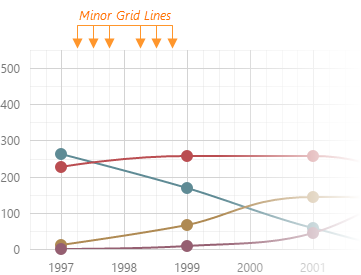
The commonAxisSettings.minorGrid object specifies common settings for all minor grid lines in the chart. To configure only those grid lines that descend from a particular axis, use the following objects.
Axis-specific settings override common settings.
minorTick
Along with major ticks, the Chart widget supports minor ticks. They divide an axis segment limited by two neighboring major ticks.

The commonAxisSettings.minorTick object specifies common settings for all minor ticks in the chart. To configure only those minor ticks that belong to a particular axis, use the following objects.
Axis-specific settings override common settings.
See Also
- argumentAxis.minorTickInterval - specifies the minor tick interval of the argument axis.
- valueAxis.minorTickInterval - specifies the minor tick interval of the value axis.
minorTickCount
Specifies how many minor ticks to place between two neighboring major ticks.
See Also
- argumentAxis.minorTickInterval - specifies the interval between minor ticks. Has a higher priority than the minorTickCount option.
minorTickInterval
Specifies the interval between minor ticks. Applies only to the axes of the "continuous" type.
Minor ticks divide the segment between two neighboring major ticks into smaller segments. Minor ticks are generated automatically, unless the minorTickInterval option is set.
If the axis displays numbers, assign a number to this option. If the axis displays date-time values, assign one of the accepted string values or an object to this option. The object should contain one or several fields described in this section, for example:
jQuery
$(function() {
    $("#chartContainer").dxChart({
        // ...
        argumentAxis: {
            // ...
            minorTickInterval: { days: 5 }
        }
    });
});
Angular
<dx-chart ... >
    <dxo-argument-axis ... >
        <dxo-minor-tick-interval [days]="5"></dxo-minor-tick-interval>
    </dxo-argument-axis>
</dx-chart>
import { DxChartModule } from "devextreme-angular";
// ...
export class AppComponent {
    // ...
}
@NgModule({
    imports: [
        // ...
        DxChartModule
    ],
    // ...
})
Vue
<template>
    <DxChart ... >
        <DxArgumentAxis>
            <DxMinorTickInterval :days="5" />
        </DxArgumentAxis>
    </DxChart>
</template>

<script>
import DxChart, {
    DxArgumentAxis,
    DxMinorTickInterval
} from 'devextreme-vue/chart';

export default {
    components: {
        DxChart,
        DxArgumentAxis,
        DxMinorTickInterval
    }
}
</script>
React
import React from 'react';

import Chart, {
    ArgumentAxis,
    MinorTickInterval
} from 'devextreme-react/chart';

class App extends React.Component {
    render() {
        return (
            <Chart ... >
                <ArgumentAxis>
                    <MinorTickInterval days={5} />
                </ArgumentAxis>
            </Chart>
        );
    }
}

export default App;
When using the widget as an ASP.NET MVC 5 Control or a DevExtreme-Based ASP.NET Core Control, specify this option using the VizTimeInterval enum. This enum accepts the same values, but they start with an upper-case letter, for example, 'day' becomes Day.
See Also
- argumentAxis.minorTickCount - specifies how many minor ticks to place between two neighboring major ticks.
- argumentAxis.minorTick - configures the appearance of minor ticks.
- argumentAxis.tickInterval - specifies the interval between major ticks.
minValueMargin
Controls the empty space between the minimum series points and the axis. Applies only to the axes of the "continuous" and "logarithmic" type.
By default, the axes extend slightly beyond their extrema generating an empty space between the axes and the minimum/maximum series points. It prevents cutting off parts of those points. To control this empty space, use the minValueMargin and maxValueMargin options. These options are used in the following formulas for the actual start and end axis values.
startAxisValue = minDataValue - (maxDataValue - minDataValue) * minValueMargin
endAxisValue = maxDataValue + (maxDataValue - minDataValue) * maxValueMargin
For example, consider that minDataValue is 1960 and maxDataValue is 2010. If you set the minValueMargin and maxValueMargin options to 0.1, the axis will start in 1955 and end in 2015.
startAxisValue = 1960 - (2010 - 1960) * 0.1 = 1960 - 50 * 0.1 = 1960 - 5 = 1955
endAxisValue = 2010 + (2010 - 1960) * 0.1 = 2010 + 50 * 0.1 = 2010 + 5 = 2015
See Also
- commonAxisSettings.valueMarginsEnabled - enables/disables margins for axes.
minVisualRangeLength
Specifies the minimum length of the visual range.
If the visual range is set on a numeric axis, assign a number to this option. If the axis displays date-time values, assign one of the accepted string values or an object to this option. The object should contain one or several fields described in this section, for example:
jQuery
$(function() {
    $("#chartContainer").dxChart({
        // ...
        argumentAxis: {
            // ...
            minVisualRangeLength: { weeks: 2 }
        }
    });
});
Angular
<dx-chart ... >
    <dxo-argument-axis ... >
        <dxo-min-visual-range-length [weeks]="2"></dxo-min-visual-range-length>
    </dxo-argument-axis>
</dx-chart>
import { Component } from '@angular/core';

@Component({
    selector: 'app-root',
    templateUrl: './app.component.html',
    styleUrls: ['./app.component.css']
})
export class AppComponent {
    // ...
}
import { BrowserModule } from '@angular/platform-browser';
import { NgModule } from '@angular/core';
import { AppComponent } from './app.component';

import { DxChartModule } from 'devextreme-angular';

@NgModule({
    declarations: [
        AppComponent
    ],
    imports: [
        BrowserModule,
        DxChartModule
    ],
    providers: [ ],
    bootstrap: [AppComponent]
})
export class AppModule { }
Vue
<template>
    <DxChart ... >
        <DxArgumentAxis ... >
            <DxMinVisualRangeLength :weeks="2" />
        </DxArgumentAxis>
    </DxChart>
</template>

<script>
import DxChart, {
    DxArgumentAxis,
    DxMinVisualRangeLength
} from 'devextreme-vue/chart';

export default {
    components: {
        DxChart,
        DxArgumentAxis,
        DxMinVisualRangeLength
    },
    data() {
        return {
            // ...
        }
    },
}
</script>
React
import React from 'react';
import Chart, {
    ArgumentAxis,
    MinVisualRangeLength
} from 'devextreme-react/chart';

class App extends React.Component {
    render() {
        return (
            <Chart ... >
                <ArgumentAxis ... >
                    <MinVisualRangeLength weeks={2} />
                </ArgumentAxis>
            </Chart>
        );
    }
}
export default App;
When you use the widget as an ASP.NET MVC 5 Control or a DevExtreme-Based ASP.NET Core Control, specify this option via the VizTimeInterval enum. This enum accepts the same values, but they start with an upper-case letter, for example, 'day' becomes Day.
See Also
placeholderSize
The reserved space will be occupied by the axis line and axis labels.

See Also
- margin - generates space around the widget.
position
Depending on the value of the rotated option, position accepts different values.
| rotated | position |
|---|---|
| false | "bottom" or "top" |
| true | "left" or "right" |
strips[]
A strip is a colored piece of the chart's background that highlights a range of values. Strips allow a viewer to see whether a certain series point falls in or out of a range.

Each object in the strips array configures a single strip. To limit a strip, set its startValue and endValue options. You may set only one of them, in which case the strip will not have a limit at one end. Note that setting the color option is also necessary for a strip to be displayed.
See Also
- argumentAxis.stripStyle - specifies the appearance of those strips that belong to the argument axis.
- commonAxisSettings.stripStyle - specifies the appearance of all strips in the widget.
stripStyle
The commonAxisSettings.stripStyle object specifies common settings for all strips in the chart. To configure only those strips that belong to a particular axis, use the following objects.
- argumentAxis.stripStyle
- valueAxis.stripStyle
To configure individual strips, use the following arrays of objects.
Individual settings override axis-specific settings which, in their turn, override common settings.
tick
Ticks divide an axis into sections that measure off values on this axis.
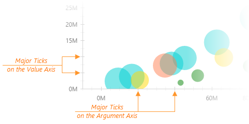
The commonAxisSettings.tick object specifies common settings for all major ticks in the chart. To configure only those major ticks that belong to a particular axis, use the following objects.
Axis-specific settings override common settings.
See Also
- argumentAxis.tickInterval - specifies the tick interval of the argument axis.
- valueAxis.tickInterval - specifies the tick interval of the value axis.
- commonAxisSettings.minorTick - customizes the appearance of minor ticks.
tickInterval
Specifies the interval between major ticks.
Major ticks divide an axis into segments, thus improving the viewer's perception of visualized data. Major ticks are generated automatically, unless the tickInterval option is set.
If the axis displays numbers, assign a number to this option. If the axis displays date-time values, assign one of the accepted string values or an object to this option. The object should contain one or several fields described in this section, for example:
jQuery
$(function() {
    $("#chartContainer").dxChart({
        // ...
        argumentAxis: {
            // ...
            tickInterval: { days: 5 }
        }
    });
});
Angular
<dx-chart ... >
    <dxo-argument-axis ... >
        <dxo-tick-interval [days]="5"></dxo-tick-interval>
    </dxo-argument-axis>
</dx-chart>
import { DxChartModule } from "devextreme-angular";
// ...
export class AppComponent {
    // ...
}
@NgModule({
    imports: [
        // ...
        DxChartModule
    ],
    // ...
})
Vue
<template>
    <DxChart ... >
        <DxArgumentAxis>
            <DxTickInterval :days="5" />
        </DxArgumentAxis>
    </DxChart>
</template>

<script>
import DxChart, {
    DxArgumentAxis,
    DxTickInterval
} from 'devextreme-vue/chart';

export default {
    components: {
        DxChart,
        DxArgumentAxis,
        DxTickInterval
    }
}
</script>
React
import React from 'react';

import Chart, {
    ArgumentAxis,
    TickInterval
} from 'devextreme-react/chart';

class App extends React.Component {
    render() {
        return (
            <Chart ... >
                <ArgumentAxis>
                    <TickInterval days={5} />
                </ArgumentAxis>
            </Chart>
        );
    }
}

export default App;
When you use an axis of the "logarithmic" type, ticks are generated on a base of powers. For example, assuming that the logarithm base is 10 and the tick interval is 1, ticks are generated at 10-2, 10-1, 100, 101, 102, 103, etc. If the tick interval becomes 2, ticks are generated at 10-1, 101, 103, etc.
When using the widget as an ASP.NET MVC 5 Control or a DevExtreme-Based ASP.NET Core Control, specify this option using the VizTimeInterval enum. This enum accepts the same values, but they start with an upper-case letter, for example, 'day' becomes Day.
See Also
- argumentAxis.tick - configures the appearance of major ticks.
- argumentAxis.minorTickInterval - specifies the interval between minor ticks.
title
The axis title is a short text displayed alongside the axis. Usually, the axis title shows units of measurement for arguments displayed by the axis. You can put any text in the axis title though.

If you assign an object to the title option, specifying the text field of this object is necessary for the axis title to be displayed. Besides the object, the title option accepts a string, thus providing a shortcut for setting the axis title. Therefore, this:
title: 'Axis Title'
is the same as this:
title: {
    text: 'Axis Title'
}
See Also
- commonAxisSettings.title - specifies the appearance of all axis titles in the widget.
type
The argument axis can have one of the following types.
- Continuous
Displays numeric and date-time arguments. To divide this axis into intervals, use the tickInterval option. - Discrete
Displays string arguments called "categories". To sort them, use the categories array. - Logarithmic
Displays numeric arguments. Each argument is the logarithmBase value raised to some power. For example, logarithmBase equaling to 10 produces the following arguments: 10-2, 10-1, 100, 101, 102, etc. The logarithmic axis is useful when you visualize a dataset of rapidly-growing values.
Normally, there is no need to specify this option, because the axis type is determined automatically depending on the type of arguments. However, you may force the use of a specific axis type, for example, to employ the "discrete" axis type with numeric or date-time arguments.
Use the AxisScaleType enum to specify this option when the widget is used as an ASP.NET MVC 5 Control or a DevExtreme-Based ASP.NET Core Control. This enum accepts the following values: Discrete, Continuous, and Logarithmic.
valueMarginsEnabled
By default, the argument axis extends slightly beyond its extrema. It prevents cutting off parts of the minimum and maximum series points. To disable this feature, set the valueMarginsEnabled option to false.
See Also
- argumentAxis.minValueMargin - sets a custom margin for minimum series points.
- argumentAxis.maxValueMargin - sets a custom margin for maximum series points.
visualRange
Defines the axis' displayed range. Cannot be wider than the wholeRange.
This option accepts one of the following:
A two-item array
Specifies the range's start and end. The array can contain a pair of numeric, string, or date-time values, depending on the axis's argumentType. You can also set one of the array values to null to specify an open-ended range.
visualRange: [50, 70]
// Open-ended range
visualRange: [null, 70]
An object with the startValue and endValue fields
An alternative to the two-item array.
visualRange: {
    startValue: 50,
    endValue: 70
}
// Open-ended range
visualRange: {
    startValue: null,
    endValue: 70
}
An object with the length and a startValue or endValue field
Specifies the range using a start or end value and length.
visualRange: {
    startValue: 50,
    length: 20
}
// ===== or =====
visualRange: {
    endValue: 70,
    length: 20
}
An object with the length field
Sets the range of the specified length using the last axis value as the end value.
visualRange: {
    length: 20
}
To specify the minimum visual range that a user can set, use the minVisualRangeLength option.
See Also
visualRangeUpdateMode
Specifies how the axis's visual range should behave when chart data is updated.
The following modes are available:
"shift"
The visual range moves to the axis's end. The range's length does not change."reset"
The visual range becomes equal to the whole range."keep"
The visual range does not change."auto"
The applied mode changes depending on the visual range's position on the axis:- at the start or middle, then "keep";
- if set to view the whole range, then "reset" (the visual range remains equal to the whole range).
See Also
- Axis.visualRange()
wholeRange
Defines the range where the axis can be zoomed and panned.
This option accepts one of the following:
A two-item array
Specifies the range's start and end. The array can contain a pair of numeric, string, or date-time values, depending on the axis's argumentType. You can also set one of the array values to null to specify an open-ended range.
wholeRange: [50, 70]
// Open-ended range
wholeRange: [null, 70]
An object with the startValue and endValue fields
An alternative to the two-item array.
wholeRange: {
    startValue: 50,
    endValue: 70
}
// Open-ended range
wholeRange: {
    startValue: null,
    endValue: 70
}
An object with the length and a startValue or endValue field
Specifies the range using a start or end value and length.
wholeRange: {
    startValue: 50,
    length: 20
}
// ===== or =====
wholeRange: {
    endValue: 70,
    length: 20
}
An object with the length field
Sets the range of the specified length using the last axis value as the end value.
wholeRange: {
    length: 20
}
See Also
workdaysOnly
Leaves only workdays on the axis: the work week days plus single workdays minus holidays. Applies only if the axis' argumentType is "datetime".
workWeek
Specifies which days are workdays. The array can contain values from 0 (Sunday) to 6 (Saturday). Applies only if workdaysOnly is true.