JavaScript/jQuery PolarChart - Visual Elements
Topics in this section describe PolarChart UI component elements. Each topic gives an overview of the element's purpose, and details how to enable and tune the chart element to your needs.
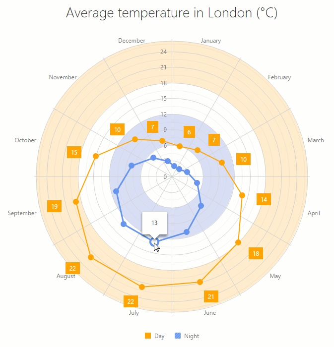
The image below is the chart element map, which can be helpful to you as you begin learning about PolarChart capabilities. Hover over the image to learn how different chart elements are called. Click an element to navigate to a topic in which you will find more details.
Series
A series represents a group of related data points. The most important characteristic of a series is its type, which determines a particular visual representation of data. You can find more details on each series type in the corresponding topics of the PolarChart Series Types section. Here, you will learn how to set a series type and other series properties.
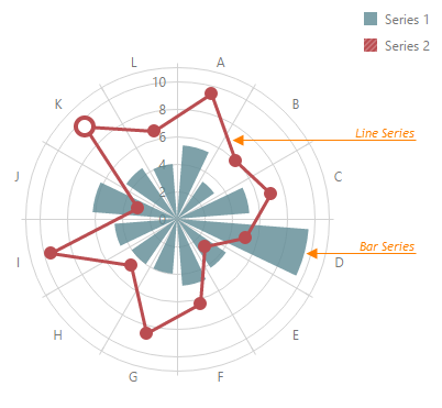
To set a series type, use the type property of the series configuration object.
var polarChartOptions = {
    // ...
    series: {
        type: 'line'
    }
};
To set data for a series, there are several approaches. You can set a common data source for all series or specify data for each series individually. For details, refer to the Data Binding section.
There can be several series displayed in the polar chart. In this instance, series is an array of series objects. You can specify series settings in the following three layers.
Common Series Settings
To set a particular property to a common value for each series, use the commonSeriesSettings configuration object.JavaScriptvar polarChartOptions = { // ... commonSeriesSettings: { type: 'line' } };Common Type-Specific Series Settings
To set a particular property to a common value for each series of a certain type, use the corresponding type-specific configuration object within the commonSeriesSettings configuration object. There are type-specific configuration objects for all series types: area, line, etc.JavaScriptvar polarChartOptions = { // ... commonSeriesSettings: { area: { color: 'LightSkyBlue' } } };Note that the series values that are set for a specific series type override common values.
Individual Series Settings
To set series properties to individual values, use the series array. The array items represent objects defining each series separately.JavaScriptvar polarChartOptions = { // ... series: [ { type: 'line' }, { type: 'bar' } ] };Note that values set individually override the common and type-specific values.
To identify series on the polar chart's legend, set a name for each series, using its name property.
var polarChartOptions = {
    series: [
        { name: 'Men' },
        { name: 'Women' }
    ]
};
In addition to series properties, the series configuration object is used to set properties of the series points and labels.
var polarChartOptions = {
    // ...
    series: {
        point: { visible: true },
        label: { visible: true }
    }
};
Series Points
A series point is a visual representation of a series' data point. Because the PolarChart UI component supports numerous series types, which represent and organize data in different ways, the visual representation of a data point differs from one type to another.
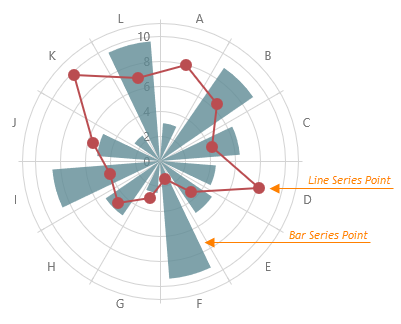
By default, points are drawn in a line-like series. In area series, points are not visible, but can be shown if required. There are also series where points are represented in a specific way - a bar and stacked bar. These specific presentations of series points are customized via specific series properties. You can learn more on them in series types descriptions (see the Series section). Series with a typical point representation expose the point configuration object that can be used for point customization. If you need to apply similar settings to all series in the chart, use the commonSeriesSettings configuration object's point object. Note that properties specified individually within series objects override the common settings specified within the commonSeriesSettings object.
var polarChartOptions = {
    // ...
    commonSeriesSettings: {
        point: {
            // Common settings for all series
        }
    },
    series: {
        point: {
            // Settings for an individual series
        }
    }
};
The following list provides an overview of the point object properties.
Visibility
Use the point's visible property to change point visibility.Appearance
You can change the point's shape, color and size, using the symbol, color and size properties.Border
Make a border visible by setting the visible property of the point's border object. In addition, you can change the border width and color, using the border's width and color properties.Hover Properties
Set a custom color, size and border settings for the "hovered" point state. For this purpose, define the hoverStyle object within the point configuration object.Selection Properties
Set a custom color, size and border settings for the "selected" point state. For this purpose, define the selectionStyle object within the point configuration object.
Series points (regardless of how they are represented) can be accompanied with textual labels. Refer to the Series Point Labels topic for details.
Error Bars
Error bars are used to indicate an error or an uncertainty in a reported measurement. They give a general idea of how precise a measurement is.
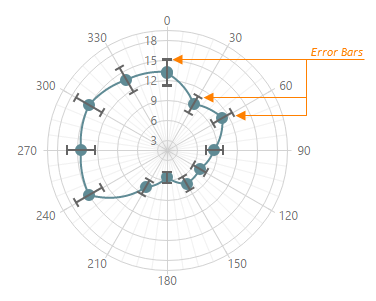
To generate an error bar, two values, high and low, are needed. If the data source of your chart provides concrete high and low values, assign the required data source fields to the series' highValueField and lowValueField properties.
Alternatively, you can calculate the high and low error bar values automatically. For this purpose, choose one of the error bar types and specify the value to be used in calculation.
Error bars can be configured for all series in the chart using the commonSeriesSettings.valueErrorBar object and also for a series individually using the valueErrorBar field of the series array elements.
You can customize the error bars' appearance using their color, edgeLength, lineWidth and opacity properties.
Series Point Labels
Each series point can be accompanied by a text label representing data related to the point. These are series point labels. For series of different types, points represent different kinds of data, thus the corresponding point labels can carry a point's value, argument or both. If required, you can also make a label display custom information.
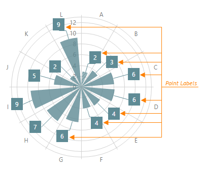
To change the default label appearance, use properties of the label object. This object should be defined within the series whose labels must be customized. If you need to provide the same properties for point labels in all series in the chart, define the label object within the commonSeriesSettings configuration object.
var polarChartOptions = {
    // ...
    commonSeriesSettings: {
        label: {
            // Common settings for all series
        }
    },
    series: {
        label: {
            // Settings for an individual series
        }
    }
};
The following list provides an overview of the label object properties.
Visibility
To make point labels visible, set the label object's visible property to true. If there are too many labels and they are not required to be shown all together, you can set a maximum for the count of labels that can be shown. For this purpose, use the maxLabelCount property of a particular series or of the commonSeriesSettings object.Arrangement
If required, you can rotate labels using the rotationAngle property. For bar- and stacked bar series, place labels inside the bar. For this purpose, set the position property to the inside value.Text Customization and Formatting
Labels represent point values by default. You can change the way these values are shown. For this purpose, use the format label property. If required, you can set a custom text to be shown by labels. For this purpose, assign a function returning the text to the customizeText property of the label object. For details on label formatting, refer to the Value Formatting section.Font Settings
To specify the required font settings for a label text, use properties of the font object, defining it within the label object.Appearance
By default, labels are painted in the color of the series whose points they represent. You can set a custom background color for labels. For this purpose, use the backgroundColor property of the label object. In addition, you can make a label border visible and set up its properties, using the border object. To show labels connected to their points, even when the points are not visible, use connectors. The connector joins a label with its point or a place where the point should be. To make connectors visible, define the connector object within the label object and set its visible property to true. If required, you can change the connector's color and width using the corresponding properties of the connector object.
Tooltips
A tooltip is a small pop-up rectangle that displays information about a series point when a user hovers the cursor over it. By default, a tooltip indicates the point's value. However, it is possible to display other information. In addition, you can customize the appearance of a tooltip or its text.
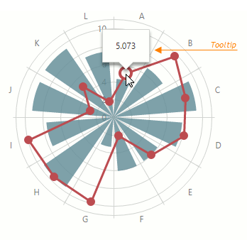
To set tooltip properties, use the tooltip configuration object of your chart. If tooltips are disabled, enable them by setting the tooltip's enabled property to true.
var polarChartOptions = {
    // ...
    tooltip: {
        enabled: true
    }
};
You can specify the tooltip appearance by changing properties listed below.
Color
By default, a tooltip has the color of the series that is currently hovered over. You can set a custom color for all tooltips in the chart. For this purpose, use the color property of the tooltip configuration object.Size
The tooltip's size is determined based on the text size and text padding values (see below). However, the size of the tooltip's arrow can be changed directly, using the arrowLength property of the tooltip configuration object.Text Positioning
Align text within tooltips as required using the paddingLeftRight and paddingTopBottom properties of the tooltip configuration object.Text Customization and Formatting
By default, tooltips represent point values. You can change the way these values are shown. For this purpose, use format tooltip property. If required, you can set custom text to be displayed by tooltips. For this purpose, assign a function specifying the text to be shown to the customizeTooltip property of the tooltip object. For details on formatting, refer to the Value Formatting help section.Font Settings
Use the tooltip object's font property to specify the required font for the tooltip text.Tooltip API
You can show and hide tooltips in code using showTooltip() and hideTooltip() methods.
In multi-series charts, you can use a shared tooltip. See the shared property description for more information.
Axes
A coordinate system is used to determine each point uniquely on a plane through two numbers, the argument and the value of a point. To define the coordinates, two lines - the axes - are specified: the axis of arguments and the axis of values. In the polar coordinates, the argument axis is the circle — different arguments have different angles (by default, the start angle is at the top, positive direction is clockwise). The value axis is vertical with the start point at the center of the circle by default. A point's value in polar coordinates is defined as a distance of the point from the center of the circle.
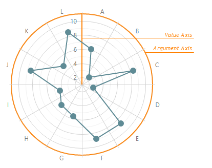
Depending on the specified data, the axes can be discrete, continuous or logarithmic. For details, refer to the Argument Axis and Value Axis topics.
Axis ticks/grid lines are arranged automatically by default based on chart data source values. However, you can rearrange them the way you like. For details, refer to the Set a Category Order and Axis Ticks Arrangement topics.
Axis properties can be set using the chart's valueAxis and argumentAxis configuration objects. If you need to set the same values for all axes, use the commonAxisSettings configuration object.
var polarChartOptions = {
    // ...
    commonAxisSettings: {
        // ...
    },
    valueAxis: {
        // ...
    },
    argumentAxis: {
        // ...
    }
};The following list gives an overview of the common axis properties.
Visibility
To make axes visible/invisible, use the visible property of the commonAxisSettings object.Appearance
You can change the color, width and opacity for the axes, using the color, width and opacity properties.
The value and argument axes can be drawn with or without labels, ticks, strips and grid lines.
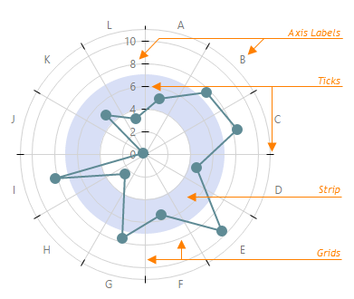
To change the visibility of these elements and set their properties, define label, ticks, strips and grid objects within the commonAxisSettings, valueAxis and/or argumentAxis configuration objects. For a detailed description of each element, refer to the corresponding document.
Argument Axis
Since a point is set up by two coordinates - an argument and a value - there should be two axes: one defining arguments and one defining values. This topic describes the axis for arguments, which is called the argument axis. To learn about the axis of values, refer to the Value Axis topic. To get common information on the PolarChart UI component's axes, refer to the Axes topic.
There are three types of argument axes.
Discrete
Contains a finite number of values, each of which represents an argument of a particular series point. These values are called categories and arranged in a certain order.Continuous
Contains an infinite number of values, some of which represent series point arguments.Logarithmic
Contains an infinite number of values, each of which represents a number (logarithm base) raised to a power.
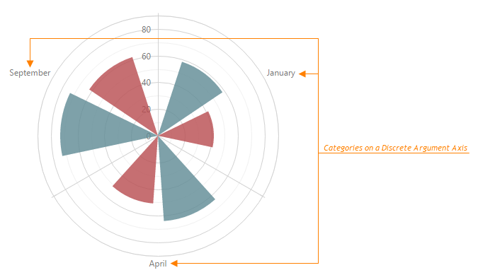
If arguments in the series' data source represent strings, a discrete axis is created. The axis' categories are ordered as they are listed in the data source. The following example demonstrates this.
var dataSource = [
    { month: 'January', Glendale: 58, Kirkland: 42 },
    { month: 'April', Glendale: 64, Kirkland: 51 },
    { month: 'September', Glendale: 73, Kirkland: 62 },
    // ...
];
You can set a specific order for categories. For this purpose, use the categories property of the argumentAxis configuration object. For details, refer to the Set a Category Order topic.
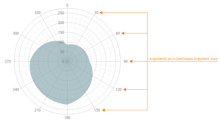
If arguments in the series' data source are numeric or date-time values, a continuous axis is created. The axis ticks/grid lines are arranged so that the axis labels do not overlap each other. The following example demonstrates this.
var dataSource = [
    { angle: 0, value: 85 },
    { angle: 90, value: 115 },
    { angle: 180, value: 225 },
    { angle: 270, value: 192 },
    { angle: 360, value: 85 },
];
In addition to discrete and continuous types, you can use the logarithmic axis type. This type can be used with numeric data source values only. Each value on the logarithmic argument axis represents a number (logarithm base) raised to a power. This number is specified by the logarithmBase property. The logarithmic axis is useful when you visualize a huge range of data.
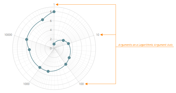
You can change the default ticks/grid lines arrangement on a continuous or a logarithmic axis. There are two ways of arranging ticks/grid lines manually. They are described in the Axis Ticks Arrangement topic.
If you need to create a discrete axis for your numeric or date-time arguments, set the argument axis' type property to 'discrete', as shown below.
var polarChartOptions = {
    argumentAxis: {
        type: 'discrete'
    },
    // ...
};
In some scenarios, you may require the type of arguments specified in the data source to be treated as another type. For instance, the data source argument field may come with string values representing dates. In this instance, specify the desired type for the arguments using the argument axis' argumentType property.
var polarChartOptions = {
    argumentAxis: {
        argumentType: 'datetime'
    },
    // ...
};
As you can see in the code above, the argumentAxis object is used to set custom values for argument axis properties.
The following list gives an overview of the argument axis properties.
Visibility
To make the argument axis visible/invisible, use the visible property of the argumentAxis configuration object.Appearance
You can change the axis color, width and opacity, using the color, width and opacity properties.Discrete Axis Ticks Arrangement
Ticks and grid lines on a discrete axis can be displayed between series points (appropriate for bar series) or across them (appropriate for line series). To choose the mode that is more appropriate for your series type, use the discreteAxisDivisionMode property of the argumentAxis configuration object.Logarithmic Axis Ticks Arrangement
You can specify the logarithm base to be used in tick calculation using the logarithmBase property.Rotate and Invert Axis
To rotate the chart, use the startAngle property. With the firstPointOnStartAngle property, the first category of a discrete series can be forced to be at the top. You can invert axis coordinates by setting the inverted property to true.
Use the argumentAxis configuration object to define the following axis child elements: ticks, grid lines, strips and labels. Their properties are detailed in the corresponding topics.
Value Axis
Since a point is set up by two coordinates - an argument and a value - there should be two axes: one defining arguments and one defining values. This topic describes the axis of values, which is called value axis. To learn about the axis of arguments, refer to the Argument Axis topic. To get common information on the PolarChart UI component's axes, refer to the Axes topic.
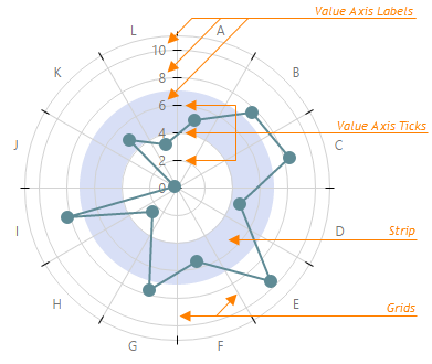
There are three types of value axes.
Discrete
Contains a finite number of values, each of which represents a value of a particular series point. These values are called categories and arranged in a certain order.Continuous
Contains an infinite number of values, some of which represent series point values.Logarithmic
Contains an infinite number of values, each of which represents a number (logarithm base) raised to a power.
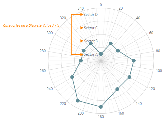
If values in the series' data source represent strings, a discrete axis is created. The axis' categories are ordered as they are listed in the data source. You can set a specific order of categories. For this purpose, use the categories property of the valueAxis configuration object. For details, refer to the Set a Category Order topic.
var dataSource = [
    { angle: 0  , value: 'Sector A' },
    { angle: 30 , value: 'Sector B' },
    { angle: 60 , value: 'Sector B' },
    { angle: 90 , value: 'Sector C' },
    { angle: 120, value: 'Sector C' },
    { angle: 150, value: 'Sector C' },
    { angle: 180, value: 'Sector D' },
    { angle: 210, value: 'Sector D' },
    { angle: 240, value: 'Sector C' },
    { angle: 270, value: 'Sector B' },
    { angle: 300, value: 'Sector B' },
    { angle: 330, value: 'Sector B' },
    { angle: 360, value: 'Sector A' }
];
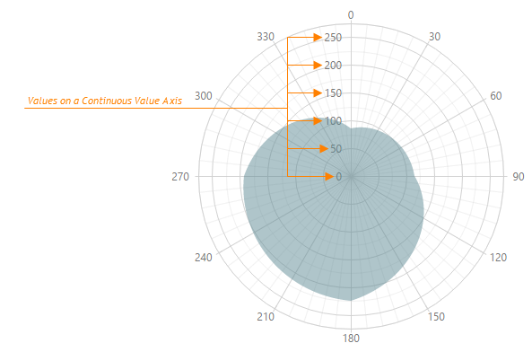
If values in the series' data source are of numeric or date-time type, a continuous axis is created. The axis ticks/grid lines are arranged so that the axis labels do not overlap each other. The following example demonstrates this.
var dataSource = [
    { angle: 0, value: 85 },
    { angle: 90, value: 115 },
    { angle: 180, value: 225 },
    { angle: 270, value: 192 },
    { angle: 360, value: 85 },
];
In addition to discrete and continuous types, you can use the logarithmic axis type. This type can be used with numeric data source values only. Each value on a logarithmic axis represents a number (logarithm base) raised to a power. This number is specified by the logarithmBase property. The logarithmic axis is useful when you visualize a huge range of data.
You can change the default ticks/grid line arrangement on a continuous or a logarithmic axis. There are two ways of arranging ticks/grid lines manually. They are described in the Axis Ticks Arrangement topic.
If you need to create a discrete axis for numeric or date-time values, set the value axis' type property to 'discrete', as shown below.
var polarChartOptions = {
    valueAxis: {
        type: 'discrete'
    },
    // ...
};
In some scenarios, you may require the type of the values specified in the data source to be treated as another type. For instance, the data source's value field may come with string values representing dates. In this instance, specify the required type for the values using the value axis' valueType property.
var polarChartOptions = {
    valueAxis: {
        valueType: 'datetime'
    },
    // ...
};
The following list gives an overview of the value axis properties.
Visibility
To make the value axis visible/invisible, use the visible property of the valueAxis configuration object.Appearance
You can change the axis color, width and opacity, using the color, width and opacity properties.Discrete Axis Ticks Arrangement
Ticks and grid lines of a discrete axis can be displayed between series points or cross them. To choose the mode that is more appropriate for your series type, use the discreteAxisDivisionMode property of the valueAxis configuration object. In addition, you can set whether to insert an indent from the axes cross or start categories at the axes cross directly. To set an appropriate variant, use the valueMarginsEnabled property.Continuous Axis Ticks Arrangement
You can set whether to display the series' minimum and maximum values with indents from the value axis boundaries or display them at the axis' boundaries. To set an appropriate variant, use the valueMarginsEnabled property. If you insert indents, set values for the minValueMargin and maxValueMargin properties.Logarithmic Axis Ticks Arrangement
You can specify the logarithm base to use in tick calculation using the logarithmBase property.Invert Axis
You can invert axis coordinates by setting the inverted property to true.
Use the valueAxis configuration object to define the following axis child elements: ticks, grid lines, strips and labels. Their properties are detailed in the corresponding topics.
Axis Ticks Arrangement
When you specify a data source for a chart series, argument and value axes are created automatically. Their ticks/grid lines are arranged so that their labels do not overlap each other. You can correct the default arrangements using axis properties (see Argument Axis and Value Axis topics). You can also fully define how to generate them. This topic details how to do this for continuous and logarithmic value and argument axes. To learn how to do this for a discrete argument axis, refer to the Set a Category Order topic.
There are two ways of arranging ticks.
Set Ticks Explicitly
Use this approach if you know for certain the exact range of series point values. In this instance, you can set the minimum value, maximum value and a tick interval for the valueAxis and/or argumentAxis configuration objects. For this purpose, use the tickInterval property. The following example demonstrates this approach.
var polarChartOptions = {
    // ...
    argumentAxis: {
        tickInterval: {
            days: 2
        }
    }
};
Set Ticks Implicitly
Use this approach when you do not know the exact values of series points. In this instance, you can specify a relative value (factor) of how closely axis labels should be placed to each other. To do so, use the axisDivisionFactor property. The following example demonstrates this approach for an argument axis.
var polarChartOptions = {
    // ...
    argumentAxis: {
        axisDivisionFactor: 10
    }
};
Set a Category Order
When specifying data for a series in a chart with a discrete axis, the order of categories on this axis is determined by the order in the series defined first. You can set a specific order of the categories. For this purpose, use the axis' categories property.
var polarChartOptions = {
    argumentAxis: {
        categories: ['January', 'February', 'March']
    },
    // ...
};
Axis Ticks
Ticks divide an axis into sections by a step that is determined automatically, or by the tickInterval and axisDivisionFactor properties of an axis. Ticks improve the comprehension of chart data.
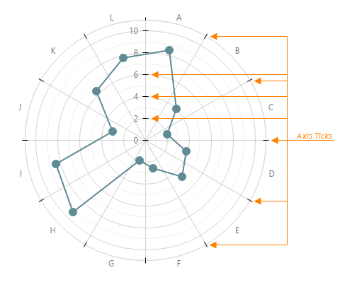
Ticks are child elements of the argument and value axes. To change their settings, define the tick object within the argumentAxis, valueAxis or commonAxisSettings configuration object.
var polarChartOptions = {
    commonAxisSettings: {
        tick: {
            visible: true,
            color: 'black'
        }
    },
    // ...
};
The following list provides an overview of tick properties.
Minor Ticks
In addition to the axis ticks, the PolarChart UI component provides the capability to draw minor ticks. Minor ticks divide an axis segment that lies between two neighboring axis ticks.
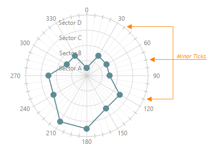
Argument axis' minor ticks are configured using the argumentAxis | minorTick object, value axis' — the valueAxis | minorTick object, and both are configured using the commonAxisSettings | minorTick object.
You can display minor ticks by setting the visible property to true. The minor ticks will be arranged automatically. You can affect the ticks arrangement using the minorTickInterval or minorTickCount properties of corresponding axis.
var polarChartOptions = {
    valueAxis: {
        minorTick: {
            // ...
        }
    },
    // ...
};
Axis Labels
Axis labels represent textual values for axis ticks.
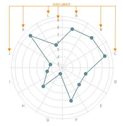
Axis labels are generated automatically. However, you can change their settings if your task requires that. Label settings are set using the label object of the argumentAxis, valueAxis or commonAxisSettings configuration object.
var polarChartOptions = {
    commonAxisSettings: {
        label: {
            // ...
        }
    },
    // ...
};
The following list provides an overview of label properties.
Visibility
To mark point labels as visible/invisible, use the label object's visible property.Intelligent Arrangement
If labels overlap each other in certain scenarios, specify how to resolve this issue using the overlappingBehavior property.Font Settings
To specify the required font settings for label text, specify properties of the label.font object.Text Customization and Formatting
You can change the way the default text is displayed by labels. For this purpose, use the format label property. If it is required, you can set a custom text to be shown by labels. For this purpose, implement a function that returns the required text and assign it to the customizeText property of the label object. For details on data formatting, refer to the Value Formatting topic.Label Position
You can shift labels closer to or farther from the axis. For this purpose, use the label object's indentFromAxis property.
Grid
A grid is a set of lines that improves the readability of chart data. Grid lines are drawn from axis ticks through the entire chart at the tick's value or argument. If you use grid lines on your chart, it is not necessary to make ticks visible.
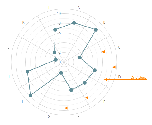
Grid lines are child elements of the argument and value axes. To change their settings, define the grid object within the argumentAxis, valueAxis or commonAxisSettings configuration object.
var polarChartOptions = {
    commonAxisSettings: {
        grid: {
            //...
        }
    },
    //...
};
The following list overviews grid properties.
Minor Grid
In addition to the grid lines built on axis ticks, the PolarChart UI component provides the minor grid that is built on minor ticks. The lines of the minor grid extend from the minor ticks throughout the entire chart's plot.
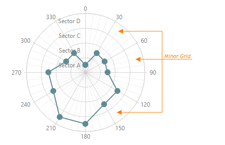
Argument axis minor grid lines are configured using the argumentAxis | minorGrid object, value axis minor grid lines — the valueAxis | minorGrid object, and both grid lines are configured using the commonAxisSettings | minorGrid object. You can customize the appearance of minor grid lines by using the color, opacity and width properties. To hide minor grid lines, set their visible property to false.
var polarChartOptions = {
    valueAxis: {
        minorGrid: {
            //...
        }
    },
    //...
};
Strips
Strips are highlighted areas on a chart within a defined range of values (minimum and maximum) of an axis to which they belong. In general, strips are used to visually represent a range of values behind a series to trace whether the series point values fall in or out of that range.
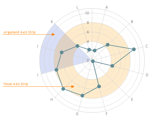
Strips are child elements of the argument and value axes. To define a strip, use the strips array within the argumentAxis and/or valueAxis configuration objects. To change common settings for strips of the argument or value axis, define the stripStyle object within the argumentAxis/valueAxis configuration object. To change common settings for all strips in the chart, define the stripStyle object within the commonAxisSettings configuration object.
var polarChartOptions = {
    argumentAxis: {
        strips: [
            { /* ... */ },
            // ...
        ],
        stripStyle: {
            // ...
        }
    },
    commonAxisSettings: {
        stripStyle: {
            // ...
        }
    },
    // ...
};
To set the bounds of a strip, use the strip's startValue and endValue properties. In addition, set the color of the strip using the color property. The following code demonstrates this.
var polarChartOptions = {
    valueAxis: {
        strips: [
            { startValue: 40, endValue: 50, color: 'blue' },
            { startValue: 70, endValue: 80, color: 'red' }
        ]
    },
    //...
};
To identify a strip and provide details of its purpose, display a label on it. Define the label object within the strips (or stripStyle in case you use commonAxisSettings) object and set its text property. Optionally, you can customize the label using the font property.
Legend
The PolarChart UI component can include a legend - an explanatory component that helps a user distinguish and identify series. Each series is represented by an item on the legend. An item marker identifies the series color. An item label displays the series title.
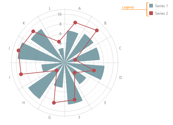
To change the default legend appearance, use the properties of the legend configuration object. The following code demonstrates how to access it.
var polarChartOptions = {
    legend: {
        // ...
    },
    // ...
};
The following list provides an overview of the legend object properties.
Visibility
To change the legend's visibility, use the legend.visible property.Location
To specify the location of the legend, use its verticalAlignment and horizontalAlignment properties. In addition, you can change the interval between the legend and neighboring chart elements using the margin property.Border
Make the legend's border visible by setting the visible property of the legend's border object. In addition, you can change the border's width, corner radius and color, using the width, cornerRadius and color properties of the border configuration object.Items Layout
Items can be placed in a row or a column. To specify how to arrange legend items, use the orientation property. There can also be several rows and columns in a legend. To set the number of rows and columns to be used, use the legend's rowCount and columnCount properties. These rows and columns must be placed within a legend separated by a space between each other, and from the legend's border. To specify the spacing parameters, use the legend's rowItemSpacing, columnItemSpacing, paddingLeftRight and paddingTopBottom properties. In addition, you can specify how item labels must be located relative to item markers. For this purpose, change the legend. itemTextPosition property.Items Appearance
You can enlarge or shrink item markers. To do this, use the markerSize property. In addition, you can specify the required font for item labels. For this purpose, use the legend's font property, which represents an object that allows you to set font properties such as color, opacity, family and size.Hover Mode
You can specify whether or not to highlight the corresponding series when a legend item is hovered over. To do this, use the legend's hoverMode property.
Chart Title
The PolarChart UI component can be displayed with a title. You can use the chart title to provide either explanatory text for the displayed data or any additional textual information.
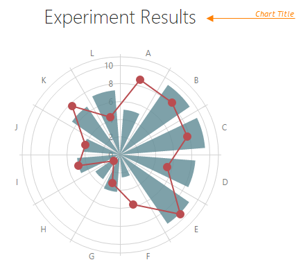
To specify the title text, use the title property as demonstrated in the code below.
var polarChartOptions = {
    // ...
    title: 'Experiment Results'
};
The title property may also be assigned an object that customizes default title properties. In that case, the title text must be assigned to the text field of this object.
var polarChartOptions = {
    title: {
        text: 'Values',
        // ...
    }
};
The following list provides an overview of title properties.
Title Location
You can place the title on any side of the chart. For this purpose, use the horizontalAlignment and verticalAlignment properties of the chart's title configuration object.Text Font
If you require a change in the title's font, specify the font property of the title configuration object.
You can also configure the chart subtitle using the subtitle object.