JavaScript/jQuery ButtonGroup - items
Configures buttons in the group.
The items array can contain:
- Objects with fields described in this section
- Objects with any other fields. In this case, specify the buttonTemplate.
If you need to update the UI component items, reassign the entire items[] array as shown in the following example:
buttonGroupInstance.option('items', newItems);See Also
disabled
Specifies whether the UI component item responds to user interaction.
elementAttr
Specifies the global attributes to be attached to the button group item's container element.
jQuery
$(function(){
    $("#buttonGroup").dxButtonGroup({
        items: [{
            // ...
            elementAttr: {
                class: "class-name"
            }
        }, // ...
        ]
    });
});
Angular
<dx-button-group ...
    [items]="buttonGroupItems>
</dx-button-group>
import { Component } from '@angular/core';

@Component({
    selector: 'app-root',
    templateUrl: './app.component.html',
    styleUrls: ['./app.component.css']
})
export class AppComponent {
    buttonGroupItems = [{
        // ...
        elementAttr: {
            class: "class-name"
        }
    }, // ...
    ]
}
import { BrowserModule } from '@angular/platform-browser';
import { NgModule } from '@angular/core';
import { AppComponent } from './app.component';

import { DxButtonGroupModule } from 'devextreme-angular';

@NgModule({
    declarations: [
        AppComponent
    ],
    imports: [
        BrowserModule,
        DxButtonGroupModule
    ],
    providers: [ ],
    bootstrap: [AppComponent]
})
export class AppModule { }
Vue
<template>
    <DxButtonGroup ...
        :items="buttonGroupItems"
    />
</template>

<script>
import DxButtonGroup from 'devextreme-vue/button-group';

const buttonGroupItems = [{
    // ...
    elementAttr: {
        class: "class-name"
    }
}, // ...
];

export default {
    components: {
        DxButtonGroup,
    },
    data() {
        return {
            buttonGroupItems
        }
    }
}
</script>
React
import React from 'react';
import 'devextreme/dist/css/dx.light.css';

import ButtonGroup from 'devextreme-react/button-group';

const buttonGroupItems = [{
    // ...
    elementAttr: {
        class: "class-name"
    }
}, // ...
];

export default function App() {
    return (
        <ButtonGroup ...
            items={buttonGroupItems}
        />
    );
}
hint
Specifies a text for the hint that appears when the button is hovered over or long-pressed.
icon
Specifies the icon to be displayed on the button.
This property accepts one of the following:
- The icon's URL
- The icon's name if the icon is from the DevExtreme icon library
- The icon's CSS class if the icon is from an external icon library (see External Icon Libraries)
- The icon in the Base64 format
- The icon in the SVG format. Ensure that the source is reliable.
template
Specifies a template that should be used to render this item only.
jQuery
The following types of the specified value are available.
- Assign a string containing the name of the required template.
- Assign a jQuery object of the template's container.
- Assign a DOM Node of the template's container.
- Assign a function that returns the jQuery object or a DOM Node of the template's container.
The following example adds a custom item to the component.
$(function() {
    $("#buttonGroupContainer").dxButtonGroup({
        // ...
        items: [
            {
                // ...
                template: '<div>Custom Item</div>'
            }
        ]
    });
});
Angular
The following types of the specified value are available.
- Assign a string containing the name of the required template.
- Assign a DOM Node of the template's container.
The following example adds a custom item to the component. Note that Angular uses custom templates instead of the template property.
<dx-button-group ... >
    <dxi-button-group-item ... >
        <div *dxTemplate>
            <div>Custom Item</div>
        </div>
    </dxi-button-group-item>
</dx-button-group>
import { Component } from '@angular/core';

@Component({
    selector: 'app-root',
    templateUrl: './app.component.html',
    styleUrls: ['./app.component.css']
})
export class AppComponent {
    // ...
}
import { BrowserModule } from '@angular/platform-browser';
import { NgModule } from '@angular/core';
import { AppComponent } from './app.component';

import { DxButtonGroupModule } from 'devextreme-angular';

@NgModule({
    declarations: [
        AppComponent
    ],
    imports: [
        BrowserModule,
        DxButtonGroupModule
    ],
    providers: [ ],
    bootstrap: [AppComponent]
})
export class AppModule { }
Vue
The following types of the specified value are available.
- Assign a string containing the name of the required template.
- Assign a DOM Node of the template's container.
The following example adds a custom item to the component. Note that Vue uses custom templates instead of the template property.
<template>
    <DxButtonGroup ... >
        <dxItem ... >
            <div>Custom Item</div>
        </dxItem>
    </DxButtonGroup>
</template>

<script>

import DxButtonGroup, {
    DxItem
} from 'devextreme-vue/button-group';

export default {
    components: {
        DxButtonGroup,
        DxItem
    },
    // ...
}
</script>
React
The following types of the specified value are available.
- Assign a string containing the name of the required template.
- Assign a DOM Node of the template's container.
The following example adds a custom item to the component. In React, specify the render or component properties.
import React from 'react';

import ButtonGroup, {
    Item
} from 'devextreme-react/button-group';

const renderCustomItem = () => {
    return <div>Custom Item</div>;
}

const App() = () => {
    return (
        <ButtonGroup ... >
            <Item ...
                render={renderCustomItem}
            >
            </Item>
        </ButtonGroup>
    );
}
export default App;
See Also
text
Specifies text displayed for the UI component item.
If you use both this property and a template, the template overrides the text.
type
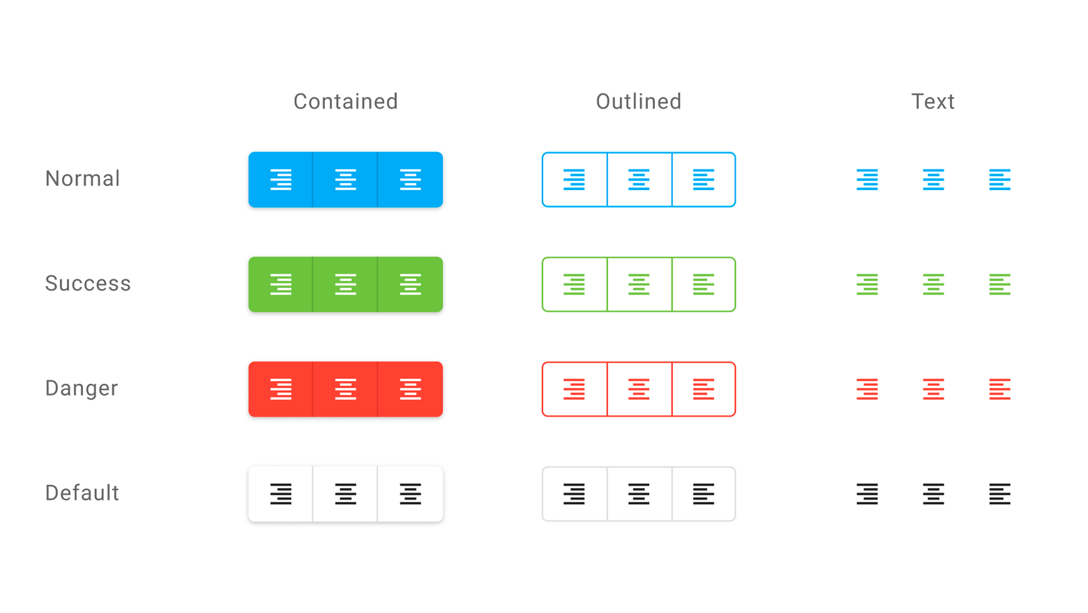
Specifies the button type.
DevExtreme supplies the following button types:

 Select one or more answers