JavaScript/jQuery Diagram - customShapes
Provide access to an array of custom shapes.
Use the customShapes property to extend a collection of built-in shapes with custom shapes.
Use the toolbox property to add the custom shapes to the toolbox.
jQuery
$(function() {
var diagram = $("#diagram").dxDiagram({
customShapes: [{
category: "hardware",
type: "internet",
title: "Internet",
backgroundImageUrl: "images/shapes/internet.svg",
backgroundImageLeft: 0.15,
backgroundImageTop: 0,
backgroundImageWidth: 0.7,
backgroundImageHeight: 0.7,
defaultWidth: 0.75,
defaultHeight: 0.75,
defaultText: "Internet",
allowEditText: true,
textLeft: 0,
textTop: 0.7,
textWidth: 1,
textHeight: 0.3,
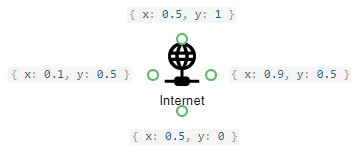
connectionPoints: [
{ x: 0.5, y: 0 },
{ x: 0.9, y: 0.5 },
{ x: 0.5, y: 1 },
{ x: 0.1, y: 0.5 }
]
},
...
],
toolbox: {
groups: [{ category: "hardware", title: "Hardware" }]
}
}).dxDiagram("instance");Angular
<dx-diagram #diagram id="diagram">
    <dxi-diagram-custom-shape
        category="hardware"
        type="internet"
        title="Internet"
        backgroundImageUrl="images/shapes/internet.svg"
        [backgroundImageLeft]="0.15"
        [backgroundImageTop]="0"
        [backgroundImageWidth]="0.7"
        [backgroundImageHeight]="0.7"
        [defaultWidth]="0.75"
        [defaultHeight]="0.75"
        defaultText="Internet"
        [allowEditText]="false"
        [textLeft]="0"
        [textTop]="0.7"
        [textWidth]="1"
        [textHeight]="0.3">
        <dxi-diagram-connection-point [x]="0.5" [y]="0"></dxi-diagram-connection-point>
        <dxi-diagram-connection-point [x]="0.9" [y]="0.5"></dxi-diagram-connection-point>
        <dxi-diagram-connection-point [x]="0.5" [y]="1"></dxi-diagram-connection-point>
        <dxi-diagram-connection-point [x]="0.1" [y]="0.5"></dxi-diagram-connection-point>
    </dxi-diagram-custom-shape>
    ...
    <dxo-diagram-toolbox>
        <dxi-diagram-group category="hardware" title="Hardware"></dxi-diagram-group>
    </dxo-diagram-toolbox>
</dx-diagram>
import { NgModule, Component, ViewChild, enableProdMode } from '@angular/core';
import { BrowserModule } from '@angular/platform-browser';
import { platformBrowserDynamic } from '@angular/platform-browser-dynamic';
import { HttpClient, HttpClientModule } from '@angular/common/http';

import { DxDiagramModule, DxDiagramComponent } from 'devextreme-angular';

@Component({
    selector: 'app-root',
    templateUrl: './app.component.html',
    styleUrls: ['./app.component.css']
})
export class AppComponent {
    @ViewChild(DxDiagramComponent, { static: false }, { static: false }) diagram: DxDiagramComponent;
    // Prior to Angular 8
    // @ViewChild(DxDiagramComponent, { static: false }) diagram: DxDiagramComponent;

    constructor(http: HttpClient) {
        http.get('data/diagram-hardware.json').subscribe(data => {
            this.diagram.instance.import(JSON.stringify(data));
        }, err => {
            throw 'Data Loading Error'
        });
    }
}
Vue
<template>
    <DxDiagram
        id="diagram"
        ref="diagram"
    >
        <DxCustomShape
            :category="'hardware'"
            :type="'internet'"
            :title="'Internet'"
            :background-image-url="'images/shapes/internet.svg'"
            :background-image-left="0.15"
            :background-image-top="0"
            :background-image-width="0.7"
            :background-image-height="0.7"
            :default-width="0.75"
            :default-height="0.75"
            :default-text="'Internet'"
            :allow-edit-text="true"
            :text-left="0"
            :text-top="0.7"
            :text-width="1"
            :text-height="0.3"
        >
            <DxConnectionPoint
                :x="0.5"
                :y="0"
            />
            <DxConnectionPoint
                :x="0.9"
                :y="0.5"
            />
            <DxConnectionPoint
                :x="0.5"
                :y="1"
            />
            <DxConnectionPoint
                :x="0.1"
                :y="0.5"
            />
        </DxCustomShape>
        ...
        <DxToolbox :visible="true">
            <DxGroup
                :category="'hardware'"
                :title="'Hardware'"
            />
        </DxToolbox>
    </DxDiagram>
</template>

<script>
import { DxDiagram, DxGroup, DxToolbox, DxCustomShape, DxConnectionPoint } from 'devextreme-vue/diagram';
import 'whatwg-fetch';

export default {
components: {
    DxDiagram, DxGroup, DxToolbox, DxCustomShape, DxConnectionPoint
},
mounted() {
    var diagram = this.$refs['diagram'].instance;
    fetch('data/diagram-hardware.json')
    .then(function(response) {
        return response.json();
    })
    .then(function(json) {
        diagram.import(JSON.stringify(json));
    })
    .catch(function() {
        throw 'Data Loading Error';
    });
}
};
</script>
React
import React from 'react';
import Diagram, { CustomShape, ConnectionPoint, Group, Toolbox } from 'devextreme-react/diagram';

class App extends React.Component {
constructor(props) {
    super(props);

    this.diagramRef = React.createRef();
}

    render() {
        return (
            <Diagram id="diagram" ref={this.diagramRef}>
                <CustomShape
                    category="hardware"
                    type="internet"
                    title="Internet"
                    backgroundImageUrl="images/shapes/internet.svg"
                    backgroundImageLeft={0.15}
                    backgroundImageTop={0}
                    backgroundImageWidth={0.7}
                    backgroundImageHeight={0.7}
                    defaultWidth={0.75}
                    defaultHeight={0.75}
                    defaultText="Internet"
                    allowEditText={true}
                    textLeft={0}
                    textTop={0.7}
                    textWidth={1}
                    textHeight={0.3}>
                <ConnectionPoint x={0.5} y={0} />
                <ConnectionPoint x={0.9} y={0.5} />
                <ConnectionPoint x={0.5} y={1} />
                <ConnectionPoint x={0.1} y={0.5} />
                </CustomShape>
                ...
                <Toolbox>
                    <Group category="hardware" title="Hardware" />
                </Toolbox>
            </Diagram>
        );
    }
}
export default App;
ASP.NET MVC Controls
@(Html.DevExtreme().Diagram()
    .ID("diagram")
    .CustomShapes(cs => {
        cs.Add()
            .Category("hardware")
            .Type("internet")
            .Title("Internet")
            .BackgroundImageUrl("../../Content/Images/shapes/internet.svg")
            .BackgroundImageLeft(0.15)
            .BackgroundImageTop(0)
            .BackgroundImageWidth(0.7)
            .BackgroundImageHeight(0.7)
            .DefaultWidth(1.9)
            .DefaultHeight(1.9)
            .DefaultText("Internet")
            .AllowEditText(true)
            .TextLeft(0)
            .TextTop(0.7)
            .TextWidth(1)
            .TextHeight(0.3)
            .ConnectionPoints(cp => {
                cp.Add().X(0.5).Y(0);
                cp.Add().X(0.9).Y(0.5);
                cp.Add().X(0.5).Y(1);
                cp.Add().X(0.1).Y(0.5);

            });
        ...
    })
    .Toolbox(tb => tb
        .Groups(g => g.Add().Category("hardware").Title("Hardware"))
    )
) See Also
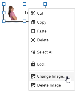
allowEditImage
Specifies whether a card shape's image can be edited.
Use the defaultImageUrl property to specify the default image that is displayed in the card. Set the allowEditImage property to true to allow users to change the image from a context menu.
See Also
backgroundImageHeight
Specifies the shape background image's fractional height.
This property specifies a fraction from 0 to 1 that represents the shape background image height in relation to the shape height. If the backgroundImageHeight property is set to 1, the image height is equal to the shape height.
The absolute image height is calculated by multiplying the backgroundImageHeight value by the shape's height.
backgroundImageLeft
Specifies the shape background image's left offset.
This property specifies a fractional left offset of a shape background image toward the shape width. If the backgroundImageLeft property is set to 0, the image's left edge matches the shape's left edge.
The absolute offset is calculated by multiplying the backgroundImageLeft value by the shape's width.
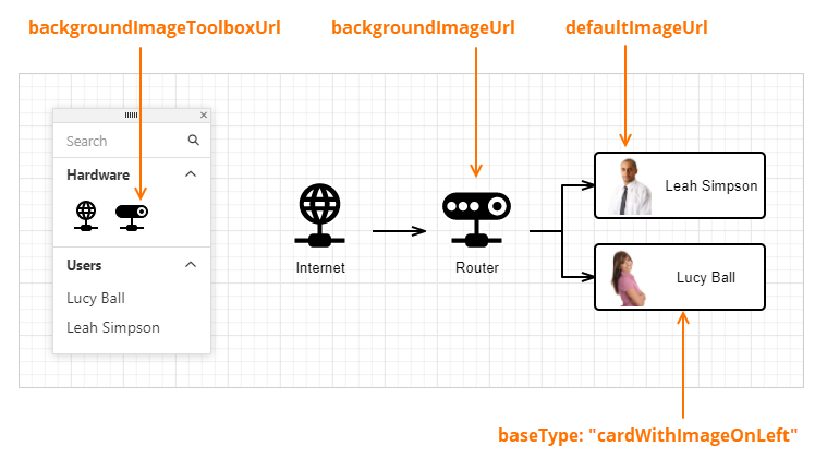
backgroundImageToolboxUrl
Specifies the shape image displayed in the toolbox.
When a custom shape is created with a custom background image (the backgroundImageUrl property), you can use the backgroundImageToolboxUrl property to specify the image displayed for the shape in the toolbox.
If the property is not set, the toolbox displays an image specified in the backgroundImageUrl property.
backgroundImageTop
Specifies the shape background image's top offset.
This property specifies the top offset (in fractions) of a shape's background image in relation to the shape's height. If the backgroundImageTop property is set to 0, the image's top edge matches the shape's top edge.
The absolute offset is calculated by multiplying the backgroundImageTop value by the shape's height.
backgroundImageUrl
Specifies the shape background image's URL.
A custom shape can be created based on a default shape type (the baseType property) or with a custom background image (the backgroundImageUrl property).
Use the backgroundImageToolboxUrl property to specify an image displayed for the shape in the toolbox. If the property is not set, the toolbox displays an image specified in the backgroundImageUrl property.
The backgroundImageUrl property is not in effect if the baseType is specified.
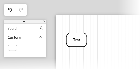
<!-- roundedRect.svg -->
<svg  xmlns="http://www.w3.org/2000/svg" x="0px" y="0px" viewBox="0 0 48 26">
<g>
    <rect rx="8" ry="8" x="0.5" y="0.5" width="47" height="25"
        style="fill:#FFFFFF; stroke:#000000; stroke-width:2px;"/>
</g>
jQuery
$(function() {
    var diagram = $("#diagram").dxDiagram({
        customShapes: [{
            category: "custom",
            type: "roundedRect",
            title: "Rounded Rectangle",
            backgroundImageUrl: "images/shapes/roundedRect.svg",
            defaultWidth: 0.75,
            defaultHeight: 0.5,
            defaultText: "Text",
            textTop: 0.35,
            textHeight: 0.3,
        }],
    toolbox: {
        groups: [{ category: "custom", title: "Custom" }]
    }
}).dxDiagram("instance");
Angular
<dx-diagram #diagram id="diagram">
    <dxi-diagram-custom-shape
        category="custom"
        type="roundedRect"
        title="Rounded Rectangle"
        backgroundImageUrl="images/shapes/roundedRect.svg"
        [defaultWidth]="0.75"
        [defaultHeight]="0.5"
        defaultText="Text"
        [textTop]="0.35"
        [textHeight]="0.3">
    </dxi-diagram-custom-shape>
    <dxo-diagram-toolbox>
        <dxi-diagram-group category="custom" title="Custom"></dxi-diagram-group>
    </dxo-diagram-toolbox>
</dx-diagram>
Vue
<template>
    <DxDiagram
        id="diagram"
        ref="diagram"
    >
        <DxCustomShape
            :category="'custom'"
            :type="'roundedRect'"
            :title="'Rounded Rectangle'"
            :background-image-url="'images/shapes/roundedRect.svg'"
            :default-width="0.75"
            :default-height="0.5"
            :default-text="'Text'"
            :text-top="0.35"
            :text-height="0.3"
        >
        </DxCustomShape>
        <DxToolbox :visible="true">
            <DxGroup
                :category="'custom'"
                :title="'Custom'"
            />
        </DxToolbox>
    </DxDiagram>
</template>
React
<Diagram id="diagram" ref={this.diagramRef}>
        <CustomShape
            category="custom"
            type="roundedRect"
            title="Rounded Rectangle"
            backgroundImageUrl="images/shapes/roundedRect.svg"
            defaultWidth={0.75}
            defaultHeight={0.5}
            defaultText="Text"
            textTop={0.35}
            textHeight={0.3}>
        </CustomShape>
        <Toolbox>
            <Group category="custom" title="Custom" />
        </Toolbox>
</Diagram>
ASP.NET Core Controls
@(Html.DevExtreme().Diagram()
    .ID("diagram")
    .CustomShapes(cs => {
        cs.Add()
            .Category("custom")
            .Type("roundedRect")
            .Title("Rounded Rectangle")
            .BackgroundImageUrl(Url.Content("~/images/shapes/roundedRect.svg"))
            .DefaultWidth(0.75)
            .DefaultHeight(0.5)
            .DefaultText("Text")
            .TextTop(0.35)
            .TextHeight(0.3);
    })
    .Toolbox(tb => tb
        .Groups(g => g.Add().Category("custom").Title("Custom"))
    )
)
ASP.NET MVC Controls
@(Html.DevExtreme().Diagram()
    .ID("diagram")
    .CustomShapes(cs => {
        cs.Add()
            .Category("custom")
            .Type("roundedRect")
            .Title("Rounded Rectangle")
            .BackgroundImageUrl(Url.Content("~/images/shapes/roundedRect.svg"))
            .DefaultWidth(0.75)
            .DefaultHeight(0.5)
            .DefaultText("Text")
            .TextTop(0.35)
            .TextHeight(0.3);
    })
    .Toolbox(tb => tb
        .Groups(g => g.Add().Category("custom").Title("Custom"))
    )
)
See Also
backgroundImageWidth
Specifies the shape background image's fractional width.
This property specifies a fraction from 0 to 1 that represents the shape background image width in relation to the shape width. If the backgroundImageWidth property is set to 1, the image width is equal to the shape width.
The absolute image width is calculated by multiplying the backgroundImageWidth value by the shape width.
baseType
Specifies the base shape type for the custom shape. The built-in shape types are shown in the Shape Types section.
When the baseType property is specified, the backgroundImageUrl property is not in effect.
defaultHeight
Specifies the initial height of the shape.
The units property specifies the measurement unit.
defaultImageUrl
Specifies the URL of an image displayed in a card shape.
A custom shape supports an inner image in two cases:
- When a shape is created based on a card shape type (the baseType property is set to
CardWithImageOnLeft,CardWithImageOnRight, orCardWithImageOnTop). Note that in this case, the image size and position properties are not in effect, because they are predefined in the shape type. - When a shape is created based on a custom SVG image (with the backgroundImageUrl property specified). In this case, you can use the following properties to customize inner image size and position: imageHeight, imageWidth, imageLeft, and imageTop.
Use the defaultImageUrl property to specify the image URL.
If the allowEditImage property is set to true, the diagram context menu displays commands that allow users to change the image.
See Also
defaultWidth
Specifies the initial width of the shape.
The units property specifies the measurement unit.
imageHeight
Specifies the shape image's fractional height.
The defaultImageUrl option specifies the URL of an image displayed inside the shape. Use the imageHeight option to specify the ratio of the image's height to the shape's height. If the imageHeight property is set to 1, the image height is then equal to the shape height.
The imageHeight option is not in effect if the baseType option is specified.
imageLeft
Specifies the shape image's left offset.
The defaultImageUrl option specifies the URL of an image displayed inside the shape. Use the imageLeft option to specify the ratio of the image's left offset to the shape's width. If the imageLeft option is set to 0, the image's left edge matches the shape's left edge.
The imageLeft option is not in effect if the baseType option is specified.
imageTop
Specifies the shape image's top offset.
The defaultImageUrl option specifies the URL of an image displayed inside the shape. Use the imageTop option to specify the ratio of the image's top offset to the shape's height. If the imageTop option is set to 0, the image's top edge matches the shape's top edge.
The imageTop option is not in effect if the baseType option is specified.
imageWidth
Specifies the shape image's fractional width.
The defaultImageUrl option specifies the URL of an image displayed inside the shape. Use the imageWidth option to specify the ratio of the image's width to the shape's width. If the imageWidth option is set to 1, the image width is equal to the shape width.
The imageWidth option is not in effect if the baseType option is specified.
keepRatioOnAutoSize
Specifies whether the shape maintains its width-to-height ratio on auto resize.
When the Diagram UI component is bound to a data source, shapes are resized to fit the shape's text. Set the keepRatioOnAutoSize property to true to maintain the width-to-height ratio of the shape on auto resize.
maxHeight
Specifies the maximum height of the shape.
The units property specifies the measurement unit.
maxWidth
Specifies the maximum width of the shape.
The units property specifies the measurement unit.
minHeight
Specifies the maximum height of the shape.
The units property specifies the measurement unit.
minWidth
Specifies the minimum width of the shape.
The units property specifies the measurement unit.
template
Specifies a custom template for the shape.
| Name | Type | Description |
|---|---|---|
| item |
The shapes object. |
Template content must be presented as SVG elements.
We recommend that you do not use the foreignObject element to define template content (Safari does not support this element).
Use the customShapeTemplate property to define a common template for all shapes in the Diagram UI component.
Set a custom shape's allowEditText option to false to disable shape text editing. Otherwise, users can add shape text that may overlap with template content.
If the textExpr option is specified, template content may overlap with text from the data source. Since the textExpr option has the default value 'text', the widget will obtain node texts from the data source’s 'text' field. To prevent this behavior, set the option to an empty string: nodes: { textExpr: "", ....
See Also
templateHeight
Specifies the shape template's fractional height.
This property specifies a fraction from 0 to 1 that represents the shape template height in relation to the shape height. If the templateHeight property is set to 1, the template height is equal to the shape height.
The absolute template height is calculated by multiplying the templateHeight value by the shape height.
templateLeft
Specifies the shape template's left offset.
This property specifies a fractional left offset of a shape template toward the shape width. If the templateLeft property is set to 0, the template's left edge matches the shape's left edge.
The absolute offset is calculated by multiplying the templateLeft value by the shape's width.
templateTop
Specifies the shape template's top offset.
This property specifies a fractional top offset of a shape template toward the shape width. If the templateTop property is set to 0, the template's top edge matches the shape's top edge.
The absolute offset is calculated by multiplying the templateTop value by the shape's width.
templateWidth
Specifies the shape template's fractional width.
This property specifies a fraction from 0 to 1 that represents the shape template width in relation to the shape width. If the templateWidth property is set to 1, the template width is equal to the shape width.
The absolute template width is calculated by multiplying the templateWidth value by the shape width.
textHeight
Specifies the shape text container's height.
This property specifies a fraction from 0 to 1 that is the height of a shape's text in relation to the shape height. If the textHeight property is set to 1, the text height is equal to the shape height.
The absolute text height is calculated by multiplying the textHeight value by the shape height.
If the textHeight property is set to 0 (zero) or undefined and the autoSizeEnabled property is set to true, the textHeight property value is equal to 1.
textLeft
Specifies the shape text's left offset.
This property specifies the shape text's left offset (in fractions) in relation to the shape width. If the textLeft property is set to 0, the text's left edge matches the shape's left edge.
The absolute offset is calculated by multiplying the textLeft value by the shape width.
textTop
Specifies the shape text's top offset.
This property specifies the shape text's top offset (in fractions) in relation to the shape height. If the textTop property is set to 0, the text's top edge matches the shape's top edge.
The absolute offset is calculated by multiplying the textTop value by the shape height.
textWidth
Specifies the shape text container's width.
This property specifies a fraction from 0 to 1 that is the shape text's width in relation to the shape width. If the textWidth property is set to 1, the text width is equal to the shape width.
The absolute text width is calculated by multiplying the textWidth value by the shape width.
If the textWidth property is set to 0 (zero) or undefined and the autoSizeEnabled property is set to true, the textWidth property value is equal to 1.
toolboxTemplate
Specifies a custom template for the shape in the toolbox.
| Name | Type | Description |
|---|---|---|
| item |
The shapes object. |
Template content must be presented as SVG elements.
We recommend that you do not use the foreignObject element to define template content (Safari does not support this element).
Use the customShapeToolboxTemplate property to define a common template for all diagram shapes in the toolbox.
See Also
toolboxWidthToHeightRatio
Specifies the aspect ratio of the shape in the toolbox.
The size of a shape in the toolbox is determined automatically based on the toolbox width and the number of shapes per row.
Use the toolboxWidthToHeightRatio property to change the aspect ratio of the shape.

 Select one or more answers