JavaScript/jQuery FileManager Options
This section describes properties that configure the FileManager UI component's contents, behavior, and appearance.
See Also
accessKey
Specifies the shortcut key that sets focus on the UI component.
The value of this property will be passed to the accesskey attribute of the HTML element that underlies the UI component.
activeStateEnabled
Specifies whether the UI component changes its visual state as a result of user interaction.
The UI component switches to the active state when users press down the primary mouse button. When this property is set to true, the CSS rules for the active state apply. You can change these rules to customize the component.
Use this property when you display the component on a platform whose guidelines include the active state change for UI components.
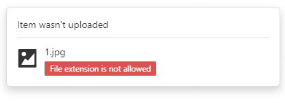
allowedFileExtensions
Specifies the allowed upload file extensions.
The FileManager UI component cannot upload a file and displays an error message when the file's extension is not allowed.
jQuery
$(function () {
    $("#file-manager").dxFileManager({
        allowedFileExtensions: [".js", ".json", ".css"]
        // ...
    });
});
Angular
<dx-file-manager id="fileManager"
    [allowedFileExtensions]="['.js', '.json', '.css']">
    <!-- ... -->
</dx-file-manager>
import { BrowserModule } from '@angular/platform-browser';
import { NgModule } from '@angular/core';
import { AppComponent } from './app.component';
import { DxFileManagerModule } from 'devextreme-angular';

@NgModule({
    declarations: [
        AppComponent
    ],
    imports: [
        BrowserModule,
        DxFileManagerModule
    ],
    //...
})
export class AppModule { }
Vue
<template>
    <DxFileManager
        :allowed-file-extensions="allowedFileExtensions" >
    </DxFileManager>
</template>
<script>
    import 'devextreme/dist/css/dx.light.css';

    import {
        DxFileManager
    } from 'devextreme-vue/file-manager';

    export default {
        components: {
            DxFileManager
        },
        data() {
            return {
                allowedFileExtensions: ['.js', '.json', '.css']
            };
        }
    };
</script>
React
import React from 'react';

import 'devextreme/dist/css/dx.light.css';

import FileManager from 'devextreme-react/file-manager';

const allowedFileExtensions = ['.txt', '.doc', '.png'];

class App extends React.Component {
    render() {
        return (
            <FileManager allowedFileExtensions={allowedFileExtensions} >
            </FileManager>
        );
    }
}
export default App;
ASP.NET MVC Controls
@(Html.DevExtreme().FileManager()
    .AllowedFileExtensions(new[] { ".js", ".json", ".css" })
    // ...
)
ASP.NET Core Controls
@(Html.DevExtreme().FileManager()
    .AllowedFileExtensions(new[] { ".js", ".json", ".css" })
    // ...
)
currentPath
Specifies the path that is used when the FileManager is initialized.
jQuery
$(function () {
    $("#file-manager").dxFileManager({
        currentPath: "Documents/Images"
        // ...
    });
});
Angular
<dx-file-manager id="fileManager"
    [currentPath]="Documents/Images">
    <!-- ... -->
</dx-file-manager>
import { BrowserModule } from '@angular/platform-browser';
import { NgModule } from '@angular/core';
import { AppComponent } from './app.component';
import { DxFileManagerModule } from 'devextreme-angular';

@NgModule({
    declarations: [
        AppComponent
    ],
    imports: [
        BrowserModule,
        DxFileManagerModule
    ],
    //...
})
export class AppModule { }
Vue
<template>
    <DxFileManager
        :current-path="Documents/Images" >
    </DxFileManager>
</template>
<script>
    import 'devextreme/dist/css/dx.light.css';

    import {
        DxFileManager
    } from 'devextreme-vue/file-manager';

    export default {
        components: {
            DxFileManager
        },
        data() {
            return {
                // ...
            };
        }
    };
</script>
React
import React from 'react';

import 'devextreme/dist/css/dx.light.css';

import FileManager from 'devextreme-react/file-manager';

class App extends React.Component {
    render() {
        return (
            <FileManager currentPath="Documents/Images" >
            </FileManager>
        );
    }
}
export default App;
ASP.NET MVC Controls
@(Html.DevExtreme().FileManager()
    .CurrentPath("Documents/Images")
    // ...
)
ASP.NET Core Controls
@(Html.DevExtreme().FileManager()
    .CurrentPath("Documents/Images")
    // ...
)
currentPathKeys
Specifies an array of path keys to the current location.
Each path part has each own key. For example, path "directory1/directory2" has two parts: 'directory1' with the 'f1' key and directory2 with the 'f2' key. To open this location, assign the ["f1","f2"] array of strings to the currentPathKeys property value.
jQuery
$(function () {
    $("#file-manager").dxFileManager({
        currentPathKeys: ["EB458000-0341-6943", "92F5-4722-A7D6-98EB"]
        // ...
    });
});
Angular
<dx-file-manager id="fileManager"
    [currentPathKeys]="['EB458000-0341-6943', '92F5-4722-A7D6-98EB']">
    <!-- ... -->
</dx-file-manager>
import { BrowserModule } from '@angular/platform-browser';
import { NgModule } from '@angular/core';
import { AppComponent } from './app.component';
import { DxFileManagerModule } from 'devextreme-angular';

@NgModule({
    declarations: [
        AppComponent
    ],
    imports: [
        BrowserModule,
        DxFileManagerModule
    ],
    //...
})
export class AppModule { }
Vue
<template>
    <DxFileManager
        :current-path-keys="keys" >
    </DxFileManager>
</template>
<script>
    import 'devextreme/dist/css/dx.light.css';

    import {
        DxFileManager
    } from 'devextreme-vue/file-manager';

    export default {
        components: {
            DxFileManager
        },
        data() {
            return {
                keys: ['EB458000-0341-6943', '92F5-4722-A7D6-98EB']
            };
        }
    };
</script>
React
import React from 'react';

import 'devextreme/dist/css/dx.light.css';

import FileManager from 'devextreme-react/file-manager';

const keys = ['EB458000-0341-6943', '92F5-4722-A7D6-98EB']

class App extends React.Component {
    render() {
        return (
            <FileManager currentPathKeys={keys} >
            </FileManager>
        );
    }
}
export default App;
ASP.NET MVC Controls
@(Html.DevExtreme().FileManager()
    .CurrentPathKeys(new[] { "EB458000-0341-6943", "92F5-4722-A7D6-98EB" })
    // ...
)
ASP.NET Core Controls
@(Html.DevExtreme().FileManager()
    .CurrentPathKeys(new[] { "EB458000-0341-6943", "92F5-4722-A7D6-98EB" })
    // ...
)
customizeDetailColumns
Customizes columns in details view. Applies only if itemView.mode is "details".
The columns before customization.
The columns after customization.
jQuery
$(function() {
    $("#fileManagerContainer").dxFileManager({
        // ...
        customizeDetailColumns: function(columns) {
            // ...
            // Customize the "columns" array objects here
            // ...
            return columns;
        }
    });
});
Angular
<dx-file-manager ...
    [customizeDetailColumns]="fileManager_customizeDetailColumns">
</dx-file-manager>
import { Component } from '@angular/core';

@Component({
    selector: 'app-root',
    templateUrl: './app.component.html',
    styleUrls: ['./app.component.css']
})
export class AppComponent {
    // Uncomment the following lines if the function should be executed in the component's context
    // constructor() {
    //     this.fileManager_customizeDetailColumns = this.fileManager_customizeDetailColumns.bind(this);
    // }

    fileManager_customizeDetailColumns(columns) {
        // ...
        // Customize the "columns" array objects here
        // ...
        return columns;
    }
}
import { BrowserModule } from '@angular/platform-browser';
import { NgModule } from '@angular/core';
import { AppComponent } from './app.component';

import { DxFileManagerModule } from 'devextreme-angular';

@NgModule({
    declarations: [
        AppComponent
    ],
    imports: [
        BrowserModule,
        DxFileManagerModule
    ],
    providers: [],
    bootstrap: [AppComponent]
})
export class AppModule { }
Vue
<template>
    <DxFileManager ...
        :customize-detail-columns="fileManager_customizeDetailColumns"
    />
</template>

<script>
import 'devextreme/dist/css/dx.light.css';

import DxFileManager from 'devextreme-vue/file-manager';

export default {
    components: {
        DxFileManager
    },
    methods: {
        fileManager_customizeDetailColumns(columns) {
            // ...
            // Customize the "columns" array objects here
            // ...
            return columns;
        }
    }
}
</script>
React
import React from 'react';

import 'devextreme/dist/css/dx.light.css';

import FileManager from 'devextreme-react/file-manager';

class App extends React.Component {
    // Uncomment the following lines if the function should be executed in the component's context
    // constructor(props) {
    //     super(props);
    //     this.fileManager_customizeDetailColumns = this.fileManager_customizeDetailColumns.bind(this);
    // }

    fileManager_customizeDetailColumns(columns) {
        // ...
        // Customize the "columns" array objects here
        // ...
        return columns;
    }

    render() {
        return (
            <FileManager ...
                customizeDetailColumns={this.fileManager_customizeDetailColumns}
            />
        );
    }
}
export default App;
ASP.NET Core Controls
@(Html.DevExtreme().FileManager()
    @* ... *@
    .CustomizeDetailColumns("customizeDetailColumns")
)

<script type="text/javascript">
    function customizeDetailColumns(columns) {
        // ...
        // Customize the "columns" array objects here
        // ...
        return columns;
    }
</script>
ASP.NET MVC Controls
@(Html.DevExtreme().FileManager()
    @* ... *@
    .CustomizeDetailColumns("customizeDetailColumns")
)

<script type="text/javascript">
    function customizeDetailColumns(columns) {
        // ...
        // Customize the "columns" array objects here
        // ...
        return columns;
    }
</script>
customizeThumbnail
Allows you to provide custom icons to be used as thumbnails.
The file or directory whose thumbnail is being customized.
An icon to use as a thumbnail.
This function should return one of the following:
- The icon's URL
- The icon's name if the icon is from the DevExtreme icon library
- The icon's CSS class if the icon is from an external icon library (see External Icon Libraries)
- The icon in the Base64 format
disabled
Specifies whether the UI component responds to user interaction.
elementAttr
Specifies the global attributes to be attached to the UI component's container element.
jQuery
$(function(){
    $("#fileManagerContainer").dxFileManager({
        // ...
        elementAttr: {
            id: "elementId",
            class: "class-name"
        }
    });
});
Angular
<dx-file-manager ...
    [elementAttr]="{ id: 'elementId', class: 'class-name' }">
</dx-file-manager>
import { DxFileManagerModule } from "devextreme-angular";
// ...
export class AppComponent {
    // ...
}
@NgModule({
    imports: [
        // ...
        DxFileManagerModule
    ],
    // ...
})
Vue
<template>
    <DxFileManager ...
        :element-attr="fileManagerAttributes">
    </DxFileManager>
</template>

<script>
import DxFileManager from 'devextreme-vue/file-manager';

export default {
    components: {
        DxFileManager
    },
    data() {
        return {
            fileManagerAttributes: {
                id: 'elementId',
                class: 'class-name'
            }
        }
    }
}
</script>
React
import React from 'react';

import FileManager from 'devextreme-react/file-manager';

class App extends React.Component {
    fileManagerAttributes = {
        id: 'elementId',
        class: 'class-name'
    }

    render() {
        return (
            <FileManager ...
                elementAttr={this.fileManagerAttributes}>
            </FileManager>
        );
    }
}
export default App;
fileSystemProvider
Specifies the file system provider.
File system providers are components that provide APIs used to access and modify virtual file systems.
Refer to File System Providers for information on supported file system providers.
The following example illustrates how to configure an Object file system provider:
jQuery
$(function () {
    $("#file-manager").dxFileManager({
        fileSystemProvider: fileSystem,
        // ...
    });
});
var fileSystem = [
    {
        name: "Documents",
        isDirectory: true,
        items: [
            {
                name: "Projects",
                isDirectory: true,
                items: [
                    {
                        name: "About.rtf",
                        isDirectory: false,
                        size: 1024
                    },
                    {
                        name: "Passwords.rtf",
                        isDirectory: false,
                        size: 2048
                    }
                ]
            },
            {
                name: "About.xml",
                isDirectory: false,
                size: 1024
            },
            //...
        ],
    },
    //...
];
Angular
<dx-file-manager id="fileManager"
    [fileSystemProvider]="fileSystem">
</dx-file-manager>
import { Component } from '@angular/core';

@Component({
    selector: 'app-root',
    templateUrl: './app.component.html',
    styleUrls: ['./app.component.css']
})

export class AppComponent {
    fileSystem = [{
        name: "Documents",
        isDirectory: true,
        items: [{
            name: "Projects",
            isDirectory: true,
            items: [{
                name: "About.rtf",
                isDirectory: false,
                size: 1024
            }, {
                name: "Passwords.rtf",
                isDirectory: false,
                size: 2048
            }]
        },{
            name: "About.xml",
            isDirectory: false,
            size: 1024
        }]
    }];
}
import { BrowserModule } from '@angular/platform-browser';
import { NgModule } from '@angular/core';
import { AppComponent } from './app.component';
import { DxFileManagerModule } from 'devextreme-angular';

@NgModule({
    declarations: [
        AppComponent
    ],
    imports: [
        BrowserModule,
        DxFileManagerModule
    ],
    //...
})
export class AppModule { }
Vue
<template>
    <DxFileManager
        :file-system-provider="fileSystem">
    </DxFileManager>
</template>

<script>
import 'devextreme/dist/css/dx.light.css';

import {
    DxFileManager
} from 'devextreme-vue/file-manager';
import { fileSystem } from "./data.js";

export default {
    components: {
        DxFileManager
    },

    data() {
        return {
            fileSystem
        };
    }
};
</script>
export const fileSystem = [{
    'name': 'Documents',
    'isDirectory': true,
    'items': [{
        'name': 'Projects',
        'isDirectory': true,
        'items': [{
            'name': 'About.rtf',
            'isDirectory': false,
            'size': 1024
        }, {
            'name': 'Passwords.rtf',
            'isDirectory': false,
            'size': 2048
        }]
    }, {
        'name': 'About.xml',
        'isDirectory': false,
        'size': 1024
    }]
}];
React
import React from 'react';

import 'devextreme/dist/css/dx.light.css';

import FileManager from 'devextreme-react/file-manager';
import { fileSystem } from './data.js';

class App extends React.Component {
    render() {
        return (
            <FileManager fileSystemProvider={fileSystem}>
            </FileManager>
        );
    }
}
export default App;
export const fileSystem = [{
    'name': 'Documents',
    'isDirectory': true,
    'items': [{
        'name': 'Projects',
        'isDirectory': true,
        'items': [{
            'name': 'About.rtf',
            'isDirectory': false,
            'size': 1024
        }, {
            'name': 'Passwords.rtf',
            'isDirectory': false,
            'size': 2048
        }]
    }, {
        'name': 'About.xml',
        'isDirectory': false,
        'size': 1024
    }]
}];
ASP.NET MVC Controls
@(Html.DevExtreme().FileManager()
    .FileSystemProvider(new JS("fileSystem"))
)
<script src="~/Scripts/data/data.js"></script>

<!-- data.js -->
var fileSystem = [{
    name: "Documents",
    isDirectory: true,
    items: [
        {
        name: "Projects",
        isDirectory: true,
        items: [
            {
            name: "About.rtf",
            isDirectory: false,
            size: 1024
        }, {
            name: "Passwords.rtf",
            isDirectory: false,
            size: 2048
        }]
    }, {
        name: "About.xml",
        isDirectory: false,
        size: 1024
    }]
}];
ASP.NET Core Controls
@(Html.DevExtreme().FileManager()
    .FileSystemProvider(new JS("fileSystem"))
)
<script src="~/Scripts/data/data.js"></script>

<!-- data.js -->
var fileSystem = [{
    name: "Documents",
    isDirectory: true,
    items: [
        {
        name: "Projects",
        isDirectory: true,
        items: [
            {
            name: "About.rtf",
            isDirectory: false,
            size: 1024
        }, {
            name: "Passwords.rtf",
            isDirectory: false,
            size: 2048
        }]
    }, {
        name: "About.xml",
        isDirectory: false,
        size: 1024
    }]
}];
focusedItemKey
Specifies a key of the initially or currently focused item.
jQuery
$(function() {
    $("#fileManagerContainer").dxFileManager({
        // ...
        focusedItemKey: "item1_key"
    });
});
Angular
<dx-file-manager id="fileManager"
    [focusedItemKey]="item1_key">
    <!-- ... -->
</dx-file-manager>
import { BrowserModule } from '@angular/platform-browser';
import { NgModule } from '@angular/core';
import { AppComponent } from './app.component';
import { DxFileManagerModule } from 'devextreme-angular';

@NgModule({
    declarations: [
        AppComponent
    ],
    imports: [
        BrowserModule,
        DxFileManagerModule
    ],
    //...
})
export class AppModule { }
Vue
<template>
    <DxFileManager
        :focused-item-key="item1_key" >
    </DxFileManager>
</template>
<script>
    import 'devextreme/dist/css/dx.light.css';

    import {
        DxFileManager
    } from 'devextreme-vue/file-manager';

    export default {
        components: {
            DxFileManager
        },
        data() {
            return {
                // ...
            };
        }
    };
</script>
React
import React from 'react';

import 'devextreme/dist/css/dx.light.css';

import FileManager from 'devextreme-react/file-manager';

class App extends React.Component {
    render() {
        return (
            <FileManager focusedItemKey="item1_key" >
            </FileManager>
        );
    }
}
export default App;
ASP.NET MVC Controls
@(Html.DevExtreme().FileManager()
    .FocusedItemKey("item1_key")
    // ...
)
ASP.NET Core Controls
@(Html.DevExtreme().FileManager()
    .FocusedItemKey("item1_key")
    // ...
)
focusStateEnabled
Specifies whether the UI component can be focused using keyboard navigation.
height
Specifies the UI component's height.
This property accepts a value of one of the following types:
Number
The height in pixels.String
A CSS-accepted measurement of height. For example,"55px","20vh","80%","inherit".
hint
Specifies text for a hint that appears when a user pauses on the UI component.
hoverStateEnabled
Specifies whether the UI component changes its state when a user pauses on it.
itemView
Configures the file and directory view.
jQuery
$(function () {
    $("#file-manager").dxFileManager({
        itemView: {
            mode: "thumbnails",
            showFolders: false,
            showParentFolder: false
        }
        // ...
    });
});
Angular
<dx-file-manager>
    <dxo-file-manager-item-view
        mode="thumbnails"
        showFolders="false"
        showParentFolder="false" >
    </dxo-file-manager-item-view>
    <!-- ... -->
</dx-file-manager>
import { BrowserModule } from '@angular/platform-browser';
import { NgModule } from '@angular/core';
import { AppComponent } from './app.component';
import { DxFileManagerModule } from 'devextreme-angular';

@NgModule({
    declarations: [
        AppComponent
    ],
    imports: [
        BrowserModule,
        DxFileManagerModule
    ],
    //...
})
export class AppModule { }
Vue
<template>
    <DxFileManager>
        <DxItemView
            mode="thumbnails"
            :show-folders="false"
            :show-parent-folder="false"
        >
        </DxItemView>
    </DxFileManager>
</template>
<script>
    import 'devextreme/dist/css/dx.light.css';

    import {
        DxFileManager,
        DxItemView
    } from 'devextreme-vue/file-manager';

    export default {
        components: {
            DxFileManager,
            DxItemView
        },
        data() {
            return {
                //...
            };
        }
    };
</script>
React
import React from 'react';

import 'devextreme/dist/css/dx.light.css';

import FileManager, { ItemView } from 'devextreme-react/file-manager';

class App extends React.Component {
    render() {
        return (
            <FileManager>
                <ItemView
                    mode="thumbnails"
                    showFolder={false}
                    showParentFolder={false}
                />
            </FileManager>
        );
    }
}
export default App;
ASP.NET Core Controls
@(Html.DevExtreme().Gantt()
    .ItemView(v => v
        .Mode()
        .ShowFolder(false)
        .ShowParentFolder(false)
    )
)
ASP.NET MVC Controls
@(Html.DevExtreme().Gantt()
    .ItemView(v => v
        .Mode()
        .ShowFolder(false)
        .ShowParentFolder(false)
    )
)onContentReady
A function that is executed when the UI component is rendered and each time the component is repainted.
Information about the event.
| Name | Type | Description |
|---|---|---|
| element |
The UI component's container. It is an HTML Element or a jQuery Element when you use jQuery. |
|
| component |
The UI component's instance. |
onContextMenuItemClick
A function that is executed when a context menu item is clicked.
Information about the event that caused the function's execution.
| Name | Type | Description |
|---|---|---|
| component |
The UI component's instance. |
|
| element |
The UI component's container. It is an HTML Element or a jQuery Element when you use jQuery. |
|
| event | Event (jQuery or EventObject) |
The event that caused the function to execute. It is an EventObject or a jQuery.Event when you use jQuery. |
| fileSystemItem |
The file system item for which you invoke the context menu. |
|
| itemData |
The clicked item's data. |
|
| itemElement |
The item's container. It is an HTML Element or a jQuery Element when you use jQuery. |
|
| itemIndex |
The clicked item's index. |
|
| viewArea |
Specifies whether the context menu is invoked in the navigation panel or in the items area. |
jQuery
$(function() {
    $("#fileManagerContainer").dxFileManager({
        // ...
        onContextMenuItemClick: function(e) {
            // Your code goes here
        }
    });
});
function onItemClick(args) {
    if(args.itemData.extension) {
        // your code
    }
}
Angular
<dx-file-manager
    (onContextMenuItemClick)="onItemClick($event)">
    <dxo-file-manager-context-menu>
        <dxi-file-manager-item text="Create .txt Document" [options]="{ extension: '.txt' }"></dxi-file-manager-item>
        <dxi-file-manager-item text="Create .rtf Document" [options]="{ extension: '.rtf' }"></dxi-file-manager-item>
        <dxi-file-manager-item text="Create .xls Document" [options]="{ extension: '.xls' }"></dxi-file-manager-item>
    </dxo-file-manager-context-menu>
    <!-- ... -->
</dx-file-manager>
import { Component } from '@angular/core';

@Component({
    selector: 'app-root',
    templateUrl: './app.component.html',
    styleUrls: ['./app.component.css']
})

export class AppComponent {
    onItemClick(e){
        if(e.itemData.options.extension) {
            // your code
        }
    }
}
import { BrowserModule } from '@angular/platform-browser';
import { NgModule } from '@angular/core';
import { AppComponent } from './app.component';
import { DxFileManagerModule } from 'devextreme-angular';

@NgModule({
    imports: [
        DxFileManagerModule
    ],
    declarations: [AppComponent],
    bootstrap: [AppComponent]
})
export class AppModule { }
Vue
<template>
    <DxFileManager
        :on-context-menu-item-click="onItemClick" >
        <DxContextMenu>
            <DxItem text="Create .txt Document" :options="{ extension: '.txt' }" />
            <DxItem text="Create .rtf Document" :options="{ extension: '.rtf' }" />
            <DxItem text="Create .xls Document" :options="{ extension: '.xls' }" />
        </DxContextMenu>
    </DxFileManager>
</template>

<script>
    import 'devextreme/dist/css/dx.light.css';

    import {
        DxFileManager,
        DxContextMenu,
        DxItem
        // ...
    } from 'devextreme-vue/file-manager';

    export default {
        components: {
            DxFileManager,
            DxContextMenu,
            DxItem
            // ...
        },
        methods: {
            onItemClick(e) {
                if(e.itemData.options.extension) {
                    // your code
                }
            }
        },
        data() {
            return {
                //...
            };
        }
    };
</script>
React
import React from 'react';
import FileManager, { ContextMenu, Item } from 'devextreme-react/file-manager';

const App = () => {
    const onItemClick = (e) => {
        if(e.itemData.extension) {
            // your code
        }
    };

    return (
        <FileManager onContextMenuItemClick={onItemClick}>
            <ContextMenu>
                <Item text="Create .txt Document" extension=".txt" />
                <Item text="Create .rtf Document" extension=".rtf" />
                <Item text="Create .xls Document" extension=".xls" />
            </ContextMenu>
        </FileManager>
    );
};

export default App;
ASP.NET MVC Controls
@(Html.DevExtreme().FileManager()
    .ContextMenu(cm => {
        cm.Items(i => {
            i.Add()
                .Text("Create .txt Document")
                .Option("extension", ".txt");
            i.Add()
                .Text("Create .rtf Document")
                .Option("extension", ".rtf");
            i.Add()
                .Text("Create .xls Document")
                .Option("extension", ".xls");
        });
    })
    .OnContextMenuItemClick("onItemClick");
)

<script>
    function onItemClick(e) {
        if(e.itemData.extension) {
            // your code
        }
    }
</script>
ASP.NET Core Controls
@(Html.DevExtreme().FileManager()
    .ContextMenu(cm => {
        cm.Items(i => {
            i.Add()
                .Text("Create .txt Document")
                .Option("extension", ".txt");
            i.Add()
                .Text("Create .rtf Document")
                .Option("extension", ".rtf");
            i.Add()
                .Text("Create .xls Document")
                .Option("extension", ".xls");
        });
    })
    .OnContextMenuItemClick("onItemClick");
)

<script>
    function onItemClick(e) {
        if(e.itemData.extension) {
            // your code
        }
    }
</script>
onContextMenuShowing
A function that is executed before a context menu is displayed.
Information about the event that caused the function's execution.
| Name | Type | Description |
|---|---|---|
| cancel |
Allows you to cancel showing the context menu. |
|
| component |
The UI component's instance. |
|
| element |
The UI component's container. It is an HTML Element or a jQuery Element when you use jQuery. |
|
| event | Event (jQuery or EventObject) |
The event that caused the function to execute. It is an EventObject or a jQuery.Event when you use jQuery. |
| fileSystemItem |
The file system item for which you invoke the context menu. |
|
| targetElement |
The file system item's container. It is an HTML Element or a jQuery Element when you use jQuery. This element can be a grid element or a thumbnail (for the items view area), or a tree view node (for the navigation panel). The targetElement field value is 'undefined' if you click on empty space in the items view area. |
|
| viewArea |
Specifies whether the context menu is invoked in the navigation panel or in the items view area. |
jQuery
$(function() {
    $("#file-manager").dxFileManager({
        // ...
        onContextMenuShowing: function (e) {
            const contextMenuItems = ['create', 'rename', 'delete'];
            if (e.viewArea === 'itemView'){
                // your code
                e.cancel = true;
            } else {
                // your code
                e.component.option('contextMenu.items', contextMenuItems);
            }
        }
    });
});
Angular
import { DxFileManagerModule } from "devextreme-angular";
// ...
export class AppComponent {
    onContextMenuShowing(e) {
        const contextMenuItems = ['create', 'rename', 'delete'];
        if (e.viewArea === 'itemView'){
            // your code
            e.cancel = true;
        } else {
            // your code
            e.component.option('contextMenu.items', contextMenuItems);
        }
    }
}
@NgModule({
    imports: [
        // ...
        DxFileManagerModule
    ],
    // ...
})
<dx-file-manager ...
    (onContextMenuShowing)="onContextMenuShowing($event)">
</dx-file-manager>
Vue
<template>
    <DxFileManager
        ...
        @context-menu-showing="onContextMenuShowing"
    />
</template>

<script>
import 'devextreme/dist/css/dx.light.css';

import DxFileManager from 'devextreme-vue/file-manager';

export default {
    components: {
        DxFileManager
    },
    methods: {
        onContextMenuShowing(e) {
            const contextMenuItems = ['create', 'rename', 'delete'];
            if (e.viewArea === 'itemView'){
                // your code
                e.cancel = true;
            } else {
                // your code
                e.component.option('contextMenu.items', contextMenuItems);
            }
        }
    }
}
</script>
React
import React from 'react';
import FileManager, { ContextMenu } from 'devextreme-react/file-manager';

const App = () => {
    const menuItems = ['create', 'rename', 'delete'];
    const [contextMenuItems, setContextMenuItems] = useState(menuItems);
    const filterMenuItems = useCallback((items) => {
        return items.filter((item) => item !== "delete");
    }, []);
    const onContextMenuShowing = useCallback(
        (e) => {
            if (e.viewArea === "itemView") {
                // your code
                e.cancel = true;
            }
            // else {
            //   If you dynamically change context menu items, use the following code to update the item states:
            //   setContextMenuItems(filterMenuItems(contextMenuItems));
            // }
        },
        [filterMenuItems, contextMenuItems]
    };

    return (
        <FileManager
            onContextMenuShowing={onContextMenuShowing}>
            <ContextMenu items={contextMenuItems}></ContextMenu>
        </FileManager>
    );
}

export default App;
ASP.NET MVC Controls
@(Html.DevExtreme().FileManager()
    .ID("file-manager")
    // ...
    .onContextMenuShowing("fm_contextMenuShowing_handler")
)
<script>
    function fm_contextMenuShowing_handler(e) {
        const contextMenuItems = ['create', 'rename', 'delete'];
        if (e.viewArea === 'itemView'){
            // your code
            e.cancel = true;
        } else {
            // your code
            e.component.option('contextMenu.items', contextMenuItems);
        }
    }
</script>
ASP.NET Core Controls
@(Html.DevExtreme().FileManager()
    .ID("file-manager")
    // ...
    .onContextMenuShowing("fm_contextMenuShowing_handler")
)
<script>
    function fm_contextMenuShowing_handler(e) {
        const contextMenuItems = ['create', 'rename', 'delete'];
        if (e.viewArea === 'itemView'){
            // your code
            e.cancel = true;
        } else {
            // your code
            e.component.option('contextMenu.items', contextMenuItems);
        }
    }
</script>
See Also
onCurrentDirectoryChanged
A function that is executed when the current directory is changed.
Information about the event that caused the function's execution.
| Name | Type | Description |
|---|---|---|
| component |
The UI component's instance. |
|
| directory |
The current directory. |
|
| element |
The UI component's container. It is an HTML Element or a jQuery Element when you use jQuery. |
jQuery
$(function() {
    $("#fileManagerContainer").dxFileManager({
        // ...
        onCurrentDirectoryChanged: function(e) {
            // Your code goes here
        }
    });
});
Angular
<dx-file-manager
    (onCurrentDirectoryChanged)="onDirectoryChanged($event)">
    <!-- ... -->
</dx-file-manager>
import { Component } from '@angular/core';

@Component({
    selector: 'app-root',
    templateUrl: './app.component.html',
    styleUrls: ['./app.component.css']
})

export class AppComponent {
    onDirectoryChanged(e){
        // your code
    }
}
import { BrowserModule } from '@angular/platform-browser';
import { NgModule } from '@angular/core';
import { AppComponent } from './app.component';
import { DxFileManagerModule } from 'devextreme-angular';

@NgModule({
    imports: [
        DxFileManagerModule
    ],
    declarations: [AppComponent],
    bootstrap: [AppComponent]
})
export class AppModule { }
Vue
<template>
    <DxFileManager
        :on-current-directory-changed="onDirectoryChanged" >
    </DxFileManager>
</template>

<script>
    import 'devextreme/dist/css/dx.light.css';

    import {
        DxFileManager
        // ...
    } from 'devextreme-vue/file-manager';

    export default {
        components: {
            DxFileManager
            // ...
        },
        methods: {
            onDirectoryChanged(e) {
                // your code
            }
        },
        data() {
            return {
                //...
            };
        }
    };
</script>
React
import React from 'react';
import FileManager from 'devextreme-react/file-manager';

const App = () => {
    const onDirectoryChanged = (e) => {
        // your code
    };

    return (
        <FileManager onCurrentDirectoryChanged={onDirectoryChanged}>
            <!-- ... -->
        </FileManager>
    );
};

export default App;
ASP.NET MVC Controls
@(Html.DevExtreme().FileManager()
    .OnCurrentDirectoryChanged("onDirectoryChanged");
    // ...
)

<script>
    function onDirectoryChanged(e) {
        // your code
    }
</script>
ASP.NET Core Controls
@(Html.DevExtreme().FileManager()
    .OnCurrentDirectoryChanged("onDirectoryChanged");
    // ...
)

<script>
    function onDirectoryChanged(e) {
        // your code
    }
</script>
onDirectoryCreated
A function that is executed when a directory is created.
Information about the event.
| Name | Type | Description |
|---|---|---|
| component |
The UI component's instance. |
|
| element |
The component's container. It is an HTML Element or a jQuery Element when you use jQuery. |
|
| name |
The name of the created directory. |
|
| parentDirectory |
The parent directory. |
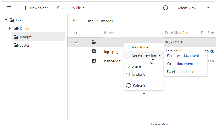
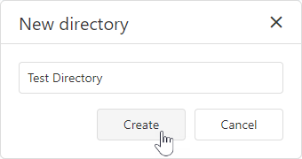
Use the Create Directory context menu or toolbar item to invoke the dialog. In the dialog, enter the directory name and click Create to create a new directory.
jQuery
$(function() {
    $("#fileManagerContainer").dxFileManager({
        // ...
        onDirectoryCreated: function(e) {
            if (e.parentDirectory.name === 'Images'){
                // your code
            }
        }
    });
});
Angular
<dx-file-manager
    (onDirectoryCreated)="onDirectoryCreated($event)">
    <!-- ... -->
</dx-file-manager>
import { Component } from '@angular/core';

@Component({
    selector: 'app-root',
    templateUrl: './app.component.html',
    styleUrls: ['./app.component.css']
})

export class AppComponent {
    onDirectoryCreated(e){
        if (e.parentDirectory.name === 'Images'){
            // your code
        }
    }
}
import { BrowserModule } from '@angular/platform-browser';
import { NgModule } from '@angular/core';
import { AppComponent } from './app.component';
import { DxFileManagerModule } from 'devextreme-angular';

@NgModule({
    imports: [
        DxFileManagerModule
    ],
    declarations: [AppComponent],
    bootstrap: [AppComponent]
})
export class AppModule { }
Vue
<template>
    <DxFileManager
        :on-directory-created="onDirectoryCreated" >
    </DxFileManager>
</template>

<script>
    import 'devextreme/dist/css/dx.light.css';

    import {
        DxFileManager
        // ...
    } from 'devextreme-vue/file-manager';

    export default {
        components: {
            DxFileManager
            // ...
        },
        methods: {
            onDirectoryCreated(e) {
                if (e.parentDirectory.name === 'Images'){
                    // your code
                }
            }
        },
        data() {
            return {
                //...
            };
        }
    };
</script>
React
import React from 'react';
import FileManager from 'devextreme-react/file-manager';

const App = () => {
    const onDirectoryCreated = (e) => {
        if (e.parentDirectory.name === 'Images'){
            // your code
        }
    };

    return (
        <FileManager onDirectoryCreated={onDirectoryCreated}>
            <!-- ... -->
        </FileManager>
    );
};

export default App;
ASP.NET MVC Controls
@(Html.DevExtreme().FileManager()
    .OnDirectoryCreated("onDirectoryCreated");
    // ...
)

<script>
    function onDirectoryCreated(e) {
        if (e.parentDirectory.name === 'Images'){
            // your code
        }
    }
</script>
ASP.NET Core Controls
@(Html.DevExtreme().FileManager()
    .OnDirectoryCreated("onDirectoryCreated");
    // ...
)

<script>
    function onDirectoryCreated(e) {
        if (e.parentDirectory.name === 'Images'){
            // your code
        }
    }
</script>
See Also
onDirectoryCreating
A function that is executed before a directory is created.
Information about the event.
| Name | Type | Description |
|---|---|---|
| cancel | | |
Allows you to cancel the directory creation. |
| component |
The UI component's instance. |
|
| element |
The component's container. It is an HTML Element or a jQuery Element when you use jQuery. |
|
| errorCode |
The error code. The following error codes are supported:
|
|
| errorText |
Allows you to specify the error message. |
|
| name |
The name of the directory. |
|
| parentDirectory |
The parent directory. |
Use the Create Directory context menu or toolbar item to invoke the dialog. In the dialog, enter the directory name and click Create to create a new directory.
The component executes the onDirectoryCreating function when a user enters a directory name and clicks Create in the dialog.
jQuery
$(function() {
    $("#file-manager").dxFileManager({
        // ...
        onDirectoryCreating: function (e) {
            if (e.parentDirectory.name === 'Images'){
                // your code
                e.cancel = true;
            }
        }
    });
});
Angular
import { DxFileManagerModule } from "devextreme-angular";
// ...
export class AppComponent {
    onDirectoryCreating(e) {
        if (e.parentDirectory.name === 'Images'){
            // your code
            e.cancel = true;
        }
    }
}
@NgModule({
    imports: [
        // ...
        DxFileManagerModule
    ],
    // ...
})
<dx-file-manager ...
    (onDirectoryCreating)="onDirectoryCreating($event)">
</dx-file-manager>
Vue
<template>
    <DxFileManager
        ...
        @on-directory-creating="onDirectoryCreating"
    />
</template>

<script>
import 'devextreme/dist/css/dx.light.css';

import DxFileManager from 'devextreme-vue/file-manager';

export default {
    components: {
        DxFileManager
    },
    methods: {
        onDirectoryCreating(e) {
            if (e.parentDirectory.name === 'Images'){
                // your code
                e.cancel = true;
            }
        }
    }
}
</script>
React
import React from 'react';
import FileManager from 'devextreme-react/file-manager';

const App = () => {
    const onDirectoryCreating = (e) => {
        if (e.parentDirectory.name === 'Images'){
            // your code
            e.cancel = true;
        }
    };

    return (
        <FileManager ...
            onDirectoryCreating={onDirectoryCreating} />
    );
}

export default App;
ASP.NET MVC Controls
@(Html.DevExtreme().FileManager()
    .ID("file-manager")
    // ...
    .OnDirectoryCreating("fm_directoryCreating_handler")
)
<script>
    function fm_directoryCreating_handler(e) {
        if (e.parentDirectory.name === 'Images'){
            // your code
            e.cancel = true;
        }
    }
</script>
ASP.NET Core Controls
@(Html.DevExtreme().FileManager()
    .ID("file-manager")
    // ...
    .OnDirectoryCreating("fm_directoryCreating_handler")
)
<script>
    function fm_directoryCreating_handler(e) {
        if (e.parentDirectory.name === 'Images'){
            // your code
            e.cancel = true;
        }
    }
</script>
See Also
onDisposing
A function that is executed before the UI component is disposed of.
Information about the event.
| Name | Type | Description |
|---|---|---|
| element |
The UI component's container. It is an HTML Element or a jQuery Element when you use jQuery. |
|
| component |
The UI component's instance. |
onErrorOccurred
A function that is executed when an error occurs.
Information about the event that caused the function's execution.
| Name | Type | Description |
|---|---|---|
| component |
The UI component's instance. |
|
| element |
The UI component's container. It is an HTML Element or a jQuery Element when you use jQuery. |
|
| errorCode |
The error code. The following error codes are supported:
|
|
| errorText |
Allows you to specify the error message. |
|
| fileSystemItem |
The processed file or directory. |
jQuery
$(function() {
    $("#fileManagerContainer").dxFileManager({
        // ...
        onErrorOccurred: function(e) {
            // Your code goes here
        }
    });
});
Angular
<dx-file-manager
    (onErrorOccurred)="onError($event)">
    <!-- ... -->
</dx-file-manager>
import { Component } from '@angular/core';

@Component({
    selector: 'app-root',
    templateUrl: './app.component.html',
    styleUrls: ['./app.component.css']
})

export class AppComponent {
    onOccurred(e){
        // your code
    }
}
import { BrowserModule } from '@angular/platform-browser';
import { NgModule } from '@angular/core';
import { AppComponent } from './app.component';
import { DxFileManagerModule } from 'devextreme-angular';

@NgModule({
    imports: [
        DxFileManagerModule
    ],
    declarations: [AppComponent],
    bootstrap: [AppComponent]
})
export class AppModule { }
Vue
<template>
    <DxFileManager
        :on-error-occurred="onError" >
    </DxFileManager>
</template>

<script>
    import 'devextreme/dist/css/dx.light.css';

    import {
        DxFileManager
        // ...
    } from 'devextreme-vue/file-manager';

    export default {
        components: {
            DxFileManager
            // ...
        },
        methods: {
            onError(e) {
                // your code
            }
        },
        data() {
            return {
                //...
            };
        }
    };
</script>
React
import React from 'react';
import FileManager from 'devextreme-react/file-manager';

const App = () => {
    const onError = (e) => {
        // your code
    };

    return (
        <FileManager onErrorOccurred={onError}>
            <!-- ... -->
        </FileManager>
    );
};

export default App;
ASP.NET MVC Controls
@(Html.DevExtreme().FileManager()
    .OnErrorOccurred("onError");
    // ...
)

<script>
    function onError(e) {
        // your code
    }
</script>
ASP.NET Core Controls
@(Html.DevExtreme().FileManager()
    .OnErrorOccurred("onError");
    // ...
)

<script>
    function onError(e) {
        // your code
    }
</script>
onFileUploaded
A function that is executed when a file is successfully uploaded.
Information about the event.
| Name | Type | Description |
|---|---|---|
| component |
The UI component's instance. |
|
| element |
The component's container. It is an HTML Element or a jQuery Element when you use jQuery. |
|
| fileData |
The uploaded file. |
|
| parentDirectory |
The parent directory. |
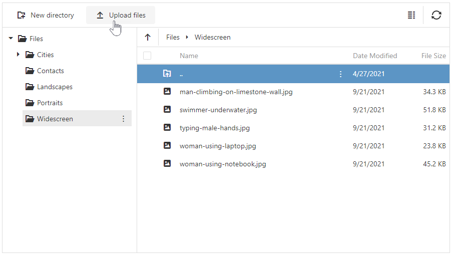
Use the Upload Files context menu or toolbar item to invoke the "Open" dialog and select a file to upload.
jQuery
$(function() {
    $("#fileManagerContainer").dxFileManager({
        // ...
        onFileUploaded: function(e) {
            if (e.parentDirectory.name === 'Images'){
                // your code
            }
        }
    });
});
Angular
<dx-file-manager
    (onFileUploaded)="onFileUploaded($event)">
    <!-- ... -->
</dx-file-manager>
import { Component } from '@angular/core';

@Component({
    selector: 'app-root',
    templateUrl: './app.component.html',
    styleUrls: ['./app.component.css']
})

export class AppComponent {
    onFileUploaded(e){
        if (e.parentDirectory.name === 'Images'){
            // your code
        }
    }
}
import { BrowserModule } from '@angular/platform-browser';
import { NgModule } from '@angular/core';
import { AppComponent } from './app.component';
import { DxFileManagerModule } from 'devextreme-angular';

@NgModule({
    imports: [
        DxFileManagerModule
    ],
    declarations: [AppComponent],
    bootstrap: [AppComponent]
})
export class AppModule { }
Vue
<template>
    <DxFileManager
        :on-file-uploaded="onFileUploaded" >
    </DxFileManager>
</template>

<script>
    import 'devextreme/dist/css/dx.light.css';

    import {
        DxFileManager
        // ...
    } from 'devextreme-vue/file-manager';

    export default {
        components: {
            DxFileManager
            // ...
        },
        methods: {
            onFileUploaded(e) {
                if (e.parentDirectory.name === 'Images'){
                    // your code
                }
            }
        },
        data() {
            return {
                //...
            };
        }
    };
</script>
React
import React from 'react';
import FileManager from 'devextreme-react/file-manager';

const App = () => {
    const onFileUploaded = (e) => {
        if (e.parentDirectory.name === 'Images'){
            // your code
        }
    };

    return (
        <FileManager onFileUploaded={onFileUploaded}>
            <!-- ... -->
        </FileManager>
    );
};

export default App;
ASP.NET MVC Controls
@(Html.DevExtreme().FileManager()
    .OnFileUploaded("onFileUploaded");
    // ...
)

<script>
    function onFileUploaded(e) {
        if (e.parentDirectory.name === 'Images'){
            // your code
        }
    }
</script>
ASP.NET Core Controls
@(Html.DevExtreme().FileManager()
    .OnFileUploaded("onFileUploaded");
    // ...
)

<script>
    function onFileUploaded(e) {
        if (e.parentDirectory.name === 'Images'){
            // your code
        }
    }
</script>
See Also
onFileUploading
A function that is executed before the file is uploaded.
Information about the event.
| Name | Type | Description |
|---|---|---|
| cancel | | |
Allows you to cancel the file upload. |
| component |
The UI component's instance. |
|
| destinationDirectory |
The directory where a file is uploaded to. |
|
| element |
The component's container. It is an HTML Element or a jQuery Element when you use jQuery. |
|
| errorCode |
The error code. The following error codes are supported:
|
|
| errorText |
Allows you to specify the error message. |
|
| fileData |
The file to be uploaded. |
Use the Upload Files context menu or toolbar item to invoke the "Open" dialog and select a file to upload.
The component executes the onFileUploading function when a user clicks Open in the dialog.
jQuery
$(function() {
    $("#file-manager").dxFileManager({
        // ...
        onFileUploading: function (e) {
            e.cancel = new Promise((resolve, reject) => {
                fetch('your-api-endpoint', {
                    method: 'POST',
                    headers: {
                        // ...
                    },
                })
                .then(result => {
                    if (result.cancel) {
                        resolve({ // Resolve instead of reject
                            cancel: true,
                            errorCode: "Error code",
                            errorText: "Error text"
                        });
                    } else {
                        resolve(...);
                    }
                });
            });
        }
    });
});
Angular
import { DxFileManagerModule } from "devextreme-angular";
// ...
export class AppComponent {
    onFileUploading(e) {
        e.cancel = new Promise((resolve, reject) => {
            fetch('your-api-endpoint', {
                method: 'POST',
                headers: {
                    // ...
                },
            })
            .then(result => {
                if (result.cancel) {
                    resolve({ // Resolve instead of reject
                        cancel: true,
                        errorCode: "Error code",
                        errorText: "Error text"
                    });
                } else {
                    resolve(...);
                }
            });
        });
    }
}
@NgModule({
    imports: [
        // ...
        DxFileManagerModule
    ],
    // ...
})
<dx-file-manager ...
    (onFileUploading)="onFileUploading($event)">
</dx-file-manager>
Vue
<template>
    <DxFileManager
        ...
        @on-file-uploading="onFileUploading"
    />
</template>

<script>
import 'devextreme/dist/css/dx.light.css';

import DxFileManager from 'devextreme-vue/file-manager';

export default {
    components: {
        DxFileManager
    },
    methods: {
        onFileUploading(e) {
            e.cancel = new Promise((resolve, reject) => {
                fetch('your-api-endpoint', {
                    method: 'POST',
                    headers: {
                        // ...
                    },
                })
                .then(result => {
                    if (result.cancel) {
                        resolve({ // Resolve instead of reject
                            cancel: true,
                            errorCode: "Error code",
                            errorText: "Error text"
                        });
                    } else {
                        resolve(...);
                    }
                });
            });
        }
    }
}
</script>
React
import React from 'react';
import FileManager from 'devextreme-react/file-manager';

const App = () => {
    const onFileUploading = (e) => {
        e.cancel = new Promise((resolve, reject) => {
            fetch('your-api-endpoint', {
                method: 'POST',
                headers: {
                    // ...
                },
            })
            .then(result => {
                if (result.cancel) {
                    resolve({ // Resolve instead of reject
                        cancel: true,
                        errorCode: "Error code",
                        errorText: "Error text"
                    });
                } else {
                    resolve(...);
                }
            });
        });
    };

    return (
        <FileManager ...
            onFileUploading={onFileUploading} />
    );
}

export default App;
ASP.NET MVC Controls
@(Html.DevExtreme().FileManager()
    .ID("file-manager")
    // ...
    .OnFileUploading("fm_fileUploading_handler")
)
<script>
    function fm_fileUploading_handler(e) {
        e.cancel = new Promise((resolve, reject) => {
            fetch('your-api-endpoint', {
                method: 'POST',
                headers: {
                    // ...
                },
            })
            .then(result => {
                if (result.cancel) {
                    resolve({ // Resolve instead of reject
                        cancel: true,
                        errorCode: "Error code",
                        errorText: "Error text"
                    });
                } else {
                    resolve(...);
                }
            });
        });
    }
</script>
ASP.NET Core Controls
@(Html.DevExtreme().FileManager()
    .ID("file-manager")
    // ...
    .OnFileUploading("fm_fileUploading_handler")
)
<script>
    function fm_fileUploading_handler(e) {
        e.cancel = new Promise((resolve, reject) => {
            fetch('your-api-endpoint', {
                method: 'POST',
                headers: {
                    // ...
                },
            })
            .then(result => {
                if (result.cancel) {
                    resolve({ // Resolve instead of reject
                        cancel: true,
                        errorCode: "Error code",
                        errorText: "Error text"
                    });
                } else {
                    resolve(...);
                }
            });
        });
    }
</script>
See Also
onFocusedItemChanged
A function that is executed when the focused item is changed.
Information about the event that caused the function's execution.
| Name | Type | Description |
|---|---|---|
| component |
The UI component's instance. |
|
| element |
The UI component's container. It is an HTML Element or a jQuery Element when you use jQuery. |
|
| item |
The currently focused file or directory. |
|
| itemElement |
The item's container. It is an HTML Element or a jQuery Element when you use jQuery. |
jQuery
$(function() {
    $("#fileManagerContainer").dxFileManager({
        // ...
        onFocusedItemChanged: function(e) {
            // Your code goes here
        }
    });
});
Angular
<dx-file-manager
    (onFocusedItemChanged)="onFocusedItemChangedEv($event)">
    <!-- ... -->
</dx-file-manager>
import { Component } from '@angular/core';

@Component({
    selector: 'app-root',
    templateUrl: './app.component.html',
    styleUrls: ['./app.component.css']
})

export class AppComponent {
    onFocusedItemChangedEv(e){
        // your code
    }
}
import { BrowserModule } from '@angular/platform-browser';
import { NgModule } from '@angular/core';
import { AppComponent } from './app.component';
import { DxFileManagerModule } from 'devextreme-angular';

@NgModule({
    imports: [
        DxFileManagerModule
    ],
    declarations: [AppComponent],
    bootstrap: [AppComponent]
})
export class AppModule { }
Vue
<template>
    <DxFileManager
        :on-focused-item-changed="onFocusedItemChangedEv" >
    </DxFileManager>
</template>

<script>
    import 'devextreme/dist/css/dx.light.css';

    import {
        DxFileManager
        // ...
    } from 'devextreme-vue/file-manager';

    export default {
        components: {
            DxFileManager
            // ...
        },
        methods: {
            onFocusedItemChangedEv(e) {
                // your code
            }
        },
        data() {
            return {
                //...
            };
        }
    };
</script>
React
import React from 'react';
import FileManager from 'devextreme-react/file-manager';

const App = () => {
    const onFocusedItemChangedEv = (e) => {
        // your code
    };

    return (
        <FileManager onFocusedItemChanged={onFocusedItemChangedEv}>
            <!-- ... -->
        </FileManager>
    );
};

export default App;
ASP.NET MVC Controls
@(Html.DevExtreme().FileManager()
    .OnFocusedItemChanged("onFocusedItemChangedEv");
    // ...
)

<script>
    function onFocusedItemChangedEv(e) {
        // your code
    }
</script>
ASP.NET Core Controls
@(Html.DevExtreme().FileManager()
    .OnFocusedItemChanged("onFocusedItemChangedEv");
    // ...
)

<script>
    function onFocusedItemChangedEv(e) {
        // your code
    }
</script>
onInitialized
A function used in JavaScript frameworks to save the UI component instance.
Information about the event.
| Name | Type | Description |
|---|---|---|
| element |
The UI component's container. It is an HTML Element or a jQuery Element when you use jQuery. |
|
| component |
The UI component's instance. |
Angular
<dx-file-manager ...
    (onInitialized)="saveInstance($event)">
</dx-file-manager>
import { Component } from "@angular/core";
import FileManager from "devextreme/ui/data_grid";
// ...
export class AppComponent {
    fileManagerInstance: FileManager;
    saveInstance (e) {
        this.fileManagerInstance = e.component;
    }
}
Vue
<template>
    <div>
        <DxFileManager ...
            @initialized="saveInstance">
        </DxFileManager>
    </div>
</template>

<script>
import DxFileManager from 'devextreme-vue/file-manager';

export default {
    components: {
        DxFileManager
    },
    data: function() {
        return {
            fileManagerInstance: null
        };
    },
    methods: {
        saveInstance: function(e) {
            this.fileManagerInstance = e.component;
        }
    }
};
</script>
<template>
    <div>
        <DxFileManager ...
            @initialized="saveInstance">
        </DxFileManager>
    </div>
</template>

<script setup>
import DxFileManager from 'devextreme-vue/file-manager';

let fileManagerInstance = null;

const saveInstance = (e) => {
    fileManagerInstance = e.component;
}
</script>
React
import FileManager from 'devextreme-react/file-manager';

class App extends React.Component {
    constructor(props) {
        super(props);

        this.saveInstance = this.saveInstance.bind(this);
    }

    saveInstance(e) {
        this.fileManagerInstance = e.component;
    }

    render() {
        return (
            <div>
                <FileManager onInitialized={this.saveInstance} />
            </div>
        );
    }
}
See Also
onItemCopied
A function that is executed when a file or directory is copied.
Information about the event.
| Name | Type | Description |
|---|---|---|
| component |
The UI component's instance. |
|
| element |
The component's container. It is an HTML Element or a jQuery Element when you use jQuery. |
|
| itemName |
The name of the copied file or directory. |
|
| itemPath |
The path to the copied file or directory. |
|
| parentDirectory |
The parent directory. |
|
| sourceItem |
The copied file or directory. |
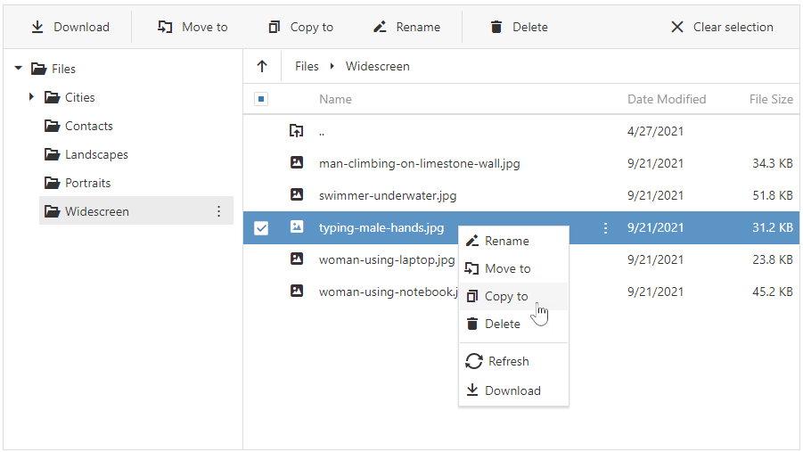
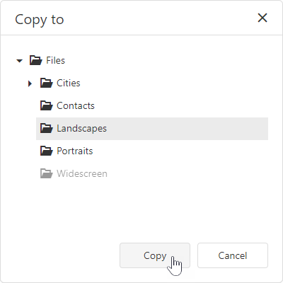
Select a file/folder and use the Copy To context menu or toolbar item to invoke the "Copy to" dialog. In the dialog, select the destination directory and click Copy.
jQuery
$(function() {
    $("#fileManagerContainer").dxFileManager({
        // ...
        onItemCopied: function(e) {
            if (e.parentDirectory.name === 'Images'){
                // your code
            }
        }
    });
});
Angular
<dx-file-manager
    (onItemCopied)="onItemCopied($event)">
    <!-- ... -->
</dx-file-manager>
import { Component } from '@angular/core';

@Component({
    selector: 'app-root',
    templateUrl: './app.component.html',
    styleUrls: ['./app.component.css']
})

export class AppComponent {
    onItemCopied(e){
        if (e.parentDirectory.name === 'Images'){
            // your code
        }
    }
}
import { BrowserModule } from '@angular/platform-browser';
import { NgModule } from '@angular/core';
import { AppComponent } from './app.component';
import { DxFileManagerModule } from 'devextreme-angular';

@NgModule({
    imports: [
        DxFileManagerModule
    ],
    declarations: [AppComponent],
    bootstrap: [AppComponent]
})
export class AppModule { }
Vue
<template>
    <DxFileManager
        :on-item-copied="onItemCopied" >
    </DxFileManager>
</template>

<script>
    import 'devextreme/dist/css/dx.light.css';

    import {
        DxFileManager
        // ...
    } from 'devextreme-vue/file-manager';

    export default {
        components: {
            DxFileManager
            // ...
        },
        methods: {
            onItemCopied(e) {
                if (e.parentDirectory.name === 'Images'){
                    // your code
                }
            }
        },
        data() {
            return {
                //...
            };
        }
    };
</script>
React
import React from 'react';
import FileManager from 'devextreme-react/file-manager';

const App = () => {
    const onItemCopied = (e) => {
        if (e.parentDirectory.name === 'Images'){
            // your code
        }
    };

    return (
        <FileManager onItemCopied={onItemCopied}>
            <!-- ... -->
        </FileManager>
    );
};

export default App;
ASP.NET MVC Controls
@(Html.DevExtreme().FileManager()
    .OnItemCopied("onItemCopied");
    // ...
)

<script>
    function onItemCopied(e) {
        if (e.parentDirectory.name === 'Images'){
            // your code
        }
    }
</script>
ASP.NET Core Controls
@(Html.DevExtreme().FileManager()
    .OnItemCopied("onItemCopied");
    // ...
)

<script>
    function onItemCopied(e) {
        if (e.parentDirectory.name === 'Images'){
            // your code
        }
    }
</script>
See Also
onItemCopying
A function that is executed before a file or directory is copied.
Information about the event.
| Name | Type | Description |
|---|---|---|
| cancel | | |
Allows you to cancel the file or directory copy process. |
| component |
The UI component's instance. |
|
| destinationDirectory |
The directory where the file or directory is being copied to. |
|
| element |
The component's container. It is an HTML Element or a jQuery Element when you use jQuery. |
|
| errorCode |
The error code. The following error codes are supported:
|
|
| errorText |
Allows you to specify the error message. |
|
| item |
The file or directory to be copied. |
Select a file/folder and use the Copy To context menu or toolbar item to invoke the "Copy to" dialog. In the dialog, select the destination directory and click Copy.
The component executes the onItemCopying function when a user clicks Copy in the dialog.
jQuery
$(function() {
    $("#file-manager").dxFileManager({
        // ...
        onItemCopying: function (e) {
            if (e.destinationDirectory === 'Images'){
                // your code
                e.cancel = true;
            }
        }
    });
});
Angular
import { DxFileManagerModule } from "devextreme-angular";
// ...
export class AppComponent {
    onItemCopying(e) {
        if (e.destinationDirectory === 'Images'){
            // your code
            e.cancel = true;
        }
    }
}
@NgModule({
    imports: [
        // ...
        DxFileManagerModule
    ],
    // ...
})
<dx-file-manager ...
    (onItemCopying)="onItemCopying($event)">
</dx-file-manager>
Vue
<template>
    <DxFileManager
        ...
        @on-item-copying="onItemCopying"
    />
</template>

<script>
import 'devextreme/dist/css/dx.light.css';

import DxFileManager from 'devextreme-vue/file-manager';

export default {
    components: {
        DxFileManager
    },
    methods: {
        onItemCopying(e) {
            if (e.destinationDirectory === 'Images'){
                // your code
                e.cancel = true;
            }
        }
    }
}
</script>
React
import React from 'react';
import FileManager from 'devextreme-react/file-manager';

const App = () => {
    const onItemCopying = (e) => {
        if (e.destinationDirectory === 'Images'){
            // your code
            e.cancel = true;
        }
    };

    return (
        <FileManager ...
            onItemCopying={onItemCopying} />
    );
}

export default App;
ASP.NET MVC Controls
@(Html.DevExtreme().FileManager()
    .ID("file-manager")
    // ...
    .OnItemCopying("fm_itemCopying_handler")
)
<script>
    function fm_itemCopying_handler(e) {
        if (e.destinationDirectory === 'Images'){
            // your code
            e.cancel = true;
        }
    }
</script>
ASP.NET Core Controls
@(Html.DevExtreme().FileManager()
    .ID("file-manager")
    // ...
    .OnItemCopying("fm_itemCopying_handler")
)
<script>
    function fm_itemCopying_handler(e) {
        if (e.destinationDirectory === 'Images'){
            // your code
            e.cancel = true;
        }
    }
</script>
See Also
onItemDeleted
A function that is executed when a file or directory is deleted.
Information about the event.
| Name | Type | Description |
|---|---|---|
| component |
The UI component's instance. |
|
| element |
The component's container. It is an HTML Element or a jQuery Element when you use jQuery. |
|
| item |
The deleted file or directory. |
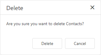
Select a file/folder and click the Delete context menu or toolbar item. In the confirmation dialog, click "Delete" to delete the file/folder.
jQuery
$(function() {
    $("#fileManagerContainer").dxFileManager({
        // ...
        onItemDeleted: function(e) {
            // your code
        }
    });
});
Angular
<dx-file-manager
    (onItemDeleted)="onItemDeleted($event)">
    <!-- ... -->
</dx-file-manager>
import { Component } from '@angular/core';

@Component({
    selector: 'app-root',
    templateUrl: './app.component.html',
    styleUrls: ['./app.component.css']
})

export class AppComponent {
    onItemDeleted(e){
        // your code
    }
}
import { BrowserModule } from '@angular/platform-browser';
import { NgModule } from '@angular/core';
import { AppComponent } from './app.component';
import { DxFileManagerModule } from 'devextreme-angular';

@NgModule({
    imports: [
        DxFileManagerModule
    ],
    declarations: [AppComponent],
    bootstrap: [AppComponent]
})
export class AppModule { }
Vue
<template>
    <DxFileManager
        :on-item-deleted="onItemDeleted" >
    </DxFileManager>
</template>

<script>
    import 'devextreme/dist/css/dx.light.css';

    import {
        DxFileManager
        // ...
    } from 'devextreme-vue/file-manager';

    export default {
        components: {
            DxFileManager
            // ...
        },
        methods: {
            onItemDeleted(e) {
                // your code
            }
        },
        data() {
            return {
                //...
            };
        }
    };
</script>
React
import React from 'react';
import FileManager from 'devextreme-react/file-manager';

const App = () => {
    const onItemDeleted = (e) => {
        // your code
    };

    return (
        <FileManager onItemDeleted={onItemDeleted}>
            <!-- ... -->
        </FileManager>
    );
};

export default App;
ASP.NET MVC Controls
@(Html.DevExtreme().FileManager()
    .OnItemDeleted("onItemDeleted");
    // ...
)

<script>
    function onItemDeleted(e) {
        // your code
    }
</script>
ASP.NET Core Controls
@(Html.DevExtreme().FileManager()
    .OnItemDeleted("onItemDeleted");
    // ...
)

<script>
    function onItemDeleted(e) {
        // your code
    }
</script>
See Also
onItemDeleting
A function that is executed before a file or directory is deleted.
Information about the event.
| Name | Type | Description |
|---|---|---|
| cancel | | |
Allows you to cancel the file or directory deletion. |
| component |
The UI component's instance. |
|
| element |
The component's container. It is an HTML Element or a jQuery Element when you use jQuery. |
|
| errorCode |
The error code. The following error codes are supported:
|
|
| errorText |
Allows you to specify the error message. |
|
| item |
The file or directory to be deleted. |
Select a file/folder and click the Delete context menu or toolbar item. In the confirmation dialog, click "Delete" to delete the file/folder.
The onItemCopying function is executed when a user clicks Delete in the confirmation dialog.
jQuery
$(function() {
    $("#file-manager").dxFileManager({
        // ...
        onItemDeleting: function (e) {
            // your code
        }
    });
});
Angular
import { DxFileManagerModule } from "devextreme-angular";
// ...
export class AppComponent {
    onItemDeleting(e) {
        // your code
    }
}
@NgModule({
    imports: [
        // ...
        DxFileManagerModule
    ],
    // ...
})
<dx-file-manager ...
    (onItemDeleting)="onItemDeleting($event)">
</dx-file-manager>
Vue
<template>
    <DxFileManager
        ...
        @on-item-deleting="onItemDeleting"
    />
</template>

<script>
import 'devextreme/dist/css/dx.light.css';

import DxFileManager from 'devextreme-vue/file-manager';

export default {
    components: {
        DxFileManager
    },
    methods: {
        onItemDeleting(e) {
            // your code
        }
    }
}
</script>
React
import React from 'react';
import FileManager from 'devextreme-react/file-manager';

const App = () => {
    const onItemDeleting = (e) => {
        // your code
    };

    return (
        <FileManager ...
            onItemDeleting={onItemDeleting} />
    );
}

export default App;
ASP.NET MVC Controls
@(Html.DevExtreme().FileManager()
    .ID("file-manager")
    // ...
    .OnItemDeleting("fm_itemDeleting_handler")
)
<script>
    function fm_itemDeleting_handler(e) {
        // your code
    }
</script>
ASP.NET Core Controls
@(Html.DevExtreme().FileManager()
    .ID("file-manager")
    // ...
    .OnItemDeleting("fm_itemDeleting_handler")
)
<script>
    function fm_itemDeleting_handler(e) {
        // your code
    }
</script>
See Also
onItemDownloading
A function that is executed before a file is downloaded.
Information about the event.
| Name | Type | Description |
|---|---|---|
| cancel | | |
Allows you to cancel the file download. |
| component |
The UI component's instance. |
|
| element |
The component's container. It is an HTML Element or a jQuery Element when you use jQuery. |
|
| errorCode |
The error code. The following error codes are supported:
|
|
| errorText |
Allows you to specify the error message. |
|
| item |
The file to be downloaded. |
Select a file and use the Download context menu or toolbar item.
The component executes the onItemDownloading function when a user clicks Download in the dialog.
jQuery
$(function() {
    $("#file-manager").dxFileManager({
        // ...
        onItemDownloading: function (e) {
            // your code
        }
    });
});
Angular
import { DxFileManagerModule } from "devextreme-angular";
// ...
export class AppComponent {
    onItemDownloading(e) {
        // your code
    }
}
@NgModule({
    imports: [
        // ...
        DxFileManagerModule
    ],
    // ...
})
<dx-file-manager ...
    (onItemDownloading)="onItemDownloading($event)">
</dx-file-manager>
Vue
<template>
    <DxFileManager
        ...
        @on-item-downloading="onItemDownloading"
    />
</template>

<script>
import 'devextreme/dist/css/dx.light.css';

import DxFileManager from 'devextreme-vue/file-manager';

export default {
    components: {
        DxFileManager
    },
    methods: {
        onItemDownloading(e) {
            // your code
        }
    }
}
</script>
React
import React from 'react';
import FileManager from 'devextreme-react/file-manager';

const App = () => {
    const onItemDownloading = (e) => {
        // your code
    };

    return (
        <FileManager ...
            onItemDownloading={onItemDownloading} />
    );
}

export default App;
ASP.NET MVC Controls
@(Html.DevExtreme().FileManager()
    .ID("file-manager")
    // ...
    .OnItemDownloading("fm_itemDownloading_handler")
)
<script>
    function fm_itemDownloading_handler(e) {
        // your code
    }
</script>
ASP.NET Core Controls
@(Html.DevExtreme().FileManager()
    .ID("file-manager")
    // ...
    .OnItemDownloading("fm_itemDownloading_handler")
)
<script>
    function fm_itemDownloading_handler(e) {
        // your code
    }
</script>
See Also
onItemMoved
A function that is executed when a file or directory is moved.
Information about the event.
| Name | Type | Description |
|---|---|---|
| component |
The UI component's instance. |
|
| element |
The component's container. It is an HTML Element or a jQuery Element when you use jQuery. |
|
| itemName |
The name of the moved file or directory. |
|
| itemPath |
The path to the moved file or directory. |
|
| parentDirectory |
The parent directory. |
|
| sourceItem |
The moved file or directory. |
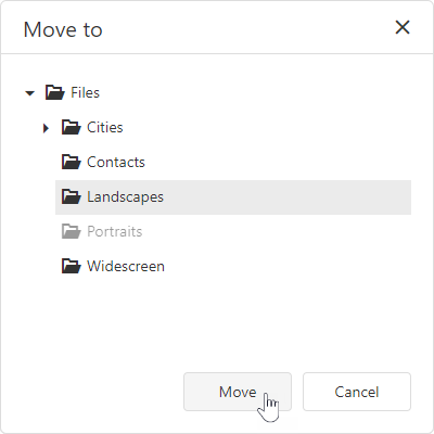
Select a file/folder and use the Move To context menu or toolbar item to invoke the "Move to" dialog. In the dialog, select the destination directory and click Move.
jQuery
$(function() {
    $("#fileManagerContainer").dxFileManager({
        // ...
        onItemMoved: function(e) {
            if (e.parentDirectory.name === 'Images'){
                // your code
            }
        }
    });
});
Angular
<dx-file-manager
    (onItemMoved)="onItemMoved($event)">
    <!-- ... -->
</dx-file-manager>
import { Component } from '@angular/core';

@Component({
    selector: 'app-root',
    templateUrl: './app.component.html',
    styleUrls: ['./app.component.css']
})

export class AppComponent {
    onItemMoved(e){
        if (e.parentDirectory.name === 'Images'){
            // your code
        }
    }
}
import { BrowserModule } from '@angular/platform-browser';
import { NgModule } from '@angular/core';
import { AppComponent } from './app.component';
import { DxFileManagerModule } from 'devextreme-angular';

@NgModule({
    imports: [
        DxFileManagerModule
    ],
    declarations: [AppComponent],
    bootstrap: [AppComponent]
})
export class AppModule { }
Vue
<template>
    <DxFileManager
        :on-item-moved="onItemMoved" >
    </DxFileManager>
</template>

<script>
    import 'devextreme/dist/css/dx.light.css';

    import {
        DxFileManager
        // ...
    } from 'devextreme-vue/file-manager';

    export default {
        components: {
            DxFileManager
            // ...
        },
        methods: {
            onItemMoved(e) {
                if (e.parentDirectory.name === 'Images'){
                    // your code
                }
            }
        },
        data() {
            return {
                //...
            };
        }
    };
</script>
React
import React from 'react';
import FileManager from 'devextreme-react/file-manager';

const App = () => {
    const onItemMoved = (e) => {
        if (e.parentDirectory.name === 'Images'){
            // your code
        }
    };

    return (
        <FileManager onItemMoved={onItemMoved}>
            <!-- ... -->
        </FileManager>
    );
};

export default App;
ASP.NET MVC Controls
@(Html.DevExtreme().FileManager()
    .OnItemMoved("onItemMoved");
    // ...
)

<script>
    function onItemMoved(e) {
        if (e.parentDirectory.name === 'Images'){
            // your code
        }
    }
</script>
ASP.NET Core Controls
@(Html.DevExtreme().FileManager()
    .OnItemMoved("onItemMoved");
    // ...
)

<script>
    function onItemMoved(e) {
        if (e.parentDirectory.name === 'Images'){
            // your code
        }
    }
</script>
See Also
onItemMoving
A function that is executed before a file or directory is moved.
Information about the event.
| Name | Type | Description |
|---|---|---|
| cancel | | |
Allows you to cancel the file or directory move process. |
| component |
The UI component's instance. |
|
| destinationDirectory |
The directory where a file is moved to. |
|
| element |
The component's container. It is an HTML Element or a jQuery Element when you use jQuery. |
|
| errorCode |
The error code. The following error codes are supported:
|
|
| errorText |
Allows you to specify the error message. |
|
| item |
The file or directory to be moved. |
Select a file/folder and use the Move To context menu or toolbar item to invoke the "Move to" dialog. In the dialog, select the destination directory and click Move.
The component executes the onItemMoving function when a user clicks Move in the dialog.
jQuery
$(function() {
    $("#file-manager").dxFileManager({
        // ...
        onItemMoving: function (e) {
            if (e.destinationDirectory === 'Images'){
                // your code
                e.cancel = true;
            }
        }
    });
});
Angular
import { DxFileManagerModule } from "devextreme-angular";
// ...
export class AppComponent {
    onItemMoving(e) {
        if (e.destinationDirectory === 'Images'){
            // your code
            e.cancel = true;
        }
    }
}
@NgModule({
    imports: [
        // ...
        DxFileManagerModule
    ],
    // ...
})
<dx-file-manager ...
    (onItemMoving)="onItemMoving($event)">
</dx-file-manager>
Vue
<template>
    <DxFileManager
        ...
        @on-item-moving="onItemMoving"
    />
</template>

<script>
import 'devextreme/dist/css/dx.light.css';

import DxFileManager from 'devextreme-vue/file-manager';

export default {
    components: {
        DxFileManager
    },
    methods: {
        onItemMoving(e) {
            if (e.destinationDirectory === 'Images'){
                // your code
                e.cancel = true;
            }
        }
    }
}
</script>
React
import React from 'react';
import FileManager from 'devextreme-react/file-manager';

const App = () => {
    const onItemMoving = (e) => {
        if (e.destinationDirectory === 'Images'){
            // your code
            e.cancel = true;
        }
    };

    return (
        <FileManager ...
            onItemMoving={onItemMoving} />
    );
}

export default App;
ASP.NET MVC Controls
@(Html.DevExtreme().FileManager()
    .ID("file-manager")
    // ...
    .OnItemMoving("fm_itemMoving_handler")
)
<script>
    function fm_itemMoving_handler(e) {
        if (e.destinationDirectory === 'Images'){
            // your code
            e.cancel = true;
        }
    }
</script>
ASP.NET Core Controls
@(Html.DevExtreme().FileManager()
    .ID("file-manager")
    // ...
    .OnItemMoving("fm_itemMoving_handler")
)
<script>
    function fm_itemMoving_handler(e) {
        if (e.destinationDirectory === 'Images'){
            // your code
            e.cancel = true;
        }
    }
</script>
See Also
onItemRenamed
A function that is executed when a file or directory is renamed.
Information about the event.
| Name | Type | Description |
|---|---|---|
| component |
The UI component's instance. |
|
| element |
The component's container. It is an HTML Element or a jQuery Element when you use jQuery. |
|
| itemName |
The current name of the renamed file or directory. |
|
| sourceItem |
The renamed file or directory. |
Select a file/directory and click the Rename context menu or toolbar item to invoke the dialog. In the dialog, enter a new name and click Save.
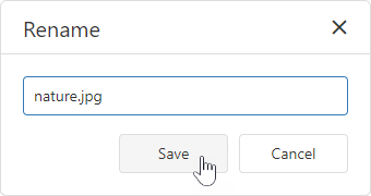
jQuery
$(function() {
    $("#fileManagerContainer").dxFileManager({
        // ...
        onItemRenamed: function(e) {
            if (e.itemName === 'test.png'){
                // your code
            }
        }
    });
});
Angular
<dx-file-manager
    (onItemRenamed)="onItemRenamed($event)">
    <!-- ... -->
</dx-file-manager>
import { Component } from '@angular/core';

@Component({
    selector: 'app-root',
    templateUrl: './app.component.html',
    styleUrls: ['./app.component.css']
})

export class AppComponent {
    onItemRenamed(e){
        if (e.itemName === 'test.png'){
            // your code
        }
    }
}
import { BrowserModule } from '@angular/platform-browser';
import { NgModule } from '@angular/core';
import { AppComponent } from './app.component';
import { DxFileManagerModule } from 'devextreme-angular';

@NgModule({
    imports: [
        DxFileManagerModule
    ],
    declarations: [AppComponent],
    bootstrap: [AppComponent]
})
export class AppModule { }
Vue
<template>
    <DxFileManager
        :on-item-renamed="onItemRenamed" >
    </DxFileManager>
</template>

<script>
    import 'devextreme/dist/css/dx.light.css';

    import {
        DxFileManager
        // ...
    } from 'devextreme-vue/file-manager';

    export default {
        components: {
            DxFileManager
            // ...
        },
        methods: {
            onItemRenamed(e) {
                if (e.itemName === 'test.png'){
                    // your code
                }
            }
        },
        data() {
            return {
                //...
            };
        }
    };
</script>
React
import React from 'react';
import FileManager from 'devextreme-react/file-manager';

const App = () => {
    const onItemRenamed = (e) => {
        if (e.itemName === 'test.png'){
            // your code
        }
    };

    return (
        <FileManager onItemRenamed={onItemRenamed}>
            <!-- ... -->
        </FileManager>
    );
};

export default App;
ASP.NET MVC Controls
@(Html.DevExtreme().FileManager()
    .OnItemRenamed("onItemRenamed");
    // ...
)

<script>
    function onItemRenamed(e) {
        if (e.itemName === 'test.png'){
            // your code
        }
    }
</script>
ASP.NET Core Controls
@(Html.DevExtreme().FileManager()
    .OnItemRenamed("onItemRenamed");
    // ...
)

<script>
    function onItemRenamed(e) {
        if (e.itemName === 'test.png'){
            // your code
        }
    }
</script>
See Also
onItemRenaming
A function that is executed before a file or directory is renamed.
Information about the event.
| Name | Type | Description |
|---|---|---|
| cancel | | |
Allows you to cancel the file or directory rename. |
| component |
The UI component's instance. |
|
| element |
The component's container. It is an HTML Element or a jQuery Element when you use jQuery. |
|
| errorCode |
The error code. The following error codes are supported:
|
|
| errorText |
Allows you to specify the error message. |
|
| item |
The file or directory to be renamed. |
|
| newName |
The new name of the file or directory. This parameter is read-only. |
Select a file/directory and click the Rename context menu or toolbar item to invoke the dialog. In the dialog, enter a new name and click Save.
The component executes the onItemRenaming function when a user enters a new file/directory name and clicks Save in the dialog.
jQuery
$(function() {
    $("#file-manager").dxFileManager({
        // ...
        onItemRenaming: function (e) {
            if (e.newName === 'nature.png'){
                // your code
                e.cancel = true;
            }
        }
    });
});
Angular
import { DxFileManagerModule } from "devextreme-angular";
// ...
export class AppComponent {
    onItemRenaming(e) {
        if (e.newName === 'nature.png'){
            // your code
            e.cancel = true;
        }
    }
}
@NgModule({
    imports: [
        // ...
        DxFileManagerModule
    ],
    // ...
})
<dx-file-manager ...
    (onItemRenaming)="onItemRenaming($event)">
</dx-file-manager>
Vue
<template>
    <DxFileManager
        ...
        @on-item-renaming="onItemRenaming"
    />
</template>

<script>
import 'devextreme/dist/css/dx.light.css';

import DxFileManager from 'devextreme-vue/file-manager';

export default {
    components: {
        DxFileManager
    },
    methods: {
        onItemRenaming(e) {
            if (e.newName === 'nature.png'){
                // your code
                e.cancel = true;
            }
        }
    }
}
</script>
React
import React from 'react';
import FileManager from 'devextreme-react/file-manager';

const App = () => {
    const onItemRenaming = (e) => {
        if (e.newName === 'nature.png'){
            // your code
            e.cancel = true;
        }
    };

    return (
        <FileManager ...
            onItemRenaming={onItemRenaming} />
    );
}

export default App;
ASP.NET MVC Controls
@(Html.DevExtreme().FileManager()
    .ID("file-manager")
    // ...
    .OnItemRenaming("fm_itemRenaming_handler")
)
<script>
    function fm_itemRenaming_handler(e) {
        if (e.newName === 'nature.png'){
            // your code
            e.cancel = true;
        }
    }
</script>
ASP.NET Core Controls
@(Html.DevExtreme().FileManager()
    .ID("file-manager")
    // ...
    .OnItemRenaming("fm_itemRenaming_handler")
)
<script>
    function fm_itemRenaming_handler(e) {
        if (e.newName === 'nature.png'){
            // your code
            e.cancel = true;
        }
    }
</script>
See Also
onOptionChanged
A function that is executed after a UI component property is changed.
Information about the event.
| Name | Type | Description |
|---|---|---|
| value | any |
The modified property's new value. |
| previousValue | any |
The UI component's previous value. |
| name |
The modified property if it belongs to the first level. Otherwise, the first-level property it is nested into. |
|
| fullName |
The path to the modified property that includes all parent properties. |
|
| element |
The UI component's container. It is an HTML Element or a jQuery Element when you use jQuery. |
|
| component |
The UI component's instance. |
The following example shows how to subscribe to component property changes:
jQuery
$(function() {
$("#fileManagerContainer").dxFileManager({
// ...
onOptionChanged: function(e) {
if(e.name === "changedProperty") {
// handle the property change here
}
}
});
});Angular
<dx-file-manager ...
(onOptionChanged)="handlePropertyChange($event)">
</dx-file-manager>
import { Component } from '@angular/core';
@Component({
selector: 'app-root',
templateUrl: './app.component.html',
styleUrls: ['./app.component.css']
})
export class AppComponent {
// ...
handlePropertyChange(e) {
if(e.name === "changedProperty") {
// handle the property change here
}
}
}
import { BrowserModule } from '@angular/platform-browser';
import { NgModule } from '@angular/core';
import { AppComponent } from './app.component';
import { DxFileManagerModule } from 'devextreme-angular';
@NgModule({
declarations: [
AppComponent
],
imports: [
BrowserModule,
DxFileManagerModule
],
providers: [ ],
bootstrap: [AppComponent]
})
export class AppModule { } Vue
<template>
<DxFileManager ...
@option-changed="handlePropertyChange"
/>
</template>
<script>
import 'devextreme/dist/css/dx.light.css';
import DxFileManager from 'devextreme-vue/file-manager';
export default {
components: {
DxFileManager
},
// ...
methods: {
handlePropertyChange: function(e) {
if(e.name === "changedProperty") {
// handle the property change here
}
}
}
}
</script> React
import React from 'react';
import 'devextreme/dist/css/dx.light.css';
import FileManager from 'devextreme-react/file-manager';
const handlePropertyChange = (e) => {
if(e.name === "changedProperty") {
// handle the property change here
}
}
export default function App() {
return (
<FileManager ...
onOptionChanged={handlePropertyChange}
/>
);
} onSelectedFileOpened
A function that is executed when the selected file is opened.
Information about the event that caused the function's execution.
| Name | Type | Description |
|---|---|---|
| component |
The UI component's instance. |
|
| element |
The UI component's container. It is an HTML Element or a jQuery Element when you use jQuery. |
|
| file |
The opened file. |
jQuery
$(function() {
$("#fileManagerContainer").dxFileManager({
// ...
onSelectedFileOpened: function(e) {
// Your code goes here
}
});
});Angular
<dx-file-manager ...
(onSelectedFileOpened)="fileManager_onSelectedFileOpened($event)">
</dx-file-manager>
import { Component } from '@angular/core';
@Component({
selector: 'app-root',
templateUrl: './app.component.html',
styleUrls: ['./app.component.css']
})
export class AppComponent {
fileManager_onSelectedFileOpened(e) {
// Your code goes here
}
}
import { BrowserModule } from '@angular/platform-browser';
import { NgModule } from '@angular/core';
import { AppComponent } from './app.component';
import { DxFileManagerModule } from 'devextreme-angular';
@NgModule({
declarations: [
AppComponent
],
imports: [
BrowserModule,
DxFileManagerModule
],
providers: [],
bootstrap: [AppComponent]
})
export class AppModule { }Vue
<template>
<DxFileManager ...
:on-selected-file-opened="fileManager_onSelectedFileOpened"
/>
</template>
<script>
import 'devextreme/dist/css/dx.light.css';
import DxFileManager from 'devextreme-vue/file-manager';
export default {
components: {
DxFileManager
},
methods: {
fileManager_onSelectedFileOpened(e) {
// Your code goes here
}
}
}
</script>React
import React from 'react';
import 'devextreme/dist/css/dx.light.css';
import FileManager from 'devextreme-react/file-manager';
class App extends React.Component {
fileManager_onSelectedFileOpened(e) {
// Your code goes here
}
render() {
return (
<FileManager ...
onSelectedFileOpened={this.fileManager_onSelectedFileOpened}
/>
);
}
}
export default App;ASP.NET MVC Controls
@(Html.DevExtreme().FileManager()
.OnSelectedFileOpened("fileManager_onSelectedFileOpened");
// ...
)
<script>
function fileManager_onSelectedFileOpened(e) {
// your code
}
</script>ASP.NET Core Controls
@(Html.DevExtreme().FileManager()
.OnSelectedFileOpened("fileManager_onSelectedFileOpened");
// ...
)
<script>
function fileManager_onSelectedFileOpened(e) {
// your code
}
</script>onSelectionChanged
A function that is executed when a file system item is selected or selection is canceled.
Information about the event that caused the function's execution.
| Name | Type | Description |
|---|---|---|
| component |
The UI component's instance. |
|
| currentDeselectedItemKeys |
The keys of the file system items whose selection has been cleared. |
|
| currentSelectedItemKeys |
The keys of the file system items that have been selected. |
|
| element |
The UI component's container. It is an HTML Element or a jQuery Element when you use jQuery. |
|
| selectedItemKeys |
The keys of all selected file system items. |
|
| selectedItems |
The currently selected file system items. |
jQuery
$(function() {
$("#fileManagerContainer").dxFileManager({
// ...
onSelectionChanged: function(e) {
// Your code goes here
}
});
});Angular
<dx-file-manager ...
(onSelectionChanged)="fileManager_onSelectionChanged($event)">
</dx-file-manager>
import { Component } from '@angular/core';
@Component({
selector: 'app-root',
templateUrl: './app.component.html',
styleUrls: ['./app.component.css']
})
export class AppComponent {
fileManager_onSelectionChanged(e) {
// Your code goes here
}
}
import { BrowserModule } from '@angular/platform-browser';
import { NgModule } from '@angular/core';
import { AppComponent } from './app.component';
import { DxFileManagerModule } from 'devextreme-angular';
@NgModule({
declarations: [
AppComponent
],
imports: [
BrowserModule,
DxFileManagerModule
],
providers: [],
bootstrap: [AppComponent]
})
export class AppModule { }Vue
<template>
<DxFileManager ...
:on-selection-changed="fileManager_onSelectionChanged"
/>
</template>
<script>
import 'devextreme/dist/css/dx.light.css';
import DxFileManager from 'devextreme-vue/file-manager';
export default {
components: {
DxFileManager
},
methods: {
fileManager_onSelectionChanged(e) {
// Your code goes here
}
}
}
</script>React
import React from 'react';
import 'devextreme/dist/css/dx.light.css';
import FileManager from 'devextreme-react/file-manager';
class App extends React.Component {
fileManager_onSelectionChanged(e) {
// Your code goes here
}
render() {
return (
<FileManager ...
onSelectionChanged={this.fileManager_onSelectionChanged}
/>
);
}
}
export default App;ASP.NET MVC Controls
@(Html.DevExtreme().FileManager()
.OnSelectionChanged("fileManager_onSelectionChanged");
// ...
)
<script>
function fileManager_onSelectionChanged(e) {
// your code
}
</script>ASP.NET Core Controls
@(Html.DevExtreme().FileManager()
.OnSelectionChanged("fileManager_onSelectionChanged");
// ...
)
<script>
function fileManager_onSelectionChanged(e) {
// your code
}
</script>onToolbarItemClick
A function that is executed when a toolbar item is clicked.
Information about the event that caused the function's execution.
| Name | Type | Description |
|---|---|---|
| component |
The UI component's instance. |
|
| element |
The UI component's container. It is an HTML Element or a jQuery Element when you use jQuery. |
|
| event | Event (jQuery or EventObject) |
The event that caused the function to execute. It is an EventObject or a jQuery.Event when you use jQuery. |
| itemData |
The clicked item's data. |
|
| itemElement |
The item's container. It is an HTML Element or a jQuery Element when you use jQuery. |
|
| itemIndex |
The clicked item's index. |
jQuery
$(function() {
$("#fileManagerContainer").dxFileManager({
// ...
onToolbarItemClick: function(e) {
// Your code goes here
}
});
});Angular
<dx-file-manager ...
(onToolbarItemClick)="fileManager_onToolbarItemClick($event)">
</dx-file-manager>
import { Component } from '@angular/core';
@Component({
selector: 'app-root',
templateUrl: './app.component.html',
styleUrls: ['./app.component.css']
})
export class AppComponent {
fileManager_onToolbarItemClick(e) {
// Your code goes here
}
}
import { BrowserModule } from '@angular/platform-browser';
import { NgModule } from '@angular/core';
import { AppComponent } from './app.component';
import { DxFileManagerModule } from 'devextreme-angular';
@NgModule({
declarations: [
AppComponent
],
imports: [
BrowserModule,
DxFileManagerModule
],
providers: [],
bootstrap: [AppComponent]
})
export class AppModule { }Vue
<template>
<DxFileManager ...
:on-toolbar-item-click="fileManager_onToolbarItemClick"
/>
</template>
<script>
import 'devextreme/dist/css/dx.light.css';
import DxFileManager from 'devextreme-vue/file-manager';
export default {
components: {
DxFileManager
},
methods: {
fileManager_onToolbarItemClick(e) {
// Your code goes here
}
}
}
</script>React
import React from 'react';
import 'devextreme/dist/css/dx.light.css';
import FileManager from 'devextreme-react/file-manager';
class App extends React.Component {
fileManager_onToolbarItemClick(e) {
// Your code goes here
}
render() {
return (
<FileManager ...
onToolbarItemClick={this.fileManager_onToolbarItemClick}
/>
);
}
}
export default App;ASP.NET MVC Controls
@(Html.DevExtreme().FileManager()
.onToolbarItemClick("fileManager_onToolbarItemClick");
// ...
)
<script>
function fileManager_onToolbarItemClick(e) {
// your code
}
</script>ASP.NET Core Controls
@(Html.DevExtreme().FileManager()
.onToolbarItemClick("fileManager_onToolbarItemClick");
// ...
)
<script>
function fileManager_onToolbarItemClick(e) {
// your code
}
</script>permissions
Specifies actions that a user is allowed to perform on files and directories.
jQuery
$(function () {
$("#file-manager").dxFileManager({
permissions: {
create: true,
copy: true,
move: true,
remove: true,
rename: true
},
// ...
});
});Angular
<dx-file-manager id="fileManager">
<dxo-file-manager-permissions
create="true"
copy="true"
move="true"
delete="true"
rename="true"
upload="true"
download="true">
</dxo-file-manager-permissions>
<!-- ... -->
</dx-file-manager>
import { DxFileManagerModule } from "devextreme-angular";
// ...
export class AppComponent {
// ...
}
@NgModule({
imports: [
// ...
DxFileManagerModule
],
// ...
})Vue
<template>
<DxFileManager>
<DxPermissions
:create="true"
:copy="true"
:move="true"
:delete="true"
:rename="true"
:upload="true"
:download="true"
/>
</DxFileManager>
</template>
<script>
import 'devextreme/dist/css/dx.light.css';
import { DxFileManager, DxPermissions } from 'devextreme-vue/file-manager';
export default {
components: {
DxFileManager,
DxPermissions
},
data() {
return {
// ...
}
}
}
</script>React
import React from 'react';
import FileManager, { Permissions } from 'devextreme-react/file-manager';
const App = () => {
return (
<FileManager>
<Permissions
create={true}
copy={true}
move={true}
delete={true}
rename={true}
upload={true}
download={true}>
</Permissions>
</FileManager>
);
};
export default App;ASP.NET MVC Controls
@(Html.DevExtreme().FileManager()
.Permissions(permissions => permissions
.Create(true)
.Copy(true)
.Move(true)
.Delete(true)
.Rename(true)
.Upload(true)
.Download(true)
)
// ...
)ASP.NET Core Controls
@(Html.DevExtreme().FileManager()
.Permissions(permissions => permissions
.Create(true)
.Copy(true)
.Move(true)
.Delete(true)
.Rename(true)
.Upload(true)
.Download(true)
)
// ...
)rootFolderName
Specifies the root directory display name.
jQuery
$(function () {
$("#file-manager").dxFileManager({
rootFolderName: "Custom Root Folder"
// ...
});
});Angular
<dx-file-manager
id="fileManager"
rootFolderName="Custom Root Folder"
>
<!-- ... -->
</dx-file-manager>
import { BrowserModule } from '@angular/platform-browser';
import { NgModule } from '@angular/core';
import { AppComponent } from './app.component';
import { DxFileManagerModule } from 'devextreme-angular';
@NgModule({
declarations: [
AppComponent
],
imports: [
BrowserModule,
DxFileManagerModule
],
//...
})
export class AppModule { } Vue
<template>
<DxFileManager
root-folder-name="Custom Root Folder"
>
</DxFileManager>
</template>
<script>
import 'devextreme/dist/css/dx.light.css';
import {
DxFileManager
} from 'devextreme-vue/file-manager';
export default {
components: {
DxFileManager
},
data() {
return {
// ...
};
}
};
</script>React
import React from 'react';
import 'devextreme/dist/css/dx.light.css';
import FileManager from 'devextreme-react/file-manager';
class App extends React.Component {
render() {
return (
<FileManager
rootFolderName="Custom Root Folder"
>
</FileManager>
);
}
}
export default App;ASP.NET MVC Controls
@(Html.DevExtreme().FileManager()
.RootFolderName("Custom Root Folder")
// ...
)ASP.NET Core Controls
@(Html.DevExtreme().FileManager()
.RootFolderName("Custom Root Folder")
// ...
)rtlEnabled
Switches the UI component to a right-to-left representation.
When this property is set to true, the UI component text flows from right to left, and the layout of elements is reversed. To switch the entire application/site to the right-to-left representation, assign true to the rtlEnabled field of the object passed to the DevExpress.config(config) method.
DevExpress.config({
rtlEnabled: true
});selectedItemKeys
Contains an array of initially or currently selected files and directories' keys.
jQuery
$(function() {
$("#fileManagerContainer").dxFileManager({
// ...
selectedItemKeys: ["item1_key", "item2_key", "item3_key"]
});
});Angular
<dx-file-manager id="fileManager"
[selectedItemKeys]="['item1_key', 'item2_key', 'item3_key']">
<!-- ... -->
</dx-file-manager>
import { BrowserModule } from '@angular/platform-browser';
import { NgModule } from '@angular/core';
import { AppComponent } from './app.component';
import { DxFileManagerModule } from 'devextreme-angular';
@NgModule({
declarations: [
AppComponent
],
imports: [
BrowserModule,
DxFileManagerModule
],
//...
})
export class AppModule { } Vue
<template>
<DxFileManager
:selected-item-keys="keys" >
</DxFileManager>
</template>
<script>
import 'devextreme/dist/css/dx.light.css';
import {
DxFileManager
} from 'devextreme-vue/file-manager';
export default {
components: {
DxFileManager
},
data() {
return {
keys: ['item1_key', 'item2_key', 'item3_key']
};
}
};
</script>React
import React from 'react';
import 'devextreme/dist/css/dx.light.css';
import FileManager from 'devextreme-react/file-manager';
const keys = ['item1_key', 'item2_key', 'item3_key']
class App extends React.Component {
render() {
return (
<FileManager selectedItemKeys={keys} >
</FileManager>
);
}
}
export default App;ASP.NET MVC Controls
@(Html.DevExtreme().FileManager()
.SelectedItemKeys(new[] { "item1_key", "item2_key", "item3_key" })
// ...
)ASP.NET Core Controls
@(Html.DevExtreme().FileManager()
.SelectedItemKeys(new[] { "item1_key", "item2_key", "item3_key" })
// ...
)selectionMode
Specifies whether a user can select a single or multiple files and directories in the item view simultaneously.
jQuery
$(function () {
$("#file-manager").dxFileManager({
selectionMode: "single"
// ...
});
});Angular
<dx-file-manager id="fileManager"
[selectionMode]="single">
<!-- ... -->
</dx-file-manager>
import { BrowserModule } from '@angular/platform-browser';
import { NgModule } from '@angular/core';
import { AppComponent } from './app.component';
import { DxFileManagerModule } from 'devextreme-angular';
@NgModule({
declarations: [
AppComponent
],
imports: [
BrowserModule,
DxFileManagerModule
],
//...
})
export class AppModule { } Vue
<template>
<DxFileManager
:selection-mode="single" >
</DxFileManager>
</template>
<script>
import 'devextreme/dist/css/dx.light.css';
import {
DxFileManager
} from 'devextreme-vue/file-manager';
export default {
components: {
DxFileManager
},
data() {
return {
// ...
};
}
};
</script>React
import React from 'react';
import 'devextreme/dist/css/dx.light.css';
import FileManager from 'devextreme-react/file-manager';
class App extends React.Component {
render() {
return (
<FileManager selectionMode={single} >
</FileManager>
);
}
}
export default App;ASP.NET MVC Controls
@(Html.DevExtreme().FileManager()
.SelectionMode(FileManagerSelectionMode.Single)
// ...
)ASP.NET Core Controls
@(Html.DevExtreme().FileManager()
.SelectionMode(FileManagerSelectionMode.Single)
// ...
)tabIndex
Specifies the number of the element when the Tab key is used for navigating.
The value of this property will be passed to the tabindex attribute of the HTML element that underlies the UI component.
toolbar
Configures toolbar settings.
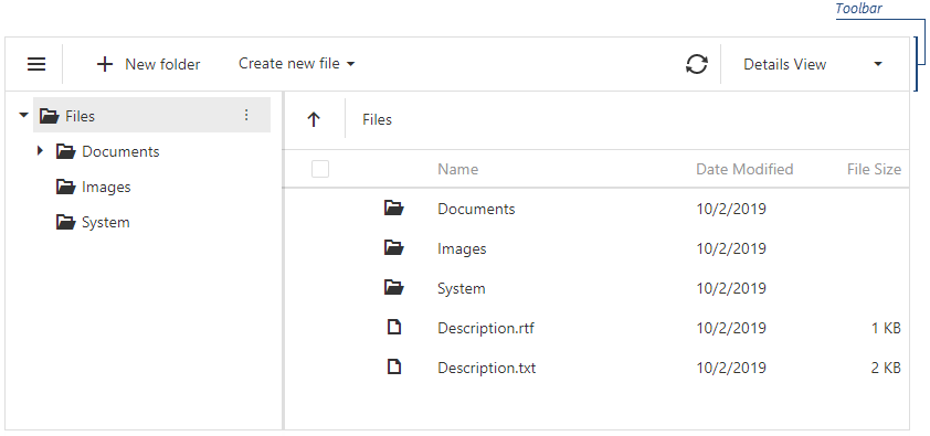
The FileManager UI component allows you to add default and custom toolbar items.
Predefined Items
Predefined toolbar items include:
- 'showNavPane' - Shows or hides the navigation panel.
- 'create' - Creates a new directory.
- 'upload' - Uploads a file.
- 'refresh' - Refreshes the file manager content and shows the progress panel.
- 'download' - Downloads a file.
- 'move' - Moves files and directories.
- 'copy' - Copies files and directories.
- 'rename' - Renames files and directories.
- 'delete' - Deletes files and directories.
- 'switchView' - Switches between the 'Details' and 'Thumbnails' file system representation modes.
- 'clearSelection' - Clears selection from files and directories in the Item View area.
To add a predefined item to the toolbar, specify its name and optional settings ('visible', 'location', 'locateInMenu', 'text', 'icon', 'disabled') and add the item to one of the following collections:
items - Displays toolbar items when no file system item is selected.
fileSelectionItems - Displays toolbar items when one or more file system items are selected.
jQuery
$(function () {
$("#file-manager").dxFileManager({
toolbar: {
items: [
// Specifies a predefined item's name and optional settings
{
name: "create",
text: "Create a directory",
icon: "newfolder"
},
// Specifies a predefined item's name only
"switchView", "separator"
//...
]
fileSelectionItems: [
"copy", "rename"
//...
]
}
});
});Angular
<dx-file-manager>
<dxo-file-manager-toolbar>
<!-- Specifies a predefined item's name and optional settings -->
<dxi-file-manager-item name="create" text="Create a directory" icon="newfolder"></dxi-file-manager-item>
<!-- Specifies a predefined item's name only -->
<dxi-file-manager-item name="switchView"></dxi-file-manager-item>
<dxi-file-manager-item name="separator"></dxi-file-manager-item>
<!-- Specifies items that are visible when users select files -->
<dxi-file-manager-file-selection-item name="copy"></dxi-file-manager-file-selection-item>
<dxi-file-manager-file-selection-item name="rename"></dxi-file-manager-file-selection-item>
</dxo-file-manager-toolbar>
</dx-file-manager>
import { BrowserModule } from '@angular/platform-browser';
import { NgModule } from '@angular/core';
import { AppComponent } from './app.component';
import { DxFileManagerModule } from 'devextreme-angular';
@NgModule({
declarations: [
AppComponent
],
imports: [
BrowserModule,
DxFileManagerModule
],
//...
})
export class AppModule { } Vue
<template>
<DxFileManager>
<DxToolbar>
<!-- Specifies a predefined item's name and optional settings -->
<DxItem name="create" text="Create a directory" icon="newfolder" />
<!-- Specifies a predefined item's name only -->
<DxItem name="switchView"/>
<DxItem name="separator"/>
<!-- Specifies items that are visible when users select files -->
<DxFileSelectionItem name="copy"/>
<DxFileSelectionItem name="rename"/>
</DxToolbar>
</DxFileManager>
</template>
<script>
import 'devextreme/dist/css/dx.light.css';
import {
DxFileManager,
DxToolbar,
DxItem,
DxFileSelectionItem
} from 'devextreme-vue/file-manager';
export default {
components: {
DxFileManager,
DxToolbar,
DxItem,
DxFileSelectionItem
},
data() {
return {
//...
};
}
};
</script>React
import React from 'react';
import 'devextreme/dist/css/dx.light.css';
import FileManager, { Toolbar, Item, FileSelectionItem } from 'devextreme-react/file-manager';
class App extends React.Component {
render() {
return (
<FileManager>
<Toolbar>
{/* Specifies a predefined item's name and optional settings */}
<Item name="create" text="Create a directory" icon="newfolder" />
{/* Specifies a predefined item's name only */}
<Item name="switchView" />
<Item name="separator" />
{/* Specifies items that are visible when users select files */}
<FileSelectionItem name="copy" />
<FileSelectionItem name="rename" />
</Toolbar>
</FileManager>
);
}
}
export default App;ASP.NET Core Controls
@(Html.DevExtreme().Gantt()
.Toolbar(toolbar => {
toolbar.Items(items => {
// Specifies a predefined item's name and optional settings
items.Add().Name(FileManagerToolbarItem.Create).Text("Create a directory").Icon("newfolder");
// Specifies a predefined item's name only
items.Add().Name(FileManagerToolbarItem.SwitchView);
items.Add().Name(FileManagerToolbarItem.Create);
});
// Specifies items that are visible when users select files
toolbar.FileSelectionItems(items => {
items.Add().Name(FileManagerToolbarItem.Copy);
items.Add().Name(FileManagerToolbarItem.Rename);
});
})
)ASP.NET MVC Controls
@(Html.DevExtreme().Gantt()
.Toolbar(toolbar => {
toolbar.Items(items => {
// Specifies a predefined item's name and optional settings
items.Add().Name(FileManagerToolbarItem.Create).Text("Create a directory").Icon("newfolder");
// Specifies a predefined item's name only
items.Add().Name(FileManagerToolbarItem.SwitchView);
items.Add().Name(FileManagerToolbarItem.Create);
});
// Specifies items that are visible when users select files
toolbar.FileSelectionItems(items => {
items.Add().Name(FileManagerToolbarItem.Copy);
items.Add().Name(FileManagerToolbarItem.Rename);
});
})
)Custom Items
To add a custom toolbar item, specify its text and optional settings (for example, a file extension for the toolbar item that creates a new file) and add the item to one of the following collections:
items - Displays toolbar items when no file system item is selected.
fileSelectionItems - Displays toolbar items when one or more file system items are selected.
The widget property allows you to specify a UI component for a custom toolbar item (dxButton is the default UI component). Use the toolbarItemClick event to handle clicks on custom toolbar items.
jQuery
$(function () {
$("#file-manager").dxFileManager({
toolbar: {
items: [
// Specifies a custom item as a dxMenu UI component
{
widget: "dxMenu",
options: {
items: [
{
text: "Create new file",
icon: "plus",
items: [
{
text: "Text Document",
extension: ".txt"
},
{
text: "RTF Document",
extension: ".rtf"
},
{
text: "Spreadsheet",
extension: ".xls"
}]
}
],
}
}]
},
onToolbarItemClick: onItemClick
});
});
function onItemClick(args) {
// ...
}Angular
<dx-file-manager>
<dxo-file-manager-toolbar>
<dxi-file-manager-item widget="dxMenu" [options]="fileMenuOptions"></dxi-file-manager-item>
</dxo-file-manager-toolbar>
</dx-file-manager>
import { Component } from '@angular/core';
import { Service } from './app.service';
@Component({
selector: 'app-root',
templateUrl: './app.component.html',
styleUrls: ['./app.component.css'],
providers: [Service]
})
export class AppComponent {
constructor(service: Service) {
this.fileMenuOptions = {
items: [
{
text: "Create new file",
icon: "plus",
items: [
{
text: "Text Document",
options: {
extension: ".txt",
}
},
{
text: "RTF Document",
options: {
extension: ".rtf",
}
},
{
text: "Spreadsheet",
options: {
extension: ".xls",
}
}
]
}
],
onItemClick: () => {
// ...
}
};
}
}
import { BrowserModule } from '@angular/platform-browser';
import { NgModule } from '@angular/core';
import { AppComponent } from './app.component';
import { DxFileManagerModule } from 'devextreme-angular';
@NgModule({
imports: [
BrowserModule,
DxFileManagerModule
],
declarations: [AppComponent],
bootstrap: [AppComponent]
})
export class AppModule { }Vue
<template>
<DxFileManager>
<DxToolbar>
<DxItem
widget="dxMenu"
:options="fileMenuOptions"
/>
</DxToolbar>
</DxFileManager>
</template>
<script>
import 'devextreme/dist/css/dx.light.css';
import {
DxFileManager,
DxToolbar,
DxItem
} from 'devextreme-vue/file-manager';
export default {
components: {
DxFileManager,
DxToolbar,
DxItem
},
data() {
return {
fileMenuOptions: {
items: [
{
text: "Create new file",
icon: "plus",
items: [
{
text: "Text Document",
options: {
extension: ".txt",
}
},
{
text: "RTF Document",
options: {
extension: ".rtf",
}
},
{
text: "Spreadsheet",
options: {
extension: ".xls",
}
}
]
}
],
onItemClick: this.onItemClick
};
},
methods:{
onItemClick() {
// ...
}
}
};
</script>React
import React from 'react';
import 'devextreme/dist/css/dx.light.css';
import FileManager, { Toolbar, Item } from 'devextreme-react/file-manager';
const App = () => {
const fileMenuOptions = {
items: [
{
text: 'Create new file',
icon: 'plus',
items: [
{
text: 'Text Document',
extension: '.txt'
},
{
text: 'RTF Document',
extension: '.rtf'
},
{
text: 'Spreadsheet',
extension: '.xls'
}
]
}
],
onItemClick: 'onItemClick'
};
const onItemClick = (e) => {
// ...
};
return (
<FileManager>
<Toolbar>
<Item widget="dxMenu" options={this.fileMenuOptions} />
</Toolbar>
</FileManager>
);
};
export default App;ASP.NET Core Controls
@(Html.DevExtreme().Gantt()
.Toolbar(toolbar => {
toolbar.Items(items => {
items.Add()
.Widget(widget => widget.Menu()
.Items(menuItems => {
menuItems.Add()
.Text("Create new file")
.Icon("plus")
.Items(subItems => {
subItems.Add()
.Text("Text Document")
.Option("extension", ".txt");
subItems.Add()
.Text("RTF Document")
.Option("extension", ".rtf");
subItems.Add()
.Text("Spreadsheet")
.Option("extension", ".xls");
});
})
.OnItemClick("onItemClick")
);
})
})
)
<script type="text/javascript">
function onItemClick() {
// ...
}
</script> ASP.NET MVC Controls
@(Html.DevExtreme().Gantt()
.Toolbar(toolbar => {
toolbar.Items(items => {
items.Add()
.Widget(widget => widget.Menu()
.Items(menuItems => {
menuItems.Add()
.Text("Create new file")
.Icon("plus")
.Items(subItems => {
subItems.Add()
.Text("Text Document")
.Option("extension", ".txt");
subItems.Add()
.Text("RTF Document")
.Option("extension", ".rtf");
subItems.Add()
.Text("Spreadsheet")
.Option("extension", ".xls");
});
})
.OnItemClick("onItemClick")
);
})
})
)
<script type="text/javascript">
function onItemClick() {
// ...
}
</script> upload
Configures upload settings.
jQuery
$(function () {
$("#file-manager").dxFileManager({
upload: {
chunkSize: 500000,
maxFileSize: 1000000
},
// ...
});
});Angular
<dx-file-manager id="fileManager">
<dxo-file-manager-upload [chunkSize]="500000" [maxFileSize]="1000000" ></dxo-file-manager-upload>
<!-- ... -->
</dx-file-manager>
import { BrowserModule } from '@angular/platform-browser';
import { NgModule } from '@angular/core';
import { AppComponent } from './app.component';
import { DxFileManagerModule } from 'devextreme-angular';
@NgModule({
declarations: [
AppComponent
],
imports: [
BrowserModule,
DxFileManagerModule
],
//...
})
export class AppModule { } Vue
<template>
<DxFileManager>
<DxUpload
:chunk-size="500000"
:max-file-size="1000000"
/>
</DxFileManager>
</template>
<script>
import 'devextreme/dist/css/dx.light.css';
import {
DxFileManager,
DxUpload
} from 'devextreme-vue/file-manager';
export default {
components: {
DxFileManager,
DxUpload
},
data() {
return {
//...
};
}
};
</script>React
import React from 'react';
import 'devextreme/dist/css/dx.light.css';
import FileManager, { Upload } from 'devextreme-react/file-manager';
class App extends React.Component {
render() {
return (
<FileManager>
<Upload
chunkSize={500000}
maxFileSize={1000000}
/>
</FileManager>
);
}
}
export default App;ASP.NET MVC Controls
@(Html.DevExtreme().FileManager()
.Upload(up => up
.ChunkSize(500000)
.MaxFileSize(1000000)
)
// ...
)ASP.NET Core Controls
@(Html.DevExtreme().FileManager()
.Upload(up => up
.ChunkSize(500000)
.MaxFileSize(1000000)
)
// ...
)
 Select one or more answers