JavaScript/jQuery Lookup Options
An object defining configuration properties for the Lookup UI component.
See Also
accessKey
Specifies the shortcut key that sets focus on the UI component.
The value of this property will be passed to the accesskey attribute of the HTML element that underlies the UI component.
activeStateEnabled
Specifies whether the UI component changes its visual state as a result of user interaction.
The UI component switches to the active state when users press down the primary mouse button. When this property is set to true, the CSS rules for the active state apply. You can change these rules to customize the component.
Use this property when you display the component on a platform whose guidelines include the active state change for UI components.
applyValueMode
Specifies the way an end user applies the selected value.
The property accepts the following values.
"useButtons"
Enables an end user to apply the selected value or cancel the selection using the Apply and Cancel buttons respectively."instantly"
Applies the selected value immediately after a user clicks the required value in the drop-down menu. To cancel the selection, click outside the drop-down menu.
cleanSearchOnOpening
Specifies whether or not the UI component cleans the search box when the popup window is displayed.
dataSource
Binds the UI component to data.
Array<CollectionWidgetItem | any>
| nullThe Lookup works with collections of objects or string, number, or boolean values.
Depending on your data source, bind Lookup to data as follows. In each case, also specify the valueExpr, displayExpr, or both if the data source provides objects.
Data Array
Assign the array to the dataSource option.Read-Only Data in JSON Format
Set the dataSource property to the URL of a JSON file or service that returns JSON data.OData
Implement an ODataStore.Web API, PHP, MongoDB
Use one of the following extensions to enable the server to process data according to the protocol DevExtreme UI components use:Then, use the createStore method to configure access to the server on the client as shown below. This method is part of DevExtreme.AspNet.Data.
jQuery
JavaScript$(function() { let serviceUrl = "https://url/to/my/service"; $("#lookupContainer").dxLookup({ // ... dataSource: DevExpress.data.AspNet.createStore({ key: "ID", loadUrl: serviceUrl + "/GetAction", insertUrl: serviceUrl + "/InsertAction", updateUrl: serviceUrl + "/UpdateAction", deleteUrl: serviceUrl + "/DeleteAction" }) }) });Angular
app.component.tsapp.component.htmlapp.module.tsimport { Component } from '@angular/core'; import CustomStore from 'devextreme/data/custom_store'; import { createStore } from 'devextreme-aspnet-data-nojquery'; @Component({ selector: 'app-root', templateUrl: './app.component.html', styleUrls: ['./app.component.css'] }) export class AppComponent { store: CustomStore; constructor() { let serviceUrl = "https://url/to/my/service"; this.store = createStore({ key: "ID", loadUrl: serviceUrl + "/GetAction", insertUrl: serviceUrl + "/InsertAction", updateUrl: serviceUrl + "/UpdateAction", deleteUrl: serviceUrl + "/DeleteAction" }) } }<dx-lookup ... [dataSource]="store"> </dx-lookup>import { BrowserModule } from '@angular/platform-browser'; import { NgModule } from '@angular/core'; import { AppComponent } from './app.component'; import { DxLookupModule } from 'devextreme-angular'; @NgModule({ declarations: [ AppComponent ], imports: [ BrowserModule, DxLookupModule ], providers: [], bootstrap: [AppComponent] }) export class AppModule { }Vue
App.vue<template> <DxLookup ... :data-source="store" /> </template> <script> import 'devextreme/dist/css/dx.light.css'; import CustomStore from 'devextreme/data/custom_store'; import { createStore } from 'devextreme-aspnet-data-nojquery'; import { DxLookup } from 'devextreme-vue/lookup'; export default { components: { DxLookup }, data() { const serviceUrl = "https://url/to/my/service"; const store = createStore({ key: "ID", loadUrl: serviceUrl + "/GetAction", insertUrl: serviceUrl + "/InsertAction", updateUrl: serviceUrl + "/UpdateAction", deleteUrl: serviceUrl + "/DeleteAction" }); return { store } } } </script>React
App.jsimport React from 'react'; import 'devextreme/dist/css/dx.light.css'; import CustomStore from 'devextreme/data/custom_store'; import { createStore } from 'devextreme-aspnet-data-nojquery'; import Lookup from 'devextreme-react/lookup'; const serviceUrl = "https://url/to/my/service"; const store = createStore({ key: "ID", loadUrl: serviceUrl + "/GetAction", insertUrl: serviceUrl + "/InsertAction", updateUrl: serviceUrl + "/UpdateAction", deleteUrl: serviceUrl + "/DeleteAction" }); class App extends React.Component { render() { return ( <Lookup ... dataSource={store} /> ); } } export default App;Any other data source
Implement a CustomStore.
Regardless of the data source on the input, the Lookup always wraps it in the DataSource object. This object allows you to sort, filter, group, and perform other data shaping operations. To get its instance, call the getDataSource() method.
Review the following notes about data binding:
Do not specify the items property if you specified the dataSource, and vice versa.
Field names cannot be equal to
thisand should not contain the following characters:.,:,[, and].Lookup does not execute dataSource.sort functions. To implement custom sorting logic, implement columns[].calculateSortValue.
jQuery
- The stores are immutable. You cannot change their configurations at runtime. Instead, create a new store or DataSource and assign it to the dataSource property as shown in the following help topic: Get and Set Properties.
Angular
- The stores are immutable. You cannot change their configurations at runtime. Instead, create a new store or DataSource and assign it to the dataSource property as shown in the following help topic: Two-Way Property Binding.
Vue
- The stores are immutable. You cannot change their configurations at runtime. Instead, create a new store or DataSource and assign it to the dataSource property as shown in the following help topic: Two-Way Property Binding.
React
- The stores are immutable. You cannot change their configurations at runtime. Instead, create a new store or DataSource and assign it to the dataSource property as shown in the following help topic: Controlled Mode.
deferRendering
Specifies whether to render the drop-down field's content when it is displayed. If false, the content is rendered immediately.
disabled
Specifies whether the UI component responds to user interaction.
displayExpr
Specifies the data field whose values should be displayed.
The current item's data object.
The displayed value.
Set this property to the name of a data field that provides displayed values...
displayExpr: "name"
... or to a function that returns the displayed value:
displayExpr: function(item) {
    // "item" can be null
    return item && 'ID: ' + item.id + ', Name: ' + item.name;
}
Leave this property unspecified or set it to this if the data source contains primitives.
See Also
displayValue
Returns the value currently displayed by the UI component.
The value you pass to this property does not affect UI component behavior. Pass an observable variable to this property to get the value currently displayed by the UI component.
dropDownCentered
Specifies whether to vertically align the drop-down menu so that the selected item is in its center. Applies only in Material Design themes.
The drop-down menu can be displayed under the input field (dropDownCentered is false) or over it and centered on the selected item (dropDownCentered is true). The following images illustrate the difference:
dropDownCentered: true |
dropDownCentered: false |
|---|---|
 |
 |
dropDownOptions
Configures the drop-down field.
Refer to the Popover configuration for information on properties that you can specify in this object.
Angular
Vue
elementAttr
Specifies the global attributes to be attached to the UI component's container element.
jQuery
$(function(){
    $("#lookupContainer").dxLookup({
        // ...
        elementAttr: {
            id: "elementId",
            class: "class-name"
        }
    });
});
Angular
<dx-lookup ...
    [elementAttr]="{ id: 'elementId', class: 'class-name' }">
</dx-lookup>
import { DxLookupModule } from "devextreme-angular";
// ...
export class AppComponent {
    // ...
}
@NgModule({
    imports: [
        // ...
        DxLookupModule
    ],
    // ...
})
Vue
<template>
    <DxLookup ...
        :element-attr="lookupAttributes">
    </DxLookup>
</template>

<script>
import DxLookup from 'devextreme-vue/lookup';

export default {
    components: {
        DxLookup
    },
    data() {
        return {
            lookupAttributes: {
                id: 'elementId',
                class: 'class-name'
            }
        }
    }
}
</script>
React
import React from 'react';

import Lookup from 'devextreme-react/lookup';

class App extends React.Component {
    lookupAttributes = {
        id: 'elementId',
        class: 'class-name'
    }

    render() {
        return (
            <Lookup ...
                elementAttr={this.lookupAttributes}>
            </Lookup>
        );
    }
}
export default App;focusStateEnabled
Specifies whether the UI component can be focused using keyboard navigation.
grouped
Specifies whether data items should be grouped.
If this property is set to true, the object assigned to the items property should include key and items properties. The key property specifies the group caption in the list. The items property represents an array listing group items.
Only one-level grouping is supported.
If you enable both this property and DataSource.paginate, the pagination works only on the group level.
height
Specifies the UI component's height.
This property accepts a value of one of the following types:
Number
The height in pixels.String
A CSS-accepted measurement of height. For example,"55px","20vh","80%","inherit".
hint
Specifies text for a hint that appears when a user pauses on the UI component.
hoverStateEnabled
Specifies whether the UI component changes its state when a user pauses on it.
inputAttr
Specifies the attributes to be passed on to the underlying HTML element.
jQuery
$(function(){
    $("#lookupContainer").dxLookup({
        // ...
        inputAttr: {
            id: "inputId"
        }
    });
});
Angular
<dx-lookup ...
    [inputAttr]="{ id: 'inputId' }">
</dx-lookup>
import { DxLookupModule } from "devextreme-angular";
// ...
export class AppComponent {
    // ...
}
@NgModule({
    imports: [
        // ...
        DxLookupModule
    ],
    // ...
})
Vue
<template>
    <DxLookup
        :input-attr="inputAttr"
    />
</template>

<script>
import 'devextreme/dist/css/dx.light.css';

import DxLookup from 'devextreme-vue/lookup';

export default {
    components: {
        DxLookup
    },
    data() {
        return {
            inputAttr: { id: 'inputId' }
        }
    }
}
</script>
React
import 'devextreme/dist/css/dx.light.css';

import Lookup from 'devextreme-react/lookup';

const inputAttr = { id: 'inputId' };

export default function App() {
    return (
        <Lookup
            inputAttr={inputAttr}
        />
    );
}
ASP.NET MVC Controls
@(Html.DevExtreme().Lookup()
    .InputAttr("id", "inputId")
    // ===== or =====
    .InputAttr(new {
        @id = "inputId"
    })
    // ===== or =====
    .InputAttr(new Dictionary<string, object>() {
        { "id", "inputId" }
    })
)
@(Html.DevExtreme().Lookup() _
.InputAttr("id", "inputId")
' ===== or =====
.InputAttr(New With {
.id = "inputId"
})
' ===== or =====
.InputAttr(New Dictionary(Of String, Object) From {
{ "id", "inputId" }
})
)To improve accessibility, use this property to specify aria-label for the component.
jQuery
$(function(){
    $("#lookupContainer").dxLookup({
        // ...
        inputAttr: {
            'aria-label': 'your-label',
        },
    });
});
Angular
<dx-lookup ...
    [inputAttr]="{ 'aria-label': 'your-label' }">
</dx-lookup>
Vue
<template>
    <DxLookup
        :input-attr="inputAttr"
    />
</template>

<script>
import DxLookup from 'devextreme-vue/lookup';

export default {
    components: {
        DxLookup
    },
    data() {
        return {
            inputAttr: { 'aria-label': 'your-label' }
        }
    }
}
</script>
React
import Lookup from 'devextreme-react/lookup';

const inputAttr = { 'aria-label': 'your-label' };

export default function App() {
    return (
        <Lookup
            inputAttr={inputAttr}
        />
    );
}
You do not need to specify aria-label if you use label.
isDirty
Specifies whether the component's current value differs from the initial value.
This property is a read-only flag. You can use it to check if the editor value changed.
jQuery
$(() => {
    const lookup = $('#lookup').dxLookup({
        // ...
    }).dxLookup('instance');

    $('#button').dxButton({
        // ...
        onClick () {
            if (lookup.option('isDirty')) {
                DevExpress.ui.notify("Do not forget to save changes", "warning", 500);
            }
        }
    });
});
Angular
import { Component, ViewChild } from '@angular/core';
import { DxLookupComponent, DxButtonModule } from 'devextreme-angular';
import notify from 'devextreme/ui/notify';

@Component({
    selector: 'app-root',
    templateUrl: './app.component.html',
    styleUrls: ['./app.component.css']
})
export class AppComponent {
    @ViewChild('lookupRef', { static: false }) lookup: DxLookupComponent;

    onClick () {
        if (this.lookup.instance.option('isDirty')) {
            notify("Do not forget to save changes", "warning", 500);
        }
    }
}
<dx-lookup ...
    #lookupRef
>
</dx-lookup>
<dx-button ...
    (onClick)="onClick($event)"
>
</dx-button>
Vue
<template>
    <DxLookup ...
        :ref="lookupRef"
    >
    </DxLookup>
    <DxButton ...
        @click="onClick"
    />
</template>

<script>
import 'devextreme/dist/css/dx.light.css';
import DxLookup from 'devextreme-vue/lookup';
import DxButton from 'devextreme-vue/button';
import notify from 'devextreme/ui/notify';

export default {
    components: {
        DxLookup,
        DxButton
    },

    data() {
        return {
            lookupRef
        }
    },

    methods: {
        onClick () {
            if (this.lookup.option('isDirty')) {
                notify("Do not forget to save changes", "warning", 500);
            }
        }
    },

    computed: {
        lookup: function() {
            return this.$refs[lookupRef].instance;
        }
    }
}
</script>
React
import React, { useRef } from 'react';
import Lookup from 'devextreme-react/lookup';
import Button from 'devextreme-react/button';
import 'devextreme/dist/css/dx.light.css';

const App = () => {
    const lookupRef = useRef(null);

    const onClick = () => {
        if (this.lookupRef.current.instance().option('isDirty')) {
            notify("Do not forget to save changes", "warning", 500);
        }
    };

    return (
        <Lookup ...
            ref={lookupRef}
        >
        </Lookup>
        <Button ...
            onClick={onClick}
        />
    );
};

export default App;
See Also
isValid
Specifies or indicates whether the editor's value is valid.
See Also
items[]
An array of items displayed by the UI component.
Array<CollectionWidgetItem | any>
The items array can contain:
- Objects with fields described in this section
- Objects with any other fields. In this case, specify the itemTemplate.
If you need to update the UI component items, reassign the entire items array as shown in the following example:
lookupInstance.option('items', newItems);As an alternative to items, you can use the dataSource property. It accepts the DataSource object, whose underlying stores provide an API that allows you to update individual items without reassigning the entire item collection.
labelMode
Specifies the label's display mode.
This property can have one of the following values:
| labelMode | Description | Illustration |
|---|---|---|
| "static" | The label is displayed above the input field. | |
| "floating" | The label is used as a placeholder, but when the editor gets focus, the label moves to the position above the input field. |
|
| "hidden" | The label is hidden. | |
| "outside" | The label is outside. |
If autofill is enabled in the browser, we do not recommend that you use "floating" mode. The autofill values will overlap the label when it is displayed as a placeholder. Use "static" mode instead.
minSearchLength
The minimum number of characters that must be entered into the text box to begin a search. Applies only if searchEnabled is true.
See Also
name
The value to be assigned to the name attribute of the underlying HTML element.
Specify this property if the UI component lies within an HTML form that will be submitted.
nextButtonText
The text displayed on the button used to load the next page from the data source.
noDataText
Specifies the text or HTML markup displayed by the UI component if the item collection is empty.
The Lookup component evaluates the noDataText property's value. This evaluation, however, makes the Lookup potentially vulnerable to XSS attacks. To guard against these attacks, encode the HTML markup before you assign it to the noDataText property. Refer to the following help topic for more information: Potentially Vulnerable API - noDataText.
onClosed
A function that is executed once the drop-down editor is closed.
Information about the event.
| Name | Type | Description |
|---|---|---|
| element |
The UI component's container. It is an HTML Element or a jQuery Element when you use jQuery. |
|
| component |
The UI component's instance. |
onContentReady
A function that is executed when the UI component is rendered and each time the component is repainted.
Information about the event.
| Name | Type | Description |
|---|---|---|
| element |
The UI component's container. It is an HTML Element or a jQuery Element when you use jQuery. |
|
| component |
The UI component's instance. |
onDisposing
A function that is executed before the UI component is disposed of.
Information about the event.
| Name | Type | Description |
|---|---|---|
| element |
The UI component's container. It is an HTML Element or a jQuery Element when you use jQuery. |
|
| component |
The UI component's instance. |
onInitialized
A function used in JavaScript frameworks to save the UI component instance.
Information about the event.
| Name | Type | Description |
|---|---|---|
| element |
The UI component's container. It is an HTML Element or a jQuery Element when you use jQuery. |
|
| component |
The UI component's instance. |
Angular
<dx-lookup ...
    (onInitialized)="saveInstance($event)">
</dx-lookup>
import { Component } from "@angular/core";
import Lookup from "devextreme/ui/data_grid";
// ...
export class AppComponent {
    lookupInstance: Lookup;
    saveInstance (e) {
        this.lookupInstance = e.component;
    }
}
Vue
<template>
    <div>
        <DxLookup ...
            @initialized="saveInstance">
        </DxLookup>
    </div>
</template>

<script>
import DxLookup from 'devextreme-vue/lookup';

export default {
    components: {
        DxLookup
    },
    data: function() {
        return {
            lookupInstance: null
        };
    },
    methods: {
        saveInstance: function(e) {
            this.lookupInstance = e.component;
        }
    }
};
</script>
<template>
    <div>
        <DxLookup ...
            @initialized="saveInstance">
        </DxLookup>
    </div>
</template>

<script setup>
import DxLookup from 'devextreme-vue/lookup';

let lookupInstance = null;

const saveInstance = (e) => {
    lookupInstance = e.component;
}
</script>
React
import Lookup from 'devextreme-react/lookup';

class App extends React.Component {
    constructor(props) {
        super(props);

        this.saveInstance = this.saveInstance.bind(this);
    }

    saveInstance(e) {
        this.lookupInstance = e.component;
    }

    render() {
        return (
            <div>
                <Lookup onInitialized={this.saveInstance} />
            </div>
        );
    }
}
See Also
onItemClick
A function that is executed when a list item is clicked or tapped.
Information about the event.
| Name | Type | Description |
|---|---|---|
| itemIndex |
The clicked item's index. If the UI component items are grouped, the index represents an object defining the group and item indexes: { group: 0, item: 0 }. |
|
| itemElement |
The item's container. |
|
| itemData |
The clicked item's data. |
|
| event | Event (jQuery or EventObject) |
The event that caused the function to execute. It is an EventObject or a jQuery.Event when you use jQuery. |
| element |
The UI component's container. It is an HTML Element or a jQuery Element when you use jQuery. |
|
| component |
The UI component's instance. |
onOpened
A function that is executed once the drop-down editor is opened.
Information about the event.
| Name | Type | Description |
|---|---|---|
| element |
The UI component's container. It is an HTML Element or a jQuery Element when you use jQuery. |
|
| component |
The UI component's instance. |
onOptionChanged
A function that is executed after a UI component property is changed.
Information about the event.
| Name | Type | Description |
|---|---|---|
| value | any |
The modified property's new value. |
| previousValue | any |
The UI component's previous value. |
| name |
The modified property if it belongs to the first level. Otherwise, the first-level property it is nested into. |
|
| fullName |
The path to the modified property that includes all parent properties. |
|
| element |
The UI component's container. It is an HTML Element or a jQuery Element when you use jQuery. |
|
| component |
The UI component's instance. |
The following example shows how to subscribe to component property changes:
jQuery
$(function() {
    $("#lookupContainer").dxLookup({
        // ...
        onOptionChanged: function(e) {
            if(e.name === "changedProperty") {
                // handle the property change here
            }
        }
    });
});
Angular
<dx-lookup ...
    (onOptionChanged)="handlePropertyChange($event)">
</dx-lookup>
import { Component } from '@angular/core';

@Component({
    selector: 'app-root',
    templateUrl: './app.component.html',
    styleUrls: ['./app.component.css']
})

export class AppComponent {
    // ...
    handlePropertyChange(e) {
        if(e.name === "changedProperty") {
            // handle the property change here
        }
    }
}
import { BrowserModule } from '@angular/platform-browser';
import { NgModule } from '@angular/core';
import { AppComponent } from './app.component';
import { DxLookupModule } from 'devextreme-angular';

@NgModule({
    declarations: [
        AppComponent
    ],
    imports: [
        BrowserModule,
        DxLookupModule
    ],
    providers: [ ],
    bootstrap: [AppComponent]
})

export class AppModule { }
Vue
<template>
    <DxLookup ...
        @option-changed="handlePropertyChange"
    />
</template>

<script>
import 'devextreme/dist/css/dx.light.css';
import DxLookup from 'devextreme-vue/lookup';

export default {
    components: {
        DxLookup
    },
    // ...
    methods: {
        handlePropertyChange: function(e) {
            if(e.name === "changedProperty") {
                // handle the property change here
            }
        }
    }
}
</script>
React
import React from 'react';
import 'devextreme/dist/css/dx.light.css';

import Lookup from 'devextreme-react/lookup';

const handlePropertyChange = (e) => {
    if(e.name === "changedProperty") {
        // handle the property change here
    }
}

export default function App() {
    return (
        <Lookup ...
            onOptionChanged={handlePropertyChange}
        />
    );
}
onPageLoading
A function that is executed before the next page is loaded.
Information about the event.
| Name | Type | Description |
|---|---|---|
| component |
The UI component's instance. |
|
| element |
The UI component's container. It is an HTML Element or a jQuery Element when you use jQuery. |
See Also
onPullRefresh
A function that is executed when the "pull to refresh" gesture is performed on the drop-down item list. Supported on mobile devices only.
Information about the event.
| Name | Type | Description |
|---|---|---|
| component |
The UI component's instance. |
|
| element |
The UI component's container. It is an HTML Element or a jQuery Element when you use jQuery. |
onScroll
A function that is executed on each scroll gesture performed on the drop-down item list.
Information about the event.
| Name | Type | Description |
|---|---|---|
| component |
The UI component's instance. |
|
| element |
The UI component's container. It is an HTML Element or a jQuery Element when you use jQuery. |
|
| event | Event (jQuery or EventObject) |
The event that caused the function to execute. It is an EventObject or a jQuery.Event when you use jQuery. |
| reachedBottom |
Indicates whether the container's bottom boundary is reached. |
|
| reachedLeft |
Indicates whether the container's left boundary is reached. |
|
| reachedRight |
Indicates whether the container's right boundary is reached. |
|
| reachedTop |
Indicates whether the container's top boundary is reached. |
|
| scrollOffset |
The current scroll offset in the following format { top: topOffset, left: leftOffset }. |
onSelectionChanged
A function that is executed when a list item is selected or selection is canceled.
Information about the event.
| Name | Type | Description |
|---|---|---|
| selectedItem | ||
| element |
The UI component's container. It is an HTML Element or a jQuery Element when you use jQuery. |
|
| component |
The UI component's instance. |
onValueChanged
A function that is executed after the UI component's value is changed.
Information about the event.
| Name | Type | Description |
|---|---|---|
| value |
The UI component's new value. |
|
| previousValue |
The UI component's previous value. |
|
| event | Event (jQuery or EventObject) |
The event that caused the function to execute. It is an EventObject or a jQuery.Event when you use jQuery. This field is undefined if the value is changed programmatically. |
| element |
The UI component's container. It is an HTML Element or a jQuery Element when you use jQuery. |
|
| component |
The UI component's instance. |
pageLoadingText
Specifies the text shown in the pullDown panel, which is displayed when the UI component is scrolled to the bottom.
pageLoadMode
Specifies whether the next page is loaded when a user scrolls the UI component to the bottom or when the "next" button is clicked.
placeholder
The text displayed by the UI component when nothing is selected.
See Also
pulledDownText
Specifies the text displayed in the pullDown panel when the UI component is pulled below the refresh threshold.
pullingDownText
Specifies the text shown in the pullDown panel while the list is being pulled down to the refresh threshold.
pullRefreshEnabled
A Boolean value specifying whether or not the UI component supports the "pull down to refresh" gesture.
If the property is set to true, the UI component data is refreshed each time you pull down and release UI component contents.
refreshingText
Specifies the text displayed in the pullDown panel while the UI component is being refreshed.
rtlEnabled
Switches the UI component to a right-to-left representation.
When this property is set to true, the UI component text flows from right to left, and the layout of elements is reversed. To switch the entire application/site to the right-to-left representation, assign true to the rtlEnabled field of the object passed to the DevExpress.config(config) method.
DevExpress.config({
    rtlEnabled: true
});searchEnabled
Specifies whether the search box is visible.
See Also
searchExpr
Specifies the name of a data source item field or an expression whose value is compared to the search criterion.
In most cases, you should pass the name of a field by whose value data items are searched. If you need to search elements by several field values, assign an array of field names to this property.
searchExpr: ["firstName", "lastName"]
For more information on searching, refer to the Search API section of the Data Layer article. For information on getters, refer to the Getters and Setters section of the Data Layer article.
searchMode
Specifies a comparison operation used to search UI component items.
searchPlaceholder
The text that is provided as a hint in the lookup's search bar.
searchStartEvent
Specifies the DOM events after which the UI component's search results should be updated.
This property accepts a single event name or several names separated by spaces.
The recommended events are "keyup", "blur", "change", "input", and "focusout", but you can use other events as well.
jQuery
$(function() {
    $("#lookup").dxLookup({
        // ...
        searchStartEvent: 'change'
    });
});
Angular
<dx-lookup ...
    searchStartEvent="change"
</dx-lookup>
import { BrowserModule } from '@angular/platform-browser';
import { NgModule } from '@angular/core';
import { AppComponent } from './app.component';
import { DxLookupModule } from 'devextreme-angular';

@NgModule({
    declarations: [
        AppComponent
    ],
    imports: [
        BrowserModule,
        DxLookupModule
    ],
    providers: [ ],
    bootstrap: [AppComponent]
})

export class AppModule { }
Vue
<template>
    <DxLookup ...
        search-start-event="change"
    />
</template>

<script>
import 'devextreme/dist/css/dx.light.css';
import DxLookup from 'devextreme-vue/lookup';

export default {
    components: {
        DxLookup
    }
}
</script>
React
import React from 'react';
import 'devextreme/dist/css/dx.light.css';

import Lookup from 'devextreme-react/lookup';

export default function App() {
    return (
        <Lookup ...
            searchStartEvent="change"
        />
    );
}
searchTimeout
Specifies the time delay, in milliseconds, after the last character has been typed in, before a search is executed.
showCancelButton
Specifies whether to display the Cancel button in the lookup window.
The Cancel button cancels the attempt to change the lookup UI component value.
showClearButton
Specifies whether to display the Clear button in the lookup window.
The Clear button calls the reset method which resets the value property to its default value (null). The lookup window closes and the text specified by the placeholder property is shown in the lookup editor.
showDataBeforeSearch
Specifies whether or not the UI component displays unfiltered values until a user types a number of characters exceeding the minSearchLength property value.
If this property is disabled, the UI component does not display values until the number of typed characters exceeds the minSearchLength value, otherwise it displays all values regardless of the specified filtering condition.
stylingMode
Specifies how the UI component's text field is styled.
The following styles are available:
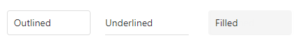
You can also use the global editorStylingMode setting to specify how the text fields of all editors in your application are styled.
tabIndex
Specifies the number of the element when the Tab key is used for navigating.
The value of this property will be passed to the tabindex attribute of the HTML element that underlies the UI component.
text
The read-only property that holds the text displayed by the UI component input element.
useItemTextAsTitle
Specifies whether the Lookup uses item's text a title attribute.
If the property is set to true, the text that items within the Lookup contain is passed to the title attribute of the respective item.
useNativeScrolling
Specifies whether or not the UI component uses native scrolling.
usePopover
Specifies whether to show lookup contents in the Popover UI component.
Lookup contents can be displayed in a Popover only if dropDownOptions.fullScreen is disabled. Otherwise, lookup contents are displayed within the Popup UI component.
Material Design themes always use the Popup UI component, ignoring the usePopover property.
validationError
Information on the broken validation rule. Contains the first item from the validationErrors array.
See Also
validationErrors
An array of validation errors.
Array<any>
Lookup updates this property automatically as it validates values. You can also update validationErrors manually to display custom errors and implement custom validation logic. The following code snippet demonstrates how to define items in this array:
jQuery
$('#lookup').dxLookup({
    isValid: false,
    validationErrors: [{ message: "Custom validation error" }],
})
Angular
<dx-lookup
    [isValid]="false"
    [validationErrors]="validationErrors"
></dx-lookup>
import { DxLookupComponent } from 'devextreme-angular/ui/lookup'

export class AppComponent {
    validationErrors = [
        { message: 'Custom validation error' }
    ];
}
Vue
<script setup lang="ts">
import { DxLookup } from 'devextreme-vue/lookup';

const validationErrors = [
    { message: 'Custom validation error' }
];
</script>

<template>
    <DxLookup
        :is-valid="false"
        :validation-errors="validationErrors"
    />
</template>
React
import { Lookup } from 'devextreme-react/lookup';

const validationErrors = [
    { message: 'Custom validation error' }
];

function App(): JSX.Element {
    return (
        <Lookup
            isValid={false}
            validationErrors={validationErrors}
        />
    )
}
validationMessageMode
Specifies how the message about the validation rules that are not satisfied by this editor's value is displayed.
The following property values are possible:
- auto
The tooltip with the message is displayed when the editor is in focus. - always
The tooltip with the message is not hidden when the editor loses focus.
validationMessagePosition
Specifies the position of a validation message relative to the component. The validation message describes the validation rules that this component's value does not satisfy.
If you set this property to auto, the component specifies the validation message position automatically.
The following example positions a validation message at the component's right:
jQuery
$(function() {
    $("#lookupContainer").dxLookup({
        // ...
        validationMessagePosition: 'right'
    }).dxValidator({
        validationRules: [{
            type: 'required',
            message: 'Required',
        }],
    });
});
Angular
<dx-lookup ...
    validationMessagePosition="right">
    <dx-validator>
        <dxi-validator-validation-rule
            type="required"
            message="Required"
        >
        </dxi-validator-validation-rule>
    </dx-validator>
</dx-lookup>
Vue
<template>
    <DxLookup ...
        validation-message-position="right"
    >
        <DxValidator>
            <DxRequiredRule message="Required" />
        </DxValidator>
    </DxLookup>
</template>

<script>
    // ...
</script>
React
import React from 'react';
// ...

function App() {
    return (
        <Lookup ...
            validationMessagePosition="right"
        >
            <Validator>
                <RequiredRule message="Required" />
            </Validator>
        </Lookup>
    );

};
export default App;
validationStatus
Indicates or specifies the current validation status.
The following table illustrates the validation status indicators:
| validationStatus | Indicator |
|---|---|
"pending" |
 |
"valid" |
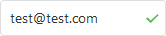 |
"invalid" |
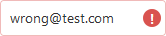 |
When you assign "invalid" to validationStatus, you can also use the validationErrors array to set an error message as shown below:
jQuery
$(function() {
    const lookup = $("#lookupContainer").dxLookup({
        // ...
    }).dxLookup("instance");

    function setInvalidStatus(message) {
        lookup.option({
            validationStatus: "invalid",
            validationErrors: [{ message: message }]
        });
    }
});
Angular
<dx-lookup
    [validationStatus]="validationStatus"
    [validationErrors]="validationErrors">
</dx-lookup>
// ...
export class AppComponent {
    validationStatus: string = "valid";
    validationErrors: any;
    // ...
    setInvalidStatus(message) {
        this.validationStatus = "invalid";
        this.validationErrors = [{ message: message }];
    }
}
Vue
<template>
    <DxLookup ...
        :validation-status="validationStatus"
        :validation-errors="validationErrors"
    />
</template>

<script>
    // ...
    export default {
        // ...
        data() {
            return {
                validationStatus: "valid",
                validationErrors: []
            }
        },
        methods: {
            setInvalidStatus(message) {
                this.validationStatus = "invalid";
                this.validationErrors = [{ message: message }];
            }
        }
    }
</script>
React
import React, { useState } from 'react';
// ...

function App() {
    const [validationStatus, setValidationStatus] = useState("valid");
    const [validationErrors, setValidationErrors] = useState([]);

    const setInvalidStatus = message => {
        setValidationStatus("invalid");
        setValidationErrors([{ message: message }]);
    }

    return (
        <Lookup
            validationStatus={validationStatus}
            validationErrors={validationErrors}
        />
    );

};
export default App;
value
Specifies the currently selected value. May be an object if dataSource contains objects, the store key is specified, and valueExpr is not set.
When dataSource contains objects, you should define valueExpr to correctly identify data items. If valueExpr is not specified, the component compares object references to display an item, not object values. For instance, if you define the value property as an object containing identical values to dataSource to select all items, the component displays nothing.
valueChangeEvent
Specifies the DOM events after which the UI component's value should be updated.
This property accepts a single event name or several names separated by spaces.
The recommended events are "keyup", "blur", "change", "input", and "focusout", but you can use other events as well.
See Also
valueExpr
Specifies which data field provides unique values to the UI component's value.
The current item's data object.
When dataSource contains objects, you should define valueExpr to correctly identify data items. Otherwise, the component uses referential equality to compare objects, which may result in unexpected behavior.
If you use a store, the valueExpr property should have the same value as the key in the store. Alternatively, you can use this as a valueExpr but the key should be specified. Refer to the following article for more information: Troubleshooting - A Drop-Down Editor Does Not Show Data.
Do not use template as a valueExpr value.
See Also

 Select one or more answers