jQuery PivotGridFieldChooser - headerFilter
Type:
A header filter allows a user to filter individual field's values by including or excluding them from the applied filter. Cicking a header filter icon invokes a popup menu displaying all the unique field values.
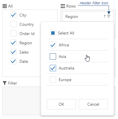
Assign true to the allowFiltering property to make the icons visible.
The user's filtering preferences are saved in the filterValues property. The header filter's Select All checkbox changes the filterType property.
search
Type:
jQuery
JavaScript
$(function(){
    $("#pivotGridFieldChooser").dxPivotGridFieldChooser({
        // ...
        headerFilter: {
            // ...
            search: {
                editorOptions: {
                    placeholder: 'Search value',
                    mode: 'text'
                },
                enabled: true,
                timeout: 700,
                mode: 'equals'
            },
        },
    })
});
Angular
app.component.html
app.component.ts
app.module.ts
<dx-pivot-grid-field-chooser ... >
    <dxo-header-filter ... >
        <dxo-search
            [editorOptions]="searchEditorOptions"
            [enabled]="true"
            [timeout]="700"
            mode="equals"
        ></dxo-search>
    </dxo-header-filter>
</dx-pivot-grid-field-chooser>
import { Component } from '@angular/core';

@Component({
    selector: 'app-root',
    templateUrl: './app.component.html',
    styleUrls: ['./app.component.css']
})

export class AppComponent {
    searchEditorOptions;
    constructor() {
        this.searchEditorOptions = {
            placeholder: 'Search value',
            mode: 'text'
        };
        // ...
    }
    // ...
}
import { BrowserModule } from '@angular/platform-browser';
import { NgModule } from '@angular/core';
import { AppComponent } from './app.component';
import { DxPivotGridFieldChooserModule } from 'devextreme-angular';

@NgModule({
    declarations: [
        AppComponent
    ],
    imports: [
        BrowserModule,
        DxPivotGridFieldChooserModule
    ],
    providers: [ ],
    bootstrap: [AppComponent]
})

export class AppModule { }
Vue
App.vue (Options API)
App.vue (Composition API)
<template>
    <DxPivotGridFieldChooser ... >
        <DxHeaderFilter ... >
            <DxSearch
                :editor-options="searchEditorOptions"
                :enabled="true"
                :timeout="700"
                mode="equals"
            />
        </DxHeaderFilter>
    </DxPivotGridFieldChooser>
</template>

<script>
import 'devextreme/dist/css/dx.light.css';
import DxPivotGridFieldChooser, {
    DxHeaderFilter,
    DxSearch,
    // ...
} from 'devextreme-vue/pivot-grid-field-chooser';

export default {
    components: {
        DxPivotGridFieldChooser,
        DxHeaderFilter,
        DxSearch,
        // ...
    },
    data() {
        return {
            searchEditorOptions: {
                placeholder: 'Search value',
                mode: 'text'
            }
        };
    }
}
</script>
<template>
    <DxPivotGridFieldChooser ... >
        <DxHeaderFilter ... >
            <DxSearch
                :editor-options="searchEditorOptions"
                :enabled="true"
                :timeout="700"
                mode="equals"
            />
        </DxHeaderFilter>
    </DxPivotGridFieldChooser>
</template>

<script setup>
import 'devextreme/dist/css/dx.light.css';
import DxPivotGridFieldChooser, {
    DxHeaderFilter,
    DxSearch,
    // ...
} from 'devextreme-vue/pivot-grid-field-chooser';

const searchEditorOptions = {
    placeholder: 'Search value',
    mode: 'text'
};

// ...
</script>
React
App.js
import React from 'react';
import 'devextreme/dist/css/dx.light.css';

import PivotGridFieldChooser, {
    HeaderFilter,
    Search,
    // ...
} from 'devextreme-react/data-grid';

const searchEditorOptions = {
    placeholder: 'Search value',
    mode: 'text'
};

export default function App() {
    return (
        <PivotGridFieldChooser ... >
            <HeaderFilter ... >
                <Search
                    editorOptions={searchEditorOptions}
                    enabled={true}
                    timeout={700}
                    mode="equals"
                />
            </HeaderFilter>
        </PivotGridFieldChooser>
    );
}
searchTimeout

Use search.timeout instead.
Specifies a delay in milliseconds between when a user finishes typing in the header filter's search panel, and when the search is executed.
Type:
Default Value: 500
Feedback