JavaScript/jQuery Scheduler - toolbar
Configures the toolbar.
items[]
Configures toolbar items.
The toolbar can contain the following elements as items:
Predefined controls
Predefined controls appear in the toolbar depending on whether a specific Scheduler feature is enabled. The following predefined controls are available:Control Name Image dateNavigator 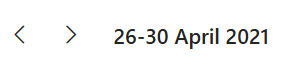
viewSwitcher 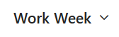
today 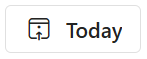
If you need to customize a predefined control, add an object to the items[] array. This object must contain the control's name and properties you want to customize. If a control does not need customization, you can include its name in the toolbar.items[] array.
jQuery
index.js$(function(){ $("#schedulerContainer").dxScheduler({ // ... toolbar: { items: [ "dateNavigator", "today" ] } }); });Angular
app.component.html<dx-scheduler ... > <dxo-scheduler-toolbar> <dxi-scheduler-toolbar-item name="dateNavigator"></dxi-scheduler-toolbar-item> <dxi-scheduler-toolbar-item name="today"></dxi-scheduler-toolbar-item> </dxo-scheduler-toolbar> </dx-scheduler>Vue
App.vue<template> <DxScheduler ... > <DxToolbar> <DxItem name="dateNavigator" /> <DxItem name="today" /> </DxToolbar> </DxScheduler> </template> <script setup lang="ts"> import DxScheduler, { DxToolbar, DxItem } from 'devextreme-vue/scheduler'; </script>React
App.jsimport Scheduler, { Toolbar, Item } from 'devextreme-react/scheduler'; // ... function App() { return ( <Scheduler ... > <Toolbar> <Item name="dateNavigator" /> <Item name="today" /> </Toolbar> </Scheduler> ); }IMPORTANTThe Scheduler does not display controls missing from the items[] array. Ensure that this array includes controls for all enabled features.The "dateNavigator" predefined control is a ButtonGroup with three items: left arrow ('prev'), right arrow ('next'), and date interval ('dateInterval'). Define options.items following the example below to customize the order of dateNavigator components and add new buttons.
jQuery
index.jsconst customButton = { text: "Custom Button", icon: "plus", onClick: () => { console.log("The Custom Button was clicked.") } } const dateNavigatorOptions = { items: ['prev', 'dateInterval', customButton, 'next'] } $(function(){ $("#schedulerContainer").dxScheduler({ // ... toolbar: { items: [{ name: "dateNavigator", options: dateNavigatorOptions }] } }); });Angular
app.component.htmlapp.component.ts<dx-scheduler ... > <dxo-scheduler-toolbar> <dxi-scheduler-toolbar-item name="dateNavigator" [options]="dateNavigatorOptions"> </dxi-scheduler-toolbar-item> </dxo-scheduler-toolbar> </dx-scheduler>import { DxSchedulerModule } from 'devextreme-angular' // ... export class AppComponent { customButton = { text: "Custom Button", icon: "plus", onClick: () => { console.log("The Custom Button was clicked.") } } dateNavigatorOptions = { items: ['prev', 'dateInterval', this.customButton, 'next'] } }Vue
App.vue<template> <DxScheduler ... > <DxToolbar> <DxItem name="dateNavigator" :options="dateNavigatorOptions" /> </DxToolbar> </DxScheduler> </template> <script setup lang="ts"> import DxScheduler, { type DxSchedulerTypes, DxToolbar, DxItem } from 'devextreme-vue/scheduler'; const customButton = { text: "Custom Button", icon: "plus", onClick: () => { console.log("The Custom Button was clicked."); } } const dateNavigatorOptions: DateNavigatorItemProperties = { items: ['prev', 'dateInterval', customButton, 'next'] } </script>React
App.jsimport Scheduler, { Toolbar, Item } from 'devextreme-react/scheduler'; // ... const customButton = { text: "Custom Button", icon: "plus", onClick: () => { console.log("The Custom Button was clicked.") } } const dateNavigatorOptions = {items: ['prev', 'dateInterval', customButton, 'next']}; function App() { return ( <Scheduler ... > <Toolbar> <Item name="dateNavigator" options={dateNavigatorOptions} /> </Toolbar> </Scheduler> ); }DevExtreme components
jQuery
You can use DevExtreme components as toolbar items. Set the widget property to specify the component you want to use and configure the component's options:
index.js$(function(){ $("#schedulerContainer").dxScheduler({ // ... toolbar: { items: [{ widget: "dxSelectBox", options: { // SelectBox properties are specified here } }] } }); });Angular
You can use DevExtreme components as toolbar items. Declare a
dxi-scheduler-itemelement to add a supported component:app.component.html<dx-scheduler ... > <dxo-scheduler-toolbar> <dxi-scheduler-toolbar-item> <dx-select-box> <!-- SelectBox properties are specified here --> </dx-select-box> </dxi-scheduler-toolbar-item> </dxo-scheduler-toolbar> </dx-scheduler>Vue
You can use DevExtreme components as toolbar items. Declare a
DxItemelement to add a supported component:App.vue<template> <DxScheduler ... > <DxToolbar> <DxItem> <DxSelectBox> <!-- SelectBox properties are specified here --> </DxSelectBox> </DxItem> </DxToolbar> </DxScheduler> </template> <script> import { DxScheduler, DxToolbar, DxItem } from 'devextreme-vue/scheduler'; import { DxSelectBox } from 'devextreme-vue/select-box'; export default { components: { DxScheduler, DxToolbar, DxItem, DxSelectBox } }; </script>React
You can use DevExtreme components as toolbar items. Declare an
Itemelement to add a supported component:App.jsimport { SelectBox } from 'devextreme-react/select-box'; import Scheduler, { Toolbar, Item } from 'devextreme-react/scheduler'; // ... function App() { return ( <Scheduler ... > <Toolbar> <Item> <SelectBox> {/* SelectBox properties are specified here */} </SelectBox> </Item> </Toolbar> </Scheduler> ); }Custom controls
To use a custom control, specify a template for it.
multiline
Specifies whether the toolbar arranges items into multiple lines when their combined width exceeds the toolbar width.
Note that if you set the multiline property to true, you cannot use the following item properties:
visible
Specifies whether the toolbar is visible.
This property can have one of the following values:
| toolbar.visible | Description |
|---|---|
| true | The toolbar is always visible. |
| false | The toolbar is always hidden. |
| undefined | The toolbar is visible only if there are items to display. |

 Select one or more answers