JavaScript/jQuery Splitter - items
An array of items (panes) displayed by the UI component.
Array<dxSplitterItem>
The items array can contain:
- Objects with fields described in this section.
- Objects with any other fields. In this case, specify the itemTemplate.
As an alternative to items, you can use the dataSource property. It accepts the DataSource object, whose underlying stores supply an API that allows you to update individual items without reassigning the entire item collection.
collapsed
Specifies whether an item (pane) is initially collapsed.
collapsedSize
Specifies the size of a collapsible item (pane) when collapsed in pixels or as a percentage.
jQuery
$(() => {
    $("#splitter").dxSplitter({
        items: [
            {
                // ...
                collapsedSize: "20px",
            }
        ],
    });
});
Angular
<dx-splitter ... >
    <dxi-splitter-item ...
        collapsedSize="20px"
    >
    </dxi-splitter-item>
</dx-splitter>
Vue
<template>
    <DxSplitter ... >
        <DxItem ...
            collapsedSize="20px"
        />
    </DxSplitter>
</template>

<script setup>
import { DxSplitter, DxItem } from "devextreme-vue/splitter";
</script>
React
import React from "react";
import Splitter, { Item } from "devextreme-react/splitter";

const App = () => (
    <React.Fragment>
        <Splitter ... >
            <Item ...
                collapsedSize="20px"
            />
        </Splitter>
    </React.Fragment>
);

export default App;collapsible
Specifies whether an item (pane) is collapsible.
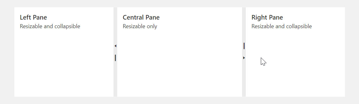
To collapse a pane, you can also double-click the separator bar.
maxSize
Specifies the maximum size of an item (pane) in pixels or as a percentage.
jQuery
$(() => {
    $("#splitter").dxSplitter({
        items: [
            {
                // ...
                maxSize: "500px",
            }
        ],
    });
});
Angular
<dx-splitter ... >
    <dxi-splitter-item ...
        maxSize="500px"
    >
    </dxi-splitter-item>
</dx-splitter>
Vue
<template>
    <DxSplitter ... >
        <DxItem ...
            maxSize="500px"
        />
    </DxSplitter>
</template>

<script setup>
import { DxSplitter, DxItem } from "devextreme-vue/splitter";
</script>
React
import React from "react";
import Splitter, { Item } from "devextreme-react/splitter";

const App = () => (
    <React.Fragment>
        <Splitter ... >
            <Item ...
                maxSize="500px"
            />
        </Splitter>
    </React.Fragment>
);

export default App;minSize
Specifies the minimum size of an item (pane) in pixels or as a percentage.
jQuery
$(() => {
    $("#splitter").dxSplitter({
        items: [
            {
                // ...
                minSize: "30%",
            }
        ],
    });
});
Angular
<dx-splitter ... >
    <dxi-splitter-item ...
        minSize="30%"
    >
    </dxi-splitter-item>
</dx-splitter>
Vue
<template>
    <DxSplitter ... >
        <DxItem ...
            minSize="30%"
        />
    </DxSplitter>
</template>

<script setup>
import { DxSplitter, DxItem } from "devextreme-vue/splitter";
</script>
React
import React from "react";
import Splitter, { Item } from "devextreme-react/splitter";

const App = () => (
    <React.Fragment>
        <Splitter ... >
            <Item ...
                minSize="30%"
            />
        </Splitter>
    </React.Fragment>
);

export default App;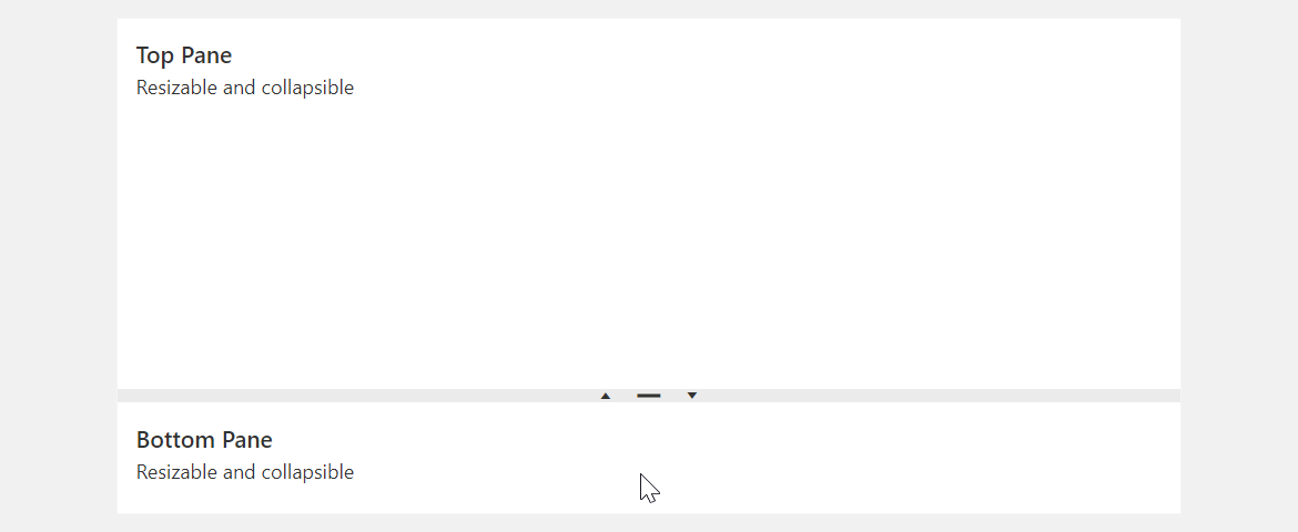
size
Specifies the initial size of an item (pane) in pixels or as a percentage. The size changes after any layout alteration.
jQuery
$(() => {
    $("#splitter").dxSplitter({
        items: [
            {
                // ...
                size: "50%",
            }
        ],
    });
});
Angular
<dx-splitter ... >
    <dxi-splitter-item ...
        size="50%"
    >
    </dxi-splitter-item>
</dx-splitter>
Vue
<template>
    <DxSplitter ... >
        <DxItem ...
            size="50%"
        />
    </DxSplitter>
</template>

<script setup>
import { DxSplitter, DxItem } from "devextreme-vue/splitter";
</script>
React
import React from "react";
import Splitter, { Item } from "devextreme-react/splitter";

const App = () => (
    <React.Fragment>
        <Splitter ... >
            <Item ...
                size="50%"
            />
        </Splitter>
    </React.Fragment>
);

export default App;
If you do not specify pane sizes, the UI component splits up the panes automatically with even distribution.
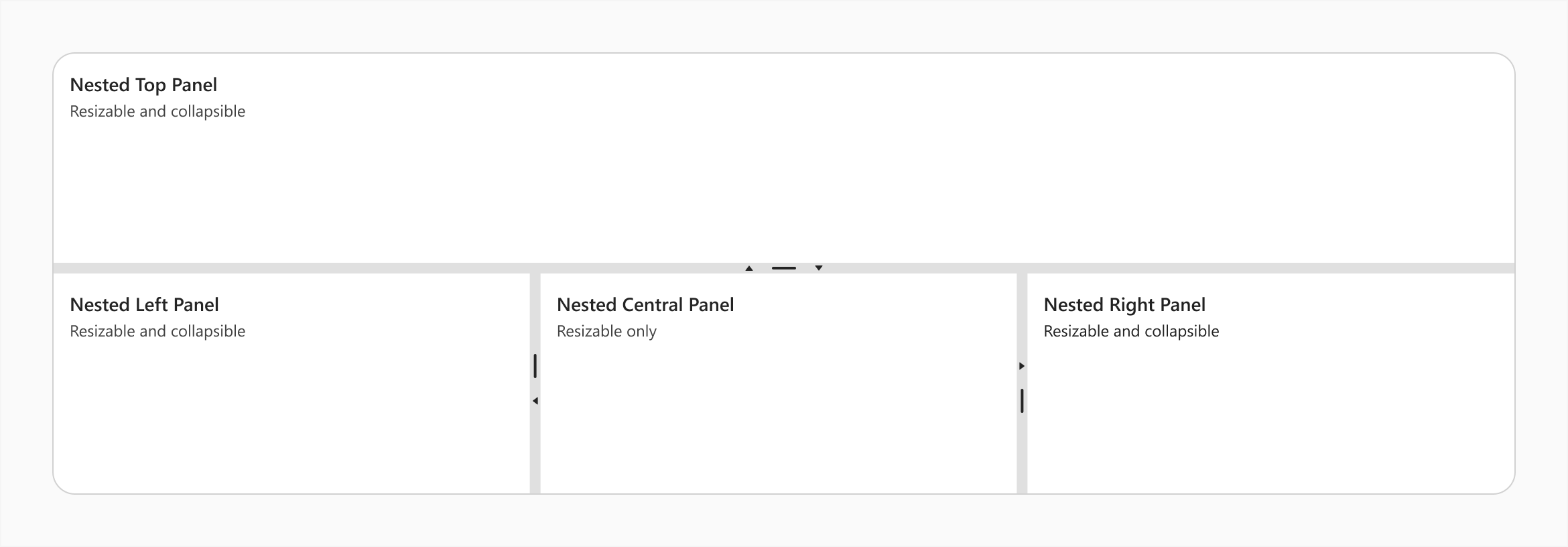
splitter
Specifies a splitter inside an item (pane).
Use this property to make the item a nested Splitter UI component.
jQuery
$(() => {
    $("#splitter").dxSplitter({
        orientation: "vertical",
        items: [{
                text: "Top Panel"
            },
            {
                splitter: {
                    items: [{
                            text: "Nested Left Panel"
                        },{
                            text: "Nested Central Panel"
                        },{
                            text: "Nested Right Panel"
                        }
                    ]
                }
            }
        ]
    });
});
Angular
<dx-splitter id="splitter" orientation="vertical">
    <dxi-splitter-item text="Top Panel"></dxi-splitter-item>
    <dxi-splitter-item>
        <dx-splitter>
            <dxi-splitter-item text="Nested Left Panel"></dxi-splitter-item>
            <dxi-splitter-item text="Nested Central Panel"></dxi-splitter-item>
            <dxi-splitter-item text="Nested Right Panel"></dxi-splitter-item>
        </dx-splitter>
    </dxi-splitter-item>
</dx-splitter>
Vue
<template>
    <DxSplitter class="splitter" orientation="vertical">
        <DxItem text="Top Panel" />
        <DxItem>
            <DxSplitter>
                <DxItem text="Nested Left Panel" />
                <DxItem text="Nested Central Panel" />
                <DxItem text="Nested Right Panel" />
            </DxSplitter>
        </DxItem>
    </DxSplitter>
</template>

<script setup>
import { DxSplitter, DxItem } from "devextreme-vue/splitter";
</script>
React
import React from "react";
import Splitter, { Item } from "devextreme-react/splitter";

const App = () => (
    <React.Fragment>
        <Splitter orientation="vertical">
            <Item text="Top Panel" />
            <Item>
                <Splitter>
                    <Item text="Nested Left Panel" />
                    <Item text="Nested Central Panel" />
                    <Item text="Nested Right Panel" />
                </Splitter>
            </Item>
        </Splitter>
    </React.Fragment>
);

export default App;template
Specifies a template that should be used to render this item only.
jQuery
The following types of the specified value are available.
- Assign a string containing the name of the required template.
- Assign a jQuery object of the template's container.
- Assign a DOM Node of the template's container.
- Assign a function that returns the jQuery object or a DOM Node of the template's container.
The following example adds a custom item to the component.
$(function() {
    $("#splitterContainer").dxSplitter({
        // ...
        items: [
            {
                // ...
                template: '<div>Custom Item</div>'
            }
        ]
    });
});
Angular
The following types of the specified value are available.
- Assign a string containing the name of the required template.
- Assign a DOM Node of the template's container.
The following example adds a custom item to the component. Note that Angular uses custom templates instead of the template property.
<dx-splitter ... >
    <dxi-splitter-item ... >
        <div *dxTemplate>
            <div>Custom Item</div>
        </div>
    </dxi-splitter-item>
</dx-splitter>
import { Component } from '@angular/core';

@Component({
    selector: 'app-root',
    templateUrl: './app.component.html',
    styleUrls: ['./app.component.css']
})
export class AppComponent {
    // ...
}
import { BrowserModule } from '@angular/platform-browser';
import { NgModule } from '@angular/core';
import { AppComponent } from './app.component';

import { DxSplitterModule } from 'devextreme-angular';

@NgModule({
    declarations: [
        AppComponent
    ],
    imports: [
        BrowserModule,
        DxSplitterModule
    ],
    providers: [ ],
    bootstrap: [AppComponent]
})
export class AppModule { }
Vue
The following types of the specified value are available.
- Assign a string containing the name of the required template.
- Assign a DOM Node of the template's container.
The following example adds a custom item to the component. Note that Vue uses custom templates instead of the template property.
<template>
    <DxSplitter ... >
        <dxItem ... >
            <div>Custom Item</div>
        </dxItem>
    </DxSplitter>
</template>

<script>

import DxSplitter, {
    DxItem
} from 'devextreme-vue/splitter';

export default {
    components: {
        DxSplitter,
        DxItem
    },
    // ...
}
</script>
React
The following types of the specified value are available.
- Assign a string containing the name of the required template.
- Assign a DOM Node of the template's container.
The following example adds a custom item to the component. In React, specify the render or component properties.
import React from 'react';

import Splitter, {
    Item
} from 'devextreme-react/splitter';

const renderCustomItem = () => {
    return <div>Custom Item</div>;
}

const App() = () => {
    return (
        <Splitter ... >
            <Item ...
                render={renderCustomItem}
            >
            </Item>
        </Splitter>
    );
}
export default App;
See Also
text
Specifies text displayed for the UI component item.
If you use both this property and a template, the template overrides the text.

 Select one or more answers