collapsed
Specifies whether an item (pane) is initially collapsed.
collapsedSize
Specifies the size of a collapsible item (pane) when collapsed in pixels or as a percentage.
jQuery
$(() => {
    $("#splitter").dxSplitter({
        items: [
            {
                // ...
                collapsedSize: "20px",
            }
        ],
    });
});
Angular
<dx-splitter ... >
    <dxi-splitter-item ...
        collapsedSize="20px"
    >
    </dxi-splitter-item>
</dx-splitter>
Vue
<template>
    <DxSplitter ... >
        <DxItem ...
            collapsedSize="20px"
        />
    </DxSplitter>
</template>

<script setup>
import { DxSplitter, DxItem } from "devextreme-vue/splitter";
</script>
React
import React from "react";
import Splitter, { Item } from "devextreme-react/splitter";

const App = () => (
    <React.Fragment>
        <Splitter ... >
            <Item ...
                collapsedSize="20px"
            />
        </Splitter>
    </React.Fragment>
);

export default App;collapsible
Specifies whether an item (pane) is collapsible.
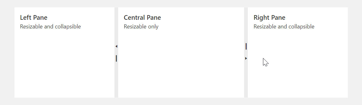
To collapse a pane, you can also double-click the separator bar.
maxSize
Specifies the maximum size of an item (pane) in pixels or as a percentage.
jQuery
$(() => {
    $("#splitter").dxSplitter({
        items: [
            {
                // ...
                maxSize: "500px",
            }
        ],
    });
});
Angular
<dx-splitter ... >
    <dxi-splitter-item ...
        maxSize="500px"
    >
    </dxi-splitter-item>
</dx-splitter>
Vue
<template>
    <DxSplitter ... >
        <DxItem ...
            maxSize="500px"
        />
    </DxSplitter>
</template>

<script setup>
import { DxSplitter, DxItem } from "devextreme-vue/splitter";
</script>
React
import React from "react";
import Splitter, { Item } from "devextreme-react/splitter";

const App = () => (
    <React.Fragment>
        <Splitter ... >
            <Item ...
                maxSize="500px"
            />
        </Splitter>
    </React.Fragment>
);

export default App;minSize
Specifies the minimum size of an item (pane) in pixels or as a percentage.
jQuery
$(() => {
    $("#splitter").dxSplitter({
        items: [
            {
                // ...
                minSize: "30%",
            }
        ],
    });
});
Angular
<dx-splitter ... >
    <dxi-splitter-item ...
        minSize="30%"
    >
    </dxi-splitter-item>
</dx-splitter>
Vue
<template>
    <DxSplitter ... >
        <DxItem ...
            minSize="30%"
        />
    </DxSplitter>
</template>

<script setup>
import { DxSplitter, DxItem } from "devextreme-vue/splitter";
</script>
React
import React from "react";
import Splitter, { Item } from "devextreme-react/splitter";

const App = () => (
    <React.Fragment>
        <Splitter ... >
            <Item ...
                minSize="30%"
            />
        </Splitter>
    </React.Fragment>
);

export default App;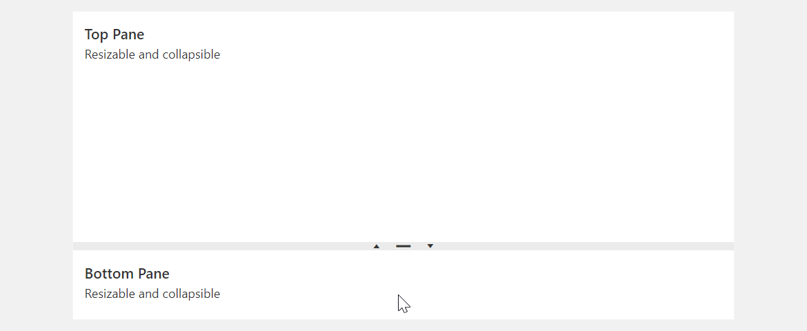
size
Specifies the initial size of an item (pane) in pixels or as a percentage. The size changes after any layout alteration.
jQuery
$(() => {
    $("#splitter").dxSplitter({
        items: [
            {
                // ...
                size: "50%",
            }
        ],
    });
});
Angular
<dx-splitter ... >
    <dxi-splitter-item ...
        size="50%"
    >
    </dxi-splitter-item>
</dx-splitter>
Vue
<template>
    <DxSplitter ... >
        <DxItem ...
            size="50%"
        />
    </DxSplitter>
</template>

<script setup>
import { DxSplitter, DxItem } from "devextreme-vue/splitter";
</script>
React
import React from "react";
import Splitter, { Item } from "devextreme-react/splitter";

const App = () => (
    <React.Fragment>
        <Splitter ... >
            <Item ...
                size="50%"
            />
        </Splitter>
    </React.Fragment>
);

export default App;
If you do not specify pane sizes, the UI component splits up the panes automatically with even distribution.
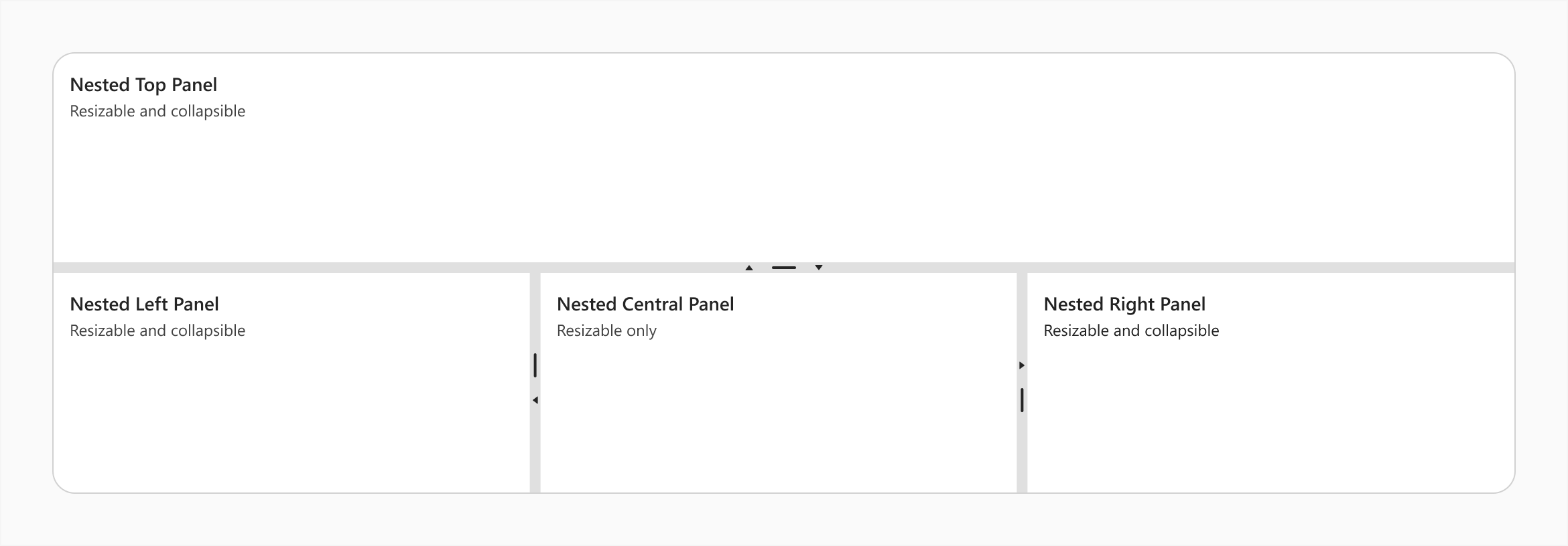
splitter
Specifies a splitter inside an item (pane).
Use this property to make the item a nested Splitter UI component.
jQuery
$(() => {
    $("#splitter").dxSplitter({
        orientation: "vertical",
        items: [{
                text: "Top Panel"
            },
            {
                splitter: {
                    items: [{
                            text: "Nested Left Panel"
                        },{
                            text: "Nested Central Panel"
                        },{
                            text: "Nested Right Panel"
                        }
                    ]
                }
            }
        ]
    });
});
Angular
<dx-splitter id="splitter" orientation="vertical">
    <dxi-splitter-item text="Top Panel"></dxi-splitter-item>
    <dxi-splitter-item>
        <dx-splitter>
            <dxi-splitter-item text="Nested Left Panel"></dxi-splitter-item>
            <dxi-splitter-item text="Nested Central Panel"></dxi-splitter-item>
            <dxi-splitter-item text="Nested Right Panel"></dxi-splitter-item>
        </dx-splitter>
    </dxi-splitter-item>
</dx-splitter>
Vue
<template>
    <DxSplitter class="splitter" orientation="vertical">
        <DxItem text="Top Panel" />
        <DxItem>
            <DxSplitter>
                <DxItem text="Nested Left Panel" />
                <DxItem text="Nested Central Panel" />
                <DxItem text="Nested Right Panel" />
            </DxSplitter>
        </DxItem>
    </DxSplitter>
</template>

<script setup>
import { DxSplitter, DxItem } from "devextreme-vue/splitter";
</script>
React
import React from "react";
import Splitter, { Item } from "devextreme-react/splitter";

const App = () => (
    <React.Fragment>
        <Splitter orientation="vertical">
            <Item text="Top Panel" />
            <Item>
                <Splitter>
                    <Item text="Nested Left Panel" />
                    <Item text="Nested Central Panel" />
                    <Item text="Nested Right Panel" />
                </Splitter>
            </Item>
        </Splitter>
    </React.Fragment>
);

export default App;template
Specifies a template that should be used to render this item only.
jQuery
The following types of the specified value are available.
- Assign a string containing the name of the required template.
- Assign a jQuery object of the template's container.
- Assign a DOM Node of the template's container.
- Assign a function that returns the jQuery object or a DOM Node of the template's container.
The following example adds a custom item to the component.
$(function() {
    $("#splitterContainer").dxSplitter({
        // ...
        items: [
            {
                // ...
                template: '<div>Custom Item</div>'
            }
        ]
    });
});
Angular
The following types of the specified value are available.
- Assign a string containing the name of the required template.
- Assign a DOM Node of the template's container.
The following example adds a custom item to the component. Note that Angular uses custom templates instead of the template property.
<dx-splitter ... >
    <dxi-splitter-item ... >
        <div *dxTemplate>
            <div>Custom Item</div>
        </div>
    </dxi-splitter-item>
</dx-splitter>
import { Component } from '@angular/core';

@Component({
    selector: 'app-root',
    templateUrl: './app.component.html',
    styleUrls: ['./app.component.css']
})
export class AppComponent {
    // ...
}
import { BrowserModule } from '@angular/platform-browser';
import { NgModule } from '@angular/core';
import { AppComponent } from './app.component';

import { DxSplitterModule } from 'devextreme-angular';

@NgModule({
    declarations: [
        AppComponent
    ],
    imports: [
        BrowserModule,
        DxSplitterModule
    ],
    providers: [ ],
    bootstrap: [AppComponent]
})
export class AppModule { }
Vue
The following types of the specified value are available.
- Assign a string containing the name of the required template.
- Assign a DOM Node of the template's container.
The following example adds a custom item to the component. Note that Vue uses custom templates instead of the template property.
<template>
    <DxSplitter ... >
        <dxItem ... >
            <div>Custom Item</div>
        </dxItem>
    </DxSplitter>
</template>

<script>

import DxSplitter, {
    DxItem
} from 'devextreme-vue/splitter';

export default {
    components: {
        DxSplitter,
        DxItem
    },
    // ...
}
</script>
React
The following types of the specified value are available.
- Assign a string containing the name of the required template.
- Assign a DOM Node of the template's container.
The following example adds a custom item to the component. In React, specify the render or component properties.
import React from 'react';

import Splitter, {
    Item
} from 'devextreme-react/splitter';

const renderCustomItem = () => {
    return <div>Custom Item</div>;
}

const App() = () => {
    return (
        <Splitter ... >
            <Item ...
                render={renderCustomItem}
            >
            </Item>
        </Splitter>
    );
}
export default App;
See Also
text
Specifies text displayed for the UI component item.
If you use both this property and a template, the template overrides the text.

 Select one or more answers