JavaScript/jQuery Bullet - Visual Elements
This guide provides a detailed overview of Bullet elements. Each topic in this guide contains a brief description of an element and its main configurable features.
Below is the element map of the Bullet UI component. It may be helpful as you begin learning about the capabilities of this UI component. Hover over an element on the map to discover the name of this element. A click on an element navigates you to a topic devoted to this element.

Bullet Bar
A bullet bar is a horizontal bar that indicates a bullet chart's primary value.

To specify the value indicated by the bullet bar, assign it to the value property.
var bulletOptions = {
    value: 42
    // ...
};
This value must belong to a range determined by the startScaleValue and endScaleValue properties. When you arrange several Bullet UI components in a column, set the same range for them so that their bullet bars can be compared visually.
var bulletOptions = {
    value: 42,
    startScaleValue: -100,
    endScaleValue: 50,
    // ...
};To distinguish positive and negative values visually, the Bullet UI component features a zero level line. Positive values are drawn to the right from this line; negative ones - to the left.
You can change the bar color using the color property.
Target Line
A target line is a vertical line that indicates a target value. According to the concept of a bullet chart, the target value is supposed to be reached by the primary value, which is indicated on a bullet chart by the bullet bar.

To specify the target value, set the target property of the main configuration object.
var bulletOptions = {
    target: 50,
    // ...
};
Additionally, you can customize the appearance of the target line. Particularly, you can specify its color using the targetColor property, and its width using the targetWidth property.
Zero Level Line
A zero level line indicates zero on a bullet graph. It serves as a starting point to the bullet bar.

By default, the zero level line is visible. However, in certain scenarios, you may need to change its visibility. For this purpose, use the showZeroLevel property.
var bulletOptions = {
    showZeroLevel: true // false
    // ...
};When visible, the zero level line has the same color as the target line. This color is specified by the targetColor property.
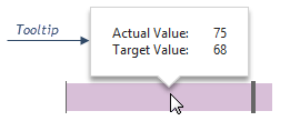
Tooltip
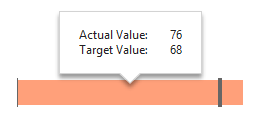
A tooltip is a small popup rectangle containing information about the values of a bullet graph. The tooltip appears when a user hovers the mouse pointer over the bullet graph.

Tooltips are configured using fields of the tooltip object. By default, they are enabled. However, if your scenario requires you to change the visibility of the tooltip, use the enabled field of the tooltip object.
var bulletOptions = {
    tooltip: {
        enabled: true // false
    },
    // ...
};
Although by default the tooltip displays information about primary and the target values, you can configure it to represent any information you may find useful. To customize the contents of the tooltip, implement the customizeTooltip function. This function must return an object with the text field specified.
var bulletOptions = {
    tooltip: {
        customizeTooltip: function (info) {
            return {
                text: '...' // the required text is specified here
            }
        },
        // ...
    },
    // ...
};
Furthermore, there is a number of additional properties specifying the appearance of the tooltip. All of them are set in the tooltip configuration object. A structured overview of these properties is given in the following list.
Color
You can specify the color of the tooltip using the color property.Font Settings
To change the font of the text displayed by the tooltip, use fields of the font object.Border Appearance
You can change the visibility, color, width and other settings of the tooltip border using fields of the border configuration object.Shadow
The tooltip is displayed casting a small shadow. To specify its blurriness, opacity, color and other settings, use shadow object fields.

 Select one or more answers