JavaScript/jQuery CircularGauge - Visual Elements
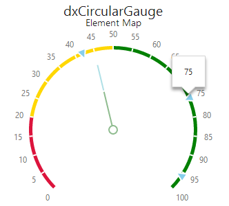
Topics in this section describe various elements of the CircularGauge UI component. Each topic gives a detailed overview of the element's purpose and ways of configuring. Below is the element map of the CircularGauge UI component. Hover over the map and you will discover how different gauge elements are called. Click an element to navigate to the topic with details on this element.
See Also
Value Indicator
A value indicator is a pointer that designates the main value on the CircularGauge. There is a set of predefined value indicator types for this UI component.
In order to customize the appearance of a value indicator, use the valueIndicator configuration object. Set its type property and then the required type-specific properties. The type-specific properties are listed within the UI component's Indicator Types reference section.
var gaugeOptions = {
    valueIndicator: {
        type: 'rangeBar',
        // Set type-specific properties here
    }
};
Subvalue Indicators
Subvalue indicators are pointers that indicate extra values on the CircularGauge. These extra values are called "subvalues". There is a set of predefined subvalue indicator types for the CircularGauge UI component.
In order to customize the appearance of the subvalue indicators, use the subvalueIndicator configuration object. Set its type property and then the required type-specific properties. The type-specific properties are listed within the UI component's Indicator Types reference section.
var gaugeOptions = {
    subvalueIndicator: {
        type: 'textCloud',
        // Set type-specific properties here
    }
};Scale Ticks
Values and subvalues are indicated on the gauge scale that is divided by scale ticks. These ticks can be major or minor.
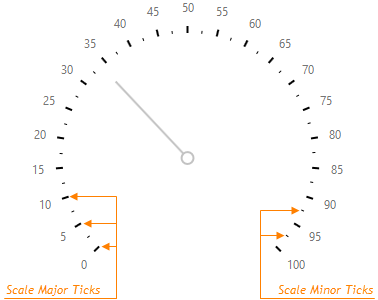
To configure major and minor scale ticks, use the scale.tick and scale.minorTick configuration objects, respectively.
var gaugeOptions = {
    scale: {
        tick: {
            // ...
        },
        minorTick: {
            // ...
        }
    }
};
Major ticks are visible by default. To display minor ticks, you need to set the minorTick.visible property to true. You can change the visibility of the major ticks using the same property within the tick configuration object.
By default, scale ticks are generated automatically. If you are not satisfied with the automatically generated ticks, you can specify a custom interval for major and minor ticks. To do this, use the tickInterval and minorTickInterval properties, respectively.
If neither automatically generated ticks nor ticks with a custom interval fit your requirements, you can place major and minor ticks at specific scale values. Assign an array of required values to the customTicks or customMinorTicks property.
var gaugeOptions = {
    scale: {
        customTicks: [4, 42, 85, 36, 14],
        customMinorTicks: [24, 61, 9, 12, 95]
    }
};
In addition, you can specify the color, length and width of major and minor ticks using the corresponding properties of the tick or minorTick configuration objects.
Scale Labels
Major scale ticks can be accompanied by scale labels. These labels display scale values. Scale labels are designed to make data represented by the CircularGauge more comprehensible.
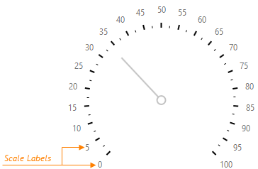
To configure scale labels, use the properties within the scale.label object.
var gaugeOptions = {
    scale: {
        label: {
            // ...
        }
    }
};
These properties are briefly described below.
Visibility
You can show/hide scale labels using the visible property.Text Customization
You can specify a format for the value displayed by a label. Moreover, you are not limited to displaying scale values only - you can customize the label's text per your requirements using the customizeText property.Appearance
The font style used for displaying the label text can be varied using properties of the font configuration object. In addition, scale labels can be indented from their ticks using the indentFromTick property.
Range Container
For the purpose of more intelligible data visualization, scale values can be combined into ranges, each of which can be colored differently. For example, you can indicate the ranges of warm and cold temperatures.
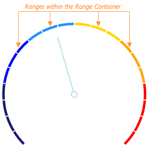
To specify the ranges, assign an array of objects defining these ranges to the ranges property of the rangeContainer configuration object.
var gaugeOptions = {
    rangeContainer: {
        ranges: [
            { startValue: -50, endValue: -30, color: 'midnightblue' },
            { startValue: -30, endValue: -15, color: 'blue' }
            // ...
        ]
    }
};
As you can see from the code above, each range is defined by its start and end values and, additionally, a color.
Besides the properties that apply to ranges, there are several properties that apply to the range container itself. They can be configured within the rangeContainer object. A brief overview of them is explained below.
Appearance
If you do not need to specify a particular color for each range, you can apply one of the predefined palettes using the palette property. However, when a specific color is assigned to a range, it overrides the color specified by the palette. If a range container does not have any ranges, or the ranges do not cover the whole range container, you can specify a color for the range container itself. For this purpose, use the backgroundColor property. In addition, you can change the width of the range container or its offset from a scale using the corresponding properties.Geometry
You can specify how to locate the range container relatively to the scale. To do this, specify the orientation property.
Tooltips
A tooltip is a small pop-up rectangle that displays information on a hovered value or subvalue indicator. By default, the tooltip shows the value indicated by the hovered element. However, it is possible to display other information in the tooltip. You can customize the text of the tooltip and its appearance in the way you require.
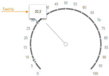
Tooltips are not enabled by default. To enable them, set the enabled property of the tooltip object to true.
var gaugeOptions = {
    tooltip: {
        enabled: true
    }
};
You can change default tooltip settings by defining the properties within the tooltip configuration object. Some of these properties are categorized and listed below.
Text Customization and Formatting
By default, a tooltip displays the value of a hovered UI component element without formatting. Set the format property to format this value. When text customization is required, assign a function specifying the text to be shown to the customizeTooltip property. Learn more in the Value Formatting topic.Font Settings
To customize the appearance of the tooltip text, define the font properties within the font configuration object.
Title and Subtitle
The CircularGauge can be displayed with a title and a subtitle. These elements usually contain general explanations about the data represented by the gauge. You can, however, place any kind of information in the gauge title and subtitle.
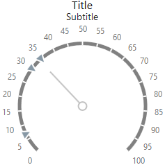
To specify a gauge title and subtitle, use the title and its nested subtitle properties. Both these properties accept either a string with the title/subtitle text:
var gaugeOptions = {
    title: {
        text: 'Gauge Title',
        subtitle: 'Gauge Subtitle'
    }
};
...or an object that configures more title/subtitle properties.
var gaugeOptions = {
    title: {
        text: 'Gauge Title',
        font: {
            size: 30,
            weight: 400
        },
        subtitle: {
            text: 'Gauge Subtitle',
            font: {
                size: 15,
                weight: 100
            }
        }
    }
};
Several title properties that can be set within the title and subtitle objects are categorized and listed below.
Location
You can place a title on any side of your gauge. For this purpose, use the horizontalAlignment and verticalAlignment properties. Note that if these properties are specified, the subtitle will be displayed at the same position as the title.Font Settings
To customize the appearance of the text, define the font properties within the font configuration object.

 Select one or more answers