JavaScript/jQuery VectorMap - Visual Elements
This guide provides a detailed overview of VectorMap elements. Each topic in this guide contains a brief description of an element and its main features, which can be configured.
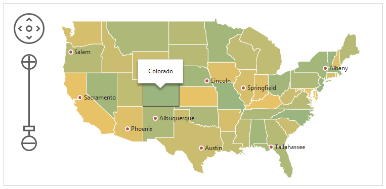
Below is the element map of the VectorMap UI component. It may be helpful as you begin learning the capabilities of this UI component. Hover over an element on the map to discover the name of this element. A click on an element navigates you to a topic devoted to this element.
Areas
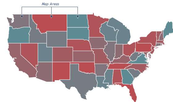
An area is the fundamental element of the VectorMap UI component. Map areas usually represent geographical objects, such as countries, continents, etc.
See Also
You can configure map areas using fields of the layer object, whose type is 'area'.
var vectorMapOptions = {
    // ...
    layers: [{
        type: 'area',
        // area settings are specified here
    },
        // ...
    ]
};
The following list provides a brief overview of area features that can be configured using this object.
Color
You can specify colors for areas using the color property and for their borders using the borderColor property. In addition, you can use a palette to colorize your map. Using a palette requires several properties to be specified. To get a step-by-step guide on applying a palette to your map, refer to the palette property description.Appearance in the Hovered State
When a user hovers the mouse pointer over an area, this area enters the hovered state. You can specify a color for an area in this state using the hoveredColor property. Additionally, you can change the appearance of the area border using the hoveredBorderColor and hoveredBorderWidth properties.Appearance in the Selected State
If you have implemented the selection capability in your map, customize the appearance of areas in the selected state. Similarly to the appearance of areas in the hovered state, you can specify a color for areas in the selected state using the selectedColor property, and a color and a width for the area border using the selectedBorderColor and selectedBorderWidth properties.
Specified directly in the layer object, these properties are applied to all map elements. To set them for specific areas, determine these properties in the object returned by the customize function. When implementing this function, use an elements array to get all layer elements. This object is passed to the customize function as the argument.
var vectorMapOptions = {
    // ...
    layers: [{
        type: 'area',
        customize: function (elements) {
            for (i in elements) {
                if (elements[i].attribute('name') == 'France')
                    elements[i].applySettings({ color: 'blue' });  // paints the 'France' area in blue
            }
        }
    }]
};
Area Labels
An area label is a text that accompanies a map area. Usually, an area label displays the name of a certain geographical object, such as a country, a continent, etc. A label disappears when its area is too small and the text does not fit it. To see the small area labels, zoom in the map.
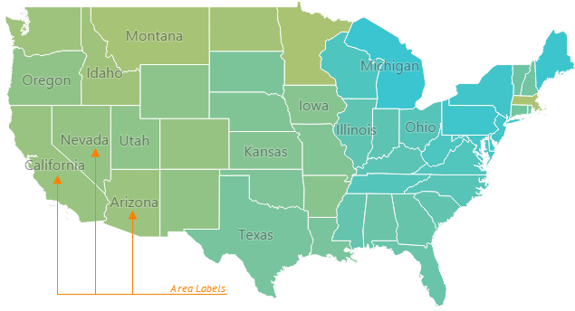
You can configure area labels using fields of the layer.label object.
var vectorMapOptions = {
    // ...
    layers: [{
        type: 'area',
        label: {
            // area labels settings are specified here
        }
    }]
};
Map data format allows you to set a number of attributes for each map area. Make sure your map data provides an attribute that can be used for labeling. To use the information provided by this attribute in a label, assign the attribute name to the layer.label.dataField property. The predefined data sources already include the 'name' attribute containing the geographical name of areas.
If you use a JSON object or a Binary Source as your map data, make sure the field you need to use for area labels is recognized by the attribute(name) method correctly.
To display area labels on a map, set the layer.label.enabled property to true. You can also customize text appearance using the font object.
Markers
A marker is a point on a map accompanied by text that helps you flag certain places on the map. For example, you can use map markers to designate cities.
Four types of markers are available in VectorMap: dot, bubble, pie and image, each of which corresponds to particular representational needs. The image below demonstrates the appearance of each marker type. Note that despite the fact that this image depicts all four types of markers on one map, an actual VectorMap can contain markers of only one type at a time.
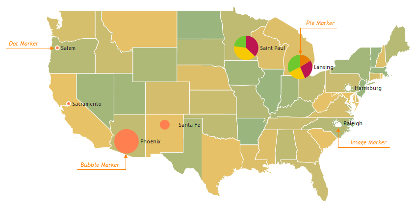
Image Markers Demo Bubble Markers Demo Pie Markers Demo
See Also
You can configure map markers using fields of the layer object, whose type is 'marker'. To specify the type of markers, set the elementType field of this object.
var vectorMapOptions = {
    // ...
    layers: [{
        // ...
        type: 'marker',
        elementType: 'bubble' // 'dot' | 'pie' | 'image'
    },
    // ...
    ]
};
The majority of marker features are configured using properties that are common for all marker types. However, there are some features that are peculiar to a particular marker type. These features are configured using properties specific for this marker type.
The following list gives an overview of the main features of all marker types and properties that control them.
Label
To specify the text that accompanies a map marker, use the marker's label.dataField property. The text itself should be specified as one of the marker attributes in the objects of the dataSource array. You can disable all marker labels by setting the label.enabled property to false. You can also configure the label's font using the label.font object.Color
You can specify the color of dot and bubble markers using the color property. To colorize pie markers, set the palette property instead. Additionally, you can change the color of the marker border using the borderColor property.Size
To specify the diameter of dot and pie markers in pixels, set the size property. The size of bubble markers cannot be specified explicitly, as it depends on the value a bubble marker represents. Instead, you can specify the size of the smallest and the largest bubbles. For this purpose, use the minSize and maxSize properties.Appearance in the Hovered State
When a user hovers the mouse pointer over a marker, this marker enters the hovered state. You can specify the color of a dot or bubble marker in this state using the hoveredColor property. Additionally, you can change the appearance of the marker border using the hoveredBorderColor and hoveredBorderWidth properties.Appearance in the Selected State
If you have implemented the selection capability in your map, customize the appearance of markers in the selected state. Similarly to the appearance of markers in the hovered state, you can specify a color for dot and bubble markers in the selected state using the selectedColor property and the appearance of the marker border using the selectedBorderColor and selectedBorderWidth properties.
Specified directly in the layers object, these properties are applied to all map markers. To set them for specific markers, determine these properties in the object returned by the customize function. When implementing this function, use an elements array to get all layer elements. This object is passed to the customize function as the argument.
var vectorMapOptions = {
    // ...
    layers: [{
        type: 'marker',
        customize: function (elements) {
            for (i in elements) {
                if (elements[i].attribute('name') == 'Austin')
                    elements[i].applySettings({ color: 'blue' });  // paints the 'Austin' area in blue
            });
        }
    }]
};
Control Bar
A control bar is a map element that supplies a user with the capability of navigating a map. This element resides on the left side of the map. The control bar consists of a pan control and a zoom bar, which provide the panning and zooming capabilities to the user.
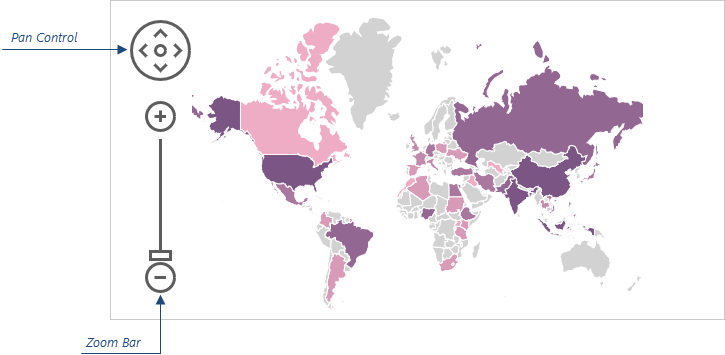
Control bar settings are specified using fields of the controlBar object.
var vectorMapOptions = {
    // ...
    controlBar: {
        // control bar settings are specified here
    }
};
The following list provides an overview of control bar properties configurable within this object.
Visibility
The control bar is visible by default, but if you need to hide it, set the enabled property to false.Color
You can specify individual colors for the outline and the inner area of the control bar elements using the borderColor and color properties respectively.
Tooltips
A tooltip is a small popup rectangle containing information about an area or a marker when a user hovers the mouse pointer over it. In common cases, a tooltip is required to display the name of the area or marker. However, it can display any information you may find useful.
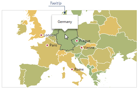
Tooltips are configured using fields of the tooltip object. By default, they are disabled. To enable them, assign true to the enabled field of the tooltip object.
var vectorMapOptions = {
    // ...
    tooltip: {
        enabled: true
    }
};
Then, you are required to specify the text to be displayed by a tooltip. Implement a function returning an object with the text field set and assign this function to the customizeTooltip property. When implementing it, you can use the Layer Element object passed to this function as the argument. To distinguish areas from markers, check the layer.type field of this object against being equal to 'area' or 'marker'. For example, the following code snippet shows how to provide text only for marker tooltips.
var vectorMapOptions = {
    // ...
    tooltip: {
        // ...
        customizeTooltip: function (element) {
            if (element.layer.type == 'marker') {
                return { text: element.text };
            }
        }
    }
};
Furthermore, there is a number of additional properties specifying the appearance of tooltips. All of them are set in the tooltip configuration object. A structured overview of these properties is given in the following list.
Color
You can specify the color of tooltips using the color property. If you need to specify the color of a particular tooltip, assign it to the color field of the object returned by the customizeTooltip function.Font Settings
To change the font of the text displayed by a tooltip, use the fields of the font object.Border Appearance
You can change the visibility, color, width and other settings of the tooltip border using the fields of the border configuration object.Shadow
Tooltips are displayed casting a small shadow. To specify its blurriness, opacity, color and other settings, use shadow object fields.
Legend
A legend is a supplementary map element that helps end-users identify a map area or a map marker.
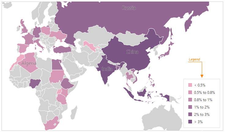
The VectorMap UI component can display several legends simultaneously. To configure the legends of your map, define one or more elements of the legends array.
var vectorMapOptions = {
    // ...
    legends: [{
        // First legend configuration
    }, {
        // Second legend configuration
    }]
};
To display a legend, define its source property according to the legend's purpose and assign the function that will generate the legend labels to the customizeText property of the legend.
var vectorMapOptions = {
    // ...
    legends: [{
        source: {
            grouping: "color",  // | 'size'
            layer: 'myLayerName'
        },
        customizeText: function (arg) {
            // Return a text according to arg
        }
    }]
};
The following list provides a brief overview of legend features that can be configured using the elements of the legends array.
Visibility
To hide the configured legend, set the visible property to false.Location
Use the horizontalAlignment and verticalAlignment properties to specify the legend's position on the map. In addition, you can change the interval between the legend and the map edges using the margin object.Appearance
Use the backgroundColor property and the border object to configure the legend's appearance. You can also customize the legend's font using the font object.Items Layout
Legend items can be placed in a row or a column. To specify how to arrange items, use the orientation property. There can also be several rows and columns in a legend. To set the number of rows and columns to be used, use the legend's rowCount and columnCount properties. These rows and columns will be placed within a legend separated by a space between each other, and from the legend's border. To specify the spacing parameters, use the legend's rowltemSpacing, columnltemSpacing, paddingLeftRight and paddingTopBottom properties.Hint
In addition to the text label describing a legend item, you can specify hints which will appear when the item is hovered. Assign the function that will generate hints to the customizeHint property.

 Select one or more answers