DevExtreme Angular - Appointment Collector
Appointments are aggregated in an appointment collector when the limit of full-sized appointments per cell is exceeded. Users should click on it to open a drop-down list of appointments.
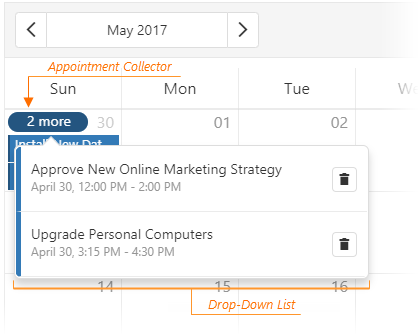
Use the appointmentCollectorTemplate and dropDownAppointmentTemplate options to customize the elements.
In the following code, the compact and non-compact appointment collectors have different texts, and a custom button that opens a details form is added near each appointment:
jQuery
JavaScript
CSS
$(function () {
    $("#schedulerContainer").dxScheduler({
        // ...
        dropDownAppointmentTemplate: function (data, index, element) {
            var container = $("<div>" + data.text + "</div>");
            var button = $("<span class='edit'>").dxButton({ icon: "event" });
            element.append(container.append(button));
        },
        appointmentCollectorTemplate: function(data, element) {
            if(data.isCompact) {
                element[0].innerText = data.appointmentCount;
            } else {
                element[0].innerText = "Total: " + data.appointmentCount;
            }
            element.addClass("collector");
        }
    });
});
.edit{
    margin-left: 10px;
}
.collector {
    font-style: italic;
    color: aliceblue;
}
Angular
HTML
TypeScript
CSS
<dx-scheduler  ...
    dropDownAppointmentTemplate="ddAppointment"
    appointmentCollectorTemplate="collectorTemplate">
    <div *dxTemplate="let item of 'ddAppointment'">
        <div>
            {{item.text}}
            <span class="edit"><dx-button icon="event"></dx-button></span>
        </div>
    </div>
    <div *dxTemplate="let data of 'collectorTemplate'" class="collector">
        <div *ngIf="data.isCompact">{{data.appointmentCount}}</div>
        <div *ngIf="!data.isCompact">Total: {{data.appointmentCount}}</div>
    </div>
</dx-scheduler>
import { DxSchedulerModule, DxButtonModule } from "devextreme-angular";
// ...
export class AppComponent  {
    // ...
}
@NgModule({
    imports: [
        // ...
        DxSchedulerModule,
        DxButtonModule
    ],
    // ...
})
::ng-deep .edit {
    margin-left: 10px;
}
::ng-deep .collector {
    font-style: italic;
    color: aliceblue;
}
AngularJS
HTML
JavaScript
CSS
<div ng-controller="DemoController">
    <div dx-scheduler="{
        ...
        dropDownAppointmentTemplate: 'ddAppointment',
        appointmentCollectorTemplate: 'collectorTemplate'
    }" dx-item-alias="item">
        <div data-options="dxTemplate: { name: 'ddAppointment' }">
            <div>
                {{item.text}}
                <span class="edit" dx-button="{ icon: 'event' }</span>
            </div>
        </div>
        <div data-options="dxTemplate: { name: 'collectorTemplate' }" class="collector">
            <div ng-if="item.isCompact">{{item.appointmentCount}}</div>
            <div ng-if="!item.isCompact">Total: {{item.appointmentCount}}</div>
        </div>
    </div>
</div>
angular.module('DemoApp', ['dx'])
    .controller('DemoController', function DemoController($scope) {
        // ...
    });
.edit {
    margin-left: 10px;
}
.collector {
    font-style: italic;
    color: aliceblue;
}
NOTE
The
dx-item-alias directive specifies the variable that is used to access the item object.Knockout
HTML
CSS
<div data-bind="dxScheduler: {
    ...
    dropDownAppointmentTemplate: 'ddAppointment',
    appointmentCollectorTemplate: 'collectorTemplate'
}">
    <div data-options="dxTemplate: { name: 'ddAppointment' }">
        <div>
            <span data-bind="text: text"></span>
            <span class="edit" data-bind="dxButton: { icon: 'event' }"></span>
        </div>
    </div>
    <div data-options="dxTemplate: { name: 'collectorTemplate' }" class="collector">
            <div data-bind="if: isCompact">
                <span data-bind="text: appointmentCount"></span>
            </div>
            <div data-bind="if: !isCompact">
                Total: <span data-bind="text: appointmentCount"></span>
            </div>
    </div>
</div>
.edit {
    margin-left: 10px;
}
.collector {
    font-style: italic;
    color: aliceblue;
}
In case of jQuery, you can also use a 3rd-party template engine to customize the widget's appearance. See the 3rd-Party Template Engines article for more information.
See Also

 Select one or more answers