Angular Scheduler - views
Specifies and configures the views to be available in the view switcher.
This property accepts an array of strings and objects:
String
A view name. Use a string if the view does not need customization, but should be available in the view switcher.Object
An individual view's configuration. Set the type property to specify the view to customize. Properties set for an individual view override their corresponding component configuration properties.JavaScriptviews: [{ type: 'workWeek', name: 'Vertical Grouping', groupOrientation: 'vertical', cellDuration: 60, intervalCount: 2, }, { type: 'workWeek', name: 'Horizontal Grouping', groupOrientation: 'horizontal', cellDuration: 30, intervalCount: 2, }, 'agenda' ]For more information about how to customize an individual view, refer to the following topic: Customize Individual Views.
To specify the current view, configure the currentView property.
- Be sure to include the currentView value in the views array.
- If the views array is empty or contains a single item, Scheduler hides the view switcher.
agendaDuration
Specifies the number of dates that can be shown at a time in the agenda view.
allDayPanelMode
Specifies the display mode for the All day panel.
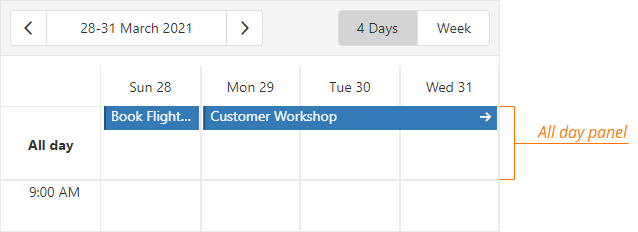
To hide the All day panel, set this property to hidden.
If you set the allDayPanelMode property to allDay, the All day panel displays only the appointments whose allDay property is set to true.
To also display appointments that have a duration equal to or more than 24 hours, assign all to this property.
jQuery
$(function() {
    $("#schedulerContainer").dxScheduler({
        // ...
        views: [{
            type: 'week',
            name: 'Week',
            allDayPanelMode: 'all',
        },
        // ...
        ],

    });
});
Angular
<dx-scheduler ... >
    <dxi-scheduler-view type="week" allDayPanelMode="all" name="Week">
    </dxi-scheduler-view>
</dx-scheduler>
import { BrowserModule } from '@angular/platform-browser';
import { NgModule } from '@angular/core';
import { AppComponent } from './app.component';

import { DxSchedulerModule } from 'devextreme-angular';

@NgModule({
    declarations: [
        AppComponent
    ],
    imports: [
        BrowserModule,
        DxSchedulerModule
    ],
    providers: [],
    bootstrap: [AppComponent]
})
export class AppModule { }
Vue
<template>
    <DxScheduler ...>
        <DxView
            type="week"
            name="Week"
            all-day-panel-mode="all"
        />
    </DxScheduler>
</template>

<script>
import 'devextreme/dist/css/dx.light.css';

import { DxScheduler } from 'devextreme-vue/scheduler';

export default {
    components: {
        DxScheduler,
        DxView
    },
    data() {
        return {
            // ...
        }
    }
}
</script>
React
import React from 'react';

import 'devextreme/dist/css/dx.light.css';

import { Scheduler } from 'devextreme-react/scheduler';

class App extends React.Component {
    render() {
        return (
            <Scheduler ...>
                <View
                    type="week"
                    name="Week"
                    allDayPanelMode="all"
                />
            </Scheduler>
        );
    }
}

export default App;
appointmentCollectorTemplate
Specifies a custom template for cell overflow indicators in this view.
jQuery
$(function() {
    $("#schedulerContainer").dxScheduler({
        // ...
        views: [{
            // ...
            appointmentCollectorTemplate: function(data, $indicatorElement) {
                $indicatorElement.append(
                    // Custom jQuery elements go here
                )
                // ===== or =====
                return /* your markup goes here */
            }
        },
        // ...
        ]
    });
});
Angular
<dx-scheduler ... >
    <dxi-scheduler-view ...
        appointmentCollectorTemplate="myTemplate">
    </dxi-scheduler-view>
    <div *dxTemplate="let data of 'myTemplate'">
        <!-- your markup goes here -->
    </div>
</dx-scheduler>
import { BrowserModule } from '@angular/platform-browser';
import { NgModule } from '@angular/core';
import { AppComponent } from './app.component';

import { DxSchedulerModule } from 'devextreme-angular';

@NgModule({
    declarations: [
        AppComponent
    ],
    imports: [
        BrowserModule,
        DxSchedulerModule
    ],
    providers: [],
    bootstrap: [AppComponent]
})
export class AppModule { }
Vue
<template>
    <DxScheduler ... >
        <DxView ...
            appointment-collector-template="myTemplate"
        />
        <template #myTemplate="{ data }">
            <!-- your markup goes here -->
        </template>
    </DxScheduler>
</template>

<script>
import 'devextreme/dist/css/dx.light.css';

import { DxScheduler, DxView } from 'devextreme-vue/scheduler';

export default {
    components: {
        DxScheduler,
        DxView
    },
    data() {
        return {
            // ...
        }
    }
}
</script>
React
import React from 'react';

import 'devextreme/dist/css/dx.light.css';

import { Scheduler, View } from 'devextreme-react/scheduler';

const renderCellOverflowIndicator = (data) => {
    return (
        {/* your markup goes here */}
    );
}

class App extends React.Component {
    render() {
        return (
            <Scheduler ... >
                <View ...
                    appointmentCollectorRender={renderCellOverflowIndicator}
                />
            </Scheduler>
        );
    }
}

export default App;
See Also
appointmentTemplate
Specifies a custom template for appointments.
| Name | Type | Description |
|---|---|---|
| appointmentData |
The appointment's data object. |
|
| targetedAppointmentData |
The appointment's data object. |
appointmentTooltipTemplate
Specifies a custom template for tooltips displayed when users click an appointment or cell overflow indicator in this view.
| Name | Type | Description |
|---|---|---|
| appointmentData |
The appointment's data object. |
|
| targetedAppointmentData |
The clicked appointment's data object. |
|
| isButtonClicked |
Specifies whether you click a button or an appointment element. |
dataCellTemplate
Specifies a custom template for table cells.
See Also
dateCellTemplate
Specifies a custom template for date scale items.
See Also
endDayHour
Specifies the last hour on the view's time scale. Accepts integer values from 0 to 24.
firstDayOfWeek
The first day of a week. Does not apply to the agenda view.
groupByDate
If true, appointments are grouped by date first and then by resource; opposite if false. Applies only if appointments are grouped and groupOrientation is "horizontal".
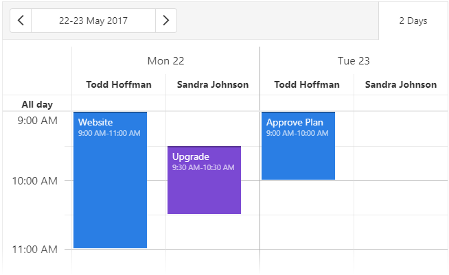
groupOrientation
Arranges resource headers vertically (in a column) or horizontally (in a row).
This property's default value depends on the view type. The following list illustrates the dependency:
"horizontal"
For the day, month, week, and workWeek view types."vertical"
For the timelineDay, timelineMonth, timelineWeek, and timelineWorkWeek view types. For the agenda, resource headers are always organized vertically.
See Also
intervalCount
Multiplies the default view interval. Applies to all view types except "agenda".
The following is a list of views and their default intervals:
- "day", "timelineDay" - a day
- "week", "timelineWeek" - a week
- "workWeek", "timelineWorkWeek" - a week without weekends
- "month" - a month
See Also
maxAppointmentsPerCell
Specifies the limit of full-sized appointments displayed per cell. Applies to all views except "agenda".
offset
Specifies the minute offset applied to configured day durations in the view.
This property shifts the interval between startDayHour and endDayHour. The offset value can be between -1440 (24 hours back) and 1440 (24 hours forward).
You can implement offset along with different startDayHour, endDayHour, and cellDuration combinations to customize the view. The following code snippet integrates these properties to configure days from 4:40 AM to 11:40 AM and a 40-minute cell duration:
jQuery
$(() => {
    $('#scheduler').dxScheduler({
        // ...
        views: [
            {
                type: 'workWeek',
                offset: -20,
                startDayHour: 5,
                endDayHour: 12,
                cellDuration: 40,
            }
        ]
    });
});
Angular
<dx-scheduler ... >
    <dxi-scheduler-view ...
        type="workWeek"
        [offset]="-20"
        [startDayHour]="5"
        [endDayHour]="12"
        [cellDuration]="40"
    >
    </dxi-scheduler-view>
</dx-scheduler>
Vue
<template>
    <DxScheduler ... >
        <DxView
            type="workWeek"
            offset="-20"
            start-day-hour="5"
            end-day-hour="12"
            cell-duration="40"
        />
    </DxScheduler>
</template>
React
import { Scheduler } from 'devextreme-react/scheduler';

function App() {
    return (
        <Scheduler ... >
            <View
                type="workWeek"
                offset="-20"
                startDayHour="5"
                endDayHour="12"
                cellDuration="40"
            />
        </Scheduler>
    )
}- This property has no effect in the agenda view.
- The offset value must be a multiple of 5.
scrolling
Configures scrolling for a view.
Scrolling allows a user to browse data outside the current viewport. Information about the available scrolling modes is in the mode property description.
See Also
startDate
Specifies the date from which to start counting the view interval. Applies to all view types except "agenda".
If this property is not defined, the count starts from the currentDate.
startDayHour
Specifies the first hour on the view's time scale. Accepts integer values from 0 to 24.
timeCellTemplate
Specifies a custom template for time scale items.
See Also
If you have technical questions, please create a support ticket in the DevExpress Support Center.