Angular DropDownButton - Overview
DevExtreme DropDownButton is a UI component that can display a list of actions. You can configure the component to trigger actions on button or list item click.
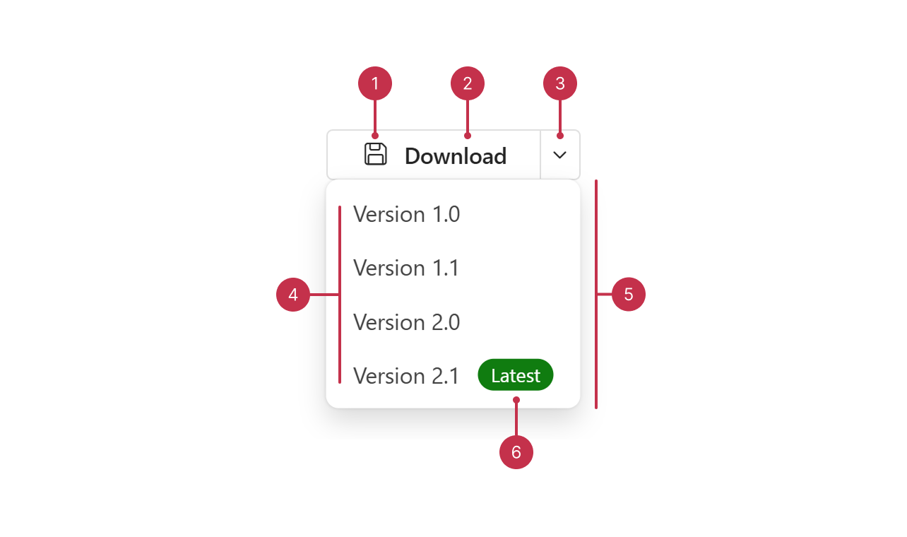
This overview highlights DropDownButton elements, key features, and what to explore next.
Key Features
Action Binding
DropDownButton can trigger actions on button click (onButtonClick) or list item click (onItemClick). You can also specify individual click handlers for each item within the component data source.Appearance Settings
You can specify an icon and text, as well as configure drop-down arrow visibility to customize component appearance.Item Configuration
You can configure text, icons, and badges to customize drop-down item appearance. The component also allows you to implement unique click handlers for each item, as well as custom templates.Split Button Support
DevExtreme DropDownButton supports a split button mode. In this mode, the component separates the action and drop-down buttons.Predefined Styling Modes
You can choose one of three styling modes to configure DropDownButton appearance: text only, contained, and outlined (default). The component also includes four built-in colors.Selection
When selection is enabled, the component displays the selected item text and icon. You can handle selection change and process selected item data at runtime.Accessibility and Keyboard Navigation
DropDownButton conforms to WCAG 2.x, European Accessibility Act (EAA), and Americans with Disabilities Act (ADA) standards. The component supports keyboard navigation and custom key handlers. TagBox also ships with right-to-left (RTL) representation support.Custom Templates
DropDownButton supports custom markup for the component action button and the drop-down content. You can also specify custom templates for specific drop-down items or a common template for all items.
If you have technical questions, please create a support ticket in the DevExpress Support Center.