All docs
V19.1
24.1
The page you are viewing does not exist in version 24.1.
23.2
The page you are viewing does not exist in version 23.2.
23.1
The page you are viewing does not exist in version 23.1.
22.2
The page you are viewing does not exist in version 22.2.
22.1
The page you are viewing does not exist in version 22.1.
21.2
The page you are viewing does not exist in version 21.2.
21.1
The page you are viewing does not exist in version 21.1.
20.2
The page you are viewing does not exist in version 20.2.
20.1
The page you are viewing does not exist in version 20.1.
19.2
19.1
18.2
18.1
The page you are viewing does not exist in version 18.1.
17.2
The page you are viewing does not exist in version 17.2.
Vue
A newer version of this page is available. Switch to the current version.

jQuery Sankey - tooltip

Configures tooltips - small pop-up rectangles that display information about a data-visualizing widget element being pressed or hovered over with the mouse pointer.

Type:

Object

arrowLength

Specifies the length of a tooltip's arrow in pixels.

Type:

Number

Default Value: 10

border

Configures a tooltip's border.

Type:

Object

color

Colors all tooltips.

Type:

String

Default Value: '#ffffff'

This option supports the following colors:

This option sets one color for all tooltips. You can specify a particular tooltip's color in the tooltip.customizeTooltip function.

container

Specifies the container in which to draw tooltips. The default container is the HTML DOM <body> element.

Type:

String

|

DOM Node

|

jQuery

Default Value: undefined

cornerRadius

Makes all the tooltip's corners rounded.

Type:

Number

Default Value: 0, 4 (Material)

The following table demonstrates how the corner's curvature depends on the cornerRadius value:

cornerRadius Result
cornerRadius: 0 DevExtreme Chart: tooltip with cornerRadius set to 0
cornerRadius: 15 DevExtreme Chart: tooltip with cornerRadius set to 15
cornerRadius: 35 DevExtreme Chart: tooltip with cornerRadius set to 35

customizeLinkTooltip

Customizes link tooltips' appearance.

Type:

Function

Function parameters:
info:

Object

Information about a sankey link being pressed or hovered over.

Object structure:
Name Type Description
source

String

The title of the link's source node.

target

String

The title of the link's target node.

weight

Number

The link's weight.

Return Value:

Object

The current tooltip's text or markup and appearance settings.

Default Value: undefined

This function should return an object with the following fields:

  • color
    Colors the current tooltip.

  • text
    Specifies the tooltip's text.

  • html
    Specifies the HTML markup the tooltip displays.

    NOTE
    If you are going to use external resources in the markup (for example, images), specify the size of the area they occupy beforehand.
  • fontColor
    Colors the tooltip's text.

  • borderColor
    Colors the tooltip's border.

View Demo

customizeNodeTooltip

Customizes node tooltips' appearance.

Type:

Function

Function parameters:
info:

Object

Information about a sankey node being pressed or hovered over.

Object structure:
Name Type Description
title

String

The node's title.

weightIn

Number

The total weight of the node's incoming links.

weightOut

Number

The total weight of the node's outgoing links.

Return Value:

Object

The current tooltip's text or markup and appearance settings.

Default Value: undefined

This function should return an object with the following fields:

  • color
    Colors the current tooltip.

  • text
    Specifies the tooltip's text.

  • html
    Specifies the HTML markup the tooltip displays.

    NOTE
    If you are going to use external resources (for example, images) in the markup, specify the size of the area they occupy beforehand.
  • fontColor
    Colors the tooltip's text.

  • borderColor
    Colors the tooltip's border.

enabled

Enables tooltips.

Type:

Boolean

Default Value: true

font

Specifies tooltips' font options.

Type:

Object

format

Formats a value before it is displayed it in a tooltip.

Type:

Format

Default Value: undefined

See the format section for details on accepted values.

See Also

opacity

Specifies tooltips' transparency.

Type:

Number

Default Value: undefined

This option accepts a value from 0 to 1, where 0 makes tooltips completely transparent, and 1 makes them opaque.
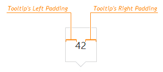
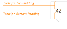
paddingLeftRight

Generates an empty space, measured in pixels, between a tooltip's left/right border and its text.

Type:

Number

Default Value: 18

DevExtreme HTML5 JavaScript Funnel Tooltips Left-Right Padding

paddingTopBottom

Generates an empty space, measured in pixels, between a tooltip's top/bottom border and its text.

Type:

Number

Default Value: 15

DevExtreme HTML5 JavaScript Funnel Tooltips Top-Bottom Padding

shadow

Configures a tooltip's shadow.

Type:

Object

zIndex

Specifies a tooltip's z-index.

Type:

Number

Default Value: undefined

If the widget's container has the CSS z-index property specified, and tooltips are displayed incorrectly, configure their z-index using this option.