JavaScript/jQuery DataGrid - filterRow
Configures the filter row.
The filter row allows a user to filter data by values of individual columns.
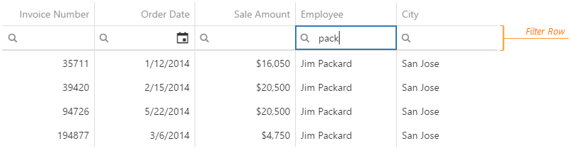
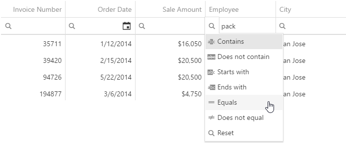
Each cell in the filter row contains a magnifying glass icon, pausing on which opens a drop-down list with filters available for the column.
To make the filter row visible, assign true to the filterRow.visible option.
See Also
applyFilter
Specifies when to apply a filter.
By default, the filter applies automatically after a user finishes entering a value into a cell of the filter row. Alternatively, the filter can be applied on a click on the "Apply Filter" button. To enable this mode, assign "onClick" to the applyFilter option.
Use the GridApplyFilterMode enum to specify this option when the widget is used as an ASP.NET MVC 5 Control or a DevExtreme-Based ASP.NET Core Control. This enum accepts the following values: Auto and OnClick.
applyFilterText
Specifies text for a hint that appears when a user pauses on a button that applies the filter.
betweenEndText
Specifies a placeholder for the editor that specifies the end of a range when a user selects the "between" filter operation.
See Also
- filterRow.betweenStartText
betweenStartText
Specifies a placeholder for the editor that specifies the start of a range when a user selects the "between" filter operation.
See Also
- filterRow.betweenEndText
operationDescriptions
Specifies descriptions for filter operations on the filter list.
See Also
- columns[].filterOperations
resetOperationText
Specifies text for the reset operation on the filter list.
The reset operation restores the default filter, which depends on the column's data type. For details on default filters by data types, refer to the description of the selectedFilterOperation option.
showAllText
Specifies text for the item that clears the applied filter. Used only when a cell of the filter row contains a select box.
In columns that contain Boolean values or use lookup, a user filters data with a select box. To clear the applied filter, the user selects the "All" item in this select box. The showAllText option specifies text for this item.

 Select one or more answers