JavaScript/jQuery Chart - valueAxis
Configures the value axis.
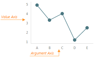
The valueAxis object, which is described here, configures the value axis individually. To specify common settings for all axes in a chart, use the commonAxisSettings object. Axis-specific settings override common settings.
aggregatedPointsPosition
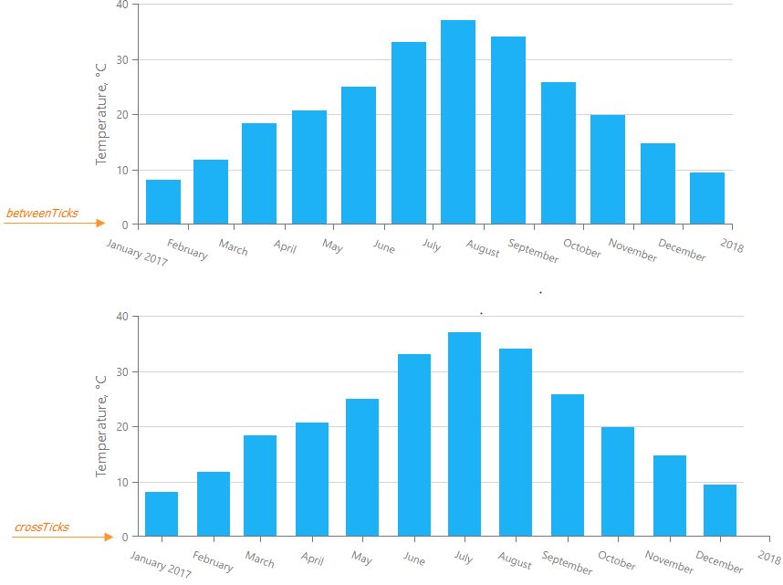
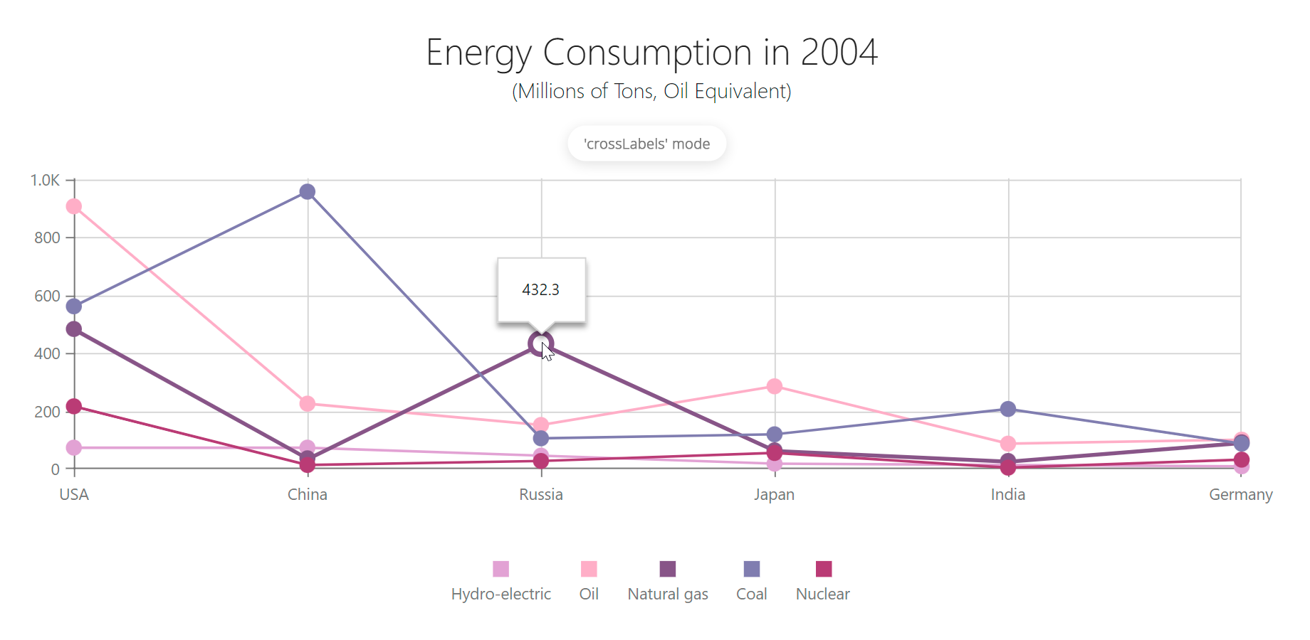
Specifies the start position of the aggregated series points in the aggregation interval. Applies only to axes of continuous and logarithmic types.
jQuery
$(function() {
    $("#chartContainer").dxChart({
        // ...
        commonAxisSettings: {
            aggregatedPointsPosition: 'crossTicks',
        },
    });
});
Angular
<dx-chart ... >
    <dxo-common-axis-settings [aggregatedPointsPosition]="crossTicks" >
    </dxo-common-series-settings>
</dx-chart>
import { Component } from '@angular/core';

@Component({
    selector: 'app-root',
    templateUrl: './app.component.html',
    styleUrls: ['./app.component.css']
})
export class AppComponent {
    // ...
}
import { BrowserModule } from '@angular/platform-browser';
import { NgModule } from '@angular/core';
import { AppComponent } from './app.component';

import { DxChartModule } from 'devextreme-angular';

@NgModule({
    declarations: [
        AppComponent
    ],
    imports: [
        BrowserModule,
        DxChartModule
    ],
    providers: [ ],
    bootstrap: [AppComponent]
})
export class AppModule { }
Vue
<template>
    <DxChart ... >
        <DxCommonAxisSettings :aggregated-points-position="crooTicks" />
    </DxChart>
</template>

<script>
import DxChart, {
    DxCommonAxisSettings
} from 'devextreme-vue/chart';

export default {
    components: {
        DxChart,
        DxCommonAxisSettings,
    },
    // ...
}
</script>
React
import React from 'react';

import Chart, {
    CommonAxisSettings
} from 'devextreme-react/chart';

class App extends React.Component {
    render() {
        return (
            <Chart ... >
                <CommonAxisSettings aggregatedPointsPosition="crossTicks" />
            </Chart>
        );
    }
}
export default App;
ASP.NET Core Controls
@(Html.DevExtreme().Chart()
    .AggregatedPointsPosition(AggregatedPointsPosition.CrossTicks)
    // ...
)
ASP.NET MVC Controls
@(Html.DevExtreme().Chart()
    .AggregatedPointsPosition(AggregatedPointsPosition.CrossTicks)
    // ...
)
See Also
allowDecimals
Specifies whether to allow decimal values on the axis. When false, the axis contains integer values only.
autoBreaksEnabled
Enables auto-calculated scale breaks. Applies only if the axis' type is "continuous" or "logarithmic" and valueType is "numeric".
If this property is true, the UI component detects large gaps between side-by-side points and cuts them out, putting scale breaks instead.
See Also
axisDivisionFactor
Specifies the minimum distance between two neighboring major ticks in pixels. Applies only to the axes of the "continuous" and "logarithmic" types.
For axes displaying numbers, the distance between major ticks depends on two interconnected properties: axisDivisionFactor and tickInterval. Consider that you have specified both these properties. If the specified tick interval leads the pixel distance between two ticks to being less than the axisDivisionFactor value, this tick interval will be ignored.
Use the axisDivisionFactor property only if you need to set the distance between ticks not knowing the axis values. Otherwise, use the tickInterval property.
breaks[]
Declares a custom scale break collection. Applies only if the axis' type is "continuous" or "logarithmic".
A scale break is an area across an axis that is displayed instead of a section of an axis range. Scale breaks improve the readability of chart sections with large gaps in their ranges.
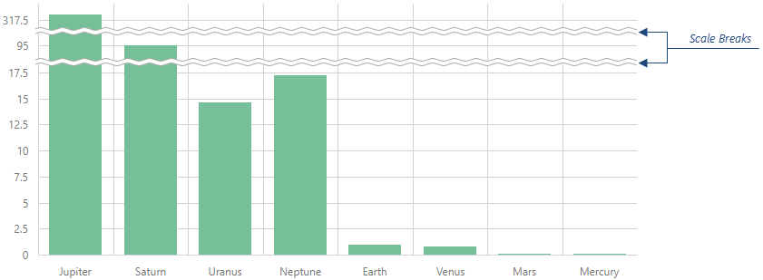
Each object in the breaks array configures a single scale break. A scale break range should be at least two tick intervals. Otherwise, the scale break might not be visible.
See Also
breakStyle
Configures scale break appearance.
The following code snippet configures commonAxisSettings.breakStyle to customize items in valueAxis.breaks[] and argumentAxis.breaks[].
jQuery
$(() => {
    $("#chartContainer").dxChart({
        commonAxisSettings: {
            breakStyle: {
                color: "red",
                line: "straight",
                width: 15,
            },
        },
        argumentAxis: {
            breaks: [{ startValue: 1998, endValue: 2003 }],
        },
        valueAxis: {
            breaks: [{ startValue: 250, endValue: 350 }],
        },
    })
})
Angular
<dx-chart>
    <dxo-common-axis-settings>
        <dxo-break-style
            color="red"
            line="straight"
            [width]="15"
        ></dxo-break-style>
    </dxo-common-axis-settings>
    <dxo-argument-axis>
        <dxi-break startValue="1998" endValue="2003"></dxi-break>
    </dxo-argument-axis>
    <dxo-value-axis>
        <dxi-break startValue="250" endValue="350"></dxi-break>
    <dxo-value-axis>
</dx-chart>
Vue
<template>
    <DxChart>
        <DxCommonAxisSettings>
            <DxBreakStyle
                color="red"
                line="straight"
                :width="15"
            />
        </DxCommonAxisSettings>
        <DxArgumentAxis>
            <DxBreak startValue="1998" endValue="2003" />
        </DxArgumentAxis>
        <DxValueAxis>
            <DxBreak startValue="250" endValue="350" />
        </DxValueAxis>
    </DxChart>
</template>
React
function App() {
return (
<Chart>
<CommonAxisSettings>
<BreakStyle
color="red"
line="straight"
width={15}
/>
</CommonAxisSettings>
<ArgumentAxis>
<Break startValue="1998" endValue="2003" />
</ArgumentAxis>
<ValueAxis>
<Break startValue="250" endValue="350" />
</ValueAxis>
</Chart>
)
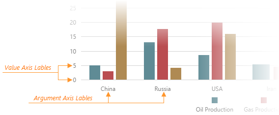
}categories
Specifies the order of categories on an axis of the "discrete" type.
Values of the string type on discrete axes maintain the order of objects in the data source. Values of the number and date types are sorted in ascending order regardless of their order within the data source. Specify the categories array to set the required order of values. In the following example, the values are sorted alphabetically:
jQuery
$(function() {
    $('#chartContainer').dxChart({
        // ...
        dataSource: dataSource,
        valueAxis: {
            categories: continentNames,
            valueField: 'continent'
        }
    });

    const dataSource = [
        { continent: 'Asia', area: 43820000 },
        { continent: 'Africa', area: 30370000 },
        { continent: 'North America', area: 24490000 },
        { continent: 'South America', area: 17840000 },
        { continent: 'Antarctica', area: 13720000 },
        { continent: 'Europe', area: 10180000 },
        { continent: 'Australia', area: 9008500 }
    ];

    const continentNames = [
        'Africa',
        'Antarctica',
        'Asia',
        'Australia',
        'Europe',
        'North America',
        'South America'
    ];
});
Angular
<dx-chart ...
    [dataSource]="dataSource">
    <dxo-value-axis
        [categories]="continentNames"
        valueField="continent">
    </dxo-value-axis>
</dx-chart>
import { Component } from '@angular/core';
@Component({
    selector: 'app-root',
    templateUrl: './app.component.html',
    styleUrls: ['./app.component.css']
})
export class AppComponent {
    dataSource = [
        { continent: 'Asia', area: 43820000 },
        { continent: 'Africa', area: 30370000 },
        { continent: 'North America', area: 24490000 },
        { continent: 'South America', area: 17840000 },
        { continent: 'Antarctica', area: 13720000 },
        { continent: 'Europe', area: 10180000 },
        { continent: 'Australia', area: 9008500 }
    ];

    continentNames = [
        'Africa',
        'Antarctica',
        'Asia',
        'Australia',
        'Europe',
        'North America',
        'South America'
    ];
}
import { BrowserModule } from '@angular/platform-browser';
import { NgModule } from '@angular/core';
import { AppComponent } from './app.component';

import { DxChartModule } from 'devextreme-angular';

@NgModule({
    declarations: [
        AppComponent
    ],
    imports: [
        BrowserModule,
        DxChartModule
    ],
    providers: [ ],
    bootstrap: [AppComponent]
})
export class AppModule { }
Vue
<template>
    <DxChart ...
        :data-source="dataSource">
        <DxValueAxis
            :categories="continentNames"
            value-field="continent"
        />
    </DxChart>
</template>

<script>
import DxChart, {
    DxValueAxis
} from 'devextreme-vue/chart';

export default {
    components: {
        DxChart,
        DxValueAxis
    },
    data() {
        return {
            dataSource: [
                { continent: 'Asia', area: 43820000 },
                { continent: 'Africa', area: 30370000 },
                { continent: 'North America', area: 24490000 },
                { continent: 'South America', area: 17840000 },
                { continent: 'Antarctica', area: 13720000 },
                { continent: 'Europe', area: 10180000 },
                { continent: 'Australia', area: 9008500 }
            ],

            continentNames: [
                'Africa',
                'Antarctica',
                'Asia',
                'Australia',
                'Europe',
                'North America',
                'South America'
            ]
        };
    }
}
</script>
React
import React from 'react';

import Chart, {
    ValueAxis
} from 'devextreme-react/chart';

const dataSource = [
    { continent: 'Asia', area: 43820000 },
    { continent: 'Africa', area: 30370000 },
    { continent: 'North America', area: 24490000 },
    { continent: 'South America', area: 17840000 },
    { continent: 'Antarctica', area: 13720000 },
    { continent: 'Europe', area: 10180000 },
    { continent: 'Australia', area: 9008500 }
];

const continentNames = [
    'Africa',
    'Antarctica',
    'Asia',
    'Australia',
    'Europe',
    'North America',
    'South America'
];

class App extends React.Component {
    render() {
        return (
            <Chart ...
                dataSource={dataSource}>
                <ValueAxis
                    categories={continentNames}
                    valueField="continent"
                />
            </Chart>
        );
    }
}

export default App;
color
Specifies the color of the axis line.
This property supports the following colors:
- Hexadecimal colors
- RGB colors
- RGBA colors
- Predefined/cross-browser color names
- Predefined SVG colors
- Paint server address
constantLines[]
Declares a collection of constant lines belonging to the value axis.
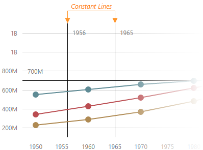
Each object in the constantLines array configures a single constant line. Setting the value property is necessary for a constant line to be displayed.
See Also
- valueAxis.constantLineStyle - specifies the appearance of those constant lines that belong to the value axis.
- commonAxisSettings.constantLineStyle - specifies the appearance of all constant lines in the UI component.
constantLineStyle
Specifies the appearance of those constant lines that belong to the value axis.
See Also
- valueAxis.constantLines[] - configures individual constant lines. Overrides the properties of the valueAxis.constantLineStyle object, which is described here.
- commonAxisSettings.constantLineStyle - specifies the appearance of all constant lines in the UI component.
customPosition
Specifies the position of the value axis on the argument axis.
The value of this property should be specified in the same format as the arguments on the argument axis. The value axis is on the pane border if the customPosition's value is outside the argument axis range.
See also
- argumentAxis.customPosition
discreteAxisDivisionMode
Specifies whether ticks and grid lines should cross axis labels or lie between them. Applies only to the axes of the "discrete" type.

endOnTick
Specifies whether to force the axis to start and end on ticks.
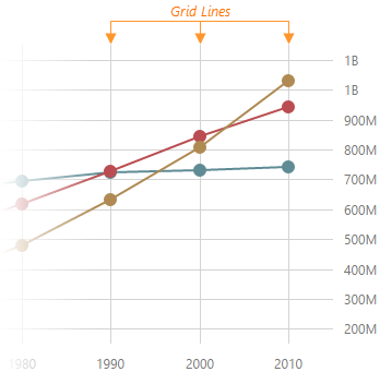
grid
Configures the grid.
Gridlines can be considered extensions of ticks.
jQuery
$('#chart').dxChart({
    commonAxisSettings: {
        grid: {
            visible: true,
            color: 'blue',
            opacity: 0.25,
            width: 2,
        },
    },
})
Angular
<dx-chart ... >
    <dxo-common-axis-settings>
        <dxo-grid
            [visible]="true"
            color="blue"
            [opacity]="0.25"
            [width]="2"
        ></dxo-grid>
    </dxo-common-axis-settings>
</dx-chart>
Vue
<template>
    <DxChart ... >
        <DxCommonAxisSettings>
            <DxGrid
                :visible="true"
                color="blue"
                :opacity="0.25"
                :width="2"
            />
        </DxCommonAxisSettings>
    </DxChart>
</template>

<script setup lang="ts">
import { DxChart, DxCommonAxisSettings, DxGrid } from 'devextreme-vue/chart';

</script>
React
import { Chart, CommonAxisSettings, Grid } from 'devextreme-react/chart';

function App() {
    return (
        <Chart ... >
            <CommonAxisSettings>
                <Grid
                    visible={true}
                    color="blue"
                    opacity={0.25}
                    width={2}
                />
            </CommonAxisSettings>
        </Chart>
    )
}
The commonAxisSettings.grid object specifies common settings for all gridlines on a chart. To configure only those grid lines that descend from a particular axis, use the following objects:
Axis-specific settings override common settings.
See Also
- commonAxisSettings.minorGrid - configures the minor grid built on minor ticks.
inverted
Inverts the axis.
When an axis is inverted (that is, when this property is set to true), its maximum and minimum values swap their places. As a result, axis values ascend in the opposite direction. Along with the axis, series also become inverted.
See Also
- rotated - rotates the chart.
label
Configures the labels of the value axis.
Axis labels display the values of major axis ticks.
See Also
- commonAxisSettings.label - configures the labels of all axes in the UI component.
linearThreshold
Specifies a value used to calculate the range on a logarithmic axis within which the axis should be linear. Applies only if the data source contains negative values or zeroes.
Setting this property prevents generating an infinite number of small axis values. Set it to an integer value that designates a power of logarithmBase. The following code sample shows how different linearThreshold values affect the linear range when the logarithmBase is 10:
linearThreshold: -1 // [-0.1; 0.1]
linearThreshold: -2 // [-0.01; 0.01]
linearThreshold: -3 // [-0.001; 0.001]
logarithmBase
Specifies the value to be raised to a power when generating ticks for an axis of the "logarithmic" type.
By default, ticks on a logarithmic axis are generated on a base of 10, i.e., 0.1, 1, 10, 100, 1000 etc. But you can specify the needed base using the logarithmBase property. For example, if you set this property to 5, the following ticks will be generated: 0.5, 5, 25, 125, 625, etc.
maxAutoBreakCount
Sets a limit on auto-calculated scale breaks. Custom scale breaks are not counted.
maxValueMargin
Controls the empty space between the maximum series points and the axis. Applies only to the axes of the "continuous" and "logarithmic" type.
The Chart component adds a space at the end of the axis data range to avoid cutting off the largest values. You can specify the size of this space with maxValueMargin, which is a ratio applied to the axis range. The following formula shows how it works:
axisEndValue = maxDataValue + (maxDataValue - minDataValue) * maxValueMargin
The following expression calculates the axis end value with a minimum data value of 1960, a maximum data value of 2010, and maxValueMargin of 0.1:
axisEndValue = 2010 + (2010 - 1960) * 0.1 = 2010 + 50 * 0.1 = 2010 + 5 = 2015
See Also
- commonAxisSettings.valueMarginsEnabled - enables/disables margins for axes.
- commonAxisSettings.minValueMargin
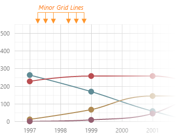
minorGrid
Configures the minor grid.
In addition to the major grid, DevExtreme Chart can display a minor grid following the placement of minor ticks.
jQuery
$('#chart').dxChart({
    // ...
    commonAxisSettings: {
        minorGrid: {
            visible: true,
            color: 'blue',
            opacity: 0.1,
            width: 1,
        },
    },
})
Angular
<dx-chart ... >
    <dxo-common-axis-settings>
        <dxo-minor-grid
            [visible]="true"
            color="blue"
            [opacity]="0.1"
            [width]="1"
        ></dxo-minor-grid>
    </dxo-common-axis-settings>
</dx-chart>
Vue
<template>
    <DxChart ... >
        <DxCommonAxisSettings>
            <DxMinorGrid
                :visible="true"
                color="blue"
                :opacity="0.1"
                :width="1"
            />
        </DxCommonAxisSettings>
    </DxChart>
</template>

<script setup lang="ts">
import { DxChart, DxCommonAxisSettings, DxMinorGrid } from 'devextreme-vue/chart';

</script>
React
import { Chart, CommonAxisSettings, MinorGrid } from 'devextreme-react/chart';

function App() {
    return (
        <Chart ... >
            <CommonAxisSettings>
                <MinorGrid
                    visible={true}
                    color="blue"
                    opacity={0.1}
                    width={1}
                />
            </CommonAxisSettings>
        </Chart>
    )
}
The commonAxisSettings.minorGrid object specifies common settings for all minor gridlines in a chart. To configure only those gridlines that descend from an axis of your choice, use the following objects:
Axis-specific settings override common settings.
- If you display the minor grid alone, it may impair chart readability. We recommend you implement the minor grid in conjunction with the major grid.
- The component does not display the minor grid on "discrete" axes.
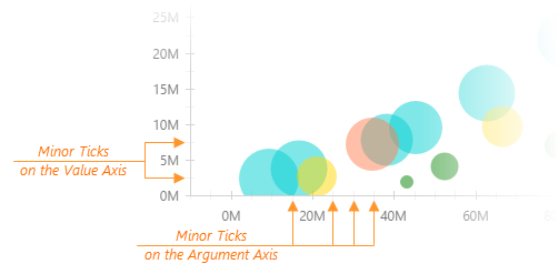
minorTick
Configures the appearance of minor axis ticks.
In addition to major ticks, the DevExtreme Chart can display minor ticks. This component places minor ticks between major ticks.
jQuery
$('#chart').dxChart({
    commonAxisSettings: {
        minorTick: {
            visible: true,
            color: "blue",
            length: 10,
            opacity: 0.5,
            shift: 0,
            width: 1,
        },
    },
})
Angular
<dx-chart ... >
    <dxo-common-axis-settings>
        <dxo-minor-tick
            [visible]="true"
            color="blue"
            [length]="10"
            [opacity]="0.5"
            [shift]="0"
            [width]="1"
        ></dxo-minor-tick>
    </dxo-common-axis-settings>
</dx-chart>
Vue
<template>
    <DxChart ... >
        <DxCommonAxisSettings>
            <DxMinorTick
                :visible="true"
                color="blue"
                :length="10"
                :opacity="0.5"
                :shift="0"
                :width="1"
            />
        </DxCommonAxisSettings>
    </DxChart>
</template>

<script setup lang="ts">
import { DxChart, DxCommonAxisSettings, DxMinorTick } from 'devextreme-vue/chart';

</script>
React
import { Chart, CommonAxisSettings, MinorTick } from 'devextreme-react/chart';

function App() {
    return (
        <Chart ... >
            <CommonAxisSettings>
                <MinorTick
                    visible={true}
                    color="blue"
                    length={10}
                    opacity={0.5}
                    shift={0}
                    width={1}
                />
            </CommonAxisSettings>
        </Chart>
    )
}
The commonAxisSettings.minorTick object specifies common settings for all minor ticks in a chart. To configure only those minor ticks that belong to a particular axis, use the following objects:
Axis-specific settings override common settings.
See Also
- argumentAxis.minorTickInterval - specifies the minor tick interval of the argument axis.
- valueAxis.minorTickInterval - specifies the minor tick interval of the value axis.
minorTickCount
Specifies how many minor ticks to place between two neighboring major ticks.
See Also
- valueAxis.minorTickInterval - specifies the interval between minor ticks. Has a higher priority than the minorTickCount property.
minorTickInterval
Specifies the interval between minor ticks. Applies only to continuous axes.
If the axis displays numbers, set the minorTickInterval to a number. This number should fall into a range of 0 to 1 for a full-stacked series. For example, a minorTickInterval of 0.05 places a minor tick every 5%. If the axis displays date-time values, set the minorTickInterval to an accepted string value or an object that contains one of the fields described in this section, for example:
jQuery
$(function() {
    $("#chartContainer").dxChart({
        // ...
        valueAxis: {
            // ...
            minorTickInterval: { days: 5 }
        }
    });
});
Angular
<dx-chart ... >
    <dxi-value-axis ... >
        <dxo-minor-tick-interval [days]="5"></dxo-minor-tick-interval>
    </dxi-value-axis>
</dx-chart>
import { DxChartModule } from "devextreme-angular";
// ...
export class AppComponent {
    // ...
}
@NgModule({
    imports: [
        // ...
        DxChartModule
    ],
    // ...
})
Vue
<template>
    <DxChart ... >
        <DxValueAxis>
            <DxMinorTickInterval :days="5" />
        </DxValueAxis>
    </DxChart>
</template>

<script>
import DxChart, {
    DxValueAxis,
    DxMinorTickInterval
} from 'devextreme-vue/chart';

export default {
    components: {
        DxChart,
        DxValueAxis,
        DxMinorTickInterval
    }
}
</script>
React
import React from 'react';

import Chart, {
    ValueAxis,
    MinorTickInterval
} from 'devextreme-react/chart';

class App extends React.Component {
    render() {
        return (
            <Chart ... >
                <ValueAxis>
                    <MinorTickInterval days={5} />
                </ValueAxis>
            </Chart>
        );
    }
}

export default App;
See Also
- valueAxis.minorTickCount
- valueAxis.minorTick
- valueAxis.tickInterval
minValueMargin
Controls the empty space between the minimum series points and the axis. Applies only to the axes of the "continuous" and "logarithmic" type.
The Chart component adds a space at the start of the axis data range to avoid cutting off the smallest values. You can specify the size of this space with minValueMargin, which is a ratio applied to the axis range. The following formula shows how it works:
axisStartValue = minDataValue - (maxDataValue - minDataValue) * minValueMargin
The following expression calculates the axis start value with a minimum data value of 1960, a maximum data value of 2010, and minValueMargin of 0.1:
axisStartValue = 1960 - (2010 - 1960) * 0.1 = 1960 - 50 * 0.1 = 1960 - 5 = 1955
See Also
- commonAxisSettings.valueMarginsEnabled - enables/disables margins for axes.
- commonAxisSettings.maxValueMargin
minVisualRangeLength
Specifies the minimum length of the visual range.
If the visual range is set on a numeric axis, assign a number to this property. If the axis displays date-time values, assign one of the accepted string values or an object to this property. The object should contain one or several fields described in this section, for example:
jQuery
$(function() {
    $("#chartContainer").dxChart({
        // ...
        valueAxis: {
            // ...
            minVisualRangeLength: { weeks: 2 }
        }
    });
});
Angular
<dx-chart ... >
    <dxi-value-axis ... >
        <dxo-min-visual-range-length [weeks]="2"></dxo-min-visual-range-length>
    </dxi-value-axis>
</dx-chart>
import { Component } from '@angular/core';

@Component({
    selector: 'app-root',
    templateUrl: './app.component.html',
    styleUrls: ['./app.component.css']
})
export class AppComponent {
    // ...
}
import { BrowserModule } from '@angular/platform-browser';
import { NgModule } from '@angular/core';
import { AppComponent } from './app.component';

import { DxChartModule } from 'devextreme-angular';

@NgModule({
    declarations: [
        AppComponent
    ],
    imports: [
        BrowserModule,
        DxChartModule
    ],
    providers: [ ],
    bootstrap: [AppComponent]
})
export class AppModule { }
Vue
<template>
    <DxChart ... >
        <DxValueAxis ... >
            <DxMinVisualRangeLength :weeks="2" />
        </DxValueAxis>
    </DxChart>
</template>

<script>
import DxChart, {
    DxValueAxis,
    DxMinVisualRangeLength
} from 'devextreme-vue/chart';

export default {
    components: {
        DxChart,
        DxValueAxis,
        DxMinVisualRangeLength
    },
    data() {
        return {
            // ...
        }
    },
}
</script>
React
import React from 'react';
import Chart, {
    ValueAxis,
    MinVisualRangeLength
} from 'devextreme-react/chart';

class App extends React.Component {
    render() {
        return (
            <Chart ... >
                <ValueAxis ... >
                    <MinVisualRangeLength weeks={2} />
                </ValueAxis>
            </Chart>
        );
    }
}
export default App;
See Also
multipleAxesSpacing
Adds a pixel-measured empty space between two side-by-side value axes. Applies if several value axes are located on one side of the chart.
The order of axes in the valueAxis array plays a significant role when you specify this property. When you need to add an empty space between two side-by-side axes, set the multipleAxesSpacing property for the axis declared last in the valueAxis array. For example, to add space between the second and the third axes, set the multipleAxesSpacing property for the third axis.
name
Specifies the name of the value axis.
When there are multiple value axes in a chart, series need to know exactly which axis they are bound to. By default, all of them are bound to the first axis in the valueAxis array. To bind a series to another axis, name the axis and assign this name to the axis series property.
offset
Specifies the shift in pixels of the value axis.
Negative numbers shift the axis position to the left, positive numbers - to the right. If the rotated property is enabled, negative numbers will shift the axis position to the top, and positive numbers - to the bottom.
See Also
opacity
Specifies how transparent the axis line should be.
This property accepts a value from 0 to 1, where 0 makes the axis line completely transparent, and 1 makes it opaque.
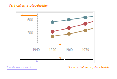
placeholderSize
Reserves a pixel-measured space for the axis.
The reserved space will be occupied by the axis line and axis labels.
See Also
- margin - generates space around the UI component.
position
Relocates the value axis.
Depending on the value of the rotated property, position accepts different values.
| rotated | position |
|---|---|
| false | "left" or "right" |
| true | "bottom" or "top" |
If the predefined positions do not meet your requirements, use the customPosition property.
showZero
Specifies whether or not to show zero on the value axis.
By default, the value axis shows zero for area- and bar-like series, and hides it for others. To force showing zero regardless of the series type, set the showZero property to true. If you set this property to false, zero will be hidden until it is included in any series.
strips[]
Declares a collection of strips belonging to the value axis.
A strip is a colored piece of the chart's background that highlights a range of values. Strips allow a viewer to see whether a certain series point falls in or out of a range.
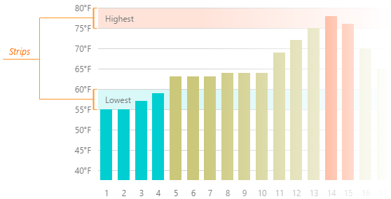
Each object in the strips array configures a single strip. To limit a strip, set its startValue and endValue properties. You may set only one of them, in which case the strip will not have a limit at one end. Note that setting the color property is also necessary for a strip to be displayed.
See Also
- valueAxis.stripStyle - specifies the appearance of those strips that belong to the value axis.
- commonAxisSettings.stripStyle - specifies the appearance of all strips in the UI component.
stripStyle
Configures the appearance of strips.
The commonAxisSettings.stripStyle object specifies common settings for all strips in the chart. To configure only those strips that belong to a particular axis, use the following objects.
- argumentAxis.stripStyle
- valueAxis.stripStyle
To configure individual strips, use the following arrays of objects.
Individual settings override axis-specific settings which, in their turn, override common settings.
synchronizedValue
Synchronizes two or more value axes with each other at a specific value.
A synchronizedValue produces an extra tick on the value axis. Such ticks of each value axis will be laid in one line thus synchronizing the axes with each other.
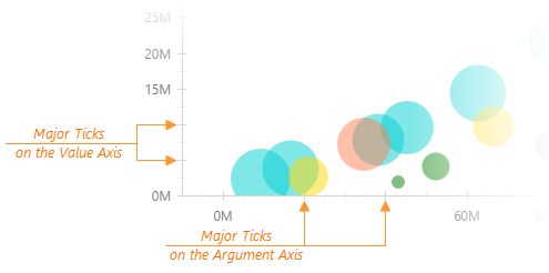
tick
Configures major axis tick appearance.
Ticks help you align values with their corresponding data points on an axis. The tick object configures major ticks that are placed in relation to value labels.
jQuery
$('#chart').dxChart({
    commonAxisSettings: {
        tick: {
            visible: true,
            color: "blue",
            length: 20,
            opacity: 0.75,
            shift: 0,
            width: 2,
        },
    },
})
Angular
<dx-chart ... >
    <dxo-common-axis-settings>
        <dxo-tick
            [visible]="true"
            color="blue"
            [length]="20"
            [opacity]="0.75"
            [shift]="0"
            [width]="2"
        ></dxo-tick>
    </dxo-common-axis-settings>
</dx-chart>
Vue
<template>
    <DxChart ... >
        <DxCommonAxisSettings>
            <DxTick
                :visible="true"
                color="blue"
                :length="20"
                :opacity="0.75"
                :shift="0"
                :width="2"
            />
        </DxCommonAxisSettings>
    </DxChart>
</template>

<script setup lang="ts">
import { DxChart, DxCommonAxisSettings, DxTick } from 'devextreme-vue/chart';

</script>
React
import { Chart, CommonAxisSettings, Tick } from 'devextreme-react/chart';

function App() {
    return (
        <Chart ... >
            <CommonAxisSettings>
                <Tick
                    visible={true}
                    color="blue"
                    length={20}
                    opacity={0.75}
                    shift={0}
                    width={2}
                />
            </CommonAxisSettings>
        </Chart>
    )
}
The commonAxisSettings.tick object specifies common settings for all major ticks in a chart. To configure only those major ticks that belong to a particular axis, use the following objects:
Axis-specific settings override common settings.
See Also
- argumentAxis.tickInterval - specifies the tick interval of the argument axis.
- valueAxis.tickInterval - specifies the tick interval of the value axis.
- commonAxisSettings.minorTick - customizes minor tick appearance.
tickInterval
Specifies the interval between major ticks. Does not apply to discrete axes.
If the axis displays numbers, set the tickInterval to a number. This number should fall into a range of 0 to 1 for a full-stacked series. For example, a tickInterval of 0.2 places a tick every 20%. If the axis displays date-time values, set the tickInterval to an accepted string value or object that contains one of the fields described in this section, for example:
jQuery
$(function() {
    $("#chartContainer").dxChart({
        // ...
        valueAxis: {
            // ...
            tickInterval: { days: 5 }
        }
    });
});
Angular
<dx-chart ... >
    <dxi-value-axis ... >
        <dxo-tick-interval [days]="5"></dxo-tick-interval>
    </dxi-value-axis>
</dx-chart>
import { DxChartModule } from "devextreme-angular";
// ...
export class AppComponent {
    // ...
}
@NgModule({
    imports: [
        // ...
        DxChartModule
    ],
    // ...
})
Vue
<template>
    <DxChart ... >
        <DxValueAxis>
            <DxTickInterval :days="5" />
        </DxValueAxis>
    </DxChart>
</template>

<script>
import DxChart, {
    DxValueAxis,
    DxTickInterval
} from 'devextreme-vue/chart';

export default {
    components: {
        DxChart,
        DxValueAxis,
        DxTickInterval
    }
}
</script>
React
import React from 'react';

import Chart, {
    ValueAxis,
    TickInterval
} from 'devextreme-react/chart';

class App extends React.Component {
    render() {
        return (
            <Chart ... >
                <ValueAxis>
                    <TickInterval days={5} />
                </ValueAxis>
            </Chart>
        );
    }
}

export default App;
When you use a "logarithmic" type axis, ticks are generated as an exponentiation. For example, assuming that the logarithm base is 10 and the tick interval is 1, ticks are generated at 10-2, 10-1, 100, 101, 102, 103, etc. If the tick interval is 2, ticks are generated at 10-1, 101, 103, etc.
See Also
- valueAxis.tick
- valueAxis.minorTickInterval
title
Configures the axis title.
The axis title is a short text displayed alongside the axis. Usually, the axis title shows units of measurement for values displayed by the axis. You can put any text in the axis title though.
If you assign an object to the title property, specifying the text field of this object is necessary for the axis title to be displayed. Besides the object, the title property accepts a string, thus providing a shortcut for setting the axis title. Therefore, this:
title: 'Axis Title'
is the same as this:
title: {
    text: 'Axis Title'
}
See Also
- commonAxisSettings.title - configures all axis titles in the UI component.
type
Specifies the type of the value axis.
The value axis can have one of the following types.
- Continuous
Displays numeric and date-time values. To divide this axis into intervals, use the tickInterval property. - Discrete
Displays string values called "categories". To sort them, use the categories array. - Logarithmic
Displays numeric values. Each value is the logarithmBase value raised to some power. For example, logarithmBase equaling to 10 produces the following values: 10-2, 10-1, 100, 101, 102, etc. The logarithmic axis is useful when you visualize a dataset of rapidly-growing values.
Normally, there is no need to specify this property, because the axis type is determined automatically depending on the type of values. However, you may force the use of a specific axis type, for example, to employ the "discrete" axis type with numeric or date-time values.
valueMarginsEnabled
Adds an empty space between axis ends and minimum/maximum series points.
When valueMarginsEnabled is true, the component extends axes to prevent cutting off minimum/maximum series points if necessary. To specify persistent margins, configure the minValueMargin and maxValueMargin properties.
valueType
Casts values to a specified data type.
If your data source stores numbers or dates as strings, specify the proper data type using this property. Make sure the dates have a valid format.
See Also
- argumentAxis.argumentType - casts arguments to a proper data type.
- valueAxis.type - specifies the axis type.
- dataPrepareSettings.checkTypeForAllData - validates the type of each value coming from the data source.
- dataPrepareSettings.convertToAxisDataType - allows you to disable the type cast in favour of the UI component performance.
visualRange
Defines the axis' displayed range. Cannot be wider than the wholeRange.
This property accepts one of the following:
A two-item array
Specifies the range's start and end. The array can contain a pair of numeric, string, or date-time values, depending on the axis's valueType. You can also set one of the array values to null to specify an open-ended range.
jQuery
index.js$(#chart).dxChart({ valueAxis: { visualRange: [50, 70] } }) // Open-ended range $(#chart).dxChart({ valueAxis: { visualRange: [null, 70] } })Angular
app.component.html<dx-chart> <dxo-value-axis [visualRange]="[50, 70]" ></dxo-value-axis> </dx-chart> <!-- Open-ended range --> <dx-chart> <dxo-value-axis [visualRange]="[null, 70]" ></dxo-value-axis> </dx-chart>Vue
App.vue<DxChart> <DxValueAxis :visualRange="[50, 70]" /> </DxChart> <!-- Open-ended range --> <DxChart> <DxValueAxis :visualRange="[null, 70]" /> </DxChart>React
App.tsx<Chart> <ValueAxis visualRange={[50, 70]} /> </Chart> <!-- Open-ended range --> <Chart> <ValueAxis visualRange={[null, 70]} /> </Chart>An object with the startValue and endValue fields
An alternative to the two-item array.
jQuery
index.js$(#chart).dxChart({ valueAxis: { visualRange: { startValue: 50, endValue: 70 } } }) // Open-ended range $(#chart).dxChart({ valueAxis: { visualRange: { startValue: null, endValue: 70 } } })Angular
app.component.html<dx-chart> <dxo-value-axis [visualRange]="{ startValue: 50, endValue: 70 }" ></dxo-value-axis> </dx-chart> <!-- Open-ended range --> <dx-chart> <dxo-value-axis [visualRange]="{ startValue: null, endValue: 70 }" ></dxo-value-axis> </dx-chart>Vue
The following code snippet demonstrates visualRange defined as a
<DxValueAxis>attribute:App.vue<DxChart> <DxValueAxis :visualRange="{ startValue: null, endValue: 70 }" /> </DxChart> <!-- Open-ended range --> <DxChart> <DxValueAxis :visualRange="{ startValue: null, endValue: 70 }" /> </DxChart>The following code snippet demonstrates visualRange defined as a
<DxVisualRange>selector:<DxChart> <DxValueAxis> <DxVisualRange startValue="50" endValue="70" /> </DxValueAxis> </DxChart> <!-- Open-ended range --> <DxChart> <DxValueAxis> <DxVisualRange :startValue="null" endValue="70" /> </DxValueAxis> </DxChart>React
The following code snippet demonstrates visualRange defined as a
<ValueAxis>attribute:App.tsx<Chart> <ValueAxis visualRange={{ startValue: null, endValue: 70 }} /> </Chart> <!-- Open-ended range --> <Chart> <ValueAxis visualRange={{ startValue: null, endValue: 70 }} /> </Chart>The following code snippet demonstrates visualRange defined as a
<VisualRange>selector:<Chart> <ValueAxis> <VisualRange startValue="50" endValue="70" /> </ValueAxis> </Chart> <!-- Open-ended range --> <Chart> <ValueAxis> <VisualRange startValue={null} endValue="70" /> </ValueAxis> </Chart>An object with the length and startValue or endValue
Specifies the range using length and start or end values.
jQuery
index.js$(#chart).dxChart({ valueAxis: { visualRange: { startValue: 50, length: 20 } } }) // or $(#chart).dxChart({ valueAxis: { visualRange: { endValue: 70, length: 20 } } })Angular
app.component.html<dx-chart> <dxo-value-axis [visualRange]="{ startValue: 50, length: 20 }" ></dxo-value-axis> </dx-chart> <!-- or --> <dx-chart> <dxo-value-axis [visualRange]="{ endValue: 70, length: 20 }" ></dxo-value-axis> </dx-chart>Vue
The following code snippet demonstrates visualRange defined as an attribute of
<DxValueAxis>:App.vue<DxChart> <DxValueAxis :visualRange="{ startValue: 50, length: 20 }" /> </DxChart> <!-- or --> <DxChart> <DxValueAxis :visualRange="{ endValue: 70, length: 20 }" /> </DxChart>The following code snippet demonstrates visualRange defined as a selector (
<DxVisualRange>):<DxChart> <DxValueAxis> <DxVisualRange startValue="50" length="20" /> </DxValueAxis> </DxChart> <!-- or --> <DxChart> <DxValueAxis> <DxVisualRange endValue="70" length="20" /> </DxValueAxis> </DxChart>React
The following code snippet demonstrates visualRange defined as an attribute of
<ValueAxis>:App.tsx<Chart> <ValueAxis visualRange={{ startValue: 50, length: 20 }} /> <Chart> <!-- or --> <Chart> <ValueAxis visualRange={{ endValue: 70, length: 20 }} /> <Chart>The following code snippet demonstrates visualRange defined as a selector (
<VisualRange>):<Chart> <ValueAxis> <VisualRange startValue="50" length="20" /> </ValueAxis> <Chart> <!-- or --> <Chart> <ValueAxis> <VisualRange endValue="70" length="20" /> </ValueAxis> <Chart>If you specify only length, the component defines the endValue property as the largest scale value.
Angular
dxo- selectors.To specify the minimum visual range that a user can set, use the minVisualRangeLength property.
The specified visual range is adjusted automatically when the argument axis is zoomed and panned. Set adjustOnZoom to false to disable this behavior.
See Also
visualRangeUpdateMode
Specifies how the component changes valueAxis.visualRange when chart data is updated.
The following modes are available:
"reset"
visualRange becomes equal to the data range or wholeRange if defined and within the data range."keep"
visualRange does not change."auto"
The component applies a mode based on argumentAxis.visualRangeUpdateMode:- If argumentAxis.visualRangeUpdateMode is "shift" or "reset", valueAxis.visualRangeUpdateMode is set to "reset".
- If argumentAxis.visualRangeUpdateMode is "keep", valueAxis.visualRangeUpdateMode is set to "keep".
"shift" (deprecated since v23.1)
The same as "auto" mode.
See Also
- Axis.visualRange()
wholeRange
Defines the range where the axis can be zoomed and panned. To limit the visual range, specify the visualRange property.
This property accepts one of the following:
A two-item array
Specifies the range's start and end. The array can contain a pair of numeric, string, or date-time values, depending on the axis's valueType. You can also set one of the array values to null to specify an open-ended range.
jQuery
index.js$(#chart).dxChart({ valueAxis: { wholeRange: [50, 70] } }) // Open-ended range $(#chart).dxChart({ valueAxis: { wholeRange: [null, 70] } })Angular
app.component.html<dx-chart> <dxo-value-axis [wholeRange]="[50, 70]" ></dxo-value-axis> </dx-chart> <!-- Open-ended range --> <dx-chart> <dxo-value-axis [wholeRange]="[null, 70]" ></dxo-value-axis> </dx-chart>Vue
App.vue<DxChart> <DxValueAxis :wholeRange="[50, 70]" /> </DxChart> <!-- Open-ended range --> <DxChart> <DxValueAxis :wholeRange="[null, 70]" /> </DxChart>React
App.tsx<Chart> <ValueAxis wholeRange={[50, 70]} /> </Chart> <!-- Open-ended range --> <Chart> <ValueAxis wholeRange={[null, 70]} /> </Chart>An object with the startValue and endValue fields
An alternative to the two-item array.
jQuery
index.js$(#chart).dxChart({ valueAxis: { wholeRange: { startValue: 50, endValue: 70 } } }) // Open-ended range $(#chart).dxChart({ valueAxis: { wholeRange: { startValue: null, endValue: 70 } } })Angular
app.component.html<dx-chart> <dxo-value-axis [wholeRange]="{ startValue: 50, endValue: 70 }" ></dxo-value-axis> </dx-chart> <!-- Open-ended range --> <dx-chart> <dxo-value-axis [wholeRange]="{ startValue: null, endValue: 70 }" ></dxo-value-axis> </dx-chart>Vue
The following code snippet demonstrates wholeRange defined as a
<DxValueAxis>attribute:App.vue<DxChart> <DxValueAxis :wholeRange="{ startValue: null, endValue: 70 }" /> </DxChart> <!-- Open-ended range --> <DxChart> <DxValueAxis :wholeRange="{ startValue: null, endValue: 70 }" /> </DxChart>The following code snippet demonstrates wholeRange defined as a
<DxWholeRange>selector:<DxChart> <DxValueAxis> <DxWholeRange startValue="50" endValue="70" /> </DxValueAxis> </DxChart> <!-- Open-ended range --> <DxChart> <DxValueAxis> <DxWholeRange :startValue="null" endValue="70" /> </DxValueAxis> </DxChart>React
The following code snippet demonstrates wholeRange defined as a
<ValueAxis>attribute:App.tsx<Chart> <ValueAxis wholeRange={{ startValue: null, endValue: 70 }} /> </Chart> <!-- Open-ended range --> <Chart> <ValueAxis wholeRange={{ startValue: null, endValue: 70 }} /> </Chart>The following code snippet demonstrates wholeRange defined as a
<WholeRange>selector:<Chart> <ValueAxis> <WholeRange startValue="50" endValue="70" /> </ValueAxis> </Chart> <!-- Open-ended range --> <Chart> <ValueAxis> <WholeRange startValue={null} endValue="70" /> </ValueAxis> </Chart>An object with the length and startValue or endValue
Specifies the range using length and start or end values.
jQuery
index.js$(#chart).dxChart({ valueAxis: { wholeRange: { startValue: 50, length: 20 } } }) // or $(#chart).dxChart({ valueAxis: { wholeRange: { endValue: 70, length: 20 } } })Angular
app.component.html<dx-chart> <dxo-value-axis [wholeRange]="{ startValue: 50, length: 20 }" ></dxo-value-axis> </dx-chart> <!-- or --> <dx-chart> <dxo-value-axis [wholeRange]="{ endValue: 70, length: 20 }" ></dxo-value-axis> </dx-chart>Vue
The following code snippet demonstrates wholeRange defined as an attribute of
<DxValueAxis>:App.vue<DxChart> <DxValueAxis :wholeRange="{ startValue: 50, length: 20 }" /> </DxChart> <!-- or --> <DxChart> <DxValueAxis :wholeRange="{ endValue: 70, length: 20 }" /> </DxChart>The following code snippet demonstrates wholeRange defined as a selector (
<DxWholeRange>):<DxChart> <DxValueAxis> <DxWholeRange startValue="50" length="20" /> </DxValueAxis> </DxChart> <!-- or --> <DxChart> <DxValueAxis> <DxWholeRange endValue="70" length="20" /> </DxValueAxis> </DxChart>React
The following code snippet demonstrates wholeRange defined as an attribute of
<ValueAxis>:App.tsx<Chart> <ValueAxis wholeRange={{ startValue: 50, length: 20 }} /> <Chart> <!-- or --> <Chart> <ValueAxis wholeRange={{ endValue: 70, length: 20 }} /> <Chart>The following code snippet demonstrates wholeRange defined as a selector (
<WholeRange>):<Chart> <ValueAxis> <WholeRange startValue="50" length="20" /> </ValueAxis> <Chart> <!-- or --> <Chart> <ValueAxis> <WholeRange endValue="70" length="20" /> </ValueAxis> <Chart>If you specify only length, the component defines the endValue property as the largest scale value.
Angular
dxo- selectors.See Also

 Select one or more answers