JavaScript/jQuery Chart - BubbleSeries
Describes settings supported by a series of the bubble type.
All the settings in this section are specified as follows:
The commonSeriesSettings object
Specifies settings for all series in a Chart.The commonSeriesSettings.bubble object
Specifies settings for all series of the bubble type.An object in the series array
Specifies settings for an individual series.
aggregation
Configures data aggregation for the series.
Displaying all the points of a Chart with many series points can affect performance. In this case, aggregate the series points or replace a group of them with a single point. The group includes only those points that fall within the same interval on the argument axis. See aggregationInterval and aggregationGroupWidth for details on dividing the axis into intervals.
The Chart provides several aggregation methods, which differ depending on the series type, and a capability to implement a custom aggregate function. To enable data aggregation for the series, set the aggregation.enabled property to true.
See Also
- Points Aggregation Demo: Multi-Series Chart | Financial Chart
- Data Aggregation
- autoHidePointMarkers
argumentField
Specifies which data source field provides arguments for series points.
Each point in a bubble series has an argument, a regular value and a size value. Arguments are provided by the argumentField; regular values are provided by the valueField; size values are provided by the sizeField.
Commonly, when a chart contains several series, many of them have the same argument and size fields. In this case, assign their names to the argumentField and sizeField properties of the commonSeriesSettings object. If a series must have unique argument and size fields, specify the same properties, but do so in the series object within the series array.
border
Configures the series border (in area-like series) or the series point border (in bar-like and bubble series).
Declared in commonSeriesSettings, the border settings apply to all series in the chart. Declared in a series configuration object, the border settings apply to this particular series only. The series-specific border settings override the common ones.
color
Specifies the color of the series.
Specified in the commonSeriesSettings object, this property colors all series in the chart. To color an individual series, specify this property in the series object within the series array.
This property supports the following colors:
- Hexadecimal colors
- RGB colors
- RGBA colors
- Predefined/cross-browser color names
- Predefined SVG colors
- Paint server address
You can also specify a custom pattern or gradient instead of a plain color. Call the registerPattern() or registerGradient() method to obtain a fill ID. Assign that value to the fillId field.
This functionality is available for the following Chart series:
- Area
- Stacked area
- Full-stacked area
- Spline area
- Stacked spline area
- Full-stacked spline area
- Range area
- Step area
- Bar
- Stacked bar
- Full-stacked bar
- Range bar
- Bubble
jQuery
$(function(){
    $("#chartContainer").dxChart({
        // ...
        series: {
            // ...
            color: {
                fillId: customPatternId
            }
        }
    });
});
Angular
<dx-chart ... >
    <dxi-chart-series
        [color]="fill"
    >
    </dxi-chart-series>
</dx-chart>
// ...

export class AppComponent {
    // ...

    fill = {
        fillId: this.customPatternId
    };
}
Vue
<template>
    <DxChart ... >
        <DxSeries :color="fill" />
        </DxSeries>
    </DxChart>
</template>

<script>
import DxChart, { DxSeries, DxSelectionStyle } from 'devextreme-vue/chart';
// ...

export default {
    components: {
        DxChart,
        DxSeries,
        DxSelectionStyle
    },
    data() {
        return {
            // ...
            fill: {
                fillId: this.customPatternId
            }
        }
    }
}
</script>
<template>
    <DxChart ... >
        <DxSeries :color="fill" />
    </DxChart>
</template>

<script setup>
import DxChart, { DxSeries, DxSelectionStyle } from 'devextreme-vue/chart';
// ...

const fill = {
    fillId: customPatternId
};
</script>
React
import React from 'react';
import Chart, { Series, SelectionStyle } from 'devextreme-react/chart';

// ...
const fill = {
    fillId: customPatternId
};

export default function App() {
    return (
        <Chart ... >
            <Series color={fill} />
        </Chart>
    );
}
hoverMode
Specifies series elements to be highlighted when a user points to a series.
When a user points to a series, it may react in one of the following ways depending on the value of the hoverMode property.
| hoverMode | Result |
|---|---|
| "onlyPoint" | 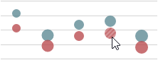 |
| "allSeriesPoints" | 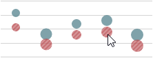 |
| "allArgumentPoints" | 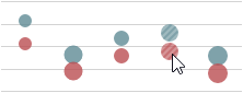 |
| "none" |  |
See Also
- hoverStyle - specifies the appearance of series in the hover state.
hoverStyle
Configures the appearance adopted by the series when a user points to it.
Declared in commonSeriesSettings, hoverStyle applies to all series in the chart. Declared in a series configuration object, hoverStyle applies to this particular series only. The series-specific hoverStyle overrides the common one.
ignoreEmptyPoints
Specifies whether the series should ignore empty data points.
Empty or null data items do not generate series points. As a result, the Chart displays data with gaps. To remove this space, enable the ignoreEmptyPoints property.
label
Configures point labels.
Declared in commonSeriesSettings, the label settings apply to all point labels in the chart. Declared in a series configuration object, the label settings apply only to the point labels that belong to this particular series. The series-specific label settings override the common ones.
jQuery
$(function() {
    $("#chartContainer").dxChart({
        // ...
        series: [{
            label: {
                // Settings for all point labels of an individual series
            }
        }, {
            // ...
        }],
        commonSeriesSettings: {
            label: {
                // Settings for all point labels in the Chart
            }
        }
    });
});
Angular
<dx-chart ... >
    <dxi-chart-series>
        <dxo-chart-label ... >
            <!-- Settings for all point labels of an individual series -->
        </dxo-chart-label>
    </dxi-chart-series>
    <dxo-chart-common-series-settings ... >
        <dxo-chart-label ... >
            <!-- Settings for all point labels in the Chart -->
        </dxo-chart-label>
    </dxo-chart-common-series-settings>
</dx-chart>
import { Component } from '@angular/core';

@Component({
    selector: 'app-root',
    templateUrl: './app.component.html',
    styleUrls: ['./app.component.css']
})
export class AppComponent {
    // ...
}
import { BrowserModule } from '@angular/platform-browser';
import { NgModule } from '@angular/core';
import { AppComponent } from './app.component';

import { DxChartModule } from 'devextreme-angular';

@NgModule({
    declarations: [
        AppComponent
    ],
    imports: [
        BrowserModule,
        DxChartModule
    ],
    providers: [ ],
    bootstrap: [AppComponent]
})
export class AppModule { }
Vue
<template>
    <DxChart ... >
        <DxSeries ... >
            <DxLabel ...>
                <!-- Settings for all point labels of an individual series -->
            </DxLabel>
        </DxSeries>
        <DxCommonSeriesSettings ... >
            <DxLabel ... >
                <!-- Settings for all point labels in the Chart -->
            </DxLabel>
        </DxCommonSeriesSettings>
    </DxChart>
</template>

<script>
import DxChart, {
    DxSeries,
    DxLabel,
    DxCommonSeriesSettings
} from 'devextreme-vue/chart';

export default {
    components: {
        DxChart,
        DxSeries,
        DxLabel,
        DxCommonSeriesSettings
    },
    // ...
}
</script>
React
import React from 'react';

import Chart, {
    Series,
    Label,
    CommonSeriesSettings
} from 'devextreme-react/chart';

class App extends React.Component {
    render() {
        return (
            <Chart ... >
                <Series ... >
                    <Label ... >
                        // Settings for all point labels of an individual series
                    </Label>
                </Series>
                <CommonSeriesSettings ... >
                    <Label ... >
                        // Settings for all point labels in the Chart
                    </Label>
                </CommonSeriesSettings>
            </Chart>
        );
    }
}
export default App;See Also
maxLabelCount
Specifies a limit for the number of point labels.
If the number of points in a series increases over time, there comes a time when it becomes so massive that displaying labels for them makes the chart too cluttered. In this instance, to keep the chart clear to the viewer, specify a limit for the number of point labels using the maxLabelCount property. Once this limit is exceeded, all point labels of the series will be hidden.
opacity
Specifies how transparent the series should be.
This property accepts a value from 0 to 1, where 0 makes the series completely transparent, and 1 makes it opaque.
pane
If this property is not specified, the series will belong to the default pane.
See Also
- panes - declares a collection of panes.
selectionMode
Specifies series elements to be highlighted when a user selects a bubble.
When a user selects a bubble, its series may react in one of the following ways depending on the value of the selectionMode property.
| selectionMode | Result |
|---|---|
| "onlyPoint" | |
| "allSeriesPoints" | |
| "allArgumentPoints" | |
| "none" | |
See Also
- pointSelectionMode - specifies whether only one or several bubbles can stay selected.
- series.selectionStyle - specifies the appearance of bubbles in the selected state.
- pointSelectionChanged - an event that fires after the selection state of a bubble has been changed.
selectionStyle
Configures the appearance adopted by the series when a user selects it.
Declared in commonSeriesSettings, selectionStyle applies to all series in the chart. Declared in a series configuration object, selectionStyle applies to this particular series only. The series-specific selectionStyle overrides the common one.
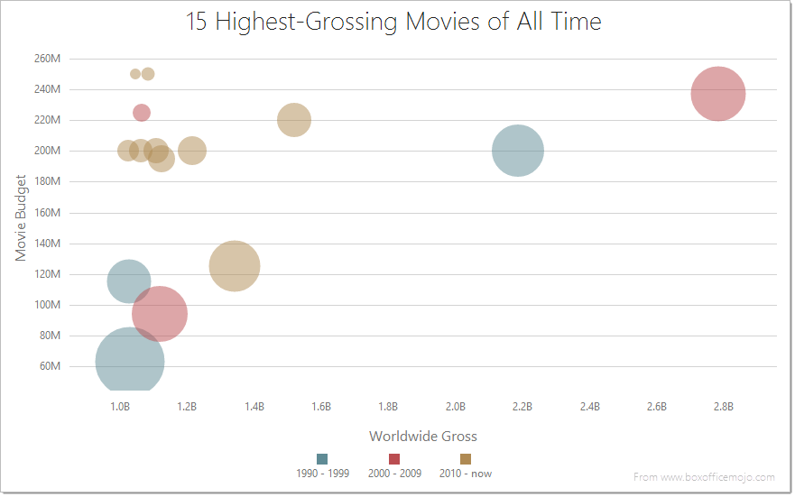
sizeField
Specifies which data source field provides size values for bubbles. Required by and applies only to bubble series.
Each point in a bubble series has an argument, a regular value and a size value. Arguments are provided by the argumentField; regular values are provided by the valueField; size values are provided by the sizeField.
Size values do not specify the real sizes of bubbles directly, they only define the sizes of bubbles in relation to each other. Apart from a size value, the real, pixel-measured size of a bubble depends on the minBubbleSize and maxBubbleSize values and the size of the pane.
Commonly, a chart contains several series, and many of them have the same size field. In this case, assign the name of this field to the sizeField property of the commonSeriesSettings object. If a series must have a unique size field, specify the same property, but do so in the series object within the series array.
tagField
Specifies which data source field provides auxiliary data for series points.
This property allows you to associate virtually any required data with a series point. This data will be stored in the tag field of the Point object.
Commonly, a chart contains several series, and many of them have the same tagField value. In this case, specify the tagField property in the commonSeriesSettings object. If a series must have a unique tagField value, specify the same property, but do so in the series object within the series array.
See Also
- series.tag - associates data with an entire series.
valueField
Specifies which data source field provides values for series points.
In the Cartesian coordinate system, each point is characterized by a pair of coordinates (X, Y). In a common case, X's are provided by the argumentField; Y's are provided by the valueField.
Certain series types require more than one value field, because their points are characterized by a larger number of coordinates. These series types are:
- Range-like series types
Range bar and range area require two value fields: rangeValue1Field and rangeValue2Field. - Financial series types
Stock and candlestick require four value fields: openValueField, closeValueField, highValueField and lowValueField.
If you use a series template, specify the value field properties in the commonSeriesSettings object. Otherwise, do this in the series object within the series array.
visible
Specifies whether the series is visible or not.
See Also

 Select one or more answers