JavaScript/jQuery CircularGauge - tooltip
Configures tooltips.
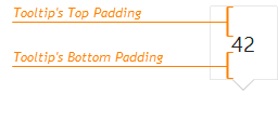
A tooltip is a miniature rectangle displaying the value of a gauge's indicator. A tooltip appears when the end-user hovers the cursor over an indicator. You can enable/disable tooltips, change their appearance and format their text using fields of the tooltip configuration object.
color
Colors all tooltips.
This property supports the following colors:
- Hexadecimal colors
- RGB colors
- RGBA colors
- Predefined/cross-browser color names
- Predefined SVG colors
- Paint server address
This property sets one color for all tooltips. You can specify a particular tooltip's color in the tooltip.customizeTooltip function.
container
Specifies the container in which to draw tooltips. The default container is the HTML DOM <body> element.
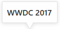
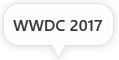
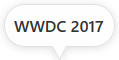
cornerRadius
Makes all the tooltip's corners rounded.
The following table demonstrates how the corner's curvature depends on the cornerRadius value:
| cornerRadius | Result |
|---|---|
cornerRadius: 0 |
 |
cornerRadius: 15 |
 |
cornerRadius: 35 |
 |
customizeTooltip
Allows you to change the appearance of specified tooltips.
The tooltip's configuration.
This property should be assigned a function that returns an object with the following fields:
| Field name | Description |
|---|---|
text |
The tooltip's text. |
html |
The HTML markup displayed in a tooltip. The CircularGauge evaluates the markup. Make sure that it does not contain malicious code. Refer to the following help topic for more information: Potentially Vulnerable API - customizeTooltip. To use external resources (for example, images) in the markup, specify the size of the area they occupy beforehand. |
color |
The tooltip's color. |
fontColor |
The color of the tooltip's text. |
borderColor |
The color of the tooltip's border. |
this keyword.See Also
format
Formats a value before it is displayed it in a tooltip.
opacity
Specifies tooltips' transparency.
This property accepts a value from 0 to 1, where 0 makes tooltips completely transparent, and 1 makes them opaque.
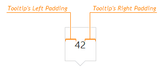
paddingLeftRight
Generates an empty space, measured in pixels, between a tooltip's left/right border and its text.

 Select one or more answers