JavaScript/jQuery RangeSelector - scale
Specifies properties of the range selector's scale.
To divide a scale, either set the dataSource property or the startValue and endValue properties. In the former case, the start and end values will be calculated based on the values provided by the data source field that is set by the dataSourceField property.
The scale's ticks are arranged automatically, based on the start and end values, so that the tick labels do not overlap each other. You can set a custom tick interval, add minor ticks and format tick labels. These and other scale properties are available in the scale configuration object.
aggregationGroupWidth
Specifies the length of aggregation intervals in pixels. May be ignored in favor of the aggregationInterval property.
For data aggregation, the scale is divided into intervals. Series points that fall within the same interval get aggregated together. The aggregationGroupWidth property defines the length of each interval in pixels.
See Also
- chart.series.aggregation
aggregationInterval
Specifies the length of aggregation intervals in scale units. Applies only to the scale of the continuous or logarithmic type.
For data aggregation, the scale is divided into intervals. Series points that fall within the same interval get aggregated together. The aggregationInterval property defines the length of each interval.
If the scale displays numbers, assign a number to this property. For example, an aggregationInterval of 100 produces the following intervals: 0 to 100, 100 to 200, 200 to 300, etc. If the scale displays date-time values, set this property to one of the accepted string values. Alternatively, you can set it to an object that contains one of the fields described in this section.
jQuery
$(function() {
    $("#rangeSelectorContainer").dxRangeSelector({
        // ...
        scale: {
            // Interval of one day
            aggregationInterval: "day",
            // Interval of five days
            aggregationInterval: { days: 5 }
        }
    });
});
Angular
<dx-range-selector ... >
    <dxo-range-selector-scale
        aggregationInterval="day"> <!-- Interval of one day -->
        <dxo-range-selector-aggregation-interval
            [days]="5">            <!-- Interval of five days -->
        </dxo-range-selector-aggregation-interval>
    </dxo-range-selector-scale>
</dx-range-selector>
import { DxRangeSelectorModule } from "devextreme-angular";
// ...
export class AppComponent {
    // ...
}
@NgModule({
    imports: [
        // ...
        DxRangeSelectorModule
    ],
    // ...
})
Vue
<template>
    <DxRangeSelector ... >
        <DxScale
            aggregation-interval="day">     <!-- Interval of one day -->
            <DxAggregationInterval
                :days="5" />                <!-- Interval of five days -->
        </DxScale>
    </DxRangeSelector>
</template>

<script>
import DxRangeSelector, {
    DxScale,
    DxAggregationInterval
} from 'devextreme-vue/range-selector';

export default {
    components: {
        DxRangeSelector,
        DxScale,
        DxAggregationInterval
    }
}
</script>
React
import React from 'react';

import RangeSelector, {
    Scale,
    AggregationInterval
} from 'devextreme-react/range-selector';

class App extends React.Component {
    render() {
        return (
            <RangeSelector ... >
                <Scale
                    aggregationInterval="day">    {/* Interval of one day */}
                    <AggregationInterval
                        days={5} />                 {/* Interval of five days */}
                </Scale>
            </RangeSelector>
        );
    }
}

export default App;
On a logarithmic scale, intervals are based on powers. For example, if the logarithmBase is 10 and the aggregationInterval is 1, the following intervals are produced: 100 to 101, 101 to 102, 102 to 103, etc. If the aggregationInterval becomes 2, intervals become longer: 100 to 102, 102 to 104, 104 to 106, etc.
See Also
allowDecimals
Specifies whether to allow decimal values on the scale. When false, the scale contains integer values only.
breaks[]
Declares a scale break collection. Applies only if the scale's type is "continuous" or "logarithmic".
A scale break is an area across an axis that is displayed instead of a section of an axis range. Scale breaks improve the readability of chart sections with large gaps in their ranges.
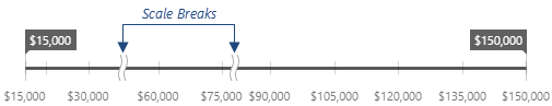
Each object in the breaks array configures a single scale break.A scale break range should be at least two tick intervals. Otherwise, the break might not be visible.
See Also
categories
Specifies the order of arguments on a discrete scale.
If the data source field provides string values, the scale build on them will be discrete. Values on a discrete scale are called "categories". By default, categories have the same running order as values in the data source field. If this is does not meet your requirements, declare an array specifying a custom running order for categories. This array should contain category names. After that, assign this array to the scale's categories property.
If you do not use a data source, specify the categories array to generate a discrete scale.
discreteAxisDivisionMode
Specifies whether ticks/grid lines of a discrete axis are located between labels or cross the labels.
endOnTick
Specifies whether to force the scale to start and end on ticks.
label
Specifies common properties for scale labels.
Scale labels represent textual values for major scale ticks. The label object exposes properties that allow you to specify custom text for scale labels and properties that allow you to change the font for text.
linearThreshold
Specifies a value used to calculate the range on a logarithmic scale within which the scale should be linear. Applies only if the data source contains negative values or zeroes.
Setting this property prevents generating an infinite number of small axis values. Set it to an integer value that designates a power of logarithmBase. The following code sample shows how different linearThreshold values affect the linear range when the logarithmBase is 10:
linearThreshold: -1 // [-0.1; 0.1]
linearThreshold: -2 // [-0.01; 0.01]
linearThreshold: -3 // [-0.001; 0.001]
logarithmBase
Specifies the value to be raised to a power when generating ticks for a logarithmic scale.
By default, ticks on a logarithmic scale are generated on a base of 10, i.e., 0.1, 1, 10, 100, 1000, etc. But you can specify a base you require using the logarithmBase property. For example, if you set this property to 5, the following ticks will be generated: 0.5, 5, 25, 125, 625, etc.
marker
Specifies properties for the date-time scale's markers.
When a scale is of the date-time type, scale markers can be displayed. If a major tick interval is set in days, a marker will be displayed between the last day of the month and the first day of the new month. The marker will indicate the new month. The same logic for setting markers is used when a tick interval is set using other date-time units.
A marker consists of a separator and label that belongs to the separator. To set the visibility of the markers, and change their default location and appearance, use the properties of the marker configuration object.
maxRange
Specifies the maximum range that can be selected.
Use this property to set the maximum range that can be selected. When trying to move a slider from the other slider further than the specified maximum range, the marker will display the last possible value that can be set and change the font color to 'red'. You can set which color to use to indicate an invalid range. For this purpose, use the invalidRangeColor property of the sliderMarker configuration object.
jQuery
$(() => {
    $('#range-selector').dxRangeSelector({
        // ...
        scale: {
            startValue: new Date(2023, 1, 1),
            endValue: new Date(2023, 6, 1),
            tickInterval: 'day',
            minRange: {
                days: 10
            }
            maxRange: 'month',
        },
    });
});
Angular
<dx-range-selector ... >
    <dxo-range-selector-scale
        [startValue]="startValue"
        [endValue]="endValue"
        tickInterval="day"
        [minRange]="minRange"
        maxRange="month"
    >
    </dxo-range-selector-scale>
</dx-range-selector>
export class AppComponent {
    startValue: Date = new Date(2023, 1, 1);
    endValue: Date = new Date(2023, 6, 1);
    minRange: Object = {
        days: 10
    };
}
Vue
<template>
    <DxRangeSelector ... >
        <DxScale
            :start-value="startValue"
            :end-value="endValue"
        >
            <DxTickInterval :days="1"/>
            <DxMinRange :days="10"/>
            <DxMaxRange :months="1"/>
        </DxScale>
    </DxRangeSelector>
</template>
<script setup>
    import DxRangeSelector, { DxScale, DxTickInterval, DxMinRange, DxMaxRange } from 'devextreme-vue/range-selector';
    const startValue = new Date(2023, 1, 1);
    const endValue = new Date(2023, 6, 1);
</script>
React
import {
    RangeSelector, Scale, MinorTick,
} from 'devextreme-react/range-selector';

const startValue = new Date(2023, 1, 1);
const endValue = new Date(2023, 6, 1);
const minRange = {
    days: 10
};

function App() {
return (
    <RangeSelector ... >
    <Scale
        startValue={startValue}
        endValue={endValue}
        tickInterval="day"
        minRange={minRange}
        maxRange="month"
    />
    </RangeSelector>
);
}

export default App;
In case of the numeric scale, assign a numeric value to this property. If the scale is of the date-time type, assign one of the predefined string values or an object to this property. The object's properties specify the number of days, hours, etc.
You can also set a minimum range that can be selected, using the minRange property.
minorTick
Specifies properties of the range selector's minor ticks.
Major and minor ticks are calculated automatically based on the scale's startValue and endValue property values. Major ticks are made visible by default. You can make minor ticks visible as well, using their visible property. You can set a custom minor tick interval using the tickInterval property. You can also specify the length, width and color of the minor ticks using corresponding properties.
minorTickCount
Specifies the number of minor ticks between neighboring major ticks.
If you set both the minorTickCount property and the minorTickInterval property, the minorTickCount property value will be ignored.
minorTickInterval
Specifies an interval between minor ticks.
In the case of a numeric scale, assign a numeric value to this property. If the scale is of the date-time type, assign one of the predefined string values. To set an interval to several days, hours, etc., assign an object with the corresponding field specified (days, hours or another field). Note that this object should contain only one of the fields described in this section.
When the snapToTicks property is set to true, sliders are docked to both major and minor ticks.
To prohibit the display of minor ticks, set the scale's showMinorTicks property to false.
To set a custom tick interval between major ticks, use the scale's tickInterval property.
minRange
Specifies the minimum range that can be selected.
Use this property to set the minimum range that can be selected. When moving a slider to a position near the other slider that is closer than the specified minimum range, the marker will display the last possible value that it can be set to, and change the font color to 'red'. You can set the color used to indicate an invalid range by using the invalidRangeColor property of the sliderMarker configuration object.
jQuery
$(() => {
    $('#range-selector').dxRangeSelector({
        // ...
        scale: {
            startValue: new Date(2023, 1, 1),
            endValue: new Date(2023, 6, 1),
            tickInterval: 'day',
            minRange: {
                days: 10
            }
            maxRange: 'month',
        },
    });
});
Angular
<dx-range-selector ... >
    <dxo-range-selector-scale
        [startValue]="startValue"
        [endValue]="endValue"
        tickInterval="day"
        [minRange]="minRange"
        maxRange="month"
    >
    </dxo-range-selector-scale>
</dx-range-selector>
export class AppComponent {
    startValue: Date = new Date(2023, 1, 1);
    endValue: Date = new Date(2023, 6, 1);
    minRange: Object = {
        days: 10
    };
}
Vue
<template>
    <DxRangeSelector ... >
        <DxScale
            :start-value="startValue"
            :end-value="endValue"
        >
            <DxTickInterval :days="1"/>
            <DxMinRange :days="10"/>
            <DxMaxRange :months="1"/>
        </DxScale>
    </DxRangeSelector>
</template>
<script setup>
    import DxRangeSelector, { DxScale, DxTickInterval, DxMinRange, DxMaxRange } from 'devextreme-vue/range-selector';
    const startValue = new Date(2023, 1, 1);
    const endValue = new Date(2023, 6, 1);
</script>
React
import {
    RangeSelector, Scale, MinorTick,
} from 'devextreme-react/range-selector';

const startValue = new Date(2023, 1, 1);
const endValue = new Date(2023, 6, 1);
const minRange = {
    days: 10
};

function App() {
return (
    <RangeSelector ... >
    <Scale
        startValue={startValue}
        endValue={endValue}
        tickInterval="day"
        minRange={minRange}
        maxRange="month"
    />
    </RangeSelector>
);
}

export default App;You can also set the maximum range that can be selected using the maxRange property.
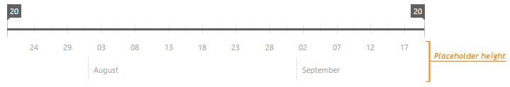
placeholderHeight
Specifies the height of the space reserved for the scale in pixels.
The scale's height includes the space occupied by scale labels, markers, and the space between the scale labels and markers.
You may need to set this property when you need to know the exact size of the RangeSelector UI component elements in vertical and horizontal directions. For instance, this may be required when displaying an image in the background in a stretched mode. To get the background height, subtract the scale's placeholder size and the slider markers' placeholder height from the RangeSelector's height.
showCustomBoundaryTicks
Specifies whether or not to show ticks for the boundary scale values, when neither major ticks nor minor ticks are created for these values.
tickInterval
Specifies an interval between axis ticks.
In the case of a numeric scale, assign a numeric value to this property. If the scale is of the date-time type, assign one of the predefined string values. To set an interval to several days, hours, etc., assign an object with the corresponding field specified (days, hours or another field). Note that this object should contain only one of the fields described in this section.
type
Specifies the type of the scale.
To decide on the scale type to use, check the type of values the scale contains.
The "continuous" type is used by default when the scale displays numeric or date-time values. Although it is divided into intervals automatically, you can specify custom intervals using the tickInterval and minorTickInterval properties.
The "logarithmic" type can be set for numeric values. A logarithmic axis is useful when you visualize a dataset of rapidly-growing values. Each scale tick represents a particular value that is raised to the next power in turn. This particular value is specified by the logarithmBase property. For example, if you set this property to 5, the following ticks will be generated: 50, 51, 52, 53, etc.
The scale will have the "discrete" type if it is built on string values. Values on this scale are called "categories". They can be generated automatically from the data source or you can specify them explicitly using the categories property.
In addition, RangeSelector provides a scale of the 'semidiscrete' type. Use it when you need to divide continuous data (numeric or date-time) into categories and allow the user to operate strictly with them. This scale type requires the minRange property to be set. For example, the following code builds a semidiscrete scale on date-time values. This scale is divided into months, and the user operates with them as if they were categories.
var rangeSelectorOptions = {
    // ...
    scale: {
        startValue: new Date(2015, 0, 1),
        endValue: new Date(2016, 0, 1),
        type: 'semidiscrete',
        minRange: 'month'
    }
};
Another example: a semidiscrete scale built on numeric values. This time, the scale is divided into tens.
var rangeSelectorOptions = {
    // ...
    scale: {
        startValue: 0,
        endValue: 100,
        type: 'semidiscrete',
        minRange: 10
    }
};valueType
Specifies the type of values on the scale.
When the scale is built on values from a data source, scale values and data source values have the same type. For example, if numeric values are specified in the data source, scale values will also be of a numeric type. In some scenarios, you may need to convert data source values into another type if, for instance, numbers are stored as strings in your data source. In this case, use the valueType property to specify the type of scale values explicitly.
workdaysOnly
Leaves only workdays on the scale: the work week days plus single workdays minus holidays. Applies only if the scale's valueType is "datetime".
workWeek
Specifies which days are workdays. The array can contain values from 0 (Sunday) to 6 (Saturday). Applies only if workdaysOnly is true.
See Also

 Select one or more answers