JavaScript/jQuery VectorMap Options
An object that specifies configuration properties for the UI component.
See Also
annotations[]
Specifies the annotation collection.
Array<VectorMap Annotation | any>
Annotations are containers for images, text blocks, and custom content that display additional information about the visualized data.
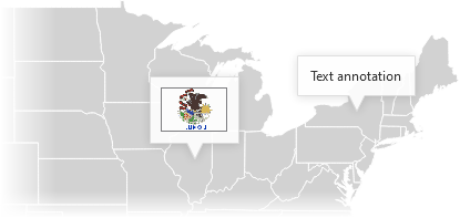
To create annotations, assign an array of objects to the annotations[] property. Each object configures an individual annotation. You can set each annotation's type property to "text", "image", or "custom". Depending on the type, specify the annotation's text, image, or template property:
jQuery
$(function() {
    $("#vectorMap").dxVectorMap({
        annotations: [{
            type: "text",
            text: "Annotation text"
        }, {
            type: "image",
            image: "http://image/url/myimage.png"
        }, {
            type: "custom",
            template: function(annotation) {
                const data = annotation.data;
                const $svg = $("<svg>");
                // ...
                // Customize the annotation's markup here
                // ...
                return $svg;
            }
        }]
    });
});
Angular
<dx-vector-map ... >
    <dxi-vector-map-annotation
        type="text"
        text="Annotation text">
    </dxi-vector-map-annotation>
    <dxi-vector-map-annotation
        type="image"
        image="http://image/url/myimage.png">
    </dxi-vector-map-annotation>
    <dxi-vector-map-annotation
        type="custom"
        template="custom-annotation">
    </dxi-vector-map-annotation>
    <svg *dxTemplate="let annotation of 'custom-annotation'">
        <!-- Declare custom SVG markup here -->
    </svg>
</dx-vector-map>
import { Component } from '@angular/core';
@Component({
    selector: 'app-root',
    templateUrl: './app.component.html',
    styleUrls: ['./app.component.css']
})
export class AppComponent {
    // ...
}
import { BrowserModule } from '@angular/platform-browser';
import { NgModule } from '@angular/core';
import { AppComponent } from './app.component';

import { DxVectorMapModule } from 'devextreme-angular';

@NgModule({
    declarations: [
        AppComponent
    ],
    imports: [
        BrowserModule,
        DxVectorMapModule
    ],
    providers: [ ],
    bootstrap: [AppComponent]
})
export class AppModule { }
Vue
<template>
    <DxVectorMap ... >
        <DxAnnotation
            type="text"
            text="Annotation text"
        />
        <DxAnnotation
            type="image"
            image="http://image/url/myimage.png"
        />
        <DxAnnotation
            type="custom"
            template="custom-annotation"
        />
        <template #custom-annotation="{ data }">
            <svg>
                <!-- Declare custom SVG markup here -->
            </svg>
        </template>
    </DxVectorMap>
</template>

<script>
import DxVectorMap, {
    DxAnnotation
} from 'devextreme-vue/vector-map';

export default {
    components: {
        DxVectorMap,
        DxAnnotation
    },
    data() {
        // ...
    }
}
</script>
React
import React from 'react';

import VectorMap, {
    Annotation
} from 'devextreme-react/vector-map';

function CustomAnnotation(annotation) {
    const data = annotation.data;
    return (
        <svg>
            {/* Declare custom SVG markup here */}
        </svg>
    );
}

export default function App() {
    return (
        <VectorMap ... >
            <Annotation
                type="text"
                text="Annotation text"
            />
            <Annotation
                type="image"
                image="http://image/url/myimage.png"
            />
            <Annotation
                type="custom"
                render={CustomAnnotation}
            />
        </VectorMap>
    );
}
Annotations can be positioned at specific geographic coordinates or coordinates of the client area:
Geographic coordinates
annotations: [{
    coordinates: [-75.4999, 43.00035]
}]
Client area coordinates (x and y)
annotations: [{
    x: 100,
    y: 200
}]
When a user long-presses an annotation or hovers the mouse pointer over it, the VectorMap displays a tooltip.
Objects in the annotations[] array configure individual annotations. To specify properties common for all annotations, use the commonAnnotationSettings object. Individual settings take precedence over common settings.
See Also
background
Specifies the properties for the map background.
The map background is a space on a map that does not contain areas. Within the background configuration object, you can specify colors for the map background and its border.
jQuery
$('#vectorMap').dxVectorMap({
    // ...
    background: {
        color: "azure",
        borderColor: "blue",
    },
})
Angular
<dx-vector-map ... >
    <dxo-vector-map-background color="azure" borderColor="blue"></dxo-vector-map-background>
</dx-vector-map>
Vue
<template>
    <DxVectorMap ... >
        <DxBackground color="azure" borderColor="blue" />
    </DxVectorMap>
</template>

<script setup lang="ts">
import { DxVectorMap, DxBackground } from 'devextreme-vue/vector-map';

</script>
React
import { VectorMap, Background } from 'devextreme-react/vector-map';

function App() {
    return (
        <VectorMap ... >
            <Background color="azure" borderColor="blue" />
        </VectorMap>
    )
}
bounds
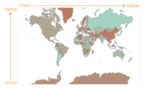
Specifies the positioning of a map in geographical coordinates.
To display a specific part of a map, specify coordinates in the bounds property. Specify an array of four values in the [minLongitude, maxLatitude, maxLongitude, minLatitude] order.
Refer to the following image to see how these values are applied to a map:
If your dataSource range is larger than the default data range of the component ([-180 to 180] longitude and [-90 to 90] latitude), note the following specifics:
- VectorMap adjusts the default bounds value to fit data in the component viewport.
- To ensure bounds is applied correctly, specify the projection property. For more information about specifying a custom projection, refer to the following demo:
center
Specifies the geographical coordinates of the center for a map.
By default, the map in the UI component is centered on the (0, 0) point. If you need to center the map on a different geographical point, assign an array of two values in the [longitude, latitude] form.
commonAnnotationSettings
Specifies settings common for all annotations in the VectorMap.
Settings specified here can be ignored in favor of individual annotation settings specified in the annotations[] array. Refer to the array's description for information on how to configure annotations.
The following code shows the commonAnnotationSettings declaration syntax:
jQuery
$(function() {
    $("#vectorMap").dxVectorMap({
        // ...
        commonAnnotationSettings: {
            tooltipEnabled: false
        }
    });
});
Angular
<dx-vector-map ... >
    <dx-common-annotation-settings
        [tooltipEnabled]="false">
    </dx-common-annotation-settings>
</dx-vector-map>
import { Component } from '@angular/core';

@Component({
    selector: 'app-root',
    templateUrl: './app.component.html',
    styleUrls: ['./app.component.css']
})
export class AppComponent {
    // ...
}
import { BrowserModule } from '@angular/platform-browser';
import { NgModule } from '@angular/core';
import { AppComponent } from './app.component';

import { DxVectorMapModule } from 'devextreme-angular';

@NgModule({
    declarations: [
        AppComponent
    ],
    imports: [
        BrowserModule,
        DxVectorMapModule
    ],
    providers: [ ],
    bootstrap: [AppComponent]
})
export class AppModule { }
Vue
<template>
    <DxVectorMap ... >
        <DxCommonAnnotationSettings
            :tooltip-enabled="false"
        />
    </DxVectorMap>
</template>

<script>
import DxVectorMap, {
    DxCommonAnnotationSettings
} from 'devextreme-vue/vector-map';

export default {
    components: {
        DxVectorMap,
        DxCommonAnnotationSettings
    },
    data() {
        // ...
    }
}
</script>
React
import React from 'react';

import VectorMap, {
    CommonAnnotationSettings
} from 'devextreme-react/vector-map';

class App extends React.Component {
    render() {
        return (
            <VectorMap ... >
                <CommonAnnotationSettings
                    tooltipEnabled={false}
                />
            </VectorMap>
        );
    }
}
export default App;See Also
controlBar
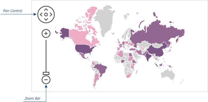
Configures the control bar.
Users can use the pan control and zoom bar in the control bar panel to navigate the map.
The following code shows how to use the controlBar object to move the control bar to the right side of the map:
jQuery
$(function() {
    $("#vectorMapContainer").dxVectorMap({
        // ...
        controlBar: {
            horizontalAlignment: "right"
        }
    });
});
Angular
<dx-vector-map ... >
    <dxo-vector-map-control-bar
        horizontalAlignment="right">
    </dxo-vector-map-control-bar>
</dx-vector-map>
// ...
import { DxVectorMapModule } from 'devextreme-angular';

@NgModule({
    imports: [
        // ...
        DxVectorMapModule
    ],
    // ...
})
export class AppModule { }
Vue
<template>
    <DxVectorMap ... >
        <DxControlBar
            horizontal-alignment="right"
        />
    </DxVectorMap>
</template>

<script>
import { DxVectorMap, DxControlBar } from 'devextreme-vue/vector-map';

export default {
    components: {
        DxVectorMap,
        DxControlBar
    },
    // ...
}
</script>
React
import React from 'react';
import { VectorMap, ControlBar } from 'devextreme-react/vector-map';

class App extends React.Component {
    render() {
        return (
            <VectorMap>
                // ...
                <ControlBar
                    horizontalAlignment="right"
                />
            </VectorMap>
        );
    }
}

export default App;
ASP.NET MVC Controls
@(Html.DevExtreme().VectorMap()
    @* ... *@
    .ControlBar(cb => cb
        .HorizontalAlignment(HorizontalAlignment.Right)
    )
)
customizeAnnotation
Customizes an individual annotation.
The annotation before customizations.
The annotation after customizations.
The following code shows how to use the customizeAnnotation function to apply different settings to text and image annotations:
jQuery
$(function() {
    $("#vectorMapContainer").dxVectorMap({
        // ...
        customizeAnnotation: function(annotationItem) {
            if(annotationItem.text) {
                annotationItem.color = "red";
            }
            if(annotationItem.image) {
                annotationItem.color = "blue";
            }
            return annotationItem;
        }
    });
});
Angular
<dx-vector-map ...
    [customizeAnnotation]="customizeAnnotation">
</dx-vector-map>
// ...
export class AppComponent {
    customizeAnnotation(annotationItem) {
        if(annotationItem.text) {
            annotationItem.color = "red";
        }
        if(annotationItem.image) {
            annotationItem.color = "blue";
        }
        return annotationItem;
    }
}
import { DxVectorMapModule } from 'devextreme-angular';
// ...
@NgModule({
    imports: [
        // ...
        DxVectorMapModule
    ],
    // ...
})
export class AppModule { }
Vue
<template>
    <DxVectorMap ...
        :customize-annotation="customizeAnnotation">
    </DxVectorMap>
</template>

<script>
import DxVectorMap from 'devextreme-vue/vector-map';

export default {
    components: {
        DxVectorMap
    },
    methods: {
        customizeAnnotation(annotationItem) {
            if(annotationItem.text) {
                annotationItem.color = "red";
            }
            if(annotationItem.image) {
                annotationItem.color = "blue";
            }
            return annotationItem;
        }
    }
}
</script>
React
import React from 'react';
import VectorMap from 'devextreme-react/vector-map';

export default function App() {
    const customizeAnnotation = (annotationItem) => {
        if(annotationItem.text) {
            annotationItem.color = "red";
        }
        if(annotationItem.image) {
            annotationItem.color = "blue";
        }
        return annotationItem;
    }

    return (
        <VectorMap ...
            customizeAnnotation={customizeAnnotation}>
        </VectorMap>
    );
}
ASP.NET MVC Controls
@(Html.DevExtreme().VectorMap()
    @* ... *@
    .CustomizeAnnotation("customizeAnnotation")
)

<script type="text/javascript">
    function customizeAnnotation(annotationItem) {
        if(annotationItem.text) {
            annotationItem.color = "red";
        }
        if(annotationItem.image) {
            annotationItem.color = "blue";
        }
        return annotationItem;
    }
</script>
See Also
elementAttr
Specifies the global attributes to be attached to the UI component's container element.
jQuery
$(function(){
    $("#vectorMapContainer").dxVectorMap({
        // ...
        elementAttr: {
            id: "elementId",
            class: "class-name"
        }
    });
});
Angular
<dx-vector-map ...
    [elementAttr]="{ id: 'elementId', class: 'class-name' }">
</dx-vector-map>
import { DxVectorMapModule } from "devextreme-angular";
// ...
export class AppComponent {
    // ...
}
@NgModule({
    imports: [
        // ...
        DxVectorMapModule
    ],
    // ...
})
Vue
<template>
    <DxVectorMap ...
        :element-attr="vectorMapAttributes">
    </DxVectorMap>
</template>

<script>
import DxVectorMap from 'devextreme-vue/vector-map';

export default {
    components: {
        DxVectorMap
    },
    data() {
        return {
            vectorMapAttributes: {
                id: 'elementId',
                class: 'class-name'
            }
        }
    }
}
</script>
React
import React from 'react';

import VectorMap from 'devextreme-react/vector-map';

class App extends React.Component {
    vectorMapAttributes = {
        id: 'elementId',
        class: 'class-name'
    }

    render() {
        return (
            <VectorMap ...
                elementAttr={this.vectorMapAttributes}>
            </VectorMap>
        );
    }
}
export default App;
export
Configures the exporting and printing features.
These features allow a user to export your UI component into a document or print it. When exporting is enabled, the "Exporting/Printing" button appears in the UI component. A click on it invokes a drop-down menu that lists exporting and printing commands. The following formats are supported for exporting into: PNG, PDF, JPEG, SVG and GIF.
See Also
legends[]
Configures map legends.
A legend is a supplementary map element that helps end-users identify a map area or a map marker. The VectorMap UI component can display several legends simultaneously. To configure legends, declare an array of objects and assign it to the legends property. Each object in this array specifies settings of one legend. These settings are described in this section.
Each legend requires the source property to be set. This property specifies whether it is areas or markers that must be accompanied with a legend. Learn more from the description of the source property.
A map legend contains several legend items. A legend item consists of a marker and a text. You can change the size of markers using the markerSize property. To provide texts for legend items, you need to implement the customizeText function.
loadingIndicator
Configures the loading indicator.
When the UI component is bound to a remote data source, it can display a loading indicator while data is loading.
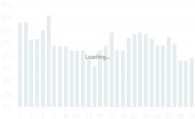
To enable the automatic loading indicator, set the enabled property to true.
If you want to change the loading indicator's visibility, use the show property or the showLoadingIndicator() and hideLoadingIndicator() methods.
maxZoomFactor
Specifies a map's maximum zoom factor.
An end user will not be able to zoom into a map larger than the factor specified here.
onCenterChanged
A function that is executed each time the center coordinates are changed.
Information about the event.
| Name | Type | Description |
|---|---|---|
| center |
The updated geographical coordinates of the center. |
|
| component |
The UI component's instance. |
|
| element |
The UI component's container. It is an HTML Element or a jQuery Element when you use jQuery. |
onClick
A function that is executed when any location on the map is clicked or tapped.
Information about the event.
| Name | Type | Description |
|---|---|---|
| component |
The UI component's instance. |
|
| element |
The UI component's container. It is an HTML Element or a jQuery Element when you use jQuery. |
|
| event | Event (jQuery or EventObject) |
The event that caused the handler execution extended by the x and y fields. It is a EventObject or a jQuery.Event when you use jQuery. |
| target |
The Layer Element object (if available). |
onDisposing
A function that is executed before the UI component is disposed of.
Information about the event.
| Name | Type | Description |
|---|---|---|
| element |
The UI component's container. It is an HTML Element or a jQuery Element when you use jQuery. |
|
| component |
The UI component's instance. |
onDrawn
A function that is executed when the UI component's rendering has finished.
Information about the event.
| Name | Type | Description |
|---|---|---|
| element |
The UI component's container. It is an HTML Element or a jQuery Element when you use jQuery. |
|
| component |
The UI component's instance. |
onExported
A function that is executed after the UI component is exported.
Information about the event.
| Name | Type | Description |
|---|---|---|
| element |
The UI component's container. It is an HTML Element or a jQuery Element when you use jQuery. |
|
| component |
The UI component's instance. |
See Also
onExporting
A function that is executed before the UI component is exported.
Information about the event.
| Name | Type | Description |
|---|---|---|
| format |
The resulting file format. One of PNG, PDF, JPEG, SVG and GIF. |
|
| fileName |
The name of the file to which the UI component is about to be exported. |
|
| element |
The UI component's container. It is an HTML Element or a jQuery Element when you use jQuery. |
|
| component |
The UI component's instance. |
See Also
onFileSaving
A function that is executed before a file with exported UI component is saved to the user's local storage.
Information about the event.
| Name | Type | Description |
|---|---|---|
| format |
The format of the file to be saved. |
|
| fileName |
The name of the file to be saved. |
|
| element |
The UI component's container. It is an HTML Element or a jQuery Element when you use jQuery. |
|
| data |
Exported data as a BLOB. |
|
| component |
The UI component's instance. |
|
| cancel |
Allows you to prevent file saving. |
See Also
onIncidentOccurred
A function that is executed when an error or warning occurs.
Information about the event.
| Name | Type | Description |
|---|---|---|
| target | any |
Information on the occurred incident. |
| element |
The UI component's container. It is an HTML Element or a jQuery Element when you use jQuery. |
|
| component |
The UI component's instance. |
The UI component notifies you of errors and warnings by passing messages to the browser console. Each message contains the incident's ID, a brief description, and a link to the Errors and Warnings section where further information about this incident can be found.
The onIncidentOccurred function allows you to handle errors and warnings the way you require. The object passed to it contains the target field. This field provides information about the occurred incident and contains the following properties:
- id
The incident's ID. The full list of IDs can be found in the Errors and Warnings section. - type
The incident's type: "error" or "warning". - args
The argument of the incident's message. Depends on the incident. For example, it may be the name of the data source field that was specified incorrectly, or the name of the property that was not set properly. - text
The text passed to the browser's console. Includes the args content, if there is any. - widget
The name of the UI component that produced the error or warning. - version
The used DevExtreme version.
onInitialized
A function used in JavaScript frameworks to save the UI component instance.
Information about the event.
| Name | Type | Description |
|---|---|---|
| element |
The UI component's container. It is an HTML Element or a jQuery Element when you use jQuery. |
|
| component |
The UI component's instance. |
Angular
<dx-vector-map ...
    (onInitialized)="saveInstance($event)">
</dx-vector-map>
import { Component } from "@angular/core";
import VectorMap from "devextreme/ui/data_grid";
// ...
export class AppComponent {
    vectorMapInstance: VectorMap;
    saveInstance (e) {
        this.vectorMapInstance = e.component;
    }
}
Vue
<template>
    <div>
        <DxVectorMap ...
            @initialized="saveInstance">
        </DxVectorMap>
    </div>
</template>

<script>
import DxVectorMap from 'devextreme-vue/vector-map';

export default {
    components: {
        DxVectorMap
    },
    data: function() {
        return {
            vectorMapInstance: null
        };
    },
    methods: {
        saveInstance: function(e) {
            this.vectorMapInstance = e.component;
        }
    }
};
</script>
<template>
    <div>
        <DxVectorMap ...
            @initialized="saveInstance">
        </DxVectorMap>
    </div>
</template>

<script setup>
import DxVectorMap from 'devextreme-vue/vector-map';

let vectorMapInstance = null;

const saveInstance = (e) => {
    vectorMapInstance = e.component;
}
</script>
React
import VectorMap from 'devextreme-react/vector-map';

class App extends React.Component {
    constructor(props) {
        super(props);

        this.saveInstance = this.saveInstance.bind(this);
    }

    saveInstance(e) {
        this.vectorMapInstance = e.component;
    }

    render() {
        return (
            <div>
                <VectorMap onInitialized={this.saveInstance} />
            </div>
        );
    }
}
See Also
onOptionChanged
A function that is executed after a UI component property is changed.
Information about the event.
| Name | Type | Description |
|---|---|---|
| value | any |
The modified property's new value. |
| previousValue | any |
The UI component's previous value. |
| name |
The modified property if it belongs to the first level. Otherwise, the first-level property it is nested into. |
|
| fullName |
The path to the modified property that includes all parent properties. |
|
| element |
The UI component's container. It is an HTML Element or a jQuery Element when you use jQuery. |
|
| component |
The UI component's instance. |
The following example shows how to subscribe to component property changes:
jQuery
$(function() {
    $("#vectorMapContainer").dxVectorMap({
        // ...
        onOptionChanged: function(e) {
            if(e.name === "changedProperty") {
                // handle the property change here
            }
        }
    });
});
Angular
<dx-vector-map ...
    (onOptionChanged)="handlePropertyChange($event)">
</dx-vector-map>
import { Component } from '@angular/core';

@Component({
    selector: 'app-root',
    templateUrl: './app.component.html',
    styleUrls: ['./app.component.css']
})

export class AppComponent {
    // ...
    handlePropertyChange(e) {
        if(e.name === "changedProperty") {
            // handle the property change here
        }
    }
}
import { BrowserModule } from '@angular/platform-browser';
import { NgModule } from '@angular/core';
import { AppComponent } from './app.component';
import { DxVectorMapModule } from 'devextreme-angular';

@NgModule({
    declarations: [
        AppComponent
    ],
    imports: [
        BrowserModule,
        DxVectorMapModule
    ],
    providers: [ ],
    bootstrap: [AppComponent]
})

export class AppModule { }
Vue
<template>
    <DxVectorMap ...
        @option-changed="handlePropertyChange"
    />
</template>

<script>
import 'devextreme/dist/css/dx.light.css';
import DxVectorMap from 'devextreme-vue/vector-map';

export default {
    components: {
        DxVectorMap
    },
    // ...
    methods: {
        handlePropertyChange: function(e) {
            if(e.name === "changedProperty") {
                // handle the property change here
            }
        }
    }
}
</script>
React
import React from 'react';
import 'devextreme/dist/css/dx.light.css';

import VectorMap from 'devextreme-react/vector-map';

const handlePropertyChange = (e) => {
    if(e.name === "changedProperty") {
        // handle the property change here
    }
}

export default function App() {
    return (
        <VectorMap ...
            onOptionChanged={handlePropertyChange}
        />
    );
}
onSelectionChanged
A function that is executed when a layer element is selected or selection is canceled.
Information about the event.
| Name | Type | Description |
|---|---|---|
| component |
The UI component's instance. |
|
| element |
The UI component's container. It is an HTML Element or a jQuery Element when you use jQuery. |
|
| target |
The selected/deselected layer element; described in the Layer Element section. |
To identify whether the selection has been applied or canceled, call the layer element's selected() method.
onTooltipHidden
A function that is executed when a tooltip becomes hidden.
Information about the event.
| Name | Type | Description |
|---|---|---|
| component |
The UI component's instance. |
|
| element |
The UI component's container. It is an HTML Element or a jQuery Element when you use jQuery. |
|
| target | | |
The layer element whose tooltip is hidden; described in the Layer Element section. |
onTooltipShown
A function that is executed when a tooltip appears.
Information about the event.
| Name | Type | Description |
|---|---|---|
| component |
The UI component's instance. |
|
| element |
The UI component's container. It is an HTML Element or a jQuery Element when you use jQuery. |
|
| target | | |
The layer element whose tooltip is shown; described in the Layer Element section. |
onZoomFactorChanged
A function that is executed each time the zoom factor is changed.
Information about the event.
| Name | Type | Description |
|---|---|---|
| component |
The UI component's instance. |
|
| element |
The UI component's container. It is an HTML Element or a jQuery Element when you use jQuery. |
|
| zoomFactor |
The updated zoom factor. |
panningEnabled
Disables the panning capability.
Setting this property to false disables a user to pan the map. However, you still can pan the map in code using the center(centerCoordinates) and viewport(viewportCoordinates) methods.
pathModified
Notifies the UI component that it is embedded into an HTML page that uses a tag modifying the path.
projection
Specifies the map projection.
You can use one of the following out-of-the-box projections:
- Mercator projection
- Equirectangular projection
- Lambert cylindrical projection
- Miller cylindrical projection
To set a custom projection, implement two functions (from and to) that convert coordinates from geographical to UI component coordinate systems. The to callback is executed to render initial data in VectorMap. The from callback is called when a user executes the pan or move action. The from and to callbacks should have the same ratio:
 const projection = {
    from: ([x, y]) => [x * A, y * B],
    to: ([lon, lat]) => [lon / A, lat / B],
};
In addition, specify the projection's aspectRatio.
redrawOnResize
Specifies whether to redraw the UI component when the size of the container changes or a mobile device rotates.
When this property is set to true, the UI component will be redrawn automatically in case the size of its container changes.
rtlEnabled
Switches the UI component to a right-to-left representation.
When this property is set to true, the UI component text flows from right to left, and the layout of elements is reversed. To switch the entire application/site to the right-to-left representation, assign true to the rtlEnabled field of the object passed to the DevExpress.config(config) method.
DevExpress.config({
    rtlEnabled: true
});size
Specifies the UI component's size in pixels.
You can specify a custom width and height for the component:
| Fixed | Relative |
|---|---|
| Assign values to the size object's height and width properties or specify a container for the component. | Specify a container for the component. The component occupies the container area. |
jQuery
$(function() {
    $("#vectorMapContainer").dxVectorMap({
        // ...
        size: {
            height: 300,
            width: 600
        }
    });
});
Angular
<dx-vector-map ... >
    <dxo-vector-map-size
        [height]="300"
        [width]="600">
    </dxo-vector-map-size>
</dx-vector-map>
import { Component } from '@angular/core';

@Component({
    selector: 'app-root',
    templateUrl: './app.component.html',
    styleUrls: ['./app.component.css']
})
export class AppComponent {
    // ...
}
import { BrowserModule } from '@angular/platform-browser';
import { NgModule } from '@angular/core';
import { AppComponent } from './app.component';

import { DxVectorMapModule } from 'devextreme-angular';

@NgModule({
    declarations: [
        AppComponent
    ],
    imports: [
        BrowserModule,
        DxVectorMapModule
    ],
    providers: [ ],
    bootstrap: [AppComponent]
})
export class AppModule { }
Vue
<template>
    <DxVectorMap ... >
        <DxSize
            :height="300"
            :width="600"
        />
    </DxVectorMap>
</template>

<script>

import DxVectorMap, {
    DxSize
} from 'devextreme-vue/vector-map';

export default {
    components: {
        DxVectorMap,
        DxSize
    },
    // ...
}
</script>
React
import React from 'react';

import VectorMap, {
    Size
} from 'devextreme-react/vector-map';

class App extends React.Component {
    render() {
        return (
            <VectorMap ... >
                <Size
                    height={300}
                    width={600}
                />
            </VectorMap>
        );
    }
}
export default App;
Alternatively, you can use CSS to style the UI component's container:
jQuery
$(function() {
    $("#vectorMap").dxVectorMap({
        // ...
    });
});
#vectorMap {
    width: 85%;
    height: 70%;
}
Angular
<dx-vector-map ...
    id="vectorMap">
</dx-vector-map>
#vectorMap {
    width: 85%;
    height: 70%;
}
Vue
<template>
    <DxVectorMap ...
        id="vectorMap">
    </DxVectorMap>
</template>

<script>
import DxVectorMap from 'devextreme-vue/vector-map';

export default {
    components: {
        DxVectorMap
    },
    // ...
}
</script>

<style>
#vectorMap {
    width: 85%;
    height: 70%;
}
</style>
React
import React from 'react';

import VectorMap from 'devextreme-react/vector-map';

class App extends React.Component {
    render() {
        return (
            <VectorMap ...
                id="vectorMap">
            </VectorMap>
        );
    }
}
export default App;
#vectorMap {
    width: 85%;
    height: 70%;
}
theme
Sets the name of the theme the UI component uses.
A theme is a UI component configuration that gives the UI component a distinctive appearance. You can use one of the predefined themes or create a custom one. Changing the property values in the UI component's configuration object overrides the theme's corresponding values.
title
Configures the UI component's title.
The UI component's title is a short text that usually indicates what is visualized. If you need to specify the title's text only, assign it directly to the title property. Otherwise, set this property to an object with the text and other fields specified.
The title can be accompanied by a subtitle elaborating on the visualized subject using the title.subtitle object.
tooltip
Configures tooltips.
A tooltip is a miniature rectangle displaying data of an area or a marker. A tooltip appears when the end-user hovers the cursor over an area or a marker. To show tooltips, do the following.
Enable tooltips.
Set the enabled property to true.Specify text to be displayed in tooltips. Specify the customizeTooltip property.
You can also change the appearance of tooltips using fields of the tooltip configuration object.
touchEnabled
Specifies whether the map should respond to touch gestures.
Assign false to this property if your map is not supposed to be viewed on touch-enabled devices.
wheelEnabled
Specifies whether or not the map should respond when a user rolls the mouse wheel.
Rolling the mouse wheel zooms a map. If you need to disable this capability, assign false to the wheelEnabled property. A user will still be able to zoom the map using the control bar.
zoomFactor
Specifies a number that is used to zoom a map initially.
Use this property to specify a zoom factor for a map while configuring it. This property accepts a value that is greater than 1. Note that the zooming is performed with relation to the center of the map.
zoomingEnabled
Disables the zooming capability.
Setting this property to false disables a user's ability to zoom the map. However, you can still zoom the map in code using the zoomFactor(zoomFactor) method.

 Select one or more answers