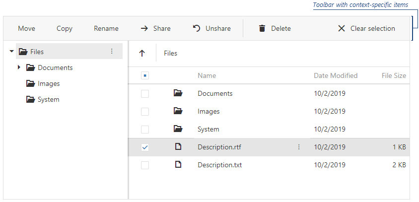
JavaScript/jQuery FileManager - toolbar
Configures toolbar settings.
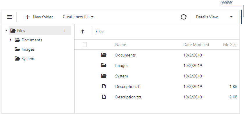
The FileManager UI component allows you to add default and custom toolbar items.
Predefined Items
Predefined toolbar items include:
- 'showNavPane' - Shows or hides the navigation panel.
- 'create' - Creates a new directory.
- 'upload' - Uploads a file.
- 'refresh' - Refreshes the file manager content and shows the progress panel.
- 'download' - Downloads a file.
- 'move' - Moves files and directories.
- 'copy' - Copies files and directories.
- 'rename' - Renames files and directories.
- 'delete' - Deletes files and directories.
- 'switchView' - Switches between the 'Details' and 'Thumbnails' file system representation modes.
- 'clearSelection' - Clears selection from files and directories in the Item View area.
To add a predefined item to the toolbar, specify its name and optional settings ('visible', 'location', 'locateInMenu', 'text', 'icon', 'disabled') and add the item to one of the following collections:
items - Displays toolbar items when no file system item is selected.
fileSelectionItems - Displays toolbar items when one or more file system items are selected.
jQuery
$(function () {
    $("#file-manager").dxFileManager({
        toolbar: {
            items: [
                // Specifies a predefined item's name and optional settings
                {
                    name: "create",
                    text: "Create a directory",
                    icon: "newfolder"
                },
                // Specifies a predefined item's name only
                "switchView", "separator"
                //...
            ]
            fileSelectionItems: [
                "copy", "rename"
                //...
            ]
        }
    });
});
Angular
<dx-file-manager>
    <dxo-file-manager-toolbar>
        <!-- Specifies a predefined item's name and optional settings -->
        <dxi-file-manager-item name="create" text="Create a directory" icon="newfolder"></dxi-file-manager-item>
        <!-- Specifies a predefined item's name only -->
        <dxi-file-manager-item name="switchView"></dxi-file-manager-item>
        <dxi-file-manager-item name="separator"></dxi-file-manager-item>
        <!-- Specifies items that are visible when users select files -->
        <dxi-file-manager-file-selection-item name="copy"></dxi-file-manager-file-selection-item>
        <dxi-file-manager-file-selection-item name="rename"></dxi-file-manager-file-selection-item>
    </dxo-file-manager-toolbar>
</dx-file-manager>
import { BrowserModule } from '@angular/platform-browser';
import { NgModule } from '@angular/core';
import { AppComponent } from './app.component';
import { DxFileManagerModule } from 'devextreme-angular';

@NgModule({
    declarations: [
        AppComponent
    ],
    imports: [
        BrowserModule,
        DxFileManagerModule
    ],
    //...
})
export class AppModule { }
Vue
<template>
    <DxFileManager>
        <DxToolbar>
            <!-- Specifies a predefined item's name and optional settings -->
            <DxItem name="create" text="Create a directory" icon="newfolder" />
            <!-- Specifies a predefined item's name only -->
            <DxItem name="switchView"/>
            <DxItem name="separator"/>
            <!-- Specifies items that are visible when users select files -->
            <DxFileSelectionItem name="copy"/>
            <DxFileSelectionItem name="rename"/>
        </DxToolbar>
    </DxFileManager>
</template>
<script>
    import 'devextreme/dist/css/dx.fluent.blue.light.css';

    import {
        DxFileManager,
        DxToolbar,
        DxItem,
        DxFileSelectionItem
    } from 'devextreme-vue/file-manager';

    export default {
        components: {
            DxFileManager,
            DxToolbar,
            DxItem,
            DxFileSelectionItem
        },
        data() {
            return {
                //...
            };
        }
    };
</script>
React
import React from 'react';

import 'devextreme/dist/css/dx.fluent.blue.light.css';

import FileManager, { Toolbar, Item, FileSelectionItem } from 'devextreme-react/file-manager';

class App extends React.Component {
    render() {
        return (
            <FileManager>
                <Toolbar>
                    {/* Specifies a predefined item's name and optional settings */}
                    <Item name="create" text="Create a directory" icon="newfolder" />
                    {/* Specifies a predefined item's name only */}
                    <Item name="switchView" />
                    <Item name="separator" />
                    {/* Specifies items that are visible when users select files */}
                    <FileSelectionItem name="copy" />
                    <FileSelectionItem name="rename" />
                </Toolbar>
            </FileManager>
        );
    }
}
export default App;
ASP.NET Core Controls
@(Html.DevExtreme().FileManager()
    .Toolbar(toolbar => {
        toolbar.Items(items => {
            // Specifies a predefined item's name and optional settings
            items.Add().Name(FileManagerToolbarItem.Create).Text("Create a directory").Icon("newfolder");
            // Specifies a predefined item's name only
            items.Add().Name(FileManagerToolbarItem.SwitchView);
            items.Add().Name(FileManagerToolbarItem.Create);
        });
        // Specifies items that are visible when users select files
        toolbar.FileSelectionItems(items => {
            items.Add().Name(FileManagerToolbarItem.Copy);
            items.Add().Name(FileManagerToolbarItem.Rename);
        });
    })
)
ASP.NET MVC Controls
@(Html.DevExtreme().FileManager()
    .Toolbar(toolbar => {
        toolbar.Items(items => {
            // Specifies a predefined item's name and optional settings
            items.Add().Name(FileManagerToolbarItem.Create).Text("Create a directory").Icon("newfolder");
            // Specifies a predefined item's name only
            items.Add().Name(FileManagerToolbarItem.SwitchView);
            items.Add().Name(FileManagerToolbarItem.Create);
        });
        // Specifies items that are visible when users select files
        toolbar.FileSelectionItems(items => {
            items.Add().Name(FileManagerToolbarItem.Copy);
            items.Add().Name(FileManagerToolbarItem.Rename);
        });
    })
)
Custom Items
To add a custom toolbar item, specify its text and optional settings (for example, a file extension for the toolbar item that creates a new file) and add the item to one of the following collections:
items - Displays toolbar items when no file system item is selected.
fileSelectionItems - Displays toolbar items when one or more file system items are selected.
The widget property allows you to specify a UI component for a custom toolbar item (dxButton is the default UI component). Use the toolbarItemClick event to handle clicks on custom toolbar items.
jQuery
$(function () {
    $("#file-manager").dxFileManager({
        toolbar: {
            items: [
                // Specifies a custom item as a dxMenu UI component
                {
                    widget: "dxMenu",
                    options: {
                        items: [
                            {
                                text: "Create new file",
                                icon: "plus",
                                items: [
                                    {
                                        text: "Text Document",
                                        extension: ".txt"
                                    },
                                    {
                                        text: "RTF Document",
                                        extension: ".rtf"
                                    },
                                    {
                                        text: "Spreadsheet",
                                        extension: ".xls"
                                    }]
                            }
                        ],
                    }
            }]
        },
        onToolbarItemClick: onItemClick
    });
});
function onItemClick(args) {
    // ...
}
Angular
<dx-file-manager>
    <dxo-file-manager-toolbar>
        <dxi-file-manager-item widget="dxMenu" [options]="fileMenuOptions"></dxi-file-manager-item>
    </dxo-file-manager-toolbar>
</dx-file-manager>
import { Component } from '@angular/core';
import { Service } from './app.service';

@Component({
    selector: 'app-root',
    templateUrl: './app.component.html',
    styleUrls: ['./app.component.css'],
    providers: [Service]
})

export class AppComponent {
    constructor(service: Service) {
        this.fileMenuOptions = {
            items: [
                {
                    text: "Create new file",
                    icon: "plus",
                    items: [
                        {
                            text: "Text Document",
                            options: {
                                extension: ".txt",
                            }
                        },
                        {
                            text: "RTF Document",
                            options: {
                                extension: ".rtf",
                            }
                        },
                        {
                            text: "Spreadsheet",
                            options: {
                                extension: ".xls",
                            }
                        }
                    ]
                }
            ],
            onItemClick: () => {
                // ...
            }
        };
    }
}
import { BrowserModule } from '@angular/platform-browser';
import { NgModule } from '@angular/core';
import { AppComponent } from './app.component';
import { DxFileManagerModule } from 'devextreme-angular';

@NgModule({
    imports: [
        BrowserModule,
        DxFileManagerModule
    ],
    declarations: [AppComponent],
    bootstrap: [AppComponent]
})
export class AppModule { }
Vue
<template>
    <DxFileManager>
        <DxToolbar>
            <DxItem
                widget="dxMenu"
                :options="fileMenuOptions"
            />
        </DxToolbar>
    </DxFileManager>
</template>
<script>
    import 'devextreme/dist/css/dx.fluent.blue.light.css';

    import {
        DxFileManager,
        DxToolbar,
        DxItem
    } from 'devextreme-vue/file-manager';

    export default {
        components: {
            DxFileManager,
            DxToolbar,
            DxItem
        },
        data() {
            return {
                fileMenuOptions: {
                    items: [
                        {
                            text: "Create new file",
                            icon: "plus",
                            items: [
                                {
                                    text: "Text Document",
                                    options: {
                                        extension: ".txt",
                                    }
                                },
                                {
                                    text: "RTF Document",
                                    options: {
                                        extension: ".rtf",
                                    }
                                },
                                {
                                    text: "Spreadsheet",
                                    options: {
                                        extension: ".xls",
                                    }
                                }
                            ]
                        }
                    ],
                onItemClick: this.onItemClick
            };
        },
        methods:{
            onItemClick() {
                // ...
            }
        }
    };
</script>
React
import React from 'react';
import 'devextreme/dist/css/dx.fluent.blue.light.css';
import FileManager, { Toolbar, Item } from 'devextreme-react/file-manager';

const App = () => {
    const fileMenuOptions = {
        items: [
            {
                text: 'Create new file',
                icon: 'plus',
                items: [
                    {
                        text: 'Text Document',
                        extension: '.txt'
                    },
                    {
                        text: 'RTF Document',
                        extension: '.rtf'
                    },
                    {
                        text: 'Spreadsheet',
                        extension: '.xls'
                    }
                ]
            }
        ],
        onItemClick: 'onItemClick'
    };

    const onItemClick = (e) => {
        // ...
    };

    return (
        <FileManager>
            <Toolbar>
                <Item widget="dxMenu" options={this.fileMenuOptions} />
            </Toolbar>
        </FileManager>
    );
};

export default App;
ASP.NET Core Controls
@(Html.DevExtreme().FileManager()
    .Toolbar(toolbar => {
        toolbar.Items(items => {
            items.Add()
                .Widget(widget => widget.Menu()
                    .Items(menuItems => {
                        menuItems.Add()
                            .Text("Create new file")
                            .Icon("plus")
                            .Items(subItems => {
                                subItems.Add()
                                    .Text("Text Document")
                                    .Option("extension", ".txt");
                                subItems.Add()
                                    .Text("RTF Document")
                                    .Option("extension", ".rtf");
                                subItems.Add()
                                    .Text("Spreadsheet")
                                    .Option("extension", ".xls");
                            });
                    })
                    .OnItemClick("onItemClick")
                );
        });
    })
)
<script type="text/javascript">
    function onItemClick() {
        // ...
    }
</script>
ASP.NET MVC Controls
@(Html.DevExtreme().FileManager()
    .Toolbar(toolbar => {
        toolbar.Items(items => {
            items.Add()
                .Widget(widget => widget.Menu()
                    .Items(menuItems => {
                        menuItems.Add()
                            .Text("Create new file")
                            .Icon("plus")
                            .Items(subItems => {
                                subItems.Add()
                                    .Text("Text Document")
                                    .Option("extension", ".txt");
                                subItems.Add()
                                    .Text("RTF Document")
                                    .Option("extension", ".rtf");
                                subItems.Add()
                                    .Text("Spreadsheet")
                                    .Option("extension", ".xls");
                            });
                    })
                    .OnItemClick("onItemClick")
                );
        })
    })
)
<script type="text/javascript">
    function onItemClick() {
        // ...
    }
</script>
fileSelectionItems[]
Configures settings of the toolbar items that are visible when users select files.
jQuery
$(function () {
    $("#file-manager").dxFileManager({
        toolbar: {
            fileSelectionItems: [
                "move", "copy", "rename",
                {
                    widget: "dxButton",
                    options: {
                        text: "Share",
                        icon: "arrowright"
                    },
                    location: "before",
                    onClick: shareItem
                },
                // ...
                "separator", "delete", "refresh", "clear"
            ]
        }
    });
});
items[]
Configures toolbar items' settings.

 Select one or more answers