Vue HtmlEditor - Predefined Items
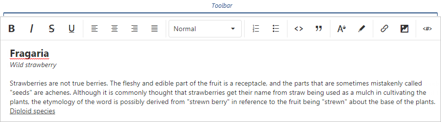
Toolbar items allow users to format the HTML Editor's content and perform actions on it.
Predefined toolbar items include:
- Buttons that apply single-choice formats to the text.
- Action buttons.
- Select boxes that apply multiple-choice formats.
- Separators that are not user-interactive and only divide other elements.
The following table lists toolbar items and the formats they apply (if applicable):
| Toolbar item name | Format | acceptedValues |
|---|---|---|
| "background" | "background" | Any value the background-color CSS property accepts. |
| "bold" | "bold" | true or false |
| "color" | "color" | Any value the color CSS property accepts. |
| "italic" | "italic" | true or false |
| "link" | "link" | String or Object ({ href: String, text: String, target: Boolean }) |
| "image" | "extendedImage" | String or Object ({ src: String, width: Number, height: Number, alt: String }) |
| "strike" | "strike" | true or false |
| "subscript" | "script" | "sub" |
| "superscript" | "script" | "super" |
| "underline" | "underline" | true or false |
| "blockquote" | "blockquote" | true or false |
| "header" | "header" | 1, 2, 3, 4, 5, or 6 |
| "increaseIndent" | "indent" | "+1" |
| "decreaseIndent" | "indent" | "-1" |
| "orderedList" | "list" | "ordered" |
| "bulletList" | "list" | "bullet" |
| "alignLeft" | "align" | "left" |
| "alignCenter" | "align" | "center" |
| "alignRight" | "align" | "right" |
| "alignJustify" | "align" | "justify" |
| "codeBlock" | "code-block" | true or false |
| "variable" | "variable" | Object ({ value: String, escapeChar: String | Array<String> }) |
| "font" | "font" | Any value the font-family CSS property accepts. |
| "size" | "size" | Any value the font-size CSS property accepts. |
| "undo" | - | - |
| "redo" | - | - |
| "clear" | - | - |
| "separator" | - | - |
| "cellProperties" | - | - |
| "tableProperties" | - | - |
| "insertTable" | - | - |
| "insertHeaderRow" | - | - |
| "insertRowAbove" | - | - |
| "insertRowBelow" | - | - |
| "insertColumnLeft" | - | - |
| "insertColumnRight" | - | - |
| "deleteColumn" | - | - |
| "deleteRow" | - | - |
| "deleteTable" | - | - |
To add a button to the toolbar, add its name to the items array:
jQuery
JavaScript
$(function(){
    $("#htmlEditorContainer").dxHtmlEditor({
        toolbar: {
            items: [ "bold", "italic", "alignRight", "alignLeft" ]
        }
    })
})
Angular
HTML
TypeScript
<dx-html-editor>
    <dxo-html-editor-toolbar>
        <dxi-html-editor-item name="bold"></dxi-html-editor-item>
        <dxi-html-editor-item name="italic"></dxi-html-editor-item>
        <dxi-html-editor-item name="alignRight"></dxi-html-editor-item>
        <dxi-html-editor-item name="alignLeft"></dxi-html-editor-item>
    </dxo-html-editor-toolbar>
</dx-html-editor>
import { DxHtmlEditorModule } from "devextreme-angular";
// ...
export class AppComponent {
    // ...
}
@NgModule({
    imports: [
        // ...
        DxHtmlEditorModule
    ],
    // ...
})
Vue
<template>
    <DxHtmlEditor>
        <DxToolbar>
            <DxItem name="bold"/>
            <DxItem name="italic"/>
            <DxItem name="alignRight"/>
            <DxItem name="alignLeft"/>
        </DxToolbar>
    </DxHtmlEditor>
</template>

<script>
import 'devextreme/dist/css/dx.light.css';

import {
    DxHtmlEditor,
    DxToolbar,
    DxItem
} from 'devextreme-vue/html-editor';

export default {
    components: {
        DxHtmlEditor,
        DxToolbar,
        DxItem
    }
}
</script>
React
import React from 'react';
import 'devextreme/dist/css/dx.light.css';

import { HtmlEditor, Toolbar, Item } from 'devextreme-react/html-editor';

class App extends React.Component {
    render() {
        return (
            <HtmlEditor>
                <Toolbar>
                    <Item name="bold"/>
                    <Item name="italic"/>
                    <Item name="alignRight"/>
                    <Item name="alignLeft"/>
                </Toolbar>
            </HtmlEditor>
        );
    }
}

export default App;
ASP.NET MVC Controls
Razor C#
@(Html.DevExtreme().HtmlEditor()
    .ID("htmlEditor")
    .Toolbar(t => t
        .Items(i => {
            i.Add().Name("bold");
            i.Add().Name("italic");
            i.Add().Name("alignRight");
            i.Add().Name("alignLeft");
        })
    )
)
To add a select box, specify the name and acceptedValues:
jQuery
JavaScript
$(function(){
    $("#htmlEditorContainer").dxHtmlEditor({
        toolbar: {
            items: [{
                name: "header",
                acceptedValues: [1, 2, 3, false]
            }, {
                name: "align",
                acceptedValues: ["left", "right", "center"]
            }]
        }
    })
})
Angular
HTML
TypeScript
<dx-html-editor>
    <dxo-html-editor-toolbar>
        <dxi-html-editor-item
            [acceptedValues]="headerAcceptedValues"
            name="header"
        />
        <dxi-html-editor-item
            [acceptedValues]="alignAcceptedValues"
            name="align"
        />
    </dxo-html-editor-toolbar>
</dx-html-editor>
import { DxHtmlEditorModule } from "devextreme-angular";
// ...
export class AppComponent {
    headerAcceptedValues =  [1, 2, 3, false];
    alignAcceptedValues = ["left", "right", "center"];
}
@NgModule({
    imports: [
        // ...
        DxHtmlEditorModule
    ],
    // ...
})
Vue
<template>
    <DxHtmlEditor>
        <DxToolbar>
            <DxItem
                :accepted-values="headerAcceptedValues"
                name="header"
            />
            <DxItem
                :accepted-values="alignAcceptedValues"
                name="align"
            />
        </DxToolbar>
    </DxHtmlEditor>
</template>

<script>
import 'devextreme/dist/css/dx.light.css';

import {
    DxHtmlEditor,
    DxToolbar,
    DxItem
} from 'devextreme-vue/html-editor';

export default {
    components: {
        DxHtmlEditor,
        DxToolbar,
        DxItem
    },
    data() {
        return {
            headerAcceptedValues: [1, 2, 3, false],
            alignAcceptedValues: ['left', 'right', 'center']
        };
    }
}
</script>
React
import React from 'react';
import 'devextreme/dist/css/dx.light.css';

import { HtmlEditor, Toolbar, Item } from 'devextreme-react/html-editor';

const headerAcceptedValues = [1, 2, 3, false];
const alignAcceptedValues = ['left', 'right', 'center'];

class App extends React.Component {
    render() {
        return (
            <HtmlEditor>
                <Toolbar>
                    <Item
                        acceptedValues={headerAcceptedValues}
                        name="header"
                    />
                    <Item
                        acceptedValues={alignAcceptedValues}
                        name="align"
                    />
                </Toolbar>
            </HtmlEditor>
        );
    }
}

export default App;
ASP.NET MVC Controls
Razor C#
@(Html.DevExtreme().HtmlEditor()
    .Toolbar(t => t
        .Items(i => {
            i.Add().Name("header")
                .AcceptedValues(new JS ("[1, 2, 3, false]"));
            i.Add().Name("align")
                .AcceptedValues(new[] { "left", "right", "center" })
        })
    )
)
Customize Predefined Items
To customize a button, assign its name to the name property and specify button properties in the options object:
jQuery
JavaScript
$(function(){
    $("#htmlEditorContainer").dxHtmlEditor({
        toolbar: {
            items: [{
                name: "clear",
                options: { icon: "clear", type: "danger" }
            }, // ...
            ]
        }
    })
})
Angular
HTML
TypeScript
<dx-html-editor>
    <dxo-html-editor-toolbar>
        <dxi-html-editor-item
            [options]="clearFormatOptions"
            name="clear">
        </dxi-html-editor-item>
    </dxo-html-editor-toolbar>
</dx-html-editor>
import { DxHtmlEditorModule } from "devextreme-angular";
// ...
export class AppComponent {
    clearFormatOptions = { icon: "clear", type: "danger" };
}
@NgModule({
    imports: [
        // ...
        DxHtmlEditorModule
    ],
    // ...
})
Vue
<template>
    <DxHtmlEditor>
        <DxToolbar>
            <DxItem
                :options="clearFormatOptions"
                name="clear"
            />
        </DxToolbar>
    </DxHtmlEditor>
</template>

<script>
import 'devextreme/dist/css/dx.light.css';

import {
    DxHtmlEditor,
    DxToolbar,
    DxItem
} from 'devextreme-vue/html-editor';

export default {
    components: {
        DxHtmlEditor,
        DxToolbar,
        DxItem
    },
    data() {
        return {
            clearFormatOptions: { icon: 'clear', type: 'danger' }
        };
    }
}
</script>
React
import React from 'react';
import 'devextreme/dist/css/dx.light.css';

import { HtmlEditor, Toolbar, Item } from 'devextreme-react/html-editor';

const clearFormatOptions = { icon: 'clear', type: 'danger' };

class App extends React.Component {
    render() {
        return (
            <HtmlEditor>
                <Toolbar>
                    <Item
                        options={clearFormatOptions}
                        name="clear"
                    />
                </Toolbar>
            </HtmlEditor>
        );
    }
}

export default App;
ASP.NET MVC Controls
Razor C#
@(Html.DevExtreme().HtmlEditor()
    .Toolbar(t => t
        .Items(i => {
            i.Add().Name("clear")
                .Widget(w => w.Button()
                    .Icon("clear")
                    .Type(ButtonType.Danger)
                );
        })
    )
)
To customize a select box, specify select box properties in the options object in addition to the name and acceptedValues properties:
jQuery
JavaScript
$(function(){
    $("#htmlEditorContainer").dxHtmlEditor({
        toolbar: {
            items: [{
                name: "size",
                acceptedValues: ["11px", "14px", "16px"],
                options: {
                    width: 150
                }
            }, // ...
            ]
        }
    })
})
Angular
HTML
TypeScript
<dx-html-editor>
    <dxo-html-editor-toolbar>
        <dxi-html-editor-item
            [options]="sizeFormatOptions"
            [acceptedValues]="sizeAcceptedValues"
            name="size"
        />
    </dxo-html-editor-toolbar>
</dx-html-editor>
import { DxHtmlEditorModule } from "devextreme-angular";
// ...
export class AppComponent {
    sizeAcceptedValues = ["11px", "14px", "16px"];
    sizeFormatOptions = { width: 150 };
}
@NgModule({
    imports: [
        // ...
        DxHtmlEditorModule
    ],
    // ...
})
Vue
<template>
    <DxHtmlEditor>
        <DxToolbar>
            <DxItem
                :options="sizeFormatOptions"
                :accepted-values="sizeAcceptedValues"
                name="size"
            />
        </DxToolbar>
    </DxHtmlEditor>
</template>

<script>
import 'devextreme/dist/css/dx.light.css';

import {
    DxHtmlEditor,
    DxToolbar,
    DxItem
} from 'devextreme-vue/html-editor';

export default {
    components: {
        DxHtmlEditor,
        DxToolbar,
        DxItem
    },
    data() {
        return {
            sizeFormatOptions: { width: 150 },
            sizeAcceptedValues: ["11px", "14px", "16px"]
        };
    }
}
</script>
React
import React from 'react';
import 'devextreme/dist/css/dx.light.css';

import { HtmlEditor, Toolbar, Item } from 'devextreme-react/html-editor';

const sizeFormatOptions = { width: 150 };
const sizeAcceptedValues = ["11px", "14px", "16px"];

class App extends React.Component {
    render() {
        return (
            <HtmlEditor>
                <Toolbar>
                    <Item
                        options={sizeFormatOptions}
                        acceptedValues={sizeAcceptedValues}
                        name="size"
                    />
                </Toolbar>
            </HtmlEditor>
        );
    }
}

export default App;
ASP.NET MVC Controls
Razor C#
@(Html.DevExtreme().HtmlEditor()
    .Toolbar(t => t
        .Items(i => {
            i.Add().Name("size")
                .AcceptedValues(new[] { "11px", "14px", "16px" })
                .Widget(w => w.SelectBox()
                    .Width(150)
                );
        })
    )
)
See Also

 Select one or more answers