Vue Gantt Props
An object that defines the Gantt UI component's configuration properties.
See Also
accessKey
Specifies the shortcut key that sets focus on the UI component.
The value of this property will be passed to the accesskey attribute of the HTML element that underlies the UI component.
activeStateEnabled
Specifies whether the UI component changes its visual state as a result of user interaction.
The UI component switches to the active state when users press down the primary mouse button. When this property is set to true, the CSS rules for the active state apply. You can change these rules to customize the component.
Use this property when you display the component on a platform whose guidelines include the active state change for UI components.
allowSelection
Specifies whether users can select tasks in the Gantt.
jQuery
$(function() {
    $("#gantt").dxGantt({
        allowSelection: false,
        // ...
    });
});
Angular
<dx-gantt
    [allowSelection]="false">
    <!-- ... -->
</dx-gantt>
import { Component } from '@angular/core';

@Component({
    selector: 'app-root',
    templateUrl: './app.component.html',
    styleUrls: ['./app.component.css']
})

export class AppComponent {
    // ...
}
import { BrowserModule } from '@angular/platform-browser';
import { NgModule } from '@angular/core';
import { AppComponent } from './app.component';
import { DxGanttModule } from 'devextreme-angular';

@NgModule({
    imports: [
        BrowserModule,
        DxGanttModule
    ],
    declarations: [AppComponent],
    bootstrap: [AppComponent]
})
export class AppModule { }
Vue
<template>
    <DxGantt
        :allow-selection="false" >
        <!-- ... -->
    </DxGantt>
</template>
<script>
    import 'devextreme/dist/css/dx.fluent.blue.light.css';
    import 'devexpress-gantt/dist/dx-gantt.css';

    import {
        DxGantt
        // ...
    } from 'devextreme-vue/gantt';

    export default {
        components: {
            DxGantt
            // ...
        }
    };
</script>
React
import React from 'react';

import 'devextreme/dist/css/dx.fluent.blue.light.css';
import 'devexpress-gantt/dist/dx-gantt.css';

import Gantt, {
    // ...
} from 'devextreme-react/gantt';

const App = () => {
    return (
        <Gantt
            allowSelection={false} >
            {/* ... */}
        </Gantt>
    );
};

export default App;
ASP.NET Core Controls
@(Html.DevExtreme().Gantt()
    .AllowSelection(false)
    // ...
)
ASP.NET MVC Controls
<!-- Razor C# -->
@(Html.DevExtreme().Gantt()
    .AllowSelection(false)
    // ...
)
See Also
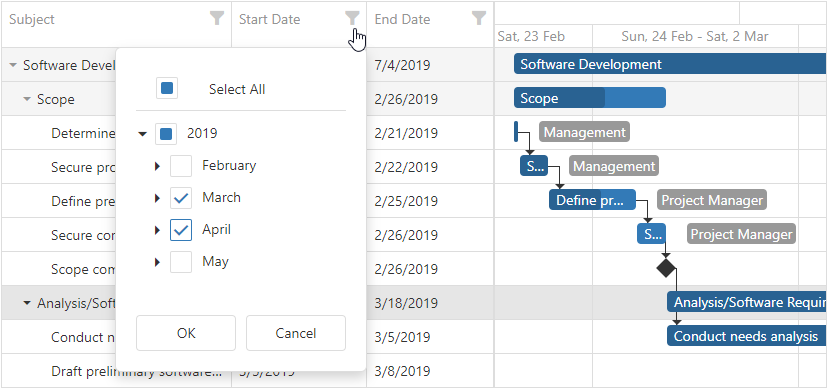
columns[]
An array of columns in the Gantt.
The columns property accepts an array of columns. To configure a column, use a dxGanttColumn object or specify a data source field (as a string value) to which the column is bound.
jQuery
$(function() {
    $("#gantt").dxGantt({
        columns: [{
            dataField: "title",
            caption: "Subject",
            width: 300
        }, {
            dataField: "start",
            caption: "Start Date"
        }, {
            dataField: "end",
            caption: "End Date"
        }],
        // ...
    });
});
Angular
<dx-gantt>
    <dxi-gantt-column dataField="title" caption="Subject" [width]="300"></dxi-gantt-column>
    <dxi-gantt-column dataField="start" caption="Start Date"></dxi-gantt-column>
    <dxi-gantt-column dataField="end" caption="End Date"></dxi-gantt-column>
</dx-gantt>
import { Component } from '@angular/core';

@Component({
    selector: 'app-root',
    templateUrl: './app.component.html',
    styleUrls: ['./app.component.css']
})

export class AppComponent {
    // ...
}
import { BrowserModule } from '@angular/platform-browser';
import { NgModule } from '@angular/core';
import { AppComponent } from './app.component';
import { DxGanttModule } from 'devextreme-angular';

@NgModule({
    imports: [
        BrowserModule,
        DxGanttModule
    ],
    declarations: [AppComponent],
    bootstrap: [AppComponent]
})
export class AppModule { }
Vue
<template>
    <DxGantt
        :allow-selection="false" >
        <DxColumn
            :width="300"
            data-field="title"
            caption="Subject"
        />
        <DxColumn
            data-field="start"
            caption="Start Date"
        />
        <DxColumn
            data-field="end"
            caption="End Date"
        />
        <!-- ... -->
    </DxGantt>
</template>
<script>
    import 'devextreme/dist/css/dx.fluent.blue.light.css';
    import 'devexpress-gantt/dist/dx-gantt.css';

    import {
        DxGantt, DxColumn
        // ...
    } from 'devextreme-vue/gantt';

    export default {
        components: {
            DxGantt, DxColumn
            // ...
        }
    };
</script>
React
import React from 'react';

import 'devextreme/dist/css/dx.fluent.blue.light.css';
import 'devexpress-gantt/dist/dx-gantt.css';

import Gantt, {
    // ...
} from 'devextreme-react/gantt';

const App = () => {
    return (
        <Gantt
            <Column dataField="title" caption="Subject" width={300} />
            <Column dataField="start" caption="Start Date" />
            <Column dataField="end" caption="End Date" />
            {/* ... */}
        </Gantt>
    );
};

export default App;
ASP.NET Core Controls
@(Html.DevExtreme().Gantt()
    .Columns(columns => {
        columns.AddFor(m => m.Title)
            .Caption("Subject")
            .Width(300);
        columns.AddFor(m => m.Start)
            .Caption("Start Date");
        columns.AddFor(m => m.End)
            .Caption("End Date");
    })
    // ...
)
ASP.NET MVC Controls
@(Html.DevExtreme().Gantt()
    .Columns(columns => {
        columns.AddFor(m => m.Title)
            .Caption("Subject")
            .Width(300);
        columns.AddFor(m => m.Start)
            .Caption("Start Date");
        columns.AddFor(m => m.End)
            .Caption("End Date");
    })
    // ...
)
dependencies
Configures dependencies.
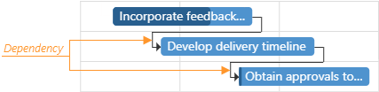
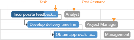
Dependencies specify the relationships between tasks. The following image illustrates how the Gantt displays dependencies in the chart:
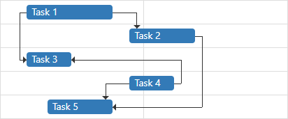
The Gantt UI component supports the following dependency types:
Finish to Start (FS) - The predecessor task's endpoint specifies the successor task's start point.
Start to Start (SS) - The predecessor task's start point specifies the successor task's start point.
Finish to Finish (FF) - The predecessor task's end point specifies the successor task's end point.
Start to Finish (SF) - The predecessor task's start point specifies the successor task's end point.
In a database, you can use any of the following formats (digit or string) to store dependency types:
| Dependency Type | Supported Values |
|---|---|
| Finish to Start (FS) | 0, "0", "FS", "fs" |
| Start to Start (SS) | 1, "1", "SS", "ss" |
| Finish to Finish (FF) | 2, "2", "FF", "ff" |
| Start to Finish (SF) | 3, "3", "SF", "sf" |
Use the dataSource property to bind the UI component to a data source, which contains information about dependency types. If the field names in your data source differ from the 'id', 'type', 'predecessorId' and 'successorId' default names, use the keyExpr, typeExpr properties to map data fields.
See Also
jQuery
$(function() {
    $("#gantt").dxGantt({
        dependencies: {
            dataSource: dependencies,
            keyExpr: "dependencyId",
            typeExpr: "dependencyType",
            predecessorIdExpr: "taskPredecessorId",
            successorIdExpr: "taskSuccessorId"
        },
        //...
    });
});
var dependencies = [{
    'dependencyId': 0,
    'taskPredecessorId': 1,
    'taskSuccessorId': 2,
    'dependencyType': 0
},
// ...
];
Angular
<dx-gantt ... >
    <dxo-gantt-dependencies
        [dataSource]="dependencies"
        keyExpr="dependencyId"
        typeExpr="dependencyType"
        predecessorIdExpr="taskPredecessorId"
        successorIdExpr="taskSuccessorId" >
    </dxo-gantt-dependencies>
    <!-- ... -->
</dx-gantt>
import { Component } from '@angular/core';

@Component({
    selector: 'app-root',
    templateUrl: './app.component.html',
    styleUrls: ['./app.component.css']
})

export class AppComponent {
    dependencies: Dependency[];
    // ...

    constructor(service: Service) {
        this.dependencies = service.getDependencies();
        // ...
    }
}
import { BrowserModule } from '@angular/platform-browser';
import { NgModule } from '@angular/core';
import { AppComponent } from './app.component';
import { DxGanttModule } from 'devextreme-angular';
import { Service, Dependency, ... } from './app.service';

@NgModule({
    imports: [
        BrowserModule,
        DxGanttModule
    ],
    declarations: [AppComponent],
    providers: [Service],
    bootstrap: [AppComponent]
})
export class AppModule { }
import { Injectable } from '@angular/core';

export class Dependency {
    dependencyId: number;
    taskPredecessorId: number;
    taskSuccessorId: number;
    dependencyType: number;
}

let dependencies: Dependency[] = [{
    'dependencyId': 0,
    'taskPredecessorId': 1,
    'taskSuccessorId': 2,
    'dependencyType': 0
},
// ...
];
@Injectable()
export class Service {
    getDependencies(): Dependency[] {
        return dependencies;
    }
}
{
  "projects": {
    "ProjectName": {
      "architect": {
        "build": {
          "options": {
            "styles": [
              "node_modules/devextreme/dist/css/dx.light.css",
              "node_modules/devexpress-gantt/dist/dx-gantt.css",
              "src/styles.css"
            ],
            ...
          },
          ...
        },
        ...
      }
    },
    ...
  },
  ...
}
Vue
<template>
    <DxGantt ... >
        <DxDependencies
            :data-source="dependencies"
            key-expr="dependencyId"
            type-expr="dependencyType"
            predecessor-id-expr="taskPredecessorId"
            successor-id-expr="taskSuccessorId" />
        <!-- ... -->
    </DxGantt>
</template>
<script>
    import 'devextreme/dist/css/dx.fluent.blue.light.css';
    import 'devexpress-gantt/dist/dx-gantt.css';

    import {
        DxGantt,
        DxDependencies,
        // ...
    } from 'devextreme-vue/gantt';
    import {
        dependencies,
        // ...
    } from './data.js';

    export default {
        components: {
            DxGantt,
            DxDependencies,
            // ...
        },
        data() {
            return {
                dependencies,
                // ...
            };
        }
    };
</script>
export const dependencies = [{
    'dependencyId': 0,
    'taskPredecessorId': 1,
    'taskSuccessorId': 2,
    'dependencyType': 0
},
// ...
];
React
import React from 'react';

import 'devextreme/dist/css/dx.fluent.blue.light.css';
import 'devexpress-gantt/dist/dx-gantt.css';

import Gantt, {
    Dependencies,
    // ...
} from 'devextreme-react/gantt';
import {
    dependencies,
    // ...
} from './data.js';

const App = () => {
    return (
        <Gantt ... >
            <Dependencies
                dataSource={dependencies}
                keyExpr="dependencyId"
                typeExpr="dependencyType"
                predecessorIdExpr="taskPredecessorId"
                successorIdExpr="taskSuccessorId" />
            {/* ... */}
        </Gantt>
    );
};

export default App;
export const dependencies = [{
    'dependencyId': 0,
    'taskPredecessorId': 1,
    'taskSuccessorId': 2,
    'dependencyType': 0
},
// ...
];
ASP.NET Core Controls
@(Html.DevExtreme().Gantt<Gantt.Task>()
    .Dependencies(d => d
        .DataSource(ds => ds.Array().Data(SampleData.GanttDependencies).Key("ID"))
        .KeyExpr("ID")
        .PredecessorIdExpr("PredecessorId")
        .SuccessorIdExpr("SuccessorId")
        .TypeExpr("Type")
    )
    // ...
)
<!-- C# -->
public partial class SampleData {
    public static readonly IEnumerable<Dependency> GanttDependencies = new[] {
        new Dependency { ID = 1, PredecessorId = 3, SuccessorId = 4, Type = 0 },
        new Dependency { ID = 2, PredecessorId = 4, SuccessorId = 5, Type = 0 },
        // ...
    }
    // ...
}
ASP.NET MVC Controls
@(Html.DevExtreme().Gantt<Task>()
    .Dependencies(d => d
        .DataSource(ds => ds.Array().Data(SampleData.GanttDependencies).Key("ID"))
        .KeyExpr("ID")
        .PredecessorIdExpr("PredecessorId")
        .SuccessorIdExpr("SuccessorId")
        .TypeExpr("Type")
    )
    // ...
)
<!-- C# -->
public partial class SampleData {
    public static readonly IEnumerable<Dependency> GanttDependencies = new[] {
        new Dependency { ID = 1, PredecessorId = 3, SuccessorId = 4, Type = 0 },
        new Dependency { ID = 2, PredecessorId = 4, SuccessorId = 5, Type = 0 },
        // ...
    }
    // ...
}
disabled
Specifies whether the UI component responds to user interaction.
editing
Configures edit properties.
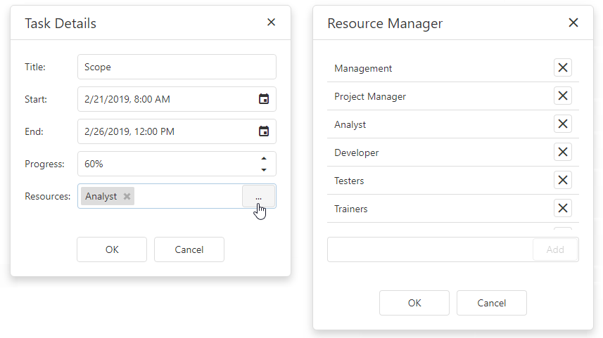
The UI component allows users to add, modify and delete tasks, resources and dependencies. Set the enabled property to true to enable edit functionality.
jQuery
$(function() {
    $("#gantt").dxGantt({
        editing: {
            enabled: true,
            allowDependencyAdding: false,
            allowDependencyDeleting: false,
            allowResourceAdding: false,
            allowResourceDeleting: false,
            allowTaskAdding: false,
            allowTaskDeleting: false,
            allowTaskResourceUpdating: false,
            allowTaskUpdating: false
        }
    });
});
Angular
<dx-gantt ... >
    <dxo-gantt-editing
        [enabled]="true"
        [allowDependencyAdding]="false"
        [allowDependencyDeleting]="false"
        [allowResourceAdding]="false"
        [allowResourceDeleting]="false"
        [allowTaskAdding]="false"
        [allowTaskDeleting]="false"
        [allowTaskResourceUpdating]="false"
        [allowTaskUpdating]="false">
    </dxo-gantt-editing>
    <!-- ... -->
</dx-gantt>
import { Component } from '@angular/core';

@Component({
    selector: 'app-root',
    templateUrl: './app.component.html',
    styleUrls: ['./app.component.css']
})

export class AppComponent {
    // ...
}
import { BrowserModule } from '@angular/platform-browser';
import { NgModule } from '@angular/core';
import { AppComponent } from './app.component';
import { DxGanttModule } from 'devextreme-angular';

@NgModule({
    imports: [
        BrowserModule,
        DxGanttModule
    ],
    declarations: [AppComponent],
    bootstrap: [AppComponent]
})
export class AppModule { }
Vue
<template>
    <DxGantt ... >
        <DxEditing
            :enabled="true"
            :allow-dependency-adding="false"
            :allow-dependency-deleting="false"
            :allow-resource-adding="false"
            :allow-resource-deleting="false"
            :allow-task-adding="false"
            :allow-task-deleting="false"
            :allow-task-resource-updating="false"
            :allow-task-updating="false"
         />
        <!-- ... -->
    </DxGantt>
</template>
<script>
    import 'devextreme/dist/css/dx.fluent.blue.light.css';
    import 'devexpress-gantt/dist/dx-gantt.css';

    import {
        DxGantt,
        DxEditing,
        // ...
    } from 'devextreme-vue/gantt';

    export default {
        components: {
            DxGantt,
            DxEditing,
            // ...
        }
    };
</script>
React
import React from 'react';

import 'devextreme/dist/css/dx.fluent.blue.light.css';
import 'devexpress-gantt/dist/dx-gantt.css';

import Gantt, {
    Editing,
    // ...
} from 'devextreme-react/gantt';

const App = () => {
    return (
        <Gantt ... >
            <Editing
                enabled={true}
                allowDependencyAdding={false}
                allowDependencyDeleting={false}
                allowResourceAdding={false}
                allowResourceDeleting={false}
                allowTaskAdding={false}
                allowTaskDeleting={false}
                allowTaskResourceUpdating={false}
                allowTaskUpdating={false} />
            {/* ... */}
        </Gantt>
    );
};

export default App;
ASP.NET Core Controls
@(Html.DevExtreme().Gantt()
    .Editing(e => {
        e.Enabled(true)
        e.AllowDependencyAdding(false)
        e.AllowDependencyDeleting(false)
        e.AllowResourceAdding(false)
        e.AllowResourceDeleting(false)
        e.AllowTaskAdding(false)
        e.AllowTaskDeleting(false)
        e.AllowTaskResourceUpdating(false)
        e.AllowTaskUpdating(false)
    })
    // ...
)
See Also
elementAttr
Specifies the global attributes to be attached to the UI component's container element.
jQuery
$(function(){
    $("#ganttContainer").dxGantt({
        // ...
        elementAttr: {
            id: "elementId",
            class: "class-name"
        }
    });
});
Angular
<dx-gantt ...
    [elementAttr]="{ id: 'elementId', class: 'class-name' }">
</dx-gantt>
import { DxGanttModule } from "devextreme-angular";
// ...
export class AppComponent {
    // ...
}
@NgModule({
    imports: [
        // ...
        DxGanttModule
    ],
    // ...
})
Vue
<template>
    <DxGantt ...
        :element-attr="ganttAttributes">
    </DxGantt>
</template>

<script>
import DxGantt from 'devextreme-vue/gantt';

export default {
    components: {
        DxGantt
    },
    data() {
        return {
            ganttAttributes: {
                id: 'elementId',
                class: 'class-name'
            }
        }
    }
}
</script>
React
import React from 'react';

import Gantt from 'devextreme-react/gantt';

class App extends React.Component {
    ganttAttributes = {
        id: 'elementId',
        class: 'class-name'
    }

    render() {
        return (
            <Gantt ...
                elementAttr={this.ganttAttributes}>
            </Gantt>
        );
    }
}
export default App;
endDateRange
Specifies the end date of the date interval in the Gantt chart.
jQuery
$(function() {
    $("#gantt").dxGantt({
        startDateRange: new Date(2018, 01, 1),
        endDateRange: new Date(2020, 01, 1)
        // ...
    });
});
Angular
<dx-gantt
    [startDateRange]="startDateRange"
    [endDateRange]="endDateRange">
    <!-- ... -->
</dx-gantt>
import { Component } from '@angular/core';

@Component({
    selector: 'app-root',
    templateUrl: './app.component.html',
    styleUrls: ['./app.component.css']
})

export class AppComponent {
    startDateRange: Date;
    endDateRange: Date;

    constructor() {
        startDateRange: new Date("2018/01/01");
        endDateRange: new Date("2020/01/01");
    }
}
import { BrowserModule } from '@angular/platform-browser';
import { NgModule } from '@angular/core';
import { AppComponent } from './app.component';
import { DxGanttModule } from 'devextreme-angular';

@NgModule({
    imports: [
        BrowserModule,
        DxGanttModule
    ],
    declarations: [AppComponent],
    bootstrap: [AppComponent]
})
export class AppModule { }
Vue
<template>
    <DxGantt
        :start-date-range="startDateRange"
        :end-date-range="endDateRange">
        <!-- ... -->
    </DxGantt>
</template>
<script>
    import 'devextreme/dist/css/dx.fluent.blue.light.css';
    import 'devexpress-gantt/dist/dx-gantt.css';

    import {
        DxGantt
        // ...
    } from 'devextreme-vue/gantt';

    export default {
        components: {
            DxGantt
            // ...
        },
        data() {
            return {
                startDateRange: new Date(2018, 12, 1),
                endDateRange: new Date(2020, 12, 1),
            }
        }
    };
</script>
React
import React from 'react';

import 'devextreme/dist/css/dx.fluent.blue.light.css';
import 'devexpress-gantt/dist/dx-gantt.css';

import Gantt, {
    // ...
} from 'devextreme-react/gantt';

const App = () => {
    const startDateRange = new Date(2018, 1, 1);
    const endDateRange = new Date(2020, 1, 1);

    return (
        <Gantt
            startDateRange = {startDateRange}
            endDateRange = {endDateRange} >
            {/* ... */}
        </Gantt>
    );
};

export default App;
ASP.NET Core Controls
@(Html.DevExtreme().Gantt()
    .StartDateRange(new Date("January 1, 2018"))
    .EndDateRange(new Date("January 1, 2020"))
    // ...
)
ASP.NET MVC Controls
@(Html.DevExtreme().Gantt()
    .StartDateRange(new Date("January 1, 2018"))
    .EndDateRange(new Date("January 1, 2020"))
    // ...
)
See Also
filterRow
Configures filter row settings.
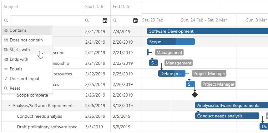
Users can enter a value into the filter row to filter Gantt data. Set the filterRow.visible property to true to display the filter row.
Each cell in the filter row contains a magnifier icon. Click a column's magnifier icon to select a filter operation available for the column. Use the selectedFilterOperation property to specify the default filter operation for a column's filter row.
To hide a filter row cell for an individual column, set the column’s allowFiltering property to false.
firstDayOfWeek
Specifies the first day of a week.
The property's value can be from 0 to 6.
- 0 - Sunday
- 1 - Monday
- 2 - Tuesday
- 3 - Wednesday
- 4 - Thursday
- 5 - Friday
- 6 - Saturday
The culture settings specify the property's default value.
jQuery
$(function() {
    $("#gantt").dxGantt({
        firstDayOfWeek: 1,
        // ...
    });
});
Angular
<dx-gantt
    [firstDayOfWeek]="1">
    <!-- ... -->
</dx-gantt>
import { Component } from '@angular/core';

@Component({
    selector: 'app-root',
    templateUrl: './app.component.html',
    styleUrls: ['./app.component.css']
})

export class AppComponent {
    // ...
}
import { BrowserModule } from '@angular/platform-browser';
import { NgModule } from '@angular/core';
import { AppComponent } from './app.component';
import { DxGanttModule } from 'devextreme-angular';

@NgModule({
    imports: [
        BrowserModule,
        DxGanttModule
    ],
    declarations: [AppComponent],
    bootstrap: [AppComponent]
})
export class AppModule { }
Vue
<template>
    <DxGantt
        :first-day-of-week="1" >
        <!-- ... -->
    </DxGantt>
</template>
<script>
    import 'devextreme/dist/css/dx.fluent.blue.light.css';
    import 'devexpress-gantt/dist/dx-gantt.css';

    import {
        DxGantt
        // ...
    } from 'devextreme-vue/gantt';

    export default {
        components: {
            DxGantt
            // ...
        }
    };
</script>
React
import React from 'react';

import 'devextreme/dist/css/dx.fluent.blue.light.css';
import 'devexpress-gantt/dist/dx-gantt.css';

import Gantt, {
    // ...
} from 'devextreme-react/gantt';

const App = () => {
    return (
        <Gantt
            firstDayOfWeek={1} >
            {/* ... */}
        </Gantt>
    );
};

export default App;
ASP.NET Core Controls
@(Html.DevExtreme().Gantt()
    .FirstDayOfWeek(FirstDayOfWeek.Monday)
    // ...
)
ASP.NET MVC Controls
@(Html.DevExtreme().Gantt()
    .FirstDayOfWeek(FirstDayOfWeek.Monday)
    // ...
)
focusStateEnabled
Specifies whether the UI component can be focused using keyboard navigation.
headerFilter
Configures the header filter settings.
The header filter allows users to filter values in an individual column. The header filter is a popup window that contains all unique values of a column. A click on the filter icon invokes the header filter.
Set the headerFilter.visible property to true to display filter icons for all columns. To hide the filter icon for an individual column, set the column’s allowHeaderFiltering property to false.
jQuery
$(function() {
    $("#gantt").dxGantt({
        headerFilter: {
            visible: true,
            width: 280,
            height: 350,
            searchTimeout: 800
        },
        // ...
    });
});
Angular
<dx-gantt ... >
    <dxo-gantt-header-filter
        [visible]="true"
        [width]="280"
        [height]="350"
        [searchTimeout]="800" >
    </dxo-gantt-header-filter>
    <!-- ... -->
</dx-gantt>
import { Component } from '@angular/core';

@Component({
    selector: 'app-root',
    templateUrl: './app.component.html',
    styleUrls: ['./app.component.css']
})

export class AppComponent {
    // ...
}
import { BrowserModule } from '@angular/platform-browser';
import { NgModule } from '@angular/core';
import { AppComponent } from './app.component';
import { DxGanttModule } from 'devextreme-angular';

@NgModule({
    imports: [
        BrowserModule,
        DxGanttModule
    ],
    declarations: [AppComponent],
    bootstrap: [AppComponent]
})
export class AppModule { }
Vue
<template>
    <DxGantt ... >
        <DxHeaderFilter
            :visible="true"
            :width="280"
            :height="350"
            :search-timeout="800"
        />
        <!-- ... -->
    </DxGantt>
</template>
<script>
    import 'devextreme/dist/css/dx.fluent.blue.light.css';
    import 'devexpress-gantt/dist/dx-gantt.css';

    import {
        DxGantt,
        DxHeaderFilter,
        // ...
    } from 'devextreme-vue/gantt';

    export default {
        components: {
            DxGantt,
            DxHeaderFilter,
            // ...
        }
    };
</script>
React
import React from 'react';

import 'devextreme/dist/css/dx.fluent.blue.light.css';
import 'devexpress-gantt/dist/dx-gantt.css';

import Gantt, {
    HeaderFilter,
    // ...
} from 'devextreme-react/gantt';

const App = () => {
    return (
        <Gantt ... >
            <HeaderFilter
                visible={true}
                width={280}
                height={350}
                searchTimeout={800} />
            {/* ... */}
        </Gantt>
    );
};

export default App;
ASP.NET Core Controls
@(Html.DevExtreme().Gantt()
    .HeaderFilter(e => {
        e.Visible(true)
        e.Width(280)
        e.Height(350)
        e.SearchTimeout(800)
    })
    // ...
)
ASP.NET MVC Controls
@(Html.DevExtreme().Gantt()
    .HeaderFilter(e => {
        e.Visible(true)
        e.Width(280)
        e.Height(350)
        e.SearchTimeout(800)
    })
    // ...
)
See Also
height
Specifies the UI component's height.
This property accepts a value of one of the following types:
Number
The height in pixels.String
A CSS-accepted measurement of height. For example,"55px","20vh","80%","inherit".
hint
Specifies text for a hint that appears when a user pauses on the UI component.
hoverStateEnabled
Specifies whether the UI component changes its state when a user pauses on it.
onContentReady
A function that is executed when the UI component is rendered and each time the component is repainted.
Information about the event.
| Name | Type | Description |
|---|---|---|
| element |
The UI component's container. It is an HTML Element or a jQuery Element when you use jQuery. |
|
| component |
The UI component's instance. |
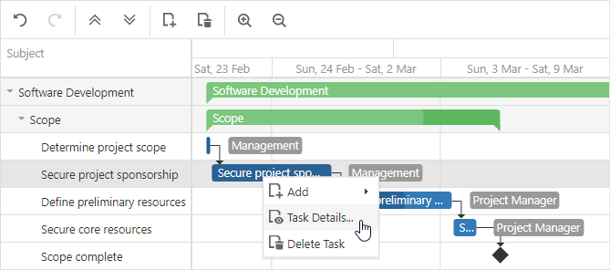
onContextMenuPreparing
A function that is executed before the context menu is rendered.
Information about the event that caused the function's execution.
| Name | Type | Description |
|---|---|---|
| cancel |
Allows you to cancel showing the context menu. |
|
| component |
The UI component's instance. |
|
| data | any |
Data of the right-clicked task or dependency. |
| element |
The UI component's container. It is an HTML Element or a jQuery Element when you use jQuery. |
|
| event | Event (jQuery or EventObject) |
The event that caused the function to execute. It is an EventObject or a jQuery.Event when you use jQuery. |
| items |
Items to be displayed in the context menu. |
|
| targetKey | any |
The key of the right-clicked task or dependency. |
| targetType |
The type of right-clicked task or dependency. |
jQuery
$(function() {
    $("#gantt").dxGantt({
        // ...
        onContextMenuPreparing: function (e) {
            // your code
            e.cancel = true;
        }
    });
});
Angular
import { DxGanttModule } from "devextreme-angular";
// ...
export class AppComponent {
    onContextMenuPreparing(e) {
        // your code
        e.cancel = true;
    }
}
@NgModule({
    imports: [
        // ...
        DxGanttModule
    ],
    // ...
})
<dx-gantt ...
    (onContextMenuPreparing)="onContextMenuPreparing($event)">
</dx-gantt>
Vue
<template>
    <DxGantt
        ...
        @context-menu-preparing="onContextMenuPreparing"
    />
</template>

<script>
import 'devextreme/dist/css/dx.fluent.blue.light.css';

import DxGantt from 'devextreme-vue/gantt';

export default {
    components: {
        DxGantt
    },
    methods: {
        onContextMenuPreparing(e) {
            // your code
            e.cancel = true;
        }
    }
}
</script>
React
import React from 'react';

import 'devextreme/dist/css/dx.fluent.blue.light.css';

import Gantt from 'devextreme-react/gantt';

class App extends React.Component {
    // ...
    render() {
        return (
            <Gantt
                 //...
                 onContextMenuPreparing={this.onContextMenuPreparing}
            />
        );
    }
    onContextMenuPreparing = (e) => {
        // your code
        e.cancel = true;
    }
}
export default App;
ASP.NET Core Controls
@(Html.DevExtreme().Gantt()
    .ID("gantt")
    .onContextMenuPreparing("gantt_contextMenuPreparing_handler")
    // ...
)
<script>
    function gantt_contextMenuPreparing_handler(e) {
        // your code
        e.cancel = true;
    }
</script>See Also
onCustomCommand
A function that is executed after a custom command item was clicked. Allows you to implement a custom command's functionality.
Information about the event.
| Name | Type | Description |
|---|---|---|
| component |
The UI component instance's name. |
|
| element |
The UI component's container. It is an HTML Element or a jQuery Element when you use jQuery. |
|
| name |
The name of the clicked item. |
jQuery
$(function() {
    $("#gantt").dxGantt({
        // ...
        onCustomCommand: function (e) {
            // your code
        }
    });
});
Angular
import { DxGanttModule } from "devextreme-angular";
// ...
export class AppComponent {
    onCustomCommand(e) {
        // your code
    }
}
@NgModule({
    imports: [
        // ...
        DxGanttModule
    ],
    // ...
})
<dx-gantt ...
    (onCustomCommand)="onCustomCommand($event)">
</dx-gantt>
Vue
<template>
    <DxGantt
        ...
        @custom-command="onCustomCommand"
    />
</template>

<script>
import 'devextreme/dist/css/dx.fluent.blue.light.css';

import DxGantt from 'devextreme-vue/gantt';

export default {
    components: {
        DxGantt
    },
    methods: {
        onCustomCommand(e) {
            // your code
        }
    }
}
</script>
React
import React from 'react';

import 'devextreme/dist/css/dx.fluent.blue.light.css';

import Gantt from 'devextreme-react/gantt';

class App extends React.Component {
    // ...
    render() {
        return (
            <Gantt
                 //...
                 onCustomCommand={this.onCustomCommand}
            />
        );
    }
    onCustomCommand = (e) => {
        // your code
    }
}
export default App;
ASP.NET Core Controls
@(Html.DevExtreme().Gantt()
    .ID("gantt")
    .onCustomCommand("gantt_customCommand_handler")
    // ...
)
<script>
    function gantt_customCommand_handler(e) {
        // your code
    }
</script>
See Also
onDependencyDeleted
A function that is executed when a dependency is deleted.
Information about the event.
| Name | Type | Description |
|---|---|---|
| component |
The UI component's instance. |
|
| element |
The widget's container. It is an HTML Element or a jQuery Element when you use jQuery. |
|
| key | any |
The key of the deleted dependency. |
| values | any |
The values of the deleted dependency. |
jQuery
$(function() {
    $("#gantt").dxGantt({
        // ...
        onDependencyDeleted: function (e) {
            if (e.key != 1)
                // your code
        }
    })
})
Angular
import { DxGanttModule } from "devextreme-angular";
// ...
export class AppComponent {
    onDependencyDeleted(e) {
        if (e.key != 1)
            // your code
    }
}
@NgModule({
    imports: [
        // ...
        DxGanttModule
    ],
    // ...
})
<dx-gantt ...
    (onDependencyDeleted)="onDependencyDeleted($event)">
</dx-gantt>
Vue
<template>
    <DxGantt
        ...
        @dependency-deleted="onDependencyDeleted"
    />
</template>

<script>
import 'devextreme/dist/css/dx.fluent.blue.light.css';

import DxGantt from 'devextreme-vue/gantt';

export default {
    components: {
        DxGantt
    },
    methods: {
        onDependencyDeleted(e) {
            if (e.key != 1)
                // your code
        }
    }
}
</script>
React
import React from 'react';

import 'devextreme/dist/css/dx.fluent.blue.light.css';

import Gantt from 'devextreme-react/gantt';

class App extends React.Component {
    // ...
    render() {
        return (
            <Gantt
                 //...
                 onDependencyDeleted={this.onDependencyDeleted}
            />
        );
    }
    onDependencyDeleted = (e) => {
        if (e.key != 1)
            // your code
    }
}
export default App;
ASP.NET Core Controls
@(Html.DevExtreme().Gantt()
    .ID("gantt")
    .onDependencyDeleted("gantt_dependencyDeleted_handler")
    // ...
)
<script>
    function gantt_dependencyDeleted_handler(e) {
        if (e.key != 1)
            // your code
    }
</script>
See Also
onDependencyDeleting
A function that is executed before a dependency is deleted.
Information about the event.
| Name | Type | Description |
|---|---|---|
| cancel |
Allows you to cancel the dependency's deletion. |
|
| component |
The UI component's instance. |
|
| element |
The UI component's container. It is an HTML Element or a jQuery Element when you use jQuery. |
|
| key | any |
The key of the deleted dependency. |
| values | any |
The values of the deleted dependency. |
jQuery
$(function() {
    $("#gantt").dxGantt({
        // ...
        onDependencyDeleting: function (e) {
            if (e.key != 1) {
                // your code
                e.cancel = true;
            }
        }
    });
});
Angular
import { DxGanttModule } from "devextreme-angular";
// ...
export class AppComponent {
    onDependencyDeleting(e) {
        if (e.key != 1) {
            // your code
            e.cancel = true;
        }
    }
}
@NgModule({
    imports: [
        // ...
        DxGanttModule
    ],
    // ...
})
<dx-gantt ...
    (onDependencyDeleting)="onDependencyDeleting($event)">
</dx-gantt>
Vue
<template>
    <DxGantt
        ...
        @dependency-deleting="onDependencyDeleting"
    />
</template>

<script>
import 'devextreme/dist/css/dx.fluent.blue.light.css';

import DxGantt from 'devextreme-vue/gantt';

export default {
    components: {
        DxGantt
    },
    methods: {
        onDependencyDeleting(e) {
            if (e.key != 1) {
                // your code
                e.cancel = true;
            }
        }
    }
}
</script>
React
import React from 'react';

import 'devextreme/dist/css/dx.fluent.blue.light.css';

import Gantt from 'devextreme-react/gantt';

class App extends React.Component {
    // ...
    render() {
        return (
            <Gantt
                 //...
                 onDependencyDeleting={this.onDependencyDeleting}
            />
        );
    }
    onDependencyDeleting = (e) => {
        if (e.key != 1) {
            // your code
            e.cancel = true;
        }
    }
}
export default App;
ASP.NET Core Controls
@(Html.DevExtreme().Gantt()
    .ID("gantt")
    .onDependencyDeleting("gantt_dependencyDeleting_handler")
    // ...
)
<script>
    function gantt_dependencyDeleting_handler(e) {
        if (e.key != 1) {
            // your code
            e.cancel = true;
        }
    }
</script>
See Also
onDependencyInserted
A function that is executed when a dependency is inserted.
Information about the event.
| Name | Type | Description |
|---|---|---|
| component |
The UI component's instance. |
|
| element |
The widget's container. It is an HTML Element or a jQuery Element when you use jQuery. |
|
| key | any |
The key of the inserted dependency. |
| values | any |
The values of the inserted dependency. |
jQuery
$(function() {
    $("#gantt").dxGantt({
        // ...
        onDependencyInserted: function (e) {
            if (e.values.type == 3) {
                // your code
            }
        }
    });
});
Angular
import { DxGanttModule } from "devextreme-angular";
// ...
export class AppComponent {
    onDependencyInserted(e) {
        if (e.values.type == 3) {
            // your code
        }
    }
}
@NgModule({
    imports: [
        // ...
        DxGanttModule
    ],
    // ...
})
<dx-gantt ...
    (onDependencyInserted)="onDependencyInserted($event)">
</dx-gantt>
Vue
<template>
    <DxGantt
        ...
        @dependency-inserted="onDependencyInserted"
    />
</template>

<script>
import 'devextreme/dist/css/dx.fluent.blue.light.css';

import DxGantt from 'devextreme-vue/gantt';

export default {
    components: {
        DxGantt
    },
    methods: {
        onDependencyInserted(e) {
            if (e.values.type == 3) {
                // your code
            }
        }
    }
}
</script>
React
import React from 'react';

import 'devextreme/dist/css/dx.fluent.blue.light.css';

import Gantt from 'devextreme-react/gantt';

class App extends React.Component {
    // ...
    render() {
        return (
            <Gantt
                 //...
                 onDependencyInserted={this.onDependencyInserted}
            />
        );
    }
    onDependencyInserted = (e) => {
        if (e.values.type == 3) {
            // your code
        }
    }
}
export default App;
ASP.NET Core Controls
@(Html.DevExtreme().Gantt()
    .ID("gantt")
    .onDependencyInserted("gantt_dependencyInserted_handler")
    // ...
)
<script>
    function gantt_dependencyInserted_handler(e) {
        if (e.key != 1) {
            // your code
            e.cancel = true;
        }
    }
</script>
See Also
onDependencyInserting
A function that is executed before a dependency is inserted.
Information about the event.
| Name | Type | Description |
|---|---|---|
| cancel |
Allows you to cancel the dependency's insertion. |
|
| component |
The UI component's instance. |
|
| element |
The UI component's container. It is an HTML Element or a jQuery Element when you use jQuery. |
|
| values | any |
The values of the inserted dependency. |
jQuery
$(function() {
    $("#gantt").dxGantt({
        // ...
        onDependencyInserting: function (e) {
            if (e.values.type == 3) {
                // your code
                e.cancel = true;
            }
        }
    });
});
Angular
import { DxGanttModule } from "devextreme-angular";
// ...
export class AppComponent {
    onDependencyInserting(e) {
        if (e.values.type == 3) {
            // your code
            e.cancel = true;
        }
    }
}
@NgModule({
    imports: [
        // ...
        DxGanttModule
    ],
    // ...
})
<dx-gantt ...
    (onDependencyInserting)="onDependencyInserting($event)">
</dx-gantt>
Vue
<template>
    <DxGantt
        ...
        @dependency-inserting="onDependencyInserting"
    />
</template>

<script>
import 'devextreme/dist/css/dx.fluent.blue.light.css';

import DxGantt from 'devextreme-vue/gantt';

export default {
    components: {
        DxGantt
    },
    methods: {
        onDependencyInserting(e) {
            if (e.values.type == 3) {
                // your code
                e.cancel = true;
            }
        }
    }
}
</script>
React
import React from 'react';

import 'devextreme/dist/css/dx.fluent.blue.light.css';

import Gantt from 'devextreme-react/gantt';

class App extends React.Component {
    // ...
    render() {
        return (
            <Gantt
                 //...
                 onDependencyInserting={this.onDependencyInserting}
            />
        );
    }
    onDependencyInserting = (e) => {
        if (e.values.type == 3) {
            // your code
            e.cancel = true;
        }
    }
}
export default App;
ASP.NET Core Controls
@(Html.DevExtreme().Gantt()
    .ID("gantt")
    .onDependencyInserting("gantt_dependencyInserting_handler")
    // ...
)
<script>
    function gantt_dependencyInserting_handler(e) {
        if (e.key != 1) {
            // your code
            e.cancel = true;
        }
    }
</script>
See Also
onDisposing
A function that is executed before the UI component is disposed of.
Information about the event.
| Name | Type | Description |
|---|---|---|
| element |
The UI component's container. It is an HTML Element or a jQuery Element when you use jQuery. |
|
| component |
The UI component's instance. |
onInitialized
A function used in JavaScript frameworks to save the UI component instance.
Information about the event.
| Name | Type | Description |
|---|---|---|
| element |
The UI component's container. It is an HTML Element or a jQuery Element when you use jQuery. |
|
| component |
The UI component's instance. |
Angular
<dx-gantt ...
    (onInitialized)="saveInstance($event)">
</dx-gantt>
import { Component } from "@angular/core";
import Gantt from "devextreme/ui/data_grid";
// ...
export class AppComponent {
    ganttInstance: Gantt;
    saveInstance (e) {
        this.ganttInstance = e.component;
    }
}
Vue
<template>
    <div>
        <DxGantt ...
            @initialized="saveInstance">
        </DxGantt>
    </div>
</template>

<script>
import DxGantt from 'devextreme-vue/gantt';

export default {
    components: {
        DxGantt
    },
    data: function() {
        return {
            ganttInstance: null
        };
    },
    methods: {
        saveInstance: function(e) {
            this.ganttInstance = e.component;
        }
    }
};
</script>
<template>
    <div>
        <DxGantt ...
            @initialized="saveInstance">
        </DxGantt>
    </div>
</template>

<script setup>
import DxGantt from 'devextreme-vue/gantt';

let ganttInstance = null;

const saveInstance = (e) => {
    ganttInstance = e.component;
}
</script>
React
import Gantt from 'devextreme-react/gantt';

class App extends React.Component {
    constructor(props) {
        super(props);

        this.saveInstance = this.saveInstance.bind(this);
    }

    saveInstance(e) {
        this.ganttInstance = e.component;
    }

    render() {
        return (
            <div>
                <Gantt onInitialized={this.saveInstance} />
            </div>
        );
    }
}
See Also
onOptionChanged
A function that is executed after a UI component property is changed.
Information about the event.
| Name | Type | Description |
|---|---|---|
| value | any |
The modified property's new value. |
| previousValue | any |
The UI component's previous value. |
| name |
The modified property if it belongs to the first level. Otherwise, the first-level property it is nested into. |
|
| fullName |
The path to the modified property that includes all parent properties. |
|
| element |
The UI component's container. It is an HTML Element or a jQuery Element when you use jQuery. |
|
| component |
The UI component's instance. |
The following example shows how to subscribe to component property changes:
jQuery
$(function() {
    $("#ganttContainer").dxGantt({
        // ...
        onOptionChanged: function(e) {
            if(e.name === "changedProperty") {
                // handle the property change here
            }
        }
    });
});
Angular
<dx-gantt ...
    (onOptionChanged)="handlePropertyChange($event)">
</dx-gantt>
import { Component } from '@angular/core';

@Component({
    selector: 'app-root',
    templateUrl: './app.component.html',
    styleUrls: ['./app.component.css']
})

export class AppComponent {
    // ...
    handlePropertyChange(e) {
        if(e.name === "changedProperty") {
            // handle the property change here
        }
    }
}
import { BrowserModule } from '@angular/platform-browser';
import { NgModule } from '@angular/core';
import { AppComponent } from './app.component';
import { DxGanttModule } from 'devextreme-angular';

@NgModule({
    declarations: [
        AppComponent
    ],
    imports: [
        BrowserModule,
        DxGanttModule
    ],
    providers: [ ],
    bootstrap: [AppComponent]
})

export class AppModule { }
Vue
<template>
    <DxGantt ...
        @option-changed="handlePropertyChange"
    />
</template>

<script>
import 'devextreme/dist/css/dx.fluent.blue.light.css';
import DxGantt from 'devextreme-vue/gantt';

export default {
    components: {
        DxGantt
    },
    // ...
    methods: {
        handlePropertyChange: function(e) {
            if(e.name === "changedProperty") {
                // handle the property change here
            }
        }
    }
}
</script>
React
import React from 'react';
import 'devextreme/dist/css/dx.fluent.blue.light.css';

import Gantt from 'devextreme-react/gantt';

const handlePropertyChange = (e) => {
    if(e.name === "changedProperty") {
        // handle the property change here
    }
}

export default function App() {
    return (
        <Gantt ...
            onOptionChanged={handlePropertyChange}
        />
    );
}
onResourceAssigned
A function that is executed when a resource is assigned to a task.
Information about the event.
| Name | Type | Description |
|---|---|---|
| component |
The UI component's instance. |
|
| element |
The widget's container. It is an HTML Element or a jQuery Element when you use jQuery. |
|
| key | any |
The key of the inserted resource assignment. |
| values | any |
The values of the processed resource and task. |
jQuery
$(function() {
    $("#gantt").dxGantt({
        // ...
        onResourceAssigned: function (e) {
            if (e.values.taskID != 0) {
                // your code
            }
        }
    });
});
Angular
import { DxGanttModule } from "devextreme-angular";
// ...
export class AppComponent {
    onResourceAssigned(e) {
        if (e.values.taskID != 0) {
            // your code
        }
    }
}
@NgModule({
    imports: [
        // ...
        DxGanttModule
    ],
    // ...
})
<dx-gantt ...
    (onResourceAssigned)="onResourceAssigned($event)">
</dx-gantt>
Vue
<template>
    <DxGantt
        ...
        @resource-assigned="onResourceAssigned"
    />
</template>

<script>
import 'devextreme/dist/css/dx.fluent.blue.light.css';

import DxGantt from 'devextreme-vue/gantt';

export default {
    components: {
        DxGantt
    },
    methods: {
        onResourceAssigned(e) {
            if (e.values.taskID != 0) {
                // your code
            }
        }
    }
}
</script>
React
import React from 'react';

import 'devextreme/dist/css/dx.fluent.blue.light.css';

import Gantt from 'devextreme-react/gantt';

class App extends React.Component {
    // ...
    render() {
        return (
            <Gantt
                 //...
                 onResourceAssigned={this.onResourceAssigned}
            />
        );
    }
    onResourceAssigned = (e) => {
        if (e.values.taskID != 0) {
            // your code
        }
    }
}
export default App;
ASP.NET Core Controls
@(Html.DevExtreme().Gantt()
    .ID("gantt")
    .onResourceAssigned("gantt_resourceAssigned_handler")
    // ...
)
<script>
    function gantt_resourceAssigned_handler(e) {
        if (e.values.taskID != 0) {
            // your code
        }
    }
</script>
See Also
onResourceAssigning
A function that is executed before a resource is assigned to a task.
Information about the event.
| Name | Type | Description |
|---|---|---|
| cancel |
Allows you to cancel the resource assignment. |
|
| component |
The UI component's instance. |
|
| element |
The UI component's container. It is an HTML Element or a jQuery Element when you use jQuery. |
|
| values | any |
The values of the processed resource and task. |
jQuery
$(function() {
    $("#gantt").dxGantt({
        // ...
        onResourceAssigning: function (e) {
            if (e.values.taskID != 0) {
                // your code
                e.cancel = true;
            }
        }
    });
});
Angular
import { DxGanttModule } from "devextreme-angular";
// ...
export class AppComponent {
    onResourceAssigning(e) {
        if (e.values.taskID != 0) {
            // your code
            e.cancel = true;
        }
    }
}
@NgModule({
    imports: [
        // ...
        DxGanttModule
    ],
    // ...
})
<dx-gantt ...
    (onResourceAssigning)="onResourceAssigning($event)">
</dx-gantt>
Vue
<template>
    <DxGantt
        ...
        @resource-assigning="onResourceAssigning"
    />
</template>

<script>
import 'devextreme/dist/css/dx.fluent.blue.light.css';

import DxGantt from 'devextreme-vue/gantt';

export default {
    components: {
        DxGantt
    },
    methods: {
        onResourceAssigning(e) {
            if (e.values.taskID != 0) {
                // your code
                e.cancel = true;
            }
        }
    }
}
</script>
React
import React from 'react';

import 'devextreme/dist/css/dx.fluent.blue.light.css';

import Gantt from 'devextreme-react/gantt';

class App extends React.Component {
    // ...
    render() {
        return (
            <Gantt
                 //...
                 onResourceAssigning={this.onResourceAssigning}
            />
        );
    }
    onResourceAssigning = (e) => {
        if (e.values.taskID != 0) {
            // your code
            e.cancel = true;
        }
    }
}
export default App;
ASP.NET Core Controls
@(Html.DevExtreme().Gantt()
    .ID("gantt")
    .onResourceAssigning("gantt_resourceAssigning_handler")
    // ...
)
<script>
    function gantt_resourceAssigning_handler(e) {
        if (e.values.taskID != 0) {
            // your code
            e.cancel = true;
        }
    }
</script>
See Also
onResourceDeleted
A function that is executed when a resource is deleted.
Information about the event.
| Name | Type | Description |
|---|---|---|
| component |
The UI component's instance. |
|
| element |
The widget's container. It is an HTML Element or a jQuery Element when you use jQuery. |
|
| key | any |
The key of the deleted resource. |
| values | any |
The values of the deleted resource. |
jQuery
$(function() {
    $("#gantt").dxGantt({
        // ...
        onResourceDeleted: function (e) {
            if (e.key == 0) {
                // your code
            }
        }
    });
});
Angular
import { DxGanttModule } from "devextreme-angular";
// ...
export class AppComponent {
    onResourceDeleted(e) {
        if (e.key == 0) {
            // your code
        }
    }
}
@NgModule({
    imports: [
        // ...
        DxGanttModule
    ],
    // ...
})
<dx-gantt ...
    (onResourceDeleted)="onResourceDeleted($event)">
</dx-gantt>
Vue
<template>
    <DxGantt
        ...
        @resource-deleted="onResourceDeleted"
    />
</template>

<script>
import 'devextreme/dist/css/dx.fluent.blue.light.css';

import DxGantt from 'devextreme-vue/gantt';

export default {
    components: {
        DxGantt
    },
    methods: {
        onResourceDeleted(e) {
            if (e.key == 0) {
                // your code
            }
        }
    }
}
</script>
React
import React from 'react';

import 'devextreme/dist/css/dx.fluent.blue.light.css';

import Gantt from 'devextreme-react/gantt';

class App extends React.Component {
    // ...
    render() {
        return (
            <Gantt
                 //...
                 onResourceDeleted={this.onResourceDeleted}
            />
        );
    }
    onResourceDeleted = (e) => {
        if (e.key == 0) {
            // your code
        }
    }
}
export default App;
ASP.NET Core Controls
@(Html.DevExtreme().Gantt()
    .ID("gantt")
    .onResourceDeleted("gantt_resourceDeleted_handler")
    // ...
)
<script>
    function gantt_resourceDeleted_handler(e) {
        if (e.key == 0) {
            // your code
        }
    }
</script>
See Also
onResourceDeleting
A function that is executed before a resource is deleted.
Information about the event.
| Name | Type | Description |
|---|---|---|
| cancel |
Allows you to cancel the resource deletion. |
|
| component |
The UI component's instance. |
|
| element |
The UI component's container. It is an HTML Element or a jQuery Element when you use jQuery. |
|
| key | any |
The key of the deleted resource. |
| values | any |
The values of the deleted resource. |
jQuery
$(function() {
    $("#gantt").dxGantt({
        // ...
        onResourceDeleting: function (e) {
            if (e.key == 0) {
                // your code
                e.cancel = true;
            }
        }
    });
});
Angular
import { DxGanttModule } from "devextreme-angular";
// ...
export class AppComponent {
    onResourceDeleting(e) {
        if (e.key == 0) {
            // your code
            e.cancel = true;
        }
    }
}
@NgModule({
    imports: [
        // ...
        DxGanttModule
    ],
    // ...
})
<dx-gantt ...
    (onResourceDeleting)="onResourceDeleting($event)">
</dx-gantt>
Vue
<template>
    <DxGantt
        ...
        @resource-deleting="onResourceDeleting"
    />
</template>

<script>
import 'devextreme/dist/css/dx.fluent.blue.light.css';

import DxGantt from 'devextreme-vue/gantt';

export default {
    components: {
        DxGantt
    },
    methods: {
        onResourceDeleting(e) {
            if (e.key == 0) {
                // your code
                e.cancel = true;
            }
        }
    }
}
</script>
React
import React from 'react';

import 'devextreme/dist/css/dx.fluent.blue.light.css';

import Gantt from 'devextreme-react/gantt';

class App extends React.Component {
    // ...
    render() {
        return (
            <Gantt
                 //...
                 onResourceDeleting={this.onResourceDeleting}
            />
        );
    }
    onResourceDeleting = (e) => {
        if (e.key == 0) {
            // your code
            e.cancel = true;
        }
    }
}
export default App;
ASP.NET Core Controls
@(Html.DevExtreme().Gantt()
    .ID("gantt")
    .onResourceDeleting("gantt_resourceDeleting_handler")
    // ...
)
<script>
    function gantt_resourceDeleting_handler(e) {
        if (e.key == 0) {
            // your code
            e.cancel = true;
        }
    }
</script>
See Also
onResourceInserted
A function that is executed when a resource is inserted.
Information about the event.
| Name | Type | Description |
|---|---|---|
| component |
The UI component's instance. |
|
| element |
The widget's container. It is an HTML Element or a jQuery Element when you use jQuery. |
|
| key | any |
The key of the inserted resource. |
| values | any |
The values of the inserted resource. |
jQuery
$(function() {
    $("#gantt").dxGantt({
        // ...
        onResourceInserted: function (e) {
            if (e.values.text == " "){
                // your code
            }
        }
    });
});
Angular
import { DxGanttModule } from "devextreme-angular";
// ...
export class AppComponent {
    onResourceInserted(e) {
        if (e.values.text == " "){
            // your code
        }
    }
}
@NgModule({
    imports: [
        // ...
        DxGanttModule
    ],
    // ...
})
<dx-gantt ...
    (onResourceInserted)="onResourceInserted($event)">
</dx-gantt>
Vue
<template>
    <DxGantt
        ...
        @resource-inserted="onResourceInserted"
    />
</template>

<script>
import 'devextreme/dist/css/dx.fluent.blue.light.css';

import DxGantt from 'devextreme-vue/gantt';

export default {
    components: {
        DxGantt
    },
    methods: {
        onResourceInserted(e) {
            if (e.values.text == " "){
                // your code
            }
        }
    }
}
</script>
React
import React from 'react';

import 'devextreme/dist/css/dx.fluent.blue.light.css';

import Gantt from 'devextreme-react/gantt';

class App extends React.Component {
    // ...
    render() {
        return (
            <Gantt
                 //...
                 onResourceInserted={this.onResourceInserted}
            />
        );
    }
    onResourceInserted = (e) => {
        if (e.values.text == " "){
            // your code
        }
    }
}
export default App;
ASP.NET Core Controls
@(Html.DevExtreme().Gantt()
    .ID("gantt")
    .onResourceInserted("gantt_resourceInserted_handler")
    // ...
)
<script>
    function gantt_resourceInserted_handler(e) {
        if (e.values.text == " "){
            // your code
        }
    }
</script>
See Also
onResourceInserting
A function that is executed before a resource is inserted.
Information about the event.
| Name | Type | Description |
|---|---|---|
| cancel |
Allows you to cancel the resource insertion. |
|
| component |
The UI component's instance. |
|
| element |
The UI component's container. It is an HTML Element or a jQuery Element when you use jQuery. |
|
| values | any |
The values of the inserted resource. |
jQuery
$(function() {
    $("#gantt").dxGantt({
        // ...
        onResourceInserting: function (e) {
            if (e.values.text == " "){
                // your code
                e.cancel = true;
            }
        }
    });
});
Angular
import { DxGanttModule } from "devextreme-angular";
// ...
export class AppComponent {
    onResourceInserting(e) {
        if (e.values.text == " "){
            // your code
            e.cancel = true;
        }
    }
}
@NgModule({
    imports: [
        // ...
        DxGanttModule
    ],
    // ...
})
<dx-gantt ...
    (onResourceInserting)="onResourceInserting($event)">
</dx-gantt>
Vue
<template>
    <DxGantt
        ...
        @resource-inserting="onResourceInserting"
    />
</template>

<script>
import 'devextreme/dist/css/dx.fluent.blue.light.css';

import DxGantt from 'devextreme-vue/gantt';

export default {
    components: {
        DxGantt
    },
    methods: {
        onResourceInserting(e) {
            if (e.values.text == " "){
                // your code
                e.cancel = true;
            }
        }
    }
}
</script>
React
import React from 'react';

import 'devextreme/dist/css/dx.fluent.blue.light.css';

import Gantt from 'devextreme-react/gantt';

class App extends React.Component {
    // ...
    render() {
        return (
            <Gantt
                 //...
                 onResourceInserting={this.onResourceInserting}
            />
        );
    }
    onResourceInserting = (e) => {
        if (e.values.text == " "){
            // your code
            e.cancel = true;
        }
    }
}
export default App;
ASP.NET Core Controls
@(Html.DevExtreme().Gantt()
    .ID("gantt")
    .onResourceInserting("gantt_resourceInserting_handler")
    // ...
)
<script>
    function gantt_resourceInserting_handler(e) {
        if (e.values.text == " "){
            // your code
            e.cancel = true;
        }
    }
</script>
See Also
onResourceManagerDialogShowing
A function that is executed before the Resource Manager dialog is shown.
Information about the event.
| Name | Type | Description |
|---|---|---|
| cancel |
Allows you to cancel the Resource Manager dialog showing. |
|
| component |
The UI component's instance. |
|
| element |
The UI component's container. It is an HTML Element or a jQuery Element when you use jQuery. |
|
| values | Array<any> |
The resources. |
jQuery
$(function() {
    $("#gantt").dxGantt({
        // ...
        onResourceManagerDialogShowing: function (e) {
            if (e.values[0].key != 1) {
                // your code
                e.cancel = true;
            }
        }
    });
});
Angular
import { DxGanttModule } from "devextreme-angular";
// ...
export class AppComponent {
    onResourceManagerDialogShowing: function (e) {
        if (e.values[0].key != 1) {
            // your code
            e.cancel = true;
        }
    }
}
@NgModule({
    imports: [
        // ...
        DxGanttModule
    ],
    // ...
})
<dx-gantt ...
    (onResourceManagerDialogShowing)="onResourceManagerDialogShowing($event)">
</dx-gantt>
Vue
<template>
    <DxGantt
        ...
        @resource-manager-dialog-showing="onResourceManagerDialogShowing"
    />
</template>

<script>
import 'devextreme/dist/css/dx.fluent.blue.light.css';

import DxGantt from 'devextreme-vue/gantt';

export default {
    components: {
        DxGantt
    },
    methods: {
        onResourceManagerDialogShowing: function (e) {
            if (e.values[0].key != 1) {
                // your code
                e.cancel = true;
            }
        }
    }
}
</script>
React
import React from 'react';

import 'devextreme/dist/css/dx.fluent.blue.light.css';

import Gantt from 'devextreme-react/gantt';

class App extends React.Component {
    // ...
    render() {
        return (
            <Gantt
                 //...
                 onResourceManagerDialogShowing={this.onResourceManagerDialogShowing}
            />
        );
    }
    onResourceManagerDialogShowing: function (e) {
        if (e.values[0].key != 1) {
            // your code
            e.cancel = true;
        }
    }
}
export default App;
ASP.NET Core Controls
@(Html.DevExtreme().Gantt()
    .ID("gantt")
    .onResourceManagerDialogShowing("gantt_resourceManagerDialogShowing_handler")
    // ...
)
<script>
    function gantt_resourceManagerDialogShowing_handler(e) {
        if (e.values[0].key != 1) {
            // your code
            e.cancel = true;
        }
    }
</script>
ASP.NET MVC Controls
@(Html.DevExtreme().Gantt()
    .ID("gantt")
    .onResourceManagerDialogShowing("gantt_resourceManagerDialogShowing_handler")
    // ...
)
<script>
    function gantt_resourceManagerDialogShowing_handler(e) {
        if (e.values[0].key != 1) {
            // your code
            e.cancel = true;
        }
    }
</script>
See Also
onResourceUnassigned
A function that is executed when a resource is unassigned from a task.
Information about the event.
| Name | Type | Description |
|---|---|---|
| component |
The UI component's instance. |
|
| element |
The widget's container. It is an HTML Element or a jQuery Element when you use jQuery. |
|
| key | any |
The key of the deleted resource assignment. |
| values | any |
The values of the processed resource and task. |
jQuery
$(function() {
    $("#gantt").dxGantt({
        // ...
        onResourceUnassigned: function (e) {
            if (e.key != 0) {
                // your code
            }
        }
    });
});
Angular
import { DxGanttModule } from "devextreme-angular";
// ...
export class AppComponent {
    onResourceUnassigned(e) {
        if (e.key != 0) {
            // your code
        }
    }
}
@NgModule({
    imports: [
        // ...
        DxGanttModule
    ],
    // ...
})
<dx-gantt ...
    (onResourceUnassigned)="onResourceUnassigned($event)">
</dx-gantt>
Vue
<template>
    <DxGantt
        ...
        @resource-unassigned="onResourceUnassigned"
    />
</template>

<script>
import 'devextreme/dist/css/dx.fluent.blue.light.css';

import DxGantt from 'devextreme-vue/gantt';

export default {
    components: {
        DxGantt
    },
    methods: {
        onResourceUnassigned(e) {
            if (e.key != 0) {
                // your code
            }
        }
    }
}
</script>
React
import React from 'react';

import 'devextreme/dist/css/dx.fluent.blue.light.css';

import Gantt from 'devextreme-react/gantt';

class App extends React.Component {
    // ...
    render() {
        return (
            <Gantt
                 //...
                 onResourceUnassigned={this.onResourceUnassigned}
            />
        );
    }
    onResourceUnassigned = (e) => {
        if (e.key != 0) {
            // your code
        }
    }
}
export default App;
ASP.NET Core Controls
@(Html.DevExtreme().Gantt()
    .ID("gantt")
    .onResourceUnassigned("gantt_resourceUnassigned_handler")
    // ...
)
<script>
    function gantt_resourceUnassigned_handler(e) {
        if (e.key != 0) {
            // your code
        }
    }
</script>
See Also
onResourceUnassigning
A function that is executed before a resource is unassigned from a task.
Information about the event.
| Name | Type | Description |
|---|---|---|
| cancel |
Allows you to cancel the resource unassignment. |
|
| component |
The UI component's instance. |
|
| element |
The UI component's container. It is an HTML Element or a jQuery Element when you use jQuery. |
|
| key | any |
The key of the resource. |
| values | any |
The values of the processed resource and task. |
jQuery
$(function() {
    $("#gantt").dxGantt({
        // ...
        onResourceUnassigning: function (e) {
            if (e.key != 0) {
                // your code
                e.cancel = true;
            }
        }
    });
});
Angular
import { DxGanttModule } from "devextreme-angular";
// ...
export class AppComponent {
    onResourceUnassigning(e) {
        if (e.key != 0) {
            // your code
            e.cancel = true;
        }
    }
}
@NgModule({
    imports: [
        // ...
        DxGanttModule
    ],
    // ...
})
<dx-gantt ...
    (onResourceUnassigning)="onResourceUnassigning($event)">
</dx-gantt>
Vue
<template>
    <DxGantt
        ...
        @resource-unassigning="onResourceUnassigning"
    />
</template>

<script>
import 'devextreme/dist/css/dx.fluent.blue.light.css';

import DxGantt from 'devextreme-vue/gantt';

export default {
    components: {
        DxGantt
    },
    methods: {
        onResourceUnassigning(e) {
            if (e.key != 0) {
                // your code
                e.cancel = true;
            }
        }
    }
}
</script>
React
import React from 'react';

import 'devextreme/dist/css/dx.fluent.blue.light.css';

import Gantt from 'devextreme-react/gantt';

class App extends React.Component {
    // ...
    render() {
        return (
            <Gantt
                 //...
                 onResourceUnassigning={this.onResourceUnassigning}
            />
        );
    }
    onResourceUnassigning = (e) => {
        if (e.key != 0) {
            // your code
            e.cancel = true;
        }
    }
}
export default App;
ASP.NET Core Controls
@(Html.DevExtreme().Gantt()
    .ID("gantt")
    .onResourceUnassigning("gantt_resourceUnassigning_handler")
    // ...
)
<script>
    function gantt_resourceUnassigning_handler(e) {
        if (e.key != 0) {
            // your code
            e.cancel = true;
        }
    }
</script>
See Also
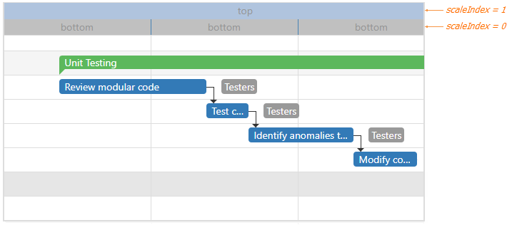
onScaleCellPrepared
A function that is executed before a scale cell is prepared.
Information about the event.
| Name | Type | Description |
|---|---|---|
| component |
The UI component's instance. |
|
| element |
The UI component's container. It is an HTML Element or a jQuery Element when you use jQuery. |
|
| scaleElement |
The scale cell. |
|
| scaleIndex |
Specifies the scale's index. |
|
| scaleType |
The scale type. |
|
| separatorElement |
The separator after the scale cell. |
|
| endDate |
The end date of the scale cell. |
|
| startDate |
The start date of the scale cell. |
The example below illustrates how to customize the scale.
jQuery
$(function() {
    $("#gantt").dxGantt({
        // ...
        onScaleCellPrepared: function(e) {
            var scaleElement = e.scaleElement[0];
            if(e.scaleIndex === 0) {
                scaleElement.style.backgroundColor = "silver";
                scaleElement.innerText = "bottom";
            } else {
                scaleElement.style.backgroundColor = "LightSteelBlue";
                scaleElement.innerText = "top";
            }
            var border = e.separatorElement[0];
            border.style.borderColor = "steelBlue";
        }
    });
});
Angular
import { DxGanttModule } from "devextreme-angular";
// ...
export class AppComponent {
    onScaleCellPrepared: function(e) {
        var scaleElement = e.scaleElement[0];
        if(e.scaleIndex === 0) {
            scaleElement.style.backgroundColor = "silver";
            scaleElement.innerText = "bottom";
        } else {
            scaleElement.style.backgroundColor = "LightSteelBlue";
            scaleElement.innerText = "top";
        }
        var border = e.separatorElement[0];
        border.style.borderColor = "steelBlue";
    }
}
@NgModule({
    imports: [
        // ...
        DxGanttModule
    ],
    // ...
})
<dx-gantt ...
    (onScaleCellPrepared)="onScaleCellPrepared($event)">
</dx-gantt>
Vue
<template>
    <DxGantt
        ...
        @scale-cell-prepared="onScaleCellPrepared"
    />
</template>

<script>
import 'devextreme/dist/css/dx.fluent.blue.light.css';

import DxGantt from 'devextreme-vue/gantt';

export default {
    components: {
        DxGantt
    },
    methods: {
        onScaleCellPrepared: function(e) {
            var scaleElement = e.scaleElement[0];
            if(e.scaleIndex === 0) {
                scaleElement.style.backgroundColor = "silver";
                scaleElement.innerText = "bottom";
            } else {
                scaleElement.style.backgroundColor = "LightSteelBlue";
                scaleElement.innerText = "top";
            }
            var border = e.separatorElement[0];
            border.style.borderColor = "steelBlue";
        }
    }
}
</script>
React
import React from 'react';

import 'devextreme/dist/css/dx.fluent.blue.light.css';

import Gantt from 'devextreme-react/gantt';

class App extends React.Component {
    // ...
    render() {
        return (
            <Gantt
                 //...
                 onScaleCellPrepared={this.onScaleCellPrepared}
            />
        );
    }
    onScaleCellPrepared: function(e) {
        var scaleElement = e.scaleElement[0];
        if(e.scaleIndex === 0) {
            scaleElement.style.backgroundColor = "silver";
            scaleElement.innerText = "bottom";
        } else {
            scaleElement.style.backgroundColor = "LightSteelBlue";
            scaleElement.innerText = "top";
        }
        var border = e.separatorElement[0];
        border.style.borderColor = "steelBlue";
    }
}
export default App;
ASP.NET Core Controls
@(Html.DevExtreme().Gantt()
    .ID("gantt")
    .onScaleCellPrepared("gantt_scaleCellPrepared_handler")
    // ...
)
<script>
    function gantt_scaleCellPrepared_handler(e) {
        var scaleElement = e.scaleElement[0];
        if(e.scaleIndex === 0) {
            scaleElement.style.backgroundColor = "silver";
            scaleElement.innerText = "bottom";
        } else {
            scaleElement.style.backgroundColor = "LightSteelBlue";
            scaleElement.innerText = "top";
        }
        var border = e.separatorElement[0];
        border.style.borderColor = "steelBlue";
    }
</script>
The code below colors the scale cells depending on the season:

jQuery
$(function() {
    $("#gantt").dxGantt({
        // ...
        onScaleCellPrepared: function(e) {
            var scaleElement = e.scaleElement;
            var color = "";
            var month = e.end.getMonth();
            if (month > 1 && month < 5) {
                color = "lightGreen";
            } else if (month > 4 && month < 8) {
                color = "green";
            } else if (month > 7 && month < 11) {
                color = "yellow";
            } else
                color = "white";
            scaleElement.style.backgroundColor = color;
        }
    });
});
Angular
import { DxGanttModule } from "devextreme-angular";
// ...
export class AppComponent {
    onScaleCellPrepared: function(e) {
        var scaleElement = e.scaleElement;
        var color = "";
        var month = e.end.getMonth();
        if (month > 1 && month < 5) {
            color = "lightGreen";
        } else if (month > 4 && month < 8) {
            color = "green";
        } else if (month > 7 && month < 11) {
            color = "yellow";
        } else
            color = "white";
        scaleElement.style.backgroundColor = color;
    }
}
@NgModule({
    imports: [
        // ...
        DxGanttModule
    ],
    // ...
})
<dx-gantt ...
    (onScaleCellPrepared)="onScaleCellPrepared($event)">
</dx-gantt>
Vue
<template>
    <DxGantt
        ...
        @scale-cell-prepared="onScaleCellPrepared"
    />
</template>

<script>
import 'devextreme/dist/css/dx.fluent.blue.light.css';

import DxGantt from 'devextreme-vue/gantt';

export default {
    components: {
        DxGantt
    },
    methods: {
        onScaleCellPrepared: function(e) {
            var scaleElement = e.scaleElement;
            var color = "";
            var month = e.end.getMonth();
            if (month > 1 && month < 5) {
                color = "lightGreen";
            } else if (month > 4 && month < 8) {
                color = "green";
            } else if (month > 7 && month < 11) {
                color = "yellow";
            } else
                color = "white";
            scaleElement.style.backgroundColor = color;
        }
    }
}
</script>
React
import React from 'react';

import 'devextreme/dist/css/dx.fluent.blue.light.css';

import Gantt from 'devextreme-react/gantt';

class App extends React.Component {
    // ...
    render() {
        return (
            <Gantt
                 //...
                 onScaleCellPrepared={this.onScaleCellPrepared}
            />
        );
    }
    onScaleCellPrepared: function(e) {
        var scaleElement = e.scaleElement;
        var color = "";
        var month = e.end.getMonth();
        if (month > 1 && month < 5) {
            color = "lightGreen";
        } else if (month > 4 && month < 8) {
            color = "green";
        } else if (month > 7 && month < 11) {
            color = "yellow";
        } else
            color = "white";
        scaleElement.style.backgroundColor = color;
    }
}
export default App;
ASP.NET Core Controls
@(Html.DevExtreme().Gantt()
    .ID("gantt")
    .onScaleCellPrepared("gantt_scaleCellPrepared_handler")
    // ...
)
<script>
    function gantt_scaleCellPrepared_handler(e) {
        var scaleElement = e.scaleElement;
        var color = "";
        var month = e.end.getMonth();
        if (month > 1 && month < 5) {
            color = "lightGreen";
        } else if (month > 4 && month < 8) {
            color = "green";
        } else if (month > 7 && month < 11) {
            color = "yellow";
        } else
            color = "white";
        scaleElement.style.backgroundColor = color;
    }
</script>
onSelectionChanged
A function that is executed after users select a task or clear its selection.
Information about the event that caused the function's execution.
| Name | Type | Description |
|---|---|---|
| component |
The UI component's instance. |
|
| element |
The UI component's container. It is an HTML Element or a jQuery Element when you use jQuery. |
|
| selectedRowKey | any |
The key of the row whose selection state was changed. |
jQuery
$(function() {
    $("#gantt").dxGantt({
        // ...
        onSelectionChanged: function (e) {
            if (e.selectedRowKey === 2) {
                // your code
            } else {
                // your code
            }
        }
    });
});
Angular
import { DxGanttModule } from "devextreme-angular";
// ...
export class AppComponent {
    onSelectionChanged(e) {
        if (e.selectedRowKey === 2) {
            // your code
        } else {
            // your code
        }
    }
}
@NgModule({
    imports: [
        // ...
        DxGanttModule
    ],
    // ...
})
<dx-gantt ...
    (onSelectionChanged)="onSelectionChanged($event)">
</dx-gantt>
Vue
<template>
    <DxGantt
        ...
        @selection-changed="onSelectionChanged"
    />
</template>

<script>
import 'devextreme/dist/css/dx.fluent.blue.light.css';

import DxGantt from 'devextreme-vue/gantt';

export default {
    components: {
        DxGantt
    },
    methods: {
        onSelectionChanged(e) {
            if (e.selectedRowKey === 2) {
                // your code
            } else {
                // your code
            }
        }
    }
}
</script>
React
import React from 'react';

import 'devextreme/dist/css/dx.fluent.blue.light.css';

import Gantt from 'devextreme-react/gantt';

class App extends React.Component {
    // ...
    render() {
        return (
            <Gantt
                 //...
                 onSelectionChanged={this.onSelectionChanged}
            />
        );
    }
    onSelectionChanged = (e) => {
        if (e.selectedRowKey === 2) {
            // your code
        } else {
            // your code
        }
    }
}
export default App;
ASP.NET Core Controls
@(Html.DevExtreme().Gantt()
    .ID("gantt")
    .onSelectionChanged("gantt_selectionChanged_handler")
    // ...
)
<script>
    function gantt_selectionChanged_handler(e) {
        if (e.selectedRowKey === 2) {
            // your code
        } else {
            // your code
        }
    }
</script>
See Also
onTaskClick
A function that is executed when a user clicks a task.
Information about the event.
| Name | Type | Description |
|---|---|---|
| component |
The UI component's instance. |
|
| data | any |
The task data. |
| element |
The UI component's container. It is an HTML Element or a jQuery Element when you use jQuery. |
|
| event | Event (jQuery or EventObject) |
The event that caused the function to execute. It is an EventObject or a jQuery.Event when you use jQuery. |
| key | any |
The task key. |
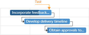
jQuery
$(function() {
    $("#gantt").dxGantt({
        // ...
        onTaskClick: function (e) {
            if (e.key != 0) {
                // your code
            }
        }
    });
});
Angular
import { DxGanttModule } from "devextreme-angular";
// ...
export class AppComponent {
    onTaskClick(e) {
        if (e.key != 0) {
            // your code
        }
    }
}
@NgModule({
    imports: [
        // ...
        DxGanttModule
    ],
    // ...
})
<dx-gantt ...
    (onTaskClick)="onTaskClick($event)">
</dx-gantt>
Vue
<template>
    <DxGantt
        ...
        @task-click="onTaskClick"
    />
</template>

<script>
import 'devextreme/dist/css/dx.fluent.blue.light.css';

import DxGantt from 'devextreme-vue/gantt';

export default {
    components: {
        DxGantt
    },
    methods: {
        onTaskClick(e) {
            if (e.key != 0) {
                // your code
            }
        }
    }
}
</script>
React
import React from 'react';

import 'devextreme/dist/css/dx.fluent.blue.light.css';

import Gantt from 'devextreme-react/gantt';

class App extends React.Component {
    // ...
    render() {
        return (
            <Gantt
                 //...
                 onTaskClick={this.onTaskClick}
            />
        );
    }
    onTaskClick = (e) => {
        if (e.key != 0) {
            // your code
        }
    }
}
export default App;
ASP.NET Core Controls
@(Html.DevExtreme().Gantt()
    .ID("gantt")
    .onTaskClick("gantt_taskClick_handler")
    // ...
)
<script>
    function gantt_taskClick_handler(e) {
        if (e.key != 0) {
            // your code
        }
    }
</script>
See Also
onTaskDblClick
A function that is executed when a user double-clicks a task.
Information about the event.
| Name | Type | Description |
|---|---|---|
| cancel |
Allows you to cancel the resource unassignment. |
|
| component |
The UI component's instance. |
|
| data | any |
The task data. |
| element |
The UI component's container. It is an HTML Element or a jQuery Element when you use jQuery. |
|
| event | Event (jQuery or EventObject) |
The event that caused the function to execute. It is an EventObject or a jQuery.Event when you use jQuery. |
| key | any |
The task key. |
jQuery
$(function() {
    $("#gantt").dxGantt({
        // ...
        onTaskDblClick: function (e) {
            if (e.key != 0) {
                // your code
                e.cancel = true;
            }
        }
    });
});
Angular
import { DxGanttModule } from "devextreme-angular";
// ...
export class AppComponent {
    onTaskDblClick(e) {
        if (e.key != 0) {
            // your code
            e.cancel = true;
        }
    }
}
@NgModule({
    imports: [
        // ...
        DxGanttModule
    ],
    // ...
})
<dx-gantt ...
    (onTaskDblClick)="onTaskDblClick($event)">
</dx-gantt>
Vue
<template>
    <DxGantt
        ...
        @task-dbl-click="onTaskDblClick"
    />
</template>

<script>
import 'devextreme/dist/css/dx.fluent.blue.light.css';

import DxGantt from 'devextreme-vue/gantt';

export default {
    components: {
        DxGantt
    },
    methods: {
        onTaskDblClick(e) {
            if (e.key != 0) {
                // your code
                e.cancel = true;
            }
        }
    }
}
</script>
React
import React from 'react';

import 'devextreme/dist/css/dx.fluent.blue.light.css';

import Gantt from 'devextreme-react/gantt';

class App extends React.Component {
    // ...
    render() {
        return (
            <Gantt
                 //...
                 onTaskDblClick={this.onTaskDblClick}
            />
        );
    }
    onTaskDblClick = (e) => {
        if (e.key != 0) {
            // your code
            e.cancel = true;
        }
    }
}
export default App;
ASP.NET Core Controls
@(Html.DevExtreme().Gantt()
    .ID("gantt")
    .onTaskDblClick("gantt_taskDblClick_handler")
    // ...
)
<script>
    function gantt_taskDblClick_handler(e) {
        if (e.key != 0) {
            // your code
            e.cancel = true;
        }
    }
</script>
See Also
onTaskDeleted
A function that is executed when a task is deleted.
Information about the event.
| Name | Type | Description |
|---|---|---|
| component |
The UI component's instance. |
|
| element |
The widget's container. It is an HTML Element or a jQuery Element when you use jQuery. |
|
| key | any |
The key of the deleted task. |
| values | any |
The values of the deleted task. |
jQuery
$(function() {
    $("#gantt").dxGantt({
        // ...
        onTaskDeleted: function (e) {
            if (e.key != 0) {
                // your code
            }
        }
    });
});
Angular
import { DxGanttModule } from "devextreme-angular";
// ...
export class AppComponent {
    onTaskDeleted(e) {
        if (e.key != 0) {
            // your code
        }
    }
}
@NgModule({
    imports: [
        // ...
        DxGanttModule
    ],
    // ...
})
<dx-gantt ...
    (onTaskDeleted)="onTaskDeleted($event)">
</dx-gantt>
Vue
<template>
<DxGantt
...
@task-deleted="onTaskDeleted"
/>
</template>
<script>
import 'devextreme/dist/css/dx.fluent.blue.light.css';
import DxGantt from 'devextreme-vue/gantt';
export default {
components: {
DxGantt
},
methods: {
onTaskDeleted(e) {
if (e.key != 0) {
// your code
}
}
}
}
</script>React
import React from 'react';
import 'devextreme/dist/css/dx.fluent.blue.light.css';
import Gantt from 'devextreme-react/gantt';
class App extends React.Component {
// ...
render() {
return (
<Gantt
//...
onTaskDeleted={this.onTaskDeleted}
/>
);
}
onTaskDeleted = (e) => {
if (e.key != 0) {
// your code
}
}
}
export default App;ASP.NET Core Controls
@(Html.DevExtreme().Gantt()
.ID("gantt")
.onTaskDeleted("gantt_taskDeleted_handler")
// ...
)
<script>
function gantt_taskDeleted_handler(e) {
if (e.key != 0) {
// your code
}
}
</script>See Also
onTaskDeleting
A function that is executed before a task is deleted.
Information about the event.
| Name | Type | Description |
|---|---|---|
| cancel |
Allows you to cancel the task deletion. |
|
| component |
The UI component's instance. |
|
| element |
The UI component's container. It is an HTML Element or a jQuery Element when you use jQuery. |
|
| key | any |
The key of the deleted task. |
| values | any |
The values of the deleted task. |
jQuery
$(function() {
$("#gantt").dxGantt({
// ...
onTaskDeleting: function (e) {
if (e.key != 0) {
// your code
e.cancel = true;
}
}
});
}); Angular
import { DxGanttModule } from "devextreme-angular";
// ...
export class AppComponent {
onTaskDeleting(e) {
if (e.key != 0) {
// your code
e.cancel = true;
}
}
}
@NgModule({
imports: [
// ...
DxGanttModule
],
// ...
})
<dx-gantt ...
(onTaskDeleting)="onTaskDeleting($event)">
</dx-gantt>Vue
<template>
<DxGantt
...
@task-deleting="onTaskDeleting"
/>
</template>
<script>
import 'devextreme/dist/css/dx.fluent.blue.light.css';
import DxGantt from 'devextreme-vue/gantt';
export default {
components: {
DxGantt
},
methods: {
onTaskDeleting(e) {
if (e.key != 0) {
// your code
e.cancel = true;
}
}
}
}
</script>React
import React from 'react';
import 'devextreme/dist/css/dx.fluent.blue.light.css';
import Gantt from 'devextreme-react/gantt';
class App extends React.Component {
// ...
render() {
return (
<Gantt
//...
onTaskDeleting={this.onTaskDeleting}
/>
);
}
onTaskDeleting = (e) => {
if (e.key != 0) {
// your code
e.cancel = true;
}
}
}
export default App;ASP.NET Core Controls
@(Html.DevExtreme().Gantt()
.ID("gantt")
.onTaskDeleting("gantt_taskDeleting_handler")
// ...
)
<script>
function gantt_taskDeleting_handler(e) {
if (e.key != 0) {
// your code
e.cancel = true;
}
}
</script>See Also
onTaskEditDialogShowing
A function that is executed before the edit dialog is shown.
Information about the event.
| Name | Type | Description |
|---|---|---|
| cancel |
Allows you to cancel the edit dialog showing. |
|
| component |
The UI component's instance. |
|
| element |
The UI component's container. It is an HTML Element or a jQuery Element when you use jQuery. |
|
| hiddenFields |
An array of hidden fields. |
|
| key | any |
The task key. |
| readOnlyFields |
An array of read-only fields. |
|
| values | any |
The task values. |
The hiddenFields and readOnlyFields parameters affect only task fields. Disable the allowTaskResourceUpdating property to freeze the Resource Manager in the Task Details dialog.
jQuery
$(function() {
$("#gantt").dxGantt({
// ...
onTaskEditDialogShowing: function (e) {
if (e.key != 0) {
// your code
e.cancel = true;
}
}
});
}); Angular
import { DxGanttModule } from "devextreme-angular";
// ...
export class AppComponent {
onTaskEditDialogShowing(e) {
if (e.key != 0) {
// your code
e.cancel = true;
}
}
}
@NgModule({
imports: [
// ...
DxGanttModule
],
// ...
})
<dx-gantt ...
(onTaskEditDialogShowing)="onTaskEditDialogShowing($event)">
</dx-gantt>Vue
<template>
<DxGantt
...
@task-edit-dialog-showing="onTaskEditDialogShowing"
/>
</template>
<script>
import 'devextreme/dist/css/dx.fluent.blue.light.css';
import DxGantt from 'devextreme-vue/gantt';
export default {
components: {
DxGantt
},
methods: {
onTaskEditDialogShowing(e) {
if (e.key != 0) {
// your code
e.cancel = true;
}
}
}
}
</script>React
import React from 'react';
import 'devextreme/dist/css/dx.fluent.blue.light.css';
import Gantt from 'devextreme-react/gantt';
class App extends React.Component {
// ...
render() {
return (
<Gantt
//...
onTaskEditDialogShowing={this.onTaskEditDialogShowing}
/>
);
}
onTaskEditDialogShowing = (e) => {
if (e.key != 0) {
// your code
e.cancel = true;
}
}
}
export default App;ASP.NET Core Controls
@(Html.DevExtreme().Gantt()
.ID("gantt")
.onTaskEditDialogShowing("gantt_taskEditDialogShowing_handler")
// ...
)
<script>
function gantt_taskEditDialogShowing_handler(e) {
if (e.key != 0) {
// your code
e.cancel = true;
}
}
</script>See Also
onTaskInserted
A function that is executed when a task is inserted.
Information about the event.
| Name | Type | Description |
|---|---|---|
| component |
The UI component's instance. |
|
| element |
The widget's container. It is an HTML Element or a jQuery Element when you use jQuery. |
|
| key | any |
The key of the inserted task. |
| values | any |
The values of the inserted task. |
jQuery
$(function() {
$("#gantt").dxGantt({
// ...
onTaskInserted: function (e) {
if (e.values.text == " ") {
// your code
}
}
});
}); Angular
import { DxGanttModule } from "devextreme-angular";
// ...
export class AppComponent {
onTaskInserted(e) {
if (e.values.text == " ") {
// your code
}
}
}
@NgModule({
imports: [
// ...
DxGanttModule
],
// ...
})
<dx-gantt ...
(onTaskInserted)="onTaskInserted($event)">
</dx-gantt>Vue
<template>
<DxGantt
...
@task-inserted="onTaskInserted"
/>
</template>
<script>
import 'devextreme/dist/css/dx.fluent.blue.light.css';
import DxGantt from 'devextreme-vue/gantt';
export default {
components: {
DxGantt
},
methods: {
onTaskInserted(e) {
if (e.values.text == " ") {
// your code
}
}
}
}
</script>React
import React from 'react';
import 'devextreme/dist/css/dx.fluent.blue.light.css';
import Gantt from 'devextreme-react/gantt';
class App extends React.Component {
// ...
render() {
return (
<Gantt
//...
onTaskInserted={this.onTaskInserted}
/>
);
}
onTaskInserted = (e) => {
if (e.values.text == " ") {
// your code
}
}
}
export default App;ASP.NET Core Controls
@(Html.DevExtreme().Gantt()
.ID("gantt")
.onTaskInserted("gantt_taskInserted_handler")
// ...
)
<script>
function gantt_taskInserted_handler(e) {
if (e.values.text == " ") {
// your code
}
}
</script>See Also
onTaskInserting
A function that is executed before a task is inserted.
Information about the event.
| Name | Type | Description |
|---|---|---|
| cancel |
Allows you to cancel the task insertion. |
|
| component |
The UI component's instance. |
|
| element |
The UI component's container. It is an HTML Element or a jQuery Element when you use jQuery. |
|
| values | any |
The values of the inserted task. |
Note that you should not specify a task ID in the onTaskInserting function.
jQuery
$(function() {
$("#gantt").dxGantt({
// ...
onTaskInserting: function (e) {
if (e.values.text == " ") {
// your code
e.cancel = true;
}
}
});
}); Angular
import { DxGanttModule } from "devextreme-angular";
// ...
export class AppComponent {
onTaskInserting(e) {
if (e.values.text == " ") {
// your code
e.cancel = true;
}
}
}
@NgModule({
imports: [
// ...
DxGanttModule
],
// ...
})
<dx-gantt ...
(onTaskInserting)="onTaskInserting($event)">
</dx-gantt>Vue
<template>
<DxGantt
...
@task-inserting="onTaskInserting"
/>
</template>
<script>
import 'devextreme/dist/css/dx.fluent.blue.light.css';
import DxGantt from 'devextreme-vue/gantt';
export default {
components: {
DxGantt
},
methods: {
onTaskInserting(e) {
if (e.values.text == " ") {
// your code
e.cancel = true;
}
}
}
}
</script>React
import React from 'react';
import 'devextreme/dist/css/dx.fluent.blue.light.css';
import Gantt from 'devextreme-react/gantt';
class App extends React.Component {
// ...
render() {
return (
<Gantt
//...
onTaskInserting={this.onTaskInserting}
/>
);
}
onTaskInserting = (e) => {
if (e.values.text == " ") {
// your code
e.cancel = true;
}
}
}
export default App;ASP.NET Core Controls
@(Html.DevExtreme().Gantt()
.ID("gantt")
.onTaskInserting("gantt_taskInserting_handler")
// ...
)
<script>
function gantt_taskInserting_handler(e) {
if (e.values.text == " ") {
// your code
e.cancel = true;
}
}
</script>See Also
onTaskMoving
A function that is executed before a task is moved.
Information about the event.
| Name | Type | Description |
|---|---|---|
| cancel |
Allows you to cancel the task's movement. |
|
| component |
The UI component's instance. |
|
| element |
The UI component's container. It is an HTML Element or a jQuery Element when you use jQuery. |
|
| key | any |
The task key. |
| newValues | any |
The task values after moving. |
| values | any |
The task values before moving. |
jQuery
$(function() {
$("#gantt").dxGantt({
// ...
onTaskMoving: function (e) {
if (e.key != 0) {
// your code
e.cancel = true;
}
}
});
}); Angular
import { DxGanttModule } from "devextreme-angular";
// ...
export class AppComponent {
onTaskMoving(e) {
if (e.key != 0) {
// your code
e.cancel = true;
}
}
}
@NgModule({
imports: [
// ...
DxGanttModule
],
// ...
})
<dx-gantt ...
(onTaskMoving)="onTaskMoving($event)">
</dx-gantt>Vue
<template>
<DxGantt
...
@task-moving="onTaskMoving"
/>
</template>
<script>
import 'devextreme/dist/css/dx.fluent.blue.light.css';
import DxGantt from 'devextreme-vue/gantt';
export default {
components: {
DxGantt
},
methods: {
onTaskMoving(e) {
if (e.key != 0) {
// your code
e.cancel = true;
}
}
}
}
</script>React
import React from 'react';
import 'devextreme/dist/css/dx.fluent.blue.light.css';
import Gantt from 'devextreme-react/gantt';
class App extends React.Component {
// ...
render() {
return (
<Gantt
//...
onTaskMoving={this.onTaskMoving}
/>
);
}
onTaskMoving = (e) => {
if (e.key != 0) {
// your code
e.cancel = true;
}
}
}
export default App;ASP.NET Core Controls
@(Html.DevExtreme().Gantt()
.ID("gantt")
.onTaskMoving("gantt_taskMoving_handler")
// ...
)
<script>
function gantt_taskMoving_handler(e) {
if (e.key != 0) {
// your code
e.cancel = true;
}
}
</script>See Also
onTaskUpdated
A function that is executed when a task is updated.
Information about the event.
| Name | Type | Description |
|---|---|---|
| component |
The UI component's instance. |
|
| element |
The widget's container. It is an HTML Element or a jQuery Element when you use jQuery. |
|
| key | any |
The key of the updated task. |
| values | any |
The task values after update. |
jQuery
$(function() {
$("#gantt").dxGantt({
// ...
onTaskUpdated: function (e) {
if (e.key != 0) {
// your code
}
}
});
}); Angular
import { DxGanttModule } from "devextreme-angular";
// ...
export class AppComponent {
onTaskUpdated(e) {
if (e.key != 0) {
// your code
}
}
}
@NgModule({
imports: [
// ...
DxGanttModule
],
// ...
})
<dx-gantt ...
(onTaskUpdated)="onTaskUpdated($event)">
</dx-gantt>Vue
<template>
<DxGantt
...
@task-updated="onTaskUpdated"
/>
</template>
<script>
import 'devextreme/dist/css/dx.fluent.blue.light.css';
import DxGantt from 'devextreme-vue/gantt';
export default {
components: {
DxGantt
},
methods: {
onTaskUpdated(e) {
if (e.key != 0) {
// your code
}
}
}
}
</script>React
import React from 'react';
import 'devextreme/dist/css/dx.fluent.blue.light.css';
import Gantt from 'devextreme-react/gantt';
class App extends React.Component {
// ...
render() {
return (
<Gantt
//...
onTaskUpdated={this.onTaskUpdated}
/>
);
}
onTaskUpdated = (e) => {
if (e.key != 0) {
// your code
}
}
}
export default App;ASP.NET Core Controls
@(Html.DevExtreme().Gantt()
.ID("gantt")
.onTaskUpdated("gantt_taskUpdated_handler")
// ...
)
<script>
function gantt_taskUpdated_handler(e) {
if (e.key != 0) {
// your code
}
}
</script>See Also
onTaskUpdating
A function that is executed before a task is updated.
Information about the event.
| Name | Type | Description |
|---|---|---|
| cancel |
Allows you to cancel the task update. |
|
| component |
The UI component's instance. |
|
| element |
The UI component's container. It is an HTML Element or a jQuery Element when you use jQuery. |
|
| key | any |
The task key. |
| newValues | any |
The task values after update. |
| values | any |
The task values before update. |
jQuery
$(function() {
$("#gantt").dxGantt({
// ...
onTaskUpdating: function (e) {
if (e.key != 0) {
// your code
e.cancel = true;
}
}
});
}); Angular
import { DxGanttModule } from "devextreme-angular";
// ...
export class AppComponent {
onTaskUpdating(e) {
if (e.key != 0) {
// your code
e.cancel = true;
}
}
}
@NgModule({
imports: [
// ...
DxGanttModule
],
// ...
})
<dx-gantt ...
(onTaskUpdating)="onTaskUpdating($event)">
</dx-gantt>Vue
<template>
<DxGantt
...
@task-updating="onTaskUpdating"
/>
</template>
<script>
import 'devextreme/dist/css/dx.fluent.blue.light.css';
import DxGantt from 'devextreme-vue/gantt';
export default {
components: {
DxGantt
},
methods: {
onTaskUpdating(e) {
if (e.key != 0) {
// your code
e.cancel = true;
}
}
}
}
</script>React
import React from 'react';
import 'devextreme/dist/css/dx.fluent.blue.light.css';
import Gantt from 'devextreme-react/gantt';
class App extends React.Component {
// ...
render() {
return (
<Gantt
//...
onTaskUpdating={this.onTaskUpdating}
/>
);
}
onTaskUpdating = (e) => {
if (e.key != 0) {
// your code
e.cancel = true;
}
}
}
export default App;ASP.NET Core Controls
@(Html.DevExtreme().Gantt()
.ID("gantt")
.onTaskUpdating("gantt_taskUpdating_handler")
// ...
)
<script>
function gantt_taskUpdating_handler(e) {
if (e.key != 0) {
// your code
e.cancel = true;
}
}
</script>See Also
resourceAssignments
Configures resource assignments.
Resource assignments define relationship between tasks and resources.
Use the dataSource property to bind the UI component to a data source, which contains resource assignments. If the field names in your data source differ from the 'id', 'resourceId' and 'taskId' default names, use the keyExpr, resourceIdExpr and/or taskIdExpr properties to map data fields.
See Also
jQuery
$(function() {
$("#gantt").dxGantt({
resourceAssignments: {
dataSource: resourceAssignments,
keyExpr: "key",
resourceIdExpr: "resourceKey",
taskIdExpr: "taskKey"
},
//...
});
});
var resourceAssignments = [{
'key': 0,
'taskKey': 3,
'resourceKey': 1
},
// ...
]; Angular
<dx-gantt ... >
<dxo-gantt-resource-assignments
[dataSource]="resourceAssignments"
keyExpr="key"
resourceIdExpr="resourceKey"
taskIdExpr="taskKey">
</dxo-gantt-resource-assignments>
<!-- ... -->
</dx-gantt>
import { Component } from '@angular/core';
@Component({
selector: 'app-root',
templateUrl: './app.component.html',
styleUrls: ['./app.component.css']
})
export class AppComponent {
resourceAssignments: ResourceAssignment[];
// ...
constructor(service: Service) {
this.resourceAssignments = service.getResourceAssignments();
// ...
}
}
import { BrowserModule } from '@angular/platform-browser';
import { NgModule } from '@angular/core';
import { AppComponent } from './app.component';
import { DxGanttModule } from 'devextreme-angular';
import { Service, ResourceAssignment, ... } from './app.service';
@NgModule({
imports: [
BrowserModule,
DxGanttModule
],
declarations: [AppComponent],
bootstrap: [AppComponent]
})
export class AppModule { }
import { Injectable } from '@angular/core';
export class ResourceAssignment {
id: number;
taskId: number;
resourceId: number;
}
const resourceAssignments: ResourceAssignment[] = [{
'key': 0,
'taskKey': 3,
'resourceKey': 1
},
// ...
];
@Injectable()
export class Service {
getResourceAssignments(): ResourceAssignment[] {
return resourceAssignments;
}
}
{
"projects": {
"ProjectName": {
"architect": {
"build": {
"options": {
"styles": [
"node_modules/devextreme/dist/css/dx.light.css",
"node_modules/devexpress-gantt/dist/dx-gantt.css",
"src/styles.css"
],
...
},
...
},
...
}
},
...
},
...
}Vue
<template>
<DxGantt ... >
<DxResourceAssignments
:data-source="resourceAssignments"
key-expr="key"
resource-id-expr="resourceKey"
task-id-expr="taskKey" />
<!-- ... -->
</DxGantt>
</template>
<script>
import 'devextreme/dist/css/dx.fluent.blue.light.css';
import 'devexpress-gantt/dist/dx-gantt.css';
import {
DxGantt,
DxResourceAssignments,
//...
} from 'devextreme-vue/gantt';
import {
resourceAssignments,
// ...
} from './data.js';
export default {
components: {
DxGantt,
DxResourceAssignments,
//...
},
data() {
return {
resourceAssignments,
//...
};
}
};
</script>
export const resourceAssignments = [{
'key': 0,
'taskKey': 3,
'resourceKey': 1
},
// ...
];React
import React from 'react';
import 'devextreme/dist/css/dx.fluent.blue.light.css';
import 'devexpress-gantt/dist/dx-gantt.css';
import Gantt, {
ResourceAssignments,
//...
} from 'devextreme-react/gantt';
import {
resourceAssignments,
//...
} from './data.js';
const App = () => {
return (
<Gantt ... >
<ResourceAssignments
dataSource={resourceAssignments}
keyExpr="key"
resourceIdExpr="resourceKey"
taskIdExpr="taskKey" />
</Gantt>
);
};
export default App;
export const resourceAssignments = [{
'key': 0,
'taskKey': 3,
'resourceKey': 1
},
// ...
];ASP.NET Core Controls
@(Html.DevExtreme().Gantt<Gantt.Task>()
.ResourceAssignments(ra => ra
.DataSource(ds => ds.Array().Data(SampleData.GanttResourceAssignments).Key("ID"))
.KeyExpr("ID")
.TaskIdExpr("TaskId")
.ResourceIdExpr("ResourceId")
)
// ...
)
<!-- C# -->
public partial class SampleData {
public static readonly IEnumerable<ResourceAssignment> GanttResourceAssignments = new[] {
new ResourceAssignment { ID = 0, TaskId = 3, ResourceId = 1 },
new ResourceAssignment { ID = 1, TaskId = 4, ResourceId = 1 },
// ...
}
// ...
}ASP.NET MVC Controls
@(Html.DevExtreme().Gantt<Gantt.Task>()
.ResourceAssignments(ra => ra
.DataSource(ds => ds.Array().Data(SampleData.GanttResourceAssignments).Key("ID"))
.KeyExpr("ID")
.TaskIdExpr("TaskId")
.ResourceIdExpr("ResourceId")
)
// ...
)
<!-- C# -->
public partial class SampleData {
public static readonly IEnumerable<ResourceAssignment> GanttResourceAssignments = new[] {
new ResourceAssignment { ID = 0, TaskId = 3, ResourceId = 1 },
new ResourceAssignment { ID = 1, TaskId = 4, ResourceId = 1 },
// ...
}
// ...
}resources
Configures task resources.
You can add resources to a project and assign them to tasks. Resources can be people responsible for tasks, equipment, materials, etc. The Gantt displays resources as labels on the right of the tasks.
Use the dataSource property to bind the UI component to a data source, which contains resources. If the field names in your data source differ from the 'id', 'text' and 'color' default names, use the keyExpr, textExpr and/or colorExpr properties to map data fields.
The 'color' field accepts the following values:
- Hexadecimal colors
- RGB colors
- RGBA colors
- Predefined/cross-browser color names
- Predefined SVG colors
- Paint server address
jQuery
$(function() {
$("#gantt").dxGantt({
resources: {
dataSource: resources,
keyExpr: "resourceId",
textExpr: "title",
colorExpr: "resourceColor"
},
//...
});
});
var resources = [{
'resourceId': 1,
'title': 'Management',
'resourceColor': 'red'
},
// ...
]; Angular
<dx-gantt ... >
<dxo-gantt-resources
[dataSource]="resources"
keyExpr="resourceId"
textExpr="title"
colorExpr="resourceColor" >
</dxo-gantt-resources>
<!-- ... -->
</dx-gantt>
import { Component } from '@angular/core';
@Component({
selector: 'app-root',
templateUrl: './app.component.html',
styleUrls: ['./app.component.css']
})
export class AppComponent {
resources: Resource[];
// ...
constructor(service: Service) {
this.resources = service.getResources();
// ...
}
}
import { BrowserModule } from '@angular/platform-browser';
import { NgModule } from '@angular/core';
import { AppComponent } from './app.component';
import { DxGanttModule } from 'devextreme-angular';
import { Service, Resource, ... } from './app.service';
@NgModule({
imports: [
BrowserModule,
DxGanttModule
],
providers: [Service],
declarations: [AppComponent],
bootstrap: [AppComponent]
})
export class AppModule { }
import { Injectable } from '@angular/core';
export class Resource {
resourceId: number;
title: string;
resourceColor: string;
}
const resources: Resource[] = [{
'resourceId': 1,
'title': 'Management',
'resourceColor': 'red'
},
// ...
];
@Injectable()
export class Service {
getResources(): Resource[] {
return resources;
}
}
{
"projects": {
"ProjectName": {
"architect": {
"build": {
"options": {
"styles": [
"node_modules/devextreme/dist/css/dx.light.css",
"node_modules/devexpress-gantt/dist/dx-gantt.css",
"src/styles.css"
],
...
},
...
},
...
}
},
...
},
...
}Vue
<template>
<DxGantt ... >
<DxResources
:data-source="resources"
key-expr="resourceId"
text-expr="title"
color-expr="resourceColor" />
<!-- ... -->
</DxGantt>
</template>
<script>
import 'devextreme/dist/css/dx.fluent.blue.light.css';
import 'devexpress-gantt/dist/dx-gantt.css';
import {
DxGantt,
DxResources,
// ...
} from 'devextreme-vue/gantt';
import {
resources,
// ...
} from './data.js';
export default {
components: {
DxGantt,
DxResources,
// ...
},
data() {
return {
resources,
// ...
};
}
};
</script>
export const resources = [{
'resourceId': 1,
'title': 'Management',
'resourceColor': 'red'
},
// ...
]; React
import React from 'react';
import 'devextreme/dist/css/dx.fluent.blue.light.css';
import 'devexpress-gantt/dist/dx-gantt.css';
import Gantt, {
Resources,
// ...
} from 'devextreme-react/gantt';
import {
resources,
// ...
} from './data.js';
const App = () => {
return (
<Gantt ... >
<Resources
dataSource={resources}
keyExpr="resourceId"
textExpr="title"
colorExpr="resourceColor" />
{/* ... */}
</Gantt>
);
};
export default App;
export const resources = [{
'resourceId': 1,
'title': 'Management',
'resourceColor': 'red'
},
// ...
];ASP.NET Core Controls
@(Html.DevExtreme().Gantt<Gantt.Task>()
.Resources(r => r
.DataSource(ds => ds.Array().Data(SampleData.GanttResources).Key("ID"))
.KeyExpr("ID")
.TextExpr("Text")
)
// ...
)
<!-- C# -->
public partial class SampleData {
public static readonly IEnumerable<Resource> GanttResources = new[] {
new Resource { ID = 1, Text = "Management" },
new Resource { ID = 2, Text = "Project Manager" },
// ...
}
// ...
}ASP.NET MVC Controls
@(Html.DevExtreme().Gantt<Gantt.Task>()
.Resources(r => r
.DataSource(ds => ds.Array().Data(SampleData.GanttResources).Key("ID"))
.KeyExpr("ID")
.TextExpr("Text")
)
// ...
)
<!-- C# -->
public partial class SampleData {
public static readonly IEnumerable<Resource> GanttResources = new[] {
new Resource { ID = 1, Text = "Management" },
new Resource { ID = 2, Text = "Project Manager" },
// ...
}
// ...
}See Also
scaleType
Specifies the zoom level of tasks in the Gantt chart.
The scaleType property specifies the zoom level for tasks when the Gantt UI component is initialized or when you call the option() method.
jQuery
$(function() {
$("#gantt").dxGantt({
scaleType: 'hours',
// ...
});
}); Angular
<dx-gantt
[scaleType]="hours">
<!-- ... -->
</dx-gantt>
import { Component } from '@angular/core';
@Component({
selector: 'app-root',
templateUrl: './app.component.html',
styleUrls: ['./app.component.css']
})
export class AppComponent {
// ...
}
import { BrowserModule } from '@angular/platform-browser';
import { NgModule } from '@angular/core';
import { AppComponent } from './app.component';
import { DxGanttModule } from 'devextreme-angular';
@NgModule({
imports: [
BrowserModule,
DxGanttModule
],
declarations: [AppComponent],
bootstrap: [AppComponent]
})
export class AppModule { }Vue
<template>
<DxGantt
:scale-type="hours" >
<!-- ... -->
</DxGantt>
</template>
<script>
import 'devextreme/dist/css/dx.fluent.blue.light.css';
import 'devexpress-gantt/dist/dx-gantt.css';
import {
DxGantt
// ...
} from 'devextreme-vue/gantt';
export default {
components: {
DxGantt
// ...
}
};
</script>React
import React from 'react';
import 'devextreme/dist/css/dx.fluent.blue.light.css';
import 'devexpress-gantt/dist/dx-gantt.css';
import Gantt, {
// ...
} from 'devextreme-react/gantt';
const App = () => {
return (
<Gantt
scaleType="hours" >
{/* ... */}
</Gantt>
);
};
export default App;ASP.NET Core Controls
@(Html.DevExtreme().Gantt()
.ScaleType(GanttScaleType.Weeks)
// ...
)If the scaleType property is set to "auto", the UI component's scale type is calculated based on the time difference between the start of the first task and the end of the final task. For example, if this difference is more than a year, the scaleType property is set to 'years'.
To browse tasks across various levels of detail in real time, hold the CTRL key and scroll the mouse wheel to zoom (in or out).
scaleTypeRange
Configures zoom range settings.
Use the scaleTypeRange.min and scaleTypeRange.max properties to limit zoom in the Gantt chart.
jQuery
$(function() {
$("#gantt").dxGantt({
scaleTypeRange: {
min: 'days',
max: 'years'
},
// ...
});
});Angular
<dx-gantt ... >
<dxo-gantt-scale-type-range
[min]="days"
[max]="years">
</dxo-gantt-scale-type-range>
<!-- ... -->
</dx-gantt>
import { Component } from '@angular/core';
@Component({
selector: 'app-root',
templateUrl: './app.component.html',
styleUrls: ['./app.component.css']
})
export class AppComponent {
// ...
}
import { BrowserModule } from '@angular/platform-browser';
import { NgModule } from '@angular/core';
import { AppComponent } from './app.component';
import { DxGanttModule } from 'devextreme-angular';
@NgModule({
imports: [
BrowserModule,
DxGanttModule
],
declarations: [AppComponent],
bootstrap: [AppComponent]
})
export class AppModule { }Vue
<template>
<DxGantt ... >
<DxScaleTypeRange
min="days"
max="years"
/>
<!-- ... -->
</DxGantt>
</template>
<script>
import 'devextreme/dist/css/dx.fluent.blue.light.css';
import 'devexpress-gantt/dist/dx-gantt.css';
import {
DxGantt,
DxScaleTypeRange,
// ...
} from 'devextreme-vue/gantt';
export default {
components: {
DxGantt,
DxScaleTypeRange,
// ...
}
};
</script>React
import React from 'react';
import 'devextreme/dist/css/dx.fluent.blue.light.css';
import 'devexpress-gantt/dist/dx-gantt.css';
import Gantt, {
ScaleTypeRange ,
// ...
} from 'devextreme-react/gantt';
const App = () => {
return (
<Gantt ... >
<ScaleTypeRange
min="days"
max="years" />
{/* ... */}
</Gantt>
);
};
export default App;ASP.NET Core Controls
@(Html.DevExtreme().Gantt()
.ScaleTypeRange(e => {
e.Min(GanttScaleType.Days)
e.Max(GanttScaleType.Years)
})
// ...
)ASP.NET MVC Controls
@(Html.DevExtreme().Gantt()
.ScaleTypeRange(e => {
e.Min(GanttScaleType.Days)
e.Max(GanttScaleType.Years)
})
// ...
)See Also
selectedRowKey
Allows you to select a row or determine which row is selected.
jQuery
$(function() {
$("#gantt").dxGantt({
selectedRowKey: 1,
// ...
});
}); Angular
<dx-gantt
[selectedRowKey]="1">
<!-- ... -->
</dx-gantt>
import { Component } from '@angular/core';
@Component({
selector: 'app-root',
templateUrl: './app.component.html',
styleUrls: ['./app.component.css']
})
export class AppComponent {
// ...
}
import { BrowserModule } from '@angular/platform-browser';
import { NgModule } from '@angular/core';
import { AppComponent } from './app.component';
import { DxGanttModule } from 'devextreme-angular';
@NgModule({
imports: [
BrowserModule,
DxGanttModule
],
declarations: [AppComponent],
bootstrap: [AppComponent]
})
export class AppModule { }Vue
<template>
<DxGantt
:selected-row-key="1" >
<!-- ... -->
</DxGantt>
</template>
<script>
import 'devextreme/dist/css/dx.fluent.blue.light.css';
import 'devexpress-gantt/dist/dx-gantt.css';
import {
DxGantt
// ...
} from 'devextreme-vue/gantt';
export default {
components: {
DxGantt
// ...
}
};
</script>React
import React from 'react';
import 'devextreme/dist/css/dx.fluent.blue.light.css';
import 'devexpress-gantt/dist/dx-gantt.css';
import Gantt, {
// ...
} from 'devextreme-react/gantt';
const App = () => {
return (
<Gantt
selectedRowKey={1} >
{/* ... */}
</Gantt>
);
};
export default App;ASP.NET Core Controls
@(Html.DevExtreme().Gantt()
.SelectedRowKey(1)
// ...
)See Also
showDependencies
Specifies whether to display dependencies between tasks.
jQuery
$(function() {
$("#gantt").dxGantt({
showResources: false,
// ...
});
}); Angular
<dx-gantt
[showResources]="false">
<!-- ... -->
</dx-gantt>
import { Component } from '@angular/core';
@Component({
selector: 'app-root',
templateUrl: './app.component.html',
styleUrls: ['./app.component.css']
})
export class AppComponent {
// ...
}
import { BrowserModule } from '@angular/platform-browser';
import { NgModule } from '@angular/core';
import { AppComponent } from './app.component';
import { DxGanttModule } from 'devextreme-angular';
@NgModule({
imports: [
BrowserModule,
DxGanttModule
],
declarations: [AppComponent],
bootstrap: [AppComponent]
})
export class AppModule { }Vue
<template>
<DxGantt
:show-resources="false" >
<!-- ... -->
</DxGantt>
</template>
<script>
import 'devextreme/dist/css/dx.fluent.blue.light.css';
import 'devexpress-gantt/dist/dx-gantt.css';
import {
DxGantt
// ...
} from 'devextreme-vue/gantt';
export default {
components: {
DxGantt
// ...
}
};
</script>React
import React from 'react';
import 'devextreme/dist/css/dx.fluent.blue.light.css';
import 'devexpress-gantt/dist/dx-gantt.css';
import Gantt, {
// ...
} from 'devextreme-react/gantt';
const App = () => {
return (
<Gantt
showResources={false} >
{/* ... */}
</Gantt>
);
};
export default App;ASP.NET Core Controls
@(Html.DevExtreme().Gantt()
.ShowResources(false)
// ...
)ASP.NET MVC Controls
<!-- Razor C# -->
@(Html.DevExtreme().Gantt()
.ShowResources(false)
// ...
)showResources
Specifies whether to display task resources.
jQuery
$(function() {
$("#gantt").dxGantt({
showResources: false,
// ...
});
}); Angular
<dx-gantt
[showResources]="false">
<!-- ... -->
</dx-gantt>
import { Component } from '@angular/core';
@Component({
selector: 'app-root',
templateUrl: './app.component.html',
styleUrls: ['./app.component.css']
})
export class AppComponent {
// ...
}
import { BrowserModule } from '@angular/platform-browser';
import { NgModule } from '@angular/core';
import { AppComponent } from './app.component';
import { DxGanttModule } from 'devextreme-angular';
@NgModule({
imports: [
BrowserModule,
DxGanttModule
],
declarations: [AppComponent],
bootstrap: [AppComponent]
})
export class AppModule { }Vue
<template>
<DxGantt
:show-resources="false" >
<!-- ... -->
</DxGantt>
</template>
<script>
import 'devextreme/dist/css/dx.fluent.blue.light.css';
import 'devexpress-gantt/dist/dx-gantt.css';
import {
DxGantt
// ...
} from 'devextreme-vue/gantt';
export default {
components: {
DxGantt
// ...
}
};
</script>React
import React from 'react';
import 'devextreme/dist/css/dx.fluent.blue.light.css';
import 'devexpress-gantt/dist/dx-gantt.css';
import Gantt, {
// ...
} from 'devextreme-react/gantt';
const App = () => {
return (
<Gantt
showResources={false} >
{/* ... */}
</Gantt>
);
};
export default App;ASP.NET Core Controls
@(Html.DevExtreme().Gantt()
.ShowResources(false)
// ...
)ASP.NET MVC Controls
<!-- Razor C# -->
@(Html.DevExtreme().Gantt()
.ShowResources(false)
// ...
)showRowLines
Specifies whether to show/hide horizontal faint lines that separate tasks.
jQuery
$(function() {
$("#gantt").dxGantt({
showRowLines: false,
// ...
});
}); Angular
<dx-gantt
[showRowLines]="false">
<!-- ... -->
</dx-gantt>
import { Component } from '@angular/core';
@Component({
selector: 'app-root',
templateUrl: './app.component.html',
styleUrls: ['./app.component.css']
})
export class AppComponent {
// ...
}
import { BrowserModule } from '@angular/platform-browser';
import { NgModule } from '@angular/core';
import { AppComponent } from './app.component';
import { DxGanttModule } from 'devextreme-angular';
@NgModule({
imports: [
BrowserModule,
DxGanttModule
],
declarations: [AppComponent],
bootstrap: [AppComponent]
})
export class AppModule { }Vue
<template>
<DxGantt
:show-row-lines="false" >
<!-- ... -->
</DxGantt>
</template>
<script>
import 'devextreme/dist/css/dx.fluent.blue.light.css';
import 'devexpress-gantt/dist/dx-gantt.css';
import {
DxGantt
// ...
} from 'devextreme-vue/gantt';
export default {
components: {
DxGantt
// ...
}
};
</script>React
import React from 'react';
import 'devextreme/dist/css/dx.fluent.blue.light.css';
import 'devexpress-gantt/dist/dx-gantt.css';
import Gantt, {
// ...
} from 'devextreme-react/gantt';
const App = () => {
return (
<Gantt
showRowLines={false} >
{/* ... */}
</Gantt>
);
};
export default App;ASP.NET Core Controls
@(Html.DevExtreme().Gantt()
.ShowRowLines(false)
// ...
)ASP.NET MVC Controls
<!-- Razor C# -->
@(Html.DevExtreme().Gantt()
.ShowRowLines(false)
// ...
)sorting
Configures sort settings.
Users can sort Gantt data by a single or multiple columns. Use the mode option to specify the sort mode.
Single Mode. Click a column header to sort data by this column. Subsequent clicks on the same header reverse the sort order.
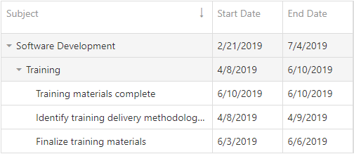
Multiple Mode. Hold Shift and click column headers to sort data by multiple columns. Subsequent clicks on the same header with the Shift key pressed reverse the column's sort order. Set the showSortIndexes option to true to show the column sort index in the header.
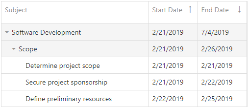
To disable sorting for a particular column, set the column’s allowSorting option to false.
To clear sorting for a column, hold Ctrl and click the column header. You can also use the column header’s context menu to specify the column’s sort settings and clear sorting. Use the ascendingText, descendingText, and the clearText options to specify text for the corresponding context menu items.
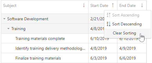
jQuery
$(function() {
$("#gantt").dxGantt({
sorting: {
mode: 'multiple',
showSortIndexes: true,
ascendingText: "Ascending Order",
descendingText: "Descending Order",
clearText: "Clear Sort"
}
});
}); Angular
<dx-gantt ... >
<dxo-gantt-sorting
mode="multiple"
[showSortIndexes]="true"
ascendingText="Ascending Order"
descendingText="Descending Order"
clearText="Clear Sort">
</dxo-gantt-sorting>
<!-- ... -->
</dx-gantt>
import { Component } from '@angular/core';
@Component({
selector: 'app-root',
templateUrl: './app.component.html',
styleUrls: ['./app.component.css']
})
export class AppComponent {
//...
}
import { BrowserModule } from '@angular/platform-browser';
import { NgModule } from '@angular/core';
import { AppComponent } from './app.component';
import { DxGanttModule } from 'devextreme-angular';
@NgModule({
imports: [
BrowserModule,
DxGanttModule
],
declarations: [AppComponent],
bootstrap: [AppComponent]
})
export class AppModule { }Vue
<template>
<DxGantt ... >
<DxSorting
mode="multiple"
:show-sort-indexes="true"
ascending-text="Ascending Order"
descending-text="Descending Order"
clear-text="Clear Sort" />
<!-- ... -->
</DxGantt>
</template>
<script>
import 'devextreme/dist/css/dx.fluent.blue.light.css';
import 'devexpress-gantt/dist/dx-gantt.css';
import {
DxGantt,
DxSorting,
// ...
} from 'devextreme-vue/gantt';
export default {
components: {
DxGantt,
DxSorting,
// ...
}
};
</script>React
import React from 'react';
import 'devextreme/dist/css/dx.fluent.blue.light.css';
import 'devexpress-gantt/dist/dx-gantt.css';
import Gantt, {
Sorting,
// ...
} from 'devextreme-react/gantt';
const App = () => {
return (
<Gantt ... >
<Sorting
mode="multiple"
showSortIndexes={true}
ascendingText="Ascending Order"
descendingText="Descending Order"
clearText="Clear Sort" />
{/* ... */}
</Gantt>
);
};
export default App;ASP.NET Core Controls
@(Html.DevExtreme().Gantt()
.Sorting(s => {
s.Mode(GridSortingMode.Multiple)
s.ShowSortIndexes(true)
s.AscendingText("Ascending Order")
s.DescendingText("Descending Order")
s.ClearText("Clear Sort")
})
// ...
)ASP.NET MVC Controls
@(Html.DevExtreme().Gantt()
.Sorting(s => {
s.Mode(GridSortingMode.Multiple)
s.ShowSortIndexes(true)
s.AscendingText("Ascending Order")
s.DescendingText("Descending Order")
s.ClearText("Clear Sort")
})
// ...
)startDateRange
Specifies the start date of the date interval in the Gantt chart.
jQuery
$(function() {
$("#gantt").dxGantt({
startDateRange: new Date(2018, 01, 1),
endDateRange: new Date(2020, 01, 1)
// ...
});
});Angular
<dx-gantt
[startDateRange]="startDateRange"
[endDateRange]="endDateRange">
<!-- ... -->
</dx-gantt>
import { Component } from '@angular/core';
@Component({
selector: 'app-root',
templateUrl: './app.component.html',
styleUrls: ['./app.component.css']
})
export class AppComponent {
startDateRange: Date;
endDateRange: Date;
constructor() {
startDateRange: new Date("2018/01/01");
endDateRange: new Date("2020/01/01");
}
}
import { BrowserModule } from '@angular/platform-browser';
import { NgModule } from '@angular/core';
import { AppComponent } from './app.component';
import { DxGanttModule } from 'devextreme-angular';
@NgModule({
imports: [
BrowserModule,
DxGanttModule
],
declarations: [AppComponent],
bootstrap: [AppComponent]
})
export class AppModule { }Vue
<template>
<DxGantt
:start-date-range="startDateRange"
:end-date-range="endDateRange">
<!-- ... -->
</DxGantt>
</template>
<script>
import 'devextreme/dist/css/dx.fluent.blue.light.css';
import 'devexpress-gantt/dist/dx-gantt.css';
import {
DxGantt
// ...
} from 'devextreme-vue/gantt';
export default {
components: {
DxGantt
// ...
},
data() {
return {
startDateRange: new Date(2018, 12, 1),
endDateRange: new Date(2020, 12, 1),
}
}
};
</script>React
import React from 'react';
import 'devextreme/dist/css/dx.fluent.blue.light.css';
import 'devexpress-gantt/dist/dx-gantt.css';
import Gantt, {
// ...
} from 'devextreme-react/gantt';
const App = () => {
const startDateRange = new Date(2018, 1, 1);
const endDateRange = new Date(2020, 1, 1);
return (
<Gantt
startDateRange = {startDateRange}
endDateRange = {endDateRange} >
{/* ... */}
</Gantt>
);
};
export default App;ASP.NET Core Controls
@(Html.DevExtreme().Gantt()
.StartDateRange(new Date("January 1, 2018"))
.EndDateRange(new Date("January 1, 2020"))
// ...
)ASP.NET MVC Controls
@(Html.DevExtreme().Gantt()
.StartDateRange(new Date("January 1, 2018"))
.EndDateRange(new Date("January 1, 2020"))
// ...
)See Also
stripLines[]
Configures strip lines.
Strip lines allows you to highlight certain time or time intervals in the chart. Use the start property to specify an individual line or combine it with the end property setting to specify a time interval.
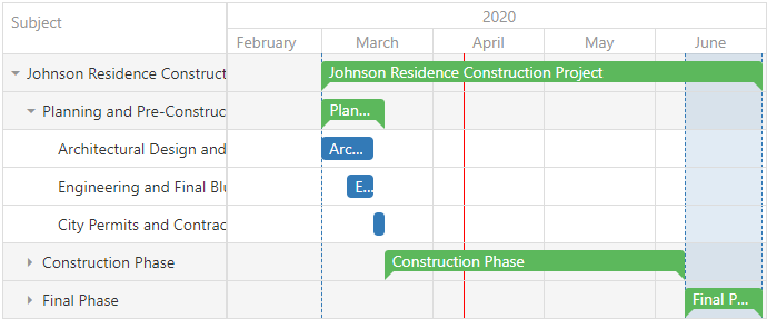
jQuery
$(function() {
$("#gantt").dxGantt({
stripLines: [{
title: "Start",
start: tasks[0].start
}, {
title: "Final Phase",
start: tasks[tasks.length - 3].start,
end: tasks[tasks.length - 1].end,
}, {
title: "Current Time",
start: new Date(),
cssClass: "current-time"
}],
//...
});
});Angular
<dx-gantt>
<dxi-gantt-strip-line
[start]="tasks[0].start"
title="Start">
</dxi-gantt-strip-line>
<dxi-gantt-strip-line
[start]="tasks[tasks.length - 3].start"
[end]="tasks[tasks.length - 1].end"
title="Final Phase">
</dxi-gantt-strip-line>
<dxi-gantt-strip-line
[start]="currentTime"
title="Current Time"
cssClass="current-time">
</dxi-gantt-strip-line>
</dx-gantt>
import { Component } from '@angular/core';
@Component({
selector: 'app-root',
templateUrl: './app.component.html',
styleUrls: ['./app.component.css']
})
export class AppComponent {
// ...
}
import { BrowserModule } from '@angular/platform-browser';
import { NgModule } from '@angular/core';
import { AppComponent } from './app.component';
import { DxGanttModule } from 'devextreme-angular';
@NgModule({
imports: [
BrowserModule,
DxGanttModule
],
declarations: [AppComponent],
bootstrap: [AppComponent]
})
export class AppModule { }Vue
<template>
<DxGantt >
<DxStripLine
:start="tasks[0].start"
title="Start"
/>
<DxStripLine
:start="tasks[tasks.length - 3].start"
:end="tasks[tasks.length - 1].end"
title="Final Phase"
/>
<DxStripLine
:start="currentTime"
title="Current Time"
css-class="current-time"
/>
<!-- ... -->
</DxGantt>
</template>
<script>
import 'devextreme/dist/css/dx.fluent.blue.light.css';
import 'devexpress-gantt/dist/dx-gantt.css';
import {
DxGantt, DxStripLine
// ...
} from 'devextreme-vue/gantt';
export default {
components: {
DxGantt, DxStripLine
// ...
}
};
</script>React
import React from 'react';
import 'devextreme/dist/css/dx.fluent.blue.light.css';
import 'devexpress-gantt/dist/dx-gantt.css';
import Gantt, {
// ...
} from 'devextreme-react/gantt';
const App = () => {
return (
<Gantt>
<StripLine start={tasks[0].start} title="Start" />
<StripLine start={tasks[tasks.length - 3].start} end={tasks[tasks.length - 1].end} title="Final Phase" />
<StripLine start={currentDate} title="Current Time" cssClass="current-time" />
{/* ... */}
</Gantt>
);
};
export default App;ASP.NET Core Controls
@(Html.DevExtreme().Gantt()
.StripLines(s => {
s.Add().Title("Start")
.Start(SampleData.GanttTasksJohnsonResidence.First().Start);
s.Add().Title("Final Phase")
.Start(SampleData.GanttTasksJohnsonResidence.Where(t => t.ID == 20).First().Start)
.End(SampleData.GanttTasksJohnsonResidence.Where(t => t.ID == 22).First().End);
s.Add().Title("Current Time")
.Start(DateTime.Now)
.CssClass("current-time");
})
// ...
)ASP.NET MVC Controls
@(Html.DevExtreme().Gantt()
.StripLines(s => {
s.Add().Title("Start")
.Start(SampleData.GanttTasksJohnsonResidence.First().Start);
s.Add().Title("Final Phase")
.Start(SampleData.GanttTasksJohnsonResidence.Where(t => t.ID == 20).First().Start)
.End(SampleData.GanttTasksJohnsonResidence.Where(t => t.ID == 22).First().End);
s.Add().Title("Current Time")
.Start(DateTime.Now)
.CssClass("current-time");
})
// ...
)tabIndex
Specifies the number of the element when the Tab key is used for navigating.
The value of this property will be passed to the tabindex attribute of the HTML element that underlies the UI component.
taskContentTemplate
Specifies custom content for the task.
| Name | Type | Description |
|---|---|---|
| cellSize |
The size of the cell that contains the task. |
|
| isMilestone |
Specifies whether the task is a milestone. |
|
| taskData |
The processed task. |
|
| taskHTML |
The default HTML element of the processed task. |
|
| taskPosition |
Task position. |
|
| taskResources |
Task resources. |
|
| taskSize |
Task size. |
To learn how to display current and planned tasks in the Gantt chart area with taskContentTemplate, refer to the following example:
jQuery
$(function() {
$("#gantt").dxGantt({
taskContentTemplate: getTaskContentTemplate,
// ...
});
});
function getTaskContentTemplate(item, container) {
var $customContainer = $(document.createElement("div"))
.addClass("custom-task")
.text(item.taskData.title)
.attr("style", "width:" + item.taskSize.width + "px");
return $customContainer;
}Angular
<dx-gantt taskContentTemplate="myTaskTemplate">
<div *dxTemplate="let data of 'myTaskTemplate'">
<div [style.width.px]="item.taskSize.width" class="custom-task">{{item.taskData.title}}</div>
<!-- ... -->
</div>
...
</dx-gantt>
import { Component } from '@angular/core';
@Component({
selector: 'app-root',
templateUrl: './app.component.html',
styleUrls: ['./app.component.css']
})
export class AppComponent {
// ...
}
import { BrowserModule } from '@angular/platform-browser';
import { NgModule } from '@angular/core';
import { AppComponent } from './app.component';
import { DxGanttModule } from 'devextreme-angular';
@NgModule({
imports: [
BrowserModule,
DxGanttModule
],
declarations: [AppComponent],
bootstrap: [AppComponent]
})
export class AppModule { }Vue
<template>
<DxGantt
:task-content-template="myTaskTemplate" >
<template #myTaskTemplate="{ data : item }">
<div [style.width.px]="item.taskSize.width" class="custom-task">{{item.taskData.title}}</div>
<!-- ... -->
</template>
</DxGantt>
</template>
<script>
import 'devextreme/dist/css/dx.fluent.blue.light.css';
import { DxGantt } from 'devextreme-vue/gantt';
export default {
components: {
DxGantt
},
methods: {
//...
},
data() {
return {
// ...
}
}
}
</script>React
import React from 'react';
import Gantt from 'devextreme-react/gantt';
import { Template } from 'devextreme-react/core/template';
const TaskTemplate = (item) => {
return (
<div className="custom-task" style={{width: item.taskSize.width + "px"}}>
<div className="custom-task-title">{item.taskData.title}</div>
</div>
);
}
export default function App() {
return (
<Gantt
taskContentRender={TaskTemplate}>
//...
</Gantt>
);
}
export default App;ASP.NET MVC
@(Html.DevExtreme().Gantt()
.TaskContentTemplate(new JS("getTaskContentTemplate"))
// ...
)
<script>
function getTaskContentTemplate(task, container) {
var $customContainer = $(document.createElement("div"))
.addClass("custom-task");
.text(item.Task.Title);
.attr("style", "width:" + item.TaskSize.Width + "px");
return $customContainer;
}
</script>taskListWidth
Specifies the width of task list columns in pixels.
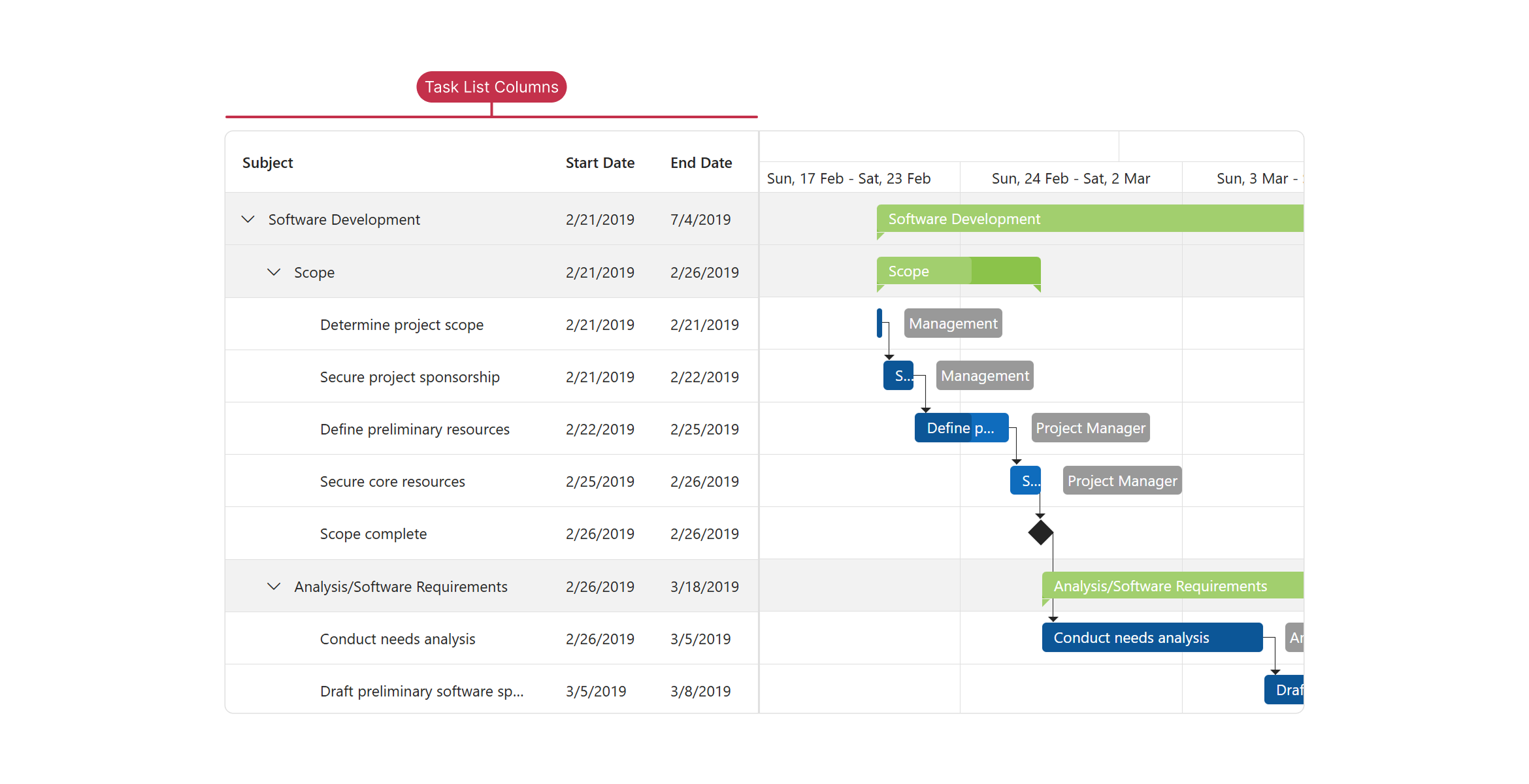
jQuery
$(function() {
$("#gantt").dxGantt({
taskListWidth: 200,
// ...
});
}); Angular
<dx-gantt
[taskListWidth]="200">
<!-- ... -->
</dx-gantt>
import { Component } from '@angular/core';
@Component({
selector: 'app-root',
templateUrl: './app.component.html',
styleUrls: ['./app.component.css']
})
export class AppComponent {
// ...
}
import { BrowserModule } from '@angular/platform-browser';
import { NgModule } from '@angular/core';
import { AppComponent } from './app.component';
import { DxGanttModule } from 'devextreme-angular';
@NgModule({
imports: [
BrowserModule,
DxGanttModule
],
declarations: [AppComponent],
bootstrap: [AppComponent]
})
export class AppModule { }Vue
<template>
<DxGantt
:task-list-width="200" >
<!-- ... -->
</DxGantt>
</template>
<script>
import 'devextreme/dist/css/dx.fluent.blue.light.css';
import 'devexpress-gantt/dist/dx-gantt.css';
import {
DxGantt
// ...
} from 'devextreme-vue/gantt';
export default {
components: {
DxGantt
// ...
}
};
</script>React
import React from 'react';
import 'devextreme/dist/css/dx.fluent.blue.light.css';
import 'devexpress-gantt/dist/dx-gantt.css';
import Gantt, {
// ...
} from 'devextreme-react/gantt';
const App = () => {
return (
<Gantt
taskListWidth={200} >
{/* ... */}
</Gantt>
);
};
export default App;ASP.NET Core Controls
@(Html.DevExtreme().Gantt()
.TaskListWidth(200)
// ...
)taskProgressTooltipContentTemplate
Specifies custom content for the tooltip that displays the task's progress while the progress handler is resized in the UI.
jQuery
$(function() {
$("#gantt").dxGantt({
taskProgressTooltipContentTemplate: getTaskProgressTooltipContentTemplate,
// ...
});
});
function getTaskProgressTooltipContentTemplate(item, container) {
var $customTooltipProgress = $(document.createElement("div"))
.addClass("custom-tooltip");
$(document.createElement("div"))
.addClass("custom-tooltip-progress")
.text("Progress: " + item.progress + "%")
.appendTo($customTooltipProgress);
// ...
return $customTooltipProgress;
}Angular
<dx-gantt taskProgressTooltipContentTemplate="myTaskProgressTooltipTemplate">
<div *dxTemplate="let item of 'myTaskProgressTooltipTemplate'" class="custom-tooltip">
<div class="custom-tooltip-progress">Progress: {{item.progress}}%</div>
<!-- ... -->
</div>
...
</dx-gantt>
import { Component } from '@angular/core';
@Component({
selector: 'app-root',
templateUrl: './app.component.html',
styleUrls: ['./app.component.css']
})
export class AppComponent {
// ...
}
import { BrowserModule } from '@angular/platform-browser';
import { NgModule } from '@angular/core';
import { AppComponent } from './app.component';
import { DxGanttModule } from 'devextreme-angular';
@NgModule({
imports: [
BrowserModule,
DxGanttModule
],
declarations: [AppComponent],
bootstrap: [AppComponent]
})
export class AppModule { }Vue
<template>
<DxGantt
:task-progress-tooltip-content-template="myTaskProgressTooltipTemplate" >
<template #myTaskProgressTooltipTemplate="{ data: item }">
<div class="custom-tooltip">
<div class="custom-tooltip-progress">Progress: {{ item.progress }}%</div>
<!-- ... -->
</div>
</template>
</DxGantt>
</template>
<script>
import 'devextreme/dist/css/dx.fluent.blue.light.css';
import { DxGantt } from 'devextreme-vue/gantt';
export default {
components: {
DxGantt
},
methods: {
//...
},
data() {
return {
// ...
}
}
}
</script>React
import React from 'react';
import Gantt from 'devextreme-react/gantt';
import { Template } from 'devextreme-react/core/template';
const TaskProgressTooltipTemplate = (item) => {
return (
<div className="custom-tooltip">
<div className="custom-tooltip-progress">Progress: {item.progress}%</div>
<!-- ... -->
</div>
);
}
export default function App() {
return (
<Gantt
taskProgressTooltipContentRender={TaskProgressTooltipTemplate}>
//...
</Gantt>
);
}
export default App;ASP.NET Core Controls
@(Html.DevExtreme().Gantt()
.TaskProgressTooltipContentTemplate(new JS("getTaskProgressTooltipContentTemplate"))
// ...
)
<script>
function getTaskProgressTooltipContentTemplate(item, container) {
var $customTooltipProgress = $(document.createElement("div"))
.addClass("custom-tooltip");
$(document.createElement("div"))
.addClass("custom-tooltip-progress")
.text("Progress: " + item.progress + "%")
.appendTo($customTooltipProgress);
// ...
return $customTooltipProgress;
}
</script>tasks
Configures tasks.

Use the dataSource property to bind the UI component to a data source, which contains tasks. If the field names in your data source differ from default names ('id', 'parentId', 'title', 'start', 'end', 'progress', 'color'), use appropriate properties (keyExpr, parentIdExpr, etc.) to map data fields.
The 'color' field accepts the following values:
- Hexadecimal colors
- RGB colors
- RGBA colors
- Predefined/cross-browser color names
- Predefined SVG colors
- Paint server address
jQuery
$(function() {
$("#gantt").dxGantt({
tasks: {
dataSource: tasks,
keyExpr: "taskId",
parentIdExpr: "parentTaskId",
titleExpr: "taskTitle",
progressExpr: "taskProgress",
startExpr: "startDate",
endExpr: "endDate",
colorExpr: "taskColor"
},
//...
});
});
var tasks = [{
'taskId': 1,
'parentTaskId': 0,
'taskTitle': 'Software Development',
'startDate': new Date('2019-02-21T05:00:00.000Z'),
'endDate': new Date('2019-07-04T12:00:00.000Z'),
'taskProgress': 31
'taskColor': 'red'
},
// ...
];Angular
<dx-gantt ... >
<dxo-gantt-tasks
[dataSource]="tasks"
keyExpr="taskId"
parentIdExpr="parentTaskId"
titleExpr="taskTitle"
progressExpr="taskProgress"
startExpr="startDate"
endExpr="endDate"
colorExpr="taskColor" >
</dxo-gantt-tasks>
<!-- ... -->
</dx-gantt>
import { Component } from '@angular/core';
@Component({
selector: 'app-root',
templateUrl: './app.component.html',
styleUrls: ['./app.component.css']
})
export class AppComponent {
tasks: Task[];
// ...
constructor(service: Service) {
this.tasks = service.getTasks();
// ...
}
}
import { BrowserModule } from '@angular/platform-browser';
import { NgModule } from '@angular/core';
import { AppComponent } from './app.component';
import { DxGanttModule } from 'devextreme-angular';
import { Service, Task, ... } from './app.service';
@NgModule({
imports: [
BrowserModule,
DxGanttModule
],
providers: [Service],
declarations: [AppComponent],
bootstrap: [AppComponent]
})
export class AppModule { }
import { Injectable } from '@angular/core';
export class Task {
taskId: number;
parentTaskId: number;
taskTitle: string;
startDate: Date;
endDate: Date;
taskProgress: number;
taskColor: string;
}
const tasks: Task[] = [{
'taskId': 1,
'parentTaskId': 0,
'taskTitle': 'Software Development',
'startDate': new Date('2019-02-21T05:00:00.000Z'),
'endDate': new Date('2019-07-04T12:00:00.000Z'),
'taskProgress': 31,
'taskColor': 'red'
},
// ...
];
@Injectable()
export class Service {
getTasks(): Task[] {
return tasks;
}
}
{
"projects": {
"ProjectName": {
"architect": {
"build": {
"options": {
"styles": [
"node_modules/devextreme/dist/css/dx.light.css",
"node_modules/devexpress-gantt/dist/dx-gantt.css",
"src/styles.css"
],
...
},
...
},
...
}
},
...
},
...
}Vue
<template>
<DxGantt ... >
<DxTasks
:data-source="tasks"
key-expr="taskId"
parent-id-expr="parentTaskId"
title-expr="taskTitle"
progress-expr="taskProgress"
start-expr="startDate"
end-expr="endDate"
color-expr="taskColor" />
<!-- ... -->
</DxGantt>
</template>
<script>
import 'devextreme/dist/css/dx.fluent.blue.light.css';
import 'devexpress-gantt/dist/dx-gantt.css';
import {
DxGantt,
DxTasks,
// ...
} from 'devextreme-vue/gantt';
import {
tasks,
// ...
} from './data.js';
export default {
components: {
DxGantt,
DxTasks,
// ...
},
data() {
return {
tasks,
// ...
};
}
};
</script>
export const tasks = [{
'taskId': 1,
'parentTaskId': 0,
'taskTitle': 'Software Development',
'startDate': new Date('2019-02-21T05:00:00.000Z'),
'endDate': new Date('2019-07-04T12:00:00.000Z'),
'taskProgress': 31,
'taskColor': 'red'
},
// ...
]; React
import React from 'react';
import 'devextreme/dist/css/dx.fluent.blue.light.css';
import 'devexpress-gantt/dist/dx-gantt.css';
import Gantt, {
Tasks,
// ...
} from 'devextreme-react/gantt';
import {
tasks,
// ...
} from './data.js';
const App = () => {
return (
<Gantt ... >
<Tasks
dataSource={tasks}
keyExpr="taskId"
parentIdExpr="parentTaskId"
titleExpr="taskTitle"
progressExpr="taskProgress"
startExpr="startDate"
endExpr="endDate"
colorExpr="taskColor" />
{/* ... */}
</Gantt>
);
};
export default App;
export const tasks = [{
'taskId': 1,
'parentTaskId': 0,
'taskTitle': 'Software Development',
'startDate': new Date('2019-02-21T05:00:00.000Z'),
'endDate': new Date('2019-07-04T12:00:00.000Z'),
'taskProgress': 31,
'taskColor': 'red'
},
// ...
];ASP.NET Core Controls
@(Html.DevExtreme().Gantt<Gantt.Task>()
.Tasks(t => t
.DataSource(ds => ds.Array().Data(SampleData.GanttTasks).Key("ID"))
.KeyExpr("ID")
.TitleExpr("Title")
.ParentIdExpr("ParentId")
.StartExpr("Start")
.EndExpr("End")
.ProgressExpr("Progress")
)
// ...
)
<!-- C# -->
public partial class SampleData {
public static readonly IEnumerable<Task> GanttTasks = new[] {
new Task {
ID = 1,
ParentId = 0,
Title = "Software Development",
Start = DateTime.Parse("2019-02-21T05:00:00.000Z"),
End = DateTime.Parse("2019-07-04T12:00:00.000Z"),
Progress = 31
},
// ...
}
// ...
}ASP.NET MVC Controls
@(Html.DevExtreme().Gantt<Gantt.Task>()
.Tasks(t => t
.DataSource(ds => ds.Array().Data(SampleData.GanttTasks).Key("ID"))
.KeyExpr("ID")
.TitleExpr("Title")
.ParentIdExpr("ParentId")
.StartExpr("Start")
.EndExpr("End")
.ProgressExpr("Progress")
)
// ...
)
<!-- C# -->
public partial class SampleData {
public static readonly IEnumerable<Task> GanttTasks = new[] {
new Task {
ID = 1,
ParentId = 0,
Title = "Software Development",
Start = DateTime.Parse("2019-02-21T05:00:00.000Z"),
End = DateTime.Parse("2019-07-04T12:00:00.000Z"),
Progress = 31
},
// ...
}
// ...
}See Also
taskTimeTooltipContentTemplate
Specifies custom content for the tooltip that displays the task's start and end time while the task is resized in the UI.
jQuery
$(function() {
$("#gantt").dxGantt({
taskTimeTooltipContentTemplate: getTaskTimeTooltipContentTemplate,
// ...
});
});
function getTaskTimeTooltipContentTemplate(item, container) {
var $customTooltipTime = $(document.createElement("div"))
.addClass("custom-tooltip");
$(document.createElement("div"))
.addClass("custom-tooltip-time")
.text("End Date: " + item.end)
.appendTo($customTooltipTime);
// ...
return $customTooltipTime;
}Angular
<dx-gantt taskTimeTooltipContentTemplate="myTaskTimeTooltipTemplate">
<div *dxTemplate="let item of 'myTaskTimeTooltipTemplate'" class="custom-tooltip">
<div class="custom-tooltip-time">End Date: {{item.end}}</div>
<!-- ... -->
</div>
...
</dx-gantt>
import { Component } from '@angular/core';
@Component({
selector: 'app-root',
templateUrl: './app.component.html',
styleUrls: ['./app.component.css']
})
export class AppComponent {
// ...
}
import { BrowserModule } from '@angular/platform-browser';
import { NgModule } from '@angular/core';
import { AppComponent } from './app.component';
import { DxGanttModule } from 'devextreme-angular';
@NgModule({
imports: [
BrowserModule,
DxGanttModule
],
declarations: [AppComponent],
bootstrap: [AppComponent]
})
export class AppModule { }Vue
<template>
<DxGantt
:task-time-tooltip-content-template="myTaskTimeTooltipTemplate" >
<template #myTaskTimeTooltipTemplate="{ data: item }">
<div class="custom-tooltip">
<div class="custom-tooltip-time">End Date: {{item.end}}</div>
<!-- ... -->
</div>
</template>
</DxGantt>
</template>
<script>
import 'devextreme/dist/css/dx.fluent.blue.light.css';
import { DxGantt } from 'devextreme-vue/gantt';
export default {
components: {
DxGantt
},
methods: {
//...
},
data() {
return {
// ...
}
}
}
</script>React
import React from 'react';
import Gantt from 'devextreme-react/gantt';
import { Template } from 'devextreme-react/core/template';
const TaskTimeTooltipTemplate = (item) => {
return (
<div className="custom-tooltip">
<div className="custom-tooltip-time">End Date: {item.end}</div>
<!-- ... -->
</div>
);
}
export default function App() {
return (
<Gantt
taskTimeTooltipContentRender={TaskTimeTooltipTemplate}>
//...
</Gantt>
);
}
export default App;ASP.NET Core Controls
@(Html.DevExtreme().Gantt()
.TaskTimeTooltipContentTemplate(new JS("getTaskTimeTooltipContentTemplate"))
// ...
)
<script>
function getTaskTimeTooltipContentTemplate(item, container) {
var $customTooltipTime = $(document.createElement("div"))
.addClass("custom-tooltip");
$(document.createElement("div"))
.addClass("custom-tooltip-time")
.text("End Date: " + item.end)
.appendTo($customTooltipTime);
// ...
return $customTooltipTime;
}
</script>taskTitlePosition
Specifies a task's title position.
Titles can be displayed "inside" or "outside" the the task. Set the position to "none" to hide the title.
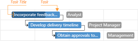
jQuery
$(function() {
$("#gantt").dxGantt({
taskTitlePosition: 'none',
// ...
});
}); Angular
<dx-gantt
[taskTitlePosition]="none">
<!-- ... -->
</dx-gantt>
import { Component } from '@angular/core';
@Component({
selector: 'app-root',
templateUrl: './app.component.html',
styleUrls: ['./app.component.css']
})
export class AppComponent {
// ...
}
import { BrowserModule } from '@angular/platform-browser';
import { NgModule } from '@angular/core';
import { AppComponent } from './app.component';
import { DxGanttModule } from 'devextreme-angular';
@NgModule({
imports: [
BrowserModule,
DxGanttModule
],
declarations: [AppComponent],
bootstrap: [AppComponent]
})
export class AppModule { }Vue
<template>
<DxGantt
:task-title-position="none" >
<!-- ... -->
</DxGantt>
</template>
<script>
import 'devextreme/dist/css/dx.fluent.blue.light.css';
import 'devexpress-gantt/dist/dx-gantt.css';
import {
DxGantt
// ...
} from 'devextreme-vue/gantt';
export default {
components: {
DxGantt
// ...
}
};
</script>React
import React from 'react';
import 'devextreme/dist/css/dx.fluent.blue.light.css';
import 'devexpress-gantt/dist/dx-gantt.css';
import Gantt, {
// ...
} from 'devextreme-react/gantt';
const App = () => {
return (
<Gantt
taskTitlePosition="none" >
{/* ... */}
</Gantt>
);
};
export default App;ASP.NET Core Controls
@(Html.DevExtreme().Gantt()
.TaskTitlePosition(GanttTaskTitlePosition.None)
// ...
)taskTooltipContentTemplate
Specifies custom content for the task tooltip.
The task tooltip's container. It is an HTML Element or a jQuery Element when you use jQuery.
jQuery
Note that the container parameter contains the content of the default tooltip. You should clear the container parameter to specify custom content for the task tooltip.
$(function() {
$("#gantt").dxGantt({
taskTooltipContentTemplate: getTaskTooltipContentTemplate,
// ...
});
});
function getTaskTooltipContentTemplate(task, container) {
var $customTooltip = $(document.createElement("div"))
.addClass("custom-task-edit-tooltip");
$(document.createElement("div"))
.addClass("custom-tooltip-title")
.text(task.title)
.appendTo($customTooltip);
// ...
return $customTooltip;
}Angular
<dx-gantt taskTooltipContentTemplate="myTaskTooltipTemplate">
<div *dxTemplate="let task of 'myTaskTooltipTemplate'" class="custom-task-edit-tooltip">
<div class="custom-tooltip-title">{{task.title}}</div>
<!-- ... -->
</div>
...
</dx-gantt>
import { Component } from '@angular/core';
@Component({
selector: 'app-root',
templateUrl: './app.component.html',
styleUrls: ['./app.component.css']
})
export class AppComponent {
// ...
}
import { BrowserModule } from '@angular/platform-browser';
import { NgModule } from '@angular/core';
import { AppComponent } from './app.component';
import { DxGanttModule } from 'devextreme-angular';
@NgModule({
imports: [
BrowserModule,
DxGanttModule
],
declarations: [AppComponent],
bootstrap: [AppComponent]
})
export class AppModule { }Vue
<template>
<DxGantt
:task-tooltip-content-template="myTooltipContentTemplate" >
<template #myTooltipContentTemplate="{ data: task }">
<div class="custom-task-edit-tooltip">
<div class="custom-tooltip-title">{{ task.title }}</div>
<!-- ... -->
</div>
</template>
</DxGantt>
</template>
<script>
import 'devextreme/dist/css/dx.fluent.blue.light.css';
import { DxGantt } from 'devextreme-vue/gantt';
export default {
components: {
DxGantt
},
methods: {
//...
},
data() {
return {
// ...
}
}
}
</script>React
import React from 'react';
import Gantt from 'devextreme-react/gantt';
import { Template } from 'devextreme-react/core/template';
const TaskTooltipTemplate = (task) => {
return (
<div class="custom-task-edit-tooltip">
<div class="custom-tooltip-title">{{ task.title }}</div>
<!-- ... -->
</div>
);
}
export default function App() {
return (
<Gantt
taskTooltipContentRender={TaskTooltipTemplate}>
//...
</Gantt>
);
}
export default App;ASP.NET Core Controls
@(Html.DevExtreme().Gantt()
.TaskTooltipContentTemplate(new JS("getTaskTooltipContentTemplate"))
// ...
)
<script>
function getTaskTooltipContentTemplate(task, container) {
var $customTooltip = $(document.createElement("div"))
.addClass("custom-task-edit-tooltip");
$(document.createElement("div"))
.addClass("custom-tooltip-title")
.text(task.Title)
.appendTo($customTooltip);
// ...
return $customTooltip;
}
</script>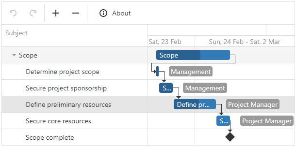
validation
Configures validation properties.
jQuery
$(function() {
$("#gantt").dxGantt({
validation: {
autoUpdateParentTasks: true,
validateDependencies: true
},
// ...
});
});Angular
<dx-gantt ... >
<dxo-gantt-validation
[autoUpdateParentTasks]="true"
[validateDependencies]="true">
</dxo-gantt-validation>
<!-- ... -->
</dx-gantt>
import { Component } from '@angular/core';
@Component({
selector: 'app-root',
templateUrl: './app.component.html',
styleUrls: ['./app.component.css']
})
export class AppComponent {
// ...
}
import { BrowserModule } from '@angular/platform-browser';
import { NgModule } from '@angular/core';
import { AppComponent } from './app.component';
import { DxGanttModule } from 'devextreme-angular';
@NgModule({
imports: [
BrowserModule,
DxGanttModule
],
declarations: [AppComponent],
bootstrap: [AppComponent]
})
export class AppModule { }Vue
<template>
<DxGantt ... >
<DxValidation
:auto-update-parent-tasks="true"
:validate-dependencies="true"
/>
<!-- ... -->
</DxGantt>
</template>
<script>
import 'devextreme/dist/css/dx.fluent.blue.light.css';
import 'devexpress-gantt/dist/dx-gantt.css';
import {
DxGantt,
DxValidation,
// ...
} from 'devextreme-vue/gantt';
export default {
components: {
DxGantt,
DxValidation,
// ...
}
};
</script>React
import React from 'react';
import 'devextreme/dist/css/dx.fluent.blue.light.css';
import 'devexpress-gantt/dist/dx-gantt.css';
import Gantt, {
Validation,
// ...
} from 'devextreme-react/gantt';
const App = () => {
return (
<Gantt ... >
<Validation
autoUpdateParentTasks={true}
validateDependencies={true} />
{/* ... */}
</Gantt>
);
};
export default App;ASP.NET Core Controls
@(Html.DevExtreme().Gantt()
.Validation(e => {
e.AutoUpdateParentTasks(true)
e.ValidateDependencies(true)
})
// ...
)ASP.NET MVC Controls
@(Html.DevExtreme().Gantt()
.Validation(e => {
e.AutoUpdateParentTasks(true)
e.ValidateDependencies(true)
})
// ...
)
 Select one or more answers