JavaScript/jQuery DropDownBox - Overview
jQuery
DevExtreme DropDownBox is an advanced editor that supports in-depth customization. The component consists of a text field and a drop-down area. The drop-down area can contain custom markup, including other DevExtreme components.
Angular
DevExtreme DropDownBox is an advanced editor that supports in-depth customization. The component consists of a text field and a drop-down area. The drop-down area can contain custom markup, including other DevExtreme components.
Vue
DevExtreme DropDownBox is an advanced editor that supports in-depth customization. The component consists of a text field and a drop-down area. The drop-down area can contain custom markup, including other DevExtreme components.
React
DevExtreme DropDownBox is an advanced editor that supports in-depth customization. The component consists of a text field and a drop-down area. The drop-down area can contain custom markup, including other DevExtreme components.
This overview highlights DropDownBox elements, key features, and what to explore next.
Elements
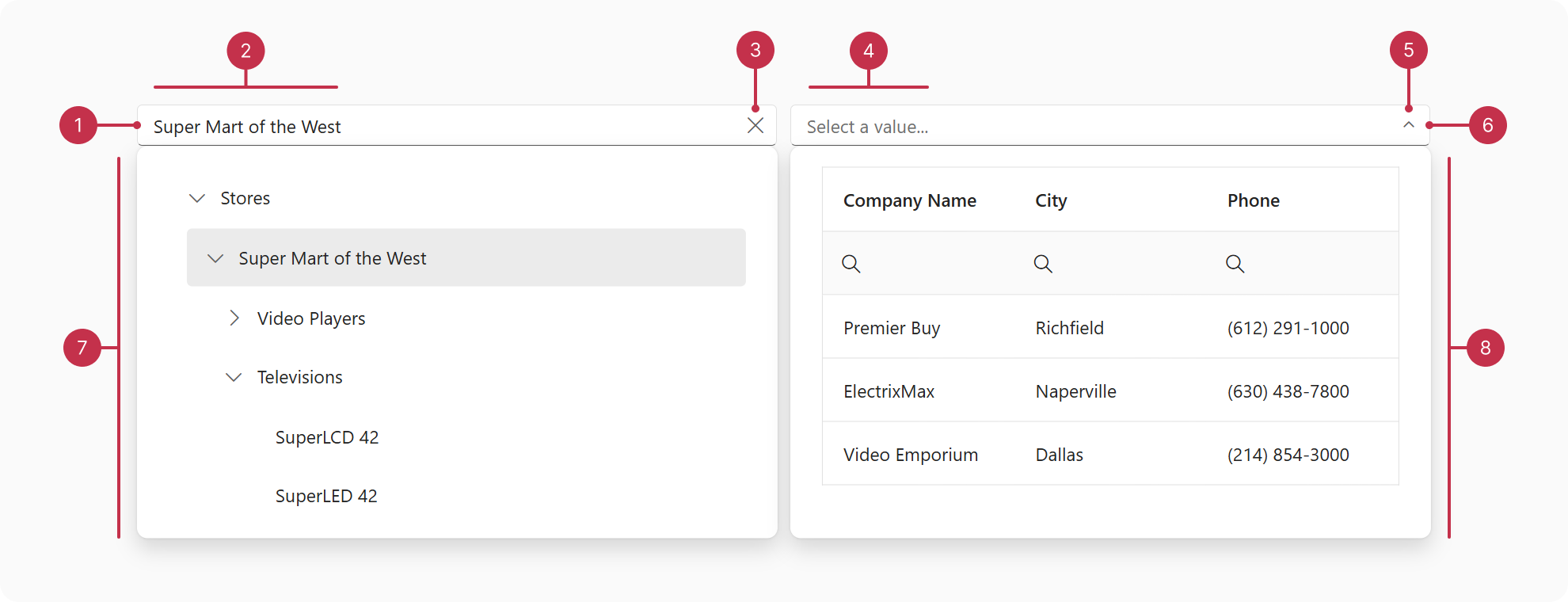
- Text Field
- Value
- Clear Button
- Placeholder
- Dropdown Button
- Text Field
- Dropdown Content - TreeView
- Dropdown Content - DataGrid
Key Features
Embed DevExtreme Components
You can embed any DevExtreme component within the DropDownBox. To display data, we recommend the DevExtreme DataGrid, TreeView, and CardView components.Synchronize with Embedded Component
To synchronize DropDownBox with its embedded component, refer to the following tutorial: Synchronize with the Embedded ElementSelection
You can configure DropDownBox selection to display single or multiple values.Validation
DropDownBox ships with data validation capabilities. You can implement custom logic to validate the component value and display a validation status to users.Text Field Customization
You can specify a text field label and placeholder, as well as configure custom or predefined buttons (clear and drop-down). To implement further customizations, you can specify text field addons.Accessibility and Keyboard Navigation
DropDownBox conforms to WCAG 2.x, European Accessibility Act (EAA), and Americans with Disabilities Act (ADA) standards. The component supports keyboard navigation and custom key handlers. DropDownBox also ships with right-to-left (RTL) representation support.
If you have technical questions, please create a support ticket in the DevExpress Support Center.