Angular TreeList - loadPanel

Configures the load panel.

Type:

Object

The load panel is displayed while the widget loads data. It consists of a loading indicator and text, both placed on a pane.
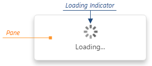
DevExtreme HTML5 JavaScript jQuery Angular Knockout Widget DataGrid TreeList LoadPanel

Since the load panel is, in fact, the DevExtreme LoadPanel widget, the loadPanel object can contain any options of this widget along with options described here.

See Also

enabled

Enables displaying the load panel automatically.

Type:

String

|

Boolean

Default Value: 'auto'
Accepted Values: 'auto' | true | false

Displaying the load panel is enabled for remote data and disabled for local data by default. Set this option to true to always enable displaying or false to never show the load panel.

height

Specifies the height of the load panel in pixels.

Type:

Number

Default Value: 90

indicatorSrc

Specifies a URL pointing to an image to be used as a loading indicator.

Type:

String

Default Value: ''

showIndicator

Specifies whether to show the loading indicator.

Type:

Boolean

Default Value: true

showPane

Specifies whether to show the pane of the load panel.

Type:

Boolean

Default Value: true

text

Specifies text displayed on the load panel.

Type:

String

Default Value: 'Loading...'

width

Specifies the width of the load panel in pixels.

Type:

Number

Default Value: 200