DevExtreme jQuery/JS - Visual Elements
This guide gives a detailed overview of PivotGrid visual elements. Each topic in this guide contains a brief description of an element and its main features, which can be configured.
Below is a pivot grid element map. It may be helpful as you begin learning the capabilities of the PivotGrid widget. Hover over an element on the map to discover the name of this element. A click on an element navigates you to a topic devoted to this element.

Headers
Headers are used to annotate numeric values in the widget. There are three headers in PivotGrid: row, column and data. The row and column headers occupy the row and column area correspondingly and are always present. The data header may be located either in the row or column area depending on the value of the dataFieldArea option.
var pivotGridOptions = {
    // ...
    dataFieldArea: 'column' // 'row'
};
The data header appears only if there are several data fields in the pivot grid. In the image below, the data header belongs to the column area.

Headers depend on field configuration. The values of those fields whose area property equals to 'row' or 'column' appear in the corresponding header. Fields that have the area property set to 'data' slightly differ. These fields provide not their values, but captions to the data header as their values are used to calculate summary values.
If items in the row header represent a hierarchical structure, they can have two different layouts. By default, each child item adjoins its parent item thus forming a line. This layout occupies a significant amount of space, which may be limited. In that case, use a more compact tree layout. To specify the layout for row header items, use the rowHeaderLayout option.
var pivotGridOptions = {
    // ...
    rowHeaderLayout: 'tree' // 'standard'
};
When the user right-clicks a header, a context menu appears. There is a number of options related to that context menu.
- allowExpandAll — allows the user to expand/collapse all header items within a header level;
- allowFiltering — allows the user to change filtering options;
- allowSorting — allows the user to change sorting options;
- allowSortingBySummary — allows the user to sort columns by summary values.
Summary Values
Summary values are numbers, displayed in grid cells. In OLAP terminology, fields that are put to the data area are called measures and a single record (usually representing a business transaction) is called fact. Summary (measure) value is calculated by the aggregation of field values from a number of facts taken from the data source. The set of facts to be aggregated is different for each pivot grid cell and depends on three dimensional areas (row, column and filter). The aggregation method is configured using the summaryType option.
There is a number of options related to the display format that can be configured:
- format — specifies a display format for field values;
- customizeText — allows you to customize the text to be displayed in the cells of a field.
Totals
Total and Grand Total rows and columns are used to display summary values calculated in more general conditions than the conditions defined by the pivot grid's state. Each total row/column aggregates data of several pivot grid rows/columns in accordance with the summary type.

Total Rows or Columns
Total Rows and Total Columns display sub-totals calculated for outer row/column fields. For example, if you expand the UK group, you will see the rows characterizing cities and also a UK Total row. This row is equal to the collapsed UK row.
Total rows can be enabled or disabled with the showColumnTotals option, and total columns — the showRowTotals option. You can also change the location of total rows or columns using the showTotalsPrior option.
Grand Total Row and Column
Grand Total Rows and Grand Total Columns aggregate data of the entire pivot grid. They show values summarized across all available data.
You can enable or disable the Grand Total Row with the showColumnGrandTotals option, and Grand Total Column — the showRowGrandTotals option.
Field Chooser
The Field Chooser is a complementary widget integrated in the pivot grid that allows you to manage the displayed data. To invoke the Field Chooser, right-click the row or column header, and choose the "Show Field Chooser" option. Also, the Field Chooser can be invoked by clicking the top-left empty area of the pivot grid.

To configure the Field Chooser, use the fieldChooser object. It has a number of options, which can be specified:
- enabled — enables or disables the Field Chooser;
- layout — specifies the field chooser layout;
- width, height — specifies the field chooser size;
- title — specifies the text to display as a title of the Field Chooser popup window.
Although the Field Chooser is already integrated in PivotGrid and can be invoked using the context menu, you can add it as a separate widget on your page. In this case, the Field Chooser will be displayed continuously and will not overlay the pivot grid.
Field Management
By default, all fields from a data source object are visible in the "All Fields" section of the Field Chooser. To hide a specific field, assign false to its visible property.
var pivotGridOptions = {
    // ...
    dataSource: {
        // ...
        fields: [{
            dataField: 'ID',
            visible: false // hides this field in the Field Chooser
        }, {
            // ...
        }]
    }
};
Using the Field Chooser, the end-user moves fields between areas with no restrictions by default. Occasionally, you may need to specify the area to which a field must belong. For example, the field that provides data for summary should not be placed anywhere except the data area. For such a field, set the isMeasure option to true.
var pivotGridOptions = {
    // ...
    dataSource: {
        // ...
        fields: [{
            // ...
            dataField: 'Amount',
            area: 'data',
            summaryType: 'count',
            isMeasure: true // allows the end-user to place this field to the data area only
        }, {
            // ...
        }]
    }
};
And the reverse can be done if you need to restrict a field from being placed to the data area by setting its isMeasure option to false.
var pivotGridOptions = {
    // ...
    dataSource: {
        // ...
        fields: [{
            // ...
            dataField: 'Region',
            area: 'row',
            isMeasure: false // disallows the end-user to place this field to the data area
        }, {
            // ...
        }]
    }
};
Foldering
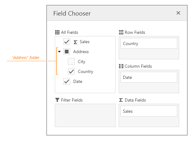
The Field Chooser allows you to organize fields from the "All Fields" section in folders. To display a field in a folder, set the field's displayFolder option to the folder name. The following code displays "Country" and "City" fields in an "Address" folder.
var pivotGridOptions = {
    // ...
    dataSource: {
        // ...
        fields: [{
            // ...
            dataField: 'Country',
            displayFolder: 'Address'
        }, {
            // ...
            dataField: 'City',
            displayFolder: 'Address'
        }, {
            // ...
        }]
    }
};
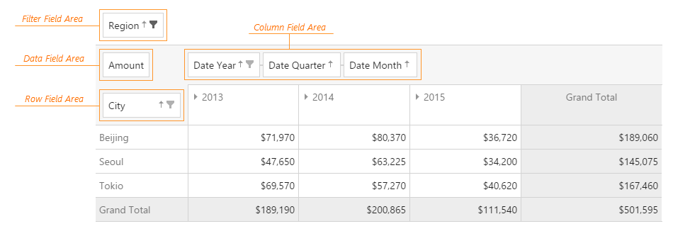
Field Panel
The Field Panel is a component that displays the fields involved in calculation of grid summaries. It consists of four field areas: column, row, data and filter. Each area holds fields of the corresponding type.
By default, the whole Field Panel is hidden. To make it visible, assign true to the visible property of the fieldPanel object.
var pivotGridOptions = {
    // ...
    fieldPanel: {
        // ...
        visible: true // shows the Field Panel
    }
};
If the Field Panel is made visible, all field areas become visible as well. To hide an individual field area, assign false to the dedicated option.
var pivotGridOptions = {
    // ...
    fieldPanel: {
        // ...
        showColumnFields: false, // hides the column field area
        showRowFields: false, // hides the row field area
        showDataFields: false, // hides the data field area
        showFilterFields: false // hides the filter field area
    }
};
The Field Panel partially covers the functionality provided by the Field Chooser. For example, the user can reorder fields within a single field area or even between them. If this capability is not required, assign false to the fieldPanel.allowFieldDragging property.
var pivotGridOptions = {
    // ...
    fieldPanel: {
        // ...
        allowFieldDragging: false // makes all fields on the Field Panel undraggable
    }
};
Moreover, if the allowSorting and allowFiltering options are true, the user can apply sorting and filtering to fields directly from the Field Panel.
Functional similarities of the Field Panel and the Field Chooser allow them to work in conjunction. When the fields of the Field Panel are draggable, and the Field Chooser is invoked, the user can move the fields not only within these components, but between them as well.
When empty, each field area of the Field Panel displays an individual placeholder. If you need to change it, use the properties of the fieldPanel.texts object.

 Select one or more answers