JavaScript/jQuery ButtonGroup - items
Configures buttons in the group.
The items array can contain:
- Objects with fields described in this section
- Objects with any other fields. In this case, specify the buttonTemplate.
If you need to update the UI component items, reassign the entire items[] array as shown in the following example:
buttonGroupInstance.option('items', newItems);See Also
component
An alias for the template property specified in React. Accepts a custom component. Refer to Using a Custom Component for more information.
disabled
Specifies whether the UI component item responds to user interaction.
hint
Specifies a text for the hint that appears when the button is hovered over or long-pressed.
icon
Specifies the icon to be displayed on the button.
This property accepts one of the following:
- The icon's URL
- The icon's name if the icon is from the DevExtreme icon library
- The icon's CSS class if the icon is from an external icon library (see External Icon Libraries)
- The icon in the Base64 format
- The icon in the SVG format. Ensure that the source is reliable.
render
An alias for the template property specified in React. Accepts a rendering function. Refer to Using a Rendering Function for more information.
template
Specifies a template that should be used to render this item only.
The following types of the specified value are available.
- Assign a string containing the name of the required template.
- Assign a jQuery object of the template's container.
- Assign a DOM Node of the template's container.
- Assign a function that returns the jQuery object or a DOM Node of the template's container.
See Also
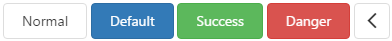
type
Specifies the button type.

 Select one or more answers