Box
Row
Map
Vue
A newer version of this page is available. Switch to the current version.

jQuery DataGrid - pager

Configures the pager.

Type:

Object

The pager is an element that allows users to navigate through pages and change their size at runtime. The pager consists of the page navigator and several optional elements: the page size selector, navigation buttons, and page information.
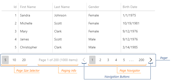
DevExtreme HTML5 JavaScript jQuery Angular Knockout UI component DataGrid Pager

DataGrid Demo TreeList Demo

See Also

allowedPageSizes

Specifies the available page sizes in the page size selector.

Type:

Array<Number>

|

String

Default Value: 'auto'
Accepted Values: 'auto'

The UI component determines the allowed page sizes depending on the amount of data by default.

DataGrid Demo TreeList Demo

infoText

Specifies the page information text.

Type:

String

Default Value: 'Page {0} of {1} ({2} items)'

You can use the following position markers in this text:

  • {0} - shows the current page number.
  • {1} - shows the total page count.
  • {2} - shows the total row count.
See Also

showInfo

Specifies whether to show the page information.

Type:

Boolean

Default Value: false

showNavigationButtons

Specifies whether to show navigation buttons.

Type:

Boolean

Default Value: false

showPageSizeSelector

Specifies whether to show the page size selector.

Type:

Boolean

Default Value: false

visible

Specifies whether the pager is visible.

Type:

Boolean

|

String

Default Value: 'auto'
Accepted Values: 'auto'

The pager is visible if paging is enabled and the total row count is greater than the pageSize property.

DataGrid Demo TreeList Demo