JavaScript/jQuery TreeList Options
An object defining configuration properties for the TreeList UI component.
accessKey
Specifies the shortcut key that sets focus on the UI component.
The value of this property will be passed to the accesskey attribute of the HTML element that underlies the UI component.
activeStateEnabled
Specifies whether or not the UI component changes its state when interacting with a user.
This property is used when the UI component is displayed on a platform whose guidelines include the active state change for UI components.
allowColumnReordering
Specifies whether a user can reorder columns.
Initially, columns appear in the order specified by the columns array. If you skip specifying this array, columns will mirror the order of fields in the first object from the dataSource. You can allow a user to reorder columns at runtime by setting the allowColumnReordering property to true.
See Also
- columns[].allowReordering
allowColumnResizing
Specifies whether a user can resize columns.
By default, the width of each column depends on the width of the UI component and the total number of columns. You can allow a user to resize the columns at runtime by setting the allowColumnResizing property to true.
See Also
- columnResizingMode
- columns[].allowResizing
- columns[].width
autoNavigateToFocusedRow
Automatically scrolls to the focused row when the focusedRowKey is changed.
cacheEnabled
Specifies whether data should be cached.
When this property is set to true, data loaded once is saved in cache. Then, the UI component takes data from this cache when performing such operations as sorting, grouping, paging, etc. Caching is helpful when the data source takes significant time to load, but consider disabling it for frequently changing data sources.
To update data in cache, call the refresh() method of the UI component or the load() method of the DataSource.
See Also
cellHintEnabled
Enables a hint that appears when a user hovers the mouse pointer over a cell with truncated content.
The cell's content may be truncated if the width of the cell's column becomes very small. In this case, when a user hovers the mouse pointer over such a cell, a hint containing the cell's value appears. To disable cell hints, assign false to the cellHintEnabled property.
columnAutoWidth
Specifies whether columns should adjust their widths to the content.
When this property is set to true, all columns adjust their width to the content.
If the TreeList is wider than its overall content, the columns are stretched to occupy all available width. To avoid this, set the columnWidth or columns.width property to "auto".
If the content is wider, the columnAutoWidth property set to true causes horizontal scrolling. You can set the allowHiding property to false for columns you want to be displayed continuously.
When the columnAutoWidth property is set to false, all columns have identical width, which in turn depends on the width of the UI component.
See Also
columnChooser
Configures the column chooser.
The column chooser allows a user to hide columns at runtime. To enable it, assign true to the columnChooser.enabled property.

See Also
- Column Chooser
- columns[].allowHiding
columnFixing
Configures column fixing.
When the width of all columns exceeds the UI component width, horizontal scrolling appears. If specific columns should be on screen constantly regardless of how far the UI component is scrolled, allow a user to fix them at runtime using the context menu. For this, set the columnFixing.enabled property to true.
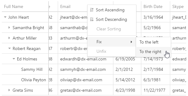
When you enable column fixing, command columns become fixed automatically.
See Also
columnHidingEnabled
Specifies whether the UI component should hide columns to adapt to the screen or container size. Ignored if allowColumnResizing is true and columnResizingMode is "widget".
This property set to true makes the UI component hide certain columns automatically if all the columns do not fit the UI component's width. Columns with low hidingPriority are hidden first. These are the rightmost (leftmost if rtlEnabled is true) columns by default. Information from hidden columns is available in an adaptive detail row.
See Also
columnResizingMode
Specifies how the UI component resizes columns. Applies only if allowColumnResizing is true.
The columnResizingMode property accepts one of the following values:
- nextColumn
When a user resizes a column, the width of the next column changes. - widget
When a user resizes a column, the width of the UI component changes.
This mode is ignored if you specify the width of any column in percent.
columns[]
Configures columns.
This property accepts an array of objects, where each object configures a single column. If a column does not need to be customized, this array may include the name of the field that provides data for this column.
jQuery
$(function() {
    $("#treeListContainer").dxTreeList({
        // ...
        columns: [{
            dataField: "Title",
            caption: "Position"
        }, {
            dataField: "FullName",
            width: 300
        },
            "CompanyName",
            "City"
        ]
    });
});
Angular
<dx-tree-list ... >
    <dxi-column dataField="Title" caption="Position"></dxi-column>
    <dxi-column dataField="FullName" [width]="300"></dxi-column>
    <dxi-column dataField="CompanyName"></dxi-column>
    <dxi-column dataField="City"></dxi-column>
</dx-tree-list>
import { DxTreeListModule } from "devextreme-angular";
// ...
export class AppComponent {
    // ...
}
@NgModule({
    imports: [
        // ...
        DxTreeListModule
    ],
    // ...
})
Vue
<template>
    <DxTreeList ... >
        <DxColumn
            data-field="Title"
            caption="Position"
        />
        <DxColumn
            data-field="FullName"
            :width="300"
        />
        <DxColumn
            data-field="CompanyName"
        />
        <DxColumn
            data-field="City"
        />
    </DxTreeList>
</template>

<script>
import 'devextreme/dist/css/dx.light.css';

import DxTreeList, {
    DxColumn
} from 'devextreme-vue/tree-list';

export default {
    components: {
        DxTreeList,
        DxColumn
    },
    // ...
}
</script>
React
import 'devextreme/dist/css/dx.light.css';

import TreeList, {
    Column
} from 'devextreme-react/tree-list';

export default function App() {
    return (
        <TreeList>
            <Column
                dataField="Title"
                caption="Position"
            />
            <Column
                dataField="FullName"
                width={300}
            />
            <Column
                dataField="CompanyName"
            />
            <Column
                dataField="City"
            />
        </TreeList>
    );
}See Also
columnWidth
Specifies the width for all data columns. Has a lower priority than the column.width property.
customizeColumns
Customizes columns after they are created.
All column configurations.
Use this function to make minor adjustments to automatically generated columns. You can access and modify column configurations using the function's parameter.
jQuery
$(function(){
    $("#treeList").dxTreeList({
        // ...
        customizeColumns: function (columns) {
            columns[0].width = 100;
            columns[1].width = 210;
        }
    })
});
Angular
import { DxTreeListModule } from "devextreme-angular";
// ...
export class AppComponent {
    customizeColumns (columns) {
        columns[0].width = 100;
        columns[1].width = 210;
    }
}
@NgModule({
    imports: [
        // ...
        DxTreeListModule
    ],
    // ...
})
<dx-tree-list ...
    [customizeColumns]="customizeColumns">
</dx-tree-list>
Vue
<template>
    <DxTreeList ...
        :customize-columns="customizeColumns">
    />
</template>

<script>
import 'devextreme/dist/css/dx.common.css';
import 'devextreme/dist/css/dx.light.css';

import DxTreeList, {
    // ...
} from 'devextreme-vue/tree-list';

export default {
    components: {
        DxTreeList
    },
    methods: {
        customizeColumns(columns) {
            columns[0].width = 100;
            columns[1].width = 210;
        }
    }
}
</script>
React
import React from 'react';

import 'devextreme/dist/css/dx.common.css';
import 'devextreme/dist/css/dx.light.css';

import TreeList, {
    // ...
} from 'devextreme-react/tree-list';

class App extends React.Component {
    customizeColumns = (columns) => {
        columns[0].width = 100;
        columns[1].width = 210;
    }

    render() {
        return (
            <TreeList ...
                customizeColumns={this.customizeColumns}
            />
        );
    }
}
export default App;
ASP.NET MVC Controls
@(Html.DevExtreme().TreeList()
    // ...
    .CustomizeColumns("customizeColumns")
)
<script>
    function customizeColumns(columns) {
        columns[0].width = 100;
        columns[1].width = 210;
    }
</script>dataSource
Binds the UI component to data.
The TreeList works with object collections that can have a plain or hierarchical structure. Depending on the structure, the objects should provide different data fields. Specify the dataStructure property to notify the TreeList of the used structure and refer to the property's description for information on the required fields.
Depending on your data source, bind the TreeList to data as follows.
Data Array
Assign the array to the dataSource option. View DemoRead-Only Data in JSON Format
Set the dataSource property to the URL of a JSON file or service that returns JSON data.OData
Implement an ODataStore.Web API, PHP, MongoDB
Use one of the following extensions to enable the server to process data according to the protocol DevExtreme UI components use:Then, use the createStore method to configure access to the server on the client as shown below. This method is part of DevExtreme.AspNet.Data.
jQuery
JavaScript$(function() { let serviceUrl = "https://url/to/my/service"; $("#treeListContainer").dxTreeList({ // ... dataSource: DevExpress.data.AspNet.createStore({ key: "ID", loadUrl: serviceUrl + "/GetAction", insertUrl: serviceUrl + "/InsertAction", updateUrl: serviceUrl + "/UpdateAction", deleteUrl: serviceUrl + "/DeleteAction" }) }) });Angular
app.component.tsapp.component.htmlapp.module.tsimport { Component } from '@angular/core'; import CustomStore from 'devextreme/data/custom_store'; import { createStore } from 'devextreme-aspnet-data-nojquery'; @Component({ selector: 'app-root', templateUrl: './app.component.html', styleUrls: ['./app.component.css'] }) export class AppComponent { store: CustomStore; constructor() { let serviceUrl = "https://url/to/my/service"; this.store = createStore({ key: "ID", loadUrl: serviceUrl + "/GetAction", insertUrl: serviceUrl + "/InsertAction", updateUrl: serviceUrl + "/UpdateAction", deleteUrl: serviceUrl + "/DeleteAction" }) } }<dx-tree-list ... [dataSource]="store"> </dx-tree-list>import { BrowserModule } from '@angular/platform-browser'; import { NgModule } from '@angular/core'; import { AppComponent } from './app.component'; import { DxTreeListModule } from 'devextreme-angular'; @NgModule({ declarations: [ AppComponent ], imports: [ BrowserModule, DxTreeListModule ], providers: [], bootstrap: [AppComponent] }) export class AppModule { }Vue
App.vue<template> <DxTreeList ... :data-source="store" /> </template> <script> import 'devextreme/dist/css/dx.common.css'; import 'devextreme/dist/css/dx.light.css'; import CustomStore from 'devextreme/data/custom_store'; import { createStore } from 'devextreme-aspnet-data-nojquery'; import { DxTreeList } from 'devextreme-vue/tree-list'; export default { components: { DxTreeList }, data() { const serviceUrl = "https://url/to/my/service"; const store = createStore({ key: "ID", loadUrl: serviceUrl + "/GetAction", insertUrl: serviceUrl + "/InsertAction", updateUrl: serviceUrl + "/UpdateAction", deleteUrl: serviceUrl + "/DeleteAction" }); return { store } } } </script>React
App.jsimport React from 'react'; import 'devextreme/dist/css/dx.common.css'; import 'devextreme/dist/css/dx.light.css'; import CustomStore from 'devextreme/data/custom_store'; import { createStore } from 'devextreme-aspnet-data-nojquery'; import TreeList from 'devextreme-react/tree-list'; const serviceUrl = "https://url/to/my/service"; const store = createStore({ key: "ID", loadUrl: serviceUrl + "/GetAction", insertUrl: serviceUrl + "/InsertAction", updateUrl: serviceUrl + "/UpdateAction", deleteUrl: serviceUrl + "/DeleteAction" }); class App extends React.Component { render() { return ( <TreeList ... dataSource={store} /> ); } } export default App;Any other data source
Implement a CustomStore.
Regardless of the data source on the input, the TreeList always wraps it in the DataSource object. This object allows you to sort, filter, group, and perform other data shaping operations. To get its instance, call the getDataSource() method.
Review the following notes about data binding:
Data field names cannot be equal to
thisand should not contain the following characters:.,:,[, and].If the TreeList UI component gets data from a server, configure remoteOperations to notify the UI component about data operations the server performs.
Selection works incorrectly with mapped data objects. Use calculated columns instead of mapping.
The stores and DataSource have methods to process and update data. However, the methods do not allow you to perform particular tasks (for example, replace the entire dataset, reconfigure data access at runtime). For such tasks, create a new array, store, or DataSource and assign it to the dataSource property as shown in the articles about changing properties in jQuery, Angular, React, and Vue.
dataStructure
Notifies the UI component of the used data structure.
The UI component expects that data has a plain structure where:
- each data item contains a
parentIdand a uniqueid; - data items of the highest hierarchical level have
parentIdequal to 0, null or undefined. It indicates that these data items descend from the root node. The root node does not have a visual representation.
var treeListData = [
    { id: 1, parentId: 0 },
    { id: 11, parentId: 1 },
    { id: 12, parentId: 1 },
    { id: 13, parentId: 1 },
    { id: 131, parentId: 13 },
    { id: 132, parentId: 13 },
    { id: 133, parentId: 13 },
    { id: 2, parentId: 0 }
];
Specify the keyExpr and parentIdExpr if parentId and id are called differently in your dataset. You can also change the root node's ID from 0 via the rootValue property.
If data has a hierarchical structure, set the dataStructure property to "tree". Parent and item IDs will be generated automatically. Data items that nest other data items should have an items field:
var treeListData = [{
    text: "item1",
    items: [{
        text: "item11"
    }, {
        text: "item12",
        items: [
            { text: "item121" },
            { text: "item122" }
        ]
    }]
}, {
    text: "item2"
}];
If the items field is called differently in your dataset, specify the itemsExpr property.
If each data item has a Boolean field that specifies whether this data item nests other items, assign the field's name to the hasItemsExpr property. The UI component uses this information to render the expand button. This is required only if the UI component is bound to a remote data source.
See Also
dateSerializationFormat
Specifies the format in which date-time values should be sent to the server.
Specify this property in the following cases:
The dataSource is empty or not set at design time. The dateSerializationFormat is needed, because the TreeList cannot detect it automatically without a data source.
You use the createStore method from the DevExtreme.AspNet.Data extension and remote date-time values are specified in UTC. DevExtreme.AspNet.Data requires the dateSerializationFormat to correctly serialize these values.
Use one of the following values to specify the dateSerializationFormat property:
"yyyy-MM-dd"- local date"yyyy-MM-ddTHH:mm:ss"- local date and time"yyyy-MM-ddTHH:mm:ssZ"- UTC date and time"yyyy-MM-ddTHH:mm:ssx"- date and time with a timezone
This property applies only if the forceIsoDateParsing field is set to true in the global configuration object.
See Also
- columns[].format
disabled
Specifies whether the UI component responds to user interaction.
editing
Configures editing.
The UI component allows a user to edit data in several modes, which are detailed in the mode property. To define what editing operations a user can perform, specify the allowAdding, allowUpdating and allowDeleting properties. Before enabling an operation, make sure that your data source supports it.
See Also
elementAttr
Specifies the global attributes to be attached to the UI component's container element.
jQuery
$(function(){
    $("#treeListContainer").dxTreeList({
        // ...
        elementAttr: {
            id: "elementId",
            class: "class-name"
        }
    });
});
Angular
<dx-tree-list ...
    [elementAttr]="{ id: 'elementId', class: 'class-name' }">
</dx-tree-list>
import { DxTreeListModule } from "devextreme-angular";
// ...
export class AppComponent {
    // ...
}
@NgModule({
    imports: [
        // ...
        DxTreeListModule
    ],
    // ...
})
Vue
<template>
    <DxTreeList ...
        :element-attr="treeListAttributes">
    </DxTreeList>
</template>

<script>
import DxTreeList from 'devextreme-vue/tree-list';

export default {
    components: {
        DxTreeList
    },
    data() {
        return {
            treeListAttributes: {
                id: 'elementId',
                class: 'class-name'
            }
        }
    }
}
</script>
React
import React from 'react';

import TreeList from 'devextreme-react/tree-list';

class App extends React.Component {
    treeListAttributes = {
        id: 'elementId',
        class: 'class-name'
    }

    render() {
        return (
            <TreeList ...
                elementAttr={this.treeListAttributes}>
            </TreeList>
        );
    }
}
export default App;
errorRowEnabled
Indicates whether to show the error row.
The error row displays data-related errors that may occur on the server during the UI component's runtime. Setting this property to false hides the error row, but the errors can still be viewed in the browser's console.
See Also
expandedRowKeys
Specifies keys of the initially expanded rows.
Setting this property expands only the specified rows, but not their parents. If a to-be-expanded row lies deep in the hierarchy, make sure to include keys of all rows that nest it.
See Also
expandNodesOnFiltering
Specifies whether nodes appear expanded or collapsed after filtering is applied.
filterBuilder
Configures the integrated filter builder.
See the FilterBuilder configuration for properties that you can specify in this object. Do not specify the fields array because the TreeList automatically populates it to sync filter builder fields with grid columns.
See Also
filterBuilderPopup
Configures the popup in which the integrated filter builder is shown.
See the Popup configuration for properties that you can specify in this object.
See Also
filterMode
Specifies whether filter and search results should include matching rows only, matching rows with ancestors, or matching rows with ancestors and descendants (full branch).
filterPanel
Configures the filter panel.
The filter panel displays the applied filter expression.
Clicking on the filter expression opens the filter builder.
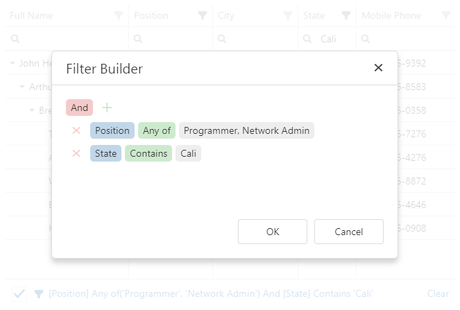
If you change the filter expression in the filter panel or filter builder, the changes are reflected in the filter row and header filter, and vice versa. You can disable this synchronization by setting the filterSyncEnabled property to false. In this case, the filter panel remains synchronized with the filter builder.
See Also
filterRow
Configures the filter row.
The filter row allows a user to filter data by values of individual columns.
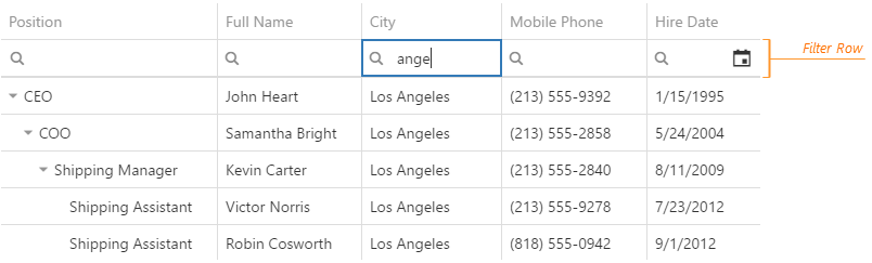
Each cell in the filter row contains a magnifying glass icon, pausing on which opens a drop-down list with filters available for the column.
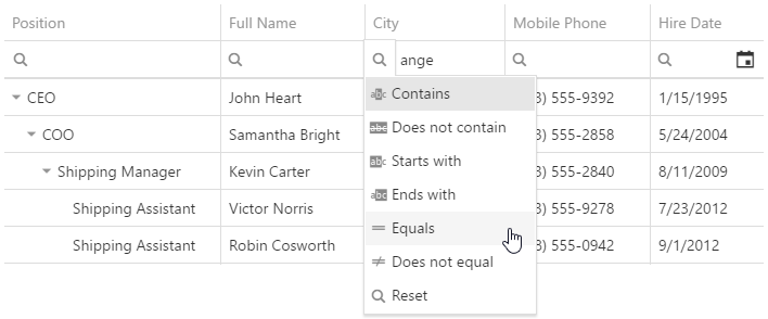
To make the filter row visible, assign true to the filterRow.visible property.
See Also
filterSyncEnabled
Specifies whether to synchronize the filter row, header filter, and filter builder. The synchronized filter expression is stored in the filterValue property.
Synchronization is enabled if the filter panel is visible. When it is enabled, check that each column that allows filtering has the dataField or name property specified.
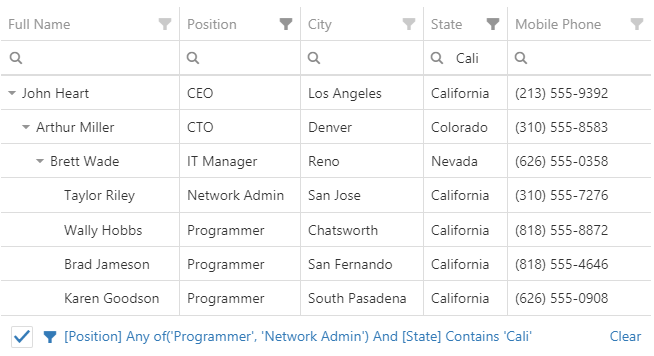
filterValue
Specifies a filter expression.
If filterSyncEnabled is true, the filter expression includes a combination of the filter row, header filter, and filter builder filters. Otherwise, it contains only the filter builder filter.
The filter expression can contain the following operations: "=", "<>", "<", ">", "<=", ">=", "between", "contains", "notcontains", "startswith", "endswith", "anyof", "noneof", and the filter builder's custom operations. Use "anyof" and "noneof" to select and clear the selection of items in the header filter's popup menu. In the following code, "anyof" is used to select items with IDs 500 and 700:
jQuery
$(function() {
    $("#treeListContainer").dxTreeList({
        // ...
        filterSyncEnabled: true,
        headerFilter: { visible: true },
        filterValue: ["ID", "anyof", [500, 700]],
    })
});
Angular
<dx-tree-list ...
    [filterSyncEnabled]="true"
    [filterValue]="['ID', 'anyof', [500, 700]]">
    <dxo-header-filter
        [visible]="true">
    </dxo-header-filter>
</dx-tree-list>
import { DxTreeListModule } from "devextreme-angular";
// ...
export class AppComponent {
    // ...
}
@NgModule({
    imports: [
        // ...
        DxTreeListModule
    ],
    // ...
})
Vue
<template>
    <DxTreeList ...
        :filter-sync-enabled="true"
        :filter-value="filterValue">
        <DxHeaderFilter :visible="true" />
    </DxTreeList>
</template>

<script>
import 'devextreme/dist/css/dx.common.css';
import 'devextreme/dist/css/dx.light.css';

import DxTreeList, {
    DxHeaderFilter,
    // ...
} from 'devextreme-vue/tree-list';

export default {
    components: {
        DxTreeList,
        DxHeaderFilter,
        // ...
    },
    data() {
        return {
            filterValue: ['ID', 'anyof', [500, 700]]
        }
    }
}
</script>
React
import React from 'react';

import 'devextreme/dist/css/dx.common.css';
import 'devextreme/dist/css/dx.light.css';

import TreeList, {
    HeaderFilter,
    // ...
} from 'devextreme-react/tree-list';

const filterValue = ['ID', 'anyof', [500, 700]];

class App extends React.Component {
    render() {
        return (
            <TreeList ...
                filterSyncEnabled={true}
                defaultFilterValue={filterValue}>
                <HeaderFilter visible={true} />
            </TreeList>
        );
    }
}
export default App;
ASP.NET MVC Controls
@(Html.DevExtreme().DataGrid()
    // ...
    .FilterSyncEnabled(true)
    .HeaderFilter(hf => hf.Visible(true))
    .FilterValue("['ID', 'anyof', [500, 700]]")
)
If a column's groupInterval property is set, the "anyof" and "noneof" operations for this column accept the beginning of intervals instead of exact values:
jQuery
$(function() {
    $("#treeListContainer").dxTreeList({
        // ...
        headerFilter: { visible: true },
        filterValue: ["ID", "anyof", [500, 700]], // Filter intervals are 500-600 and 700-800
        columns: [{
            dataField: "ID",
            dataType: "number",
            headerFilter: { groupInterval: 100 }
        },
        // ...
        ]
    })
});
Angular
<dx-tree-list ...
    <!-- Filter intervals are 500-600 and 700-800 -->
    [(filterValue)]="['ID', 'anyof', [500, 700]]">
        <dxo-header-filter
            [visible]="true">
        </dxo-header-filter>
        <dxi-column
            dataField="ID"
            dataType="number">
                <dxo-header-filter
                    [groupInterval]="100">
                </dxo-header-filter>
        </dxi-column>
</dx-tree-list>
import { DxTreeListModule } from "devextreme-angular";
// ...
export class AppComponent {
    // ...
}
@NgModule({
    imports: [
        // ...
        DxTreeListModule
    ],
    // ...
})
Vue
<template>
    <DxTreeList ...
        <!-- Filter intervals are 500-600 and 700-800 -->
        :filter-value="filterValue">
        <DxHeaderFilter :visible="true" />
        <DxColumn
            data-field="ID"
            data-type="number">
            <DxColumnHeaderFilter :group-interval="100" />
        </DxColumn>
    </DxTreeList>
</template>

<script>
import 'devextreme/dist/css/dx.common.css';
import 'devextreme/dist/css/dx.light.css';

import DxTreeList, {
    DxColumn,
    DxHeaderFilter,
    DxColumnHeaderFilter,
    // ...
} from 'devextreme-vue/tree-list';

export default {
    components: {
        DxTreeList,
        DxColumn,
        DxHeaderFilter,
        DxColumnHeaderFilter,
        // ...
    },
    data() {
        return {
            filterValue: ['ID', 'anyof', [500, 700]]
        }
    }
}
</script>
React
import React from 'react';

import 'devextreme/dist/css/dx.common.css';
import 'devextreme/dist/css/dx.light.css';

import TreeList, {
    Column,
    HeaderFilter,
    ColumnHeaderFilter,
    // ...
} from 'devextreme-react/tree-list';

const filterValue = ['ID', 'anyof', [500, 700]];

class App extends React.Component {
    render() {
        return (
            <TreeList ...
                {/* Filter intervals are 500-600 and 700-800 */}
                defaultFilterValue={filterValue}>
                <HeaderFilter visible={true} />
                <Column
                    dataField="ID"
                    dataType="number">
                    <ColumnHeaderFilter groupInterval={100} />
                </Column>
            </TreeList>
        );
    }
}
export default App;
ASP.NET MVC Controls
@(Html.DevExtreme().DataGrid()
    // ...
    // Filter intervals are 500-600 and 700-800
    .HeaderFilter(headerFilter => headerFilter.Visible(true))
    .FilterValue("['ID', 'anyof', [500, 700]]")
    .Columns(columns => {
        columns.AddFor(m => m.ID)
            .DataType(GridColumnDataType.Number)
            .HeaderFilter(hf => hf.GroupInterval(100));
        // ...
    })
)See Also
focusedColumnIndex
The index of the column that contains the focused data cell. This index is taken from the columns array.
Unlike banded columns, Band columns cannot be focused.
The default index, -1, means that no column is focused.
See Also
focusedRowEnabled
Specifies whether the focused row feature is enabled.
When this property is set to true, the following applies:
- Rows are initially sorted by keys if any field of remoteOperations is true.
- The row with focusedRowIndex or focusedRowKey is highlighted.
- When the data row area is focused, this row is focused and the area is scrolled down to it.
- The onFocusedRowChanging and onFocusedRowChanged functions become active.
See Also
focusedRowIndex
Specifies or indicates the focused data row's index.
The focused row has a key and index on a page. When the pager is used for navigation, the focused row's index persists from page to page, but corresponds to a different row with a different key on each page.
The default index, -1, means that no row is focused.
The focusedRowKey takes precedence over the focusedRowIndex when both are specified.
See Also
focusedRowKey
Specifies initially or currently focused grid row's key.
The focused row has a key and index on a page. When the pager is used for navigation, the focused row's index persists from page to page but corresponds to a different row with a different key on each page.
In the DataGrid, group rows can also be focused. See the Group Index and Key topic for more information on how group keys are formed.
See Also
focusStateEnabled
Specifies whether the UI component can be focused using keyboard navigation.
hasItemsExpr
Specifies which data field defines whether the node has children.
If you load data from the server, you need to set this property so that the UI component does not render the expand button for nodes without children.
headerFilter
Configures the header filter feature.
A header filter allows a user to filter values in an individual column by including/excluding them in/from the applied filter. A click on a header filter icon invokes a popup menu with all unique values in the column. By selecting or clearing the selection of values in this menu, the user includes/excludes them in/from the filter.
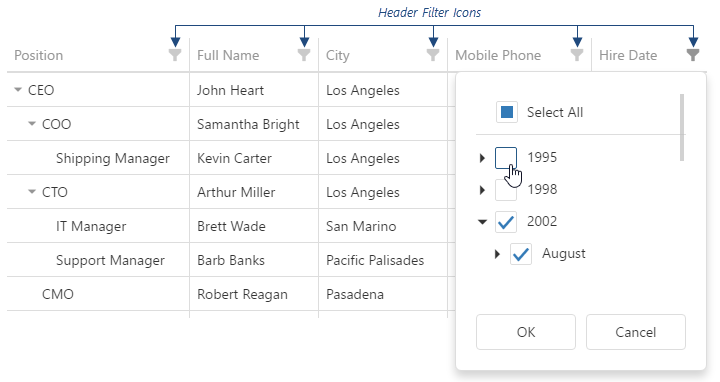
To make header filter icons visible, assign true to the headerFilter.visible property.
A header filter's popup menu lists all column values. If they are numbers or dates, you can group them using the groupInterval property in the column's headerFilter. You can also provide a custom data source for a header filter using the dataSource property.
The user's filtering preferences are saved in the filterValues property. The header filter's Select All checkbox changes the filterType property.
See Also
height
Specifies the UI component's height.
This property accepts a value of one of the following types:
Number
The height in pixels.String
A CSS-accepted measurement of height. For example,"55px","80%","inherit".Function
A function returning either of the above. For example:JavaScriptheight: function() { return window.innerHeight / 1.5; }
highlightChanges
Specifies whether to highlight rows and cells with edited data. repaintChangesOnly should be true.
Collaborative Editing Demo SignalR Service Demo
You can change the following CSS rules and classes that control highlighting:
@keyframes dx-treelist-highlight-change {
    from {
        background-color: #efefef;
    }
    50% {
        background-color: #efefef;
    }
}
.dx-treelist-cell-updated-animation {
    animation: dx-treelist-highlight-change 1s;
}
.dx-treelist-row-inserted-animation {
    animation: dx-treelist-highlight-change 1s;
}
hint
Specifies text for a hint that appears when a user pauses on the UI component.
hoverStateEnabled
Specifies whether to highlight rows when a user moves the mouse pointer over them.
itemsExpr
Specifies which data field contains nested items. Set this property when your data has a hierarchical structure.
keyExpr
Specifies the key property (or properties) that provide(s) key values to access data items. Each key value must be unique.
loadPanel
Configures the load panel.
The load panel is displayed while the UI component loads data. It consists of a loading indicator and text, both placed on a pane.
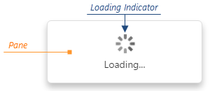
Since the load panel is, in fact, the DevExtreme LoadPanel UI component, the loadPanel object can contain any properties of this UI component along with properties described here.
See Also
noDataText
Specifies a text string shown when the TreeList does not display any data.
onAdaptiveDetailRowPreparing
A function that is executed before an adaptive detail row is rendered.
Information about the event that caused the function's execution.
| Name | Type | Description |
|---|---|---|
| component |
The UI component's instance. |
|
| element |
The UI component's container. It is an HTML Element or a jQuery Element when you use jQuery. |
|
| formOptions |
The properties of the Form UI component. |
|
| model |
Model data. Available only if you use Knockout. |
Adaptive detail rows display information from columns that were hidden when the UI component adapted to the screen or container size. Each adaptive detail row contains the Form UI component that you can customize within the onAdaptiveDetailRowPreparing function using the formOptions object. Refer to the Form Configuration section for details on properties of the Form UI component.
The following Form properties cannot be specified using formOptions:
- template
- editorType
- any event handler (properties whose name starts with "on...")
See Also
- columnHidingEnabled
- columns[].hidingPriority
- Adaptability
onCellClick
A function that is executed when a cell is clicked or tapped. Executed before onRowClick.
Information about the event that caused the function's execution.
| Name | Type | Description |
|---|---|---|
| cellElement |
The cell's container. It is an HTML Element or a jQuery Element when you use jQuery. |
|
| column |
This column's configuration. |
|
| columnIndex |
The index of the column to which the cell belongs. |
|
| component |
The UI component's instance. |
|
| data |
The data of the row to which the cell belongs. Available if the rowType is "data", "detail" or "detailAdaptive". |
|
| displayValue | any |
The cell's displayed value. Available if the rowType is "data". |
| element |
The UI component's container. It is an HTML Element or a jQuery Element when you use jQuery. |
|
| event | Event (jQuery or EventObject) |
The event that caused the function to execute. It is a dxEvent or a jQuery.Event when you use jQuery. |
| key | any |
The row's key. Available if the rowType is "data", "detail" or "detailAdaptive". |
| model |
Model data. Available only if you use Knockout. |
|
| row |
The row properties. Available if the rowType is "data", "detail" or "detailAdaptive". |
|
| rowIndex |
The index of the row to which the cell belongs. Refer to Column and Row Indexes for more information. |
|
| rowType |
The row's type. |
|
| text |
The cell's formatted value converted to a string. Available if the rowType is "data". |
|
| value | any |
The cell's raw value. Available if the rowType is "data". |
onCellDblClick
A function that is executed when a cell is double-clicked or double-tapped. Executed before onRowDblClick.
Information about the event that caused the function's execution.
| Name | Type | Description |
|---|---|---|
| cellElement |
The cell's container. It is an HTML Element or a jQuery Element when you use jQuery. |
|
| column |
The column's configuration. |
|
| columnIndex |
The index of the column the cell belongs to. |
|
| component |
The UI component's instance. |
|
| data |
The data of the row the cell belongs to. Available if the rowType is "data", "detail" or "detailAdaptive". |
|
| displayValue | any |
The value displayed in the cell. Available if the rowType is "data". |
| element |
The UI component's container. It is an HTML Element or a jQuery Element when you use jQuery. |
|
| event | Event (jQuery or EventObject) |
The event that caused the function to execute. It is a dxEvent or a jQuery.Event when you use jQuery. |
| key | any |
The row's key. Available if the rowType is "data", "detail" or "detailAdaptive". |
| model |
Model data. Available only if you use Knockout. |
|
| row |
The row's properties. Available if the rowType is "data", "detail" or "detailAdaptive". |
|
| rowIndex |
The index of the row the cell belongs to. Refer to Column and Row Indexes for more information. |
|
| rowType |
The row's type. |
|
| text |
The cell's formatted value converted to a string. Available if the rowType is "data". |
|
| value | any |
The cell's raw value. Available if the rowType is "data". |
onCellHoverChanged
A function that is executed after the pointer enters or leaves a cell.
Information about the event that caused the function's execution.
| Name | Type | Description |
|---|---|---|
| cellElement |
The cell's container. It is an HTML Element or a jQuery Element when you use jQuery. |
|
| column |
This column's configuration. |
|
| columnIndex |
The index of the column to which the cell belongs. |
|
| component |
The UI component's instance. |
|
| data |
The data of the row to which the cell belongs. Available if the rowType is "data", "detail" or "detailAdaptive". |
|
| displayValue | any |
The cell's displayed value. Available if the rowType is "data". |
| element |
The UI component's container. It is an HTML Element or a jQuery Element when you use jQuery. |
|
| eventType |
Indicates whether the pointer entered or left the cell. Can be either "mouseover" or "mouseout". |
|
| key | any |
The row's key. Available if the rowType is "data", "detail" or "detailAdaptive". |
| model |
Model data. Available only if you use Knockout. |
|
| row |
The row properties. Available if the rowType is "data", "detail" or "detailAdaptive". |
|
| rowIndex |
The index of the row to which the cell belongs. Refer to Column and Row Indexes for more information. |
|
| rowType |
The row's type. |
|
| text |
The cell's formatted value converted to a string. Available if the rowType is "data". |
|
| value | any |
The cell's raw value. Available if the rowType is "data". |
To identify whether the pointer has entered or left the cell, check the eventType field's value.
onCellPrepared
A function that is executed after a grid cell is created.
Information about the event that caused the function's execution.
| Name | Type | Description |
|---|---|---|
| cellElement |
The cell's container. It is an HTML Element or a jQuery Element when you use jQuery. |
|
| column |
This column's configuration. |
|
| columnIndex |
The visible column index described in the following topic: Column and Row Indexes. |
|
| component |
The UI component's instance. |
|
| data |
The data of the row to which the cell belongs. Available if the rowType is "data", "detail", or "detailAdaptive". |
|
| displayValue | any |
The cell's displayed value. Available if the rowType is "data". |
| element |
The UI component's container. It is an HTML Element or a jQuery Element when you use jQuery. |
|
| isExpanded |
Indicates whether the row is expanded or collapsed. Available if rowType is "data" or "detail". |
|
| isNewRow |
Indicates that the row is added, but not yet saved. Available if rowType is "data". |
|
| isSelected |
Indicates whether the row is selected. Available if rowType is "data" or "detail". |
|
| key | any |
The row's key. Available if the rowType is "data", "detail" or "detailAdaptive". |
| model |
Model data. Available only if you use Knockout. |
|
| oldValue | any |
The cell's previous raw value. Defined only if repaintChangesOnly is true. |
| row |
The row properties. |
|
| rowIndex |
The row's index. Refer to Column and Row Indexes for more information. |
|
| rowType |
The row's type. |
|
| text |
The cell's formatted value converted to a string. Available if the rowType is "data". |
|
| value | any |
The cell's raw value. Available if the rowType is "data". |
| watch |
Allows you to track a variable and execute actions when it changes. Applies when repaintChangesOnly is true.
|
In the following code, the onCellPrepared function is used to change a ProductName's color depending on the Amount of sold products. You can paste this code in the Real-Time Updates demo and see how it works.
jQuery
$(function() {
    $("#treeListContainer").dxTreeList({
        // ...
        repaintChangesOnly: true,
        onCellPrepared: function(e) {
            if(e.rowType === "data" && e.column.dataField === "ProductName") {
                e.cellElement.css("color", e.data.Amount >= 10000 ? "green" : "red");
                // Tracks the `Amount` data field
                e.watch(function() {
                    return e.data.Amount;
                }, function() {
                    e.cellElement.css("color", e.data.Amount >= 10000 ? "green" : "red");
                })
            }
        }
    })
})
Angular
import { DxTreeListModule } from "devextreme-angular";
// ...
export class AppComponent {
    onCellPrepared(e) {
        if(e.rowType === "data" && e.column.dataField === "ProductName") {
            e.cellElement.style.color = e.data.Amount >= 10000 ? "green" : "red";
            // Tracks the `Amount` data field
            e.watch(function() {
                return e.data.Amount;
            }, function() {
                e.cellElement.style.color = e.data.Amount >= 10000 ? "green" : "red";
            })
        }
    }
}
@NgModule({
    imports: [
        // ...
        DxTreeListModule
    ],
    // ...
})
<dx-tree-list ...
    [repaintChangesOnly]="true"
    (onCellPrepared)="onCellPrepared($event)">
</dx-tree-list>
Vue
<template>
    <DxTreeList
        :repaint-changes-only="true"
        @cell-prepared="onCellPrepared"
    />
</template>

<script>
import 'devextreme/dist/css/dx.common.css';
import 'devextreme/dist/css/dx.light.css';

import TreeList from 'devextreme-vue/tree-list';

export default {
    components: {
        DxTreeList
    },
    methods: {
       onCellPrepared(e) {
            if(e.rowType === "data" && e.column.dataField === "ProductName") {
                e.cellElement.style.color = e.data.Amount >= 10000 ? "green" : "red";
                // Tracks the `Amount` data field
                e.watch(function() {
                    return e.data.Amount;
                }, function() {
                    e.cellElement.style.color = e.data.Amount >= 10000 ? "green" : "red";
                })
            }
        }
    }
}
</script>
React
import React from 'react';

import 'devextreme/dist/css/dx.common.css';
import 'devextreme/dist/css/dx.light.css';

import TreeList from 'devextreme-react/tree-list';

class App extends React.Component {
    // ...
    render() {
        return (
            <TreeList
                 repaintChangesOnly={true}
                 onCellPrepared={this.onCellPrepared}
            />
        );
    }
    onCellPrepared = (e) => {
        if(e.rowType === "data" && e.column.dataField === "ProductName") {
            e.cellElement.style.color = e.data.Amount >= 10000 ? "green" : "red";
            // Tracks the `Amount` data field
            e.watch(function() {
                return e.data.Amount;
            }, function() {
                e.cellElement.style.color = e.data.Amount >= 10000 ? "green" : "red";
            })
        }
    }
}
export default App;
ASP.NET MVC Controls
@(Html.DevExtreme().TreeList()
    .ID("treeListContainer")
    // ...
    .RepaintChangesOnly(true)
    .OnCellPrepared("treeList_cellPrepared_handler")
)
<script>
    function treeList_cellPrepared_handler(e) {
        if (e.rowType === "data" && e.column.dataField === "ProductName") {
            e.cellElement.css("color", e.data.Amount >= 10000 ? "green" : "red");
            // Tracks the `Amount` data field
            e.watch(function() {
                return e.data.Amount;
            }, function() {
                e.cellElement.css("color", e.data.Amount >= 10000 ? "green" : "red");
            })
        }
    }
</script>
See Also
onContentReady
A function that is executed when the UI component's content is ready and each time the content is changed.
Information about the event.
| Name | Type | Description |
|---|---|---|
| component |
The UI component's instance. |
|
| element |
The UI component's container. It is an HTML Element or a jQuery Element when you use jQuery. |
|
| model |
Model data. Available only when using Knockout. |
onContextMenuPreparing
A function that is executed before the context menu is rendered.
Information about the event that caused the function's execution.
| Name | Type | Description |
|---|---|---|
| column |
This column's configuration. |
|
| columnIndex |
The index of the column on which the context menu is invoked. For details on indexes, see the following help topic: Column and Row Indexes. |
|
| component |
The UI component's instance. |
|
| element |
The UI component's container. It is an HTML Element or a jQuery Element when you use jQuery. |
|
| items |
Items to be displayed in the context menu. Their structure is described in the items property description. Each item also contains the onItemClick event handler, which allows you to access the clicked or tapped item's data. |
|
| model |
Model data. Available only if you use Knockout. |
|
| row |
The row properties. |
|
| rowIndex |
The index of the row on which the context menu is invoked. Refer to the following help topic for more information: Column and Row Indexes. |
|
| target |
The name of the element on which the context menu is invoked: "header", "content", or "footer". This field is read-only. |
|
| targetElement |
The element's container. It is an HTML Element or a jQuery Element when you use jQuery. |
In the following code, the onContextMenuPreparing function adds a custom item to the context menu invoked when a user right-clicks any column header:
jQuery
$(function() {
    $("#treeListContainer").dxTreeList({
        // ...
        onContextMenuPreparing: function(e) {
            if (e.target == "header") {
                // e.items can be undefined
                if (!e.items) e.items = [];

                // Add a custom menu item
                e.items.push({
                    text: "Log Column Caption",
                    onItemClick: function() {
                        console.log(e.column.caption);
                    }
                });
            }
        }
    });
});
Angular
<dx-tree-list ...
    (onContextMenuPreparing)="addMenuItems($event)">
</dx-tree-list>
import { Component } from '@angular/core';

@Component({
    selector: 'app-root',
    templateUrl: './app.component.html',
    styleUrls: ['./app.component.css']
})
export class AppComponent {
    addMenuItems(e) {
        if (e.target == 'header') {
            // e.items can be undefined
            if (!e.items) e.items = [];

            // Add a custom menu item
            e.items.push({
                text: 'Log Column Caption',
                onItemClick: () => {
                    console.log(e.column.caption);
                }
            });
        }
    }
}
import { BrowserModule } from '@angular/platform-browser';
import { NgModule } from '@angular/core';
import { AppComponent } from './app.component';

import { DxTreeListModule } from 'devextreme-angular';

@NgModule({
    declarations: [
        AppComponent
    ],
    imports: [
        BrowserModule,
        DxTreeListModule
    ],
    providers: [ ],
    bootstrap: [AppComponent]
})
export class AppModule { }
Vue
<template>
    <DxTreeList ...
        @context-menu-preparing="addMenuItems">
    </DxTreeList>
</template>

<script>
import 'devextreme/dist/css/dx.common.css';
import 'devextreme/dist/css/dx.light.css';

import DxTreeList from 'devextreme-vue/tree-list';

export default {
    components: {
        DxTreeList
    },
    data() {
        return {
            // ...
        }
    },
    methods: {
        addMenuItems(e) {
            if (e.target == 'header') {
                // e.items can be undefined
                if (!e.items) e.items = [];

                // Add a custom menu item
                e.items.push({
                    text: 'Log Column Caption',
                    onItemClick: () => {
                        console.log(e.column.caption);
                    }
                });
            }
        }
    }
}
</script>
React
import React from 'react';

import 'devextreme/dist/css/dx.common.css';
import 'devextreme/dist/css/dx.light.css';

import TreeList from 'devextreme-react/tree-list';

class App extends React.Component {
    addMenuItems(e) {
        if (e.target == 'header') {
            // e.items can be undefined
            if (!e.items) e.items = [];

            // Add a custom menu item
            e.items.push({
                text: 'Log Column Caption',
                onItemClick: () => {
                    console.log(e.column.caption);
                }
            });
        }
    }

    render() {
        return (
            <TreeList ...
                onContextMenuPreparing={this.addMenuItems}>
            </TreeList>
        );
    }
}
export default App;
onDataErrorOccurred
A function that is executed when an error occurs in the data source.
Information on the occurred error.
| Name | Type | Description |
|---|---|---|
| component |
The UI component's instance. |
|
| element |
The UI component's container. It is an HTML Element or a jQuery Element when you use jQuery. |
|
| error |
The standard Error object that defines the error. |
|
| model |
Model data. Available only if you use Knockout. |
Handles errors that might occur in the data source. To obtain a human-readable description of the error in the function, use the error.message field.
onDisposing
A function that is executed before the UI component is disposed of.
Information about the event.
| Name | Type | Description |
|---|---|---|
| component |
The UI component's instance. |
|
| element |
The UI component's container. It is an HTML Element or a jQuery Element when you use jQuery. |
|
| model |
Model data. Available only if you use Knockout. |
onEditCanceled
A function that is executed after row changes are discarded.
Information about the event that caused the function's execution.
| Name | Type | Description |
|---|---|---|
| changes | Array<any> |
Discarded row changes. |
| component |
The UI component's instance. |
|
| element |
The UI component's container. It is an HTML Element or a jQuery Element when you use jQuery. |
|
| model |
Model data. Available only if Knockout is used. |
onEditCanceling
A function that is executed when the edit operation is canceled, but row changes are not yet discarded.
Information about the event that caused the function's execution.
| Name | Type | Description |
|---|---|---|
| cancel |
Set this field to true if the row changes should not be discarded. |
|
| changes | Array<any> |
Row changes to be discarded. |
| component |
The UI component's instance. |
|
| element |
The UI component's container. It is an HTML Element or a jQuery Element when you use jQuery. |
|
| model |
Model data. Available only if Knockout is used. |
An edit operation can be canceled from the UI (with the Cancel button) or programatically (with the cancelEditData() method).
onEditingStart
A function that is executed before a cell or row switches to the editing state.
Information about the event that caused the function's execution.
| Name | Type | Description |
|---|---|---|
| cancel |
Allows you to cancel row editing. |
|
| column |
The configuration of the column whose cell is switching to the editing state. Available in "cell" and "batch" editing modes. |
|
| component |
The UI component's instance. |
|
| data |
The data of the row to be edited. |
|
| element |
The UI component's container. It is an HTML Element or a jQuery Element when you use jQuery. |
|
| key | any |
The row's key. |
| model |
Model data. Available only if Knockout is used. |
If the editing.mode is "batch" or "cell", this function is executed while the UI component renders columns of boolean dataType and other columns whose showEditorAlways property is true.
onEditorPrepared
A function that is executed after an editor is created. Not executed for cells with an editCellTemplate.
Information about the event that caused the function's execution.
| Name | Type | Description |
|---|---|---|
| component |
The UI component's instance. |
|
| dataField |
The name of the field that provides data for the column the editor belongs to. |
|
| disabled |
Indicates whether the editor is disabled. |
|
| editorElement |
The editor's container. It is an HTML Element or a jQuery Element when you use jQuery. |
|
| element |
The UI component's container. It is an HTML Element or a jQuery Element when you use jQuery. |
|
| model |
Model data. Available only if you use Knockout. |
|
| parentType |
The editor's location. One of "dataRow", "filterRow", "headerRow" or "searchPanel". |
|
| readOnly |
Indicates whether the editor is read-only. |
|
| row |
The properties of the row the editor belongs to. |
|
| rtlEnabled |
Indicates whether the editor uses right-to-left representation. |
|
| setValue(newValue, newText) | any |
A method you should call to change the cell value and, optionally, the displayed value after the editor's value is changed. |
| updateValueTimeout |
Gets and sets the delay between the moment a user stops typing a filter value and the change is applied. Available if the parentType is "filterRow" or "searchPanel". |
|
| value | any |
The editor's value. |
| width |
The editor's width; equals null for all editors except for those whose parentType equals "searchPanel". |
onEditorPreparing
A function used to customize a cell's editor. Not executed for cells with an editCellTemplate.
Information about the event that caused the function's execution.
| Name | Type | Description |
|---|---|---|
| cancel |
Allows you to cancel the editor's creation. |
|
| component |
The UI component's instance. |
|
| dataField |
The name of the field that provides data for the column the editor belongs to. |
|
| disabled |
Indicates whether the editor is disabled. |
|
| editorElement |
The editor's container. It is an HTML Element or a jQuery Element when you use jQuery. |
|
| editorName |
Allows you to change the editor. Accepts names of DevExtreme UI components only, for example, "dxTextBox". |
|
| editorOptions |
Gets and sets the editor's configuration. editorOptions specified in the editing.form object have precedence over this parameter. |
|
| element |
The UI component's container. It is an HTML Element or a jQuery Element when you use jQuery. |
|
| model |
Model data. Available only if you use Knockout. |
|
| parentType |
The editor's location. One of "dataRow", "filterRow", "headerRow" or "searchPanel". |
|
| readOnly |
Indicates whether the editor is read-only. |
|
| row |
The properties of the row the editor belongs to. |
|
| rtlEnabled |
Indicates whether the editor uses right-to-left representation. |
|
| setValue(newValue, newText) | any |
A method you should call to change the cell value and, optionally, the displayed value after the editor's value is changed. |
| updateValueTimeout |
Gets and sets the delay between the moment a user stops typing a filter value and the change is applied. Available if the parentType is "filterRow" or "searchPanel". |
|
| value | any |
The editor's value. This field is read-only. To change the editor's value, use the setValue(newValue, newText) function parameter. |
| width |
The editor's width; equals null for all editors except for those whose parentType equals "searchPanel". |
Use this function to:
Override the default editor's onValueChanged handler. For other default editor customizations, use editorOptions.
jQuery
index.js$(function() { $("#treeListContainer").dxTreeList({ // ... onEditorPreparing: function(e) { if (e.dataField === "requiredDataField" && e.parentType === "dataRow") { const defaultValueChangeHandler = e.editorOptions.onValueChanged; e.editorOptions.onValueChanged = function(args) { // Override the default handler // ... // Custom commands go here // ... // If you want to modify the editor value, call the setValue function: // e.setValue(newValue); // Otherwise, call the default handler: defaultValueChangeHandler(args); } } } }); });Angular
app.component.htmlapp.component.tsapp.module.ts<dx-tree-list ... (onEditorPreparing)="overrideOnValueChanged($event)"> </dx-tree-list>import { Component } from '@angular/core'; @Component({ selector: 'app-root', templateUrl: './app.component.html', styleUrls: ['./app.component.css'] }) export class AppComponent { overrideOnValueChanged(e) { if (e.dataField === 'requiredDataField' && e.parentType === 'dataRow') { const defaultValueChangeHandler = e.editorOptions.onValueChanged; e.editorOptions.onValueChanged = function (args) { // Override the default handler // ... // Custom commands go here // ... // If you want to modify the editor value, call the setValue function: // e.setValue(newValue); // Otherwise, call the default handler: defaultValueChangeHandler(args); } } } }import { BrowserModule } from '@angular/platform-browser'; import { NgModule } from '@angular/core'; import { AppComponent } from './app.component'; import { DxTreeListModule } from 'devextreme-angular'; @NgModule({ declarations: [ AppComponent ], imports: [ BrowserModule, DxTreeListModule ], providers: [], bootstrap: [AppComponent] }) export class AppModule { }Vue
App.vue<template> <DxTreeList ... @editor-preparing="overrideOnValueChanged"> </DxTreeList> </template> <script> import 'devextreme/dist/css/dx.common.css'; import 'devextreme/dist/css/dx.light.css'; import DxTreeList from 'devextreme-vue/tree-list'; export default { components: { DxTreeList }, // ... methods: { overrideOnValueChanged(e) { if (e.dataField === 'requiredDataField' && e.parentType === 'dataRow') { const defaultValueChangeHandler = e.editorOptions.onValueChanged; e.editorOptions.onValueChanged = function (args) { // Override the default handler // ... // Custom commands go here // ... // If you want to modify the editor value, call the setValue function: // e.setValue(newValue); // Otherwise, call the default handler: defaultValueChangeHandler(args); } } } } } </script>React
App.jsimport React from 'react'; import 'devextreme/dist/css/dx.common.css'; import 'devextreme/dist/css/dx.light.css'; import TreeList from 'devextreme-react/tree-list'; class App extends React.Component { overrideOnValueChanged(e) { if (e.dataField === 'requiredDataField' && e.parentType === 'dataRow') { const defaultValueChangeHandler = e.editorOptions.onValueChanged; e.editorOptions.onValueChanged = function (args) { // Override the default handler // ... // Custom commands go here // ... // If you want to modify the editor value, call the setValue function: // e.setValue(newValue); // Otherwise, call the default handler: defaultValueChangeHandler(args); } } } render() { return ( <TreeList ... onEditorPreparing={this.overrideOnValueChanged}> </TreeList> ); } } export default App;ASP.NET MVC Controls
Razor C#@(Html.DevExtreme().TreeList() // ... .OnEditorPreparing("overrideOnValueChanged") ) <script type="text/javascript"> function overrideOnValueChanged(e) { if (e.dataField === "requiredDataField" && e.parentType === "dataRow") { const defaultValueChangeHandler = e.editorOptions.onValueChanged; e.editorOptions.onValueChanged = function(args) { // Override the default handler // ... // Custom commands go here // ... // If you want to modify the editor value, call the setValue function: // e.setValue(newValue); // Otherwise, call the default handler: defaultValueChangeHandler(args); } } } </script>Customize editors used in the search panel, filter row, and selection column.
Use the parentType function parameter to check if the editor being customized belongs to one of these UI elements.Implement other customization cases.
See Also
- columns[].showEditorAlways
onFocusedCellChanged
A function that is executed after the focused cell changes. Applies only to cells in data rows.
Information about the event that caused the function's execution.
| Name | Type | Description |
|---|---|---|
| cellElement |
The focused cell's container. It is an HTML Element or a jQuery Element when you use jQuery. |
|
| column |
The column's properties. |
|
| columnIndex |
The index of the cell's column. |
|
| component |
The UI component's instance. |
|
| element |
The UI component's container. It is an HTML Element or a jQuery Element when you use jQuery. |
|
| model |
Model data. Available only if you use Knockout. |
|
| row |
The row's properties. |
|
| rowIndex |
The index of the cell's row. |
See Also
onFocusedCellChanging
A function that is executed before the focused cell changes. Applies only to cells in data rows.
Information about the event that caused the function's execution.
| Name | Type | Description |
|---|---|---|
| cancel |
Allows you to cancel focusing a new cell. |
|
| cellElement |
The to-be-focused cell's container. It is an HTML Element or a jQuery Element when you use jQuery. |
|
| columns |
The visible columns' properties. |
|
| component |
The UI component's instance. |
|
| element |
The UI component's container. It is an HTML Element or a jQuery Element when you use jQuery. |
|
| event | Event (jQuery or EventObject) |
The event that caused the function to execute. It is a dxEvent or a jQuery.Event when you use jQuery. |
| isHighlighted |
true if the cell is highlighted; otherwise false, even if the cell's row is highlighted. |
|
| model |
Model data. Available only if you use Knockout. |
|
| newColumnIndex |
The index of the column the cell that should be focused belongs to. |
|
| newRowIndex |
The index of the row the cell that should be focused belongs to. |
|
| prevColumnIndex |
The index of the previously focused cell's column. |
|
| prevRowIndex |
The index of the previously focused cell's row. |
|
| rows |
The visible rows' properties. |
In the following code, the onFocusedCellChanging function is used to customize keyboard navigation within a row. The cell navigation is looped in a single row because focus moves to the row's first cell after reaching the last cell and vice versa:
jQuery
$(function() {
    $("#treeListContainer").dxTreeList({
        // ...
        onFocusedCellChanging: function (e) {
            if (e.newColumnIndex == e.prevColumnIndex) {
                e.newColumnIndex = (e.newColumnIndex == 0 ? e.columns.length - 1 : 0)
            }
        }
    });
});
Angular
import { DxTreeListModule } from "devextreme-angular";
// ...
export class AppComponent {
    onFocusedCellChanging (e) {
        if (e.newColumnIndex == e.prevColumnIndex) {
            e.newColumnIndex = (e.newColumnIndex == 0 ? e.columns.length - 1 : 0)
        }
    }
}
@NgModule({
    imports: [
        // ...
        DxTreeListModule
    ],
    // ...
})
<dx-tree-list ...
    (onFocusedCellChanging)="onFocusedCellChanging($event)">
</dx-tree-list>
Vue
<template>
    <DxTreeList ...
        @focused-cell-changing="onFocusedCellChanging"
    >
    </DxTreeList>
</template>

<script>
import 'devextreme/dist/css/dx.common.css';
import 'devextreme/dist/css/dx.light.css';

import { DxTreeList } from 'devextreme-vue/tree-list';

export default {
    components: {
        DxTreeList
    },
    methods: {
        onFocusedCellChanging(e) {
            if (e.newColumnIndex == e.prevColumnIndex) {
                e.newColumnIndex = (e.newColumnIndex == 0 ? e.columns.length - 1 : 0);
            }
        }
    }
}
</script>
React
import React from 'react';

import 'devextreme/dist/css/dx.common.css';
import 'devextreme/dist/css/dx.light.css';

import TreeList from 'devextreme-react/tree-list';

class App extends React.Component {
    render() {
        return (
            <TreeList ...
                onFocusedCellChanging={this.onFocusedCellChanging}
            >
            </TreeList>
        );
    }

    onFocusedCellChanging(e) {
        if (e.newColumnIndex == e.prevColumnIndex) {
            e.newColumnIndex = (e.newColumnIndex == 0 ? e.columns.length - 1 : 0);
        }
    }
}
export default App;
See Also
onFocusedRowChanged
A function that executed when the focused row changes. Applies only to data rows. focusedRowEnabled should be true.
Information about the event that caused the function's execution.
| Name | Type | Description |
|---|---|---|
| component |
The UI component's instance. |
|
| element |
The UI component's container. It is an HTML Element or a jQuery Element when you use jQuery. |
|
| model |
Model data. Available only if you use Knockout. |
|
| row |
The row's properties. |
|
| rowElement |
The focused row's container. It is an HTML Element or a jQuery Element when you use jQuery. |
|
| rowIndex |
The row's index. |
onFocusedRowChanging
A function that is executed before the focused row changes. Applies only to data rows. focusedRowEnabled should be true.
Information about the event that caused the function's execution.
| Name | Type | Description |
|---|---|---|
| cancel |
Allows you to cancel focusing a new row. |
|
| component |
The UI component's instance. |
|
| element |
The UI component's container. It is an HTML Element or a jQuery Element when you use jQuery. |
|
| event | Event (jQuery or EventObject) |
The event that caused the function to execute. It is a dxEvent or a jQuery.Event when you use jQuery. |
| model |
Model data. Available only if you use Knockout. |
|
| newRowIndex |
The index of the row to be focused. |
|
| prevRowIndex |
The index of the previously focused row. |
|
| rowElement |
The to-be-focused row's container. It is an HTML Element or a jQuery Element when you use jQuery. |
|
| rows |
The visible rows' properties. |
See Also
onInitialized
A function used in JavaScript frameworks to save the UI component instance.
Information about the event.
| Name | Type | Description |
|---|---|---|
| component |
The UI component's instance. |
|
| element |
The UI component's container. It is an HTML Element or a jQuery Element when you use jQuery. |
onInitNewRow
A function that is executed before a new row is added to the UI component.
Information about the event that caused the function's execution.
| Name | Type | Description |
|---|---|---|
| component |
The UI component's instance. |
|
| data |
The data of the inserted row; initially empty. |
|
| element |
The UI component's container. It is an HTML Element or a jQuery Element when you use jQuery. |
|
| model |
Model data. Available only if you use Knockout. |
|
| promise |
Assign a Promise to this field to perform an asynchronous operation, such as a request to a server. |
You can use this function to populate a new row with data. Add fields to the data object that correspond to the data source object's fields. Note that the data object can omit some fields from the data source object. Add only those fields that should initialize specific cells of a new row.
In the following code, the onInitNewRow function is used to provide default values for the new row's ID, hireDate, and position cells. The promise parameter is used to obtain values for the ID and position cell values asynchronously:
jQuery
$(function() {
    $("#treeListContainer").dxTreeList({
        dataSource: [{
            ID: 1,
            hireDate: 1491821760000,
            position: "CTO"
        }, // ...
        ],
        columns: [ "ID", {
            dataField: "hireDate",
            dataType: "date"
        }, "position" ],
        onInitNewRow: function(e) {
            e.data.hireDate = new Date();
            e.promise = getDefaultData().done(function(data) {
                e.data.ID = data.ID;
                e.data.position = data.Position;
            });
        }
    });
    function getDefaultData() {
        var promise = $.ajax({
            // The URL returns { ID: 100, Position: "Programmer" }
            url: "https://www.mywebsite.com/api/getDefaultData",
            dataType: "json"
        });
        return promise;
    }
})
Angular
<dx-tree-list ...
    [dataSource]="employees"
    (onInitNewRow)="onInitNewRow($event)">
    <dxi-column dataField="ID"></dxi-column>
    <dxi-column dataField="hireDate" dataType="date"></dxi-column>
    <dxi-column dataField="position"></dxi-column>
</dx-tree-list>
import { Component } from '@angular/core';

@Component({
    selector: 'app-root',
    templateUrl: './app.component.html',
    styleUrls: ['./app.component.css']
})
export class AppComponent {
    employees = [{
        ID: 1,
        hireDate: 1491821760000,
        position: "CTO"
    }, // ...
    ];
    onInitNewRow(e) {
        e.data.hireDate = new Date();
        e.promise = this.getDefaultData().then((data: any) => {
            e.data.ID = data.ID;
            e.data.position = data.Position;
        });
    }
    getDefaultData() {
        return this.httpClient.get("https://www.mywebsite.com/api/getDefaultData")
            .toPromise()
            .then(data => {
                // "data" is { ID: 100, Position: "Programmer" }
                return data;
            })
            .catch(error => { throw 'Data Loading Error' });
    }
}
import { BrowserModule } from '@angular/platform-browser';
import { NgModule } from '@angular/core';
import { AppComponent } from './app.component';

import { DxTreeListModule } from 'devextreme-angular';

@NgModule({
    declarations: [
        AppComponent
    ],
    imports: [
        BrowserModule,
        DxTreeListModule
    ],
    providers: [ ],
    bootstrap: [AppComponent]
})
export class AppModule { }
Vue
<template>
    <DxTreeList ...
        :data-source="employees"
        @init-new-row="initNewRow">
        <DxColumn data-field="ID" />
        <DxColumn data-field="hireDate" data-type="date" />
        <DxColumn data-field="position" />
    </DxTreeList>
</template>
<script>
import 'devextreme/dist/css/dx.common.css';
import 'devextreme/dist/css/dx.light.css';

import { DxTreeList, DxColumn } from 'devextreme-vue/tree-list';
import 'whatwg-fetch';

const employees = [{
    ID: 1,
    hireDate: 1491821760000,
    position: "CTO"
}, // ...
];

export default {
    components: {
        DxTreeList,
        DxColumn
    },
    data() {
        employees
    },
    methods: {
        initNewRow(e) {
            e.data.hireDate = new Date();
            e.promise = this.getDefaultData().then(data => {
                e.data.ID = data.ID;
                e.data.position = data.Position;
            });
        }
        getDefaultData() {
            return fetch("https://www.mywebsite.com/api/getDefaultData")
                .then(response => response.json())
                .then((data) => {
                    // "data" is { ID: 100, Position: "Programmer" }
                    return data;
                })
                .catch(() => { throw 'Data Loading Error' });
        }
    }
};
</script>
React
import React from 'react';

import 'devextreme/dist/css/dx.common.css';
import 'devextreme/dist/css/dx.light.css';

import { TreeList, Column } from 'devextreme-react/tree-list';
import 'whatwg-fetch';

const employees = [{
    ID: 1,
    hireDate: 1491821760000,
    position: "CTO"
}, // ...
];

class App extends React.Component {
    constructor(props) {
        super(props);
        this.onInitNewRow = this.onInitNewRow.bind(this);
        this.getDefaultData = this.getDefaultData.bind(this);
    }

    onInitNewRow(e) {
        e.promise = this.getDefaultData().then(data => {
            e.data.ID = data.ID;
            e.data.position = data.Position;
        });
        e.data.hireDate = new Date();
    }

    getDefaultData() {
        return fetch("https://www.mywebsite.com/api/getDefaultData")
            .then(response => response.json())
            .then((data) => {
                // "data" is { ID: 100, Position: "Programmer" }
                return data;
            })
            .catch(() => { throw 'Data Loading Error' });
    }

    render() {
        return (
            <TreeList ...
                dataSource={employees}
                onInitNewRow={this.onInitNewRow}>
                <Column dataField="ID" />
                <Column dataField="hireDate" dataType="date" />
                <Column dataField="position" />
            </TreeList>
        );
    }
}
export default App;
ASP.NET MVC Controls
@(Html.DevExtreme().TreeList()
    .DataSource(new JS("employees"))
    .Columns(c => {
        c.Add().DataField("ID");
        c.Add().DataField("hireDate")
            .DataType(GridColumnDataType.Date);
        c.Add().DataField("position");
    })
    .OnInitNewRow("onInitNewRow")
)
<script type="text/javascript">
    var employees = [{
        ID: 1,
        hireDate: 1491821760000,
        position: "CTO"
    }, // ...
    ];
    function onInitNewRow(e) {
        e.data.hireDate = new Date();
        e.promise = getDefaultData().done(data => {
            e.data.ID = data.ID;
            e.data.position = data.Position;
        });
    }
    function getDefaultData() {
        let promise = $.ajax({
            // The URL returns { ID: 100, Position: "Programmer" }
            url: "https://www.mywebsite.com/api/getDefaultData",
            dataType: "json",
        });
        return promise;
    }
</script>
onKeyDown
A function that is executed when the UI component is in focus and a key has been pressed down.
Information about the event that caused the function's execution.
| Name | Type | Description |
|---|---|---|
| component |
The UI component's instance. |
|
| element |
The UI component's container. It is an HTML Element or a jQuery Element when you use jQuery. |
|
| event | Event (jQuery or EventObject) |
The event that caused the function to execute. It is a dxEvent or a jQuery.Event when you use jQuery. This event is based on the keydown native event. |
| handled |
Indicates whether the UI component has already handled this event. |
|
| model |
Model data. Available only if you use Knockout. |
The following code shows how to handle a key combination:
jQuery
$(function() {
    $("#treeList").dxTreeList({
        // ...
        onKeyDown(e) {
            if (e.event.ctrlKey && e.event.key === "Q") {
                console.log("Ctrl + Q was pressed");
            }
        }
    });
});
Angular
<dx-tree-list ...
    (onKeyDown)="onKeyDown($event)">
</dx-tree-list>
import { Component } from '@angular/core';

@Component({
    selector: 'app-root',
    templateUrl: './app.component.html',
    styleUrls: ['./app.component.css']
})
export class AppComponent {
    onKeyDown(e) {
        if (e.event.ctrlKey && e.event.key === "Q") {
            console.log("Ctrl + Q was pressed");
        }
    }
}
import { BrowserModule } from '@angular/platform-browser';
import { NgModule } from '@angular/core';
import { AppComponent } from './app.component';

import { DxTreeListModule } from 'devextreme-angular';

@NgModule({
    declarations: [
        AppComponent
    ],
    imports: [
        BrowserModule,
        DxTreeListModule
    ],
    providers: [ ],
    bootstrap: [AppComponent]
})
export class AppModule { }
Vue
<template>
    <DxTreeList ...
        @key-down="onKeyDown">
    </DxTreeList>
</template>

<script>
import 'devextreme/dist/css/dx.common.css';
import 'devextreme/dist/css/dx.light.css';

import DxTreeList from 'devextreme-vue/tree-list';

export default {
    components: {
        DxTreeList
    },
    methods: {
        onKeyDown(e) {
            if (e.event.ctrlKey && e.event.key === "Q") {
                console.log("Ctrl + Q was pressed");
            }
        }
    }
}
</script>
React
import React from 'react';

import 'devextreme/dist/css/dx.common.css';
import 'devextreme/dist/css/dx.light.css';

import TreeList from 'devextreme-react/tree-list';

class App extends React.Component {
    render() {
        return (
            <TreeList ...
                onKeyDown={this.onKeyDown}>
            </TreeList>
        );
    }

    onKeyDown(e) {
        if (e.event.ctrlKey && e.event.key === "Q") {
            console.log("Ctrl + Q was pressed");
        }
    }
}
export default App;
onNodesInitialized
A function that is executed after the loaded nodes are initialized.
Information about the event that caused the function's execution.
| Name | Type | Description |
|---|---|---|
| component |
The UI component's instance. |
|
| element |
The UI component's container. It is an HTML Element or a jQuery Element when you use jQuery. |
|
| model |
Model data. Available only if you use Knockout. |
|
| root |
The root node. |
Use this function to modify the node fields. You can traverse the tree using the forEachNode(callback) method or implement your custom algorithm. Within this algorithm, start traversing from the root node, which is available via the function parameter's root field. Every node, including the root one, provides access to its child nodes in the children field, which allows traversing the whole tree.
onOptionChanged
A function that is executed after a UI component property is changed.
Information about the event.
| Name | Type | Description |
|---|---|---|
| model |
Model data. Available only if you use Knockout. |
|
| fullName |
The path to the modified property that includes all parent properties. |
|
| element |
The UI component's container. It is an HTML Element or a jQuery Element when you use jQuery. |
|
| component |
The UI component's instance. |
|
| name |
The modified property if it belongs to the first level. Otherwise, the first-level property it is nested into. |
|
| value | any |
The modified property's new value. |
The following example shows how to subscribe to component property changes:
jQuery
$(function() {
    $("#treeListContainer").dxTreeList({
        // ...
        onOptionChanged: function(e) {
            if(e.name === "changedProperty") {
                // handle the property change here
            }
        }
    });
});
Angular
<dx-tree-list ...
    (onOptionChanged)="handlePropertyChange($event)">
</dx-tree-list>
import { Component } from '@angular/core';

@Component({
    selector: 'app-root',
    templateUrl: './app.component.html',
    styleUrls: ['./app.component.css']
})

export class AppComponent {
    // ...
    handlePropertyChange(e) {
        if(e.name === "changedProperty") {
            // handle the property change here
        }
    }
}
import { BrowserModule } from '@angular/platform-browser';
import { NgModule } from '@angular/core';
import { AppComponent } from './app.component';
import { DxTreeListModule } from 'devextreme-angular';

@NgModule({
    declarations: [
        AppComponent
    ],
    imports: [
        BrowserModule,
        DxTreeListModule
    ],
    providers: [ ],
    bootstrap: [AppComponent]
})

export class AppModule { }
Vue
<template>
    <DxTreeList ...
        @option-changed="handlePropertyChange"
    />
</template>

<script>
import 'devextreme/dist/css/dx.common.css';
import 'devextreme/dist/css/dx.light.css';
import DxTreeList from 'devextreme-vue/tree-list';

export default {
    components: {
        DxTreeList
    },
    // ...
    methods: {
        handlePropertyChange: function(e) {
            if(e.name === "changedProperty") {
                // handle the property change here
            }
        }
    }
}
</script>
React
import React from 'react';
import 'devextreme/dist/css/dx.common.css';
import 'devextreme/dist/css/dx.light.css';

import TreeList from 'devextreme-react/tree-list';

const handlePropertyChange = (e) => {
    if(e.name === "changedProperty") {
        // handle the property change here
    }
}

export default function App() {
    return (
        <TreeList ...
            onOptionChanged={handlePropertyChange}
        />
    );
}
onRowClick
A function that is executed when a grid row is clicked or tapped.
Information about the event that caused the function's execution.
| Name | Type | Description |
|---|---|---|
| columns |
All column configurations. |
|
| component |
The UI component's instance. |
|
| data |
The row's data. |
|
| element |
The UI component's container. It is an HTML Element or a jQuery Element when you use jQuery. |
|
| event | Event (jQuery or EventObject) |
The event that caused the function to execute. It is a dxEvent or a jQuery.Event when you use jQuery. |
| handled |
Indicates whether internal UI component functions have already handled the event. |
|
| isExpanded |
Indicates whether the row is expanded or collapsed. Available if rowType is "data" or "detail". |
|
| isNewRow |
Indicates that the row is added, but not yet saved. Available if rowType is "data". |
|
| isSelected |
Indicates whether the row is selected. Available if rowType is "data" or "detail". |
|
| key | any |
The row's key. Available if the rowType is "data", "detail" or "detailAdaptive". |
| level |
The node's hierarchical level. |
|
| model |
Model data. Available only if you use Knockout. |
|
| node |
The row's node. |
|
| rowElement |
The row's container. It is an HTML Element or a jQuery Element when you use jQuery. |
|
| rowIndex |
The row's index. Refer to Column and Row Indexes for more information. |
|
| rowType |
The row's type. |
|
| values | Array<any> |
Values displayed in the row cells. |
Prior to this function, the UI component executes the onCellClick function and sometimes internal functions. You can use the handled field to check whether internal functions were executed.
onRowCollapsed
A function that is executed after a row is collapsed.
Information about the event that caused the function's execution.
| Name | Type | Description |
|---|---|---|
| component |
The UI component's instance. |
|
| element |
The UI component's container. It is an HTML Element or a jQuery Element when you use jQuery. |
|
| key | any |
The key of the row. |
| model |
Model data. Available only if you use Knockout. |
onRowCollapsing
A function that is executed before a row is collapsed.
Information about the event that caused the function's execution.
| Name | Type | Description |
|---|---|---|
| cancel |
Allows you to cancel row collapsing. |
|
| component |
The UI component's instance. |
|
| element |
The UI component's container. It is an HTML Element or a jQuery Element when you use jQuery. |
|
| key | any |
The key of the row. |
| model |
Model data. Available only if you use Knockout. |
To cancel row collapsing, assign true to the cancel field of the function parameter.
onRowDblClick
A function that is executed when a row is double-clicked or double-tapped. Executed after onCellDblClick.
Information about the event that caused the function's execution.
| Name | Type | Description |
|---|---|---|
| columns |
The configurations of visible columns. |
|
| component |
The UI component's instance. |
|
| data |
The row's data. |
|
| element |
The UI component's container. It is an HTML Element or a jQuery Element when you use jQuery. |
|
| event | Event (jQuery or EventObject) |
The event that caused the function to execute. It is a dxEvent or a jQuery.Event when you use jQuery. |
| isExpanded |
Indicates whether the row is expanded or collapsed. Available if rowType is "data" or "detail". |
|
| isNewRow |
Indicates that the row is added, but not yet saved. Available if rowType is "data". |
|
| isSelected |
Indicates whether the row is selected. Available if rowType is "data" or "detail". |
|
| key | any |
The row's key. Available if the rowType is "data", "detail" or "detailAdaptive". |
| model |
Model data. Available only if you use Knockout. |
|
| rowElement |
The row's container. It is an HTML Element or a jQuery Element when you use jQuery. |
|
| rowIndex |
The row's index. Refer to Column and Row Indexes for more information. |
|
| rowType |
The row's type. |
|
| values | Array<any> |
Raw values displayed in the row's cells. |
onRowExpanded
A function that is executed after a row is expanded.
Information about the event that caused the function's execution.
| Name | Type | Description |
|---|---|---|
| component |
The UI component's instance. |
|
| element |
The UI component's container. It is an HTML Element or a jQuery Element when you use jQuery. |
|
| key | any |
The key of the row. |
| model |
Model data. Available only if you use Knockout. |
onRowExpanding
A function that is executed before a row is expanded.
Information about the event that caused the function's execution.
| Name | Type | Description |
|---|---|---|
| cancel |
Allows you to cancel row expansion. |
|
| component |
The UI component's instance. |
|
| element |
The UI component's container. It is an HTML Element or a jQuery Element when you use jQuery. |
|
| key | any |
The key of the group or master row. |
| model |
Model data. Available only if you use Knockout. |
To cancel row expansion, assign true to the cancel field of the function parameter.
onRowInserted
A function that is executed after a new row has been inserted into the data source.
Information about the event that caused the function's execution.
| Name | Type | Description |
|---|---|---|
| component |
The UI component's instance. |
|
| data |
The data of the row. |
|
| element |
The UI component's container. It is an HTML Element or a jQuery Element when you use jQuery. |
|
| error |
The standard Error object defining an error that may occur during insertion. |
|
| key | any |
The key of the row. If a field providing keys is not specified in the data source, the whole data object is considered the key. |
| model |
Model data. Available only if you use Knockout. |
onRowInserting
A function that is executed before a new row is inserted into the data source.
Information about the event that caused the function's execution.
| Name | Type | Description |
|---|---|---|
| cancel | | |
true, a Promise resolved with true, or a rejected Promise stops row insertion. |
| component |
The UI component's instance. |
|
| data |
The data of the row that should be inserted. |
|
| element |
The UI component's container. It is an HTML Element or a jQuery Element when you use jQuery. |
|
| model |
Model data. Available only if you use Knockout. |
This function allows you to intercept row insertion and perform additional actions. The following code shows how to use the function parameter's cancel field to prevent or continue row insertion. In this code, a Promise is assigned to this field. Row insertion continues if a user confirms it and row data validation on the server succeeds (the Promise is resolved); otherwise, row insertion is prevented (the Promise is rejected):
jQuery
$(function(){
    $("#treeListContainer").dxTreeList({
        // ...
        onRowInserting: function(e) {
            const deferred = $.Deferred();
            const promptPromise = DevExpress.ui.dialog.confirm("Are you sure?", "Confirm changes");
            promptPromise.done((dialogResult) => {
                if (dialogResult) {
                    $.ajax({
                        url: "https://url/to/your/validation/service",
                        dataType: "json",
                        data: e.newData,
                        success: function(validationResult) {
                            if (validationResult.errorText) {
                                deferred.reject(validationResult.errorText);
                            } else {
                                deferred.resolve(false);
                            }
                        },
                        error: function() {
                            deferred.reject("Data Loading Error");
                        },
                        timeout: 5000
                    });
                } else {
                    deferred.resolve(true);
                }
            });
            e.cancel = deferred.promise();
        }
    })
})
Angular
import { HttpClient, HttpClientModule, HttpParams } from "@angular/common/http";
import { confirm } from 'devextreme/ui/dialog';
// ...
export class AppComponent {
    constructor(private httpClient: HttpClient) { /*...*/}
    // ...
    async insertRow(e) {
        const isCanceled = async () => {
            const dialogResult = await confirm("Are you sure?", "Confirm changes");
            if (dialogResult) {
                let params = new HttpParams();
                for (let key in e.newData) {
                    params = params.set(key, e.newData[key]);
                }
                const validationResult = await this.httpClient
                    .get("https://url/to/your/validation/service", { params: params })
                    .toPromise();
                if (validationResult.errorText) {
                    console.log(validationResult.errorText);
                    return true;
                } else {
                    return false;
                }
            } else {
                return true;
            }
        }
        e.cancel = await isCanceled();
    }
}
<dx-tree-list ...
    (onRowInserting)="insertRow($event)">
</dx-tree-list>
// ...
import { DxTreeListModule } from 'devextreme-angular';
import { HttpClientModule } from "@angular/common/http";

@NgModule({
    imports: [
        // ...
        DxTreeListModule,
        HttpClientModule
    ],
    // ...
})
Vue
<template>
    <DxTreeList ...
        @row-inserting="insertRow">
    </DxTreeList>
</template>
<script>
import DxTreeList, { ... } from 'devextreme-vue/tree-list';
import dialog from 'devextreme/ui/dialog';
// ...

export default {
    components: {
        DxTreeList,
        // ...
    },
    // ...
    methods: {
        async insertRow(e) {
            const isCanceled = async () => {
                const dialogResult = await dialog.confirm("Are you sure?", "Confirm changes");
                if (dialogResult) {
                    let params = "?";
                    for (let key in e.newData) {
                        params += `${key}=${e.newData[key]}&`;
                    }
                    params = params.slice(0, -1);
                    const validationResult = await fetch(`https://url/to/your/validation/service${params}`);
                    if (validationResult.errorText) {
                        console.log(validationResult.errorText);
                        return true;
                    } else {
                        return false;
                    }
                } else {
                    return true;
                }
            }
            e.cancel = await isCanceled();
        }
    },
};
</script>
React
import React from 'react';
import 'devextreme/dist/css/dx.common.css';
import 'devextreme/dist/css/dx.light.css';

import dialog from 'devextreme/ui/dialog';
import TreeList, { ... } from 'devextreme-react/tree-list';

async function insertRow(e) {
    const isCanceled = async () => {
        const dialogResult = await dialog.confirm("Are you sure?", "Confirm changes");
        if (dialogResult) {
            let params = "?";
            for (let key in e.newData) {
                params += `${key}=${e.newData[key]}&`;
            }
            params = params.slice(0, -1);
            const validationResult = await fetch(`https://url/to/your/validation/service${params}`);
            if (validationResult.errorText) {
                console.log(validationResult.errorText);
                return true;
            } else {
                return false;
            }
        } else {
            return true;
        }
    }
    e.cancel = await isCanceled();
}

function App() {
    return (
        <TreeList ...
            onRowInserting={insertRow}>
            // ...
        </TreeList>
    );
}

export default App;Do not use this function to insert data. If you need a custom insert logic, implement CustomStore's insert function.
In batch editing mode, this function is executed for each row individually if several rows should be inserted.
onRowPrepared
A function that is executed after a row is created.
Information about the event that caused the function's execution.
| Name | Type | Description |
|---|---|---|
| columns |
All column configurations. |
|
| component |
The UI component's instance. |
|
| data |
The row's data. Available if the rowType is "data", "detail" or "detailAdaptive". |
|
| element |
The UI component's container. It is an HTML Element or a jQuery Element when you use jQuery. |
|
| isExpanded |
Indicates whether the row is expanded or collapsed. Available if rowType is "data" or "detail". |
|
| isNewRow |
Indicates that the row is added, but not yet saved. Available if rowType is "data". |
|
| isSelected |
Indicates whether the row is selected. Available if rowType is "data" or "detail". |
|
| key | any |
The row's key. Available if the rowType is "data", "detail" or "detailAdaptive". |
| level |
The node's hierarchical level. |
|
| model |
Model data. Available only if you use Knockout. |
|
| node |
The row's node. |
|
| rowElement |
The row's container. It is an HTML Element or a jQuery Element when you use jQuery. |
|
| rowIndex |
The row's index. Refer to Column and Row Indexes for more information. |
|
| rowType |
The row's type. |
|
| values | Array<any> |
Values displayed in the row cells. |
onRowRemoved
A function that is executed after a row has been removed from the data source.
Information about the event that caused the function's execution.
| Name | Type | Description |
|---|---|---|
| component |
The UI component's instance. |
|
| data |
The data of the row. |
|
| element |
The UI component's container. It is an HTML Element or a jQuery Element when you use jQuery. |
|
| error |
The standard Error object defining an error that may occur during removal. |
|
| key | any |
The key of the row. If a field providing keys is not specified in the data source, the whole data object is considered the key. |
| model |
Model data. Available only if you use Knockout. |
onRowRemoving
A function that is executed before a row is removed from the data source.
Information about the event that caused the function's execution.
| Name | Type | Description |
|---|---|---|
| cancel | | |
true, a Promise resolved with true, or a rejected Promise stops row removal. |
| component |
The UI component's instance. |
|
| data |
The data of the row that should be removed. |
|
| element |
The UI component's container. It is an HTML Element or a jQuery Element when you use jQuery. |
|
| key | any |
The row's key. |
| model |
Model data. Available only if you use Knockout. |
This function allows you to intercept row removal and perform additional actions. The following code shows how to use the function parameter's cancel field to prevent or continue removal. In this code, a Promise is assigned to this field. Removal continues if a user confirms it and row validation on the server succeeds (the Promise is resolved); otherwise, removal is prevented (the Promise is rejected):
jQuery
$(function(){
    $("#treeListContainer").dxTreeList({
        // ...
        onRowRemoving: function(e) {
            var deferred = $.Deferred();
            $.ajax({
                url: `https://url/to/your/validation/service/${e.key}`,
                success: function(validationResult) {
                    if (validationResult.errorText) {
                        deferred.reject(validationResult.errorText);
                    } else {
                        deferred.resolve(false);
                    }
                },
                error: function() {
                    deferred.reject("Data Loading Error");
                },
                timeout: 5000
            });
            e.cancel = deferred.promise();
        },
    })
})
Angular
import { DxTreeListModule } from "devextreme-angular";
import { HttpClient, HttpClientModule, HttpParams } from "@angular/common/http";
// ...
export class AppComponent {
    constructor(private httpClient: HttpClient) { /*...*/}
    async validateRemove(e) {
        const isCanceled = async () => {
            const validationResult = await this.httpClient
                .get(`https://url/to/your/validation/service/${e.key}`)
                .toPromise();
            if (validationResult.errorText) {
                console.log(validationResult.errorText);
                return true;
            } else {
                return false;
            }
        }
        e.cancel = await isCanceled();
    }
}
<dx-tree-list ...
    (onRowRemoving)="validateRemove($event)">
</dx-tree-list>
// ...
import { DxTreeListModule } from 'devextreme-angular';
import { HttpClientModule } from "@angular/common/http";

@NgModule({
    imports: [
        // ...
        DxTreeListModule,
        HttpClientModule
    ],
    // ...
})
Vue
<template>
    <DxTreeList ...
        @row-removing="validateRemove">
    </DxTreeList>
</template>
<script>
import DxTreeList, { ... } from 'devextreme-vue/tree-list';
import dialog from 'devextreme/ui/dialog';
// ...

export default {
    components: {
        DxTreeList,
        // ...
    },
    // ...
    methods: {
        async validateRemove(e) {
            const isCanceled = async () => {
                const validationResult = await fetch(`https://url/to/your/validation/service/${e.key}`);
                if (validationResult.errorText) {
                    console.log(validationResult.errorText);
                    return true;
                } else {
                    return false;
                }
            };
            e.cancel = await isCanceled();
        }
    },
};
</script>
React
import React from 'react';
import 'devextreme/dist/css/dx.common.css';
import 'devextreme/dist/css/dx.light.css';

import dialog from 'devextreme/ui/dialog';
import TreeList, { ... } from 'devextreme-react/tree-list';

async function validateRemove(e) {
    const isCanceled = async () => {
        const validationResult = await fetch(`https://url/to/your/validation/service/${e.key}`);
        if (validationResult.errorText) {
            console.log(validationResult.errorText);
            return true;
        } else {
            return false;
        }
    };
    e.cancel = await isCanceled();
}

function App() {
    return (
        <TreeList ...
            onRowRemoving={validateRemove}>
            // ...
        </TreeList>
    );
}

export default App;
onRowUpdated
A function that is executed after a row has been updated in the data source.
Information about the event that caused the function's execution.
| Name | Type | Description |
|---|---|---|
| component |
The UI component's instance. |
|
| data |
The updated data of the row. |
|
| element |
The UI component's container. It is an HTML Element or a jQuery Element when you use jQuery. |
|
| error |
The standard Error object defining an error that may occur during updating. |
|
| key | any |
The key of the row. If a field providing keys is not specified in the data source, the whole data object is considered the key. |
| model |
Model data. Available only if you use Knockout. |
onRowUpdating
A function that is executed before a row is updated in the data source.
Information about the event that caused the function's execution.
| Name | Type | Description |
|---|---|---|
| cancel | | |
true, a Promise resolved with true, or a rejected Promise stops row updating. |
| component |
The UI component's instance. |
|
| element |
The UI component's container. It is an HTML Element or a jQuery Element when you use jQuery. |
|
| key | any |
The row's key. |
| model |
Model data. Available only if you use Knockout. |
|
| newData |
The row's updated data. |
|
| oldData |
The row's old data. |
This function allows you to intercept row update and perform additional actions. The following code shows how to use the function parameter's cancel field to prevent or continue row update. In this code, a Promise is assigned to this field. Row update continues if a user confirms it and row data validation on the server succeeds (the Promise is resolved); otherwise, row update is prevented (the Promise is rejected).
jQuery
$(function(){
    $("#treeListContainer").dxTreeList({
        // ...
        onRowUpdating: function(e) {
            const deferred = $.Deferred();
            const promptPromise = DevExpress.ui.dialog.confirm("Are you sure?", "Confirm changes");
            promptPromise.done((dialogResult) => {
                if (dialogResult) {
                    $.ajax({
                        url: "https://url/to/your/validation/service",
                        dataType: "json",
                        data: e.newData,
                        success: function(validationResult) {
                            if (validationResult.errorText) {
                                deferred.reject(validationResult.errorText);
                            } else {
                                deferred.resolve(false);
                            }
                        },
                        error: function() {
                            deferred.reject("Data Loading Error");
                        },
                        timeout: 5000
                    });
                } else {
                    deferred.resolve(true);
                }
            });
            e.cancel = deferred.promise();
        }
    })
})
Angular
import { HttpClient, HttpClientModule, HttpParams } from "@angular/common/http";
import { confirm } from 'devextreme/ui/dialog';
// ...
export class AppComponent {
    constructor(private httpClient: HttpClient) { /*...*/}
    // ...
    async updateRow(e) {
        const isCanceled = async () => {
            const dialogResult = await confirm("Are you sure?", "Confirm changes");
            if (dialogResult) {
                let params = new HttpParams();
                for (let key in e.newData) {
                    params = params.set(key, e.newData[key]);
                }
                const validationResult = await this.httpClient
                    .get("https://url/to/your/validation/service", { params: params })
                    .toPromise();
                if (validationResult.errorText) {
                    console.log(validationResult.errorText);
                    return true;
                } else {
                    return false;
                }
            } else {
                return true;
            }
        }
        e.cancel = await isCanceled();
    }
}
<dx-tree-list ...
    (onRowUpdating)="updateRow($event)">
</dx-tree-list>
// ...
import { DxTreeListModule } from 'devextreme-angular';
import { HttpClientModule } from "@angular/common/http";

@NgModule({
    imports: [
        // ...
        DxTreeListModule,
        HttpClientModule
    ],
    // ...
})
Vue
<template>
    <DxTreeList ...
        @row-updating="updateRow">
    </DxTreeList>
</template>
<script>
import DxTreeList, { ... } from 'devextreme-vue/tree-list';
import dialog from 'devextreme/ui/dialog';
// ...

export default {
    components: {
        DxTreeList,
        // ...
    },
    // ...
    methods: {
        async updateRow(e) {
            const isCanceled = async () => {
                const dialogResult = await dialog.confirm("Are you sure?", "Confirm changes");
                if (dialogResult) {
                    let params = "?";
                    for (let key in e.newData) {
                        params += `${key}=${e.newData[key]}&`;
                    }
                    params = params.slice(0, -1);
                    const validationResult = await fetch(`https://url/to/your/validation/service${params}`);
                    if (validationResult.errorText) {
                        console.log(validationResult.errorText);
                        return true;
                    } else {
                        return false;
                    }
                } else {
                    return true;
                }
            }
            e.cancel = await isCanceled();
        }
    },
};
</script>
React
import React from 'react';
import 'devextreme/dist/css/dx.common.css';
import 'devextreme/dist/css/dx.light.css';

import dialog from 'devextreme/ui/dialog';
import TreeList, { ... } from 'devextreme-react/tree-list';

async function updateRow(e) {
    const isCanceled = async () => {
        const dialogResult = await dialog.confirm("Are you sure?", "Confirm changes");
        if (dialogResult) {
            let params = "?";
            for (let key in e.newData) {
                params += `${key}=${e.newData[key]}&`;
            }
            params = params.slice(0, -1);
            const validationResult = await fetch(`https://url/to/your/validation/service${params}`);
            if (validationResult.errorText) {
                console.log(validationResult.errorText);
                return true;
            } else {
                return false;
            }
        } else {
            return true;
        }
    }
    e.cancel = await isCanceled();
}

function App() {
    return (
        <TreeList ...
            onRowUpdating={updateRow}>
            // ...
        </TreeList>
    );
}

export default App;You can use this function to change
e.newDatavalues, but do not use it to implement custom update logic. For this purpose, you can implement the onSaving or CustomStore's update function.In batch editing mode, this function is executed for each row individually if several rows should be updated.
onRowValidating
A function that is executed after cells in a row are validated against validation rules.
Information about the event that caused the function's execution.
| Name | Type | Description |
|---|---|---|
| brokenRules | Array<RequiredRule | NumericRule | RangeRule | StringLengthRule | CustomRule | CompareRule | PatternRule | EmailRule | AsyncRule> |
An array of broken rules. The structure of rule objects is described in the Validation Rules section. |
| component |
The UI component's instance. |
|
| element |
The UI component's container. It is an HTML Element or a jQuery Element when you use jQuery. |
|
| errorText |
An error message to be displayed. |
|
| isValid |
Indicates whether data in all row cells satisfies the validation rules. |
|
| key | any |
The key of the row. If a field providing keys is not specified in the data source, the whole data object is considered the key. |
| model |
Model data. Available only if you use Knockout. |
|
| newData |
The data of the validated row after changes. |
|
| oldData |
The data of the validated row before changes. |
|
| promise |
Assign a Promise to this field to perform an asynchronous operation, such as a request to a server. |
Use this function to perform operations before messages about failed validation are shown. For instance, you can run additional checks and change the isValid function parameter to change the validation result. You can also change the errorText parameter to correct the error message.
The following code illustrates how to validate an email address on the server and display an error row with a custom error text if the validation fails:
jQuery
$(function() {
    $("#treeListContainer").dxTreeList({
        // ...
        onRowValidating: function(e) {
            if(e.newData.Email) {
                e.promise = checkEmail(e.newData.Email)
                    .done(function(result) {
                        e.errorText = result.errorText;
                        e.isValid = result.isValid;
                    });
            }
        }
    });
});
function checkEmail(email) {
    return $.ajax({
        // The url returns { errorText: "The Email address you entered already exists.", isValid: false }
        url: "https://www.mywebsite.com/api/checkEmail",
        dataType: "json",
        data: { email: email }
    });
}
Angular
<dx-tree-list ...
    (onRowValidating)="onRowValidating($event)">
</dx-tree-list>
import { Component } from '@angular/core';
import { HttpClient, HttpParams } from '@angular/common/http';

@Component({
    selector: 'app-root',
    templateUrl: './app.component.html',
    styleUrls: ['./app.component.css']
})
export class AppComponent {
    constructor(@Inject(HttpClient) http: HttpClient) {
        this.checkEmail = this.checkEmail.bind(this);
    }
    onRowValidating(e) {
        if(e.newData.Email) {
            e.promise = this.checkEmail(e.newData.Email)
                .then((result: any) => {
                    // "result" is { errorText: "The Email address you entered already exists.", isValid: false }
                    e.errorText = result.errorText;
                    e.isValid = result.isValid;
                });
        }
    }
    checkEmail(email) {
        const params = new HttpParams().set("email", email);
        return this.http.get("https://www.mywebsite.com/api/checkEmail", { params })
            .toPromise();
    }
}
import { BrowserModule } from '@angular/platform-browser';
import { NgModule, Component } from '@angular/core';
import { HttpClientModule } from '@angular/common/http';
import { AppComponent } from './app.component';

import { DxTreeListModule } from 'devextreme-angular';

@NgModule({
    declarations: [
        AppComponent
    ],
    imports: [
        BrowserModule,
        HttpClientModule,
        DxTreeListModule
    ],
    providers: [],
    bootstrap: [AppComponent]
})
export class AppModule { }
Vue
<template>
    <DxTreeList ...
        @row-validating="onRowValidating">
    </DxTreeList>
</template>

<script>
import 'devextreme/dist/css/dx.common.css';
import 'devextreme/dist/css/dx.light.css';

import DxTreeList from 'devextreme-vue/tree-list';
import 'whatwg-fetch';

export default {
    components: {
        DxTreeList
    },
    // ...
    methods: {
        onRowValidating(e) {
            if(e.newData.Email) {
                e.promise = this.checkEmail(e.newData.Email)
                    .then((result: any) => {
                        // "result" is { errorText: "The Email address you entered already exists.", isValid: false }
                        e.errorText = result.errorText;
                        e.isValid = result.isValid;
                    });
            }
        },
        checkEmail(email) {
            let params = '?' + 'email=' + email;
            return fetch("https://www.mywebsite.com/api/checkEmail${params}")
                .toPromise();
        }
    }
}
</script>
React
import React from 'react';

import 'devextreme/dist/css/dx.common.css';
import 'devextreme/dist/css/dx.light.css';

import TreeList from 'devextreme-react/tree-list';
import 'whatwg-fetch';

class App extends React.Component {
    constructor(props) {
        super(props);
        this.onRowValidating = this.onRowValidating.bind(this);
    }

    onRowValidating(e) {
        if(e.newData.Email) {
            e.promise = this.checkEmail(e.newData.Email)
                .then((result: any) => {
                    // "result" is { errorText: "The Email address you entered already exists.", isValid: false }
                    e.errorText = result.errorText;
                    e.isValid = result.isValid;
                });
        }
    }
    checkEmail(email) {
        let params = '?' + 'email=' + email;
        return fetch("https://www.mywebsite.com/api/checkEmail${params}")
            .toPromise();
    }

    render() {
        return (
            <TreeList ...
                onRowValidating={this.onRowValidating}>
            </TreeList>
        );
    }
}
export default App;
ASP.NET MVC Controls
@(Html.DevExtreme().TreeList()
    // ...
    .OnRowValidating("onRowValidating")
)

<script type="text/javascript">
    function onRowValidating(e) {
        if(e.newData.Email) {
            e.promise = checkEmail(e.newData.Email)
                .done(function(result) {
                    e.errorText = result.errorText;
                    e.isValid = result.isValid;
                });
        }
    }
    function checkEmail(email) {
        return $.ajax({
            // The url returns { errorText: "The Email address you entered already exists.", isValid: false }
            url: "https://www.mywebsite.com/api/checkEmail",
            dataType: "json",
            data: { email: email }
        });
    }
</script>onSaved
A function that is executed after row changes are saved.
Information about the event that caused the function's execution.
| Name | Type | Description |
|---|---|---|
| changes | Array<any> |
Saved changes. |
| component |
The UI component's instance. |
|
| element |
The UI component's container. It is an HTML Element or a jQuery Element when you use jQuery. |
|
| model |
Model data. Available only if Knockout is used. |
onSaving
A function that is executed before pending row changes are saved.
Information about the event that caused the function's execution.
| Name | Type | Description |
|---|---|---|
| cancel |
Set this field to true if the default saving logic should be disabled. |
|
| changes | Array<any> |
Pending row changes; a copy of the editing.changes array. |
| component |
The UI component's instance. |
|
| element |
The UI component's container. It is an HTML Element or a jQuery Element when you use jQuery. |
|
| model |
Model data. Available only if Knockout is used. |
|
| promise |
Assign a Promise to this field to perform an asynchronous operation, such as a request to a server. |
A save operation can be initiated from the UI (with the Save button) or programatically (with the saveEditData() method).
onSelectionChanged
A function that is executed after selecting a row or clearing its selection.
Information about the event that caused the function's execution.
| Name | Type | Description |
|---|---|---|
| component |
The UI component's instance. |
|
| currentDeselectedRowKeys | Array<any> |
The keys of the rows whose selection has been cleared. |
| currentSelectedRowKeys | Array<any> |
The keys of the rows that have been selected. |
| element |
The UI component's container. It is an HTML Element or a jQuery Element when you use jQuery. |
|
| model |
Model data. Available only if you use Knockout. |
|
| selectedRowKeys | Array<any> |
The keys of all selected rows. |
| selectedRowsData |
The data of all selected rows. |
onToolbarPreparing
A function that is executed before the toolbar is created.
Information about the event that caused the function's execution.
| Name | Type | Description |
|---|---|---|
| component |
The UI component's instance. |
|
| element |
The UI component's container. It is an HTML Element or a jQuery Element when you use jQuery. |
|
| model |
Model data. Available only if you use Knockout. |
|
| toolbarOptions |
This function allows you to customize the toolbar. Depending on the configuration, the UI component may add the following items to the toolbar:
 - "columnChooserButton"
  - "addRowButton"
  - "saveButton"
  - "revertButton"
  - "exportButton"
  - "applyFilterButton"
 - "searchPanel"
The following code shows how to use this function to customize the toolbar:
jQuery
$(function() {
    $("#treeListContainer").dxTreeList({
        // ...
        onToolbarPreparing: function (e) {
            let toolbarItems = e.toolbarOptions.items;
            // Modifies an existing item
            toolbarItems.forEach(function(item) {
                if (item.name === "saveButton") {
                    item.options = {
                        icon: "custom-save-icon",
                        onClick: function(e) {
                            // Implement custom save logic here
                        }
                    }
                }
            });

            // Adds a new item
            toolbarItems.push({
                widget: "dxButton",
                options: { icon: "user", onClick: function() { ... } },
                location: "after"
            });
        }
    });
});
Angular
import { DxTreeListModule, DxButtonModule } from "devextreme-angular";
// ...
export class AppComponent {
    onToolbarPreparing (e) {
        let toolbarItems = e.toolbarOptions.items;
        // Modifies an existing item
        toolbarItems.forEach(function(item) {
            if (item.name === "saveButton") {
                item.options = {
                    icon: "custom-save-icon",
                    onClick: function(e) {
                        // Implement custom save logic here
                    }
                }
            }
        });

        // Adds a new item
        toolbarItems.push({
            widget: "dxButton",
            options: { icon: "user", onClick: function () { ... } },
            location: "after"
        });
    }
}
@NgModule({
    imports: [
        // ...
        DxTreeListModule,
        DxButtonModule
    ],
    // ...
})
<dx-tree-list ...
    (onToolbarPreparing)="onToolbarPreparing($event)">
</dx-tree-list>
Vue
<template>
    <DxTreeList ...
        @toolbar-preparing="onToolbarPreparing"
    />
</template>

<script>
import 'devextreme/dist/css/dx.common.css';
import 'devextreme/dist/css/dx.light.css';

import { DxTreeList } from 'devextreme-vue/tree-list';

export default {
    components: {
        DxTreeList
    },
    methods: {
        onToolbarPreparing(e) {
            let toolbarItems = e.toolbarOptions.items;
            // Modifies an existing item
            toolbarItems.forEach(function(item) {
                if (item.name === "saveButton") {
                    item.options = {
                        icon: "custom-save-icon",
                        onClick: function(e) {
                            // Implement custom save logic here
                        }
                    }
                }
            });

            // Adds a new item
            toolbarItems.push({
                widget: 'dxButton',
                options: {
                    icon: 'user',
                    onClick: function() {
                        // ...
                    }
                },
                location: 'after'
            });
        }
    }
}
</script>
React
import React from 'react';

import 'devextreme/dist/css/dx.common.css';
import 'devextreme/dist/css/dx.light.css';

import TreeList from 'devextreme-react/tree-list';

class App extends React.Component {
    render() {
        return (
            <TreeList ...
                onToolbarPreparing={this.onToolbarPreparing}
            />
        );
    }

    onToolbarPreparing(e) {
        let toolbarItems = e.toolbarOptions.items;
        // Modifies an existing item
        toolbarItems.forEach(function(item) {
            if (item.name === "saveButton") {
                item.options = {
                    icon: "custom-save-icon",
                    onClick: function(e) {
                        // Implement custom save logic here
                    }
                }
            }
        });

        // Adds a new item
        toolbarItems.push({
            widget: 'dxButton',
            options: {
                icon: 'user',
                onClick: function() {
                    // ...
                }
            },
            location: 'after'
        });
    }
}
export default App;pager
Configures the pager.
The pager is an element that allows users to navigate through pages and change their size at runtime. The pager consists of the page navigator and several optional elements: the page size selector, navigation buttons, and page information.

See Also
paging
Configures paging.
Paging allows the UI component to load data in portions instead of loading it simultaneously. To enable paging, set the paging.enabled property to true.
Users can switch between pages and change paging settings using the pager or they can scroll the pages. Paging settings apply with any scrolling mode.
See Also
remoteOperations
Notifies the TreeList of the server's data processing operations. Applies only if data has a plain structure.
Server-side data processing improves the UI component's performance on large datasets. When the server does not implement particular operations (and/or the corresponding remoteOperations fields are false) they are executed on the client. Note that the UI component may send queries to the server while executing a client-side operation.
The following table lists the possible remoteOperations configurations and the operations the server should implement. The server should also implement additional operations depending on the used UI component functionality.
| Setting | Required server-side operations | Additional server-side operations |
|---|---|---|
remoteOperations: { filtering: true } |
filtering | - |
remoteOperations: { sorting: true } |
sorting | filtering* |
remoteOperations: { grouping: true } |
grouping, filtering | sorting* |
- If this functionality is used in the UI component.
When operations are performed on the server side, the TreeList does not support:
- sorting, grouping, and filtering by columns with the calculateCellValue or calculateDisplayValue property defined;
- custom sorting using functions (that is, calculateSortValue accepts strings only).
Web API Service Demo Load Data on Demand Demo
See Also
- Data Binding: Web API, PHP, MongoDB | Custom Sources
renderAsync
Specifies whether to render the filter row, command columns, and columns with showEditorAlways set to true after other elements.
See Also
- columns.renderAsync
repaintChangesOnly
Specifies whether to repaint only those cells whose data changed.
See Also
- push(changes) in: ArrayStore | CustomStore | LocalStore | ODataStore
- DataSource.reshapeOnPush
rootValue
Specifies the root node's identifier. Applies if dataStructure is "plain".
rowAlternationEnabled
Specifies whether rows should be shaded differently.
All rows are monochrome without any visual distinctions by default. If you set this property to true, ordinary-looking rows will alternate with slightly shaded ones.
rtlEnabled
Switches the UI component to a right-to-left representation.
When this property is set to true, the UI component text flows from right to left, and the layout of elements is reversed. To switch the entire application/site to the right-to-left representation, assign true to the rtlEnabled field of the object passed to the DevExpress.config(config) method.
DevExpress.config({
    rtlEnabled: true
});searchPanel
Configures the search panel.
The search panel allows searching for values in several columns at once. The UI component searches against only those columns whose allowSearch property is set to true.
To make the search panel visible, set the searchPanel.visible property to true.
See Also
selectedRowKeys
Allows you to select rows or determine which rows are selected.
Array<any>
Keys are stored in the order the user selects rows.
To access a row using its key, specify the data field that provides key values. Assign the data field's name to the key property of the store that underlies the dataSource.
See Also
selection
Configures runtime selection.
A user can select rows in a single or multiple mode. In multiple mode, a user can select all rows at once. To disable this feature, assign false to the allowSelectAll.
Single Row Selection Demo Multiple Row Selection Demo
See Also
showBorders
Specifies whether the outer borders of the UI component are visible.
showColumnHeaders
Specifies whether column headers are visible.
See Also
- columns[].caption
showColumnLines
Specifies whether vertical lines that separate one column from another are visible.
See Also
showRowLines
Specifies whether horizontal lines that separate one row from another are visible.
sorting
Configures runtime sorting.
A user can sort rows by values of a single or multiple columns depending on the value of the sorting.mode property.
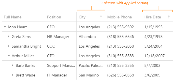
To apply sorting to a column, a user clicks its header or selects a command from the context menu.
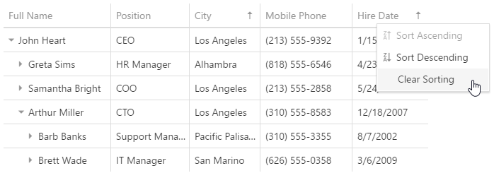
Note that rows are sorted within their hierarchical level.
See Also
stateStoring
Configures state storing.
State storing enables the UI component to save applied settings and restore them the next time the UI component is loaded. Assign true to the stateStoring.enabled property to enable this functionality.
State storing saves the following properties:
|
|
|
- expandedRowKeys are not saved if autoExpandAll is true.
See Also
tabIndex
Specifies the number of the element when the Tab key is used for navigating.
The value of this property will be passed to the tabindex attribute of the HTML element that underlies the UI component.
twoWayBindingEnabled
Specifies whether to enable two-way data binding.
Two-way data binding ensures that the UI tracks changes made in the data source by a 3rd-party component, and vice versa. This way, the UI component and its data source stay synchronized. If you implement two-way data binding in the UI component on your own using the cellTemplate and/or editCellTemplate properties, make sure to set the twoWayBindingEnabled property to false.
width
Specifies the UI component's width.
This property accepts a value of one of the following types:
Number
The width in pixels.String
A CSS-accepted measurement of width. For example,"55px","80%","auto","inherit".Function
A function returning either of the above. For example:JavaScriptwidth: function() { return window.innerWidth / 1.5; }

 Select one or more answers