JavaScript/jQuery Chart - series.label
Configures point labels.
Declared in commonSeriesSettings, the label settings apply to all point labels in the chart. Declared in a series configuration object, the label settings apply only to the point labels that belong to this particular series. The series-specific label settings override the common ones.
jQuery
$(function() {
    $("#chartContainer").dxChart({
        // ...
        series: [{
            label: {
                // Settings for all point labels of an individual series
            }
        }, {
            // ...
        }],
        commonSeriesSettings: {
            label: {
                // Settings for all point labels in the Chart
            }
        }
    });
});
Angular
<dx-chart ... >
    <dxi-chart-series>
        <dxo-chart-label ... >
            <!-- Settings for all point labels of an individual series -->
        </dxo-chart-label>
    </dxi-chart-series>
    <dxo-chart-common-series-settings ... >
        <dxo-chart-label ... >
            <!-- Settings for all point labels in the Chart -->
        </dxo-chart-label>
    </dxo-chart-common-series-settings>
</dx-chart>
import { Component } from '@angular/core';

@Component({
    selector: 'app-root',
    templateUrl: './app.component.html',
    styleUrls: ['./app.component.css']
})
export class AppComponent {
    // ...
}
import { BrowserModule } from '@angular/platform-browser';
import { NgModule } from '@angular/core';
import { AppComponent } from './app.component';

import { DxChartModule } from 'devextreme-angular';

@NgModule({
    declarations: [
        AppComponent
    ],
    imports: [
        BrowserModule,
        DxChartModule
    ],
    providers: [ ],
    bootstrap: [AppComponent]
})
export class AppModule { }
Vue
<template>
    <DxChart ... >
        <DxSeries ... >
            <DxLabel ...>
                <!-- Settings for all point labels of an individual series -->
            </DxLabel>
        </DxSeries>
        <DxCommonSeriesSettings ... >
            <DxLabel ... >
                <!-- Settings for all point labels in the Chart -->
            </DxLabel>
        </DxCommonSeriesSettings>
    </DxChart>
</template>

<script>
import DxChart, {
    DxSeries,
    DxLabel,
    DxCommonSeriesSettings
} from 'devextreme-vue/chart';

export default {
    components: {
        DxChart,
        DxSeries,
        DxLabel,
        DxCommonSeriesSettings
    },
    // ...
}
</script>
React
import React from 'react';

import Chart, {
    Series,
    Label,
    CommonSeriesSettings
} from 'devextreme-react/chart';

class App extends React.Component {
    render() {
        return (
            <Chart ... >
                <Series ... >
                    <Label ... >
                        // Settings for all point labels of an individual series
                    </Label>
                </Series>
                <CommonSeriesSettings ... >
                    <Label ... >
                        // Settings for all point labels in the Chart
                    </Label>
                </CommonSeriesSettings>
            </Chart>
        );
    }
}
export default App;See Also
alignment
Aligns point labels in relation to their points.
This property accepts the following values:
center
Displays labels in the center of the point.left
Aligns the left corner of the label to the center of the point.right
Aligns the right corner of the label to the center of the point.
argumentFormat
Formats the point argument before it is displayed in the point label. To format the point value, use the format property.
A point label displays only the point value by default. Using the label.customizeText property, you can instruct the label to display the point argument as well. The argumentFormat property applies in this case only. This property accepts an object whose fields are described in the format section.
See Also
- format - provides a comprehensive overview of formatting capabilities.
- Value Formatting - shows how to apply formatting to various UI component elements.
backgroundColor
Colors the point labels' background. The default color is inherited from the points.
This property supports the following colors:
- Hexadecimal colors
- RGB colors
- RGBA colors
- Predefined/cross-browser color names
- Predefined SVG colors
- Paint server address
You can remove the label's background by setting this property to "none". In this case, the label's text is the same color as the point.
connector
Configures the label connectors.
A point label is always displayed near its series point, though the label is placed separately. To make the relationship between the series point and its label evident, use a connector.
By default, label connectors are hidden. To make them visible, set the connector.visible property to true.
customizeText
Customizes text displayed by point labels.
Information on the series point.
Text displayed by label.
null to hide the series label.This property accepts a function whose parameter exposes the following fields.
| Field | Description |
|---|---|
| originalValue | The raw value of the point. |
| value | The originalValue after type cast. |
| valueText | The value with an applied format and converted to string. |
| originalArgument | The raw argument of the point. |
| argument | The originalArgument after type cast. |
| argumentText | The argument with an applied format and converted to string. |
| size | The size value of the point. For bubble series only. |
| index | 0 - if the point is minimum; 1 - if the point is maximum. For range area and range bar series only. |
| point | The Point object. |
| seriesName | The name of the series to which the point belongs. |
The following fields are inherent to stacked-like series only.
| Field | Description |
|---|---|
| percent | Point percentage value. |
| percentText | The percentage with an applied format and converted to string. |
| total | The sum of all values in the stack. |
| totalText | The total with an applied format and converted to string. |
The following fields are inherent to financial series (candlestick and stock) only.
| Field | Description |
|---|---|
| originalOpenValue | The raw open value of the point. |
| openValue | The originalOpenValue after type cast. |
| openValueText | The openValue with an applied format and converted to string. |
| originalCloseValue | The raw close value of the point. |
| closeValue | The originalCloseValue after type cast. |
| closeValueText | The closeValue with an applied format and converted to string. |
| originalHighValue | The raw high value of the point. |
| highValue | The originalHighValue after type cast. |
| highValueText | The highValue with an applied format and converted to string. |
| originalLowValue | The raw low value of the point. |
| lowValue | The originalLowValue after type cast. |
| lowValueText | The lowValue with an applied format and converted to string. |
| reductionValue | The reduction value. |
| reductionValueText | The reductionValue with an applied format and converted to string. |
this keyword.See Also
displayFormat
Specifies the label's text.
This property is ignored if labels are hidden.
Use the parameters of the label.customizeText function as placeholders in the displayFormat property value.
The example below illustrates how to customize label text for all series and individual series:
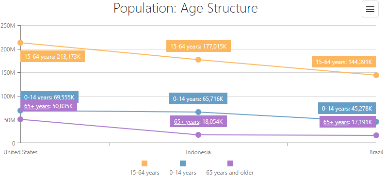
jQuery
$(function() {
    $("#chartContainer").dxChart({
    // ...
    commonSeriesSettings: {
        type: 'line',
        label: {
            format: 'thousands',
            visible: true,
            displayFormat: "{seriesName}: {valueText}",
        }
    },
    series: [
        { valueField: 'y1564', name: '15-64 years' },
        { valueField: 'y014', name: '0-14 years' },
        { valueField: 'y65', name: '65 years and older',
            label: {
                displayFormat: "<u>65+ years</u>: {valueText}",
            },
        },
    ],
    });
});
Angular
<dx-chart ... >
    <dxi-chart-series valueField="y1564" name="15-64 years"></dxi-chart-series>
    <dxi-chart-series valueField="y014" name="0-14 years"></dxi-chart-series>
    <dxi-chart-series valueField="y65" name="65 years and older">
        <dxo-chart-label displayformat="<u>65+ years</u>: {valueText}">
        </dxo-chart-label>
    </dxi-chart-series>
    <dxo-chart-common-series-settings ... >
        <dxo-chart-label
            format="thousands"
            [visible]="true"
            displayFormat="{seriesName}: {valueText}">
        </dxo-chart-label>
    </dxo-chart-common-series-settings>
</dx-chart>
import { Component } from '@angular/core';

@Component({
    selector: 'app-root',
    templateUrl: './app.component.html',
    styleUrls: ['./app.component.css']
})
export class AppComponent {
    // ...
}
import { BrowserModule } from '@angular/platform-browser';
import { NgModule } from '@angular/core';
import { AppComponent } from './app.component';

import { DxChartModule } from 'devextreme-angular';

@NgModule({
    declarations: [
        AppComponent
    ],
    imports: [
        BrowserModule,
        DxChartModule
    ],
    providers: [ ],
    bootstrap: [AppComponent]
})
export class AppModule { }
Vue
<template>
    <DxChart ... >
        <DxSeries
            value-field="y1564"
            name="15-64 years"
        />
        <DxSeries
            value-field="y014"
            name="0-14 years"
        />
        <DxSeries
            value-field="y65"
            name="65 years and older">
            <DxLabel display-format="<u>65+ years</u>: {valueText}" />
        </DxSeries>
        <DxCommonSeriesSettings ... >
            <DxLabel :visible="true" format="thousands" display-format="{seriesName}: {valueText}" />
        </DxCommonSeriesSettings>
    </DxChart>
</template>

<script>
import DxChart, {
    DxSeries,
    DxLabel,
    DxCommonSeriesSettings
} from 'devextreme-vue/chart';

export default {
    components: {
        DxChart,
        DxSeries,
        DxLabel,
        DxCommonSeriesSettings
    },
    // ...
}
</script>
React
import React from 'react';

import Chart, {
    Series,
    Label,
    CommonSeriesSettings
} from 'devextreme-react/chart';

class App extends React.Component {
    render() {
        return (
            <Chart ... >
                <Series valueField="y1564" name="15-64 years"></Series>
                <Series valueField="y014" name="0-14 years"></Series>
                <Series valueField="y65" name="65 years and older">
                    <Label displayFormat="<u>65+ years</u>: {valueText}" >
                    </Label>
                </Series>
                <CommonSeriesSettings ... >
                    <Label
                        format="thousands"
                        visible={true}
                        displayFormat="{seriesName}: {valueText}"
                        >
                    </Label>
                </CommonSeriesSettings>
            </Chart>
        );
    }
}
export default App;
ASP.NET Core Controls
@(Html.DevExtreme().Chart()
    .CommonSeriesSettings(s => s
        .Label(label => label
            .Format(Format.Thousands)
            .DisplayFormat("{seriesName}: {valueText}")
            .Visible(true)
            )
        )
    .Series(s => {
        s.Add().ValueField("y1564").Name("15-64 years");
        s.Add().ValueField("y014").Name("0-14 years");
        s.Add().ValueField("y65").Name("65 years and older").Label(label => label
            .DisplayFormat("<u>65+ years</u>: {valueText}")
        );
    })
    // ...
)
ASP.NET MVC Controls
@(Html.DevExtreme().Chart()
    .CommonSeriesSettings(s => s
        .Label(label => label
            .Format(Format.Thousands)
            .DisplayFormat("{seriesName}: {valueText}")
            .Visible(true)
            )
        )
    .Series(s => {
        s.Add().ValueField("y1564").Name("15-64 years");
        s.Add().ValueField("y014").Name("0-14 years");
        s.Add().ValueField("y65").Name("65 years and older").Label(label => label
            .DisplayFormat("<u>65+ years</u>: {valueText}")
        );
    })
    // ...
)format
Formats the point value before it is displayed in the point label.
See the format section for information on accepted values.
If you specify the format with an object and apply it to a full-stacked-like series, this object can also contain the percentPrecision field. Full-stacked-like series points have absolute and percentage values. The percentPrecision field specifies how many decimal digits the percentage values should have:
format: {
    type: "fixedPoint", // the format of absolute values
    precision: 1, // the precision of absolute values (123.456 --> 123.4)
    percentPrecision: 2 // the precision of percentage values (12.3456 % --> 12.34 %)
}
See Also
horizontalOffset
Along with verticalOffset, shifts point labels from their initial positions.
The number assigned to this property specifies the shift in pixels. A negative number shifts the point labels to the left, a positive number - to the right.
position
Specifies whether to display point labels inside or outside of series points. Applies only to bubble, range-like and bar-like series.
- The default value for full-stacked bar and stacked bar series is "inside".
- If valueAxis.label.position is "outside" and the series type is bar or stacked bar, the component may position labels of the highest bars inside. To ensure Chart always displays labels outside, increase maxValueMargin.
showForZeroValues
Specifies whether or not to show labels for points with zero value. Applies only to bar-like series.

 Select one or more answers