JavaScript/jQuery Drawer Options
This section describes properties that configure the Drawer UI component's contents, behavior and appearance.
See Also
activeStateEnabled
Specifies whether the UI component changes its visual state as a result of user interaction.
The UI component switches to the active state when users press down the primary mouse button. When this property is set to true, the CSS rules for the active state apply. You can change these rules to customize the component.
Use this property when you display the component on a platform whose guidelines include the active state change for UI components.
animationDuration
Specifies the duration of the drawer's opening and closing animation (in milliseconds). Applies only if animationEnabled is true.
animationEnabled
Specifies whether to use an opening and closing animation.
See Also
closeOnOutsideClick
Specifies whether to close the drawer if a user clicks or taps the view area.
Event (jQuery or EventObject)
The raised event. It is a EventObject or a jQuery.Event when you use jQuery.
true if the UI component should be closed; otherwise false.
The function passed to this property enables you to specify a custom condition for UI component closing. For instance, you can prevent closing until a user clicks a specific element on the view:
jQuery
$(function() {
    $("#drawerContainer").dxDrawer({
        // ...
        closeOnOutsideClick: function(e) {
            return e.target === $("#someElement").get()[0];
        }
    });
});
Angular
import { DxDrawerModule } from "devextreme-angular";
// ...
export class AppComponent {
    // ...
    closeOnOutsideClick(e) {
        return e.target === document.getElementById("someElement");
    }
}
@NgModule({
     imports: [
         // ...
         DxDrawerModule
     ],
     // ...
 })
<dx-drawer ...
    [closeOnOutsideClick]="closeOnOutsideClick">
</dx-drawer>
Vue
<template>
    <DxDrawer ....
        :close-on-outside-click="closeOnOutsideClick">
    </DxDrawer>
</template>

<script>
import 'devextreme/dist/css/dx.fluent.blue.light.css';

import DxDrawer from 'devextreme-vue/drawer';

export default {
    components: {
        DxDrawer
    },
    methods: {
        closeOnOutsideClick (e) {
            return e.target === document.getElementById("someElement");
        }
    }
}
</script>
React
import React from 'react';
import 'devextreme/dist/css/dx.fluent.blue.light.css';

import Drawer from 'devextreme-react/drawer';

const closeOnOutsideClick = (e) => {
    return e.target === document.getElementById("someElement");
};

export default function App() {
    return (
        <Drawer ...
            closeOnOutsideClick={closeOnOutsideClick}>
        </Drawer>
    );
}
disabled
Specifies whether the UI component responds to user interaction.
elementAttr
Specifies the global attributes to be attached to the UI component's container element.
jQuery
$(function(){
    $("#drawerContainer").dxDrawer({
        // ...
        elementAttr: {
            id: "elementId",
            class: "class-name"
        }
    });
});
Angular
<dx-drawer ...
    [elementAttr]="{ id: 'elementId', class: 'class-name' }">
</dx-drawer>
import { DxDrawerModule } from "devextreme-angular";
// ...
export class AppComponent {
    // ...
}
@NgModule({
    imports: [
        // ...
        DxDrawerModule
    ],
    // ...
})
Vue
<template>
    <DxDrawer ...
        :element-attr="drawerAttributes">
    </DxDrawer>
</template>

<script>
import DxDrawer from 'devextreme-vue/drawer';

export default {
    components: {
        DxDrawer
    },
    data() {
        return {
            drawerAttributes: {
                id: 'elementId',
                class: 'class-name'
            }
        }
    }
}
</script>
React
import React from 'react';

import Drawer from 'devextreme-react/drawer';

class App extends React.Component {
    drawerAttributes = {
        id: 'elementId',
        class: 'class-name'
    }

    render() {
        return (
            <Drawer ...
                elementAttr={this.drawerAttributes}>
            </Drawer>
        );
    }
}
export default App;
height
Specifies the view's height.
This property accepts a value of one of the following types:
Number
The height in pixels.String
A CSS-accepted measurement of height. For example,"55px","20vh","inherit". If you want to specify a relative height, usevhheight measurements.Function (deprecated since v21.2)
Refer to the W0017 warning description for information on how to migrate to viewport units.
hint
Specifies text for a hint that appears when a user pauses on the UI component.
hoverStateEnabled
Specifies whether the UI component changes its state when a user pauses on it.
maxSize
Specifies the drawer's width or height (depending on the drawer's position) in the opened state.
See Also
minSize
Specifies the drawer's width or height (depending on the drawer's position) in the closed state.
See Also
onDisposing
A function that is executed before the UI component is disposed of.
Information about the event.
| Name | Type | Description |
|---|---|---|
| element |
The UI component's container. It is an HTML Element or a jQuery Element when you use jQuery. |
|
| component |
The UI component's instance. |
onInitialized
A function used in JavaScript frameworks to save the UI component instance.
Information about the event.
| Name | Type | Description |
|---|---|---|
| element |
The UI component's container. It is an HTML Element or a jQuery Element when you use jQuery. |
|
| component |
The UI component's instance. |
Angular
<dx-drawer ...
    (onInitialized)="saveInstance($event)">
</dx-drawer>
import { Component } from "@angular/core";
import Drawer from "devextreme/ui/data_grid";
// ...
export class AppComponent {
    drawerInstance: Drawer;
    saveInstance (e) {
        this.drawerInstance = e.component;
    }
}
Vue
<template>
    <div>
        <DxDrawer ...
            @initialized="saveInstance">
        </DxDrawer>
    </div>
</template>

<script>
import DxDrawer from 'devextreme-vue/drawer';

export default {
    components: {
        DxDrawer
    },
    data: function() {
        return {
            drawerInstance: null
        };
    },
    methods: {
        saveInstance: function(e) {
            this.drawerInstance = e.component;
        }
    }
};
</script>
<template>
    <div>
        <DxDrawer ...
            @initialized="saveInstance">
        </DxDrawer>
    </div>
</template>

<script setup>
import DxDrawer from 'devextreme-vue/drawer';

let drawerInstance = null;

const saveInstance = (e) => {
    drawerInstance = e.component;
}
</script>
React
import Drawer from 'devextreme-react/drawer';

class App extends React.Component {
    constructor(props) {
        super(props);

        this.saveInstance = this.saveInstance.bind(this);
    }

    saveInstance(e) {
        this.drawerInstance = e.component;
    }

    render() {
        return (
            <div>
                <Drawer onInitialized={this.saveInstance} />
            </div>
        );
    }
}
See Also
onOptionChanged
A function that is executed after a UI component property is changed.
Information about the event.
| Name | Type | Description |
|---|---|---|
| value | any |
The modified property's new value. |
| previousValue | any |
The UI component's previous value. |
| name |
The modified property if it belongs to the first level. Otherwise, the first-level property it is nested into. |
|
| fullName |
The path to the modified property that includes all parent properties. |
|
| element |
The UI component's container. It is an HTML Element or a jQuery Element when you use jQuery. |
|
| component |
The UI component's instance. |
The following example shows how to subscribe to component property changes:
jQuery
$(function() {
    $("#drawerContainer").dxDrawer({
        // ...
        onOptionChanged: function(e) {
            if(e.name === "changedProperty") {
                // handle the property change here
            }
        }
    });
});
Angular
<dx-drawer ...
    (onOptionChanged)="handlePropertyChange($event)">
</dx-drawer>
import { Component } from '@angular/core';

@Component({
    selector: 'app-root',
    templateUrl: './app.component.html',
    styleUrls: ['./app.component.css']
})

export class AppComponent {
    // ...
    handlePropertyChange(e) {
        if(e.name === "changedProperty") {
            // handle the property change here
        }
    }
}
import { BrowserModule } from '@angular/platform-browser';
import { NgModule } from '@angular/core';
import { AppComponent } from './app.component';
import { DxDrawerModule } from 'devextreme-angular';

@NgModule({
    declarations: [
        AppComponent
    ],
    imports: [
        BrowserModule,
        DxDrawerModule
    ],
    providers: [ ],
    bootstrap: [AppComponent]
})

export class AppModule { }
Vue
<template>
    <DxDrawer ...
        @option-changed="handlePropertyChange"
    />
</template>

<script>
import 'devextreme/dist/css/dx.fluent.blue.light.css';
import DxDrawer from 'devextreme-vue/drawer';

export default {
    components: {
        DxDrawer
    },
    // ...
    methods: {
        handlePropertyChange: function(e) {
            if(e.name === "changedProperty") {
                // handle the property change here
            }
        }
    }
}
</script>
React
import React from 'react';
import 'devextreme/dist/css/dx.fluent.blue.light.css';

import Drawer from 'devextreme-react/drawer';

const handlePropertyChange = (e) => {
    if(e.name === "changedProperty") {
        // handle the property change here
    }
}

export default function App() {
    return (
        <Drawer ...
            onOptionChanged={handlePropertyChange}
        />
    );
} openedStateMode
Specifies how the drawer interacts with the view in the opened state.
The following modes are available:
"overlap"
The drawer overlaps the view. If you assign "overlap" to the openedStateMode property, the Drawer uses the Popup component to render a side menu. A z-index of all overlay UI components (Popup, Popover, etc.) on a page is calculated when a component is created and it takes into account the z-indexes of existing overlays. As a result, a newly opened Popup (the Drawer's panel) is displayed at the top. If you need to display a different window at the top, call the focus() method for the Popup after the openedStateMode property is changed."shrink"
The view's width decreases to accommodate the drawer."push"
The drawer partially displaces the view.
Note that if the value of this property changes, the Drawer template is re-rendered.
See Also
position
Specifies the drawer's position in relation to the view.
Use "before" and "after" if the Drawer should be positioned differently in right-to-left and regular representations. The following table shows the dependency between the rtlEnabled value and "before" and "after" positions:
| "before" | "after" | |
|---|---|---|
| rtlEnabled: false | left side of the view | right side of the view |
| rtlEnabled: true | right side of the view | left side of the view |
revealMode
Specifies the drawer's reveal mode.
The following modes are available:
"slide"
The drawer slides in. The drawer and its content are animated."expand"
The drawer expands from the closed position. The drawer's width is animated; its content is not.
When you change the Drawer's reveal mode, the component needs to perform recalculations for animation. As a result, the template is rerendered which can increase loading time.
See Also
rtlEnabled
Switches the UI component to a right-to-left representation.
When this property is set to true, the UI component text flows from right to left, and the layout of elements is reversed. To switch the entire application/site to the right-to-left representation, assign true to the rtlEnabled field of the object passed to the DevExpress.config(config) method.
DevExpress.config({
    rtlEnabled: true
});shading
Specifies whether to shade the view when the drawer is opened.
See Also
template
Specifies the drawer's content.
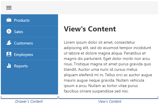
This property specifies the drawer's content. To specify the view's content, nest it inside the Drawer's markup element as shown in the code below.
jQuery
$(function() {
    $("#drawerContainer").dxDrawer({
        template: function() {
            const $drawerContent = $("<div>").width(200);
            // ...
            // Specify the drawer's content here
            // ...
            return $drawerContent;
        }
    });
});
<div id="drawerContainer">
    <!-- Declare the view's content here -->
</div>
Angular
<dx-drawer
    template="drawer-content">
    <div *dxTemplate="let data of 'drawer-content'" style="width:200px;">
        <!-- Declare the drawer's content here -->
    </div>
    <!-- Declare the view's content here -->
</dx-drawer>
Vue
<template>
    <DxDrawer
        template="drawer-content">
        <template #drawer-content="{ data }" style="width:200px;">
            <!-- Declare the drawer's content here -->
        </template>
        <!-- Declare the view's content here -->
    </DxDrawer>
</template>

<script>
import 'devextreme/dist/css/dx.fluent.blue.light.css';

import DxDrawer from 'devextreme-vue/drawer';

export default {
    components: {
        DxDrawer
    }
}
</script>
React
import React from 'react';

import 'devextreme/dist/css/dx.fluent.blue.light.css';

import Drawer from 'devextreme-react/drawer';

function DrawerContent() {
    return (
        <div style={{ width: 200 }}>
            {/* Declare the drawer's content here */}
        </div>
    )
}

export default function App() {
    return (
        <Drawer
            render={DrawerContent}>
            {/* Declare the view's content here */}
        </Drawer>
    );
}See Also
visible
Specifies whether the Drawer UI component (including the view) is visible.
width
Specifies the view's width.
This property accepts a value of one of the following types:
Number
The width in pixels.String
A CSS-accepted measurement of width. For example,"55px","20vw","auto","inherit". If you want to specify relative width, use thevwwidth measurements.Function (deprecated since v21.2)
Refer to the W0017 warning description for information on how you can migrate to viewport units.

 Select one or more answers