DevExtreme jQuery/JS - Predefined Themes
DevExtreme provides Generic, Generic Compact, Material Design, and Fluent (all trademarks or registered trademarks are property of their respective owners) themes. These themes are available in the following colors:
Generic Themes
Light
Light Compact
Dark
Dark Compact
Carmine
Carmine Compact
Soft Blue
Soft Blue Compact
Dark Moon
Dark Moon Compact
Dark Violet
Dark Violet Compact
Green Mist
Green Mist Compact
Contrast
Contrast Compact
Material Design Themes
Blue Light
Blue Light Compact
Blue Dark
Blue Dark Compact
Lime Light
Lime Light Compact
Lime Dark
Lime Dark Compact
Orange Light
Orange Light Compact
Orange Dark
Orange Dark Compact
Purple Light
Purple Light Compact
Purple Dark
Purple Dark Compact
Teal Light
Teal Light Compact
Teal Dark
Teal Dark Compact
Fluent Themes
Blue Light
Blue Light Compact
Blue Dark
Blue Dark Compact
SaaS Light
SaaS Light Compact
SaaS Dark
SaaS Dark Compact
Each theme is a stylesheet that contains a collection of CSS classes. The following stylesheets are available out of the box:
dx.light.cssdx.dark.cssdx.carmine.cssdx.softblue.cssdx.darkmoon.cssdx.darkviolet.cssdx.greenmist.cssdx.contrast.css
dx.light.compact.cssdx.dark.compact.cssdx.carmine.compact.cssdx.softblue.compact.cssdx.darkmoon.compact.cssdx.darkviolet.compact.cssdx.greenmist.compact.cssdx.contrast.compact.css
dx.material.blue.light.cssdx.material.blue.dark.cssdx.material.lime.light.cssdx.material.lime.dark.cssdx.material.orange.light.cssdx.material.orange.dark.cssdx.material.purple.light.cssdx.material.purple.dark.cssdx.material.teal.light.cssdx.material.teal.dark.css
dx.material.blue.light.compact.cssdx.material.blue.dark.compact.cssdx.material.lime.light.compact.cssdx.material.lime.dark.compact.cssdx.material.orange.light.compact.cssdx.material.orange.dark.compact.cssdx.material.purple.light.compact.cssdx.material.purple.dark.compact.cssdx.material.teal.light.compact.cssdx.material.teal.dark.compact.css
dx.fluent.blue.light.cssdx.fluent.blue.dark.cssdx.fluent.saas.light.cssdx.fluent.saas.dark.css
dx.fluent.blue.light.compact.cssdx.fluent.blue.dark.compact.cssdx.fluent.saas.light.compact.cssdx.fluent.saas.dark.compact.css
CSS themes are designed to customize HTML-based UI components. However, SVG-based UI components use their own themes to assume an appearance that matches a particular CSS theme. Refer to the Themes article for more information on themes in SVG-based UI components.
Apply a Theme
jQuery
To apply a theme, include a theme stylesheet in the index page's <head> tag. You can use local files or get the stylesheets from CDN.
Angular
To apply a theme, configure the module bundler you use and import a theme stylesheet. Refer to the following article for detailed instructions: Configure Stylesheets.
Vue
To apply a theme, configure the module bundler you use and import a theme stylesheet. Refer to the following article for detailed instructions: Import Stylesheets.
React
To apply a theme, configure the module bundler you use and import a theme stylesheet. Refer to the following article for detailed instructions: Import Stylesheets.
Using SCSS
You can import a theme bundle from the bundles folder of the devextreme package into the root .scss file:
/* @use 'devextreme/scss/bundles/dx.theme_name.scss';  */
@use 'devextreme/scss/bundles/dx.carmine.scss';
Alternatively, you can import individual files that comprise a theme. The theme folder name is material, generic, or fluent depending on the theme family. The example below imports files from the Material Blue Light Compact theme:
@use 'devextreme/scss/widgets/material/colors' with ($color: 'blue', $mode: 'light');
@use 'devextreme/scss/widgets/material/sizes' with ($size: 'compact');
@use 'devextreme/scss/widgets/material/icons';
@use 'devextreme/scss/widgets/material/widget';
@use 'devextreme/scss/widgets/material/card';
@use 'devextreme/scss/widgets/material/fieldset';
@use 'devextreme/scss/widgets/material/common';
@use 'devextreme/scss/widgets/base/resizable';
@use 'devextreme/scss/widgets/base/draggable';
@use 'devextreme/scss/widgets/base/ui';
@use 'devextreme/scss/widgets/material';
To import only specific components, replace @use 'devextreme/scss/widgets/themeName'; with @use 'devextreme/scss/widgets/themeName/componentName';:
@use "devextreme/scss/widgets/generic/colors" with ($color: "darkmoon");
@use "devextreme/scss/widgets/generic/sizes" with ($size: "default");
@use "devextreme/scss/widgets/generic/typography";
@use "devextreme/scss/widgets/generic/icons";
@use "devextreme/scss/widgets/generic/widget";
@use "devextreme/scss/widgets/generic/card";
@use "devextreme/scss/widgets/generic/fieldset";
@use "devextreme/scss/widgets/generic/common";
@use "devextreme/scss/widgets/base/resizable";
@use "devextreme/scss/widgets/base/draggable";
@use "devextreme/scss/widgets/base/ui";
@use "devextreme/scss/widgets/generic/textBox";
@use "devextreme/scss/widgets/generic/button";
You can use the following variables in imported files:
$mode
The main theme palette (darkorlight). This variable has effect onMaterialthemes only.$color
Derived from the theme name. This variable defines the main theme color (blue, carmine, contrast, etc.)$size:
Can becompactordefault.
devextreme/scss/widgets/ folder to learn about customizable variables. Note that this code is internal and DevExtreme does not have complete documentation for the SCSS structure. Variable names, import order, and the folder structure may change in future builds without official notice. To customize specific variables, use ThemeBuilder or override individual CSS classes.Color Swatches
Color swatches are secondary color schemes used alongside a primary color scheme. You can use them to stylize parts of your application differently, for instance, when the navigation sidebar should be dark and the content area light.
A color swatch is defined by scoped CSS rules that are prefixed with a specific selector: dx-swatch-xxx (for instance, dx-swatch-green). To apply a color swatch to a part of an HTML document, wrap this part as follows:
<div>
    This content applies the primary color scheme

    <div class="dx-swatch-dark">
        This content applies the "dark" color scheme
    </div>
</div>You can generate color swatches with the DevExtreme CLI or ThemeBuilder UI:
-
The following command generates a new
customcolor swatch that uses Generic Dark as a base theme:Code> devextreme build-theme –-base-theme="generic.dark" --make-swatch --output-color-scheme="dark" // ===== or without installing DevExtreme CLI globally ===== > npx -p devextreme-cli devextreme build-theme –-base-theme="generic.dark" --make-swatch --output-color-scheme="dark"
The result of this command is a
dx.generic.dark.cssfile in which every rule is prefixed with the.dx-swatch-darkCSS selector. Move the file to the application folder, register it, and add the swatch class to a page element.Refer to DevExtreme CLI: ThemeBuilder for more information about CLI commands and command line arguments.
-
Click Export on the toolbar to open the Theme Export pop-up dialog. Enter the color swatch's name, check the Save as a color swatch checkbox, and proceed to the last step.
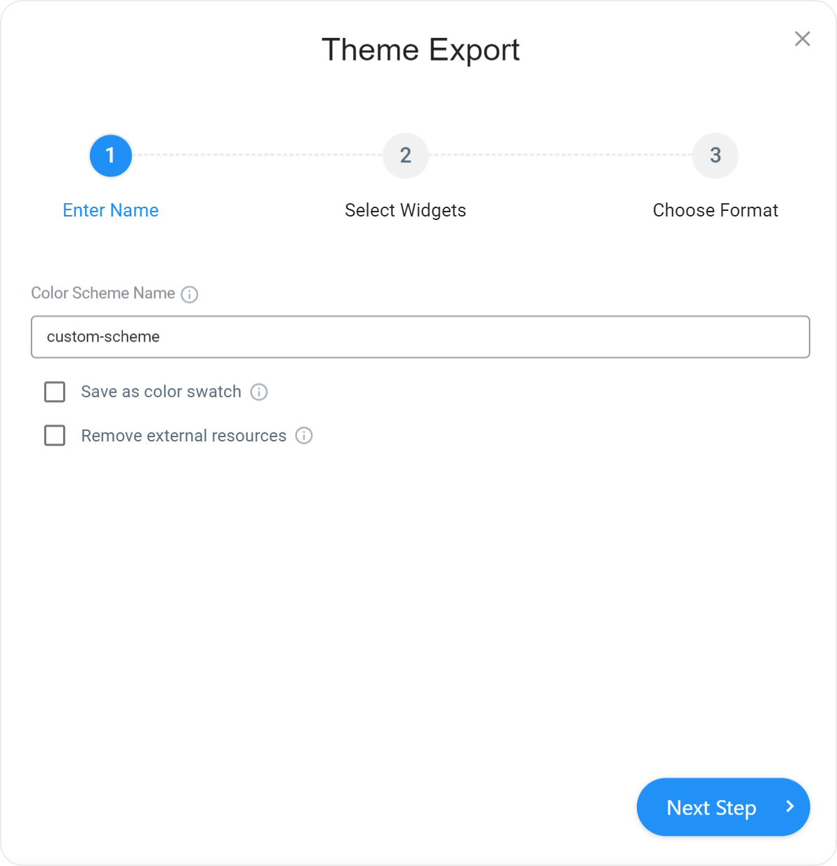
Click Download CSS File to save a CSS file on your computer.
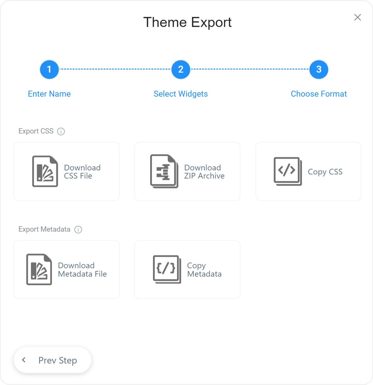
Move the resulting CSS file to the application folder, register it, and add the swatch class to a page element.
Without Page Reload
You can use this approach only if the themes belong to the same group. For instance, you can switch from Generic Light to any other Generic theme, but not to a Generic Compact or Material Design theme (see Predefined Themes).
Include theme stylesheets on your
index.htmlpage as shown below. A theme with thedata-activeattribute set totrueis applied. In the following code snippet, the light theme is used:jQuery
index.html<head> <!-- Generic themes --> <link rel="dx-theme" data-theme="generic.light" href="css/dx.light.css" data-active="true"> <link rel="dx-theme" data-theme="generic.dark" href="css/dx.dark.css" data-active="false"> <link rel="dx-theme" data-theme="generic.contrast" href="css/dx.contrast.css" data-active="false"> <!-- ... --> <!-- or Generic Compact themes--> <link rel="dx-theme" data-theme="generic.light.compact" href="css/dx.light.compact.css" data-active="true"> <link rel="dx-theme" data-theme="generic.dark.compact" href="css/dx.dark.compact.css" data-active="false"> <link rel="dx-theme" data-theme="generic.contrast.compact" href="css/dx.contrast.compact.css" data-active="false"> <!-- ... --> <!-- or Material Design themes--> <link rel="dx-theme" data-theme="material.blue.light" href="css/dx.material.blue.light.css" data-active="true"> <link rel="dx-theme" data-theme="material.blue.dark" href="css/dx.material.blue.dark.css" data-active="false"> <link rel="dx-theme" data-theme="material.teal.light" href="css/dx.material.teal.light.css" data-active="false"> <!-- ... --> </head>Angular
If you want your themes to update automatically with the DevExtreme package, reference them in
angular.json, and after, use the themes inindex.html.angular.jsonindex.html"assets": [ "src/favicon.ico", "src/assets", { "glob": "**/*", "input": "./node_modules/devextreme/dist/css/", "output": "assets" } ],<head> <!-- Generic themes --> <link rel="dx-theme" data-theme="generic.light" href="assets/dx.light.css" data-active="true"> <link rel="dx-theme" data-theme="generic.dark" href="assets/dx.dark.css" data-active="false"> <link rel="dx-theme" data-theme="generic.contrast" href="assets/dx.contrast.css" data-active="false"> <!-- ... --> <!-- or Generic Compact themes--> <link rel="dx-theme" data-theme="generic.light.compact" href="assets/dx.light.compact.css" data-active="true"> <link rel="dx-theme" data-theme="generic.dark.compact" href="assets/dx.dark.compact.css" data-active="false"> <link rel="dx-theme" data-theme="generic.contrast.compact" href="assets/dx.contrast.compact.css" data-active="false"> <!-- ... --> <!-- or Material Design themes--> <link rel="dx-theme" data-theme="material.blue.light" href="assets/dx.material.blue.light.css" data-active="true"> <link rel="dx-theme" data-theme="material.blue.dark" href="assets/dx.material.blue.dark.css" data-active="false"> <link rel="dx-theme" data-theme="material.teal.light" href="assets/dx.material.teal.light.css" data-active="false"> <!-- ... --> </head>Vue
Copy the stylesheets, fonts, and icons you want to use from
node_modules/devextreme/dist/css/folder to thepublicfolder. If you created your own theme, place it in thepublicfolder.index.html<head> <!-- Generic themes --> <link rel="dx-theme" data-theme="generic.light" href="<%= BASE_URL %>dx.light.css" data-active="true"> <link rel="dx-theme" data-theme="generic.dark" href="<%= BASE_URL %>dx.dark.css" data-active="false"> <link rel="dx-theme" data-theme="generic.contrast" href="<%= BASE_URL %>dx.contrast.css" data-active="false"> <!-- ... --> <!-- or Generic Compact themes--> <link rel="dx-theme" data-theme="generic.light.compact" href="<%= BASE_URL %>dx.light.compact.css" data-active="true"> <link rel="dx-theme" data-theme="generic.dark.compact" href="<%= BASE_URL %>dx.dark.compact.css" data-active="false"> <link rel="dx-theme" data-theme="generic.contrast.compact" href="<%= BASE_URL %>dx.contrast.compact.css" data-active="false"> <!-- ... --> <!-- or Material Design themes--> <link rel="dx-theme" data-theme="material.blue.light" href="<%= BASE_URL %>dx.material.blue.light.css" data-active="true"> <link rel="dx-theme" data-theme="material.blue.dark" href="<%= BASE_URL %>dx.material.blue.dark.css" data-active="false"> <link rel="dx-theme" data-theme="material.teal.light" href="<%= BASE_URL %>dx.material.teal.light.css" data-active="false"> <!-- ... --> </head>React
Copy the stylesheets, fonts, and icons you want to use from
node_modules/devextreme/dist/css/folder to thepublicfolder. If you created your own theme, place it in thepublicfolder.index.html<head> <!-- Generic themes --> <link rel="dx-theme" data-theme="generic.light" href="%PUBLIC_URL%/dx.light.css" data-active="true"> <link rel="dx-theme" data-theme="generic.dark" href="%PUBLIC_URL%/dx.dark.css" data-active="false"> <link rel="dx-theme" data-theme="generic.contrast" href="%PUBLIC_URL%/dx.contrast.css" data-active="false"> <!-- ... --> <!-- or Generic Compact themes--> <link rel="dx-theme" data-theme="generic.light.compact" href="%PUBLIC_URL%/dx.light.compact.css" data-active="true"> <link rel="dx-theme" data-theme="generic.dark.compact" href="%PUBLIC_URL%/dx.dark.compact.css" data-active="false"> <link rel="dx-theme" data-theme="generic.contrast.compact" href="%PUBLIC_URL%/dx.contrast.compact.css" data-active="false"> <!-- ... --> <!-- or Material Design themes--> <link rel="dx-theme" data-theme="material.blue.light" href="%PUBLIC_URL%/dx.material.blue.light.css" data-active="true"> <link rel="dx-theme" data-theme="material.blue.dark" href="%PUBLIC_URL%/dx.material.blue.dark.css" data-active="false"> <link rel="dx-theme" data-theme="material.teal.light" href="%PUBLIC_URL%/dx.material.teal.light.css" data-active="false"> <!-- ... --> </head>Use the DevExpress.ui.themes.current(themeName) method to switch to another theme.
The method accepts the data-theme attribute value. For example, if you want to switch to dx.generic.dark, pass generic.dark (without the 'dx' prefix) as an argument in the method. For a custom theme, specify the theme you used as a base. If both of your themes are derived from the same base, get the data-theme value from the font-family value of the dx-theme-marker CSS class, which is located in each theme's CSS file.
If you use SVG components, you should also call the refreshTheme() method to update their theme. The following example shows how to apply the Generic Contrast theme:
jQuery
DevExpress.ui.themes.current("generic.contrast");
// When using SVG components
// DevExpress.viz.refreshTheme();
Angular
import { themes } from "devextreme/ui/themes";
themes.current("generic.contrast");

// When using SVG components
// import { refreshTheme } from "devextreme/viz/themes";
// refreshTheme();
Vue
import { themes } from "devextreme/ui/themes";
themes.current("generic.contrast");

// When using SVG components
// import { refreshTheme } from "devextreme/viz/themes";
// refreshTheme();
React
import { themes } from "devextreme/ui/themes";
themes.current("generic.contrast");

// When using SVG components
// import { refreshTheme } from "devextreme/viz/themes";
// refreshTheme();With Page Reload
This approach is suitable for switching between any themes, but it involves page reload:
Include theme stylesheets on your index page as shown below. The syntax is the same as in the step 1 of the previous instructions, but the
data-activeattributes are set to false for all themes.jQuery
index.html<head> <link rel="dx-theme" data-theme="material.blue.light" href="css/dx.material.blue.light.css" data-active="false"> <link rel="dx-theme" data-theme="material.blue.dark" href="css/dx.material.blue.dark.css" data-active="false"> <link rel="dx-theme" data-theme="material.teal.light" href="css/dx.material.teal.light.css" data-active="false"> <!-- ... --> </head>Angular
If you want your themes to update automatically with the DevExtreme package, reference them in
angular.json, and after, use the themes inindex.html.angular.jsonindex.html"assets": [ "src/favicon.ico", "src/assets", { "glob": "**/*", "input": "./node_modules/devextreme/dist/css/", "output": "assets" } ],<head> <link rel="dx-theme" data-theme="material.blue.light" href="assets/dx.material.blue.light.css" data-active="false"> <link rel="dx-theme" data-theme="material.blue.dark" href="assets/dx.material.blue.dark.css" data-active="false"> <link rel="dx-theme" data-theme="material.teal.light" href="assets/dx.material.teal.light.css" data-active="false"> <!-- ... --> </head>Vue
Copy the stylesheets you want to use from
node_modules/devextreme/dist/css/folder to thepublicfolder. If you created your own theme, place it in thepublicfolder.index.html<head> <link rel="dx-theme" data-theme="material.blue.light" href="<%= BASE_URL %>dx.material.blue.light.css" data-active="false"> <link rel="dx-theme" data-theme="material.blue.dark" href="<%= BASE_URL %>dx.material.blue.dark.css" data-active="false"> <link rel="dx-theme" data-theme="material.teal.light" href="<%= BASE_URL %>dx.material.teal.light.css" data-active="false"> <!-- ... --> </head>React
Copy the stylesheets you want to use from
node_modules/devextreme/dist/css/folder to thepublicfolder. If you created your own theme, place it in thepublicfolder.index.html<head> <link rel="dx-theme" data-theme="material.blue.light" href="%PUBLIC_URL%/dx.material.blue.light.css" data-active="false"> <link rel="dx-theme" data-theme="material.blue.dark" href="%PUBLIC_URL%/dx.material.blue.dark.css" data-active="false"> <link rel="dx-theme" data-theme="material.teal.light" href="%PUBLIC_URL%/dx.material.teal.light.css" data-active="false"> <!-- ... --> </head>Save the target theme's name in the window.localStorage and reload the page:
Codevar switchTheme = function(themeName) { window.localStorage.setItem("dx-theme", themeName); window.location.reload(); }On page loading, restore the theme name and pass it to the DevExpress.ui.themes.current(themeName) method. You can also specify the theme to be applied in case no theme name is found in the window.localStorage. In the following code, it is the Material Blue Light theme.
jQuery
CodeDevExpress.ui.themes.current(window.localStorage.getItem("dx-theme") || "material.blue.light");Angular
Codeimport themes from "devextreme/ui/themes"; themes.current(window.localStorage.getItem("dx-theme") || "material.blue.light");Vue
Codeimport themes from "devextreme/ui/themes"; themes.current(window.localStorage.getItem("dx-theme") || "material.blue.light");React
Codeimport themes from "devextreme/ui/themes"; themes.current(window.localStorage.getItem("dx-theme") || "material.blue.light");
Switch Between Color Swatches
You can use StyleSheet API to switch between color swatches. In the following code, theme swatches are called theme.custom-scheme.light.css and theme.custom-scheme.dark.css and are placed in the same folder as index.html. The code uses SelectBox to implement the swatch selector. To switch between themes too, call DevExpress.ui.themes.current(themeName) method in the onValueChanged callback.
jQuery
$(() => {
    const themeData = ["light", "dark"];
    const themeMarker = "theme.";

    $("#themeSelector").dxSelectBox({
        dataSource: themeData,
        value: themeData[0],
        onValueChanged(e) {
            let accent = e.value;
            for (let index in document.styleSheets) {
                let styleSheet = document.styleSheets[index],
                    href = styleSheet.href;
                if (href) {
                    let themeMarkerPosition = href.indexOf(themeMarker);
                    let startPosition = themeMarkerPosition + themeMarker.length,
                        endPosition = href.indexOf(".css"),
                        fileNamePart = href.substring(startPosition, endPosition);
                    if (fileNamePart.includes("custom-scheme")) {
                        styleSheet.disabled = !(
                            accent === fileNamePart.substring(fileNamePart.indexOf('.')+1)
                        );
                    }
                }
            }
        },
    });
});
Angular
import { Component } from '@angular/core';

@Component({
    selector: 'app-root',
    templateUrl: './app.component.html',
    styleUrls: ['./app.component.css']
})

export class AppComponent {
    themeData = ["light", "dark"];
    themeMarker = "theme.";
    onValueChanged(e) {
        let accent = e.value;
        for (let index in document.styleSheets) {
            let styleSheet = document.styleSheets[index],
                href = styleSheet.href;
            if (href) {
                let themeMarkerPosition = href.indexOf(this.themeMarker);
                let startPosition = themeMarkerPosition + this.themeMarker.length,
                    endPosition = href.indexOf(".css"),
                    fileNamePart = href.substring(startPosition, endPosition);
                if (fileNamePart.includes("custom-scheme")) {
                    styleSheet.disabled = !(
                        accent === fileNamePart.substring(fileNamePart.indexOf('.')+1)
                    );
                }
            }
        }
    };
}
<dx-select-box
    [dataSource]="themeData"
    [value]="themeData[0]"
    (onValueChanged)="onValueChanged($event)"
></dx-select-box>
Vue
<template>
    <DxSelectBox
        :data-source="themeData"
        :value="themeData[0]"
        @value-changed="onValueChanged"
    ></DxSelectBox>
</template>

<script>
    import { DxSelectBox } from "devextreme-vue";
    export default {
        name: "App",
        components: {
            DxSelectBox,
        },
        data() {
            return {
                themeData: ["light", "dark"],
                themeMarker: "theme."
            };
        },
        methods: {
            onValueChanged(e) {
                let accent = e.value;
                for (let index in document.styleSheets) {
                    let styleSheet = document.styleSheets[index],
                        href = styleSheet.href;
                    if (href) {
                        let themeMarkerPosition = href.indexOf(this.themeMarker);
                        let startPosition = themeMarkerPosition + this.themeMarker.length,
                            endPosition = href.indexOf(".css"),
                            fileNamePart = href.substring(startPosition, endPosition);
                        if (fileNamePart.includes("custom-scheme")) {
                            styleSheet.disabled = !(
                                accent === fileNamePart.substring(fileNamePart.indexOf('.')+1)
                            );
                        }
                    }
                }
            }
        }
    };
</script>
React
import React, { useState, useCallback } from 'react';
import { SelectBox } from 'devextreme-react';

const themeData = ["light", "dark"];
const themeMarker = "theme.";

function App() {
    const [value, setValue] = useState(themeData[0]);

    const onValueChanged = useCallback((accent) => {
        setValue(accent);
        for (let index in document.styleSheets) {
            let styleSheet = document.styleSheets[index],
                href = styleSheet.href;
            if (href) {
                let themeMarkerPosition = href.indexOf(themeMarker);
                let startPosition = themeMarkerPosition + themeMarker.length,
                    endPosition = href.indexOf(".css"),
                    fileNamePart = href.substring(startPosition, endPosition);
                if (fileNamePart.includes("custom-scheme")) {
                    styleSheet.disabled = !(
                        accent === fileNamePart.substring(fileNamePart.indexOf('.')+1)
                    );
                }
            }
        }
    }, []);

    return (
        <React.Fragment>
            <SelectBox
                dataSource={themeData}
                value={value}
                onValueChange={onValueChanged}
            />
        </React.Fragment>
    );
}

export default App;
You can use the StyleSheet API to switch between swatches and themes. Refer to the following GitHub repository for more information:

 Select one or more answers