JavaScript/jQuery DataGrid - Adaptability
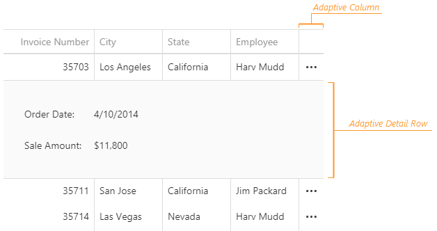
The DataGrid can hide columns and adapt its layout to screens of different sizes. Data from hidden columns is available in adaptive detail rows. A user can click the ellipsis buttons in the adaptive column to expand or collapse these rows:
Hide Columns
When the total width of columns exceeds component width, the DataGrid either truncates column cell text or adds horizontal scrolling. As an alternative, the component can hide one or several columns to prevent horizontal scrolling and display cell text in full. To enable this feature, set the columnHidingEnabled property to true.
Each column has a unique default hiding priority. The rightmost column has the priority of 0. This value is incremented by 1 for columns from right to left; the column with the lowest priority is hidden first.
You can use the columns[].hidingPriority property to specify custom hiding priorities for those columns that you want to hide. Other columns will never be hidden. This will override the default behavior described above. In this case, the columnHidingEnabled property can be omitted.
jQuery
$(function() {
    $("#dataGridContainer").dxDataGrid({
        columnHidingEnabled: true,
        // These columns will be hidden in the following order:
        columns: [{
            // ...
            hidingPriority: 0 // first
        }, {
            // ...
            hidingPriority: 1 // second
        }, {
            // ...
            hidingPriority: 2 // third
        }]
    });
});
Angular
<dx-data-grid ...
    [columnHidingEnabled]="true">
    <!-- These columns will be hidden in the following order: -->
    <dxi-data-grid-column [hidingPriority]="0" ... ></dxi-data-grid-column> <!-- first -->
    <dxi-data-grid-column [hidingPriority]="1" ... ></dxi-data-grid-column> <!-- second -->
    <dxi-data-grid-column [hidingPriority]="2" ... ></dxi-data-grid-column> <!-- third -->
</dx-data-grid>
import { DxDataGridModule } from "devextreme-angular";
// ...
export class AppComponent {
    // ...
}
@NgModule({
    imports: [
        // ...
        DxDataGridModule
    ],
    // ...
})
Vue
<template>
    <DxDataGrid ...
        :column-hiding-enabled="true">
        <!-- These columns will be hidden in the following order: -->
        <DxColumn :hiding-priority="0" ... /> <!-- first -->
        <DxColumn :hiding-priority="1" ... /> <!-- second -->
        <DxColumn :hiding-priority="2" ... /> <!-- third -->
    </DxDataGrid>
</template>

<script>
import 'devextreme/dist/css/dx.light.css';

import DxDataGrid, {
    DxColumn
} from 'devextreme-vue/data-grid';

export default {
    components: {
        DxDataGrid,
        DxColumn
    },
    // ...
}
</script>
React
import React from 'react';

import 'devextreme/dist/css/dx.light.css';

import DataGrid, {
    Column
} from 'devextreme-react/data-grid';

export default function App() {
    return (
        <DataGrid ...
            columnHidingEnabled={true}>
            {/* These columns will be hidden in the following order: */}
            <Column defaultHidingPriority={0} ... /> {/* first */}
            <Column defaultHidingPriority={1} ... /> {/* second */}
            <Column defaultHidingPriority={2} ... /> {/* third */}
        </DataGrid>
    );
}If your DataGrid is inside a resizable container, you must call the updateDimensions() method on each container resize to rerender the component:
jQuery
$("#dataGridContainer").dxDataGrid("updateDimensions");Angular
import { ..., ViewChild } from "@angular/core";
import { DxDataGridModule, DxDataGridComponent } from "devextreme-angular";
// ...
export class AppComponent {
    @ViewChild(DxDataGridComponent, { static: false }) dataGrid: DxDataGridComponent;
    // Prior to Angular 8
    // @ViewChild(DxDataGridComponent) dataGrid: DxDataGridComponent;
    renderDataGrid () {
        this.dataGrid.instance.updateDimensions();
    };
}
@NgModule({
    imports: [
        // ...
        DxDataGridModule
    ],
    // ...
})
Vue
<template>
    <DxDataGrid ...
        :ref="dataGridRefKey">
    </DxDataGrid>
</template>

<script>
import 'devextreme/dist/css/dx.light.css';

import DxDataGrid from 'devextreme-vue/data-grid';

const dataGridRefKey = "my-data-grid";

export default {
    components: {
        DxDataGrid
    },
    data() {
        return() {
            dataGridRefKey
        }
    },
    methods: {
        renderDataGrid() {
            this.dataGrid.updateDimensions();
        }
    },
    computed: {
        dataGrid: function() {
            return this.$refs[dataGridRefKey].instance;
        }
    }
}
</script>
React
import React, { useRef } from 'react';
import 'devextreme/dist/css/dx.light.css';
import DataGrid from 'devextreme-react/data-grid';

export default function App() {
    const dataGrid = useRef(null);
    const renderDataGrid = () => {
        dataGrid.current.instance().updateDimensions();
    };

    return (
        <DataGrid ref={dataGrid}>
            {/* ... */ }
        </DataGrid>
    );
}
Customize Adaptive Detail Row
Adaptive detail rows contain the Form UI component. You can implement the onAdaptiveDetailRowPreparing handler to customize the Form: change its properties in the formOptions attribute of the function's argument. For example, the following code marks the form's "OrderID" data field as required:
jQuery
$(function() {
    $("#dataGridContainer").dxDataGrid({
        // ...
        onAdaptiveDetailRowPreparing: function (e) {
            for (let formItem of e.formOptions.items) {
                if (formItem.dataField == "OrderID") {
                    formItem.isRequired = true;
                }
            }
        }
    });
});
Angular
import { DxDataGridModule } from "devextreme-angular";
// ...
export class AppComponent {
    onAdaptiveDetailRowPreparing (e) {
        for (let formItem of e.formOptions.items) {
            if (formItem.dataField == "OrderID") {
                formItem.isRequired = true;
            }
        }
    }
}
@NgModule({
    imports: [
        // ...
        DxDataGridModule
    ],
    // ...
})
<dx-data-grid ...
    (onAdaptiveDetailRowPreparing)="onAdaptiveDetailRowPreparing($event)">
</dx-data-grid>
Vue
<template>
    <DxDataGrid ...
        :@adaptive-detail-row-preparing="onAdaptiveDetailRowPreparing">
    </DxDataGrid>
</template>

<script>
import 'devextreme/dist/css/dx.light.css';

import DxDataGrid from 'devextreme-vue/data-grid';

export default {
    components: {
        DxDataGrid
    },
    methods: {
        onAdaptiveDetailRowPreparing(e) {
            for (let formItem of e.formOptions.items) {
                if (formItem.dataField == 'OrderID') {
                    formItem.isRequired = true;
                }
            }
        }
    }
}
</script>
React
import React from 'react';

import 'devextreme/dist/css/dx.light.css';

import DataGrid from 'devextreme-react/data-grid';

const onAdaptiveDetailRowPreparing = (e) => {
    for (let formItem of e.formOptions.items) {
        if (formItem.dataField == 'OrderID') {
            formItem.isRequired = true;
        }
    }
};

export default function App() {
    return (
        <DataGrid ...
            onAdaptiveDetailRowPreparing={onAdaptiveDetailRowPreparing}>
        </DataGrid>
    );
}
Expand and Collapse Adaptive Detail Rows
You can call the expandAdaptiveDetailRow(key) or collapseAdaptiveDetailRow() method to expand or collapse an adaptive detail row. To check whether a specific row is expanded, use the isAdaptiveDetailRowExpanded(key) method. Note that only one detail row can be expanded at a time.
jQuery
var expandAdaptiveDetailRow = function (key, dataGridInstance) {
    if (!dataGridInstance.isAdaptiveDetailRowExpanded(key)) {
        dataGridInstance.expandAdaptiveDetailRow(key);
    }
}
Angular
import { ..., ViewChild } from "@angular/core";
import { DxDataGridModule, DxDataGridComponent } from "devextreme-angular";
// ...
export class AppComponent {
    @ViewChild(DxDataGridComponent, { static: false }) dataGrid: DxDataGridComponent;
    // Prior to Angular 8
    // @ViewChild(DxDataGridComponent) dataGrid: DxDataGridComponent;
    expandAdaptiveDetailRow (key) {
        if (!this.dataGrid.instance.isAdaptiveDetailRowExpanded(key)) {
            this.dataGrid.instance.expandAdaptiveDetailRow(key);
        }
    }
}
@NgModule({
    imports: [
        // ...
        DxDataGridModule
    ],
    // ...
})
Vue
<template>
    <DxDataGrid ...
        :ref="dataGridRefKey">
    </DxDataGrid>
</template>

<script>
import 'devextreme/dist/css/dx.light.css';

import DxDataGrid from 'devextreme-vue/data-grid';

const dataGridRefKey = "my-data-grid";

export default {
    components: {
        DxDataGrid
    },
    data() {
        return() {
            dataGridRefKey
        }
    },
    methods: {
        expandAdaptiveDetailRow(key) {
            if (!this.dataGrid.isAdaptiveDetailRowExpanded(key)) {
                this.dataGrid.expandAdaptiveDetailRow(key);
            }
        }
    },
    computed: {
        dataGrid: function() {
            return this.$refs[dataGridRefKey].instance;
        }
    }
}
</script>
React
import React, { useRef } from 'react';
import 'devextreme/dist/css/dx.light.css';
import DataGrid from 'devextreme-react/data-grid';

export default function App() {
    const dataGrid = useRef(null);
    const expandAdaptiveDetailRow = (key) => {
        if (!dataGrid.current.instance().isAdaptiveDetailRowExpanded(key)) {
            dataGrid.current.instance().expandAdaptiveDetailRow(key);
        }
    };

    return (
        <DataGrid ref={dataGrid}>
            {/* ... */ }
        </DataGrid>
    );
}
See Also

 Select one or more answers