React FilterBuilder Props
An object defining the FilterBuilder widget's configuration options.
See Also
- Configure a Widget: Angular | Vue | React | jQuery | AngularJS | Knockout | ASP.NET MVC 5 | ASP.NET Core
accessKey
Specifies the shortcut key that sets focus on the widget.
The value of this option will be passed to the accesskey attribute of the HTML element that underlies the widget.
activeStateEnabled
Specifies whether or not the widget changes its state when interacting with a user.
This option is used when the widget is displayed on a platform whose guidelines include the active state change for widgets.
allowHierarchicalFields
Specifies whether the widget can display hierarchical data fields.
See Also
elementAttr
Specifies the attributes to be attached to the widget's root element.
jQuery
$(function(){
    $("#filterBuilderContainer").dxFilterBuilder({
        // ...
        elementAttr: {
            id: "elementId",
            class: "class-name"
        }
    });
});
Angular
<dx-filter-builder ...
    [elementAttr]="{ id: 'elementId', class: 'class-name' }">
</dx-filter-builder>
import { DxFilterBuilderModule } from "devextreme-angular";
// ...
export class AppComponent {
    // ...
}
@NgModule({
    imports: [
        // ...
        DxFilterBuilderModule
    ],
    // ...
})
ASP.NET MVC Controls
@(Html.DevExtreme().FilterBuilder()
    .ElementAttr("class", "class-name")
    // ===== or =====
    .ElementAttr(new {
        @id = "elementId",
        @class = "class-name"
    })
    // ===== or =====
    .ElementAttr(new Dictionary<string, object>() {
        { "id", "elementId" },
        { "class", "class-name" }
    })

)
@(Html.DevExtreme().FilterBuilder() _
.ElementAttr("class", "class-name")
' ===== or =====
.ElementAttr(New With {
.id = "elementId",
.class = "class-name"
})
' ===== or =====
.ElementAttr(New Dictionary(Of String, Object) From {
{ "id", "elementId" },
{ "class", "class-name" }
})
)fields
Configures fields.
This option accepts an array of objects, each configuring a filter condition's appearance. Each condition consists of a data field, operation and value. A logical operation can combine conditions on the same level in a group.
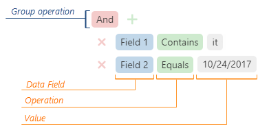
See the Field section for details on fields you can specify in each object.
focusStateEnabled
Specifies whether the widget can be focused using keyboard navigation.
groupOperations
Specifies a set of available group operations.
The group operations are:
- "and"
- "notAnd"
Returns a reverted result of an "and" operation:["!", [[condition1], "and", [condition2]]]. - "or"
- "notOr"
Returns a reverted result of an "or" operation:["!", [[condition1], "or", [condition2]]].
See Also
height
Specifies the widget's height.
This option accepts a value of one of the following types:
Number
The height in pixels.String
A CSS-accepted measurement of height. For example,"55px","80%","inherit".Function
A function returning either of the above. For example:JavaScriptheight: function() { return window.innerHeight / 1.5; }
hint
Specifies text for a hint that appears when a user pauses on the widget.
hoverStateEnabled
Specifies whether the widget changes its state when a user pauses on it.
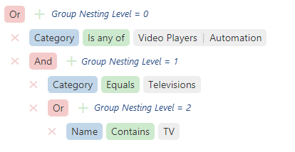
maxGroupLevel
Specifies groups' maximum nesting level.
Assign 0 to this option to disallow new groups, 1 - to allow new first-level groups, 2 - to allow new first- and second-level groups, and so on.
onContentReady
A function that is executed when the widget's content is ready and each time the content is changed.
Information about the event.
| Name | Type | Description |
|---|---|---|
| component |
The widget's instance. |
|
| element |
The widget's container. It is an HTML Element or a jQuery Element when you use jQuery. |
|
| model |
The model data. Available only when using Knockout. |
onDisposing
A function that is executed before the widget is disposed of.
Information about the event.
| Name | Type | Description |
|---|---|---|
| component |
The widget's instance. |
|
| element |
The widget's container. It is an HTML Element or a jQuery Element when you use jQuery. |
|
| model |
The model data. Available only if you use Knockout. |
onEditorPrepared
A function that is executed after an editor is created.
Information about the event.
| Name | Type | Description |
|---|---|---|
| component |
The widget's instance. |
|
| dataField |
The data field's name. |
|
| disabled |
Indicates whether the editor is disabled. |
|
| editorElement |
The editor's container. It is an HTML Element or a jQuery Element when you use jQuery. |
|
| editorName |
The editor's name. |
|
| element |
The widget's container. It is an HTML Element or a jQuery Element when you use jQuery. |
|
| filterOperation |
The applied filter operation. |
|
| model |
The model data. Available only if you use Knockout. |
|
| readOnly |
Indicates whether the editor is read-only. |
|
| rtlEnabled |
Indicates whether the editor uses right-to-left representation. |
|
| setValue(newValue) | any |
A method that you need to call to change the field's value after the editor's value changes. |
| updateValueTimeout |
Gets and sets the delay between when a user stops typing the field's value and when it is applied. |
|
| value | any |
The editor's value. |
| width |
The editor's width. |
The widget offers a user a different editor for entering a value depending on the field's dataType: Calendar, TextBox, SelectBox, etc. You can customize automatically created editors using this function.
onEditorPreparing
A function that is executed before an editor is created.
Information about the event.
| Name | Type | Description |
|---|---|---|
| cancel |
Allows you to cancel the creation of the editor. |
|
| component |
The widget's instance. |
|
| dataField |
The data field's name. |
|
| disabled |
Indicates whether the editor is disabled. |
|
| editorElement |
The editor's container. It is an HTML Element or a jQuery Element when you use jQuery. |
|
| editorName |
Allows you to change the editor. Accepts names of DevExtreme widgets only, for example, "dxTextBox". |
|
| editorOptions |
Gets and sets the editor configuration. |
|
| element |
The widget's container. It is an HTML Element or a jQuery Element when you use jQuery. |
|
| filterOperation |
The applied filter operation. |
|
| model |
The model data. Available only if you use Knockout. |
|
| readOnly |
Indicates whether the editor is read-only. |
|
| rtlEnabled |
Indicates whether the editor uses right-to-left representation. |
|
| setValue(newValue) | any |
A method that you should call to change the field's value after the editor's value changes. |
| updateValueTimeout |
Gets and sets the delay between when a user stops typing the field value and when it is applied. |
|
| value | any |
The editor's value. |
| width |
The editor's width. |
The widget offers a user different editors for entering a value depending on the field's dataType: Calendar, TextBox, SelectBox, and so on. Use this function to customize those default editors or substitute them for other editors.
In the following code, a default editor is replaced with the DevExtreme TextArea widget. Note that the widget's onValueChanged function is overridden, and its declaration ends with the setValue(newValue, newText) method's call. This method updates the value.
jQuery
$(function() {
    $("#filterBuilder").dxFilterBuilder({
        // ...
        onEditorPreparing: function (e) {
            if (e.dataField == "description") {
                e.editorName = "dxTextArea";
                e.editorOptions.showClearButton = true;
                e.editorOptions.onValueChanged = function(event) {
                    var value = event.value;
                    e.setValue(value.toLowerCase());
                }
            }
        }
    });
});
Angular
import { DxFilterBuilderModule } from "devextreme-angular";
// ...
export class AppComponent {
    onEditorPreparing (e) {
        if (e.dataField == "description") {
            e.editorName = "dxTextArea";
            e.editorOptions.showClearButton = true;
            e.editorOptions.onValueChanged = (event) => {
                let value = event.value;
                e.setValue(value.toLowerCase());
            }
        }
    }
}
@NgModule({
    imports: [
        // ...
        DxFilterBuilderModule
    ],
    // ...
})
<dx-filter-builder ...
    (onEditorPreparing)="onEditorPreparing($event)">
</dx-filter-builder>
The following code shows how to replace a default editor with a non-DevExtreme editor (an HTML checkbox in this case):
jQuery
$(function() {
    $("#filterBuilder").dxFilterBuilder({
        // ...
        onEditorPreparing: function(e) {
            if(e.dataField === "completed") {
                e.cancel = true; // Cancels creating the default editor
                $('<input type="checkbox">')
                    .prop("checked", e.value)
                    .on("change", function(event) {
                        e.setValue(event.target.checked);
                    })
                    .appendTo(e.editorElement);
            }
        }
    });
});
Angular
import { DxFilterBuilderModule } from "devextreme-angular";
// ...
export class AppComponent {
    onEditorPreparing (e) {
        if(e.dataField === "completed") {
            e.cancel = true; // Cancels creating the default editor
            let checkbox = document.createElement("INPUT");
            checkbox.setAttribute("type", "checkbox");
            checkbox.setAttribute("checked", e.value);
            checkbox.addEventListener("change", (event) => {
                e.setValue(event.target.checked);
            });
            e.editorElement.appendChild(checkbox);
        }
    }
}
@NgModule({
    imports: [
        // ...
        DxFilterBuilderModule
    ],
    // ...
})
<dx-filter-builder ...
    (onEditorPreparing)="onEditorPreparing($event)">
</dx-filter-builder>onInitialized
A function used in JavaScript frameworks to save the widget instance.
Information about the event.
| Name | Type | Description |
|---|---|---|
| component |
The widget's instance. |
|
| element |
The widget's container. It is an HTML Element or a jQuery Element when you use jQuery. |
onOptionChanged
A function that is executed after a widget option is changed.
Information about the event.
| Name | Type | Description |
|---|---|---|
| model |
The model data. Available only if you use Knockout. |
|
| fullName |
The path to the modified option that includes all parent options. |
|
| element |
The widget's container. It is an HTML Element or a jQuery Element when you use jQuery. |
|
| component |
The widget's instance. |
|
| name |
The modified option if it belongs to the first level. Otherwise, the first-level option it is nested into. |
|
| value | any |
The modified option's new value. |
onValueChanged
A function that is executed after the widget's value is changed.
Information about the event.
| Name | Type | Description |
|---|---|---|
| component |
The widget's instance. |
|
| element |
The widget's container. It is an HTML Element or a jQuery Element when you use jQuery. |
|
| model |
The model data. Available only if you use Knockout. |
|
| previousValue |
The widget's previous value. |
|
| value |
The widget's new value. |
rtlEnabled
Switches the widget to a right-to-left representation.
When this option is set to true, the widget text flows from right to left, and the layout of elements is reversed. To switch the entire application/site to the right-to-left representation, assign true to the rtlEnabled field of the object passed to the DevExpress.config(config) method.
DevExpress.config({
    rtlEnabled: true
});
See Also
- Right-to-Left Support Demo: DataGrid | Navigation Widgets | Editors
tabIndex
Specifies the number of the element when the Tab key is used for navigating.
The value of this option will be passed to the tabindex attribute of the HTML element that underlies the widget.
value
Allows you to specify a filter.
See Also
width
Specifies the widget's width.
This option accepts a value of one of the following types:
Number
The width in pixels.String
A CSS-accepted measurement of width. For example,"55px","80%","auto","inherit".Function
A function returning either of the above. For example:JavaScriptwidth: function() { return window.innerWidth / 1.5; }

 Select one or more answers