DevExtreme React - Command Columns
The TreeList provides the following command columns:
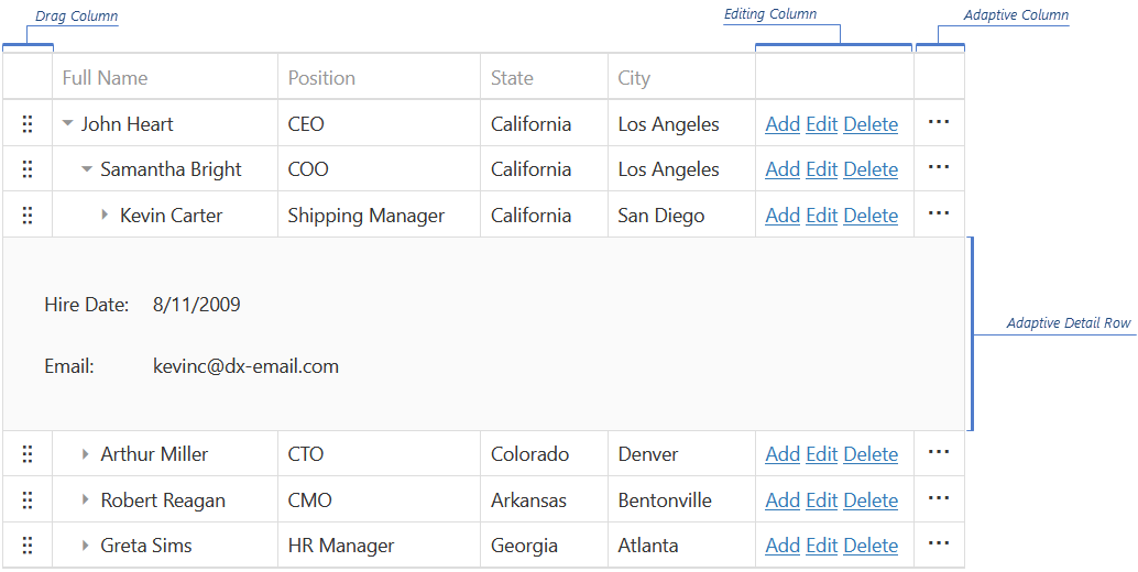
Adaptive column
Contains ellipsis buttons that expand/collapse adaptive detail rows. Appears if columnHidingEnabled is true or hidingPriority is set for at least one column and only when certain columns do not fit into the screen or container size.Button column (custom command column)
Contains buttons that execute custom actions. See Create a Column with Custom Buttons.Edit column
A Button column pre-populated with edit commands. See Customize the Edit Column.Drag Column
Contains drag icons. Appears when a column's type is "drag", and the allowReordering and showDragIcons options of the rowDragging object are true.
Configure a Command Column
All columns are configured in the columns array. Assign a command column's name to the type option and specify the other column options.
The following example shows how to specify the adaptive column's width:
jQuery
$(function () {
    $("#treeListContainer").dxTreeList({
        // ...
        columns: [{
            type: "adaptive",
            width: 50
        }]
    });
});
Angular
<dx-tree-list ... >
    <dxi-column type="adaptive" [width]="50"></dxi-column>
</dx-tree-list>
import { DxTreeListModule } from "devextreme-angular";
// ...
export class AppComponent {
    // ...
}
@NgModule({
    imports: [
        // ...
        DxTreeListModule
    ],
    // ...
})
If a command column should have custom content, specify the column's cellTemplate and headerCellTemplate:
jQuery
$(function () {
    $("#treeListContainer").dxTreeList({
        // ...
        columns: [{
            type: "selection",
            cellTemplate: function ($cellElement, cellInfo) {
                // Render custom cell content here
            },
            headerCellTemplate: function ($headerElement, headerInfo) {
                // Render custom header content here
            }
        }]
    });
});
Angular
<dx-tree-list ... >
    <dxi-column
        type="selection"
        cellTemplate="selectionCellTemplate"
        headerCellTemplate="selectionHeaderCellTemplate">
    </dxi-column>
    <div *dxTemplate="let cellInfo of 'selectionCellTemplate'">
        <!-- Declare custom cell content here -->
    </div>
    <div *dxTemplate="let headerInfo of 'selectionHeaderCellTemplate'">
        <!-- Declare custom header content here -->
    </div>
</dx-tree-list>
import { DxTreeListModule } from "devextreme-angular";
// ...
export class AppComponent {
    // ...
}
@NgModule({
    imports: [
        // ...
        DxTreeListModule
    ],
    // ...
})
Reorder Command Columns
Command columns are reordered similarly to regular columns. Refer to the Column Reordering article for more information.
Customize the Edit Column
The edit column appears when editing is allowed. The avaiable editing buttons depend on the editing mode.
The edit column is a type of buttons column. To customize it, set the column's type to "buttons" and specify the other options.
The following articles describe how to customize edit buttons.
Customize Buttons
The column's buttons array allows you to customize the built-in editing buttons. It can contain configuration objects or button names if the buttons should be available but do not need customizations.
In the following code, a CSS class is added to the Save button. The Add, Edit, and Delete buttons should also be declared to display them:
jQuery
$(function () {
    $("#treeListContainer").dxTreeList({
        // ...
        columns: [{
            type: "buttons",
            buttons: [{
                name: "save",
                cssClass: "my-class"
            }, "add", "edit", "delete"]
        }]
    });
});
Angular
<dx-tree-list ... >
    <dxi-column type="buttons">
        <dxi-button
            name="save"
            cssClass="my-class">
        </dxi-button>
        <dxi-button name="add"></dxi-button>
        <dxi-button name="edit"></dxi-button>
        <dxi-button name="delete"></dxi-button>
    </dxi-column>
</dx-tree-list>
import { DxTreeListModule } from "devextreme-angular";
// ...
export class AppComponent {
    // ...
}
@NgModule({
    imports: [
        // ...
        DxTreeListModule
    ],
    // ...
})
Hide a Button
Editing buttons' visibility depends on the allowed editing capabilities. For example, the Delete button is visible if users can delete rows. You can configure the editing capabilities in the editing object.
The Add, Edit, and Delete buttons can be hidden by omitting them when declaring the buttons array. However, users can still use the keyboard to add, edit, and delete.
jQuery
$(function () {
    $("#treeListContainer").dxTreeList({
        // ...
        editing: {
            allowUpdating: true,
            allowDeleting: true
        },
        columns: [{
            type: "buttons",
            buttons: ["edit"] // The Add and Delete buttons are hidden
        }]
    });
});
Angular
<dx-tree-list ... >
    <dxo-editing
        [allowUpdating]="true"
        [allowDeleting]="true">
    </dxo-editing>
    <dxi-column type="buttons">
        <dxi-button name="edit"></dxi-button>
    </dxi-column>
</dx-tree-list>
import { DxTreeListModule } from "devextreme-angular";
// ...
export class AppComponent {
    // ...
}
@NgModule({
    imports: [
        // ...
        DxTreeListModule
    ],
    // ...
})
You can hide an editing button or disable editing capabilities for specific rows. Use functions to specify the button's visible option or the editing.allowAdding/allowUpdating/allowDeleting option. Refer to the options' descriptions for examples.
Add a Custom Button
Add an object to the buttons array and specify the button's options in it...
jQuery
$(function () {
    $("#treeListContainer").dxTreeList({
        // ...
        columns: [{
            type: "buttons",
            buttons: ["add", "edit", "delete", {
                text: "My Command",
                icon: "/url/to/my/icon.ico",
                hint: "My Command",
                onClick: function (e) {
                    // Execute your command here
                }
            }]
        }]
    });
});
Angular
<dx-tree-list ... >
    <dxi-column type="buttons">
        <dxi-button name="add"></dxi-button>
        <dxi-button name="edit"></dxi-button>
        <dxi-button name="delete"></dxi-button>
        <dxi-button
            text="My Command"
            icon="/url/to/my/icon.ico"
            hint="My Command"
            [onClick]="myCommand">
        </dxi-button>
    </dxi-column>
</dx-tree-list>
import { DxTreeListModule } from "devextreme-angular";
// ...
export class AppComponent {
    myCommand (e) {
        // Execute your command here
    }
}
@NgModule({
    imports: [
        // ...
        DxTreeListModule
    ],
    // ...
})
... or use a template to render the button with custom appearance. In this case, the onClick function is not executed, and you should handle the click event of the element placed inside the template.
jQuery
$(function () {
    $("#treeListContainer").dxTreeList({
        // ...
        columns: [{
            type: "buttons",
            buttons: ["add", "edit", "delete", {
                template: function (e) {
                    // Specify custom markup here
                }
            }]
        }]
    });
});
Angular
<dx-tree-list ... >
    <dxi-column type="buttons">
        <dxi-button name="add"></dxi-button>
        <dxi-button name="edit"></dxi-button>
        <dxi-button name="delete"></dxi-button>
        <dxi-button template="myCommand">
            <div *dxTemplate="let data of 'myCommand'">
                <!-- Declare custom markup here -->
            </div>
        </dxi-button>
    </dxi-column>
</dx-tree-list>
import { DxTreeListModule } from "devextreme-angular";
// ...
export class AppComponent {
    // ...
}
@NgModule({
    imports: [
        // ...
        DxTreeListModule
    ],
    // ...
})
Create a Column with Custom Buttons
The following code shows how to add a command column with custom buttons. Note that the edit column should be declared explicitly because a custom command column replaces it.
jQuery
$(function () {
    $("#treeListContainer").dxTreeList({
        // ...
        columns: [{
            type: "buttons",
            buttons: ["add", "edit", "delete"]
        },
        "firstName",
        "lastName", {
            type: "buttons",
            buttons: [
                // Declare and configure custom buttons here
            ]
        }]
    });
});
Angular
<dx-tree-list ... >
    <dxi-column type="buttons" [buttons]="['add', 'edit', 'delete']"></dxi-column>
    <dxi-column dataField="firstName"></dxi-column>
    <dxi-column dataField="lastName"></dxi-column>
    <dxi-column type="buttons">
        <dxi-button ... ></dxi-button>
        <!-- Declare and configure custom buttons here -->
    </dxi-column>
</dx-tree-list>
import { DxTreeListModule } from "devextreme-angular";
// ...
export class AppComponent {
    // ...
}
@NgModule({
    imports: [
        // ...
        DxTreeListModule
    ],
    // ...
})
 Select one or more answers