Angular DataGrid - Master-Detail Interface
User Interaction
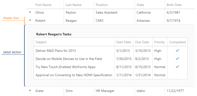
The master-detail interface supplies a standard data row with an expandable section that contains detail data. In master-detail terms, the data row is called "master row" and the expandable section - "detail section".
The master-detail interface becomes available after you specify the detail sections' contents using the masterDetail.template property. You can expand and collapse detail sections programmatically or enable a user to do it by setting the masterDetail.enabled property to true. Set the masterDetail.autoExpandAll property to true to expand these sections by default.
jQuery
$(function() {
    $("#dataGridContainer").dxDataGrid({
        // ...
        masterDetail: {
            enabled: true,
            autoExpandAll: true,
            template: function (container, info) {
                сonst currentEmployeeData = info.data;
                container.append(
                    $(`<div class="employeeInfo">
                        <img class="employeePhoto" src=${currentEmployeeData.Picture}/>
                        <p class="employeeNotes">${currentEmployeeData.Notes}</p>
                    </div>`)
                );
            }
        }
    });
});
Angular
<dx-data-grid ... >
    <dxo-data-grid-master-detail
        [enabled]="true"
        [autoExpandAll]="true"
        [template]="'detail'">
    </dxo-data-grid-master-detail>
    <div *dxTemplate="let employee of 'detail'">
        <div class="employeeInfo">
            <img class="employeePhoto" [src]="employee.data.Picture" />
            <p class="employeeNotes">{{employee.data.Notes}}</p>
        </div>
    </div>
</dx-data-grid>
import { DxDataGridModule } from "devextreme-angular";
// ...
export class AppComponent {
    // ...
}
@NgModule({
    imports: [
        // ...
        DxDataGridModule
    ],
    // ...
})
Vue
<template>
    <DxDataGrid ... >
        <DxMasterDetail
            :enabled="true"
            :auto-expand-all="true"
            template="detail"
        />
        <template #detail="{ data }">
            <div class="employeeInfo">
                <img class="employeePhoto" :src="data.Picture" />
                <p class="employeeNotes">{{ data.Notes }}</p>
            </div>
        </template>
    </DxDataGrid>
</template>

<script>
import 'devextreme/dist/css/dx.light.css';

import DxDataGrid, {
    DxMasterDetail
} from 'devextreme-vue/data-grid';

export default {
    components: {
        DxDataGrid,
        DxMasterDetail
    },
    // ...
}
</script>
React
import React from 'react';
import 'devextreme/dist/css/dx.light.css';

import DataGrid, {
    MasterDetail
} from 'devextreme-react/data-grid';

const DetailSection = ({ data }) => {
    return (
        <div class="employeeInfo">
            <img class="employeePhoto" src={data.Picture} />
            <p class="employeeNotes">{data.Notes}</p>
        </div>
    );
};

export default function App() {
    return (
        <DataGrid ... >
            <MasterDetail
                enabled={true}
                autoExpandAll={true}
                render={DetailSection}
            />
        </DataGrid>
    );
}
Once loaded, a detail section's content remains cached until a user switches to another page in the DataGrid or reloads the web page.
API
Pass -1 to the expandAll(groupIndex) or collapseAll(groupIndex) method to expand or collapse all master rows at once.
jQuery
const dataGrid = $("#dataGridContainer").dxDataGrid("instance");
dataGrid.expandAll(-1);
dataGrid.collapseAll(-1);
Angular
import { ..., ViewChild } from "@angular/core";
import { DxDataGridModule, DxDataGridComponent } from "devextreme-angular";
// ...
export class AppComponent {
    @ViewChild(DxDataGridComponent, { static: false }) dataGrid: DxDataGridComponent;
    // Prior to Angular 8
    // @ViewChild(DxDataGridComponent) dataGrid: DxDataGridComponent;
    expandAllMasterRows () {
        this.dataGrid.instance.expandAll(-1);
    }
    collapseAllMasterRows () {
        this.dataGrid.instance.collapseAll(-1);
    }
}
@NgModule({
    imports: [
        // ...
        DxDataGridModule
    ],
    // ...
})
Vue
<template>
    <DxDataGrid ...
        :ref="dataGridRefKey">
        <!-- ... -->
    </DxDataGrid>
</template>

<script>
import 'devextreme/dist/css/dx.light.css';
import DxDataGrid, { ... } from 'devextreme-vue/data-grid';

const dataGridRefKey = "my-data-grid";

export default {
    components: {
        DxDataGrid,
        // ...
    },
    data: function() {
        return {
            dataGridRefKey
        };
    },
    methods: {
        expandAllMasterRows() {
            this.dataGrid.expandAll(-1);
        },
        collapseAllMasterRows() {
            this.dataGrid.collapseAll(-1);
        }
    },
    computed: {
        dataGrid: function() {
            return this.$refs[dataGridRefKey].instance;
        }
    }
}
</script>
React
import React, { useRef, useCallback } from 'react';
import 'devextreme/dist/css/dx.light.css';

import DataGrid, { ... } from 'devextreme-react/data-grid';

export default function App() {
    const dataGrid = useRef(null);
    const expandAllMasterRows = useCallback(() => {
        dataGrid.current.instance().expandAll(-1);
    }, []);
    const collapseAllMasterRows = useCallback(() => {
        dataGrid.current.instance().collapseAll(-1);
    }, []);

    return (
        <DataGrid ...
            ref={dataGrid}>
            {/* ... */}
        </DataGrid>
    );
}
The expandRow(key) and collapseRow(key) methods expand and collapse an individual master row. You can check a row's current state by calling the isRowExpanded(key) method.
jQuery
function toggleMasterRow (rowKey) {
    const dataGrid = $("#dataGridContainer").dxDataGrid("instance");
    if (dataGrid.isRowExpanded(rowKey)) {
        dataGrid.collapseRow(rowKey);
    } else {
        dataGrid.expandRow(rowKey);
    }
}
Angular
import { ..., ViewChild } from "@angular/core";
import { DxDataGridModule, DxDataGridComponent } from "devextreme-angular";
// ...
export class AppComponent {
    @ViewChild(DxDataGridComponent, { static: false }) dataGrid: DxDataGridComponent;
    // Prior to Angular 8
    // @ViewChild(DxDataGridComponent) dataGrid: DxDataGridComponent;
    toggleMasterRow (rowKey) {
        if (this.dataGrid.instance.isRowExpanded(rowKey)) {
            this.dataGrid.instance.collapseRow(rowKey);
        } else {
            this.dataGrid.instance.expandRow(rowKey);
        }
    }
}
@NgModule({
    imports: [
        // ...
        DxDataGridModule
    ],
    // ...
})
Vue
<template>
    <DxDataGrid ...
        :ref="dataGridRefKey">
        <!-- ... -->
    </DxDataGrid>
</template>

<script>
import 'devextreme/dist/css/dx.light.css';
import DxDataGrid, { ... } from 'devextreme-vue/data-grid';

const dataGridRefKey = "my-data-grid";

export default {
    components: {
        DxDataGrid,
        // ...
    },
    data: function() {
        return {
            dataGridRefKey
        };
    },
    methods: {
        toggleMasterRow(rowKey) {
            if (this.dataGrid.isRowExpanded(rowKey)) {
                this.dataGrid.collapseRow(rowKey);
            } else {
                this.dataGrid.expandRow(rowKey);
            }
        }
    },
    computed: {
        dataGrid: function() {
            return this.$refs[dataGridRefKey].instance;
        }
    }
}
</script>
React
import React, { useRef, useCallback } from 'react';
import 'devextreme/dist/css/dx.light.css';

import DataGrid, { ... } from 'devextreme-react/data-grid';

export default function App() {
    const dataGrid = useRef(null);
    const toggleMasterRow = useCallback((rowKey) => {
        if (dataGrid.current.instance().isRowExpanded(rowKey)) {
            dataGrid.current.instance().collapseRow(rowKey);
        } else {
            dataGrid.current.instance().expandRow(rowKey);
        }
    }, []);

    return (
        <DataGrid ...
            ref={dataGrid}>
            {/* ... */}
        </DataGrid>
    );
}Events
Events raised for a master row when a user expands or collapses it are identical to the events raised for expanding or collapsing a group. See this topic for details.

 Select one or more answers