User Interaction
The DataGrid widget allows a user to add, delete and update data. Assign true to the corresponding field of the editing object to enable an operation. You can set a column's allowEditing option to false if its data should not be edited.
jQuery
$(function() {
    $("#dataGridContainer").dxDataGrid({
        // ...
        editing: {
            allowUpdating: true,
            allowAdding: true,
            allowDeleting: true
        },
        columns: [
            { dataField: 'id', allowEditing: false },
            // ...
        ]
    });
});
Angular
<dx-data-grid ... >
    <dxo-editing
        [allowUpdating]="true"
        [allowAdding]="true"
        [allowDeleting]="true">
    </dxo-editing>
    <dxi-column dataField="id" [allowEditing]="false"></dxi-column>
</dx-data-grid>
import { DxDataGridModule } from 'devextreme-angular';
// ...
export class AppComponent {
    // ...
}
@NgModule({
    imports: [
        // ...
        DxDataGridModule
    ],
    // ...
})
With the DataGrid you can edit data in several modes. Use the editing.mode option to specify it.
jQuery
$(function() {
    $("#dataGridContainer").dxDataGrid({
        // ...
        editing: {
            mode: 'row' // 'batch' | 'cell' | 'form' | 'popup'
        }
    });
});
Angular
<dx-data-grid ... >
    <dxo-editing
        mode="row"> <!-- 'batch' | 'cell' | 'form' | 'popup' -->
    </dxo-editing>
</dx-data-grid>
import { DxDataGridModule } from 'devextreme-angular';
// ...
export class AppComponent {
    // ...
}
@NgModule({
    imports: [
        // ...
        DxDataGridModule
    ],
    // ...
})
The following sections detail the DataGrid's appearance and behavior in each editing mode.
Row Mode
In this mode a user edits data row by row. When a user clicks an "Edit" button, the corresponding row enters the editing state, and the "Save" and "Cancel" buttons appear in the command column. The widget saves changes only if the "Save" button is clicked. If a user starts editing another row, sorts or filters data, it discards the changes.
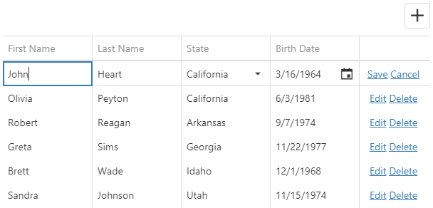
Clicking a "Delete" button invokes the confirmation dialog that allows a user to cancel row deletion. Use the code below to hide this dialog.
jQuery
$(function() {
    $("#dataGridContainer").dxDataGrid({
        // ...
        editing: {
            // ...
            mode: 'row',
            allowDeleting: true,
            texts: {
                confirmDeleteMessage: null
            }
        }
    });
});
Angular
<dx-data-grid ... >
    <dxo-editing mode="row" [allowDeleting]="true">
        <dxo-texts [confirmDeleteMessage]="null"></dxo-texts>
    </dxo-editing>
</dx-data-grid>
import { DxDataGridModule } from 'devextreme-angular';
// ...
export class AppComponent {
    // ...
}
@NgModule({
    imports: [
        // ...
        DxDataGridModule
    ],
    // ...
})Cell Mode
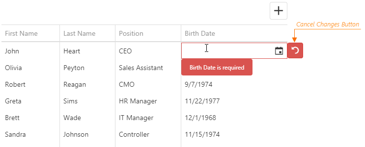
In the cell mode, a user edits data cell by cell. Changes are saved once a cell loses the focus, or discarded if a user presses Esc. An added row is saved only when the focus is shifted from it. Choose this mode if any changes should be saved to the data source immediately.
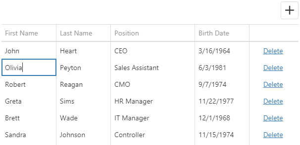
If you validate data, a cell is locked in the editing state until a user enters a valid value or clicks the "Cancel Changes" button.
Clicking a "Delete" button invokes the confirmation dialog that allows a user to cancel row deletion. Use the code below to hide this dialog.
jQuery
$(function() {
    $("#dataGridContainer").dxDataGrid({
        // ...
        editing: {
            mode: 'cell',
            texts: {
                confirmDeleteMessage: null
            }
        }
    });
});
Angular
<dx-data-grid ... >
    <dxo-editing mode="cell" [allowDeleting]="true">
        <dxo-texts [confirmDeleteMessage]="null"></dxo-texts>
    </dxo-editing>
</dx-data-grid>
import { DxDataGridModule } from 'devextreme-angular';
// ...
export class AppComponent {
    // ...
}
@NgModule({
    imports: [
        // ...
        DxDataGridModule
    ],
    // ...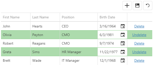
})Batch Mode
In the batch mode, like in the cell mode, a user edits data cell by cell. However, in this mode, the widget stores changes in a buffer until a user clicks the global "Save" button instead of saving them immediately. This mode is useful when you need to defer saving multiple changes.
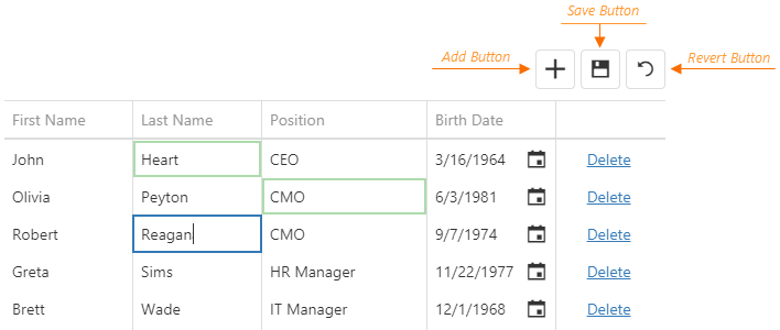
When a user clicks a row's "Delete" button, the widget only marks the row as deleted. Users can restore this row by clicking the "Undelete" button if they have not saved the changes yet. They can also discard all unsaved changes by clicking the "Revert" button.
Form Mode
In the form mode, a row becomes a form with editable fields in the editing state. A form field corresponds to a row's cell.
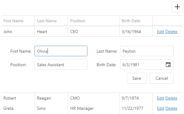
The DataGrid uses the DevExtreme Form widget as the form. You can customize individual form fields using the columns[].formItem object whose members are described in the Simple Item section. Note that this object does not allow changing or configuring the editor (see Customize Editors).
jQuery
$(function() {
    $("#dataGridContainer").dxDataGrid({
        // ...
        editing: {
            allowUpdating: true,
            mode: "form"
        },
        columns: [{
            dataField: "Full_Name",
            formItem: {
                colSpan: 2,
                label: {
                    location: "top"
                }
            }
        },
        // ...
        ]
    });
});
Angular
<dx-data-grid ... >
    <dxo-editing
        [allowUpdating]="true"
        mode="form">
    </dxo-editing>
    <dxi-column dataField="Full_Name">
        <dxo-form-item [colSpan]="2">
            <dxo-label location="top"></dxo-label>
        </dxo-form-item>
    </dxi-column>
</dx-data-grid>
import { DxDataGridModule } from 'devextreme-angular';
// ...
export class AppComponent {
    // ...
}
@NgModule({
    imports: [
        // ...
        DxDataGridModule
    ],
    // ...
})
ASP.NET MVC Controls
@(Html.DevExtreme().DataGrid()
    // ...
    .Editing(e => e
        .AllowUpdating(true)
        .Mode(GridEditMode.Form)
    )
    .Columns(cols => {
        // ...
        cols.Add().DataField("Full_Name")
            .FormItem(item => item
                .ColSpan(2)
                .Label(l => l.Location(FormLabelLocation.Top)
            )
        );
    })
)
The form contains only the editable fields, or "simple items" (as they are called in the Form widget) by default. The form can also contain group, tabbed, and empty items, which help you arrange simple items in different ways. Configure the items in the editing.form.items array as shown in the following code. The items with the specified dataField are simple items. Identical dataFields connect a simple item with a column.
jQuery
$(function() {
    $("#dataGridContainer").dxDataGrid({
        // ...
        editing: {
            allowUpdating: true,
            mode: "form",
            form: {
                items: [{
                    itemType: "group",
                    caption: "Personal Data",
                    items: [
                        { dataField: "Full_Name" },
                        { dataField: "Prefix" },
                        { dataField: "Position" }
                    ]
                    // or just
                    // items: ["Full_Name", "Prefix", "Position"]
                }, {
                    itemType: "group",
                    caption: "Contacts",
                    items: ["Email", "Skype"]
                }]
            }
        },
        columns: [
            { dataField: "Full_Name" },
            { dataField: "Prefix" },
            { dataField: "Position" },
            { dataField: "Email" },
            { dataField: "Skype" }
        ]
    });
});
Angular
<dx-data-grid ... >
    <dxo-editing
        [allowUpdating]="true"
        mode="form">
        <dxo-form>
            <dxi-item itemType="group" caption="Personal Data">
                <dxi-item dataField="Full_Name"></dxi-item>
                <dxi-item dataField="Prefix"></dxi-item>
                <dxi-item dataField="Position"></dxi-item>
            </dxi-item>
            <dxi-item itemType="group" caption="Contacts">
                <dxi-item dataField="Email"></dxi-item>
                <dxi-item dataField="Skype"></dxi-item>
            </dxi-item>
        </dxo-form>
    </dxo-editing>
    <dxi-column dataField="Full_Name"></dxi-column>
    <dxi-column dataField="Prefix"></dxi-column>
    <dxi-column dataField="Position"></dxi-column>
    <dxi-column dataField="Email"></dxi-column>
    <dxi-column dataField="Skype"></dxi-column>
</dx-data-grid>
import { DxDataGridModule } from 'devextreme-angular';
// ...
export class AppComponent {
    // ...
}
@NgModule({
    imports: [
        // ...
        DxDataGridModule
    ],
    // ...
})
ASP.NET MVC Controls
@(Html.DevExtreme().DataGrid()
    // ...
    .Editing(e => e
        .AllowUpdating(true)
        .Mode(GridEditMode.Form)
        .Form(f => f
            .Items(i => {
                i.AddGroup()
                    .Caption("Personal Data")
                    .Items(groupItems => {
                        groupItems.AddSimple().DataField("Full_Name");
                        groupItems.AddSimple().DataField("Prefix");
                        groupItems.AddSimple().DataField("Position");
                    });
                i.AddGroup()
                    .Caption("Contacts")
                    .Items(groupItems => {
                        groupItems.AddSimple().DataField("Email");
                        groupItems.AddSimple().DataField("Skype");
                    });
            })
        )
    )
    .Columns(cols => {
        cols.Add().DataField("Full_Name");
        cols.Add().DataField("Prefix");
        cols.Add().DataField("Position");
        cols.Add().DataField("Email");
        cols.Add().DataField("Skype");
    })
)
See the topics in the Organize Simple Items section for more information on organizing simple items on the form. You can also specify other Form widget options in the editing.form object to configure the editing form. Refer to the Form Guides for more information.
Popup Mode
The popup mode is the form mode with the form placed in a popup window.
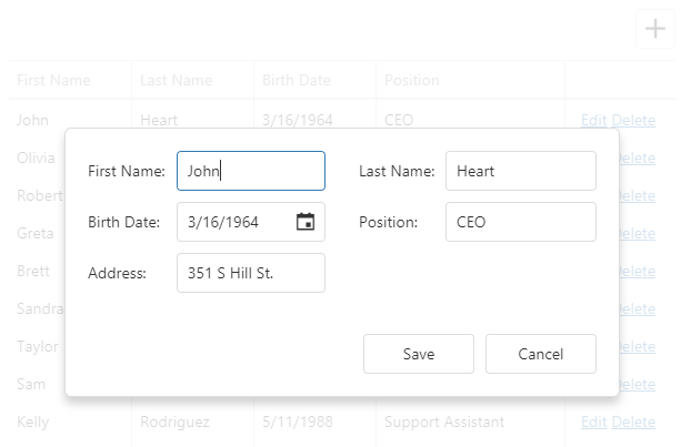
Use the editing.popup object to customize the popup window. Refer to the Popup Configuration section to learn which fields this object can contain.
jQuery
$(function() {
    $("#dataGridContainer").dxDataGrid({
        // ...
        editing: {
            allowUpdating: true,
            mode: "popup",
            form: {
                labelLocation: "top"
            },
            popup: {
                showTitle: true,
                title: "Row in the editing state"
            }
        }
    });
});
Angular
<dx-data-grid ... >
    <dxo-editing
        [allowUpdating]="true"
        mode="popup">
        <dxo-form labelLocation="top"></dxo-form>
        <dxo-popup [showTitle]="true" title="Row in the editing state"></dxo-popup>
    </dxo-editing>
</dx-data-grid>
import { DxDataGridModule } from 'devextreme-angular';
// ...
export class AppComponent {
    // ...
}
@NgModule({
    imports: [
        // ...
        DxDataGridModule
    ],
    // ...
})
Since the popup and form modes are very similar, you can use the same columns.formItem and editing.form options to customize items and layout in both modes. See the Form Mode topic for more details on form customization.
Add
Use the addRow() method to add an empty row.
jQuery
$("#dataGridContainer").dxDataGrid("addRow");Angular
import { ..., ViewChild } from '@angular/core';
import { DxDataGridModule, DxDataGridComponent } from 'devextreme-angular';
// ...
export class AppComponent {
    @ViewChild(DxDataGridComponent) dataGrid: DxDataGridComponent;
    addRow () {
       this.dataGrid.instance.addRow();
    }
}
@NgModule({
    imports: [
        // ...
        DxDataGridModule
    ],
    // ...
})
You can specify initial values for a newly added row in the onInitNewRow event handler.
jQuery
$(function() {
    $("#dataGridContainer").dxDataGrid({
        // ...
        columns: [{
            dataField: "Hire_Date",
            dataType: "date"
        },
            // ...
        ],
        onInitNewRow: function(e) {
            e.data.Hire_Date = new Date();
        }
    });
});
Angular
<dx-data-grid ...
    (onInitNewRow)="onInitNewRow($event)">
    <dxi-column dataField="Hire_Date" dataType="date"></dxi-column>
</dx-data-grid>
import { DxDataGridModule } from 'devextreme-angular';
// ...
export class AppComponent {
    onInitNewRow (e) {
        e.data.Hire_Date = new Date();
    }
}
@NgModule({
    imports: [
        // ...
        DxDataGridModule
    ],
    // ...
})
See Also
- Call Methods: jQuery | Angular | AngularJS | Knockout | ASP.NET MVC
Update
The cellValue (rowIndex, visibleColumnIndex, value) method updates a cell's value. This cell can be located using its row and column indexes. If the cell's data field is known, you can pass it instead of the column index. After a value is updated, save it to the data source by calling the saveEditData() method.
jQuery
$(function() {
    $("#dataGridContainer").dxDataGrid({ ... });

    $("#updateCellButton").dxButton({
        text: "Update Cell",
        onClick: function() {
            $("#dataGridContainer").dxDataGrid("cellValue", 1, "Position", "CTO");
            $("#dataGridContainer").dxDataGrid("saveEditData");
        }
    });
});
Angular
import { DxDataGridModule, DxButtonModule } from 'devextreme-angular';
// ...
export class AppComponent {
    @ViewChild(DxDataGridComponent) dataGrid: DxDataGridComponent;
    updateCell () {
        this.dataGrid.instance.cellValue(1, "Position", "CTO");
        this.dataGrid.instance.saveEditData();
    }
}
@NgModule({
    imports: [
        // ...
        DxDataGridModule,
        DxButtonModule
    ],
    // ...
})
<dx-data-grid ... ></dx-data-grid>
<dx-button
    text="Update Cell"
    (onClick)="updateCell()">
</dx-button>
The DataGrid widget allows you to process an updated cell value in the columns.setCellValue function before this value is saved to the data source.
jQuery
$(function() {
    $("#dataGridContainer").dxDataGrid({
        // ...
        editing: {
            allowUpdating: true,
            allowAdding: true
        },
        columns: [
            { dataField: "ID", visible: false },
            {
                dataField: "Full_Name",
                setCellValue: function (rowData, value) {
                    rowData.ID = value + Math.random() * 100;
                    rowData.Full_Name = value;
                }
            }
            // ...
        ]
    });
});
Angular
import { DxDataGridModule } from 'devextreme-angular';
// ...
export class AppComponent {
    setCellValue (rowData, value) {
        rowData.ID = value + Math.random() * 100;
        rowData.Full_Name = value;
    }
}
@NgModule({
    imports: [
        // ...
        DxDataGridModule
    ],
    // ...
})
<dx-data-grid>
    <dxo-editing
        [allowUpdating]="true"
        [allowAdding]="true">
    </dxo-editing>
    <dxi-column dataField="ID" [visible]="false"></dxi-column>
    <dxi-column dataField="Full_Name" [setCellValue]="setCellValue"></dxi-column>
</dx-data-grid>
Call the hasEditData() to check if there are any unsaved changes. You can save or cancel them using the saveEditData() or cancelEditData() method, respectively.
jQuery
$(function() {
    $("#dataGridContainer").dxDataGrid({ ... });

    $("#saveChangesButton").dxButton({
        text: "Save changes",
        onClick: function() {
            var dataGrid = $("#dataGridContainer").dxDataGrid("instance");
            if (dataGrid.hasEditData()) {
                // Implement your logic here
                dataGrid.saveEditData();
            }
        }
    });
});
Angular
import { DxDataGridModule, DxButtonModule } from 'devextreme-angular';
// ...
export class AppComponent {
    @ViewChild(DxDataGridComponent) dataGrid: DxDataGridComponent;
    saveEditData () {
        if (this.dataGrid.instance.hasEditData()) {
            // Implement your logic here
            this.dataGrid.instance.saveEditData();
        }
    }
}
@NgModule({
    imports: [
        // ...
        DxDataGridModule,
        DxButtonModule
    ],
    // ...
})
<dx-data-grid ... ></dx-data-grid>
<dx-button
    text="Save changes"
    (onClick)="saveEditData()">
</dx-button>
See Also
- Call Methods: jQuery | Angular | AngularJS | Knockout | ASP.NET MVC
Delete
Call the deleteRow(rowIndex) method to delete a specific row from the data source. This method invokes a confirmation dialog that allows a user to cancel deletion. The following code hides this dialog, thus a row is instantly deleted from the data source:
jQuery
$(function() {
    var dataGrid = $("#dataGridContainer").dxDataGrid({
        // ...
        editing: {
            mode: "row",
            allowDeleting: true,
            texts: {
                // Hides the confirmation dialog
                confirmDeleteMessage: null
            }
        }
    }).dxDataGrid("instance");

    $("#deleteRowButton").dxButton({
        text: "Delete Row",
        onClick: function() {
            // Deletes the second row
            dataGrid.deleteRow(1);
        }
    });
});
Angular
<dx-data-grid>
    <dxo-editing
        mode="row"
        [allowDeleting]="true">
        <dxo-texts [confirmDeleteMessage]="null"></dxo-texts>
    </dxo-editing>
</dx-data-grid>
<dx-button
    text="Delete Row"
    (onClick)="deleteRow()">
</dx-button>
import { DxDataGridModule, DxButtonModule } from 'devextreme-angular';
// ...
export class AppComponent {
    @ViewChild(DxDataGridComponent) dataGrid: DxDataGridComponent;
    deleteRow () {
        // Deletes the second row
        this.dataGrid.instance.deleteRow(1);
    }
}
@NgModule({
    imports: [
        // ...
        DxDataGridModule,
        DxButtonModule
    ],
    // ...
})
Note that in the batch mode a row is only marked as deleted. To save changes, call the saveEditData() method. Calling the undeleteRow(rowIndex) method cancels row deletion.
jQuery
$("#dataGridContainer").dxDataGrid("undeleteRow", 1);Angular
import { DxDataGridModule } from 'devextreme-angular';
// ...
export class AppComponent {
    @ViewChild(DxDataGridComponent) dataGrid: DxDataGridComponent;
    undeleteRow () {
        this.dataGrid.instance.undeleteRow(1);
    }
}
@NgModule({
    imports: [
        // ...
        DxDataGridModule
    ],
    // ...
})
See Also
- Call Methods: jQuery | Angular | AngularJS | Knockout | ASP.NET MVC
Events
The DataGrid widget raises events before and after a row is inserted, updated or removed from the data source. If the event handlers are going to remain unchanged during the widget's lifetime, assign them to corresponding onEventName options:
jQuery
$(function(){
    $("#dataGridContainer").dxDataGrid({
        // ...
        onRowInserting: function(e) {
            // Handler of the "rowInserting" event
        }
    });
});
Angular
<dx-data-grid ...
    (onRowInserting)="onRowInserting($event)">
</dx-data-grid>
import { DxDataGridModule } from 'devextreme-angular';
// ...
export class AppComponent {
    onRowInserting (e) {
        // Handler of the "rowInserting" event
    }
}
@NgModule({
    imports: [
        // ...
        DxDataGridModule
    ],
    // ...
})
If you are going to change the event handlers at runtime, or if you need to attach several handlers to a single event, subscribe to this event using the on(eventName, eventHandler) method. This approach is more typical of jQuery.
var rowUpdatingEventHandler1 = function(e) {
    // First handler of the "rowUpdating" event
};

var rowUpdatingEventHandler2 = function(e) {
    // Second handler of the "rowUpdating" event
};

$("#dataGridContainer").dxDataGrid("instance")
    .on("rowUpdating", rowUpdatingEventHandler1)
    .on("rowUpdating", rowUpdatingEventHandler2);
In addition, the DataGrid raises the initNewRow event when a new row is added and the editingStart event when a row enters the editing state. These events can be handled just like others - using the onEventName option or the on(eventName, eventHandler) method. In the following example, the onInitNewRow event handler specifies initial values for an added row:
jQuery
$(function () {
    $("#dataGridContainer").dxDataGrid({
        // ...
        onInitNewRow: function(e) { // Handler of the "initNewRow" event
            // Sets an initial value for the "Hire_Date" field
            e.data.Hire_Date = new Date();
        }
    });
});
Angular
<dx-data-grid ...
    (onInitNewRow)="onInitNewRow($event)">
</dx-data-grid>
import { DxDataGridModule } from 'devextreme-angular';
// ...
export class AppComponent {
    onInitNewRow (e) { // Handler of the "initNewRow" event
        // Sets an initial value for the "Hire_Date" field
        e.data.Hire_Date = new Date();
    }
}
@NgModule({
    imports: [
        // ...
        DxDataGridModule
    ],
    // ...
})
See Also
- Handle Events: jQuery | Angular | AngularJS | Knockout | ASP.NET MVC
Customize Editors
The columns's dataType defines a cell's editor that can be configured using the editorOptions object. However, this object cannot be used to change the editor's type or onValueChanged event handler. Instead, use the onEditorPreparing function as shown in the following code. The function's parameter provides the editorName and editorOptions fields for changing the used editor and its configuration.
jQuery
$(function() {
    $("#dataGridContainer").dxDataGrid({
        // ...
        columns: [{
            dataField: "Note",
            editorOptions: {
                height: 200
            }
        }, // ...
        ],
        onEditorPreparing: function(e) {
            if (e.dataField == "Note") {
                e.editorName = "dxTextArea"; // Changes the editor's type
                e.editorOptions.onValueChanged = function (args) {
                    // Implement your logic here

                    e.setValue(args.value); // Updates the cell value
                }
            }
        }
    });
});
Angular
<dx-data-grid ...
    (onEditorPreparing)="onEditorPreparing($event)">
    <dxi-column
        dataField="Note"
        [editorOptions]="{ height: 200 }">
    </dxi-column>
</dx-data-grid>
import { DxDataGridModule, DxTextAreaModule } from 'devextreme-angular';
// ...
export class AppComponent {
    onEditorPreparing (e) {
        if (e.dataField == "Note") {
            e.editorName = "dxTextArea"; // Changes the editor's type
            e.editorOptions.onValueChanged = function (args) {
                // Implement your logic here

                e.setValue(args.value); // Updates the cell value
            }
        }
    }
}
@NgModule({
    imports: [
        // ...
        DxDataGridModule,
        DxTextAreaModule
    ],
    // ...
})
ASP.NET MVC Controls
@(Html.DevExtreme().DataGrid()
    // ...
    .Columns(cols => {
        // ...
        cols.Add().DataField("Note")
            .EditorOptions(new { height = 200 });
    })
    .OnEditorPreparing("dataGrid_editorPreparing")
)

<script type="text/javascript">
    function dataGrid_editorPreparing(e) {
        if (e.dataField == "Note") {
            e.editorName = "dxTextArea"; // Changes the editor's type
            e.editorOptions.onValueChanged = function (args) {
                // Implement your logic here

                e.setValue(args.value); // Updates the cell value
            }
        }
    }
</script>
Implement the columns[].editCellTemplate function for more extensive customization, in which you should specify your custom component's appearance and behavior in full. The following code uses this function to substitute an HTML check box for a default editor:
jQuery
$(function() {
    $("#dataGridContainer").dxDataGrid({
        // ...
        columns: [{
            dataField: "Hidden",
            editCellTemplate: function(cellElement, cellInfo) {
                $('<input type="checkbox">')
                    .prop("checked", cellInfo.value)
                    .prop("disabled", cellInfo.setValue ? null : "disabled")
                    .on("change", function(args) {
                        cellInfo.setValue(args.target.checked);
                    })
                    .appendTo(cellElement);
            }
        },
        // ...
    });
});
Angular
<dx-data-grid ... >
    <dxi-column dataField="Hidden" editCellTemplate="editCellTemplate"></dxi-column>
    <div *dxTemplate="let cellInfo of 'editCellTemplate'">
        <input type="checkbox"
            [checked]="cellInfo.value"
            (change)="setCheckBoxValue($event, cellInfo)"
            [attr.disabled]="cellInfo.setValue ? null : 'disabled'" />
    </div>
</dx-data-grid>
import { DxDataGridModule } from 'devextreme-angular';
// ...
export class AppComponent {
    setCheckBoxValue (args, cellInfo) {
        cellInfo.setValue(args.target.checked);
    }
}
@NgModule({
    imports: [
        // ...
        DxDataGridModule
    ],
    // ...
})
ASP.NET MVC Controls
@(Html.DevExtreme().DataGrid()
    // ...
    .Columns(cols => {
        // ...
        cols.Add().DataField("Hidden")
            .EditCellTemplate(new JS("dataGrid_hidden_editCellTemplate"));
    })
)

<script type="text/javascript">
    function dataGrid_hidden_editCellTemplate (cellElement, cellInfo) {
        $('<input type="checkbox">')
            .prop("checked", cellInfo.value)
            .prop("disabled", cellInfo.setValue ? null : "disabled")
            .on("change", function (args) {
                cellInfo.setValue(args.target.checked);
            })
            .appendTo(cellElement);
    }
</script>
Editors are displayed in cells in the normal state too if you set the columns.showEditorAlways option to true.
jQuery
$(function() {
    $("#dataGridContainer").dxDataGrid({
        // ...
        columns: [{
            dataField: "Hidden",
            dataType: "boolean",
            showEditorAlways: true
        }]
    });
});
Angular
<dx-data-grid ... >
    <dxi-column
        dataField="Hidden"
        dataType="boolean"
        [showEditorAlways]="true">
    </dxi-column>
</dx-data-grid>
import { DxDataGridModule } from 'devextreme-angular';
// ...
export class AppComponent {
    // ...
}
@NgModule({
    imports: [
        // ...
        DxDataGridModule
    ],
    // ...
})
ASP.NET MVC Controls
@(Html.DevExtreme().DataGrid()
    // ...
    .Columns(cols => {
        // ...
        cols.Add().DataField("Hidden")
            .DataType(GridColumnDataType.Boolean)
            .ShowEditorAlways(true);
    })
)
See Also
Data Validation
The DataGrid widget uses the build-in validation engine to validate user input. You can attach validation rules using the columns.validationRules option which accepts an array of objects with fields described in the Validation Rules section. The editor displays an error message if a value fails to pass the validation check.
jQuery
$(function() {
    $("#dataGridContainer").dxDataGrid({
        // ...
        columns: [{
            dataField: "Full_Name",
            validationRules: [{ type: "required" }]
        }, {
            dataField: "Login",
            validationRules: [{
                type: "stringLength",
                min: 3,
                message: "Login should be longer than 3 symbols"
            }]
        },
        // ...
        ]
    });
});
Angular
<dx-data-grid ... >
    <dxi-column dataField="Full_Name">
        <dxi-validation-rule type="required"></dxi-validation-rule>
    </dxi-column>
    <dxi-column dataField="Login">
        <dxi-validation-rule
            type="stringLength"
            [min]="3"
            message="Login should be longer than 3 symbols" >
        </dxi-validation-rule>
    </dxi-column>
</dx-data-grid>
import { DxDataGridModule } from 'devextreme-angular';
// ...
export class AppComponent {
    // ...
}
@NgModule({
    imports: [
        // ...
        DxDataGridModule
    ],
    // ...
})
The onRowValidating handler allows you to interfere before a notification that a validation rule has been broken is displayed. For instance, you can perform additional checks in this handler and change the validation result by changing the isValid field of the handler parameter.
jQuery
$(function() {
    $("#dataGridContainer").dxDataGrid({
        // ...
        onRowValidating: function (e) {
            if (e.isValid && e.newData.Login === "Administrator") {
                e.isValid = false;
                e.errorText = "Your cannot log in as Administrator";
            }
        }
    });
});
Angular
import { DxDataGridModule } from 'devextreme-angular';
// ...
export class AppComponent {
    barAdministratorLogin (e) {
        if (e.isValid && e.newData.Login === "Administrator") {
            e.isValid = false;
            e.errorText = "Your cannot log in as Administrator";
        }
    }
}
@NgModule({
    imports: [
        // ...
        DxDataGridModule
    ],
    // ...
})
<dx-data-grid ...
    (onRowValidating)="barAdministratorLogin($event)">
</dx-data-grid>See Also

 Select one or more answers