React PieChart Props
An object that defines configuration options for the PieChart widget.
adaptiveLayout
Specifies adaptive layout options.
The adaptive layout enables the widget to hide optional elements if they do not fit in the container. Elements are hidden in the following sequence:
- Title
- Export menu icon
- Legend
- Point labels (can be saved by setting the adaptiveLayout.keepLabels option to true)
Use the height and width options in the adaptiveLayout object to specify the minimum container size at which the layout begins to adapt.
See Also
animation
Specifies animation options.
The widget animates its elements at the beginning of its lifetime and when the data source changes.
jQuery
$(function() {
    $("#pieChartContainer").dxPieChart({
        // ...
        animation: {
            easing: "linear",
            duration: 500,
            maxPointCountSupported: 100
        }
    });
});
Angular
<dx-pie-chart ... >
    <dxo-animation
        easing="linear"
        [duration]="500"
        [maxPointCountSupported]="100">
    </dxo-animation>
</dx-pie-chart>
import { Component } from '@angular/core';

@Component({
    selector: 'app-root',
    templateUrl: './app.component.html',
    styleUrls: ['./app.component.css']
})
export class AppComponent {
    // ...
}
import { BrowserModule } from '@angular/platform-browser';
import { NgModule } from '@angular/core';
import { AppComponent } from './app.component';

import { DxPieChartModule } from 'devextreme-angular';

@NgModule({
    declarations: [
        AppComponent
    ],
    imports: [
        BrowserModule,
        DxPieChartModule
    ],
    providers: [ ],
    bootstrap: [AppComponent]
})
export class AppModule { }
Vue
<template>
    <dx-pie-chart ... >
        <dx-animation
            easing="linear"
            :duration="500"
            :max-point-count-supported="100"
        />
    </dx-pie-chart>
</template>

<script>
import 'devextreme/dist/css/dx.common.css';
import 'devextreme/dist/css/dx.light.css';

import DxPieChart, {
    DxAnimation
} from 'devextreme-vue/pie-chart';

export default {
    components: {
        DxPieChart,
        DxAnimation
    },
    // ...
}
</script>
React
import React from 'react';

import 'devextreme/dist/css/dx.common.css';
import 'devextreme/dist/css/dx.light.css';

import PieChart, {
    Animation
} from 'devextreme-react/pie-chart';

class App extends React.Component {
    render() {
        return (
            <PieChart ... >
                <Animation
                    easing="linear"
                    duration={500}
                    maxPointCountSupported={100}
                />
            </PieChart>
        );
    }
}
export default App;
commonSeriesSettings
An object defining the configuration options that are common for all series of the PieChart widget.
Use this object's properties to set options for all chart series at once.
customizeLabel
Customizes the appearance of an individual point label.
Information on the series point.
The label's configuration.
All point labels in a chart are identical by default, but you can specify a unique appearance for individual labels using the customizeLabel function. This function should return an object with options that will be changed for a certain label. See the label object for information about all options available for changing.
The customizeLabel function accepts an object providing information about the series point that the label belongs to. This object contains the following fields.
customizePoint
Customizes the appearance of an individual series point.
Information on the series point.
The point's configuration.
By default, all the points of a pie are displayed identically. But you can specify different appearance for certain points using the customizePoint field. Assign a function to this field. This function should return an object with options that should be changed for a certain point. The following pie options can be changed.
When implementing a callback function for this option, use the argument or value of a point. They can be accessed using the following fields of the function's parameter.
- argument
The argument of the point. - value
The value of the point. - tag
The tag of the point. - index
The index of the point in the points array.
In addition, these values can be accessed using the this object.
dataSource
Binds the widget to data.
If you use DevExtreme ASP.NET MVC Controls, refer to the Data Binding article.
The PieChart works with collections of objects.
Depending on your data source, bind the PieChart to data as follows.
Data Array
Assign the array to the dataSource option. View DemoRead-Only Data in JSON Format
Set the dataSource option to the URL of a JSON file or service that returns JSON data. View DemoOData
Implement an ODataStore.Web API, PHP, MongoDB
Use one of the following extensions to enable the server to process data according to the protocol DevExtreme widgets use:Then, use the createStore method to configure access to the server on the client as shown below. This method is part of DevExtreme.AspNet.Data.
jQuery
JavaScript$(function() { let serviceUrl = "https://url/to/my/service"; $("#pieChartContainer").dxPieChart({ // ... dataSource: DevExpress.data.AspNet.createStore({ key: "ID", loadUrl: serviceUrl + "/GetAction", insertUrl: serviceUrl + "/InsertAction", updateUrl: serviceUrl + "/UpdateAction", deleteUrl: serviceUrl + "/DeleteAction" }) }) });Angular
app.component.tsapp.component.htmlapp.module.tsimport { Component } from '@angular/core'; import CustomStore from 'devextreme/data/custom_store'; import { createStore } from 'devextreme-aspnet-data-nojquery'; @Component({ selector: 'app-root', templateUrl: './app.component.html', styleUrls: ['./app.component.css'] }) export class AppComponent { store: CustomStore; constructor() { let serviceUrl = "https://url/to/my/service"; this.store = createStore({ key: "ID", loadUrl: serviceUrl + "/GetAction", insertUrl: serviceUrl + "/InsertAction", updateUrl: serviceUrl + "/UpdateAction", deleteUrl: serviceUrl + "/DeleteAction" }) } }<dx-pie-chart ... [dataSource]="store"> </dx-pie-chart>import { BrowserModule } from '@angular/platform-browser'; import { NgModule } from '@angular/core'; import { AppComponent } from './app.component'; import { DxPieChartModule } from 'devextreme-angular'; @NgModule({ declarations: [ AppComponent ], imports: [ BrowserModule, DxPieChartModule ], providers: [], bootstrap: [AppComponent] }) export class AppModule { }Vue
App.vue<template> <dx-pie-chart ... :data-source="store" /> </template> <script> import 'devextreme/dist/css/dx.common.css'; import 'devextreme/dist/css/dx.light.css'; import CustomStore from 'devextreme/data/custom_store'; import { createStore } from 'devextreme-aspnet-data-nojquery'; import { DxPieChart } from 'devextreme-vue/pie-chart'; export default { components: { DxPieChart }, data() { const serviceUrl = "https://url/to/my/service"; const store = createStore({ key: "ID", loadUrl: serviceUrl + "/GetAction", insertUrl: serviceUrl + "/InsertAction", updateUrl: serviceUrl + "/UpdateAction", deleteUrl: serviceUrl + "/DeleteAction" }); return { store } } } </script>React
App.jsimport React from 'react'; import 'devextreme/dist/css/dx.common.css'; import 'devextreme/dist/css/dx.light.css'; import CustomStore from 'devextreme/data/custom_store'; import { createStore } from 'devextreme-aspnet-data-nojquery'; import PieChart from 'devextreme-react/pie-chart'; const serviceUrl = "https://url/to/my/service"; const store = createStore({ key: "ID", loadUrl: serviceUrl + "/GetAction", insertUrl: serviceUrl + "/InsertAction", updateUrl: serviceUrl + "/UpdateAction", deleteUrl: serviceUrl + "/DeleteAction" }); class App extends React.Component { render() { return ( <PieChart ... dataSource={store} /> ); } } export default App;Any other data source
Implement a CustomStore.
Regardless of the data source on the input, the PieChart always wraps it in the DataSource object. This object allows you to sort, filter, group, and otherwise shape data. To get its instance, call the getDataSource() method.
After providing data, bind series to it.
Please review the following notes about data binding:
If you wrap the store into the DataSource object explicitly, set the paginate option to false to prevent data from partitioning.
Data field names should not contain the following characters:
.,,,:,[, and].DataSource and stores provide methods to process and update data. However, the methods do not allow you to perform particular tasks (for example, replace the entire dataset, reconfigure data access at runtime). For such tasks, create a new array, store, or DataSource and assign it to the dataSource option as shown in the articles about changing options in jQuery, Angular, React, and Vue.
diameter
Specifies the diameter of the pie.
This option accepts a number that identifies the ratio between the pie's diameter and the widget's width or height (depending on which of them is less). For example, assume that the widget's size is 300x500 pixels and the diameter option is set to 0.5. Then, the resulting diameter of the pie will be:
0.5 * min(300,500) = 0.5 * 300 = 150 pixels
See Also
elementAttr
Specifies the attributes to be attached to the widget's root element.
jQuery
$(function(){
    $("#pieChartContainer").dxPieChart({
        // ...
        elementAttr: {
            id: "elementId",
            class: "class-name"
        }
    });
});
Angular
<dx-pie-chart ...
    [elementAttr]="{ id: 'elementId', class: 'class-name' }">
</dx-pie-chart>
import { DxPieChartModule } from "devextreme-angular";
// ...
export class AppComponent {
    // ...
}
@NgModule({
    imports: [
        // ...
        DxPieChartModule
    ],
    // ...
})
ASP.NET MVC Control
@(Html.DevExtreme().PieChart()
    .ElementAttr("class", "class-name")
    // ===== or =====
    .ElementAttr(new {
        @id = "elementId",
        @class = "class-name"
    })
    // ===== or =====
    .ElementAttr(new Dictionary<string, object>() {
        { "id", "elementId" },
        { "class", "class-name" }
    })

)
@(Html.DevExtreme().PieChart() _
.ElementAttr("class", "class-name")
' ===== or =====
.ElementAttr(New With {
.id = "elementId",
.class = "class-name"
})
' ===== or =====
.ElementAttr(New Dictionary(Of String, Object) From {
{ "id", "elementId" },
{ "class", "class-name" }
})
)export
Configures the exporting and printing features.
These features allow a user to export your widget into a document or print it. When exporting is enabled, the "Exporting/Printing" button appears in the widget. A click on it invokes a drop-down menu that lists exporting and printing commands. The following formats are supported for exporting into: PNG, PDF, JPEG, SVG and GIF.
See Also
innerRadius
Specifies the fraction of the inner radius relative to the total radius in the series of the 'doughnut' type. The value should be between 0 and 1.
Use this option to change the amount of space occupied by the inner area of the doughnut-type pie chart.
legend
Specifies PieChart legend options.
The PieChart widget can include a legend. It helps you distinguish and identify the points of the displayed series. Each point is presented by an item on the legend. An item marker identifies the point's (slice's) color. An item label displays a value corresponding to the point. Use the legend property to set up PieChart legend options to the required values. To learn more about the legend and its options, refer to the Legend topic.
loadingIndicator
Configures the loading indicator.
When the widget visualizes local data, loading is instant. But when the widget is bound to a remote data source, loading may takes a considerable amount of time. To keep the viewer's attention, the widget can display a loading indicator.

To activate the loading indicator, assign true to the loadingIndicator.show option. Once data is loaded, the loading indicator will be hidden automatically.
See Also
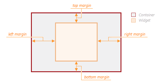
margin
Generates space around the widget.
jQuery
$(function() {
    $("#pieChartContainer").dxPieChart({
        // ...
        margin: {
            top: 20,
            bottom: 20,
            left: 30,
            right: 30
        }
    });
});
Angular
<dx-pie-chart ... >
    <dxo-margin
        [top]="20"
        [bottom]="20"
        [left]="30"
        [right]="30">
    </dxo-margin>
</dx-pie-chart>
import { Component } from '@angular/core';

@Component({
    selector: 'app-root',
    templateUrl: './app.component.html',
    styleUrls: ['./app.component.css']
})
export class AppComponent {
    // ...
}
import { BrowserModule } from '@angular/platform-browser';
import { NgModule } from '@angular/core';
import { AppComponent } from './app.component';

import { DxPieChartModule } from 'devextreme-angular';

@NgModule({
    declarations: [
        AppComponent
    ],
    imports: [
        BrowserModule,
        DxPieChartModule
    ],
    providers: [ ],
    bootstrap: [AppComponent]
})
export class AppModule { }
Vue
<template>
    <dx-pie-chart ... >
        <dx-margin
            :top="20"
            :bottom="20"
            :left="30"
            :right="30"
        />
    </dx-pie-chart>
</template>

<script>
import 'devextreme/dist/css/dx.common.css';
import 'devextreme/dist/css/dx.light.css';

import DxPieChart, {
    DxMargin
} from 'devextreme-vue/pie-chart';

export default {
    components: {
        DxPieChart,
        DxMargin
    },
    // ...
}
</script>
React
import React from 'react';

import 'devextreme/dist/css/dx.common.css';
import 'devextreme/dist/css/dx.light.css';

import PieChart, {
    Margin
} from 'devextreme-react/pie-chart';

class App extends React.Component {
    render() {
        return (
            <PieChart ... >
                <Margin
                    top={20}
                    bottom={20}
                    left={30}
                    right={30}
                />
            </PieChart>
        );
    }
}
export default App;
minDiameter
Specifies the minimum diameter of the pie.
This option specifies the minimum ratio between the pie's diameter and the widget's width or height (depending on which of them is less). For example, assume that the widget's size is 300x500 pixels and the minDiameter option is 0.7. Then, the diameter of the pie will never be less than:
0.7 * min(300,500) = 0.7 * 300 = 210 pixels
See Also
onDisposing
A function that is executed before the widget is disposed of.
Information about the event.
| Name | Type | Description |
|---|---|---|
| component |
The widget's instance. |
|
| element |
The widget's container. It is an HTML Element or a jQuery Element when you use jQuery. |
|
| model |
The model data. Available only if you use Knockout. |
onDone
A function that is executed when all series are ready.
Information about the event.
| Name | Type | Description |
|---|---|---|
| component |
The widget's instance. |
|
| element |
The widget's container. It is an HTML Element or a jQuery Element when you use jQuery. |
|
| model |
The model data. Available only if you use Knockout. |
onDrawn
A function that is executed when the widget's rendering has finished.
Information about the event.
| Name | Type | Description |
|---|---|---|
| component |
The widget's instance. |
|
| element |
The widget's container. It is an HTML Element or a jQuery Element when you use jQuery. |
|
| model |
The model data. Available only if you use Knockout. |
onExported
A function that is executed after the widget is exported.
Information about the event.
| Name | Type | Description |
|---|---|---|
| component |
The widget's instance. |
|
| element |
The widget's container. It is an HTML Element or a jQuery Element when you use jQuery. |
|
| model |
The model data. Available only if you use Knockout. |
See Also
onExporting
A function that is executed before the widget is exported.
Information about the event.
| Name | Type | Description |
|---|---|---|
| component |
The widget's instance. |
|
| element |
The widget's container. It is an HTML Element or a jQuery Element when you use jQuery. |
|
| model |
The model data. Available only if you use Knockout. |
|
| fileName |
The name of the file to which the widget is about to be exported. |
|
| cancel |
Allows you to prevent exporting. |
|
| format |
The resulting file format. One of PNG, PDF, JPEG, SVG and GIF. |
See Also
onFileSaving
A function that is executed before a file with exported widget is saved to the user's local storage.
Information about the event.
| Name | Type | Description |
|---|---|---|
| component |
The widget's instance. |
|
| element |
The widget's container. It is an HTML Element or a jQuery Element when you use jQuery. |
|
| fileName |
The name of the file to be saved. |
|
| format |
The format of the file to be saved. |
|
| data |
Exported data as a BLOB. |
|
| cancel |
Allows you to prevent file saving. |
See Also
onIncidentOccurred
A function that is executed when an error or warning occurs.
Information about the event.
| Name | Type | Description |
|---|---|---|
| component |
The widget's instance. |
|
| element |
The widget's container. It is an HTML Element or a jQuery Element when you use jQuery. |
|
| model |
The model data. Available only if you use Knockout. |
|
| target | any |
Information on the occurred incident. |
The widget notifies you of errors and warnings by passing messages to the browser console. Each message contains the incident's ID, a brief description, and a link to the Errors and Warnings section where further information about this incident can be found.
The onIncidentOccurred function allows you to handle errors and warnings the way you require. The object passed to it contains the target field. This field provides information about the occurred incident and contains the following properties:
- id
The incident's ID. The full list of IDs can be found in the Errors and Warnings section. - type
The incident's type: "error" or "warning". - args
The argument of the incident's message. Depends on the incident. For example, it may be the name of the data source field that was specified incorrectly, or the name of the option that was not set properly. - text
The text passed to the browser's console. Includes the args content, if there is any. - widget
The name of the widget that produced the error or warning. - version
The used DevExtreme version.
onInitialized
A function used in JavaScript frameworks to save the widget instance.
Information about the event.
| Name | Type | Description |
|---|---|---|
| component |
The widget's instance. |
|
| element |
The widget's container. It is an HTML Element or a jQuery Element when you use jQuery. |
onLegendClick
A function that is executed when a legend item is clicked or tapped.
Information about the event.
| Name | Type | Description |
|---|---|---|
| component |
The widget's instance. |
|
| element |
The widget's container. It is an HTML Element or a jQuery Element when you use jQuery. |
|
| model |
The model data. Available only if you use Knockout. |
|
| jQueryEvent |
Use 'event' instead. The jQuery event that caused the handler execution. Deprecated in favor of the event field. |
|
| event | Event (jQuery or EventObject) |
The event that caused the handler execution. It is a dxEvent or a jQuery.Event when you use jQuery. |
| target | | |
The argument of the point(s) corresponding to the clicked legend item. |
| points |
The Point object(s). |
onOptionChanged
A function that is executed after a widget option is changed.
Information about the event.
| Name | Type | Description |
|---|---|---|
| name |
The modified option if it belongs to the first level. Otherwise, the first-level option it is nested into. |
|
| model |
The model data. Available only if you use Knockout. |
|
| element |
The widget's container. It is an HTML Element or a jQuery Element when you use jQuery. |
|
| component |
The widget's instance. |
|
| fullName |
The path to the modified option that includes all parent options. |
|
| value | any |
The modified option's new value. |
onPointClick
A function that is executed when a series point is clicked or tapped.
Information about the event.
| Name | Type | Description |
|---|---|---|
| component |
The widget's instance. |
|
| element |
The widget's container. It is an HTML Element or a jQuery Element when you use jQuery. |
|
| model |
The model data. Available only if you use Knockout. |
|
| jQueryEvent |
Use 'event' instead. The jQuery event that caused the handler execution. Deprecated in favor of the event field. |
|
| event | Event (jQuery or EventObject) |
The event that caused the handler execution. It is a dxEvent or a jQuery.Event when you use jQuery. |
| target |
The clicked series point; described in the Point section. |
onPointHoverChanged
A function that is executed after the pointer enters or leaves a series point.
To identify whether the pointer has entered or left the series point, call the point's isHovered() method.
onPointSelectionChanged
A function that is executed when a series point is selected or selection is canceled.
To identify whether the selection has been applied or canceled, call the point's isSelected() method.
onTooltipHidden
A function that is executed when a tooltip becomes hidden.
Information about the event.
| Name | Type | Description |
|---|---|---|
| component |
The widget's instance. |
|
| element |
The widget's container. It is an HTML Element or a jQuery Element when you use jQuery. |
|
| model |
The model data. Available only if you use Knockout. |
|
| target |
The series point whose tooltip is hidden; described in the Point section. |
See Also
- hideTooltip()
- Point.hideTooltip()
onTooltipShown
A function that is executed when a tooltip appears.
Information about the event.
| Name | Type | Description |
|---|---|---|
| component |
The widget's instance. |
|
| element |
The widget's container. It is an HTML Element or a jQuery Element when you use jQuery. |
|
| model |
The model data. Available only if you use Knockout. |
|
| target |
The series point whose tooltip is shown; described in the Point section. |
See Also
- Point.showTooltip()
palette
Sets the palette to be used to colorize series and their elements.
This option accepts either the name of a predefined palette or an array of colors. The array can include the following colors:
- Hexadecimal colors
- RGB colors
- RGBA colors
- Predefined/cross-browser color names
- Predefined SVG colors
Use the VizPalette enum to specify this option when the widget is used as an ASP.NET MVC Control. This enum accepts the following values: Default, SoftPastel, HarmonyLight, Pastel, Bright, Soft, Ocean, Vintage, Violet, Carmine, DarkMoon, SoftBlue, DarkViolet, and GreenMist.
See Also
- Palettes
- paletteExtensionMode
- series.color
paletteExtensionMode
Specifies what to do with colors in the palette when their number is less than the number of series (in the Chart widget) or points in a series (in the PieChart widget).
The following variants are available:
"blend"
Create a blend of two neighboring colors and insert it between these colors in the palette."alternate"
Repeat the full set of palette colors, alternating their normal, lightened, and darkened shades in that order."extrapolate"
Repeat the full set of palette colors, changing their shade gradually from dark to light.
Use the VizPaletteExtensionMode enum to specify this option when the widget is used as an ASP.NET MVC Control. This enum accepts the following values: Blend, Alternate, and Extrapolate.
pathModified
Notifies the widget that it is embedded into an HTML page that uses a tag modifying the path.
pointSelectionMode
Specifies whether a single point or multiple points can be selected in the chart.
To set the points to highlight along with the selected point, set the series.selectionMode option.
To learn how to select a point, refer to the Selection Handling topic.
Use the ChartElementSelectionMode enum to specify this option when the widget is used as an ASP.NET MVC Control. This enum accepts the following values: Single and Multiple.
redrawOnResize
Specifies whether to redraw the widget when the size of the parent browser window changes or a mobile device rotates.
When this option is set to true, the widget will be redrawn automatically in case the size of its parent window changes.
resolveLabelOverlapping
Specifies how a chart must behave when point labels overlap.
Series point labels display series point values. If the series in your pie chart contains a large number of points, point labels may overlap. In this case, specify how the chart must resolve overlapping using the resolveLabelOverlapping option. To hide certain labels, set this option to 'hide'. Labels to be hidden will be determined automatically. To resolve overlapping by shifting labels from their positions, set the resolveLabelOverlapping option to 'shift'. In this case, it is recommended that you display label connectors so that pie segments are connected with their labels. If there is not enough space for all labels after they are shifted, labels with the smallest values will be hidden.
Use the PieChartResolveLabelOverlapping enum to specify this option when the widget is used as an ASP.NET MVC Control. This enum accepts the following values: None, Hide, and Shift.
rtlEnabled
Switches the widget to a right-to-left representation.
When this option is set to true, the widget text flows from right to left, and the layout of elements is reversed. To switch the entire application/site to the right-to-left representation, assign true to the rtlEnabled field of the object passed to the DevExpress.config(config) method.
DevExpress.config({
    rtlEnabled: true
});
segmentsDirection
Specifies the direction that the pie chart segments will occupy.
Use the PieChartSegmentsDirection enum to specify this option when the widget is used as an ASP.NET MVC Control. This enum accepts the following values: Clockwise and AntiClockwise.
series
Specifies options for the series of the PieChart widget.
A series represents a group of related data points. To configure a series, assign an object to the series option. If PieChart must contain several series, assign an array of such objects to the same option. Refer to the Series Overview topic to learn the basics of what a series is, what it does, and how it helps.
The definitive characteristic of a series is its type. The PieChart widget provides two series types - Pie and Doughnut.
When you have a multi-series pie, settings that are common for all series can be specified all together. Use the commonSeriesSettings object to do this.
seriesTemplate
Defines options for the series template.
In most cases, you can organize the array that is assigned to the chart's dataSource option in the following way.
[
    {arg: arg1Value, series1Value: val11, series2Value: val12, ...}
    {arg: arg2Value, series1Value: val21, series2Value: val22, ...}
    ...
    {arg: argNValue, series1Value: valN1, series2Value: valN2, ...}
]
Each object that is included in the array represents an argument value and the values of all series for this argument.
However, there are some scenarios in which you do not know exactly how many series will be added. In these cases, you will not be able to define the data source in the manner detailed above. Instead, define it in the following way.
[
    {seriesName: series1, arg: arg11Value, val: value11 }
    {seriesName: series1, arg: arg12Value, val: value12 }
    ...
    {seriesName: seriesM, arg: argM1Value, val: valueM1 }
    {seriesName: seriesM, arg: argM2Value, val: valueM2 }
    ...
]
If you define a data source in this manner, set the argument and value fields using the argumentField and valueField properties of the commonSeriesSettings configuration object (for all series at once). Then, define a template for the series using the seriesTemplate configuration object. Within this object, set the data source field that specifies the series name to the nameField option.
If you need to specify individual values for options of a particular series, assign a callback function to the customizeSeries option of the seriesTemplate object.
size
Specifies the widget's size in pixels.
The widget occupies its container's entire area by default. Use the size object to specify the widget's size if it should be different from that of its container. Assign 0 to size object's height and width options to hide the widget.
jQuery
$(function() {
    $("#pieChartContainer").dxPieChart({
        // ...
        size: {
            height: 300,
            width: 600
        }
    });
});
Angular
<dx-pie-chart ... >
    <dxo-size
        [height]="300"
        [width]="600">
    </dxo-size>
</dx-pie-chart>
import { Component } from '@angular/core';

@Component({
    selector: 'app-root',
    templateUrl: './app.component.html',
    styleUrls: ['./app.component.css']
})
export class AppComponent {
    // ...
}
import { BrowserModule } from '@angular/platform-browser';
import { NgModule } from '@angular/core';
import { AppComponent } from './app.component';

import { DxPieChartModule } from 'devextreme-angular';

@NgModule({
    declarations: [
        AppComponent
    ],
    imports: [
        BrowserModule,
        DxPieChartModule
    ],
    providers: [ ],
    bootstrap: [AppComponent]
})
export class AppModule { }
Vue
<template>
    <dx-pie-chart ... >
        <dx-size
            :height="300"
            :width="600"
        />
    </dx-pie-chart>
</template>

<script>
import 'devextreme/dist/css/dx.common.css';
import 'devextreme/dist/css/dx.light.css';

import DxPieChart, {
    DxSize
} from 'devextreme-vue/pie-chart';

export default {
    components: {
        DxPieChart,
        DxSize
    },
    // ...
}
</script>
React
import React from 'react';

import 'devextreme/dist/css/dx.common.css';
import 'devextreme/dist/css/dx.light.css';

import PieChart, {
    Size
} from 'devextreme-react/pie-chart';

class App extends React.Component {
    render() {
        return (
            <PieChart ... >
                <Size
                    height={300}
                    width={600}
                />
            </PieChart>
        );
    }
}
export default App;
sizeGroup
Allows you to display several adjoining pies in the same size.
Besides the pie itself, the PieChart widget comprises other diverse elements that affect the size of the pie. Therefore, when you display several PieChart widgets side by side, their pies may differ in size. To eliminate these differences, collect all the PieChart widgets in a single size group by setting their sizeGroup option to identical values. The widgets should have identical layouts, that is, the same container's size, position of the title and legend, etc. Note also that a single page can contain many size groups, but a widget can be a member of only one of them.
See Also
startAngle
Specifies the angle in arc degrees from which the first segment of a pie chart should start.
theme
Sets the name of the theme the widget uses.
A theme is a widget configuration that gives the widget a distinctive appearance. Use can use one of the predefined themes or create a custom one. Changing the option values in the widget's configuration object overrides the theme's corresponding values.
Use the VizTheme enum to specify this option when the widget is used as an ASP.NET MVC Control. This enum accepts the following values: GenericLight, GenericDark, GenericContrast, GenericCarmine, GenericDarkMoon, GenericSoftBlue, GenericDarkViolet, GenericGreenMist, IOS7Default, MaterialBlueLight, MaterialLimeLight, MaterialOrangeLight, MaterialPurpleLight, MaterialTealLight.
title
Configures the widget's title.
The widget's title is a short text that usually indicates what is visualized. If you need to specify the title's text only, assign it directly to the title option. Otherwise, set this option to an object with the text and other fields specified.
The title can be accompanied by a subtitle elaborating on the visualized subject using the title.subtitle object.
tooltip
Configures tooltips.
A tooltip is a miniature rectangle displaying values of a series point. A tooltip appears when the end-user hovers the cursor over a series point. You can enable/disable tooltips, change their appearance and format their text using fields of the tooltip configuration object.
type
Specifies the type of the pie chart series.
See Series Overview for details.
Use the PieChartType enum to specify this option when the widget is used as an ASP.NET MVC Control. This enum accepts the following values: Pie, Doughnut, and Donut.

 Select one or more answers