User Interaction
Users can add, delete, and update grid data. To enable these operations, assign true to the corresponding fields of the editing object. You can set a column's allowEditing option to false if its data should not be edited.
Grid data can be edited in several modes. Set the editing.mode option to specify the mode.
jQuery
$(function() {
    $("#dataGridContainer").dxDataGrid({
        // ...
        editing: {
            allowUpdating: true,
            allowAdding: true,
            allowDeleting: true,
            mode: 'row' // 'batch' | 'cell' | 'form' | 'popup'
        },
        columns: [
            { dataField: 'id', allowEditing: false },
            // ...
        ]
    });
});
Angular
<dx-data-grid ... >
    <dxo-editing
        [allowUpdating]="true"
        [allowAdding]="true"
        [allowDeleting]="true"
        mode="row"> <!-- 'batch' | 'cell' | 'form' | 'popup' -->
    </dxo-editing>
    <dxi-column dataField="id" [allowEditing]="false"></dxi-column>
</dx-data-grid>
import { DxDataGridModule } from "devextreme-angular";
// ...
export class AppComponent {
    // ...
}
@NgModule({
    imports: [
        // ...
        DxDataGridModule
    ],
    // ...
})
Vue
<template>
    <DxDataGrid ... >
        <DxEditing
            :allow-updating="true"
            :allow-adding="true"
            :allow-deleting="true"
            mode="row" /> <!-- 'batch' | 'cell' | 'form' | 'popup' -->
        <DxColumn data-field="id" :allow-editing="false" />
    </DxDataGrid>
</template>

<script>
import 'devextreme/dist/css/dx.common.css';
import 'devextreme/dist/css/dx.light.css';

import DxDataGrid, {
    DxEditing,
    DxColumn
} from 'devextreme-vue/data-grid';

export default {
    components: {
        DxDataGrid,
        DxEditing,
        DxColumn
    }
}
</script>
React
import React from 'react';

import 'devextreme/dist/css/dx.common.css';
import 'devextreme/dist/css/dx.light.css';

import DataGrid, {
    Editing,
    Column
} from 'devextreme-react/data-grid';

class App extends React.Component {
    render() {
        return (
            <DataGrid ... >
                <Editing
                    allowUpdating={true}
                    allowAdding={true}
                    allowDeleting={true}
                    mode="row" /> {/* 'batch' | 'cell' | 'form' | 'popup' */}
                <Column dataField="id" allowEditing={false} />
            </DataGrid>
        );
    }
}
export default App;
The following sections detail the DataGrid's appearance and behavior in each editing mode.
Row Mode
In this mode a user edits data row by row. When a user clicks an "Edit" button, the corresponding row enters the editing state, and the "Save" and "Cancel" buttons appear in the edit column. The widget saves changes only if the "Save" button is clicked. If a user starts editing another row, sorts or filters data, it discards the changes.
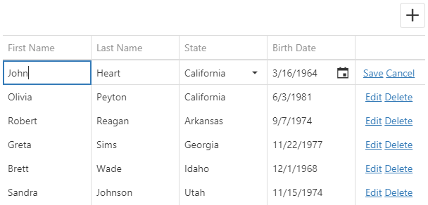
Clicking a "Delete" button invokes the confirmation dialog that allows a user to cancel row deletion. Use the code below to hide this dialog.
jQuery
$(function() {
    $("#dataGridContainer").dxDataGrid({
        // ...
        editing: {
            // ...
            mode: 'row',
            allowDeleting: true,
            texts: {
                confirmDeleteMessage: null
            }
        }
    });
});
Angular
<dx-data-grid ... >
    <dxo-editing mode="row" [allowDeleting]="true">
        <dxo-texts [confirmDeleteMessage]="null"></dxo-texts>
    </dxo-editing>
</dx-data-grid>
import { DxDataGridModule } from "devextreme-angular";
// ...
export class AppComponent {
    // ...
}
@NgModule({
    imports: [
        // ...
        DxDataGridModule
    ],
    // ...
})
Vue
<template>
    <DxDataGrid ... >
        <DxEditing
            mode="row"
            :allow-deleting="true">
            <DxEditingTexts :confirm-delete-message="null" />
        </DxEditing>
    </DxDataGrid>
</template>

<script>
import { DxDataGrid, DxEditing, DxEditingTexts } from 'devextreme-vue/data-grid';

export default {
    components: {
        DxDataGrid,
        DxEditing,
        DxEditingTexts
    },
    data() {}
}
</script>
React
import React from 'react';

import { DataGrid, Editing, EditingTexts } from 'devextreme-react/data-grid';

class App extends React.Component {
    render() {
        return (
            <DataGrid ... >
                <Editing
                    mode="row"
                    allowDeleting={true}>
                    <EditingTexts confirmDeleteMessage={null} />
                </Editing>
            </DataGrid>
        );
    }
}
export default App; See Also
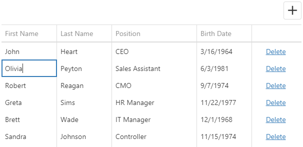
Cell Mode
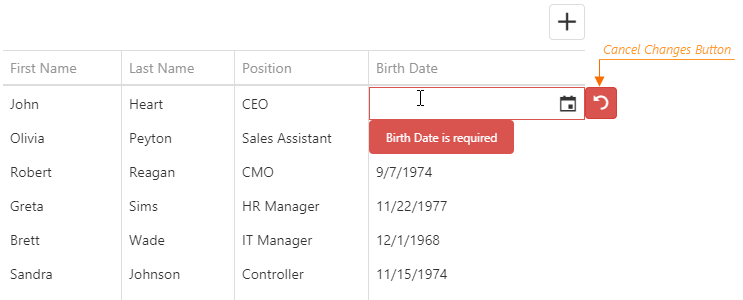
In the cell mode, a user edits data cell by cell. Changes are saved once a cell loses the focus, or discarded if a user presses Esc. An added row is saved only when the focus is shifted from it. Choose this mode if any changes should be saved to the data source immediately.
If you validate data, a cell is locked in the editing state until a user enters a valid value or clicks the "Cancel Changes" button.
Clicking a "Delete" button invokes the confirmation dialog that allows a user to cancel row deletion. Use the code below to hide this dialog.
jQuery
$(function() {
    $("#dataGridContainer").dxDataGrid({
        // ...
        editing: {
            mode: 'cell',
            texts: {
                confirmDeleteMessage: null
            }
        }
    });
});
Angular
<dx-data-grid ... >
    <dxo-editing mode="cell" [allowDeleting]="true">
        <dxo-texts [confirmDeleteMessage]="null"></dxo-texts>
    </dxo-editing>
</dx-data-grid>
import { DxDataGridModule } from "devextreme-angular";
// ...
export class AppComponent {
    // ...
}
@NgModule({
    imports: [
        // ...
        DxDataGridModule
    ],
    // ...
})See Also
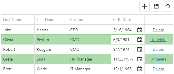
Batch Mode
In the batch mode, like in the cell mode, a user edits data cell by cell. However, in this mode, the widget stores changes in a buffer until a user clicks the global "Save" button instead of saving them immediately. This mode is useful when you need to defer saving multiple changes.
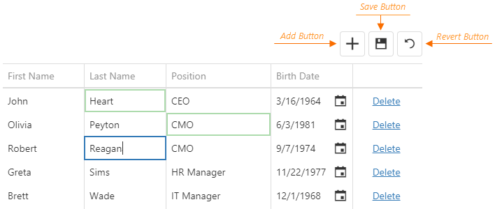
When a user clicks a row's "Delete" button, the widget only marks the row as deleted. Users can restore this row by clicking the "Undelete" button if they have not saved the changes yet. They can also discard all unsaved changes by clicking the "Revert" button.
See Also
Form Mode
In form edit mode, row cells become editable form fields. Form fields are sorted like columns in the columns array.
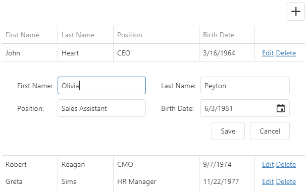
Configure the form using the editing.form object. The DataGrid uses the DevExtreme Form widget, so you can specify any Form options in this object except those listed in its description.
For example, you can specify the items array to reorder editable fields (or "simple items", as they are called in the Form widget), or organize them in groups and tabs.
In the following code, the items with the specified dataField are simple items. Identical dataFields connect a simple item with a column:
jQuery
$(function() {
    $("#dataGridContainer").dxDataGrid({
        // ...
        editing: {
            allowUpdating: true,
            mode: "form",
            form: {
                items: [{
                    itemType: "group",
                    caption: "Personal Data",
                    items: [
                        { dataField: "Prefix" },
                        { dataField: "Full_Name" },
                        { dataField: "Position" },
                        { dataField: "Duties", editorType: "dxTextArea" }
                    ]
                    // or just
                    // items: ["Prefix", "Full_Name", "Position"]
                }, {
                    itemType: "group",
                    caption: "Contacts",
                    items: ["Email", "Skype"]
                }]
            }
        },
        columns: [
            { dataField: "Full_Name" },
            { dataField: "Prefix" },
            { dataField: "Position" },
            { dataField: "Duties" },
            { dataField: "Email" },
            { dataField: "Skype" }
        ]
    });
});
Angular
<dx-data-grid ... >
    <dxo-editing
        [allowUpdating]="true"
        mode="form">
        <dxo-form>
            <dxi-item itemType="group" caption="Personal Data">
                <dxi-item dataField="Prefix"></dxi-item>
                <dxi-item dataField="Full_Name"></dxi-item>
                <dxi-item dataField="Position"></dxi-item>
                <dxi-item dataField="Duties" editorType="dxTextArea"></dxi-item>
            </dxi-item>
            <dxi-item itemType="group" caption="Contacts">
                <dxi-item dataField="Email"></dxi-item>
                <dxi-item dataField="Skype"></dxi-item>
            </dxi-item>
        </dxo-form>
    </dxo-editing>
    <dxi-column dataField="Full_Name"></dxi-column>
    <dxi-column dataField="Prefix"></dxi-column>
    <dxi-column dataField="Position"></dxi-column>
    <dxi-column dataField="Duties"></dxi-column>
    <dxi-column dataField="Email"></dxi-column>
    <dxi-column dataField="Skype"></dxi-column>
</dx-data-grid>
import { DxDataGridModule } from "devextreme-angular";
// ...
export class AppComponent {
    // ...
}
@NgModule({
    imports: [
        // ...
        DxDataGridModule
    ],
    // ...
})
Vue
<template>
    <DxDataGrid ... >
        <DxEditing
            :allow-updating="true"
            mode="form">
            <DxForm>
                <DxGroupItem caption="Personal Data">
                    <DxSimpleItem data-field="Prefix" />
                    <DxSimpleItem data-field="Full_Name" />
                    <DxSimpleItem data-field="Position" />
                    <DxSimpleItem data-field="Duties" editor-type="dxTextArea" />
                </DxGroupItem>
                <DxGroupItem caption="Contacts">
                    <DxSimpleItem data-field="Email" />
                    <DxSimpleItem data-field="Skype" />
                </DxGroupItem>
            </DxForm>
        </DxEditing>
        <DxColumn data-field="Full_Name" />
        <DxColumn data-field="Prefix" />
        <DxColumn data-field="Position" />
        <DxColumn data-field="Duties" />
        <DxColumn data-field="Email" />
        <DxColumn data-field="Skype" />
    </DxDataGrid>
</template>

<script>
import 'devextreme/dist/css/dx.common.css';
import 'devextreme/dist/css/dx.light.css';

import DxDataGrid, {
    DxEditing,
    DxForm,
    DxColumn
} from 'devextreme-vue/data-grid';

import {
    DxSimpleItem,
    DxGroupItem
} from 'devextreme-vue/form';

import 'devextreme-vue/text-area';

export default {
    components: {
        DxDataGrid,
        DxEditing,
        DxForm,
        DxColumn,
        DxSimpleItem,
        DxGroupItem
    }
}
</script>
React
import React from 'react';

import 'devextreme/dist/css/dx.common.css';
import 'devextreme/dist/css/dx.light.css';

import DataGrid, {
    Editing,
    Form,
    Column
} from 'devextreme-react/data-grid';

import {
    SimpleItem,
    GroupItem
} from 'devextreme-react/form';

import 'devextreme-react/text-area';

class App extends React.Component {
    render() {
        return (
            <DataGrid ... >
                <Editing
                    allowUpdating={true}
                    mode="form">
                    <Form>
                        <GroupItem caption="Personal Data">
                            <SimpleItem dataField="Prefix" />
                            <SimpleItem dataField="Full_Name" />
                            <SimpleItem dataField="Position" />
                            <SimpleItem dataField="Duties" editorType="dxTextArea" />
                        </GroupItem>
                        <GroupItem caption="Contacts">
                            <SimpleItem dataField="Email" />
                            <SimpleItem dataField="Skype" />
                        </GroupItem>
                    </Form>
                </Editing>
                <Column dataField="Full_Name" />
                <Column dataField="Prefix" />
                <Column dataField="Position" />
                <Column dataField="Duties" />
                <Column dataField="Email" />
                <Column dataField="Skype" />
            </DataGrid>
        );
    }
}
export default App;
ASP.NET MVC Controls
@(Html.DevExtreme().DataGrid()
    // ...
    .Editing(e => e
        .AllowUpdating(true)
        .Mode(GridEditMode.Form)
        .Form(f => f
            .Items(i => {
                i.AddGroup()
                    .Caption("Personal Data")
                    .Items(groupItems => {
                        groupItems.AddSimple().DataField("Prefix");
                        groupItems.AddSimple().DataField("Full_Name");
                        groupItems.AddSimple().DataField("Position");
                        groupItems.AddSimple().DataField("Duties")
                            .Editor(e => e.TextArea());
                    });
                i.AddGroup()
                    .Caption("Contacts")
                    .Items(groupItems => {
                        groupItems.AddSimple().DataField("Email");
                        groupItems.AddSimple().DataField("Skype");
                    });
            })
        )
    )
    .Columns(cols => {
        cols.Add().DataField("Full_Name");
        cols.Add().DataField("Prefix");
        cols.Add().DataField("Position");
        cols.Add().DataField("Duties");
        cols.Add().DataField("Email");
        cols.Add().DataField("Skype");
    })
)
See Also
You can use a column's formItem object to customize an individual simple item. See an example in its description.
If you need to validate form values, specify validation rules as described in the Data Validation article.
Popup Mode
The popup mode is the form mode with the form placed in a popup window.
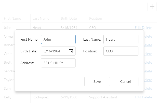
Use the editing.popup object to customize the popup window. This object can contain the Popup widget's fields. However, you should refer to the popup object's description for information on restrictions that apply.
jQuery
$(function() {
    $("#dataGridContainer").dxDataGrid({
        // ...
        editing: {
            allowUpdating: true,
            mode: "popup",
            form: {
                labelLocation: "top"
            },
            popup: {
                showTitle: true,
                title: "Row in the editing state"
            }
        }
    });
});
Angular
<dx-data-grid ... >
    <dxo-editing
        [allowUpdating]="true"
        mode="popup">
        <dxo-form labelLocation="top"></dxo-form>
        <dxo-popup [showTitle]="true" title="Row in the editing state"></dxo-popup>
    </dxo-editing>
</dx-data-grid>
import { DxDataGridModule } from "devextreme-angular";
// ...
export class AppComponent {
    // ...
}
@NgModule({
    imports: [
        // ...
        DxDataGridModule
    ],
    // ...
})
Vue
<template>
    <DxDataGrid ... >
        <DxEditing
            :allow-updating="true"
            mode="popup">
            <DxForm
                label-location="top"
            />
            <DxPopup
                :show-title="true"
                title="Row in the editing state"
            />
        </DxEditing>
    </DxDataGrid>
</template>

<script>
import 'devextreme/dist/css/dx.common.css';
import 'devextreme/dist/css/dx.light.css';

import DxDataGrid, {
    DxEditing,
    DxForm,
    DxPopup
} from 'devextreme-vue/data-grid';

export default {
    components: {
        DxDataGrid,
        DxEditing,
        DxForm,
        DxPopup
    }
}
</script>
React
import React from 'react';

import 'devextreme/dist/css/dx.common.css';
import 'devextreme/dist/css/dx.light.css';

import DataGrid, {
    Editing,
    Form,
    Popup
} from 'devextreme-react/data-grid';

class App extends React.Component {
    render() {
        return (
            <DataGrid ... >
                <Editing
                    allowUpdating={true}
                    mode="popup">
                    <Form
                        labelLocation="top"
                    />
                    <Popup
                        showTitle={true}
                        title="Row in the editing state"
                    />
                </Editing>
            </DataGrid>
        );
    }
}
export default App;
Since the popup and form modes are very similar, you can use the same columns.formItem and editing.form options to customize items and layout in both modes. See the Form Mode topic for more details on form customization.
See Also
Add
Use the addRow() method to add an empty row.
jQuery
$("#dataGridContainer").dxDataGrid("addRow");Angular
import { ..., ViewChild } from "@angular/core";
import { DxDataGridModule, DxDataGridComponent } from "devextreme-angular";
// ...
export class AppComponent {
    @ViewChild(DxDataGridComponent, { static: false }) dataGrid: DxDataGridComponent;
    // Prior to Angular 8
    // @ViewChild(DxDataGridComponent) dataGrid: DxDataGridComponent;
    addRow () {
       this.dataGrid.instance.addRow();
    }
}
@NgModule({
    imports: [
        // ...
        DxDataGridModule
    ],
    // ...
})
Vue
<template>
    <DxDataGrid ...
        ref="myDataGrid">
    </DxDataGrid>
</template>

<script>
import 'devextreme/dist/css/dx.common.css';
import 'devextreme/dist/css/dx.light.css';

import DxDataGrid from 'devextreme-vue/data-grid';

export default {
    components: {
        DxDataGrid
    },
    methods: {
        addNewRow() {
            this.$refs['myDataGrid'].instance.addRow();
        }
    }
}
</script>
React
import React from 'react';

import 'devextreme/dist/css/dx.common.css';
import 'devextreme/dist/css/dx.light.css';

import DataGrid from 'devextreme-react/data-grid';

class App extends React.Component {
    constructor(props) {
        super(props);
        this.dataGridRef = React.createRef();
        this.addNewRow = this.addNewRow.bind(this);
    }

    addNewRow() {
        this.dataGridRef.current.instance.addRow();
    }

    render() {
        return (
            <DataGrid ...
                ref={this.dataGridRef}>
            </DataGrid>
        );
    }
}
export default App;
You can specify initial values for a newly added row in the onInitNewRow event handler.
jQuery
$(function() {
    $("#dataGridContainer").dxDataGrid({
        // ...
        columns: [{
            dataField: "Hire_Date",
            dataType: "date"
        },
            // ...
        ],
        onInitNewRow: function(e) {
            e.data.Hire_Date = new Date();
        }
    });
});
Angular
<dx-data-grid ...
    (onInitNewRow)="onInitNewRow($event)">
    <dxi-column dataField="Hire_Date" dataType="date"></dxi-column>
</dx-data-grid>
import { DxDataGridModule } from "devextreme-angular";
// ...
export class AppComponent {
    onInitNewRow (e) {
        e.data.Hire_Date = new Date();
    }
}
@NgModule({
    imports: [
        // ...
        DxDataGridModule
    ],
    // ...
})
Vue
<template>
    <DxDataGrid ...
        @init-new-row="setHireDate">
        <DxColumn data-field="Hire_Date" data-type="date" />
    </DxDataGrid>
</template>

<script>
import 'devextreme/dist/css/dx.common.css';
import 'devextreme/dist/css/dx.light.css';

import DxDataGrid, {
    DxColumn
} from 'devextreme-vue/data-grid';

export default {
    components: {
        DxDataGrid,
        DxColumn
    },
    methods: {
        setHireDate(e) {
            e.data.Hire_Date = new Date();
        }
    }
}
</script>
React
import React from 'react';

import 'devextreme/dist/css/dx.common.css';
import 'devextreme/dist/css/dx.light.css';

import DataGrid, {
    Column
} from 'devextreme-react/data-grid';

class App extends React.Component {
    setHireDate(e) {
        e.data.Hire_Date = new Date();
    }

    render() {
        return (
            <DataGrid ...
                onInitNewRow={this.setHireDate}>
                <Column dataField="Hire_Date" dataType="date" />
            </DataGrid>
        );
    }
}
export default App;
See Also
- Call Methods: Angular | Vue | React | jQuery | AngularJS | Knockout | ASP.NET MVC 5 | ASP.NET Core
Update
The cellValue(rowIndex, visibleColumnIndex, value) method updates a cell's value. This cell can be located using its row and column indexes. If the cell's data field is known, you can pass it instead of the column index. After a value is updated, save it to the data source by calling the saveEditData() method.
jQuery
$(function() {
    $("#dataGridContainer").dxDataGrid({ ... });

    $("#updateCellButton").dxButton({
        text: "Update Cell",
        onClick: function() {
            $("#dataGridContainer").dxDataGrid("cellValue", 1, "Position", "CTO");
            $("#dataGridContainer").dxDataGrid("saveEditData");
        }
    });
});
Angular
import { DxDataGridModule, DxButtonModule } from "devextreme-angular";
// ...
export class AppComponent {
    @ViewChild(DxDataGridComponent, { static: false }) dataGrid: DxDataGridComponent;
    // Prior to Angular 8
    // @ViewChild(DxDataGridComponent) dataGrid: DxDataGridComponent;
    updateCell () {
        this.dataGrid.instance.cellValue(1, "Position", "CTO");
        this.dataGrid.instance.saveEditData();
    }
}
@NgModule({
    imports: [
        // ...
        DxDataGridModule,
        DxButtonModule
    ],
    // ...
})
<dx-data-grid ... ></dx-data-grid>
<dx-button
    text="Update Cell"
    (onClick)="updateCell()">
</dx-button>
Vue
<template>
    <div>
        <DxDataGrid ...
            :ref="dataGridRefKey">
        </DxDataGrid>
        <DxButton
            text="Update Cell"
            @click="updateCell"
        />
    </div>
</template>

<script>
import 'devextreme/dist/css/dx.common.css';
import 'devextreme/dist/css/dx.light.css';

import DxDataGrid from 'devextreme-vue/data-grid';
import DxButton from 'devextreme-vue/button';

const dataGridRefKey = 'myDataGrid';

export default {
    components: {
        DxDataGrid,
        DxButton
    },
    data: function() {
        return {
            dataGridRefKey
        }
    },
    methods: {
        updateCell() {
            this.dataGrid.cellValue(1, "Position", "CTO");
            this.dataGrid.saveEditData();
        }
    },
    computed: {
        dataGrid: function() {
            return this.$refs[dataGridRefKey].instance;
        }
    }
}
</script>
React
import React from 'react';

import 'devextreme/dist/css/dx.common.css';
import 'devextreme/dist/css/dx.light.css';

import DataGrid from 'devextreme-react/data-grid';
import Button from 'devextreme-react/button';

class App extends React.Component {
    constructor(props) {
        super(props);
        this.dataGridRef = React.createRef();
        this.updateCell = this.updateCell.bind(this);
    }

    get dataGrid() {
        return this.dataGridRef.current.instance;
    }

    updateCell() {
        this.dataGrid.cellValue(1, "Position", "CTO");
        this.dataGrid.saveEditData();
    }

    render() {
        return (
            <React.Fragment>
                <DataGrid ...
                    ref={this.dataGridRef}>
                </DataGrid>
                <Button
                    text="Update Cell"
                    onClick={this.updateCell}
                />
            </React.Fragment>
        );
    }
}
export default App;
To process an updated cell value before saving it to the data source, implement the columns.setCellValue function. Refer to the function's description for an example.
You can check if there are any unsaved changes by calling the hasEditData() method. Use the saveEditData() or cancelEditData() method to save or cancel them, respectively.
jQuery
$(function() {
    $("#dataGridContainer").dxDataGrid({ ... });

    $("#saveChangesButton").dxButton({
        text: "Save changes",
        onClick: function() {
            var dataGrid = $("#dataGridContainer").dxDataGrid("instance");
            if(dataGrid.hasEditData()) {
                dataGrid.saveEditData().then(() => {
                    if(!dataGrid.hasEditData()) {
                        // Saved successfully
                    } else {
                        // Saving failed
                    }
                });
            }
        }
    });
});
Angular
import { DxDataGridModule, DxButtonModule } from "devextreme-angular";
// ...
export class AppComponent {
    @ViewChild(DxDataGridComponent, { static: false }) dataGrid: DxDataGridComponent;
    // Prior to Angular 8
    // @ViewChild(DxDataGridComponent) dataGrid: DxDataGridComponent;
    saveEditData() {
        if(this.dataGrid.instance.hasEditData()) {
            this.dataGrid.instance.saveEditData().then(() => {
                if(!this.dataGrid.instance.hasEditData()) {
                    // Saved successfully
                } else {
                    // Saving failed
                }
            });
        }
    }
}
@NgModule({
    imports: [
        // ...
        DxDataGridModule,
        DxButtonModule
    ],
    // ...
})
<dx-data-grid ... ></dx-data-grid>
<dx-button
    text="Save changes"
    (onClick)="saveEditData()">
</dx-button>
Vue
<template>
    <div>
        <DxDataGrid ...
            :ref="dataGridRefKey">
        </DxDataGrid>
        <DxButton
            text="Save changes"
            @click="saveChanges"
        />
    </div>
</template>

<script>
import 'devextreme/dist/css/dx.common.css';
import 'devextreme/dist/css/dx.light.css';

import DxDataGrid from 'devextreme-vue/data-grid';
import DxButton from 'devextreme-vue/button';

const dataGridRefKey = 'myDataGrid';

export default {
    components: {
        DxDataGrid,
        DxButton
    },
    data: function() {
        return {
            dataGridRefKey
        }
    },
    methods: {
        saveChanges() {
            if(this.dataGrid.hasEditData()) {
                this.dataGrid.saveEditData().then(() => {
                    if(!this.dataGrid.hasEditData()) {
                        // Saved successfully
                    } else {
                        // Saving failed
                    }
                });
            }
        }
    },
    computed: {
        dataGrid: function() {
            return this.$refs[dataGridRefKey].instance;
        }
    }
}
</script>
React
import React from 'react';

import 'devextreme/dist/css/dx.common.css';
import 'devextreme/dist/css/dx.light.css';

import DataGrid from 'devextreme-react/data-grid';
import Button from 'devextreme-react/button';

class App extends React.Component {
    constructor(props) {
        super(props);
        this.dataGridRef = React.createRef();
        this.saveChanges = this.saveChanges.bind(this);
    }

    get dataGrid() {
        return this.dataGridRef.current.instance;
    }

    saveChanges() {
        if(this.dataGrid.hasEditData()) {
            this.dataGrid.saveEditData().then(() => {
                if(!this.dataGrid.hasEditData()) {
                    // Saved successfully
                } else {
                    // Saving failed
                }
            });
        }
    }

    render() {
        return (
            <React.Fragment>
                <DataGrid ...
                    ref={this.dataGridRef}>
                </DataGrid>
                <Button
                    text="Save changes"
                    onClick={this.saveChanges}
                />
            </React.Fragment>
        );
    }
}
export default App;
See Also
- Call Methods: Angular | Vue | React | jQuery | AngularJS | Knockout | ASP.NET MVC 5 | ASP.NET Core
Delete
Call the deleteRow(rowIndex) method to delete a specific row from the data source. This method invokes a confirmation dialog that allows a user to cancel deletion. The following code hides this dialog, thus a row is instantly deleted from the data source:
jQuery
$(function() {
    var dataGrid = $("#dataGridContainer").dxDataGrid({
        // ...
        editing: {
            mode: "row",
            allowDeleting: true,
            texts: {
                // Hides the confirmation dialog
                confirmDeleteMessage: null
            }
        }
    }).dxDataGrid("instance");

    $("#deleteRowButton").dxButton({
        text: "Delete Row",
        onClick: function() {
            // Deletes the second row
            dataGrid.deleteRow(1);
        }
    });
});
Angular
<dx-data-grid>
    <dxo-editing
        mode="row"
        [allowDeleting]="true">
        <dxo-texts [confirmDeleteMessage]="null"></dxo-texts>
    </dxo-editing>
</dx-data-grid>
<dx-button
    text="Delete Row"
    (onClick)="deleteRow()">
</dx-button>
import { DxDataGridModule, DxButtonModule } from "devextreme-angular";
// ...
export class AppComponent {
    @ViewChild(DxDataGridComponent, { static: false }) dataGrid: DxDataGridComponent;
    // Prior to Angular 8
    // @ViewChild(DxDataGridComponent) dataGrid: DxDataGridComponent;
    deleteRow () {
        // Deletes the second row
        this.dataGrid.instance.deleteRow(1);
    }
}
@NgModule({
    imports: [
        // ...
        DxDataGridModule,
        DxButtonModule
    ],
    // ...
})
Vue
<template>
    <DxDataGrid
        ref="dataGrid">
        <DxEditing
            mode="row"
            :allow-deleting="true">
            <DxEditingTexts :confirm-delete-message="null" />
        </DxEditing>
    </DxDataGrid>
    <DxButton
        text="Delete Row"
        @click="deleteRow"
    />
</template>

<script>
import { DxDataGrid, DxEditing, DxEditingTexts } from 'devextreme-vue/data-grid';

import DxButton from 'devextreme-vue/button';

export default {
    components: {
        DxDataGrid,
        DxEditing,
        DxEditingTexts,
        DxButton
    },
    methods: {
        deleteRow() {
            this.$refs.dataGrid.instance.deleteRow(1);
        }
    },
    data() {}
}
</script>
React
import React from 'react';

import { DataGrid, Editing, EditingTexts } from 'devextreme-react/data-grid';
import Button from 'devextreme-react/button';

class App extends React.Component {
    constructor(props) {
        super(props);

        this.dataGridRef = React.createRef();
        this.deleteRow = this.deleteRow.bind(this);
    }
    get dataGrid() {
        return this.dataGridRef.current.instance;
    }

    deleteRow() {
        this.dataGrid.deleteRow(1);
    }

    render() {
        return (
            <DataGrid
                ref={this.dataGridRef}>
                <Editing
                    mode="row"
                    allowDeleting={true}>
                    <EditingTexts confirmDeleteMessage={null} />
                </Editing>
            </DataGrid>
            <Button
                text="Delete Row"
                onClick={this.deleteRow}
            />
        );
    }
}
export default App;
Note that in the batch mode a row is only marked as deleted. To save changes, call the saveEditData() method. Calling the undeleteRow(rowIndex) method cancels row deletion.
jQuery
$("#dataGridContainer").dxDataGrid("undeleteRow", 1);Angular
import { DxDataGridModule } from "devextreme-angular";
// ...
export class AppComponent {
    @ViewChild(DxDataGridComponent, { static: false }) dataGrid: DxDataGridComponent;
    // Prior to Angular 8
    // @ViewChild(DxDataGridComponent) dataGrid: DxDataGridComponent;
    undeleteRow () {
        this.dataGrid.instance.undeleteRow(1);
    }
}
@NgModule({
    imports: [
        // ...
        DxDataGridModule
    ],
    // ...
})
Vue
<template>
    <DxDataGrid
        ref="dataGrid">
    </DxDataGrid>
</template>

<script>
import { DxDataGrid } from 'devextreme-vue/data-grid';

export default {
    components: {
        DxDataGrid
    },
    methods: {
        undeleteRow() {
            this.$refs.dataGrid.instance.undeleteRow(1);
        }
    },
    data() {}
}
</script>
React
import React from 'react';

import { DataGrid } from 'devextreme-react/data-grid';

class App extends React.Component {
    constructor(props) {
        super(props);

        this.dataGridRef = React.createRef();
        this.undeleteRow = this.undeleteRow.bind(this);
    }
    get dataGrid() {
        return this.dataGridRef.current.instance;
    }

    undeleteRow() {
        this.dataGrid.undeleteRow(1);
    }

    render() {
        return (
            <DataGrid
                ref={this.dataGridRef}
            />
        );
    }
}
export default App;
See Also
- Call Methods: Angular | Vue | React | jQuery | AngularJS | Knockout | ASP.NET MVC 5 | ASP.NET Core
Get Current Cell Values
To get current cell values, call the cellValue(rowIndex, dataField) method. If a cell is being edited, this method returns the unsaved cell value.
The cellValue(rowIndex, dataField) method requires a row index. Use the getRowIndexByKey(key) method to use a key to get the row index. Obtaining the key to use depends on your particular scenario. If you want to get the key of the row being edited, you can use the parameter passed to the onEditingStart event handler:
jQuery
$(function() {
    var editRowKey;
    var dataGridInstance = $("#dataGridContainer").dxDataGrid({
        // ...
        onEditingStart: function(e) {
            editRowKey = e.key;
        }
    }).dxDataGrid("instance");
    // ...
    var editRowIndex = dataGridInstance.getRowIndexByKey(editRowKey);
    var cellValue = dataGridInstance.cellValue(editRowIndex, "EmployeeName");
});
Angular
<dx-data-grid ...
    (onEditingStart)="onEditingStart($event)">
</dx-data-grid>
import { Component, ViewChild } from "@angular/core";
import { DxDataGridComponent } from "devextreme-angular";

@Component({
    selector: 'app-root',
    templateUrl: './app.component.html',
    styleUrls: ['./app.component.css']
})
export class AppComponent {
    @ViewChild(DxDataGridComponent, { static: false }, { static: false }) dataGrid: DxDataGridComponent
    // Prior to Angular 8
    // @ViewChild(DxDataGridComponent, { static: false }) dataGrid: DxDataGridComponent

    editRowKey: number;

    onEditingStart(e) {
        this.editRowKey = e.key;
        // ...
    }

    getCellValue() {
        const editRowIndex = this.dataGrid.instance.getRowIndexByKey(this.editRowKey);
        if(editRowIndex >= 0) {
            return this.dataGrid.instance.cellValue(editRowIndex, "EmployeeName");
        }
        return null;
    }
}
import { BrowserModule } from '@angular/platform-browser';
import { NgModule } from '@angular/core';
import { AppComponent } from './app.component';

import { DxDataGridModule } from 'devextreme-angular';

@NgModule({
    declarations: [
        AppComponent
    ],
    imports: [
        BrowserModule,
        DxDataGridModule
    ],
    bootstrap: [AppComponent]
})
export class AppModule { }
Vue
<template>
    <DxDataGrid ...
        :ref="dataGridRefKey"
        @editing-start="onEditingStart">
    </DxDataGrid>
</template>

<script>
import 'devextreme/dist/css/dx.common.css';
import 'devextreme/dist/css/dx.light.css';

import DxDataGrid from 'devextreme-vue/data-grid';

const dataGridRefKey = 'myDataGrid';

export default {
    components: {
        DxDataGrid
    },
    data: function() {
        return {
            dataGridRefKey,
            editRowKey
        }
    },
    methods: {
        onEditingStart(e) {
            this.editRowKey = e.key;
            // ...
        },
        getCellValue() {
            const editRowIndex = this.dataGrid.getRowIndexByKey(this.editRowKey);
            if(editRowIndex >= 0) {
                return this.dataGrid.cellValue(editRowIndex, "EmployeeName");
            }
            return null;
        }
    },
    computed: {
        dataGrid: function() {
            return this.$refs[dataGridRefKey].instance;
        }
    }
}
</script>
React
import React from 'react';

import 'devextreme/dist/css/dx.common.css';
import 'devextreme/dist/css/dx.light.css';

import DataGrid from 'devextreme-react/data-grid';

class App extends React.Component {
    constructor(props) {
        super(props);
        this.dataGridRef = React.createRef();
        this.getCellValue = this.getCellValue.bind(this);
        this.onEditingStart = this.onEditingStart.bind(this);
    }

    get dataGrid() {
        return this.dataGridRef.current.instance;
    }

    getCellValue() {
        const editRowIndex = this.dataGrid.getRowIndexByKey(this.state.editRowKey);
        if(editRowIndex >= 0) {
            return this.dataGrid.cellValue(editRowIndex, "EmployeeName");
        }
        return null;
    }

    onEditingStart(e) {
        this.setState({
            editRowKey: e.key
        });
        // ...
    }

    render() {
        return (
            <DataGrid ...
                ref={this.dataGridRef}
                onEditingStart={this.onEditingStart}>
            </DataGrid>
        );
    }
}
export default App;
To access a cell value after the user has edited it, but before it is saved to the data source, use the setCellValue function as an alternative. In addition to edited cell values, it allows you to get the cell values before user edits. setCellValue is set individually for each column.
jQuery
$(function() {
    $("#dataGridContainer").dxDataGrid({
        // ...
        columns: [
            // ...
            {
                dataField: "EmployeeName",
                setCellValue: function(newData, value, currentRowData) {
                    // currentRowData contains the row data before the edit
                    // value contains the edited value
                }
            }
        ]
    });
});
Angular
<dx-data-grid ... >
    <dxi-column
        dataField="EmployeeName"
        [setCellValue]="setCellValue">
    </dxi-column>
</dx-data-grid>
import { Component } from "@angular/core";
import { DxDataGridComponent } from "devextreme-angular";

@Component({
    selector: 'app-root',
    templateUrl: './app.component.html',
    styleUrls: ['./app.component.css']
})
export class AppComponent {
    setCellValue (newData, value, currentRowData) {
        // currentRowData contains the row data before the edit
        // value contains the edited value
    }
}
import { BrowserModule } from '@angular/platform-browser';
import { NgModule } from '@angular/core';
import { AppComponent } from './app.component';

import { DxDataGridModule } from 'devextreme-angular';

@NgModule({
    declarations: [
        AppComponent
    ],
    imports: [
        BrowserModule,
        DxDataGridModule
    ],
    bootstrap: [AppComponent]
})
export class AppModule { }
Vue
<template>
    <DxDataGrid ... >
        <DxColumn
            data-field="EmployeeName"
            :set-cell-value="setCellValue"
        />
    </DxDataGrid>
</template>

<script>
import 'devextreme/dist/css/dx.common.css';
import 'devextreme/dist/css/dx.light.css';

import DxDataGrid, {
    DxColumn
} from 'devextreme-vue/data-grid';

export default {
    components: {
        DxDataGrid,
        DxColumn
    },
    methods: {
        setCellValue(newData, value, currentRowData) {
            // currentRowData contains the row data before the edit
            // value contains the edited value
        }
    }
}
</script>
React
import React from 'react';

import 'devextreme/dist/css/dx.common.css';
import 'devextreme/dist/css/dx.light.css';

import DataGrid, {
    Column
} from 'devextreme-react/data-grid';

class App extends React.Component {
    setCellValue(newData, value, currentRowData) {
        // currentRowData contains the row data before the edit
        // value contains the edited value
    }

    render() {
        return (
            <DataGrid ... >
                <Column
                    dataField="Full_Name"
                    setCellValue={this.setCellValue}
                />
            </DataGrid>
        );
    }
}
export default App;
See Also
- Call Methods: Angular | Vue | React | jQuery | AngularJS | Knockout | ASP.NET MVC 5 | ASP.NET Core
Events
The DataGrid widget raises events before and after a row is inserted, updated or removed from the data source. If the event handlers are going to remain unchanged during the widget's lifetime, assign them to corresponding onEventName options:
jQuery
$(function(){
    $("#dataGridContainer").dxDataGrid({
        // ...
        onRowInserting: function(e) {
            // Handler of the "rowInserting" event
        }
    });
});
Angular
<dx-data-grid ...
    (onRowInserting)="onRowInserting($event)">
</dx-data-grid>
import { DxDataGridModule } from "devextreme-angular";
// ...
export class AppComponent {
    onRowInserting (e) {
        // Handler of the "rowInserting" event
    }
}
@NgModule({
    imports: [
        // ...
        DxDataGridModule
    ],
    // ...
})
Vue
<template>
    <DxDataGrid ...
        @row-inserting="onRowInserting">
    </DxDataGrid>
</template>

<script>
import 'devextreme/dist/css/dx.common.css';
import 'devextreme/dist/css/dx.light.css';

import DxDataGrid from 'devextreme-vue/data-grid';

export default {
    components: {
        DxDataGrid
    },
    methods: {
        onRowInserting(e) {
            // Handler of the "rowInserting" event
        }
    }
}
</script>
React
import React from 'react';

import 'devextreme/dist/css/dx.common.css';
import 'devextreme/dist/css/dx.light.css';

import DataGrid from 'devextreme-react/data-grid';

class App extends React.Component {
    onRowInserting(e) {
        // Handler of the "rowInserting" event
    }

    render() {
        return (
            <DataGrid ...
                onRowInserting={this.onRowInserting}>
            </DataGrid>
        );
    }
}
export default App;
If you are going to change the event handlers at runtime, or if you need to attach several handlers to a single event, subscribe to this event using the on(eventName, eventHandler) method. This approach is more typical of jQuery.
var rowUpdatingEventHandler1 = function(e) {
    // First handler of the "rowUpdating" event
};

var rowUpdatingEventHandler2 = function(e) {
    // Second handler of the "rowUpdating" event
};

$("#dataGridContainer").dxDataGrid("instance")
    .on("rowUpdating", rowUpdatingEventHandler1)
    .on("rowUpdating", rowUpdatingEventHandler2);
In addition, the DataGrid raises the initNewRow event when a new row is added and the editingStart event when a row enters the editing state. These events can be handled just like others - using the onEventName option or the on(eventName, eventHandler) method. In the following example, the onInitNewRow event handler specifies initial values for an added row:
jQuery
$(function () {
    $("#dataGridContainer").dxDataGrid({
        // ...
        onInitNewRow: function(e) { // Handler of the "initNewRow" event
            // Sets an initial value for the "Hire_Date" field
            e.data.Hire_Date = new Date();
        }
    });
});
Angular
<dx-data-grid ...
    (onInitNewRow)="onInitNewRow($event)">
</dx-data-grid>
import { DxDataGridModule } from "devextreme-angular";
// ...
export class AppComponent {
    onInitNewRow (e) { // Handler of the "initNewRow" event
        // Sets an initial value for the "Hire_Date" field
        e.data.Hire_Date = new Date();
    }
}
@NgModule({
    imports: [
        // ...
        DxDataGridModule
    ],
    // ...
})
Vue
<template>
    <DxDataGrid ...
        @init-new-row="onInitNewRow">
    </DxDataGrid>
</template>

<script>
import 'devextreme/dist/css/dx.common.css';
import 'devextreme/dist/css/dx.light.css';

import DxDataGrid from 'devextreme-vue/data-grid';

export default {
    components: {
        DxDataGrid
    },
    methods: {
        onInitNewRow(e) { // Handler of the "initNewRow" event
            // Sets an initial value for the "Hire_Date" field
            e.data.Hire_Date = new Date();
        }
    }
}
</script>
React
import React from 'react';

import 'devextreme/dist/css/dx.common.css';
import 'devextreme/dist/css/dx.light.css';

import DataGrid from 'devextreme-react/data-grid';

class App extends React.Component {
    onInitNewRow(e) { // Handler of the "initNewRow" event
        // Sets an initial value for the "Hire_Date" field
        e.data.Hire_Date = new Date();
    }

    render() {
        return (
            <DataGrid ...
                onInitNewRow={this.onInitNewRow}>
            </DataGrid>
        );
    }
}
export default App;
See Also
- Handle Events: Angular | Vue | React | jQuery | AngularJS | Knockout | ASP.NET MVC 5 | ASP.NET Core
Customize Editors
The columns's dataType defines a cell's editor that can be configured using the editorOptions object. However, this object cannot be used to change the editor's type or onValueChanged event handler. Instead, use the onEditorPreparing function as shown in the following code. The function's parameter provides the editorName and editorOptions fields for changing the used editor and its configuration.
jQuery
$(function() {
    $("#dataGridContainer").dxDataGrid({
        // ...
        columns: [{
            dataField: "Note",
            editorOptions: {
                height: 200
            }
        }, // ...
        ],
        onEditorPreparing: function(e) {
            if (e.dataField == "Note" && e.parentType === "dataRow") {
                e.editorName = "dxTextArea"; // Changes the editor's type
                e.editorOptions.onValueChanged = function (args) {
                    // Implement your logic here

                    e.setValue(args.value); // Updates the cell value
                }
            }
        }
    });
});
Angular
<dx-data-grid ...
    (onEditorPreparing)="onEditorPreparing($event)">
    <dxi-column
        dataField="Note"
        [editorOptions]="{ height: 200 }">
    </dxi-column>
</dx-data-grid>
import { DxDataGridModule, DxTextAreaModule } from "devextreme-angular";
// ...
export class AppComponent {
    onEditorPreparing (e) {
        if (e.dataField == "Note" && e.parentType === "dataRow") {
            e.editorName = "dxTextArea"; // Changes the editor's type
            e.editorOptions.onValueChanged = function (args) {
                // Implement your logic here

                e.setValue(args.value); // Updates the cell value
            }
        }
    }
}
@NgModule({
    imports: [
        // ...
        DxDataGridModule,
        DxTextAreaModule
    ],
    // ...
})
Vue
<template>
    <DxDataGrid ...
        @editor-preparing="onEditorPreparing">
        <DxColumn
            data-field="Note"
            :editor-options="textAreaOptions"
        />
    </DxDataGrid>
</template>

<script>
import 'devextreme/dist/css/dx.common.css';
import 'devextreme/dist/css/dx.light.css';

import DxDataGrid, {
    DxColumn
} from 'devextreme-vue/data-grid';
import 'devextreme-vue/text-area';

export default {
    components: {
        DxDataGrid,
        DxColumn
    },
    data() {
        return {
            textAreaOptions: { height: 200 }
        }
    },
    methods: {
        onEditorPreparing(e) {
            if(e.dataField == "Note" && e.parentType === "dataRow") {
                e.editorName = "dxTextArea"; // Changes the editor's type
                e.editorOptions.onValueChanged = function (args) {
                    // Implement your logic here

                    e.setValue(args.value); // Updates the cell value
                }
            }
        }
    }
}
</script>
React
import React from 'react';

import 'devextreme/dist/css/dx.common.css';
import 'devextreme/dist/css/dx.light.css';

import DataGrid, {
    Column
} from 'devextreme-react/data-grid';
import 'devextreme-react/text-area';

class App extends React.Component {
    textAreaOptions = { height: 200 };
    onEditorPreparing(e) {
        if(e.dataField == "Note" && e.parentType === "dataRow") {
            e.editorName = "dxTextArea"; // Changes the editor's type
            e.editorOptions.onValueChanged = function (args) {
                // Implement your logic here

                e.setValue(args.value); // Updates the cell value
            }
        }
    }

    render() {
        return (
            <DataGrid ...
                onEditorPreparing={this.onEditorPreparing}>
                <Column
                    dataField="Note"
                    editorOptions={this.textAreaOptions}
                />
            </DataGrid>
        );
    }
}
export default App;
ASP.NET MVC Controls
@(Html.DevExtreme().DataGrid()
    // ...
    .Columns(cols => {
        // ...
        cols.Add().DataField("Note")
            .EditorOptions(new { height = 200 });
    })
    .OnEditorPreparing("dataGrid_editorPreparing")
)

<script type="text/javascript">
    function dataGrid_editorPreparing(e) {
        if (e.dataField == "Note" && e.parentType === "dataRow") {
            e.editorName = "dxTextArea"; // Changes the editor's type
            e.editorOptions.onValueChanged = function (args) {
                // Implement your logic here

                e.setValue(args.value); // Updates the cell value
            }
        }
    }
</script>
Implement the column's editCellTemplate for more extensive customization. In this template, you should specify your custom component's appearance and behavior in full. The following code uses the template to substitute the Switch widget for a default editor. This configuration may be useful in batch editing mode.
jQuery
$(function() {
    $("#dataGridContainer").dxDataGrid({
        // ...
        columns: [{
            dataField: "isChecked",
            editCellTemplate: function(cellElement, cellInfo) {
                $("<div />").dxSwitch({
                    width: 50,
                    switchedOnText: "YES",
                    switchedOffText: "NO",
                    value: cellInfo.value,
                    onValueChanged: function(e) {
                        cellInfo.setValue(e.value);
                    }
                }).appendTo(cellElement);
            }
        }],
        editing: {
            mode: "batch",
            allowUpdating: true
        }
    });
});
Angular
<dx-data-grid ... >
    <dxi-column
        dataField="isChecked"
        editCellTemplate="editCellTemplate">
    </dxi-column>
    <div *dxTemplate="let cellInfo of 'editCellTemplate'">
        <dx-switch
            [width]="50"
            switchedOnText="YES"
            switchedOffText="NO"
            [(value)]="cellInfo.value"
            (onValueChanged)="setEditedValue($event, cellInfo)">
        </dx-switch>
    </div>
    <dxo-editing mode="batch" [allowUpdating]="true"></dxo-editing>
</dx-data-grid>
import { DxDataGridModule, DxSwitchModule } from "devextreme-angular";
// ...
export class AppComponent {
    setEditedValue (valueChangedEventArg, cellInfo) {
        cellInfo.setValue(valueChangedEventArg.value);
    }
}
@NgModule({
    imports: [
        // ...
        DxDataGridModule,
        DxSwitchModule
    ],
    // ...
})
Vue
<template>
    <DxDataGrid ... >
        <DxColumn
            data-field="isChecked"
            edit-cell-template="switch"
        />
        <template #switch="{ data }">
            <DxSwitch
                :width="50"
                switched-on-text="YES"
                switched-off-text="NO"
                :value="data.value"
                @value-changed="setEditedValue($event, data)"
            />
        </template>
        <DxEditing
            mode="batch"
            :allow-updating="true"
        />
    </DxDataGrid>
</template>

<script>
import 'devextreme/dist/css/dx.common.css';
import 'devextreme/dist/css/dx.light.css';

import DxDataGrid, {
    DxColumn,
    DxEditing
} from 'devextreme-vue/data-grid';

import DxSwitch from 'devextreme-vue/switch';

export default {
    components: {
        DxDataGrid,
        DxColumn,
        DxEditing,
        DxSwitch
    },
    methods: {
        setEditedValue(valueChangedEventArg, cellInfo) {
            cellInfo.setValue(valueChangedEventArg.value);
        }
    }
}
</script>
React
import React from 'react';

import 'devextreme/dist/css/dx.common.css';
import 'devextreme/dist/css/dx.light.css';

import DataGrid, {
    Column,
    Editing
} from 'devextreme-react/data-grid';

import Switch from 'devextreme-react/switch';

class App extends React.Component {
    renderSwitch(cellInfo) {
        const setEditedValue = valueChangedEventArg => {
            cellInfo.setValue(valueChangedEventArg.value);
        }
        return (
            <Switch
                width={50}
                switchedOnText="YES"
                switchedOffText="NO"
                defaultValue={cellInfo.value}
                onValueChanged={setEditedValue}
            />
        )
    }

    render() {
        return (
            <DataGrid ... >
                <Column
                    dataField="isChecked"
                    editCellRender={this.renderSwitch}
                />
                <Editing
                    mode="batch"
                    allowUpdating={true}
                />
            </DataGrid>
        );
    }
}
export default App;
ASP.NET MVC Controls
@(Html.DevExtreme().DataGrid()
    // ...
    .Columns(cols => {
        // ...
        cols.Add().DataField("isChecked")
            .EditCellTemplate(new TemplateName("edit-cells"));
    })
    .Editing(m => m.Mode(GridEditMode.Batch).AllowUpdating(true))
)

@using (Html.DevExtreme().NamedTemplate("edit-cells")) {
    @(Html.DevExtreme().Switch()
        .Width(50)
        .SwitchedOnText("YES")
        .SwitchedOffText("NO")
        .Value(new JS("value"))
        .OnValueChanged("function(e) { setValue(e.value) }")
    )
}
Editors are displayed in cells in the normal state too if you set the columns.showEditorAlways option to true.
jQuery
$(function() {
    $("#dataGridContainer").dxDataGrid({
        // ...
        columns: [{
            dataField: "Hidden",
            dataType: "boolean",
            showEditorAlways: true
        }]
    });
});
Angular
<dx-data-grid ... >
    <dxi-column
        dataField="Hidden"
        dataType="boolean"
        [showEditorAlways]="true">
    </dxi-column>
</dx-data-grid>
import { DxDataGridModule } from "devextreme-angular";
// ...
export class AppComponent {
    // ...
}
@NgModule({
    imports: [
        // ...
        DxDataGridModule
    ],
    // ...
})
Vue
<template>
    <DxDataGrid ... >
        <DxColumn
            data-field="Hidden"
            data-type="boolean"
            :show-editor-always="true"
        />
    </DxDataGrid>
</template>

<script>
import 'devextreme/dist/css/dx.common.css';
import 'devextreme/dist/css/dx.light.css';

import DxDataGrid, {
    DxColumn
} from 'devextreme-vue/data-grid';

export default {
    components: {
        DxDataGrid,
        DxColumn
    }
}
</script>
React
import React from 'react';

import 'devextreme/dist/css/dx.common.css';
import 'devextreme/dist/css/dx.light.css';

import DataGrid, {
    Column
} from 'devextreme-react/data-grid';

class App extends React.Component {
    render() {
        return (
            <DataGrid ... >
                <Column
                    dataField="Hidden"
                    dataType="boolean"
                    showEditorAlways={true}
                />
            </DataGrid>
        );
    }
}
export default App;
ASP.NET MVC Controls
@(Html.DevExtreme().DataGrid()
    // ...
    .Columns(cols => {
        // ...
        cols.Add().DataField("Hidden")
            .DataType(GridColumnDataType.Boolean)
            .ShowEditorAlways(true);
    })
)
See Also
Data Validation
User input is validated against a set of validation rules. You can configure them in a column's validationRules array. Validation rules are attached to the editors and do not depend on the current edit mode.
jQuery
$(function() {
    $("#dataGridContainer").dxDataGrid({
        // ...
        columns: [{
            dataField: "Full_Name",
            validationRules: [{ type: "required" }]
        }, {
            dataField: "Login",
            validationRules: [{
                type: "stringLength",
                min: 3,
                message: "Login should be at least 3 symbols long"
            }]
        },
        // ...
        ]
    });
});
Angular
<dx-data-grid ... >
    <dxi-column dataField="Full_Name">
        <dxi-validation-rule type="required"></dxi-validation-rule>
    </dxi-column>
    <dxi-column dataField="Login">
        <dxi-validation-rule
            type="stringLength"
            [min]="3"
            message="Login should be at least 3 symbols long" >
        </dxi-validation-rule>
    </dxi-column>
</dx-data-grid>
import { DxDataGridModule } from "devextreme-angular";
// ...
export class AppComponent {
    // ...
}
@NgModule({
    imports: [
        // ...
        DxDataGridModule
    ],
    // ...
})
Vue
<template>
    <DxDataGrid ... >
        <DxColumn data-field="Full_Name">
            <DxRequiredRule />
        </DxColumn>
        <DxColumn data-field="Login">
            <DxStringLengthRule
                :min="3"
                message="Login should be at least 3 symbols long"
            />
        </DxColumn>
    </DxDataGrid>
</template>

<script>
import 'devextreme/dist/css/dx.common.css';
import 'devextreme/dist/css/dx.light.css';

import DxDataGrid, {
    DxColumn,
    DxRequiredRule,
    DxStringLengthRule
} from 'devextreme-vue/data-grid';

export default {
    components: {
        DxDataGrid,
        DxColumn,
        DxRequiredRule,
        DxStringLengthRule
    }
}
</script>
React
import React from 'react';

import 'devextreme/dist/css/dx.common.css';
import 'devextreme/dist/css/dx.light.css';

import DataGrid, {
    Column,
    RequiredRule,
    StringLengthRule
} from 'devextreme-react/data-grid';

class App extends React.Component {
    render() {
        return (
            <DataGrid ... >
                <Column dataField="Full_Name">
                    <RequiredRule />
                </Column>
                <Column dataField="Login">
                    <StringLengthRule
                        min={3}
                        message="Login should be at least 3 symbols long"
                    />
                </Column>
            </DataGrid>
        );
    }
}
export default App;
The onRowValidating handler allows you to perform an action before a notification that a validation rule has been broken is displayed. For instance, you can perform additional checks in this handler and change the validation result by changing the handler parameter's isValid field.
jQuery
$(function() {
    $("#dataGridContainer").dxDataGrid({
        // ...
        onRowValidating: function (e) {
            if (e.isValid && e.newData.Login === "Administrator") {
                e.isValid = false;
                e.errorText = "Your cannot log in as Administrator";
            }
        }
    });
});
Angular
import { DxDataGridModule } from "devextreme-angular";
// ...
export class AppComponent {
    denyAdminLogin (e) {
        if (e.isValid && e.newData.Login === "Administrator") {
            e.isValid = false;
            e.errorText = "Your cannot log in as Administrator";
        }
    }
}
@NgModule({
    imports: [
        // ...
        DxDataGridModule
    ],
    // ...
})
<dx-data-grid ...
    (onRowValidating)="denyAdminLogin($event)">
</dx-data-grid>
Vue
<template>
    <DxDataGrid ...
        @row-validating="denyAdminLogin">
    </DxDataGrid>
</template>

<script>
import 'devextreme/dist/css/dx.common.css';
import 'devextreme/dist/css/dx.light.css';

import DxDataGrid from 'devextreme-vue/data-grid';

export default {
    components: {
        DxDataGrid
    },
    methods: {
        denyAdminLogin(e) {
            if(e.isValid && e.newData.Login === "Administrator") {
                e.isValid = false;
                e.errorText = "Your cannot log in as Administrator";
            }
        }
    }
}
</script>
React
import React from 'react';

import 'devextreme/dist/css/dx.common.css';
import 'devextreme/dist/css/dx.light.css';

import DataGrid from 'devextreme-react/data-grid';

class App extends React.Component {
    denyAdminLogin(e) {
        if(e.isValid && e.newData.Login === "Administrator") {
            e.isValid = false;
            e.errorText = "Your cannot log in as Administrator";
        }
    }

    render() {
        return (
            <DataGrid ...
                onRowValidating={this.denyAdminLogin}>
            </DataGrid>
        );
    }
}
export default App;See Also

 Select one or more answers