React Scheduler - View Types
The Scheduler UI component provides several types of views. This topic describes visual elements and their position for each view.
A user switches between views with the View Switcher. To specify which views are available in it, assign an array to the views property. To define what view is displayed after the first launch, set the currentView property.
jQuery
$(function(){
    $("#schedulerContainer").dxScheduler({
        // ...
        views: ['day', 'week', 'agenda'],
        currentView: 'week'
    });
});
Angular
<dx-scheduler ...
    [views]="['day', 'week', 'agenda']"
    currentView="week">
</dx-scheduler>
import { DxSchedulerModule } from "devextreme-angular";
// ...
export class AppComponent {
    // ...
}
@NgModule({
    imports: [
        // ...
        DxSchedulerModule
    ],
    // ...
})
Vue
<template>
    <DxScheduler
        :views=views
        current-view="week"
    />
</template>

<script>
import 'devextreme/dist/css/dx.light.css';

import DxScheduler from 'devextreme-vue/scheduler';

export default {
    components: {
        // ...
        DxScheduler
    },
    data() {
        return {
         views: ['day', 'week', 'agenda'],
       };
    },
    // ...
}
</script>
React
import React from 'react';

import 'devextreme/dist/css/dx.light.css';

import Scheduler from 'devextreme-react/scheduler';

const views = ['day', 'week', 'agenda'];

class App extends React.Component {
    render() {
        return (
            <Scheduler
                views={views}
                currentView="week"
            />
        );
    }
}
export default App;Day View
The day view displays appointments for a specified date. The Scheduler UI component arranges appointments from top to bottom. If their time intervals overlap, their width is decreased and they are placed next to each other.
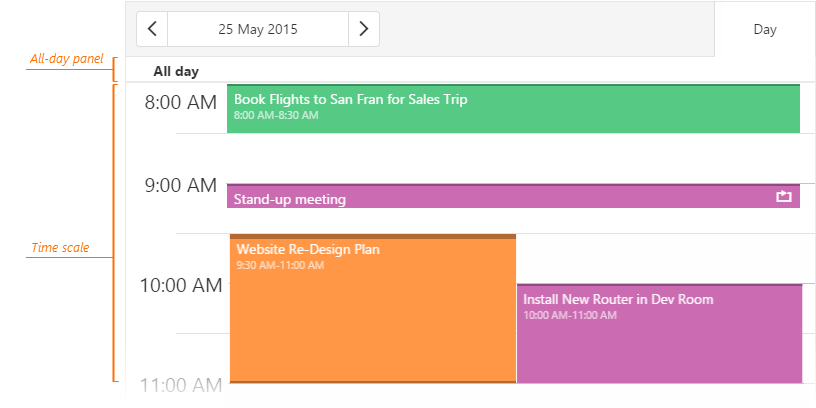
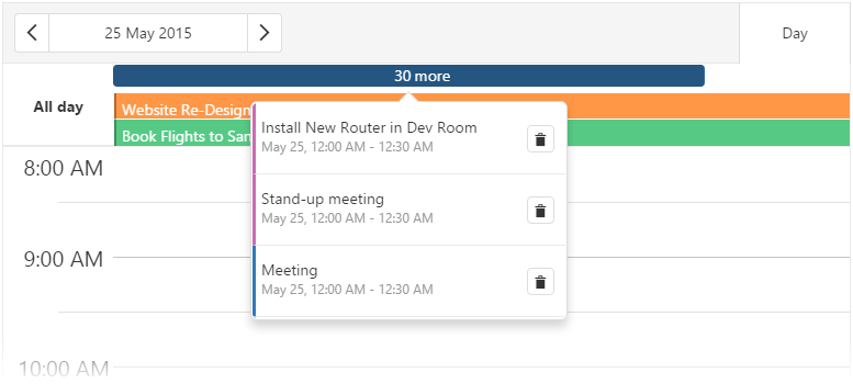
All-day appointments are displayed on the All-day panel. You can set an appointment limit on this panel using the maxAppointmentsPerCell property. Appointments that exceed this limit are hidden, and a cell overflow indicator is displayed instead. If hidden appointments are associated with the same resource, the indicator will have the same color as this resource. Otherwise, the indicator has a default color.

A user can click the cell overflow indicator to view the hidden appointments.
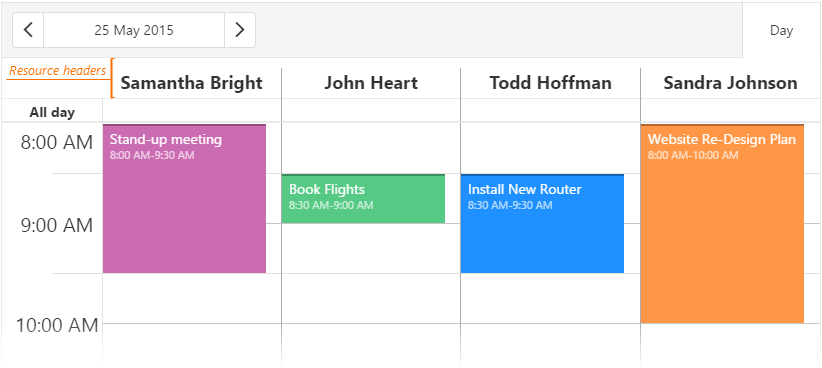
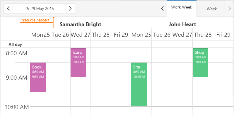
Resource headers are displayed above the All-day panel when you group appointments by resources.
Week and WorkWeek Views
The week and workWeek views display appointments for a week. The workWeek view does not include weekends. The Scheduler UI component arranges appointments from top to bottom. If their time intervals overlap, their width is decreased and they are placed next to each other.
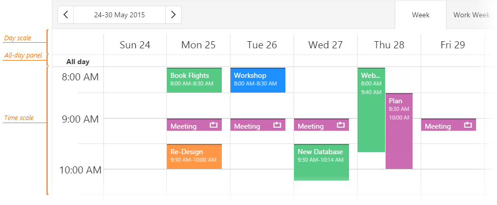
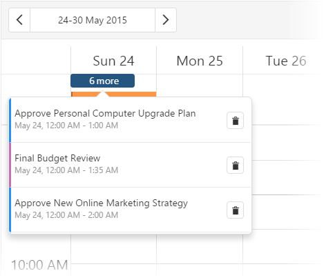
All-day appointments are displayed on the All-day panel. You can set an appointment limit on this panel using the maxAppointmentsPerCell property. Appointments that exceed this limit are hidden, and a cell overflow indicator is displayed instead. If hidden appointments are associated with the same resource, the indicator will have the same color as this resource. Otherwise, the indicator has a default color.
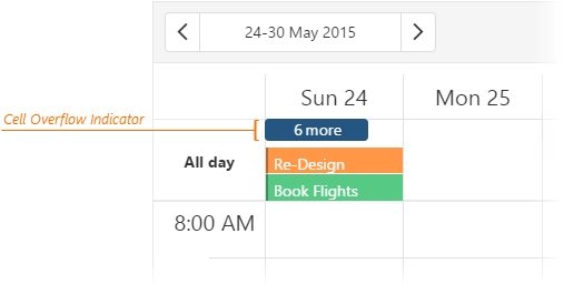
A user can click the cell overflow indicator to view the hidden appointments.
Resource headers are above the day scale when you group appointments by resources.
Month View
The month view displays appointments for a month. The Scheduler UI component arranges appointments from left to right. An appointment's size depends on its duration in days. However, it occupies the entire day cell if an appointment lasts only for several hours or minutes. The time scale and All-day panel are not available in this view.
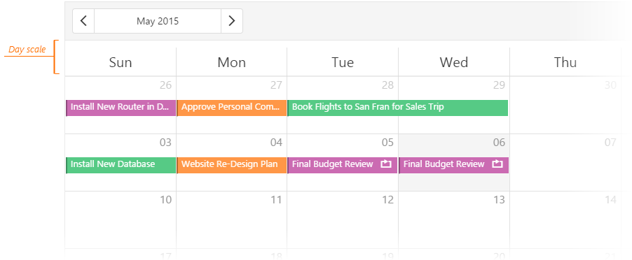
In the month view, Scheduler renders appointments in ascending order of startDateExpr. If appointments have the same start date, they are rendered in the order defined in DataSource. You can use the DataSource's sort property to reorder such appointments.
You can use the maxAppointmentsPerCell property to set a limit on the number of full-sized appointments displayed in a single cell. Appointments that exceed this limit are hidden, and a cell overflow indicator is displayed instead. If hidden appointments are associated with the same resource, the indicator will have the same color as this resource. Otherwise, the indicator has a default color.
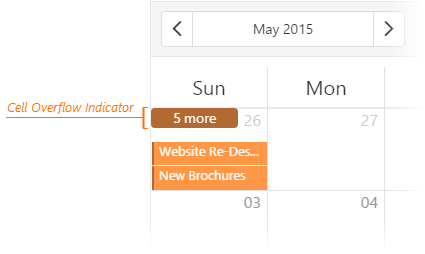
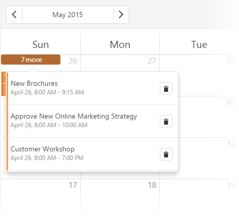
A user can click the cell overflow indicator to view the hidden appointments.
Resource headers are above the day scale when you group appointments by resources.

Timeline Views
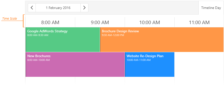
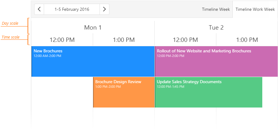
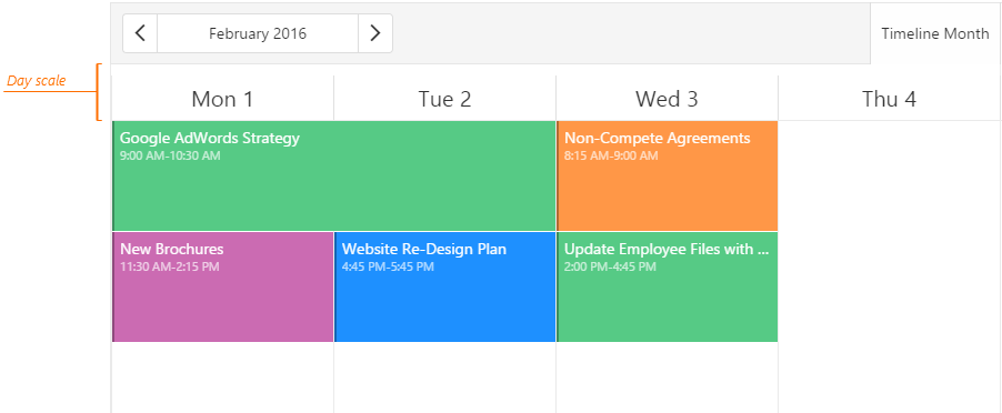
Timeline views display appointments on a horizontal timeline. The Scheduler UI component arranges appointments from left to right. If their time intervals overlap, the width of appointments is decreased and they are placed alongside or under each other.
The Scheduler UI component supports the following timeline views.
timelineDay
timelineWeek and timelineWorkWeek
timelineMonth
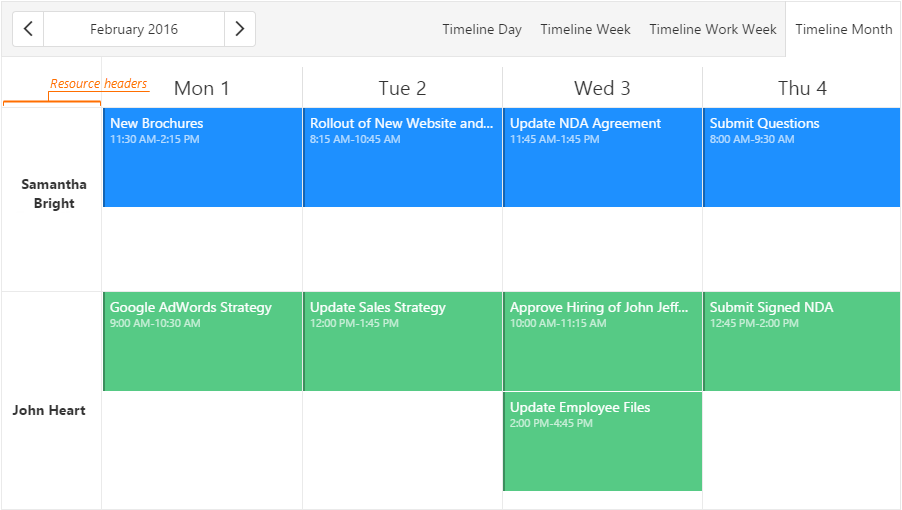
If you group appointments by resources, the resource headers are located at the left side of the view.
Agenda View
The agenda view lists all available appointments grouped by date. This view displays appointments in a compact way, which is useful when displaying the scheduler on narrow screens. If an appointment lasts for several days, it is displayed for each day to which it belongs. If an appointment lasts all day, it is placed above other appointments of that day. The Scheduler does not support grouping resources by multiple data fields in the agenda view.
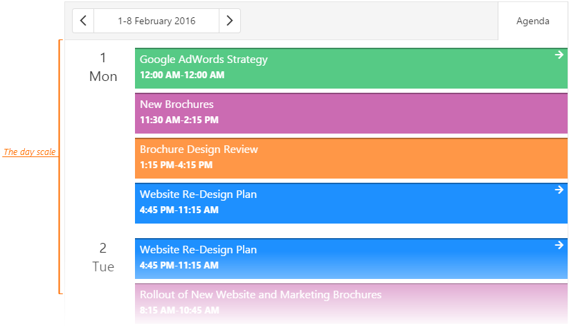
By default, the agenda view displays appointments for seven dates at a time from the currentDate onward. To change the number of dates, specify the agendaDuration property. For details on individual view customization, see the Customize Individual Views topic.
jQuery
$(function() {
    $("#schedulerContainer").dxScheduler({
        // ...
        views: [{
            type: "agenda",
            agendaDuration: 5
        }]
    });
});
Angular
<dx-scheduler ...
    currentView="agenda">
    <dxi-scheduler-view
        type="agenda"
        [agendaDuration]="5">
    </dxi-scheduler-view>
</dx-scheduler>
import { DxSchedulerModule } from "devextreme-angular";
// ...
export class AppComponent  {
    // ...
}
@NgModule({
    imports: [
        // ...
        DxSchedulerModule
    ],
    // ...
})
Vue
<template>
    <DxScheduler current-view="agenda">
        <DxView
            type="agenda"
            :agenda-duration="5" />
    </DxScheduler>
</template>

<script>
import 'devextreme/dist/css/dx.light.css';

import { DxScheduler, DxView } from 'devextreme-vue/scheduler';

export default {
    components: {
        // ...
        DxScheduler,
        DxView
    },
    // ...
}
</script>
React
import React from 'react';

import 'devextreme/dist/css/dx.light.css';

import { Scheduler, View } from 'devextreme-react/scheduler';

class App extends React.Component {
    render() {
        return (
            <Scheduler currentView="agenda">
                <View
                    type="agenda"
                    agendaDuration={5} />
            </Scheduler>
        );
    }
}
export default App;
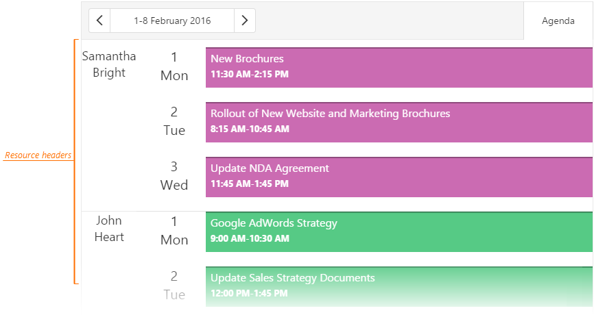
If you group appointments by resources, the resource headers are located at the left side of the date scale.
See Also

 Select one or more answers