DevExtreme React - Application Template
Generate a New Application
DevExtreme React Application Template can leverage the following two frameworks: Vite or Next.js. To select the framework, specify the --app-type argument. If you omit the argument, the command prompts you to choose.
// ===== generate a react app with Vite =====
npx devextreme-cli new react-app app-name --app-type=vite
// ===== generate a react app with Next.js =====
npx devextreme-cli new react-app app-name --app-type=nextjs
devextreme-cli new react-app, refer to the following help topic: DevExtreme CLI - Create a New Application.Execute the following commands to run the application:
cd app-name
npm run dev
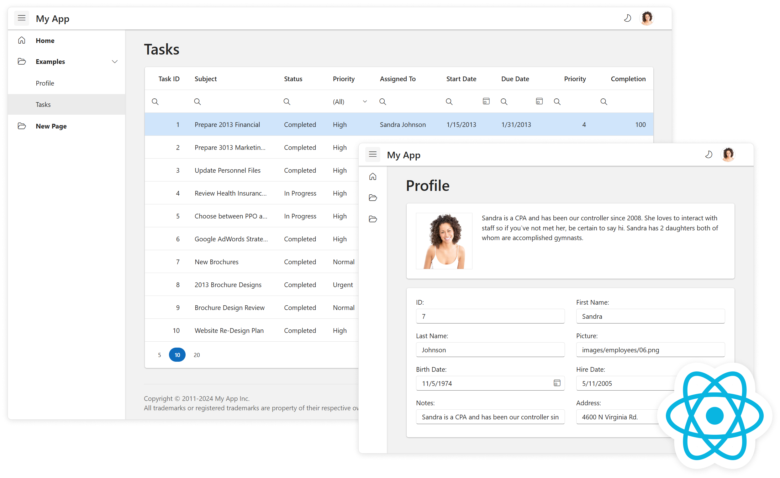
Layouts
The application template has two layouts that differ only in toolbar type: outer (default) or inner.
Outer toolbar
Inner toolbar
To switch to another layout:
If your project uses Vite, replace the
SideNavOuterToolbarimport withSideNavInnerToolbarinsrc\Content.js.Content.jsimport { SideNavInnerToolbar as SideNavBarLayout, SingleCard } from './layouts';If your project uses Next.js, replace the
SideNavOuterToolbarimport withSideNavInnerToolbarinsrc\app\pages\layout.jsx.Content.jsimport { SideNavInnerToolbar as SideNavBarLayout, SingleCard } from './src/layouts/index';
To generate a new application with an inner toolbar, set the --layout flag to side-nav-inner-toolbar:
npx devextreme-cli new react-app app-name --layout=side-nav-inner-toolbar
Add a New View
Run the following command to add a new view. --icon specifies an icon from the DevExtreme icon library.
npx devextreme add view view-name [--icon=IconName]
You can find the added view in:
src\pagesif your project uses Vite.src\app\pagesif your project uses Next.js.
The devextreme add view command also creates a navigation menu item for the added view in src\app-navigation.js.
Configure Menu Items
To configure navigation menu items, edit src\app-navigation.js.
Each item configuration has the following fields:
text - the item's text
icon - the item's icon
path - a navigation path associated with the item
items - child items
{
text: 'Category',
icon: 'folder',
items: [{
text: 'About',
path: '/about'
}]
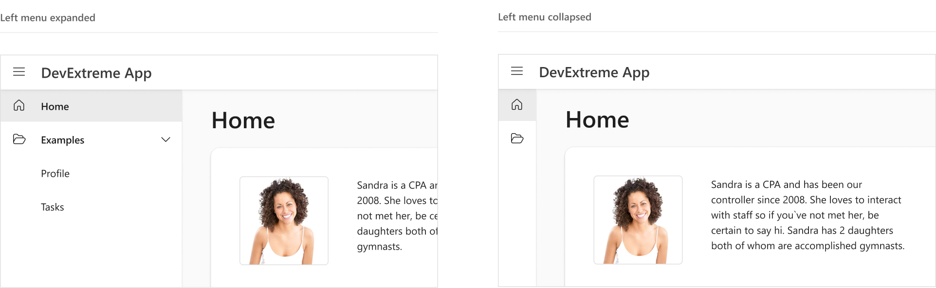
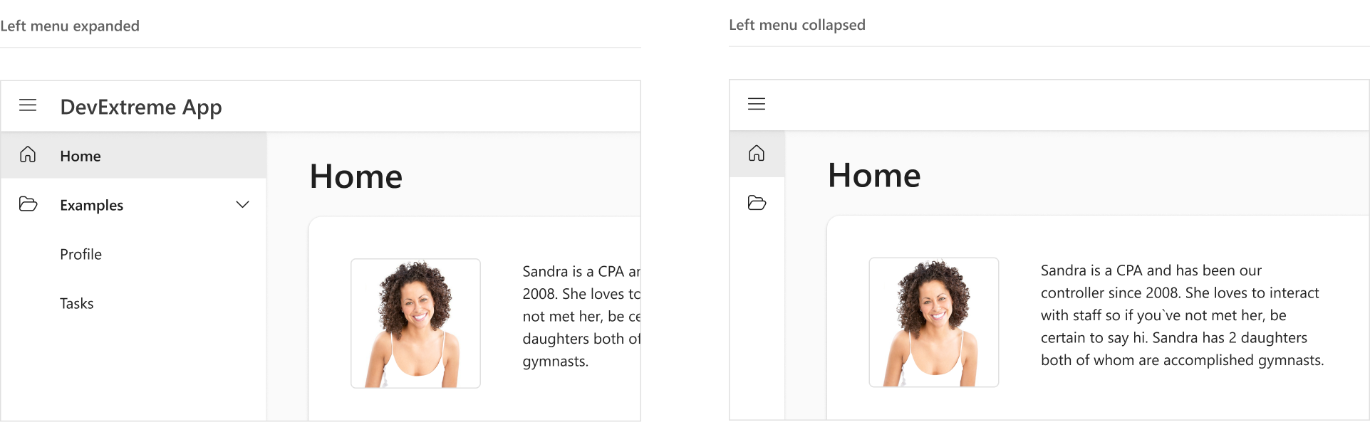
}Hide the Menu in the Closed State
In its closed state, the navigation menu is partially visible as it displays item icons. If items do not have icons, you can hide the menu. In the SideNavOuterToolbar or SideNavInnerToolbar component (depending on project layout type), find the Drawer configuration and set its minSize property to 0:
// ...
export default function ({ title, children }) {
    // ...
    return (
        <div className={'side-nav-outer-toolbar'}>
            <Drawer ...
                minSize={0}>
                {/* ... */}
            </Drawer>
        </div>
    );
}
Add a Custom Toolbar Item
The application template uses the DevExtreme Toolbar component. The Toolbar is part of the Header component. To add a custom toolbar item, add an Item element inside Toolbar in src\components\header\Header.js.
Refer to the items help section for information on Item properties.
The following code adds a search button to the toolbar:
// ...
export default ({ ..., search }) => (
    <header className={'header-component'}>
        <Toolbar className={'header-toolbar'}>
            {/* ... */}
            <Item location="after">
                <Button icon="search" onClick={search} />
            </Item>
            {/* ... */}
        </Toolbar>
    </header>
)
// ...
export default function ({ title, children }) {
    // ...
    const search = useCallback(() => {
        console.log("search");
    }, []);

    return (
        <div className={'side-nav-outer-toolbar'}>
            <Header ...
                search={search}
            />
            {/* ... */}
        </div>
    );
}
In the code above, the button click handler is declared in the SideNavOuterToolbar component. This component applies when the outer toolbar layout is used. If your application uses the inner toolbar layout, add the same code to the SideNavInnerToolbar component.
Switch the Theme
For more information about switching themes, refer to the following help topic: Switch Between Themes at Runtime. You can also refer the following GitHub example:
You can switch between themes in the DevExtreme React Template. Review theme switcher logic in src\theme.js.
The template uses a main theme for view content and an additional theme (color swatch) for the navigation menu. The corresponding .JSON files are shown below.
| Theme | Base file | Additional file |
|---|---|---|
| Light | src\themes\metadata.base.json |
src\themes\metadata.additional.json |
| Dark | src\themes\metadata.base.dark.json |
src\themes\metadata.additional.dark.json |
The default theme is fluent.blue.light. To switch to another theme, open the .JSON files mentioned above and assign a new theme to the baseTheme field:
{
    // ...
    "baseTheme": "material.blue.light",
    // ...
}
{
    // ...
    "baseTheme": "material.blue.light",
    // ...
}
{
    // ...
    "baseTheme": "material.blue.dark",
    // ...
}
{
    // ...
    "baseTheme": "material.blue.dark",
    // ...
}
You can find all theme names in the Predefined Themes help topic. Use theme names without the dx prefix.
generic. prefix. For instance, generic.dark instead of dark.After making changes in theme .JSON files, run the following command to rebuild themes:
npm run build-themes
Create a Custom Theme
You can use the DevExtreme ThemeBuilder to create custom themes based on predefined themes. Follow the steps below:
Import a theme .JSON file into ThemeBuilder.
Export theme metadata to the initial file (see Postpone Customization).
Run the following command to rebuild themes:
npm run build-themes
Apply a Color Swatch
Color swatches are secondary color schemes used alongside a primary color scheme.
In the DevExtreme React Template, a color swatch is applied to the navigation menu. You can configure this color swatch in src\themes\metadata.additional.json and src\themes\metadata.additional.dark.json.
To use this color swatch on an element, add the dx-swatch-additional class (or dx-swatch-additional-dark for a dark theme) to the element:
<div className={`dx-swatch-additional${theme?.isDark() ? '-dark' : ''}`}>
    <!-- Your content here -->
</div>
Apply Theme Variables to Custom Elements
Theme variables are defined in src\variables.scss. Apply the variables to custom elements, so that element appearance is consistent with the rest of the application.
The following code applies the var(--base-accent) variable as the background-color of my-element:
// Your SCSS file
@use "../../../variables.scss";
#my-element {
background-color: var(--base-accent);
}Authentication
The DevExtreme React Application Template includes authentication functions and UI (multiple authentication pages). These pages allow users to sign in, create accounts, and reset or change their passwords. The authentication functionality of Vite and Next.js templates is different.
Vite Authentication
The Vite template offers stub functions that utilize React Router for authentication with client-side routing. The UnauthenticatedContent.js component renders authentication pages. The Content.js component renders the rest of the application.
Implement Authentication Functions
Authentication functions for backend requests are in src\api\auth.js. You must update these functions to make requests to your server. For example, add users or verify their credentials.
Each function returns an object with the following fields:
| Field | Description |
|---|---|
| isOk | A Boolean value that indicates whether the request was successful. |
| message | An error message (if an error occurred). |
| data | The request result (user information). |
Get User Information
User information is stored in a context declared in the contexts\auth.js module.
To access user information from any part of the application, use the useAuth hook from contexts\auth-hooks.js. This hook returns an object with the following fields:
| Field | Description |
|---|---|
| user | An object with information about the current user; undefined if the user is not authenticated. |
| signIn | A function that sends a sign-in request to the server and saves received user information. Accepts user email and password as parameters. |
| signOut | A function that clears current user information. |
| loading | A Boolean value that is true while user information is being loaded (an HTTP request is in progress). |
The following code uses the useAuth hook to access user information:
import { useAuth } from './contexts/auth-hooks';

export default function() {
    const { user } = useAuth();
    if (user) {
        // User is authenticated
        ...
    }
    ...
}
Next.js Authentication
The Next.js template implements server-side routing and authentication. The implementation follows the Next.js Authentication Guide and offers session management with JSON Web Tokens (JWTs).
Generate Session Key
To implement authentication functions in the Next.js template, define a session key first. This key is used to encrypt session cookies. You can find it in application\.env:
SESSION_SECRET=<your_secret_key_goes_here>
You can generate a secret key with the openssl command in the terminal:
openssl rand -base64 32
Implement Authentication Functions
Authentication functions for back-end requests are located in src\app\actions\auth.jsx. You must update these functions to access your authentication backend (add users or verify their credentials).
Each function returns an object with the following fields:
| Field | Description |
|---|---|
| isOk | A Boolean value that indicates whether the request was successful. |
| message | An error message (if an error occurred). |
Implement Authorization Functions
Authorization functions allow you to verify if a given user has access to certain pages in your project. If a user is not authorized, you can redirect them to an authorization page. These functions are located in middleware.js in the root directory of your project.
_DEMO_logIn() function in middleware.js. This function allows you to test your application during development stage without authorization. Remove this function and implement redirects in production version.
 Select one or more answers