React ButtonGroup - items
Configures buttons in the group.
The items array can contain:
- Objects with fields described in this section
- Objects with any other fields. In this case, specify the buttonTemplate.
If you need to update the UI component items, reassign the entire items[] array as shown in the following example:
buttonGroupInstance.option('items', newItems);See Also
component
An alias for the template property specified in React. Accepts a custom component. Refer to Using a Custom Component for more information.
disabled
Specifies whether the UI component item responds to user interaction.
elementAttr
Specifies the global attributes to be attached to the button group item's container element.
jQuery
$(function(){
    $("#buttonGroup").dxButtonGroup({
        items: [{
            // ...
            elementAttr: {
                class: "class-name"
            }
        }, // ...
        ]
    });
});
Angular
<dx-button-group ...
    [items]="buttonGroupItems>
</dx-button-group>
import { Component } from '@angular/core';

@Component({
    selector: 'app-root',
    templateUrl: './app.component.html',
    styleUrls: ['./app.component.css']
})
export class AppComponent {
    buttonGroupItems = [{
        // ...
        elementAttr: {
            class: "class-name"
        }
    }, // ...
    ]
}
import { BrowserModule } from '@angular/platform-browser';
import { NgModule } from '@angular/core';
import { AppComponent } from './app.component';

import { DxButtonGroupModule } from 'devextreme-angular';

@NgModule({
    declarations: [
        AppComponent
    ],
    imports: [
        BrowserModule,
        DxButtonGroupModule
    ],
    providers: [ ],
    bootstrap: [AppComponent]
})
export class AppModule { }
Vue
<template>
    <DxButtonGroup ...
        :items="buttonGroupItems"
    />
</template>

<script>
import DxButtonGroup from 'devextreme-vue/button-group';

const buttonGroupItems = [{
    // ...
    elementAttr: {
        class: "class-name"
    }
}, // ...
];

export default {
    components: {
        DxButtonGroup,
    },
    data() {
        return {
            buttonGroupItems
        }
    }
}
</script>
React
import React from 'react';
import 'devextreme/dist/css/dx.fluent.blue.light.css';

import ButtonGroup from 'devextreme-react/button-group';

const buttonGroupItems = [{
    // ...
    elementAttr: {
        class: "class-name"
    }
}, // ...
];

export default function App() {
    return (
        <ButtonGroup ...
            items={buttonGroupItems}
        />
    );
}
hint
Specifies a text for the hint that appears when the button is hovered over or long-pressed.
icon
Specifies the icon to be displayed on the button.
This property accepts one of the following:
- The icon's URL
- The icon's name if the icon is from the DevExtreme icon library
- The icon's CSS class if the icon is from an external icon library (see External Icon Libraries)
- The icon in the Base64 format
- The icon in the SVG format. Ensure that the source is reliable.
render
An alias for the template property specified in React. Accepts a rendering function. Refer to Using a Rendering Function for more information.
template
Specifies a template that should be used to render this item only.
jQuery
This property supports the following values:
- A template container as a jQuery object or DOM Node
- A function that returns a template container (as a jQuery object or DOM node)
For more information about templates, refer to the following help topic: DevExtreme React - Custom Templates.
$(function() {
    $("#buttonGroupContainer").dxButtonGroup({
        // ...
        items: [
            {
                // ...
                template: '<div>Custom Item</div>'
            }
        ]
    });
});
Angular
For more information about templates, refer to the following help topic: DevExtreme React - Custom Templates.
<dx-button-group ... >
    <dxi-button-group-item ... >
        <div *dxTemplate>
            <div>Custom Item</div>
        </div>
    </dxi-button-group-item>
</dx-button-group>
import { Component } from '@angular/core';

@Component({
    selector: 'app-root',
    templateUrl: './app.component.html',
    styleUrls: ['./app.component.css']
})
export class AppComponent {
    // ...
}
import { BrowserModule } from '@angular/platform-browser';
import { NgModule } from '@angular/core';
import { AppComponent } from './app.component';

import { DxButtonGroupModule } from 'devextreme-angular';

@NgModule({
    declarations: [
        AppComponent
    ],
    imports: [
        BrowserModule,
        DxButtonGroupModule
    ],
    providers: [ ],
    bootstrap: [AppComponent]
})
export class AppModule { }
Vue
For more information about templates, refer to the following help topic: DevExtreme React - Custom Templates.
<template>
    <DxButtonGroup ... >
        <DxItem ... >
            <div>Custom Item</div>
        </DxItem>
    </DxButtonGroup>
</template>

<script>

import DxButtonGroup, {
    DxItem
} from 'devextreme-vue/button-group';

export default {
    components: {
        DxButtonGroup,
        DxItem
    },
    // ...
}
</script>
React
For more information about templates, refer to the following help topic: DevExtreme React - Custom Templates.
import React from 'react';

import ButtonGroup, {
    Item
} from 'devextreme-react/button-group';

const renderCustomItem = () => {
    return <div>Custom Item</div>;
}

const App() = () => {
    return (
        <ButtonGroup ... >
            <Item ...
                render={renderCustomItem}
            >
            </Item>
        </ButtonGroup>
    );
}
export default App;
See Also
text
Specifies text displayed for the UI component item.
If you use both this property and a template, the template overrides the text.
type
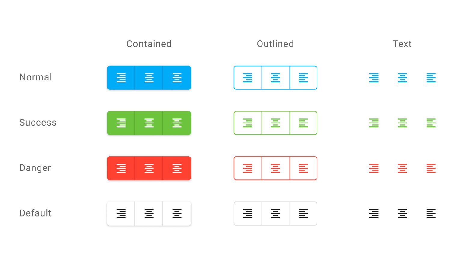
Specifies the button type.
DevExtreme supplies the following button types:

 Select one or more answers