React DropDownButton Props
This section describes properties that configure the DropDownButton UI component's contents, behavior, and appearance.
See Also
accessKey
Specifies the shortcut key that sets focus on the UI component.
The value of this property will be passed to the accesskey attribute of the HTML element that underlies the UI component.
activeStateEnabled
Specifies whether the UI component changes its visual state as a result of user interaction.
The UI component switches to the active state when users press down the primary mouse button. When this property is set to true, the CSS rules for the active state apply. You can change these rules to customize the component.
Use this property when you display the component on a platform whose guidelines include the active state change for UI components.
component
An alias for the template property specified in React. Accepts a custom component. Refer to Using a Custom Component for more information.
dataSource
Provides data for the drop-down menu.
Array<dxDropDownButtonItem | any>
| | | | nullThe DropDownButton works with collections of objects or string or number values.
Depending on your data source, bind DropDownButton to data as follows. If the data source provides objects, also specify the keyExpr and displayExpr properties. Note that particular fields in the objects can control the UI component's appearance. See the Default Templates for more information.
Data Array
Assign the array to the dataSource option.Read-Only Data in JSON Format
Set the dataSource property to the URL of a JSON file or service that returns JSON data.OData
Implement an ODataStore.Web API, PHP, MongoDB
Use one of the following extensions to enable the server to process data according to the protocol DevExtreme UI components use:Then, use the createStore method to configure access to the server on the client as shown below. This method is part of DevExtreme.AspNet.Data.
jQuery
JavaScript$(function() { let serviceUrl = "https://url/to/my/service"; $("#dropDownButtonContainer").dxDropDownButton({ // ... dataSource: DevExpress.data.AspNet.createStore({ key: "ID", loadUrl: serviceUrl + "/GetAction", insertUrl: serviceUrl + "/InsertAction", updateUrl: serviceUrl + "/UpdateAction", deleteUrl: serviceUrl + "/DeleteAction" }) }) });Angular
app.component.tsapp.component.htmlapp.module.tsimport { Component } from '@angular/core'; import CustomStore from 'devextreme/data/custom_store'; import { createStore } from 'devextreme-aspnet-data-nojquery'; @Component({ selector: 'app-root', templateUrl: './app.component.html', styleUrls: ['./app.component.css'] }) export class AppComponent { store: CustomStore; constructor() { let serviceUrl = "https://url/to/my/service"; this.store = createStore({ key: "ID", loadUrl: serviceUrl + "/GetAction", insertUrl: serviceUrl + "/InsertAction", updateUrl: serviceUrl + "/UpdateAction", deleteUrl: serviceUrl + "/DeleteAction" }) } }<dx-drop-down-button ... [dataSource]="store"> </dx-drop-down-button>import { BrowserModule } from '@angular/platform-browser'; import { NgModule } from '@angular/core'; import { AppComponent } from './app.component'; import { DxDropDownButtonModule } from 'devextreme-angular'; @NgModule({ declarations: [ AppComponent ], imports: [ BrowserModule, DxDropDownButtonModule ], providers: [], bootstrap: [AppComponent] }) export class AppModule { }Vue
App.vue<template> <DxDropDownButton ... :data-source="store" /> </template> <script> import 'devextreme/dist/css/dx.light.css'; import CustomStore from 'devextreme/data/custom_store'; import { createStore } from 'devextreme-aspnet-data-nojquery'; import { DxDropDownButton } from 'devextreme-vue/drop-down-button'; export default { components: { DxDropDownButton }, data() { const serviceUrl = "https://url/to/my/service"; const store = createStore({ key: "ID", loadUrl: serviceUrl + "/GetAction", insertUrl: serviceUrl + "/InsertAction", updateUrl: serviceUrl + "/UpdateAction", deleteUrl: serviceUrl + "/DeleteAction" }); return { store } } } </script>React
App.jsimport React from 'react'; import 'devextreme/dist/css/dx.light.css'; import CustomStore from 'devextreme/data/custom_store'; import { createStore } from 'devextreme-aspnet-data-nojquery'; import DropDownButton from 'devextreme-react/drop-down-button'; const serviceUrl = "https://url/to/my/service"; const store = createStore({ key: "ID", loadUrl: serviceUrl + "/GetAction", insertUrl: serviceUrl + "/InsertAction", updateUrl: serviceUrl + "/UpdateAction", deleteUrl: serviceUrl + "/DeleteAction" }); class App extends React.Component { render() { return ( <DropDownButton ... dataSource={store} /> ); } } export default App;Any other data source
Implement a CustomStore.
Regardless of the data source on the input, the DropDownButton always wraps it in the DataSource object. This object allows you to sort, filter, group, and perform other data shaping operations. To get its instance, call the getDataSource() method.
Review the following notes about data binding:
Do not specify the items property if you specified the dataSource, and vice versa.
Field names cannot be equal to
thisand should not contain the following characters:.,:,[, and].DropDownButton does not execute dataSource.sort functions. To implement custom sorting logic, implement columns[].calculateSortValue.
jQuery
- The stores are immutable. You cannot change their configurations at runtime. Instead, create a new store or DataSource and assign it to the dataSource property as shown in the following help topic: Get and Set Properties.
Angular
- The stores are immutable. You cannot change their configurations at runtime. Instead, create a new store or DataSource and assign it to the dataSource property as shown in the following help topic: Two-Way Property Binding.
Vue
- The stores are immutable. You cannot change their configurations at runtime. Instead, create a new store or DataSource and assign it to the dataSource property as shown in the following help topic: Two-Way Property Binding.
React
- The stores are immutable. You cannot change their configurations at runtime. Instead, create a new store or DataSource and assign it to the dataSource property as shown in the following help topic: Controlled Mode.
deferRendering
Specifies whether to wait until the drop-down menu is opened the first time to render its content. Specifies whether to render the view's content when it is displayed. If false, the content is rendered immediately.
disabled
Specifies whether the UI component responds to user interaction.
displayExpr
Specifies the data field whose values should be displayed in the drop-down menu.
The current item's data object.
The displayed value.
Set this property to the name of a data field that provides displayed values...
displayExpr: "name"
... or to a function that returns the displayed value:
displayExpr: function(item) {
    // "item" can be null
    return item && 'ID: ' + item.id + ', Name: ' + item.name;
}
Do not change the default value if the data source contains primitives.
dropDownContentComponent
An alias for the dropDownContentTemplate property specified in React. Accepts a custom component. Refer to Using a Custom Component for more information.
dropDownContentRender
An alias for the dropDownContentTemplate property specified in React. Accepts a rendering function. Refer to Using a Rendering Function for more information.
dropDownContentTemplate
Specifies custom content for the drop-down field.
The drop-down field contains the List UI component. Implement this template to replace the UI component with custom content. The following restrictions apply when the template is specified:
- itemTemplate is ignored;
- onItemClick and onSelectionChanged are never executed;
- selectedItemKey should be updated manually.
See Also
dropDownOptions
Configures the drop-down field.
See the Popup configuration for properties that you can specify in this object.
Angular
Vue
elementAttr
Specifies the global attributes to be attached to the UI component's container element.
jQuery
$(function(){
    $("#dropDownButtonContainer").dxDropDownButton({
        // ...
        elementAttr: {
            id: "elementId",
            class: "class-name"
        }
    });
});
Angular
<dx-drop-down-button ...
    [elementAttr]="{ id: 'elementId', class: 'class-name' }">
</dx-drop-down-button>
import { DxDropDownButtonModule } from "devextreme-angular";
// ...
export class AppComponent {
    // ...
}
@NgModule({
    imports: [
        // ...
        DxDropDownButtonModule
    ],
    // ...
})
Vue
<template>
    <DxDropDownButton ...
        :element-attr="dropDownButtonAttributes">
    </DxDropDownButton>
</template>

<script>
import DxDropDownButton from 'devextreme-vue/drop-down-button';

export default {
    components: {
        DxDropDownButton
    },
    data() {
        return {
            dropDownButtonAttributes: {
                id: 'elementId',
                class: 'class-name'
            }
        }
    }
}
</script>
React
import React from 'react';

import DropDownButton from 'devextreme-react/drop-down-button';

class App extends React.Component {
    dropDownButtonAttributes = {
        id: 'elementId',
        class: 'class-name'
    }

    render() {
        return (
            <DropDownButton ...
                elementAttr={this.dropDownButtonAttributes}>
            </DropDownButton>
        );
    }
}
export default App;
focusStateEnabled
Specifies whether users can use keyboard to focus the UI component.
height
Specifies the UI component's height.
This property accepts a value of one of the following types:
Number
The height in pixels.String
A CSS-accepted measurement of height. For example,"55px","20vh","80%","inherit".
hint
Specifies text for a hint that appears when a user pauses on the UI component.
hoverStateEnabled
Specifies whether the UI component changes its state when a user hovers the mouse pointer over it.
icon
Specifies the button's icon.
This property accepts one of the following:
- The icon's URL
- The icon's name if the icon is from the DevExtreme icon library
- The icon's CSS class if the icon is from an external icon library (see External Icon Libraries)
- The icon in the Base64 format
- The icon in the SVG format. Ensure that the source is reliable.
itemComponent
An alias for the itemTemplate property specified in React. Accepts a custom component. Refer to Using a Custom Component for more information.
itemRender
An alias for the itemTemplate property specified in React. Accepts a rendering function. Refer to Using a Rendering Function for more information.
items[]
Provides drop-down menu items.
The items array can contain:
- Objects with fields described in this section
- Objects with any other fields. In this case, specify the keyExpr and displayExpr or itemTemplate.
If you need to update the UI component items, reassign the entire items array as shown in the following example:
dropDownButtonInstance.option('items', newItems);As an alternative to items, you can use the dataSource property. It accepts the DataSource object, whose underlying stores provide an API that allows you to update individual items without reassigning the entire item collection.
keyExpr
Specifies which data field provides keys used to distinguish between the selected drop-down menu items.
Alternatively, you can specify the key in the store assigned to the dataSource.
noDataText
Specifies the text or HTML markup displayed in the drop-down menu when it does not contain any items.
The DropDownButton component evaluates the noDataText property's value. This evaluation, however, makes the DropDownButton potentially vulnerable to XSS attacks. To guard against these attacks, encode the HTML markup before you assign it to the noDataText property. Refer to the following help topic for more information: Potentially Vulnerable API - noDataText.
onButtonClick
A function that is executed when the button is clicked or tapped. If splitButton is true, this function is executed for the action button only.
Information about the event that caused the function execution.
| Name | Type | Description |
|---|---|---|
| component |
The UI component's instance. |
|
| element |
The UI component's container. It is an HTML Element or a jQuery Element when you use jQuery. |
|
| event | Event (jQuery or EventObject) |
The event that caused the function to execute. It is an EventObject or a jQuery.Event when you use jQuery. |
| selectedItem |
The selected item's data. Available when useSelectMode is true. |
onContentReady
A function that is executed when the UI component is rendered and each time the component is repainted.
Information about the event.
| Name | Type | Description |
|---|---|---|
| element |
The UI component's container. It is an HTML Element or a jQuery Element when you use jQuery. |
|
| component |
The UI component's instance. |
onDisposing
A function that is executed before the UI component is disposed of.
Information about the event.
| Name | Type | Description |
|---|---|---|
| element |
The UI component's container. It is an HTML Element or a jQuery Element when you use jQuery. |
|
| component |
The UI component's instance. |
onInitialized
A function used in JavaScript frameworks to save the UI component instance.
Information about the event.
| Name | Type | Description |
|---|---|---|
| element |
The UI component's container. It is an HTML Element or a jQuery Element when you use jQuery. |
|
| component |
The UI component's instance. |
Angular
<dx-drop-down-button ...
    (onInitialized)="saveInstance($event)">
</dx-drop-down-button>
import { Component } from "@angular/core";
import DropDownButton from "devextreme/ui/data_grid";
// ...
export class AppComponent {
    dropDownButtonInstance: DropDownButton;
    saveInstance (e) {
        this.dropDownButtonInstance = e.component;
    }
}
Vue
<template>
    <div>
        <DxDropDownButton ...
            @initialized="saveInstance">
        </DxDropDownButton>
    </div>
</template>

<script>
import DxDropDownButton from 'devextreme-vue/drop-down-button';

export default {
    components: {
        DxDropDownButton
    },
    data: function() {
        return {
            dropDownButtonInstance: null
        };
    },
    methods: {
        saveInstance: function(e) {
            this.dropDownButtonInstance = e.component;
        }
    }
};
</script>
<template>
    <div>
        <DxDropDownButton ...
            @initialized="saveInstance">
        </DxDropDownButton>
    </div>
</template>

<script setup>
import DxDropDownButton from 'devextreme-vue/drop-down-button';

let dropDownButtonInstance = null;

const saveInstance = (e) => {
    dropDownButtonInstance = e.component;
}
</script>
React
import DropDownButton from 'devextreme-react/drop-down-button';

class App extends React.Component {
    constructor(props) {
        super(props);

        this.saveInstance = this.saveInstance.bind(this);
    }

    saveInstance(e) {
        this.dropDownButtonInstance = e.component;
    }

    render() {
        return (
            <div>
                <DropDownButton onInitialized={this.saveInstance} />
            </div>
        );
    }
}
See Also
onItemClick
A function that is executed when a drop-down menu item is clicked.
Information about the event that caused the function to execute.
| Name | Type | Description |
|---|---|---|
| component |
The UI component's instance. |
|
| element |
The UI component's container. It is an HTML Element or a jQuery Element when you use jQuery. |
|
| event | Event (jQuery or EventObject) |
The event that caused the function to execute. It is an EventObject or a jQuery.Event when you use jQuery. |
| itemData |
The clicked item's data. |
|
| itemElement |
The item's container. It is an HTML Element or a jQuery Element when you use jQuery. |
onOptionChanged
A function that is executed after a UI component property is changed.
Information about the event.
| Name | Type | Description |
|---|---|---|
| value | any |
The modified property's new value. |
| previousValue | any |
The UI component's previous value. |
| name |
The modified property if it belongs to the first level. Otherwise, the first-level property it is nested into. |
|
| fullName |
The path to the modified property that includes all parent properties. |
|
| element |
The UI component's container. It is an HTML Element or a jQuery Element when you use jQuery. |
|
| component |
The UI component's instance. |
The following example shows how to subscribe to component property changes:
jQuery
$(function() {
    $("#dropDownButtonContainer").dxDropDownButton({
        // ...
        onOptionChanged: function(e) {
            if(e.name === "changedProperty") {
                // handle the property change here
            }
        }
    });
});
Angular
<dx-drop-down-button ...
    (onOptionChanged)="handlePropertyChange($event)">
</dx-drop-down-button>
import { Component } from '@angular/core';

@Component({
    selector: 'app-root',
    templateUrl: './app.component.html',
    styleUrls: ['./app.component.css']
})

export class AppComponent {
    // ...
    handlePropertyChange(e) {
        if(e.name === "changedProperty") {
            // handle the property change here
        }
    }
}
import { BrowserModule } from '@angular/platform-browser';
import { NgModule } from '@angular/core';
import { AppComponent } from './app.component';
import { DxDropDownButtonModule } from 'devextreme-angular';

@NgModule({
    declarations: [
        AppComponent
    ],
    imports: [
        BrowserModule,
        DxDropDownButtonModule
    ],
    providers: [ ],
    bootstrap: [AppComponent]
})

export class AppModule { }
Vue
<template>
    <DxDropDownButton ...
        @option-changed="handlePropertyChange"
    />
</template>

<script>
import 'devextreme/dist/css/dx.light.css';
import DxDropDownButton from 'devextreme-vue/drop-down-button';

export default {
    components: {
        DxDropDownButton
    },
    // ...
    methods: {
        handlePropertyChange: function(e) {
            if(e.name === "changedProperty") {
                // handle the property change here
            }
        }
    }
}
</script>
React
import React from 'react';
import 'devextreme/dist/css/dx.light.css';

import DropDownButton from 'devextreme-react/drop-down-button';

const handlePropertyChange = (e) => {
    if(e.name === "changedProperty") {
        // handle the property change here
    }
}

export default function App() {
    return (
        <DropDownButton ...
            onOptionChanged={handlePropertyChange}
        />
    );
}
onSelectionChanged
A function that is executed when an item is selected or selection is canceled. In effect when useSelectMode is true.
Information about the event that caused the function to execute.
| Name | Type | Description |
|---|---|---|
| component |
The UI component's instance. |
|
| element |
The UI component's container. It is an HTML Element or a jQuery Element when you use jQuery. |
|
| item |
The selected item's data. |
|
| previousItem |
The previously selected item's data. |
render
An alias for the template property specified in React. Accepts a rendering function. Refer to Using a Rendering Function for more information.
rtlEnabled
Switches the UI component to a right-to-left representation.
When this property is set to true, the UI component text flows from right to left, and the layout of elements is reversed. To switch the entire application/site to the right-to-left representation, assign true to the rtlEnabled field of the object passed to the DevExpress.config(config) method.
DevExpress.config({
    rtlEnabled: true
});selectedItemKey
Contains the selected item's key and allows you to specify the initially selected item. Applies when useSelectMode is true.
Keys are taken from the data field specified in the UI component's keyExpr property or the key property of the store that underlies the dataSource.
See Also
showArrowIcon
Specifies whether the arrow icon should be displayed.
The following table demonstrates how the showArrowIcon property affects the DropDownButton's appearance:
| showArrowIcon value | Result |
|---|---|
showArrowIcon: true |
 |
showArrowIcon: false |
 |
splitButton
Specifies whether to split the button in two: one executes an action, the other opens and closes the drop-down menu.
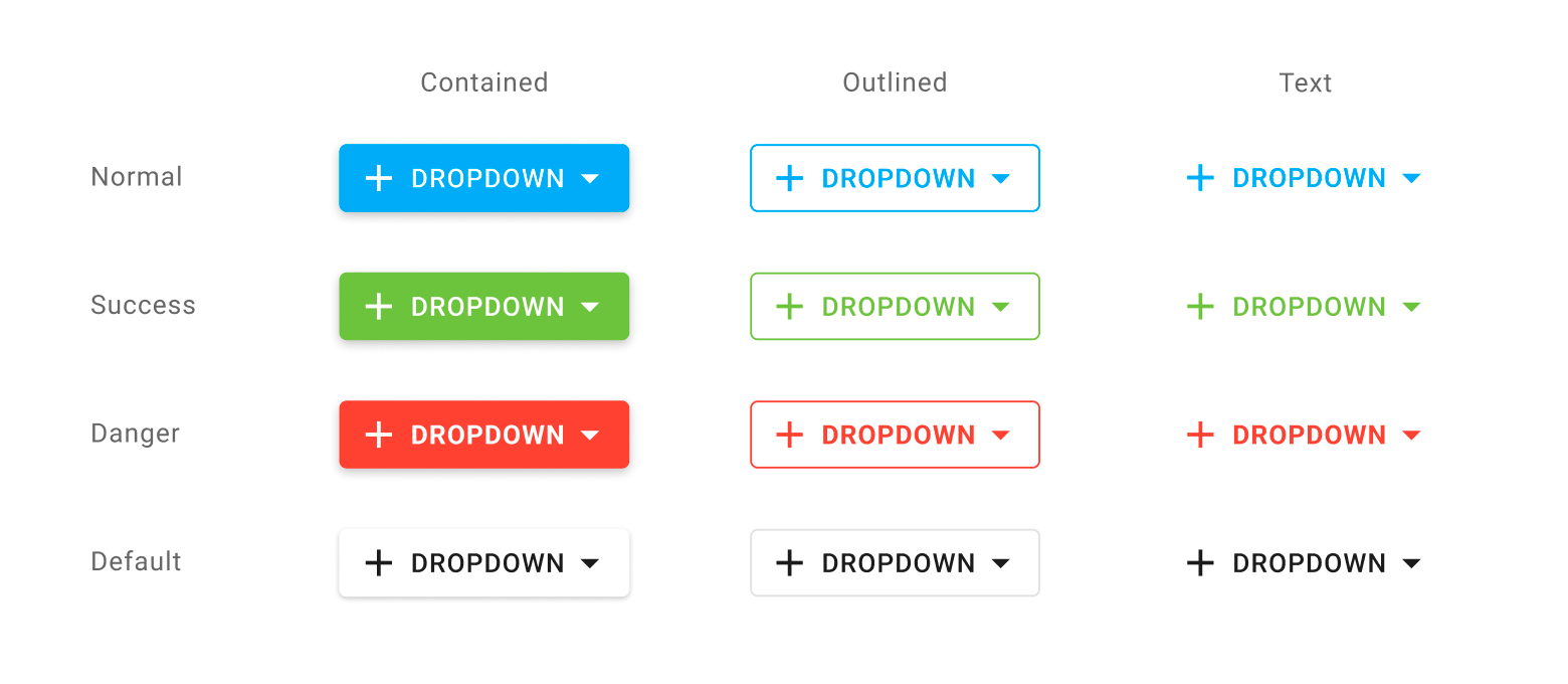
stylingMode
Specifies how the button is styled.
DevExtreme supplies the following drop-down button styling modes:
tabIndex
Specifies the number of the element when the Tab key is used for navigating.
The value of this property will be passed to the tabindex attribute of the HTML element that underlies the UI component.
template
Specifies a custom template for the base button in DropDownButton.
The following code sample creates a DropDownButton with multiline text in the base button.
jQuery
$(function() {
    $("#myDropDownButton").dxDropDownButton({
         height: "auto",
        width: "auto",
        icon: 'todo',
        text: 'Done',
        template: (data, $element) => {
            $(`<span class="dx-icon-${data.icon} dx-icon"></span>`).appendTo($element);
            const $textContainer = $('<div class="text-container">').appendTo($element);
            $(`<div class='status'>${data.text}</div>`).appendTo($textContainer);
            $(`<div class='additional-status'>Or not done</div>`).appendTo($textContainer);
            $(`<span class="dx-icon-spindown dx-icon"></span>`).appendTo($element);
        },
    });
});
.text-container {
    padding: 10px;
    display: flex;
    flex-direction: column;
    align-items: flex-start;
    line-height: 1;
}

.additional-status {
    color: lightgray;
}

.dx-icon-spindown:before {
    padding-left: 32px;
}
Angular
<dx-drop-down-button
    icon="todo"
    text="Done"
    height="auto"
    width="auto"
    template="button-template"
>
    <div *dxTemplate="let data of 'button-template'">
        <span class="dx-icon-{{ data.icon }} dx-icon"></span>
        <div class="text-container">
        <div class="status">{{ data.text }}</div>
        <div class="additional-status">Or not done</div>
        </div>
        <span class="dx-icon-spindown dx-icon"></span>
    </div>
</dx-drop-down-button>
.text-container {
    padding: 10px;
    display: flex;
    flex-direction: column;
    align-items: flex-start;
    line-height: 1;
}

.additional-status {
    color: lightgray;
}

.dx-icon-spindown:before {
    padding-left: 32px;
}
Vue
<template>
    <DxDropDownButton
        icon="todo"
        text="Done"
        height="auto"
        width="auto"
        template="button-template"
    >
        <template #button-template="{ data }">
            <span :class="'dx-icon-' + data.icon + ' dx-icon'"></span>
            <div class="text-container">
                <div class="status">{{ data.text }}</div>
                <div class="additional-status">Or not done</div>
            </div>
            <span class="dx-icon-spindown dx-icon"></span>
        </template>
    </DxDropDownButton>
</template>

<script>
// ...
</script>

<style>
.text-container {
    padding: 10px;
    display: flex;
    flex-direction: column;
    align-items: flex-start;
    line-height: 1;
}

.additional-status {
    color: lightgray;
}

.dx-icon-spindown:before {
    padding-left: 32px;
}
</style>
React
// ...
const renderButton = (data) => {
    return (
        <React.Fragment>
            <span className={"dx-icon-" + data.icon + " dx-icon"}></span>
            <div className="text-container">
                <div className="status">{data.text}</div>
                <div className="additional-status">Or not done</div>
            </div>
            <span className="dx-icon-spindown dx-icon"></span>
        </React.Fragment>
    );
};

export default function App() {
    return (
        <Button
            icon="todo"
            text="Done"
            height="auto"
            width="auto"
            render={renderButton}
        />
    );
}
.text-container {
    padding: 10px;
    display: flex;
    flex-direction: column;
    align-items: flex-start;
    line-height: 1;
}

.additional-status {
    color: lightgray;
}

.dx-icon-spindown:before {
    padding-left: 32px;
}See Also
type
Specifies the drop-down button type.
DevExtreme supplies the following drop-down button types:
useItemTextAsTitle
Specifies whether the DropDownButton uses item's text a title attribute.
If the property is set to true, the text that items within the DropDownButton contain is passed to the title attribute of the respective item.
useSelectMode
Specifies whether the UI component stores the selected drop-down menu item.
When you set this property to true, the following applies:
The selectedItemKey and selectedItem properties can be used.
The onSelectionChanged function can be executed.
The button's text and icon are taken from the selected item. If you use the dropDownContentTemplate, you should update the selectedItemKey and the button's appearance.

 Select one or more answers