DevExtreme React - Use MUI components in your DevExtreme application
MUI is a popular line of React components and design tools. The design of MUI components follows Google's Material Design guidelines. Most MUI products are open-source, and do not require a commercial license.
You don't have to use MUI to add a Material Design look and feel to your application. The DevExtreme library includes a range of Material Design themes. However, if you want to use both MUI components and DevExtreme components, you can.
You don't need extra configuration to run MUI components side by side with DevExtreme components. But if you nest components from different frameworks, you have to understand how they interact with one another.
Run the sample application
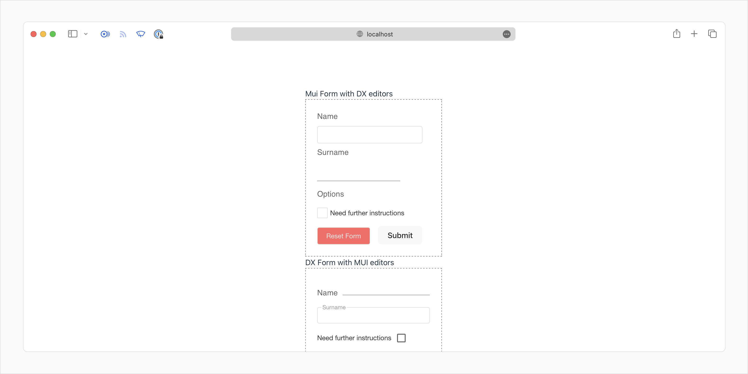
The DevExtreme team created a single-page, ready-to-run Vite application that illustrates two common use cases. It contains an MUI component with DevExtreme children, and a DevExtreme component with MUI children.
Install the dependencies and run the app:
npm i; npm run dev
DevExtreme components inside MUI components
The src/MUI-Form-with-DX-editors.tsx file contains an MUI form with DevExtreme inputs.
Form context and hooks
The FormControl MUI component is simple in comparison to its DevExtreme counterpart. Its purpose is to keep track of the form state. Inputs and labels can access this data with the useFormControlContext hook.
Since DX inputs do not have access to the useFormControlContext hook out of the box, we need to create a wrapper function:
// In accordance with MUI conventions, do not capitalize the name of the wrapper function
const dX_MUI_Form_Wrapper_HOC = (DXComponent: any, componentName: keyof FormData) => (props: any) => {
    const { onValueChange, ...restProps } = props;
    const value = useFormControlContext()?.value as FormData;
    return <DXComponent value={value[componentName]} onValueChange={onValueChange} {...restProps}></DXComponent>
}
And wrap both of our non-MUI inputs:
const DXTextBoxWrapper = dX_MUI_Form_Wrapper_HOC(DXTextBox, 'textBox')
const DXCheckBoxWrapper = dX_MUI_Form_Wrapper_HOC(DXCheckBox, 'checkBox')
State management
React.js developers recommend the use of controlled state management mode for web forms.
The handleFormDataChange function in the example updates the state of the form object in response to user interaction. The state is a dictionary, with each key corresponding to a single input component.
interface FormData {
    textBox: string,
    muiInput: string,
    checkBox: boolean | null,
}

const DefaultFormData = {
    textBox: '',
    muiInput: '',
    checkBox: false
}

const [formData, updateFormData] = useState<FormData>(DefaultFormData);

const handleFormDataChange = (name: string) => (value: string | boolean | null) => {
        updateFormData({ ...formData, [name]: value });
}
Handle button presses
const handleSubmit = useCallback((event: FormEvent) => {
    event.preventDefault();
    notify(`User ${formData.textBox} ${formData.muiInput} succesfully registered`);
}, [formData]);

const handleReset = useCallback(() => {
    updateFormData(DefaultFormData);
}, []);
Create and apply the MUI theme
Open App.tsx. We can use the styled-components library and MUI's built-in theme manager to manage the visual look of our page.
import { ThemeProvider } from 'styled-components';
import { createTheme } from '@mui/system';

const theme = createTheme({
palette: {
    background: {
    paper: '#fff',
    },
    text: {
    primary: '#173A5E',
    secondary: '#EBE7E7',
    },
    action: {
    active: '#001E3C',
    },
    success: {
    dark: '#009688',
    },
    error: {
    main: '#FF6666'
    }
},
});
Enclose the content of the page in the ThemeProvider tag to apply the theme:
<ThemeProvider theme={theme}>
<MUIFormDxEditors />
...
</ThemeProvider>
Styling Non-MUI components
Non-MUI components do not automatically gain access to the sx styling prop. Use the unstable_styleFunctionSx utility to create a wrapper for the DxButton component:
import { useTheme } from 'styled-components';
import { unstable_styleFunctionSx, SxProps, styled, Theme }from '@mui/system';
interface DivProps {
    sx?: SxProps;
}
const DxButtonSxWrapped = styled(DxButton)<DivProps>( unstable_styleFunctionSx,);
Now we can retrieve the global MUI theme and style the button:
const theme = useTheme() as Theme;
<DxButtonSxWrapped sx={{
    'backgroundColor': theme.palette.error.main,
    'color': theme.palette.text.secondary
}} text="Reset Form" onClick={handleReset}
/>
This technique is useful if your MUI theme includes settings that DevExtreme themes cannot store --- for example, font-related settings. An easier way to style DevExtreme components nested within MUI components is to simply use DevExtreme themes. Open the DevExtreme ThemeBuilder, define the same color palette as the MUI theme, and reference the DevExtreme theme in your application.
MUI components inside DevExtreme components
You can utilize a similar strategy to use MUI controls inside a DevExtreme component.
Create functions that handle form state change:
const [formData, updateFormData] = useState<FormData>({
    textBox: '',
    muiInput: '',
    checkBox: false
});
const handleFormDataChange = (name: string) => (value: string | boolean | null) => {
    updateFormData({ ...formData, [name]: value });
}
const handleMuiFormDataChange = (name: string) => (event: React.ChangeEvent<HTMLInputElement>) => {
    updateFormData({ ...formData, [name]: event.target.value });
}
Create a wrapper for MUI inputs that triggers these functions:
const InputTemplate = () => {
    return <MUIInput onChange={handleMuiFormDataChange('muiInput')} />;
}
Use the render() method to wrap MUI components inside DXItem and DXLabel.
<DXForm className="form">
    <DXItem render={InputTemplate}>
        <DXLabel render={() => <MUIFormLabel component="legend">Name</MUIFormLabel>}></DXLabel>
    </DXItem>
    <DXItem render={() => (<>
        Need further instructions
        <MUICheckbox onChange={handleMuiFormDataChange('checkBox')} />
    </>)} />
    < DXLabel render={() => <MUIInputLabel>Options</MUIInputLabel>} />
    <DXItem render={() => <DXButton onClick={handleSubmit}>Submit</DXButton>}></DXItem>
</DXForm>
 Select one or more answers