Chart - Tooltips Overview
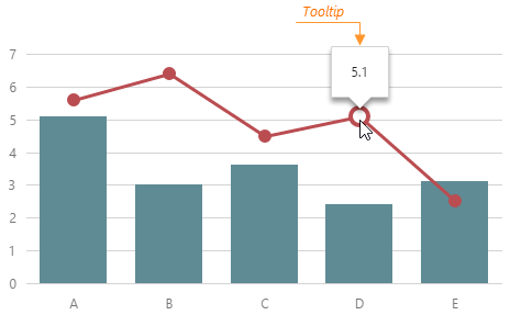
A tooltip is a small pop-up rectangle displaying information about a series point that the user pauses on. By default, the information is the point value, but it is possible to display anything in a tooltip.
All properties configuring tooltips are collected in the tooltip object. For example, to enable the tooltips, assign true to the enabled property of this object.
jQuery
JavaScript
$(function() {
    $("#chartContainer").dxChart({
        // ...
        tooltip: {
            enabled: true
        }
    });
});
Angular
HTML
TypeScript
<dx-chart ... >
    <dxo-chart-tooltip
        [enabled]="true">
    </dxo-chart-tooltip>
</dx-chart>
import { DxChartModule } from "devextreme-angular";
// ...
export class AppComponent {
    // ...
}
@NgModule({
    imports: [
        // ...
        DxChartModule
    ],
    // ...
})
Vue
App.vue
<template>
    <DxChart ... >
        <DxTooltip
            :enabled="true"
        />
    </DxChart>
</template>

<script>
import DxChart, {
    DxTooltip
} from 'devextreme-vue/chart';

export default {
    components: {
        DxChart,
        DxTooltip
    }
}
</script>
React
App.js
import React from 'react';
import Chart, {
    Tooltip
} from 'devextreme-react/chart';

class App extends React.Component {
    render() {
        return (
            <Chart ... >
                <Tooltip
                    enabled={true}
                />
            </Chart>
        );
    }
}

export default App;
Properties declared in the tooltip object apply to all tooltips in the Chart. If you want to customize a specific tooltip, assign a function to the customizeTooltip property. This function must return an object with properties for the tooltip that you want to customize.
jQuery
JavaScript
$(function() {
    $("#chartContainer").dxChart({
        // ...
        tooltip: {
            enabled: true,
            color: 'yellow',
            // Paints the tooltips of all points whose value is more than 100 in red
            // Other tooltips remain painted in yellow
            customizeTooltip: function (pointInfo) {
                return pointInfo.value > 100 ? { color: 'red' } : { };
            }
        }
    });
});
Angular
HTML
TypeScript
<dx-chart ... >
    <dxo-chart-tooltip
        [enabled]="true"
        color="yellow"
        [customizeTooltip]="customizeTooltip">
    </dxo-chart-tooltip>
</dx-chart>
import { DxChartModule } from "devextreme-angular";
// ...
export class AppComponent {
    // Paints the tooltips of all points whose value is more than 100 in red
    // Other tooltips remain painted in yellow
    customizeTooltip (pointInfo: any) {
        return pointInfo.value > 100 ? { color: 'red' } : { };
    };
}
@NgModule({
    imports: [
        // ...
        DxChartModule
    ],
    // ...
})
Vue
App.vue
<template>
    <DxChart ... >
        <DxTooltip
            :enabled="true"
            :customize-tooltip="customizeTooltip"
            color="yellow"
        />
    </DxChart>
</template>

<script>
import DxChart, {
    DxTooltip
} from 'devextreme-vue/chart';

export default {
    components: {
        DxChart,
        DxTooltip
    },
    methods: {
        customizeTooltip (pointInfo) {
            return pointInfo.value > 100 ? { color: "red" } : { };
        }
    }
}
</script>
React
App.js
import React from 'react';
import Chart, {
    Tooltip
} from 'devextreme-react/chart';

class App extends React.Component {
    render() {
        return (
            <Chart ... >
                <Tooltip
                    enabled={true}
                    color="yellow"
                    customizeTooltip={customizeTooltip}
                />
            </Chart>
        );
    }
}

function customizeTooltip(pointInfo) {
    return pointInfo.value > 100 ? { color: "red" } : { };
}

export default App;
See Also

 Select one or more answers