React Funnel - Overview
A tooltip is a small pop-up rectangle that displays information about a funnel item if it is pressed or the mouse pointer hovers over it. The information is the item's argument and value by default, but it is possible to display anything in a tooltip.
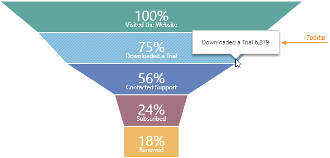
All properties configuring tooltips are collected in the tooltip object. For example, to enable tooltips, assign true to this object's enabled property.
jQuery
JavaScript
$(function() {
    $("#funnelContainer").dxFunnel({
        // ...
        tooltip: {
            enabled: true
        }
    });
});
Angular
HTML
TypeScript
<dx-funnel ... >
    <dxo-funnel-tooltip
        [enabled]="true">
    </dxo-funnel-tooltip>
</dx-funnel>
import { DxFunnelModule } from "devextreme-angular";
// ...
export class AppComponent {
    // ...
}
@NgModule({
    imports: [
        // ...
        DxFunnelModule
    ],
    // ...
})
Vue
App.vue
<template>
    <DxFunnel ... >
        <DxTooltip :enabled="true" />
    </DxFunnel>
</template>

<script>
import DxFunnel, {
    DxTooltip
} from 'devextreme-vue/funnel';

export default {
    components: {
        DxFunnel,
        DxTooltip
    }
}
</script>
React
App.js
import React from 'react';
import Funnel, { Tooltip } from 'devextreme-react/funnel';

class App extends React.Component {
    render() {
        return (
            <Funnel ... >
                <Tooltip enabled={true} />
            </Funnel>
        );
    }
}

export default App;
Properties declared in the tooltip object apply to all tooltips in the Funnel. If you want to customize a specific tooltip, assign a function to the customizeTooltip property. This function must return an object with properties for the tooltip you want to customize.
jQuery
JavaScript
$(function() {
    $("#funnelContainer").dxFunnel({
        // ...
        tooltip: {
            enabled: true,
            color: 'yellow',
            // Tooltips of all items with the value more than 100 turn red
            // Other tooltips remain yellow
            customizeTooltip: function (itemInfo) {
                return itemInfo.value > 100 ? { color: 'red' } : { }
            }
        }
    });
});
Angular
HTML
TypeScript
<dx-funnel ... >
    <dxo-funnel-tooltip
        [enabled]="true"
        color="yellow"
        [customizeTooltip]="customizeTooltip">
    </dxo-funnel-tooltip>
</dx-funnel>
import { DxFunnelModule } from "devextreme-angular";
// ...
export class AppComponent {
    // Tooltips of all items with the value more than 100 turn red
    // Other tooltips remain yellow
    customizeTooltip (itemInfo) {
        return itemInfo.value > 100 ? { color: 'red' } : { }
    };
}
@NgModule({
    imports: [
        // ...
        DxFunnelModule
    ],
    // ...
})
Vue
App.vue
<template>
    <DxFunnel ... >
        <DxTooltip
            :enabled="true"
            color="yellow"
            :customize-tooltip="customizeTooltip"
        />
    </DxFunnel>
</template>

<script>
import DxFunnel, {
    DxTooltip
} from 'devextreme-vue/funnel';

export default {
    components: {
        DxFunnel,
        DxTooltip
    },
    methods: {
        customizeTooltip (itemInfo) {
            return itemInfo.value > 100 ? { color: 'red' } : { }
        }
    }
}
</script>
React
App.js
import React from 'react';
import Funnel, { Tooltip } from 'devextreme-react/funnel';

class App extends React.Component {
    render() {
        return (
            <Funnel ... >
                <Tooltip
                    enabled={true}
                    color="yellow"
                    customizeTooltip={this.customizeTooltip}
                />
            </Funnel>
        );
    }
    customizeTooltip (itemInfo) {
        return itemInfo.value > 100 ? { color: 'red' } : { }
    }
}

export default App;
See Also

 Select one or more answers